Abstraction
Introduction:Abstraction is the visual representation of the formal elements within art for example; lines, shadows, geometric shapes, texture, tone, light etc. Abstraction could literally represent art itself yet it could also represent the significance of reality. It can be very simple and also rather complex to distinguish and interpret the meaning of the image.
|
During this project:
|
_______________________________________________________________________________________________________________________________
First Experimentation (initial ideas):-
Evaluation-
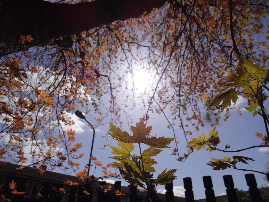
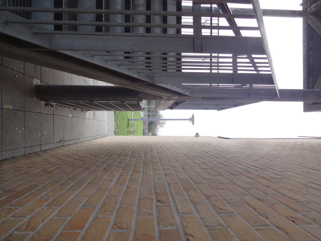
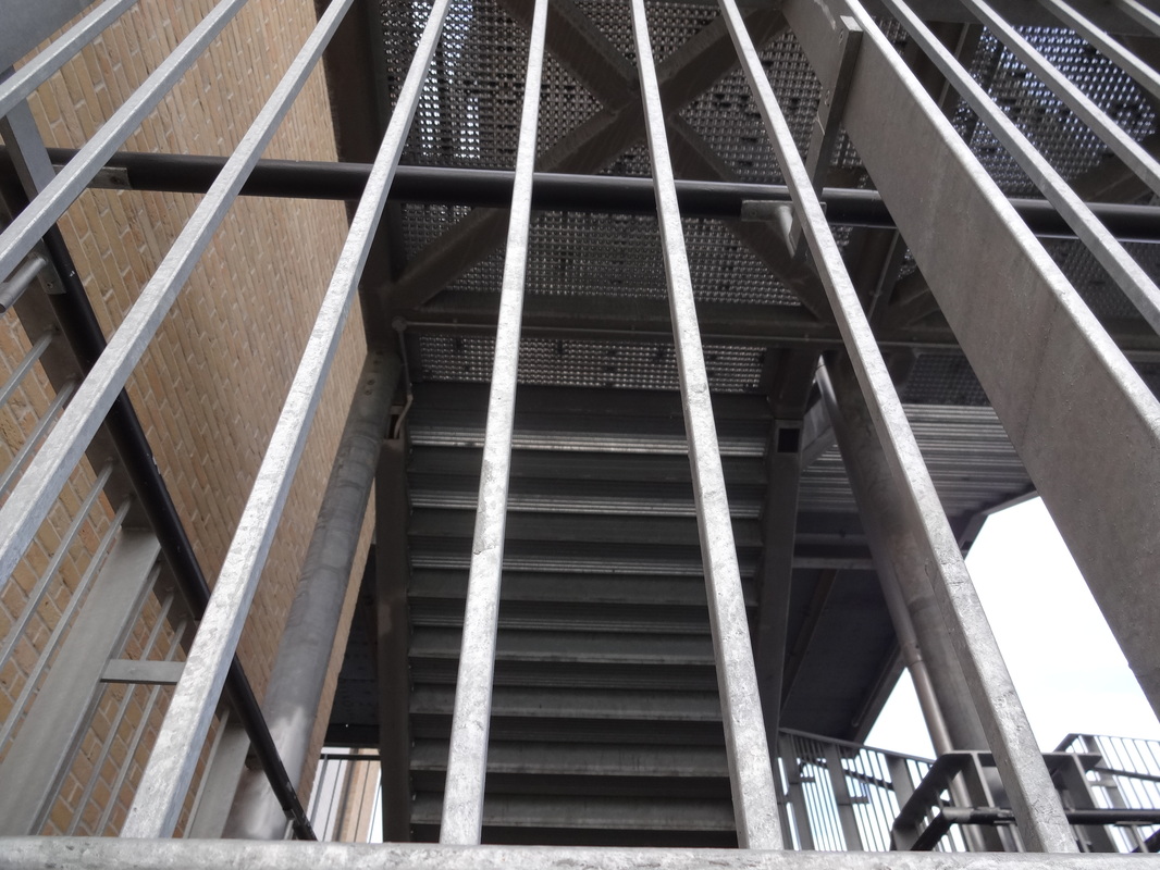
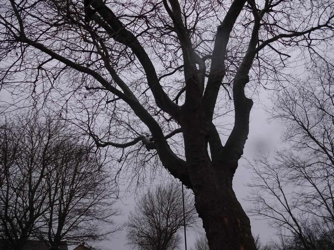
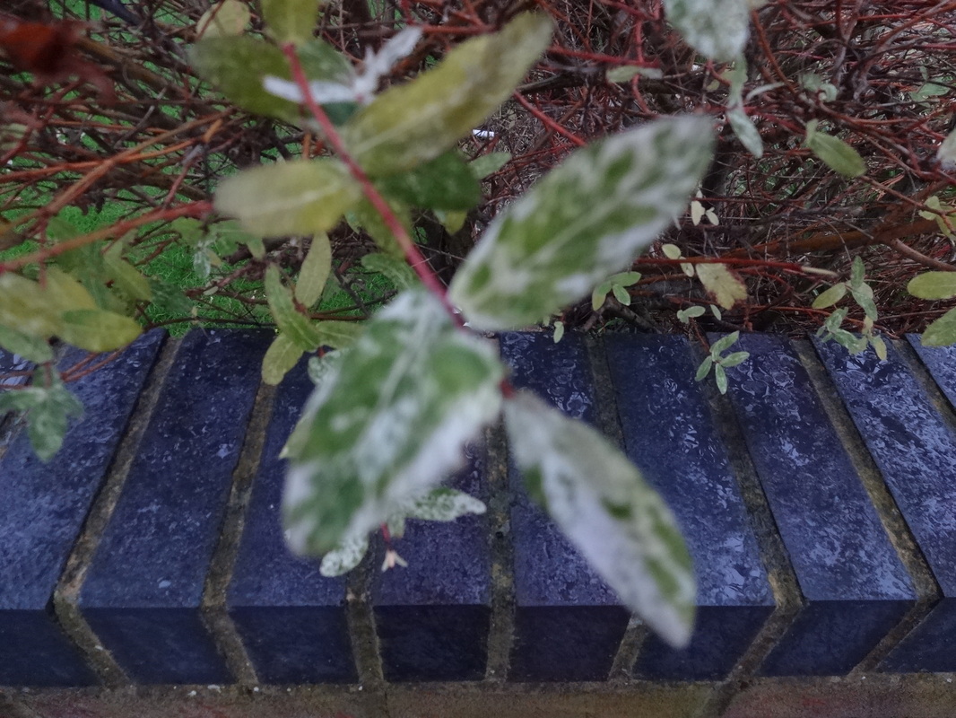
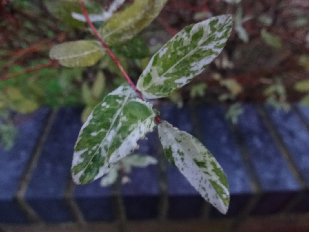
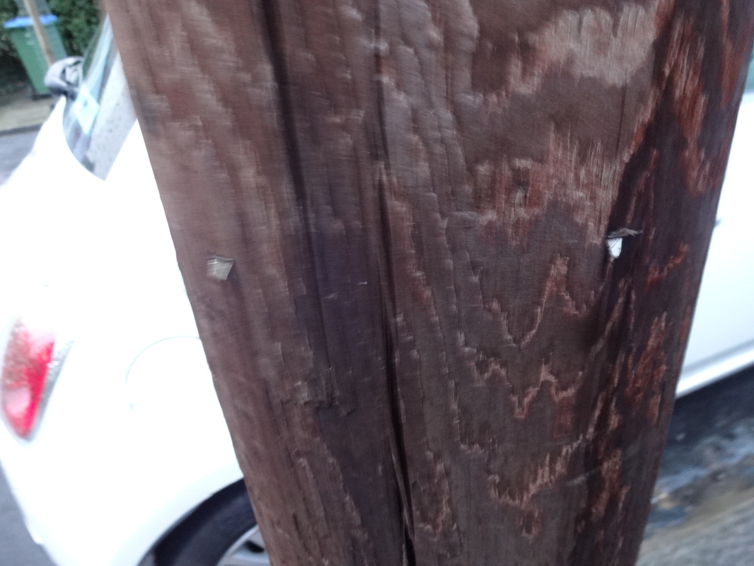
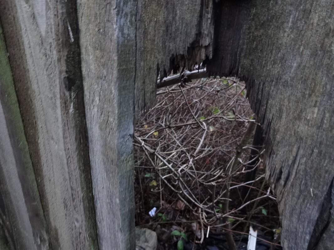
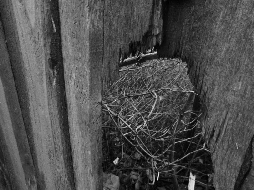
For homework we had to take several images with our initial ideas of abstraction. Even though i couldn't take much images, i looked through my previous images and chose ones that i feel would work and put them into groups with the same elements.
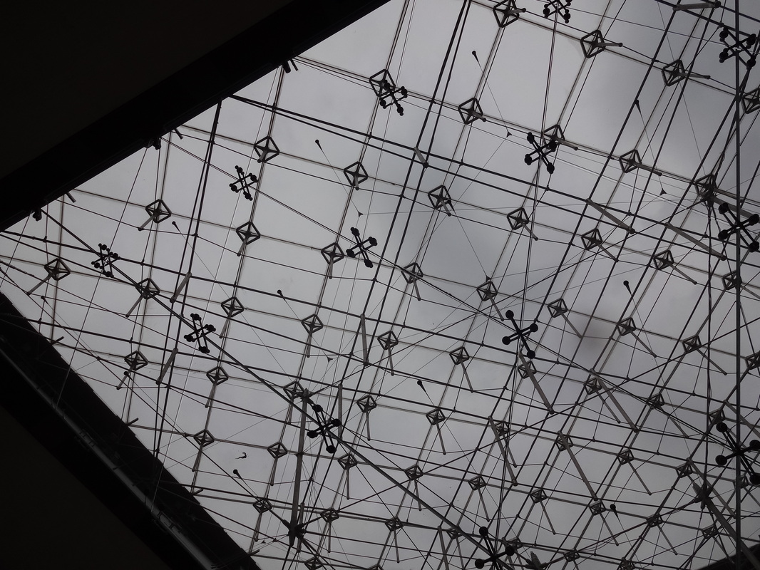
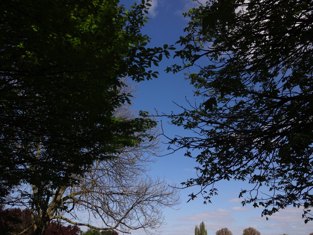
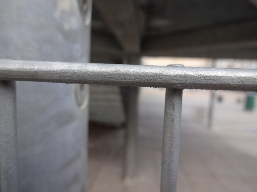
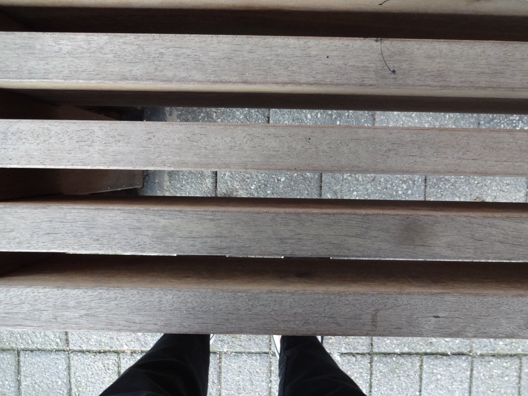
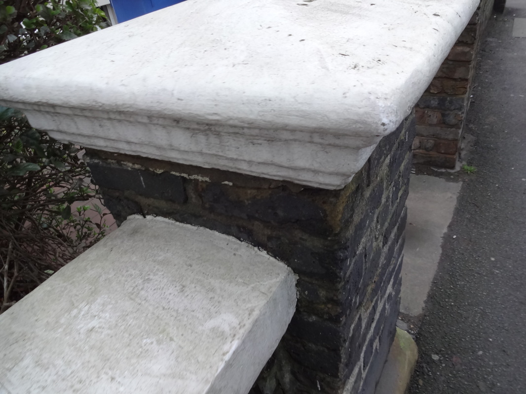
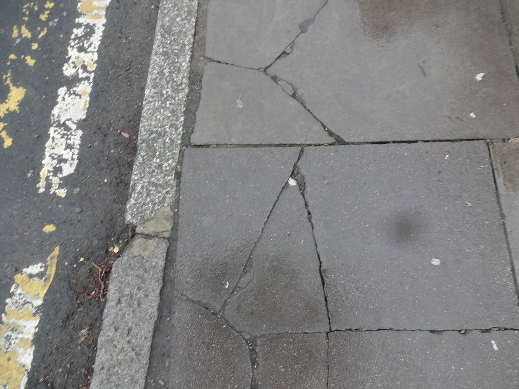
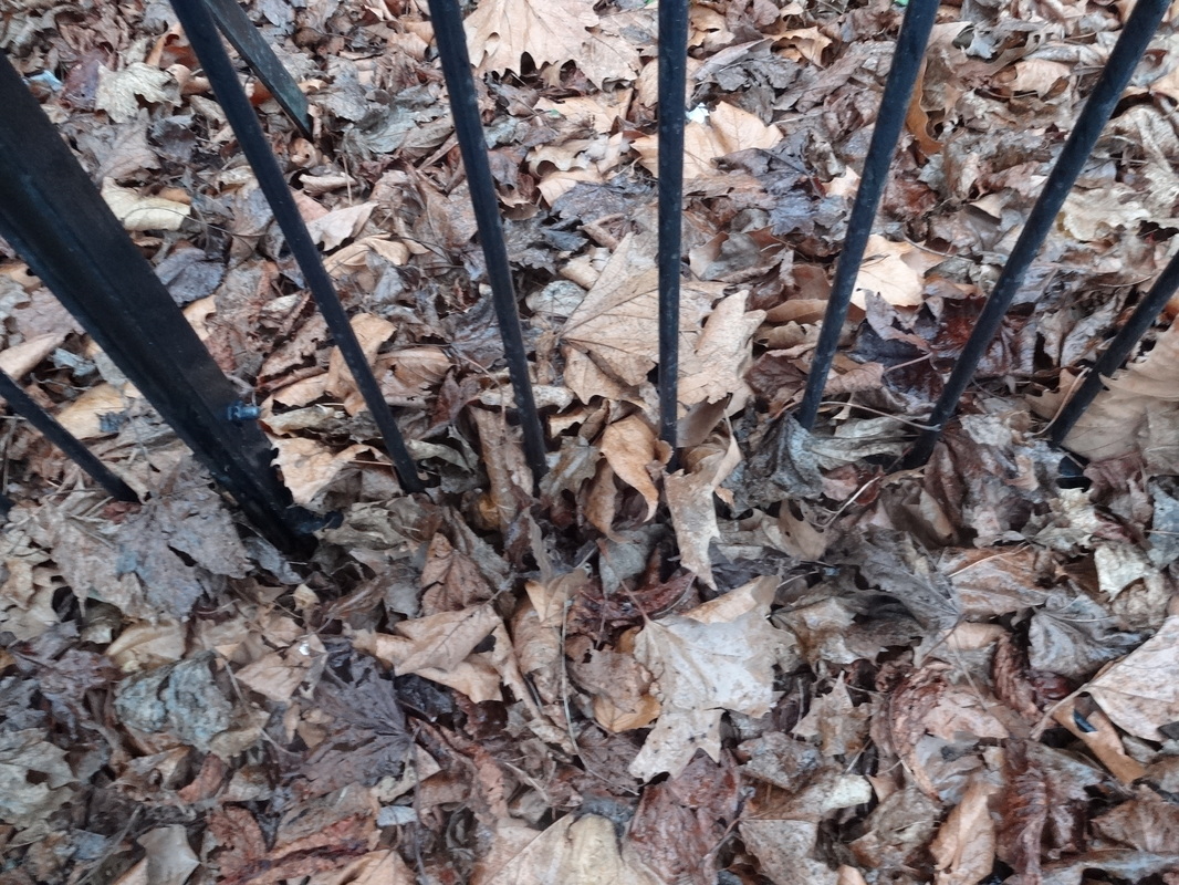
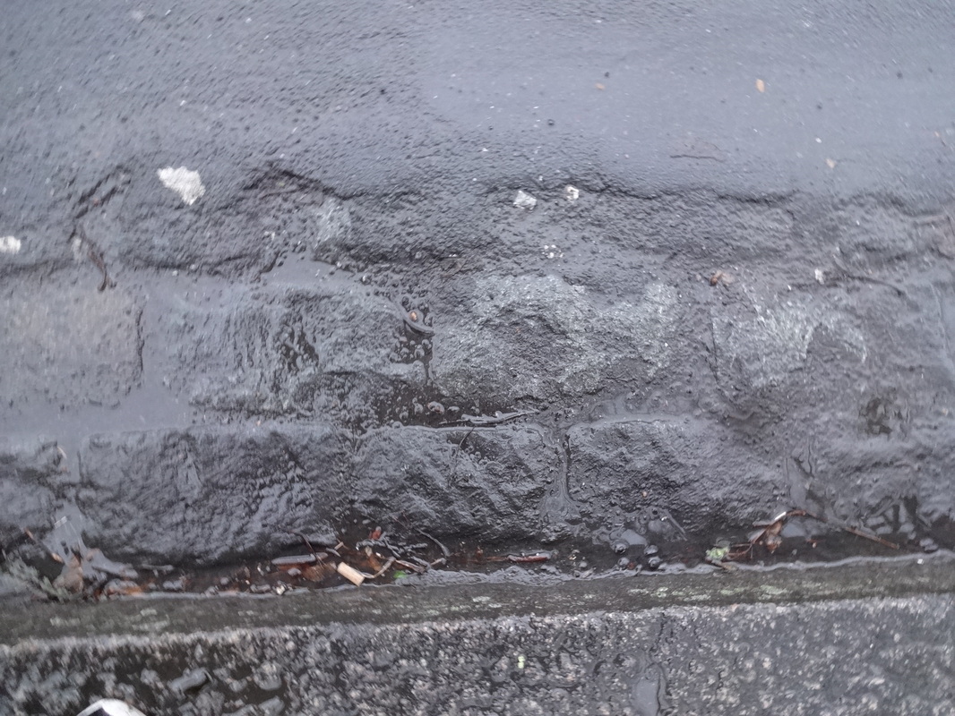
First Row- Focussing on line, shape and composition. These images have a low saturation, therefore it allows us to really defines the lines in the shapes.
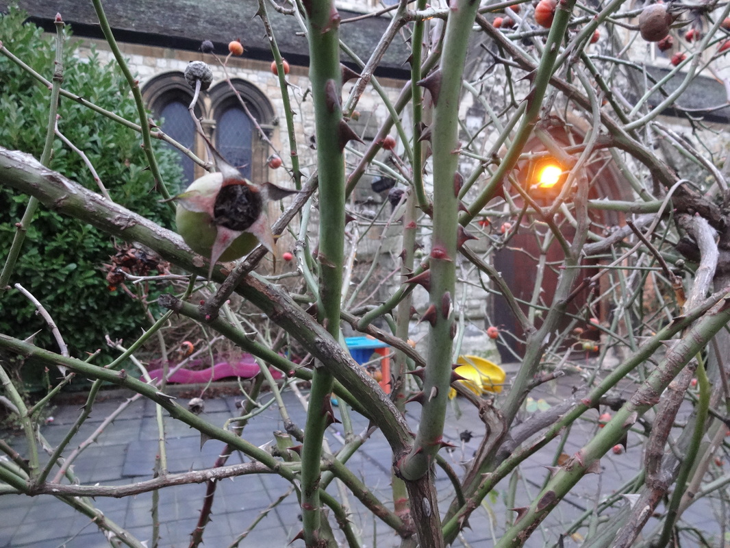
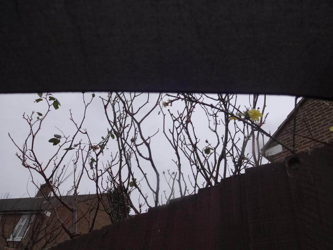
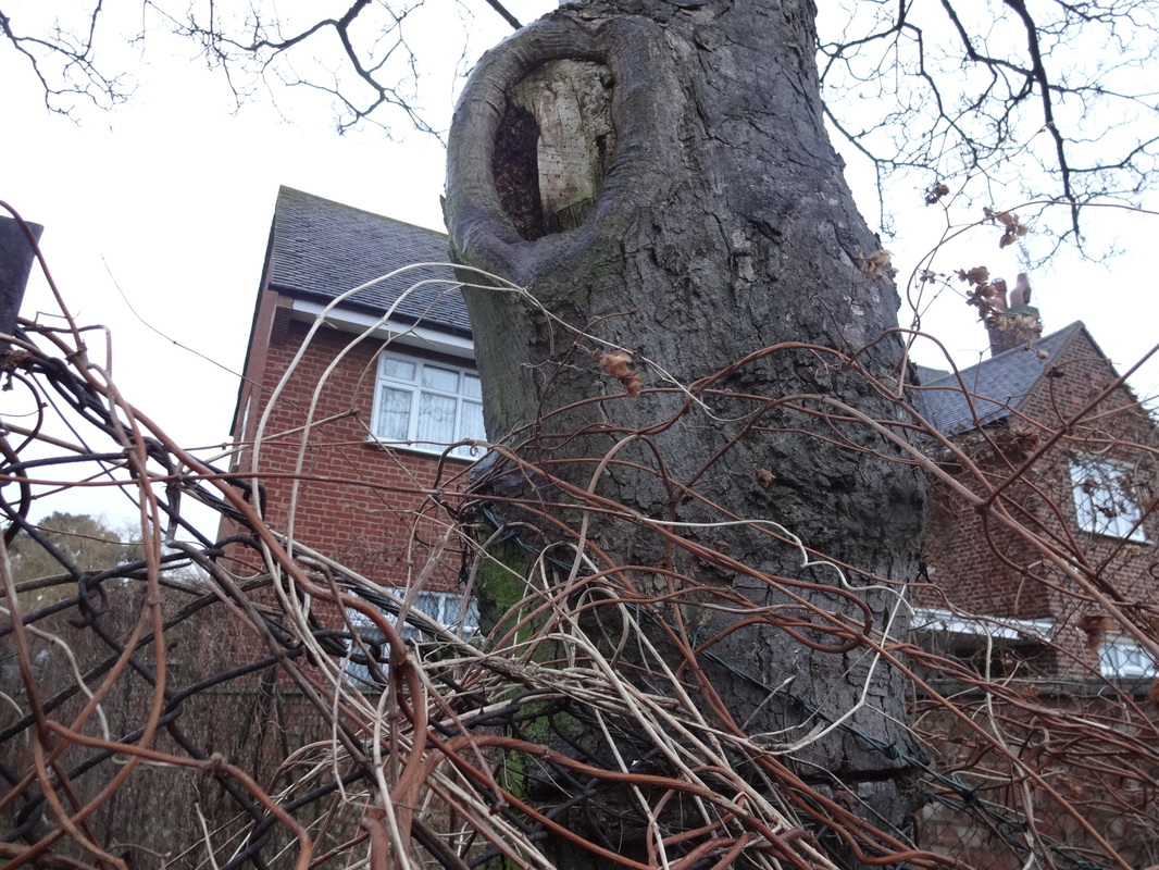
Second Row- Focussing on colour, light and tone. By using nature, i was able to use natural light to create images with different tones and colours.
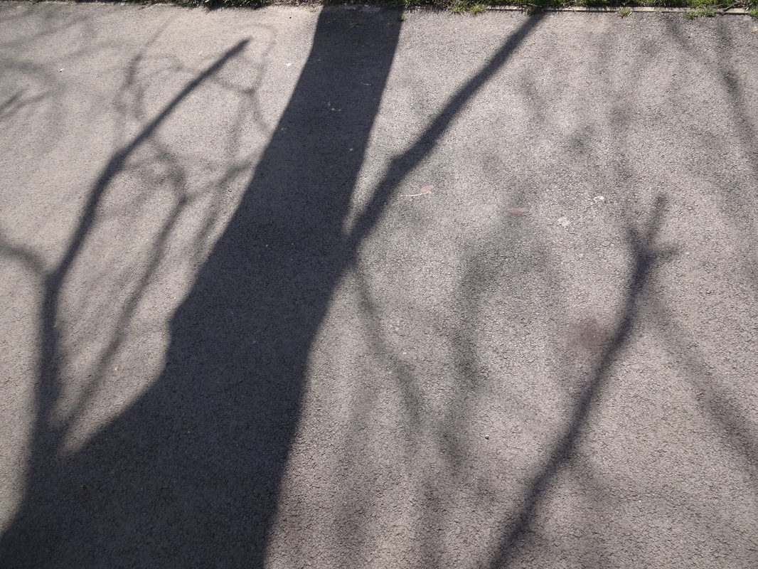
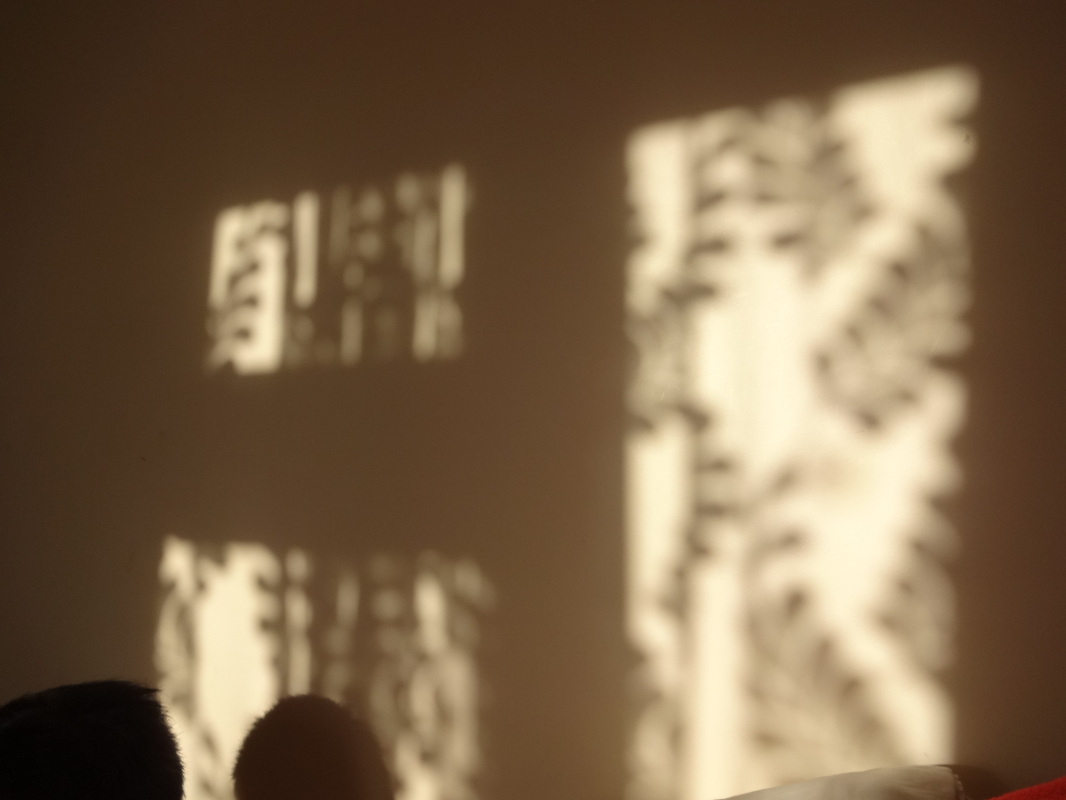
Third Row- Focussing on shadow and composition. I took images of shadows from the tree and used it to fill the whole image, so theres not much negative space.
First Row- Focussing on line, shape and composition. These images have a low saturation, therefore it allows us to really defines the lines in the shapes.
Second Row- Focussing on colour, light and tone. By using nature, i was able to use natural light to create images with different tones and colours.
Third Row- Focussing on shadow and composition. I took images of shadows from the tree and used it to fill the whole image, so theres not much negative space.
Artist research 1- Neda Vent Fischer
|
|
Neda Vend Fischer is a Yugoslavian-born photographer. She is currently spending her time between Paris and Begrade, and most of her works are captured there. Her work is based on Paris and taking images of buildings, but then editing them and creating lines with them. She works well with colour, as some of her images are in black and white whilst some are in colour. Her images are generally taken in the city and she captures famous buildings, but she also has some images based on nature. In addition her images are also well composed and the angle in which she has taken it in is intriguing. For example, the third image on the slideshow works really well as its in black and white and also the elements are drawing into the centre. Therefore, it allows the viewer to draw in, to directly focus on the centre. Nevertheless the technique which she has used to edit her images, allows the viewer to question the original image. Whilst some of her images are simple, some of them are quite densely composed; which forms contrast between her images. Furthermore, her images have influenced me when i'm developing my images. For my next set of images, i will focus on the formal element- Lines, similar to Neda Vent Fischer's work. Also, when composing my images i will try to compose them quite densely and not simple. After, though i am still unsure of how to do it, i will experiment with photoshop to create something similar to the artist.
___________________________________________________________________________________________________ |
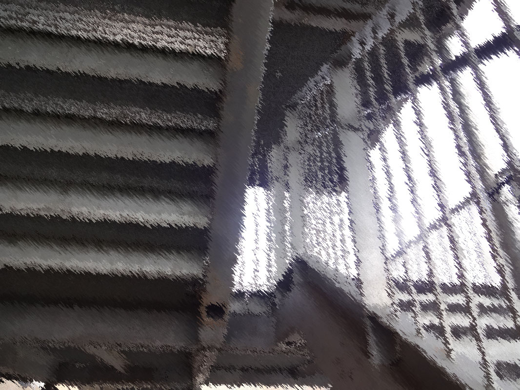
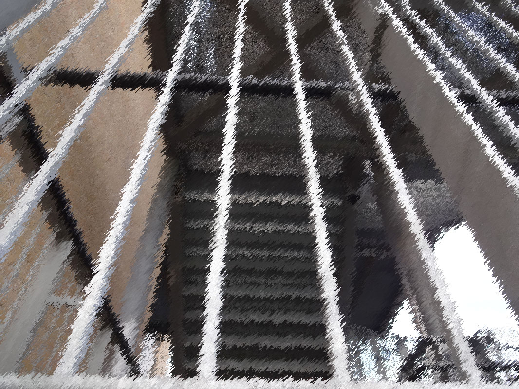
Photo shoot 2; Lines
Evaluation
|
WWW;
I focussed clearly on lines and captured the images at different angles for effect. In addition, i was inspired by the artist Neda Vent Fischer, as her work is based on lines within abstraction. Also, the composition in my images are though out, as i have filled the whole image with the elements and so there's no negative space where its irrelevant. So, some images are simple and some are more complex and sophisticated. |
EBI;
To improve my images, i will further develop them my going onto photoshop and create brush strokes onto them, this idea came from my artist research. The reason why i'm doing this is because it allows the image to represent and show lines more. |
|
|
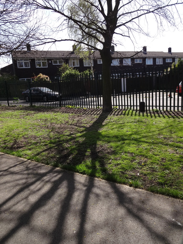
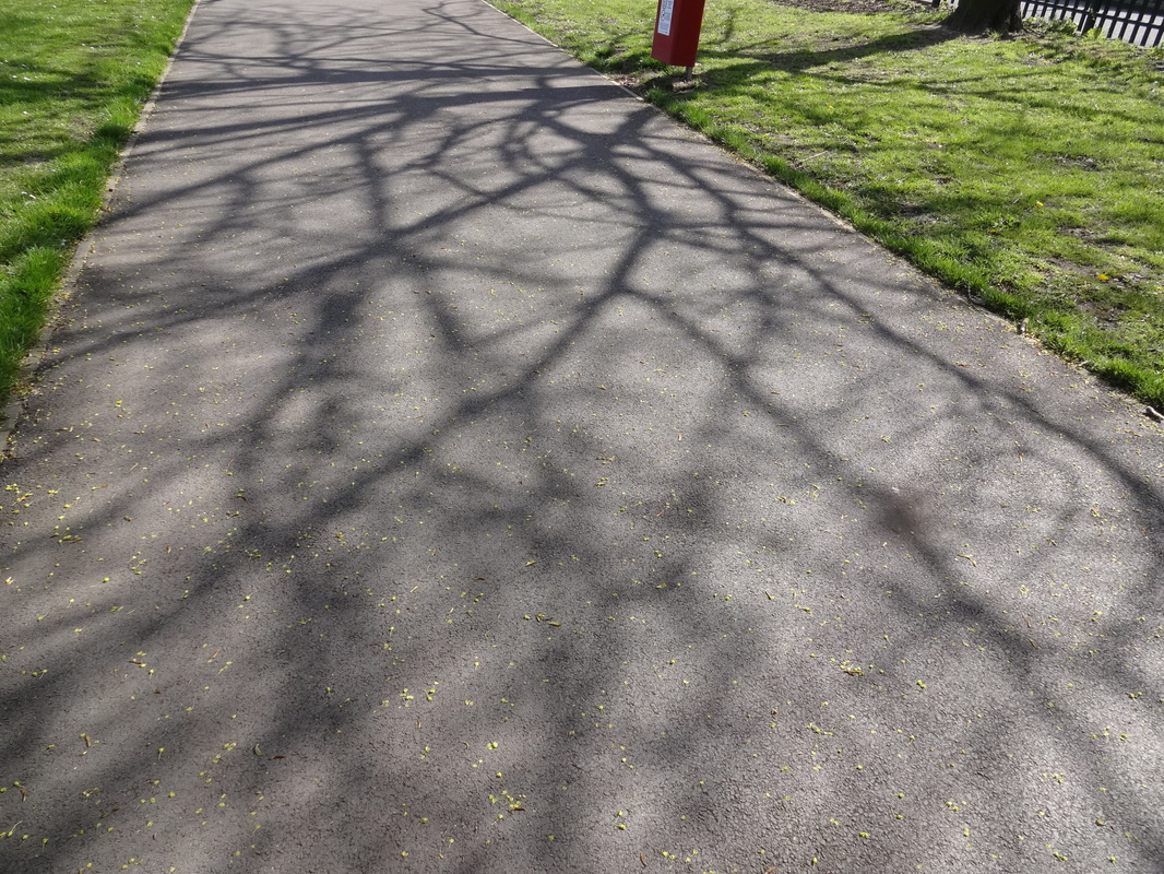
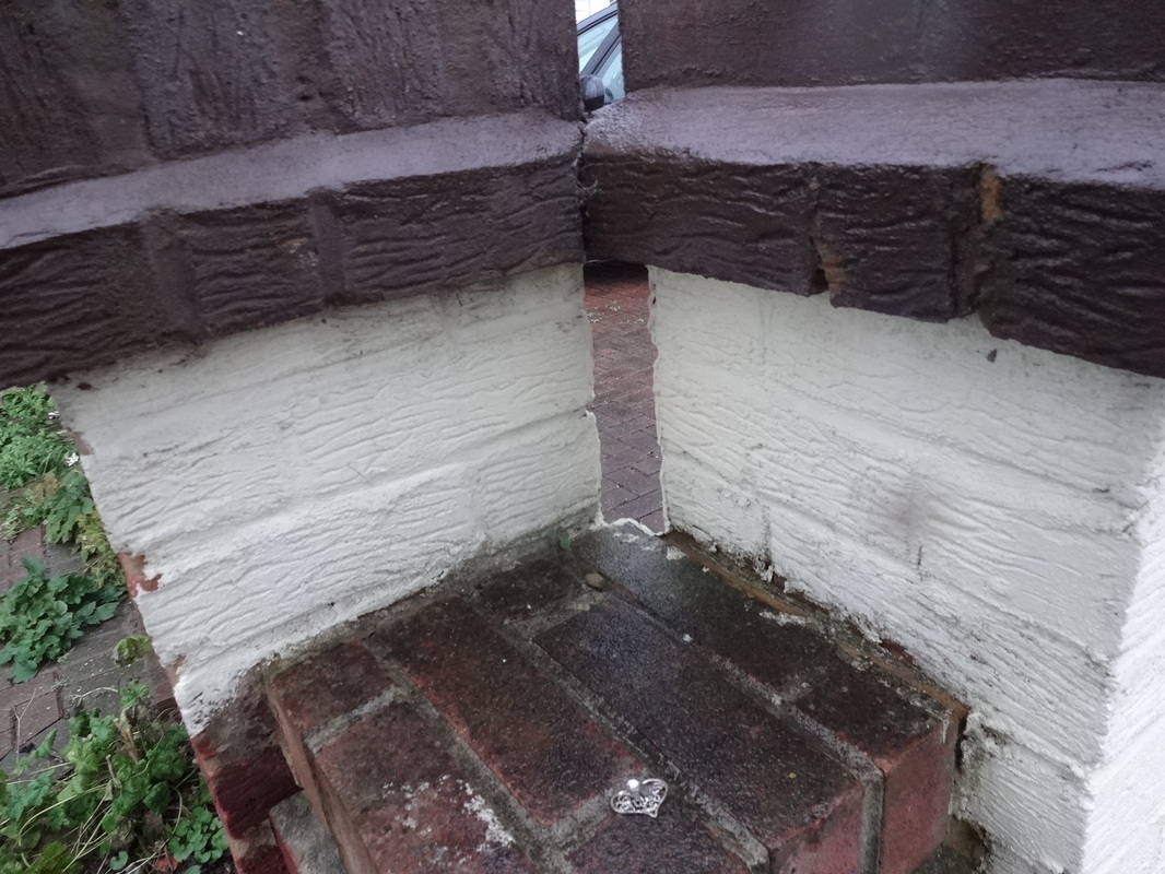
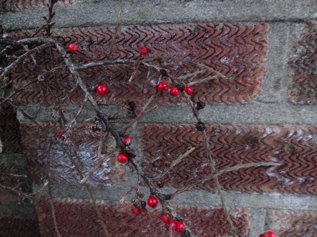
20 images for homework:
Shadow-

Out of focus-
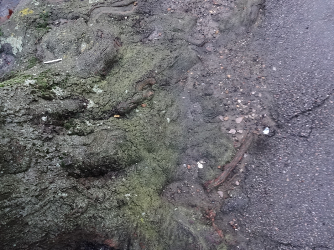
Texture-
Tone-
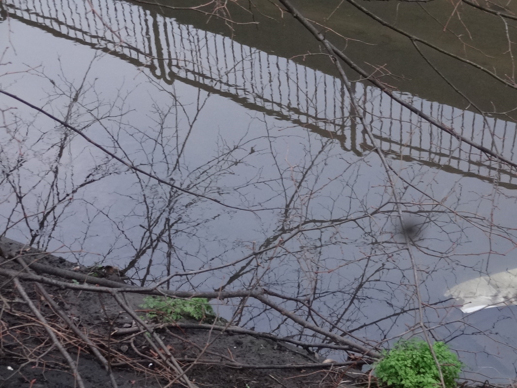
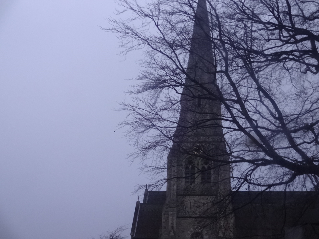
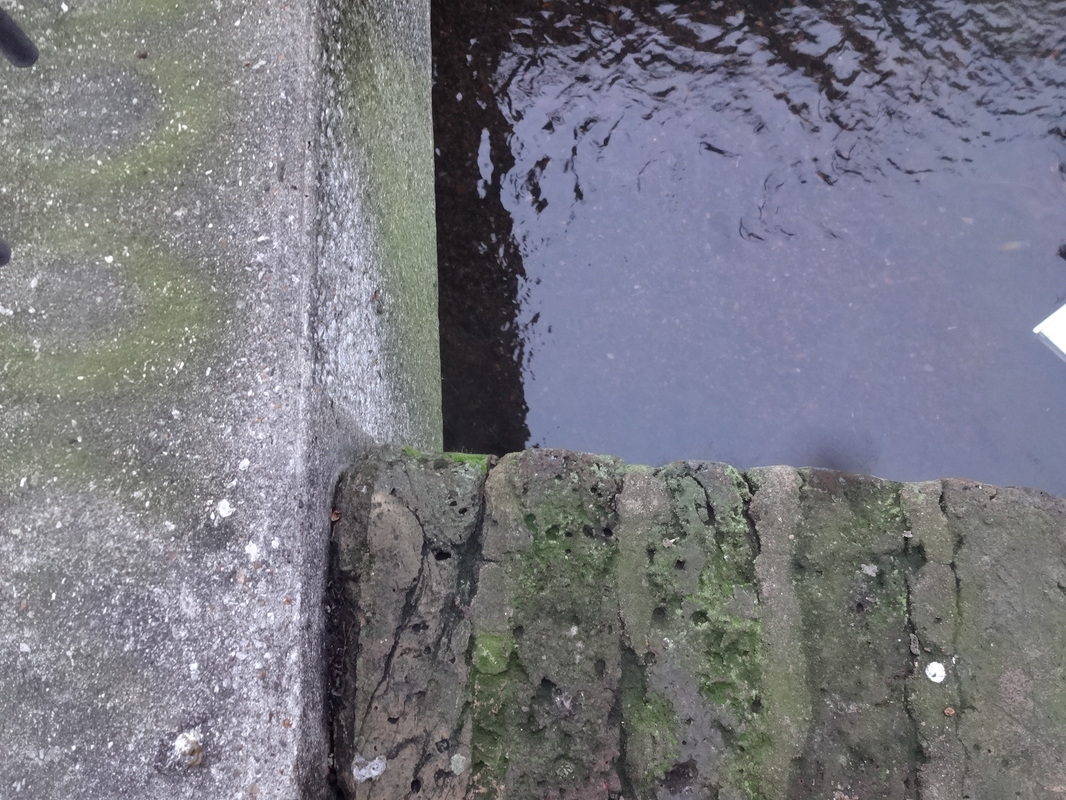
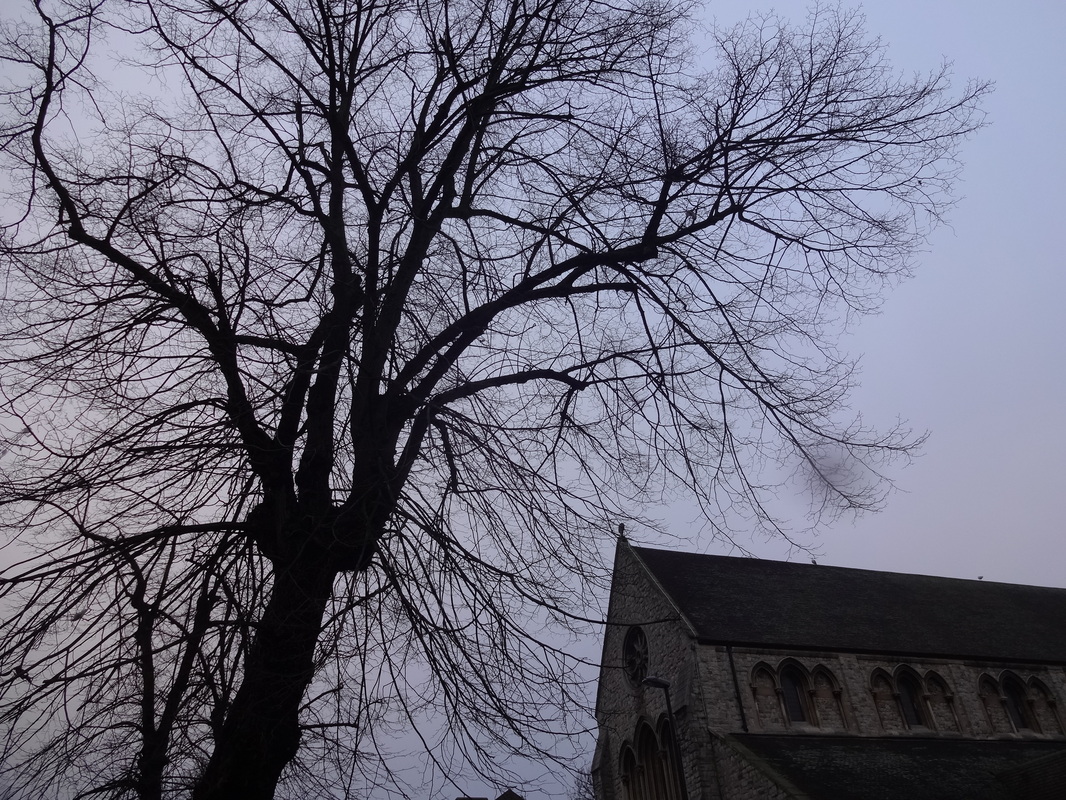
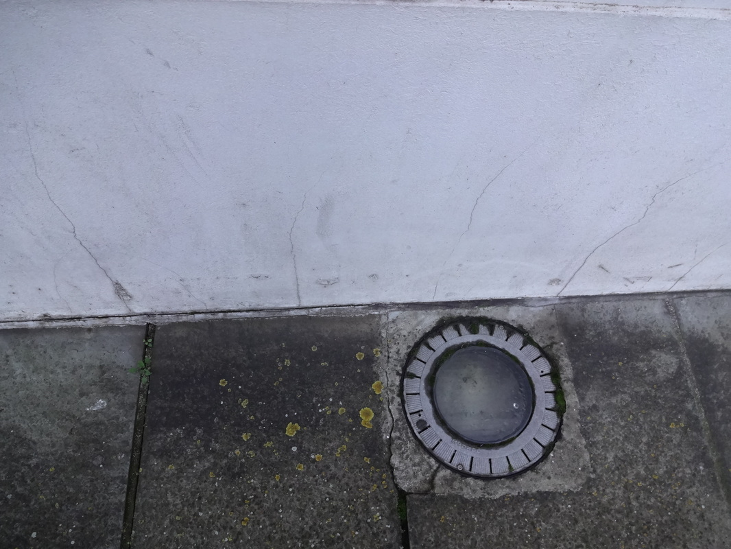
Image evaluations-
|
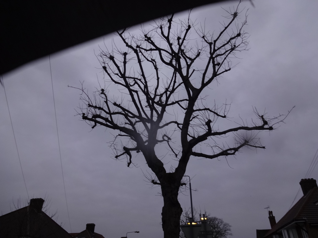
WWW- Even though i had not focussed on one particular element, I was able to section all my images into 4 separate elements. I chose to do a variety of elements, therefore i was able to see which one worked best for me and also the element which has most potential for improvements. I like the colour formed from the images based on shadows; especially with the black silhouette.
|
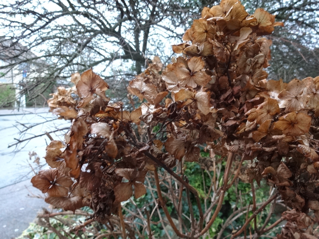
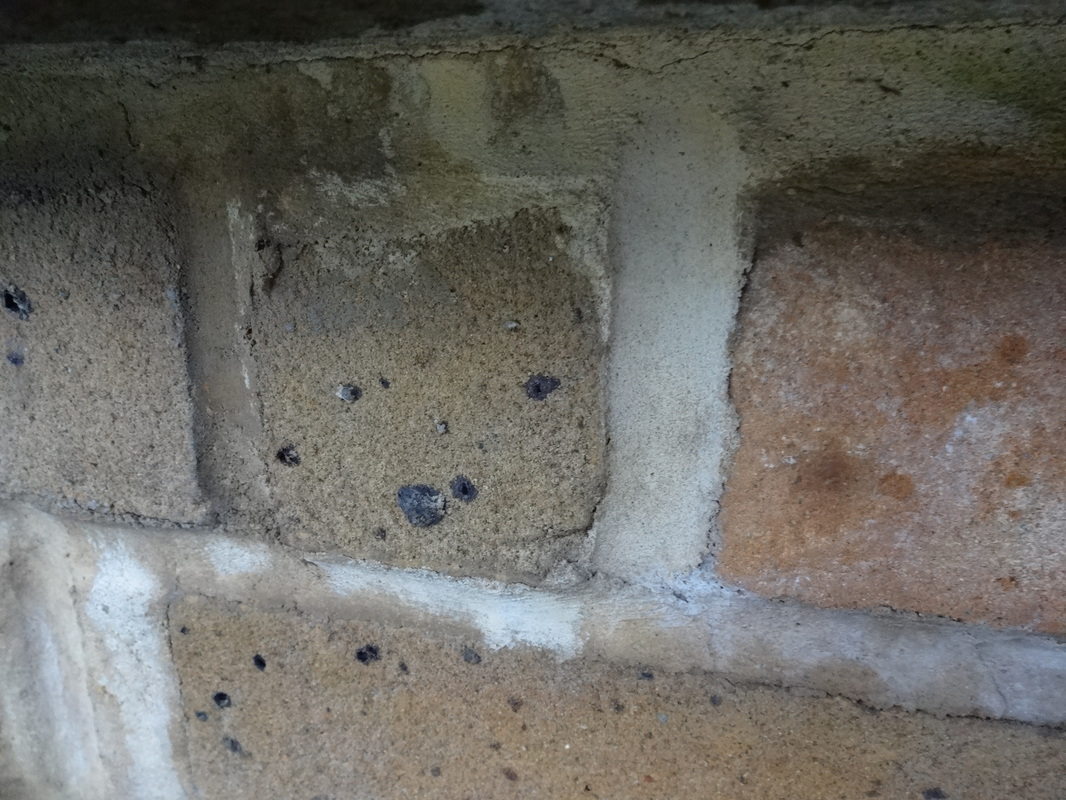
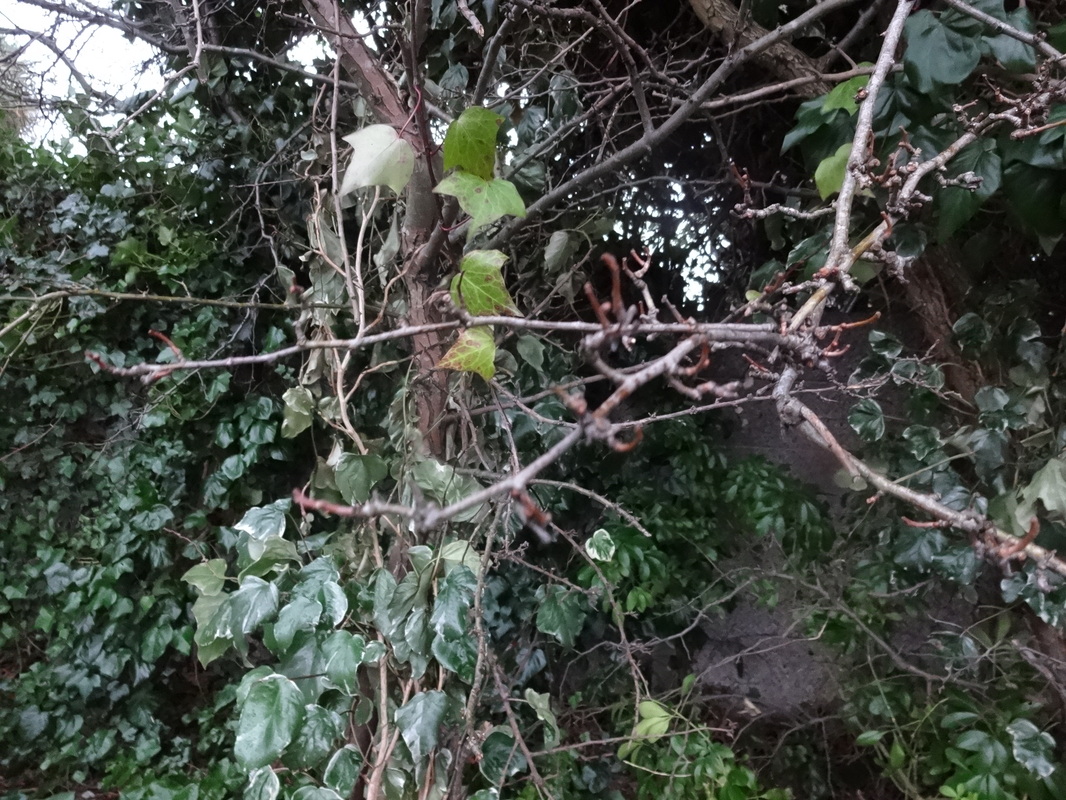
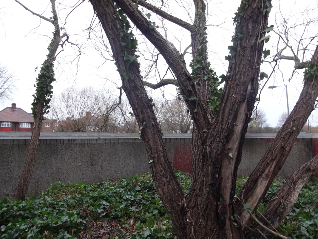
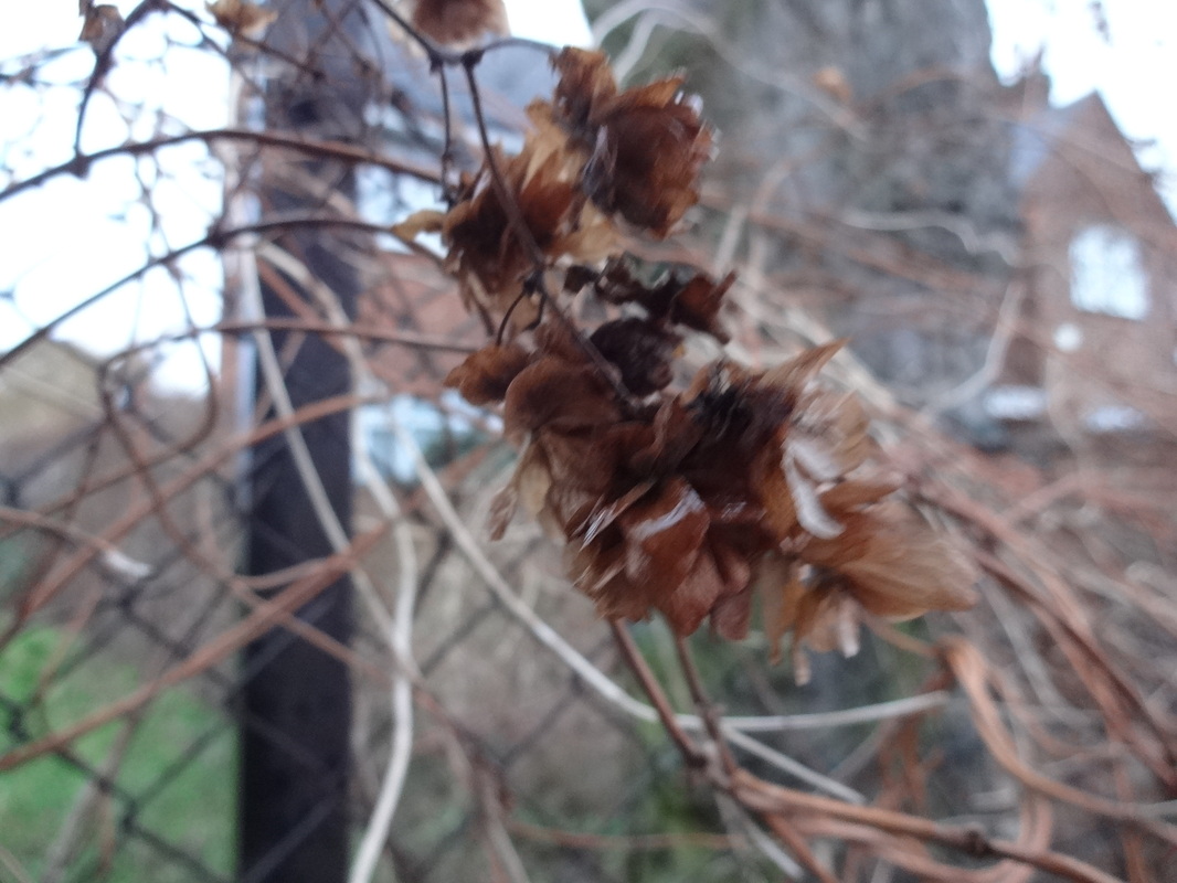
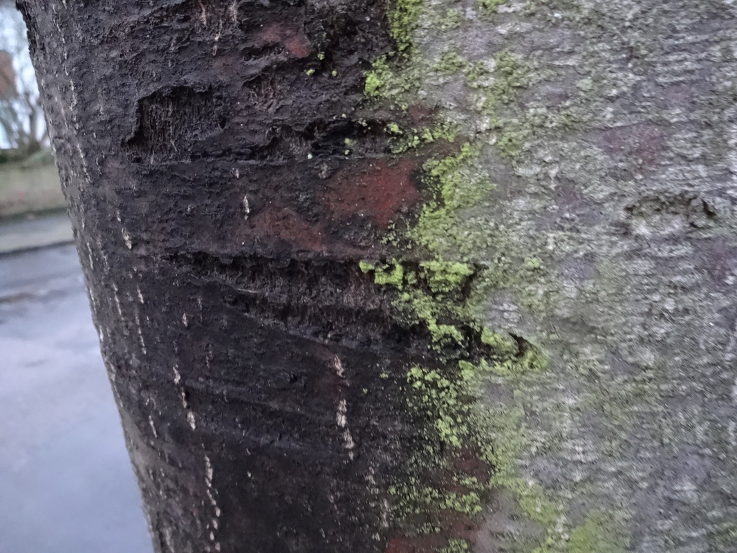
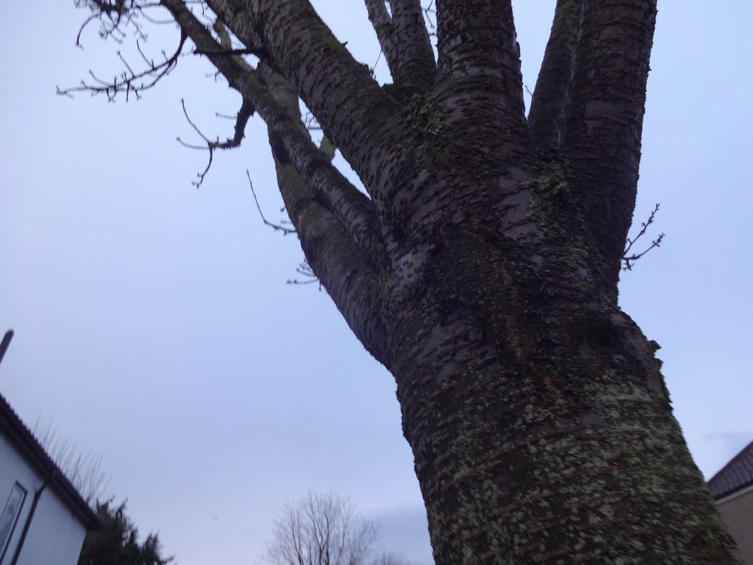
EBI-From these images i hope to take more images relating to tone and texture as they were the most intriguing and successful. Hopefully i am able to take more images with colour and not so much with dull tones. Furthermore, i will take more images relating to nature in particular tree barks for texture and also tree branches.
|
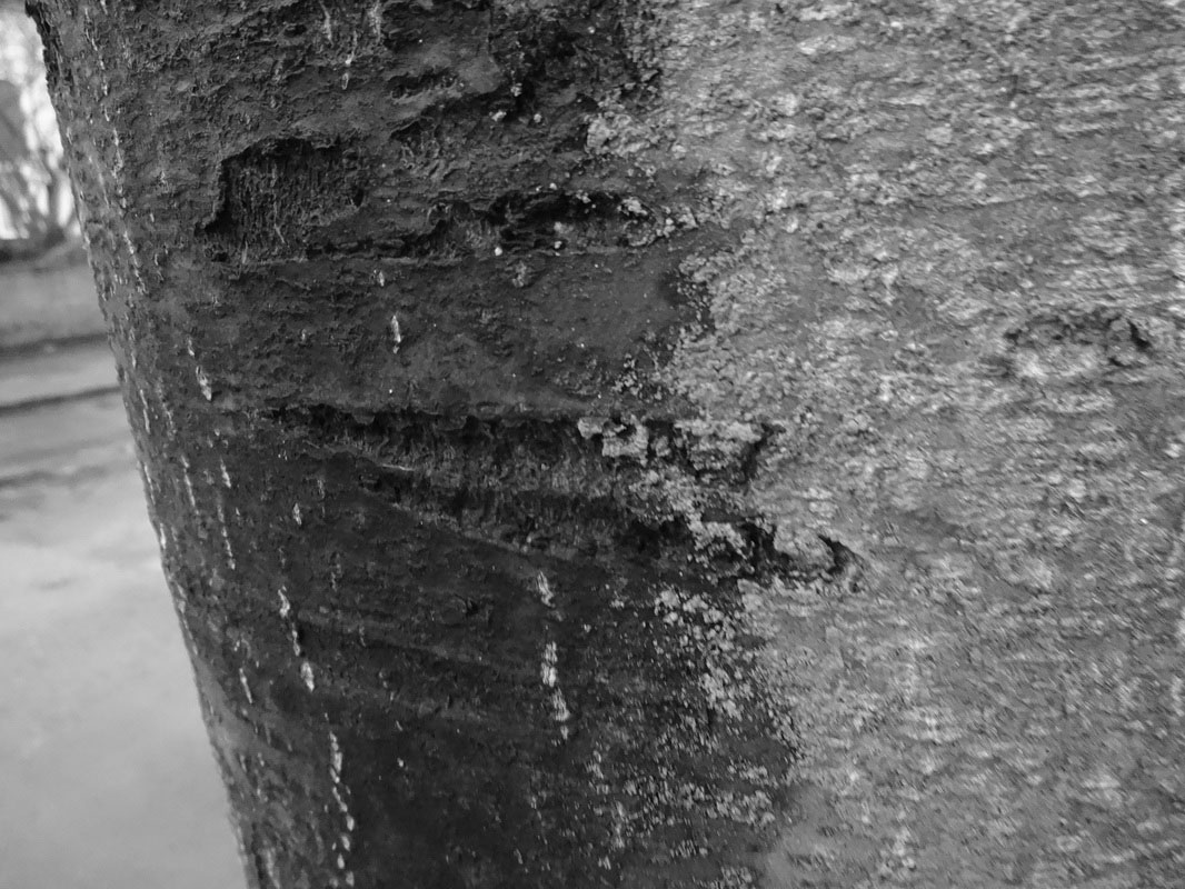
Images based on texture and tone
WWW; |
EBI; |
|
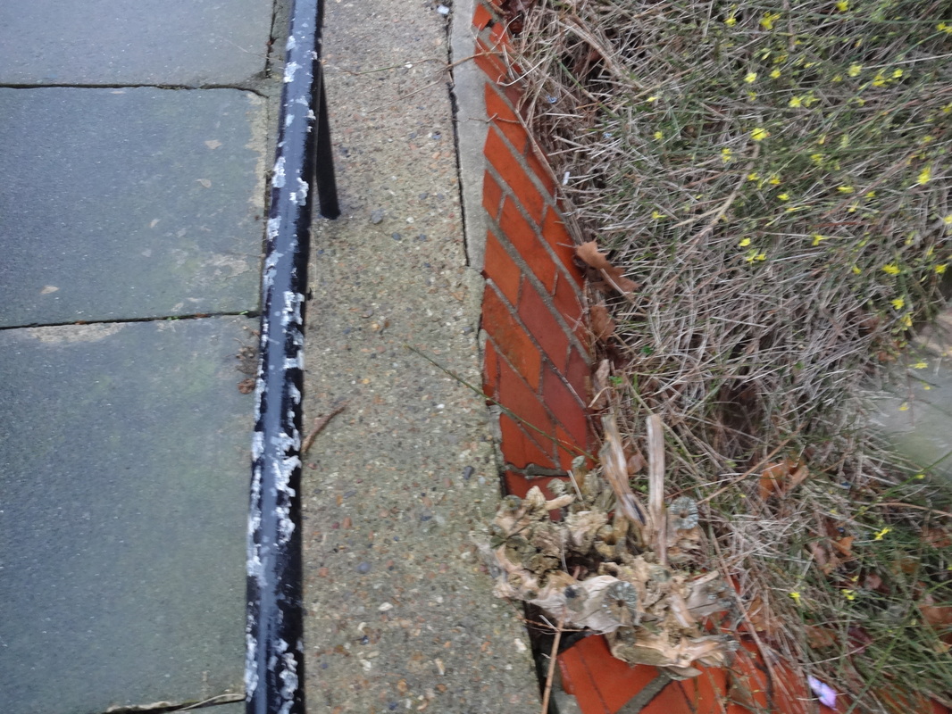
Following on from my previous photos, i wanted to focus on taking images with more colour and also adding some texture to create more depth within the photo. I feel that this was achieved because when i was composing these images i looked carefully to see what type of colours i could incorporate. Also, with the trees i was able to capture texture also.
|
Even though i wanted to look at colour, to develop i may invert some images into black and white, so that it may further emphasise on texture and tone. I will choose 3 successful images then i will see how they look together. Also, i will look at an artist with similar work to mine, that works with nature and also tones; which will be Minor White.
|
FOLLOWING ON- |
I will try and use other softwares such as photoshop to change the images, as i may distort some parts. I will also lower the saturation of my images and make them black and white. Further, i may print these out and cut them up, playing a bit with fragments.
|
3 images into black and white
Evaluation
I chose 3 images which i found most successful from my collection. These 3 images are really densely composed and are quite compact. After editing these images, i liked the contrasts between the darker and lighter tones which creates a subtle effect. As it's black and white, the texture on the trees is more distinct and clear, which further improves my theme.
Artist Research 2: Minor White
|
Minor White is an American artist (1908-1976). He was born in Minneapolis, Minnesota. White was raised by his grandparents for most of childhood life, and his grandfather gave him a camera at the age of 7, from there his passion for photography had began. In late 1937 he moved to Seattle, where he then purchased a 35mm Argus camera and carried on travelling. Later, he joined the Oregan Camera club to learn from other photographers and their work. Further, from then he had his work exhibited at the Museum of Modern art in New York, his collection was called "Image of Freedom". Through this he was introduced to the triumvirate of modern photography such as Paul Strand, Edward Weston and Alfred Stieglitz, whose concept of equivalence - the notion of finding in nature formal relationships that reflect the photographers internal experience- had a profound effect on his thinking.
White made thousands of black-and-white and colour photographs of landscapes, people and abstract subject matter, created with both technical mastery and a strong visual sense of light and shadow. White was greatly influenced by Stieglitz’s concept of "equivalence," which White interpreted as allowing photographs to represent more than their subject matter. In his later life he often made photographs of rocks, surf, wood and other natural objects that were isolated from their context, so that they became abstract forms. He intended these to be interpreted by the viewer as something more than what they actually present. He recognised an object or series of forms that, when photographed, would yield an image with specific suggestive powers that can direct the viewer into a specific and known feeling, state, or place within himself. _____________________________________________________________________________________ |
“At first glance a photograph can inform us. At second glance it can reach us.” -Minor White |
Minor White response; photoshop FINAL PIECE #1
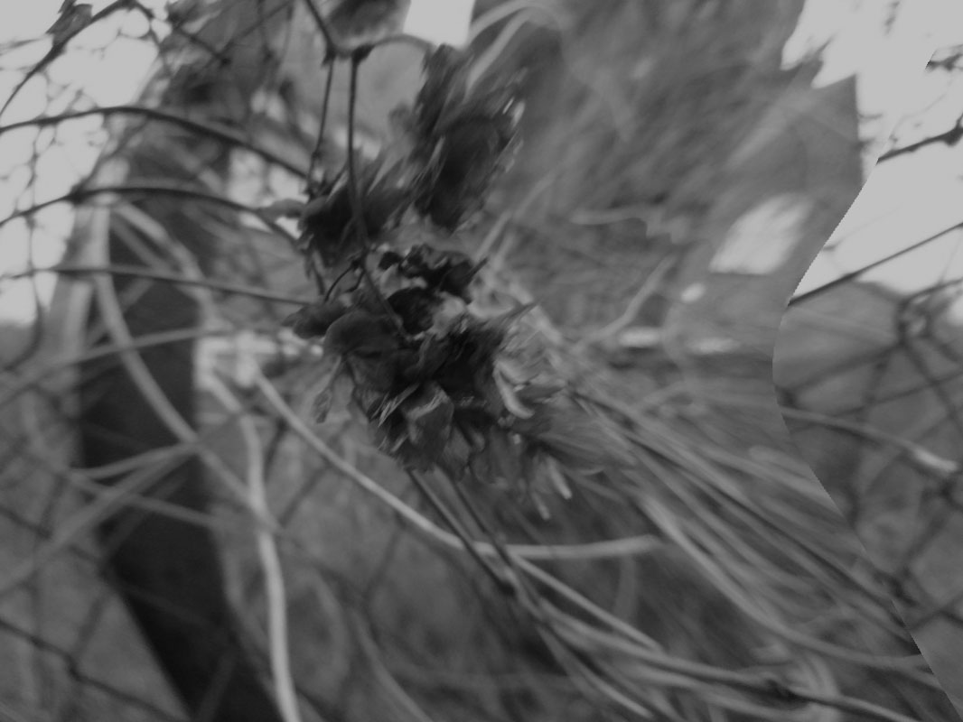
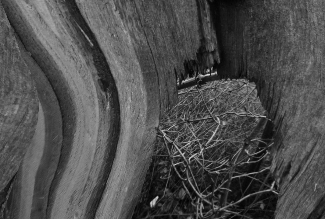
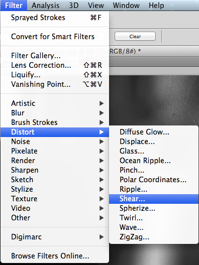
Image evaluation-
These two images were originally from the collection of texture and tone. Then, i chose 3 which I found successful and really contributed to the two elements. These three images were in colour before, however i chose to make them into black and white to further emphasise the elements. After this i researched an artist which had similar work to mine and found a way which i could improve my images making them more interesting. I therefore found out more about Minor White, which he produced a lot of his work in black and white. Also, in some of his images there was a subtle distorted effect making the image have more ambiance. So, i used the software to photoshop to improve my images. I went on the filter option then hovered over the distort option, after i experimented around with the different options there was, as i wasn't sure of which one was the right one to use. After, this experimentation, i found the correct one which created a subtle curve in my images.
I chose this as my final piece as it conveys the idea of abstraction as it contains the elements of: tone, texture, line, focus and light.
I chose this as my final piece as it conveys the idea of abstraction as it contains the elements of: tone, texture, line, focus and light.
--------------------------------------------------------------
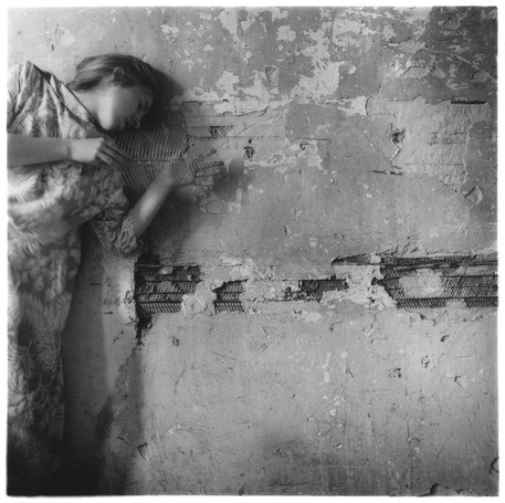
Artist Research 3: Francesca Woodman
|
|
Francesca Woodman was born April 3, 1948 in Colorado. She's an American photographer which captures black and white images which usually contains a single person, either herself or another female model. Her images are simple and abstract similar to the model in her images as they are usually wearing nothing or with minimal clothing. The models are mainly blurred- as a result of movement or Francesca's technique of long-exposures, this therefore takes away the true meaning and creating a obscure effect. Her images capture parts of the body since sometimes the person is hidden or some parts have been concealed by quite plain but innovative artistic pieces which relate carefully to her theme. She explores the the idea of gender and self. So, she uses the human body to represent this and it further compliments its surroundings. Francesca's idea of blending in with the background creates a ghostly effect and she really focusses on the scenario an the objects around her. Her composition for each image is carefully thought out as her props and objects are specifically placed in a position to create a surrealistic and unsettling atmosphere. She is often in quite obscure and desolate areas, therefore her images are simple and minimalistic. Furthermore, with her ideas being black and white and her creative techniques, we can really feel that her images are abstract as we can really focus on the different elements within her images.
__________________________________________________________________________ |
|
Image evaluation-This is one of my favourite images from taken by the artist Francesca's Woodman. This image shows the depression from the lady as she leans towards the wall behind her. This is clear from her rather minimal expressions and also by the way her hand is placed. In my opinion, I think that this image has been composed and its not a natural position, this is because of the way her hands are in line with each other creating a horizontal effect similar to the cracks on the wall. In addition i was instinctively drawn to her use of texture and tone within this image. Texture is evident from the cracked wall and some of the layers being stripped from it. This contrasts with the model featured in the image, as she represents the natural and innocent ways from a females perspective. Whist, the wall symbolises the harsh feeling of life and background, in which the women is having the throw herself upon it with a depressed mind. Furthermore, the technique of tone is also clear as the models dress has a wide range of tone and looks quite innocent, which also again represents her character. Though i have used a similar concept within my own images of using something natural or has life, against a man-made background to create contrast, I know i can develop and maybe start using humans within my images to develop a much deeper contrast. I feel like i can really use this as an inspiration for my next set of images as i focus more deeply on the use of black and white to create more feeling within the image.
|
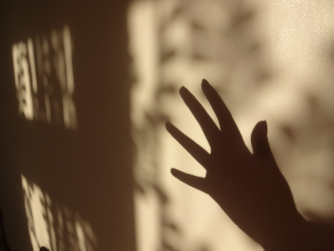
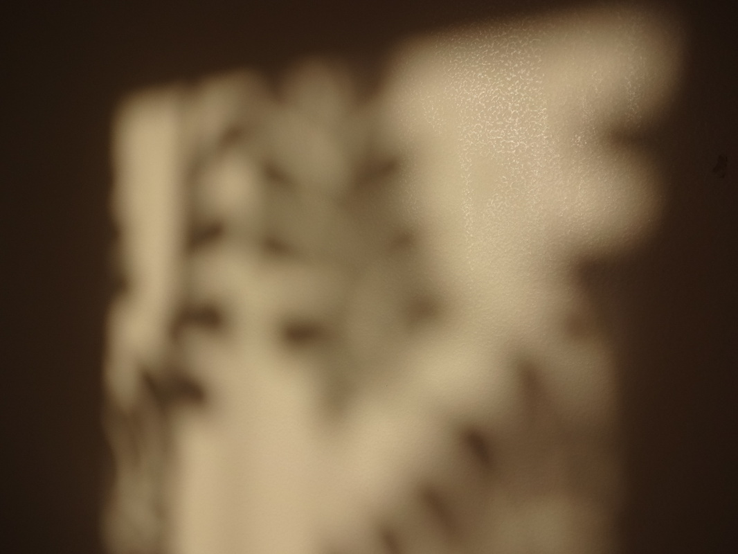
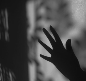
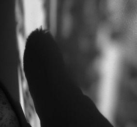
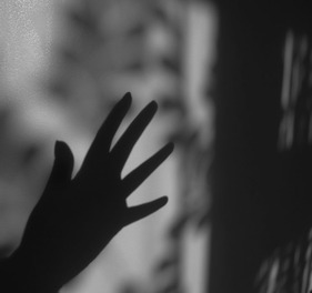
Francesca Woodman response; (shadows and tone)
In this final piece, i used three images which i had taken for homework based on shadows. I really liked these three images because it really conveys the concept of abstraction as it contains the formal elements of shadows, tones and lights. These images were taken in my room when the sun light was shining through the curtains, which creates the subtle blurred pattern in the background. Further, i used some human features to act as the main focus of the image and it created a very dark, dominant shadow. These images were originally a sepia type of colour, but then i used photoshop to change the colours and turned them into black and white. By doing this, the image looks more interesting, as the dominant feature is more clear and it the tones also stand out more. With photoshop, i also cropped these images so that they were square shaped, as the edge of these images wasn't really interesting and i felt like there was too much negative space which was not needed.
These three images were all inspired by Francesca Woodman, she captures images of humans, but only captures a part of them, showing only a small fragment of their whole body. These images clearly show the inspiration, because in these images i captured only the hand and also a head of someone. By doing this, it allows the viewer to question the real meaning and person in the photo.
These three images were all inspired by Francesca Woodman, she captures images of humans, but only captures a part of them, showing only a small fragment of their whole body. These images clearly show the inspiration, because in these images i captured only the hand and also a head of someone. By doing this, it allows the viewer to question the real meaning and person in the photo.
FINAL PIECE #2-
|
|
|
|

|
Final project evaluation
During this project about abstraction, i have developed my skills in research, experimentation and development. As abstraction is such an open theme, there were many different artists and pathways which i could've chosen to follow. Nevertheless, I remained focussed and finished of with two final pieces.
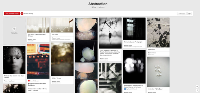
I began with writing a project proposal, allowing me to plan my steps within this project and so i didn't lose track. After this, i went on the Tallis Pinterest site, to look at the topic under abstraction, there were many different images and artists which had interesting works. After, looking through this page several points during my project, i researched three artists in depth and carefully analysized their images to find out which formal elements were seen and also what inspirations i received from their works. Firstly, i researched the artist Neda Vent Fischer, her work was very different compared to the works i usually look at. This is because she focussed on lines, texture and colour. I didn't usually work with colour, so this challenged me to try something new. After this, i looked at the works of Minor White, his work really intrigued me straight away as his images were simple yet sophisticated in some aspects. White took images based around nature and he took them in black and white, this really made the elements in the image seem more prominent. There were many elements which he focussed on including- texture, tone, light and shape. Overall, from all the other artists i looked at, his work really inspired me. My final artist research was Francesca Woodman, even though initially i wasn't planning to carefully research her, however her work was deviating and it also contrasted with the previous artist. Francesca's work contrasts with White's as she has humans in her images; in addition, she only captured parts of their body, which creates a mysterious sense as we question the actual meaning behind the image.
After the research of an artist, i went on to take some images with a digital camera. By using a digital camera, the images were more sharper and clearer. When taking my images, I focused on the composition and made sure i incooperated some of the elements from the artists. I took several images in a variety of locations, so that the images didn't all look similar. Nevertheless, in the first few weeks of the project, i was still unsure of what elements to focus on, so i took many and then after i identified which images were successful and also which ones i could develop to become better, successful ones. So, firstly i began with lines, these images were densely composed and i further went onto photoshop to create more lines, inspired by Vent Fischer. I didn't know how to develop from there, so i went onto another different artist which i found and this time i looked at texture, this was based around nature mainly; to improve i inverted some of my successful ones into black and white, because i felt like in this tone, the subject was more clearly visible and more sharp. Then, finally i used some of my previous images- from my shadows collection- which i then adjusted the contrast, saturation and brightness on iPhoto. Finally, this became one of my final pieces as i figured out how i wanted it to be arranged.
Furthermore, with every adjustment i did or intended to do, i recorded it down onto this page, so that i could see where i was going to go next; by writing it down, i was able to plan ahead and know which steps i was planning to next take. In addition, after each photo experiment, i wrote down what went well (WWW) and what i could do next to improve as 'even better if' (EBI). It was as important to evaluate someone else's work as to evaluate my own to know where to improve. I tried to make my evaluations simple, so that it was easy to understand. Also, the each of the elements on my abstraction page was displayed was also vital, so that someone else would find it easy to navigate through my page and know which evaluation was for which image.
In conclusion, i've learnt a lot from this project and it has really helped me to develop my photographic skills; as it has increased my confidence in experimentation and using softwares such as photoshop. As a personal project, i think i've done well and achieved what i intended to. Overall, i am happy with my two final pieces and how smooth and consistent this project was.
