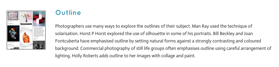
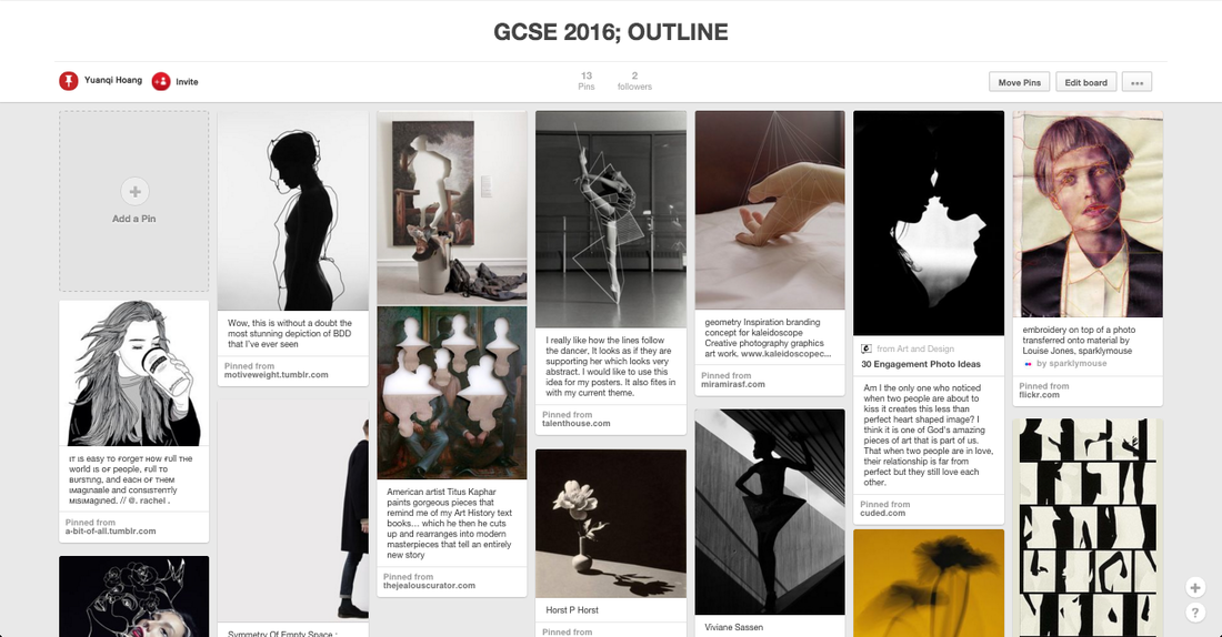
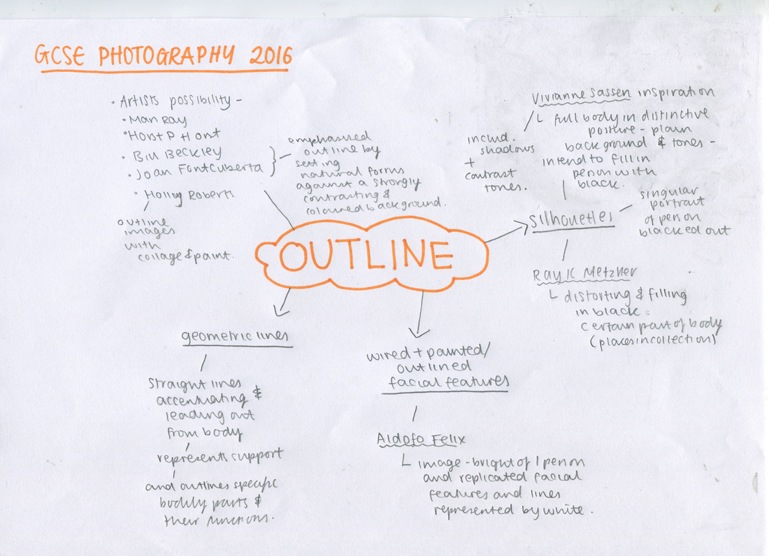
OUTLINE
    |
WHY I CHOSE THIS THEME?After looking at the GCSE themes that we could explore i decided to choose Outline. After looking at Pinterest I was intrigued and especially liked the idea of silhouettes and geometric lines outlining a singular person. I looked at Man Ray's technique of solarisation by creating negatives which are reversed in tones. I hope to be able to create black and white images and using different sources such as Photoshop to revert the tone. I also found the idea of silhouettes a good route to explore and experiment, i will capture shadows and a singular person in the centre of the image which I may trace the person and outline them before filling the whole section with a opaque colour. I found the artist Ray K Metzker, and i liked his selection of images with silhouettes, and i might create a final piece of silhouettes in a collection like his. My first interpretation of this outline project is the idea of silhouettes and shadows so i will go on and take images relating to it first.
|
OUTLINE initial mindmap
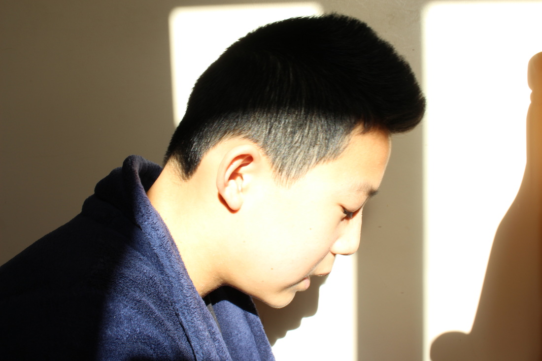
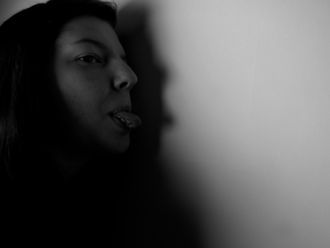
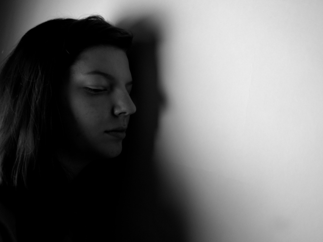
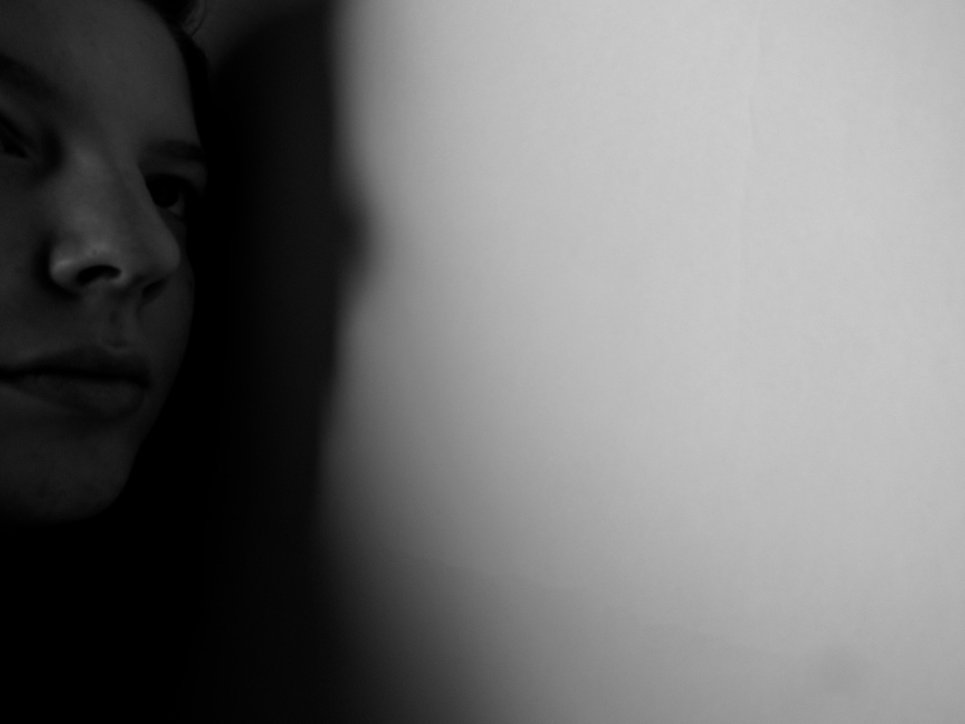
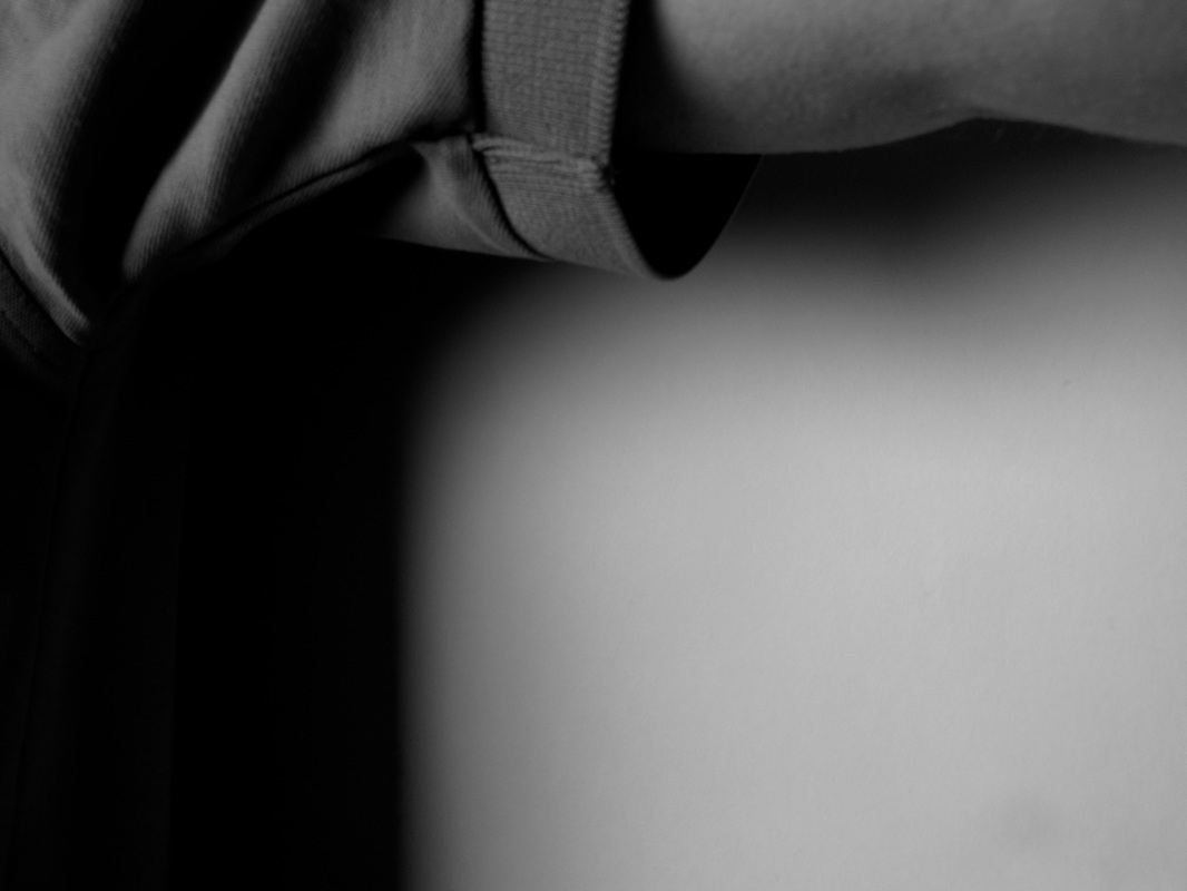
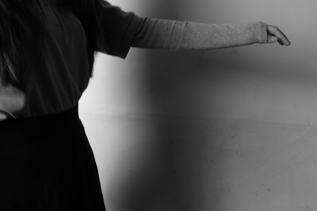
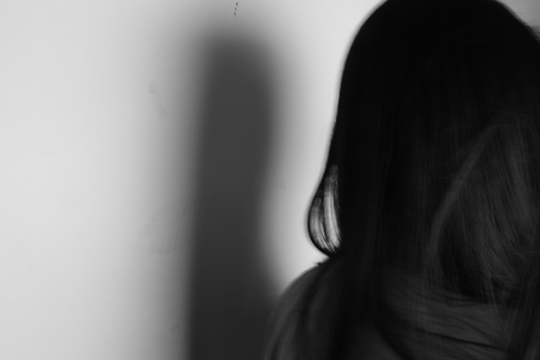
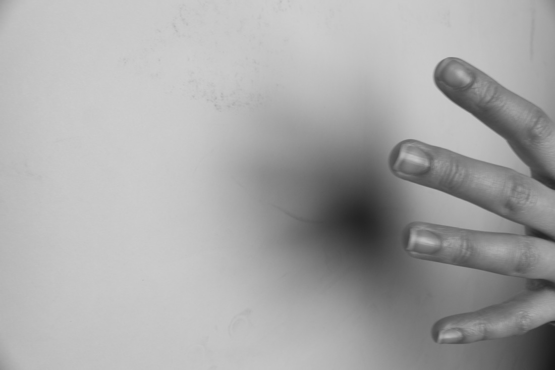
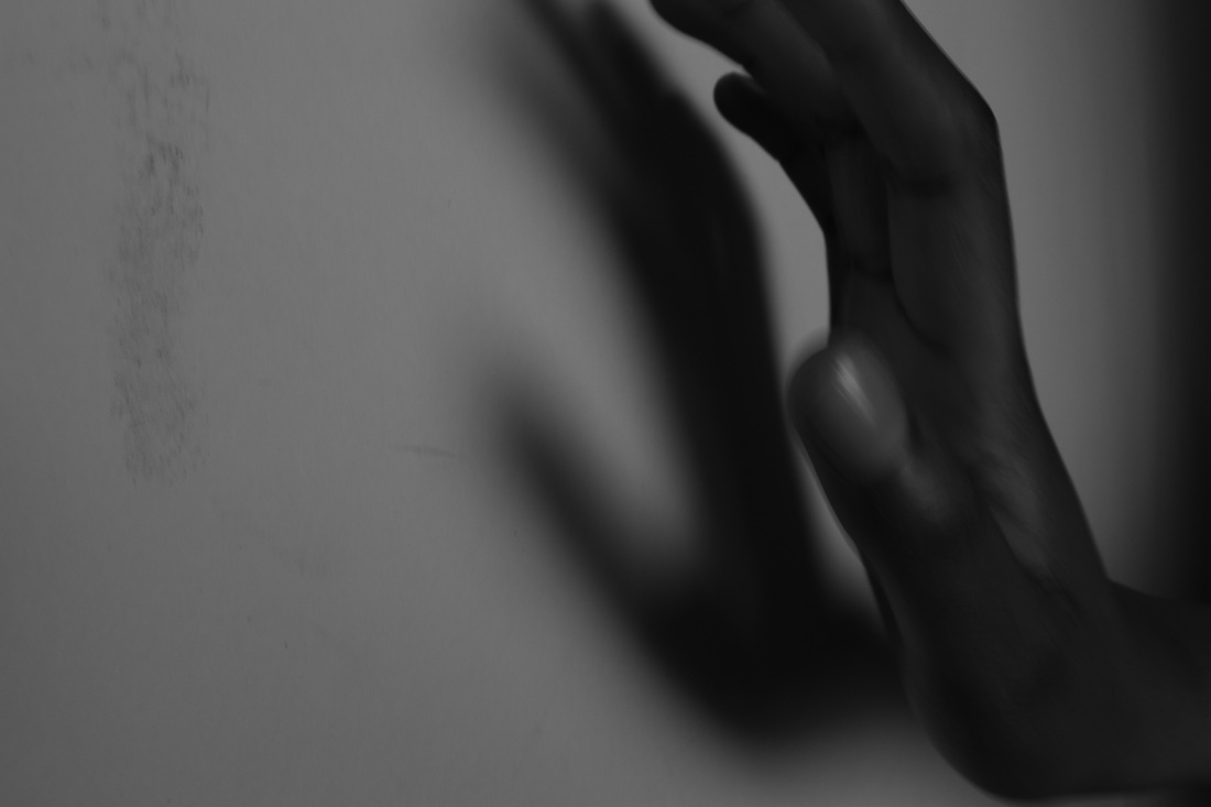
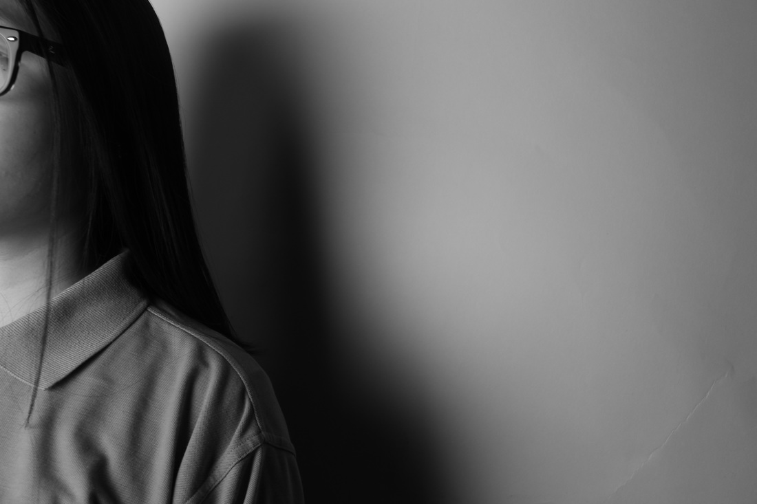
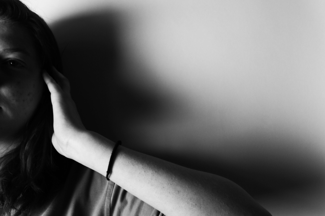
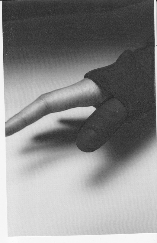
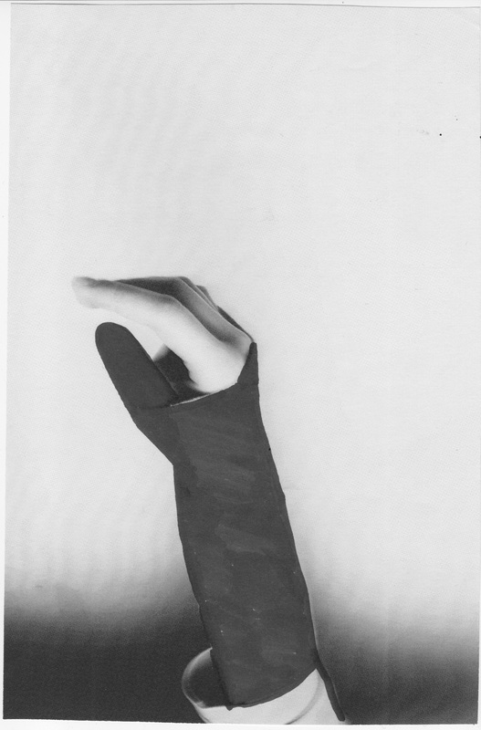
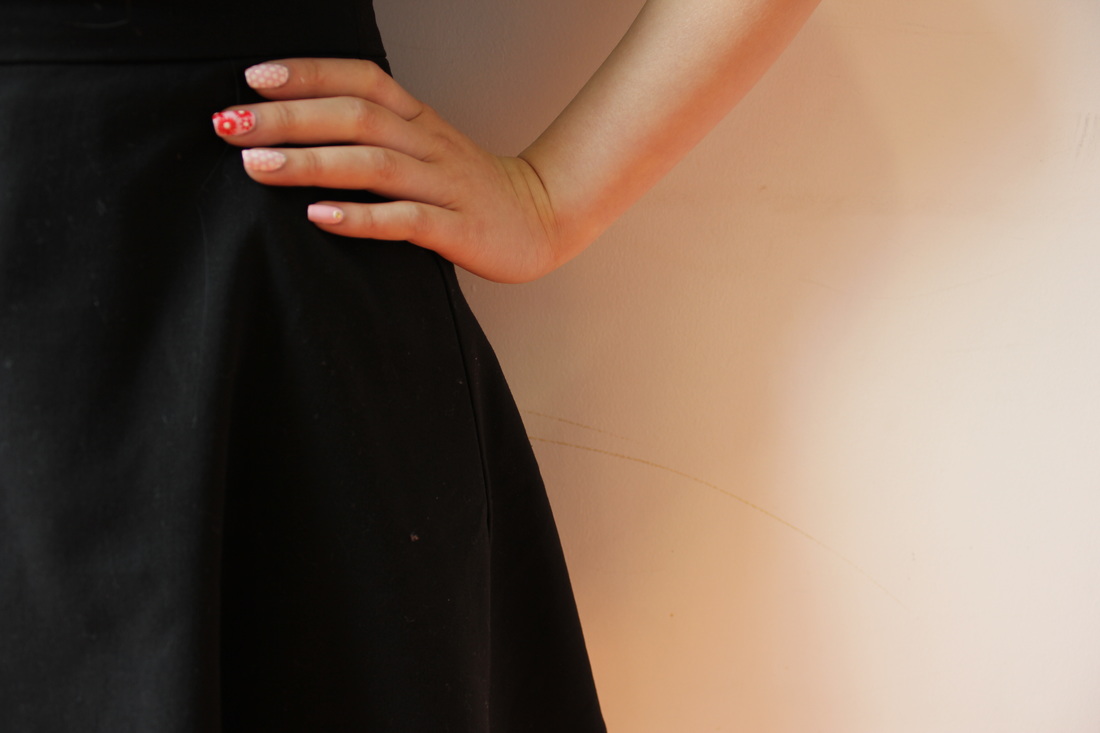
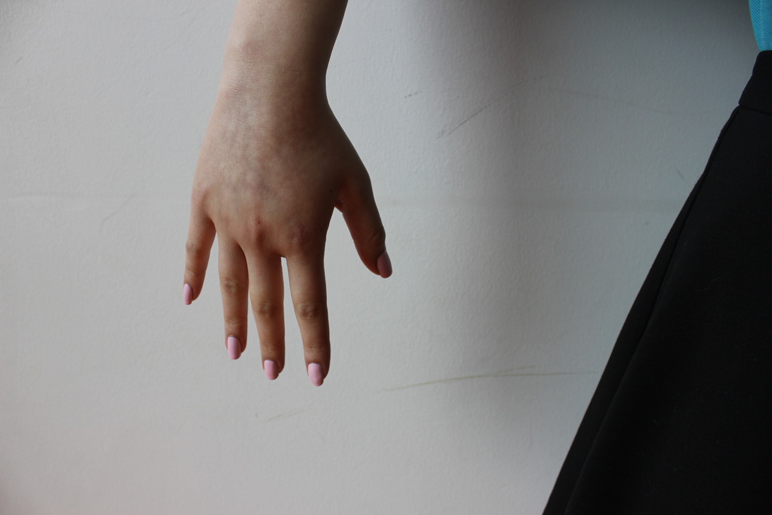
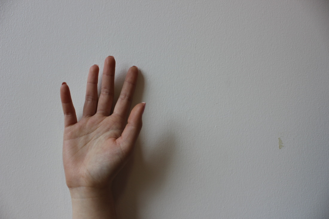
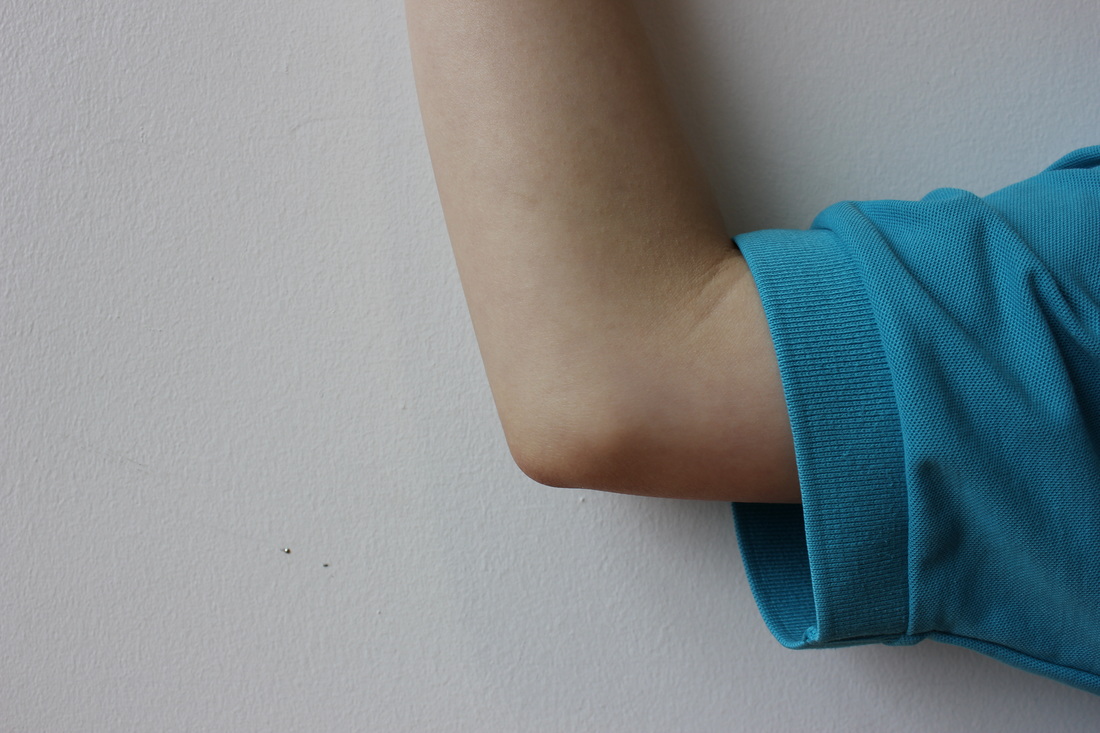
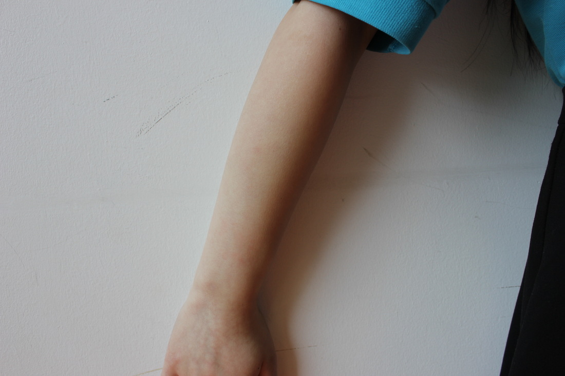
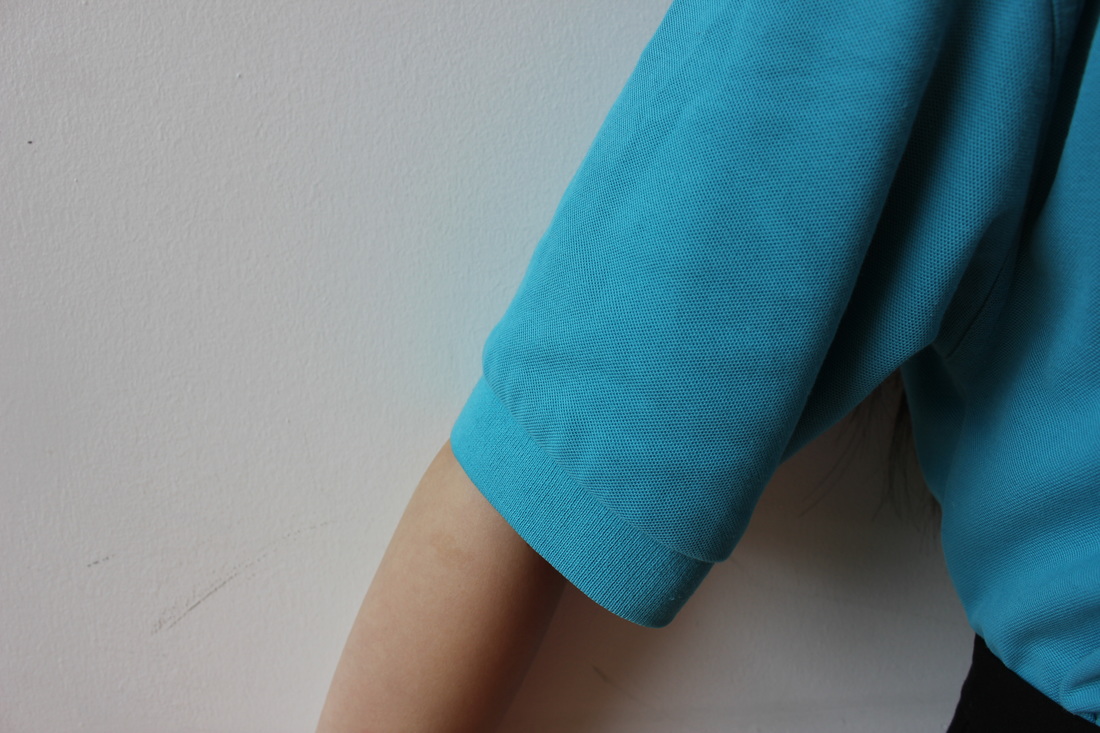
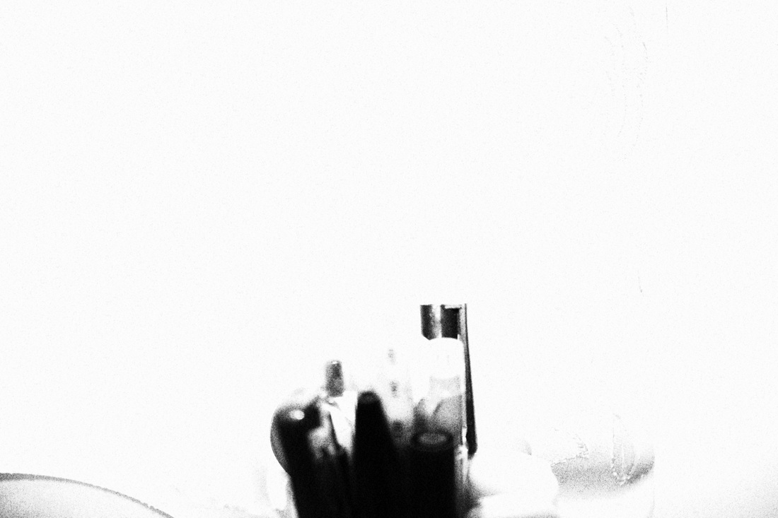
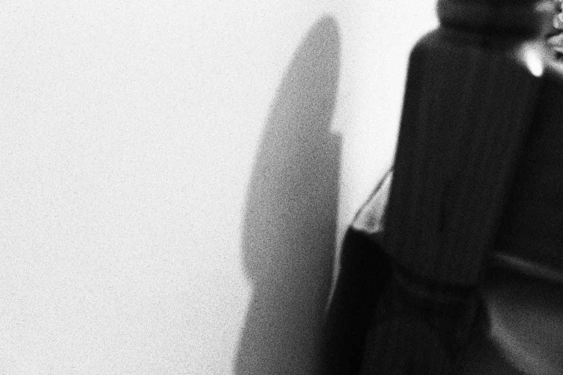
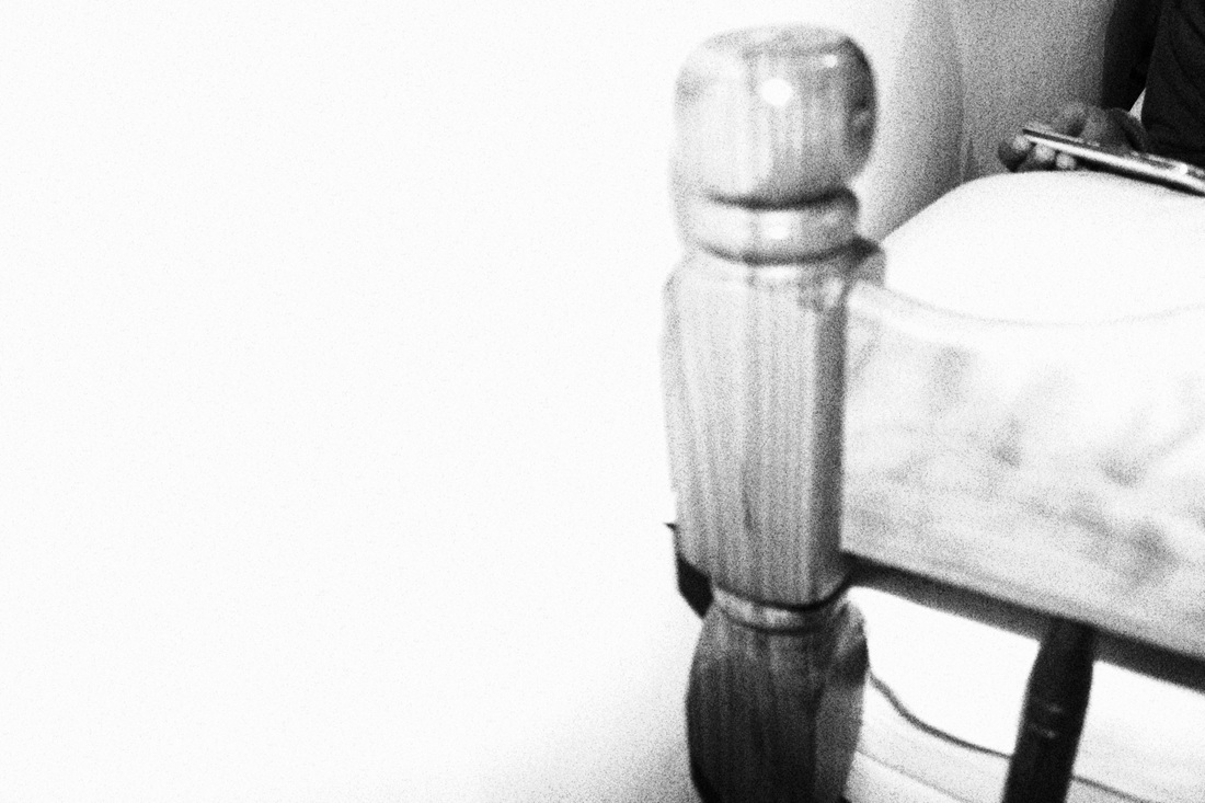
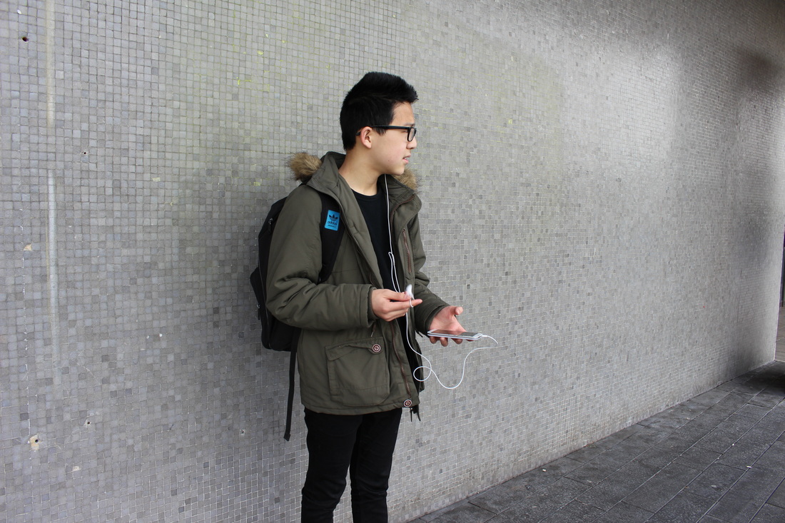
Initial response #1 -Shadows -(700D DSLR)

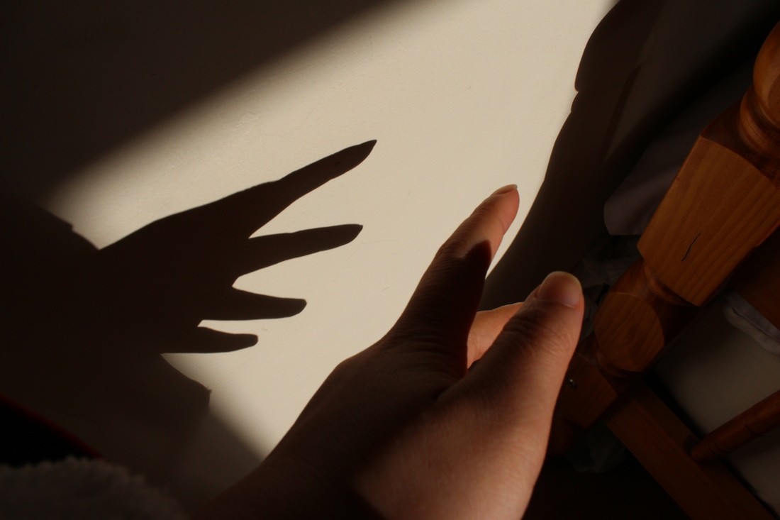
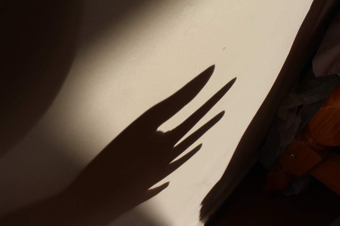
Evaluation-
In my first experiment i focussed on shadows, but after research i realised that silhouettes were more just the outline of the whole figure. After looking at my images, I saw that I had more shadows. One of my restraints was that the light shining through the windows were very minimal, so i had to wait for the correct time to take the images. In the room there was a small section with light which i tried to take pictures with. I experimented with a human figure and also human parts such as the hand. This being my first shoot i was slightly unsure of the exact purpose an content of the images, so i took simple ones, which some were successful whilst some didn't come out as well. I will research artists which i find interesting and which reflect some of the ideas i have- following the ideas of tones and shadows etc. At the moment the shadows are of a darker tone but i intend to use an editing source to possibly invert it to makes the shadow brighter and the person darker creating a contrast.
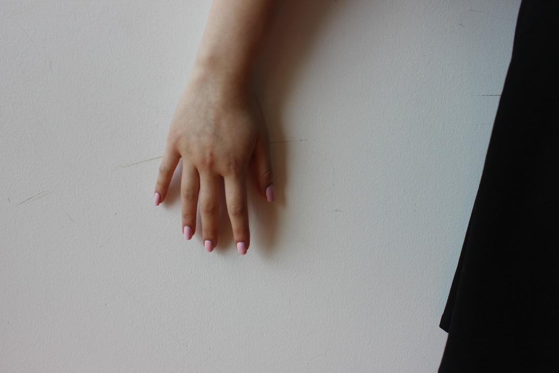
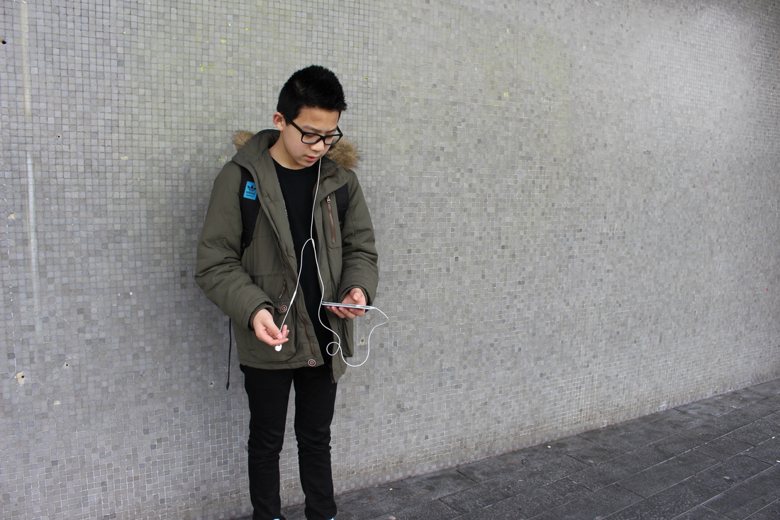
Most successful:
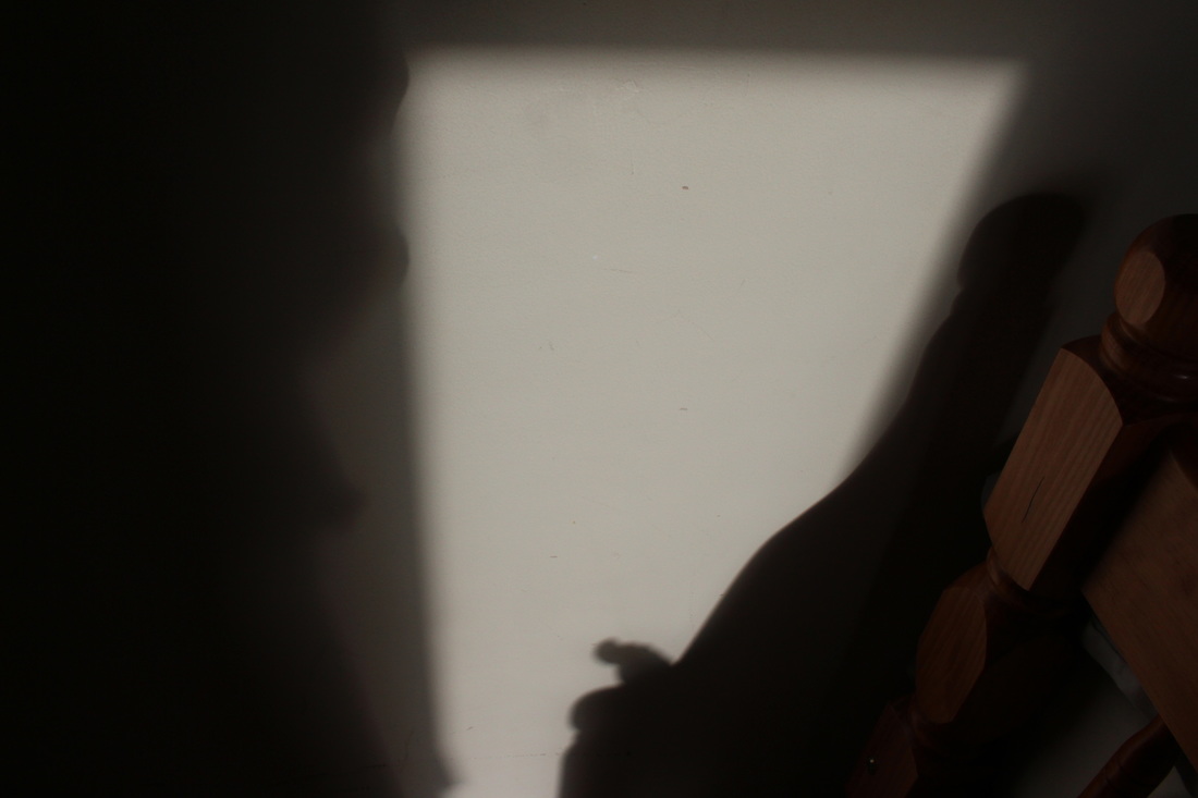
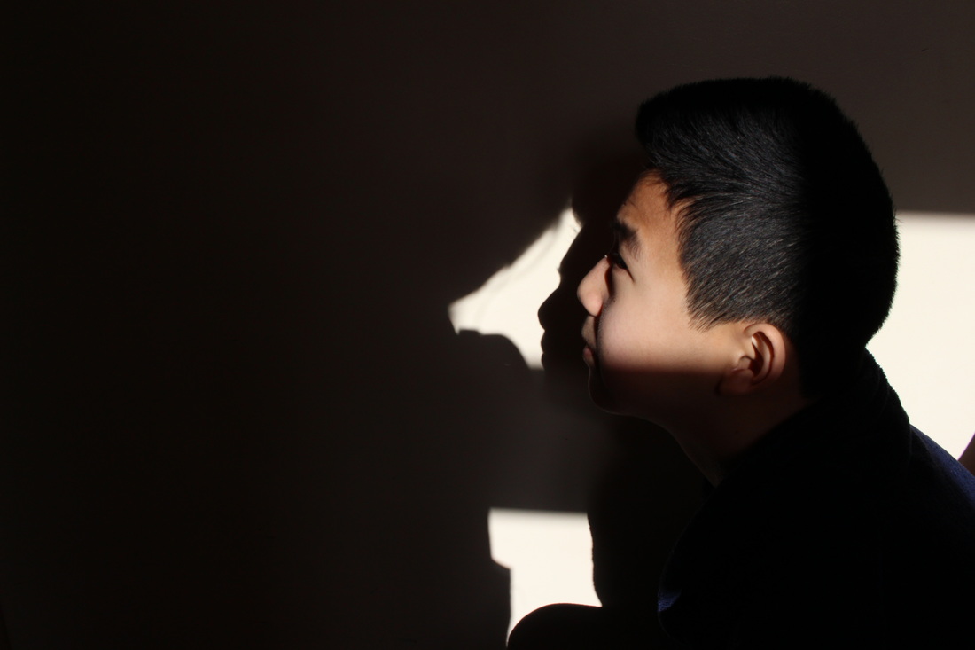
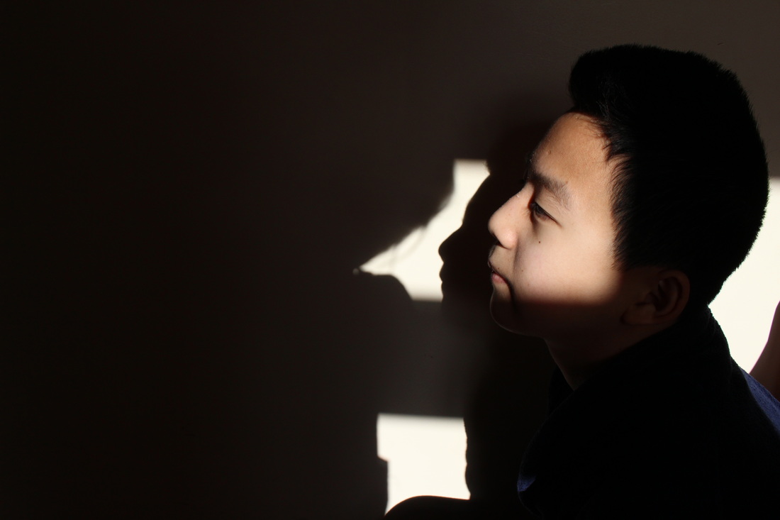
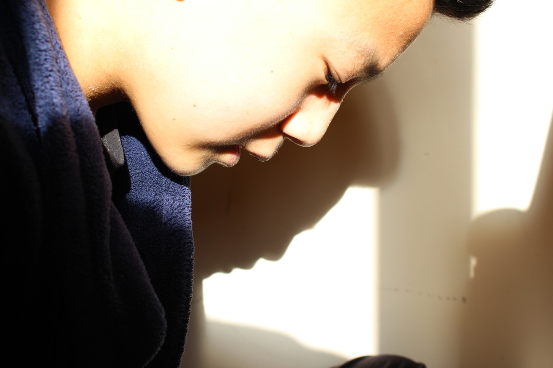
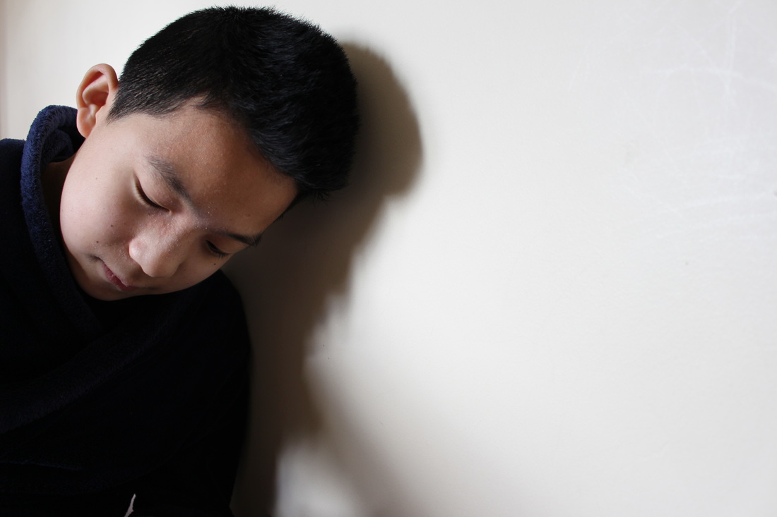
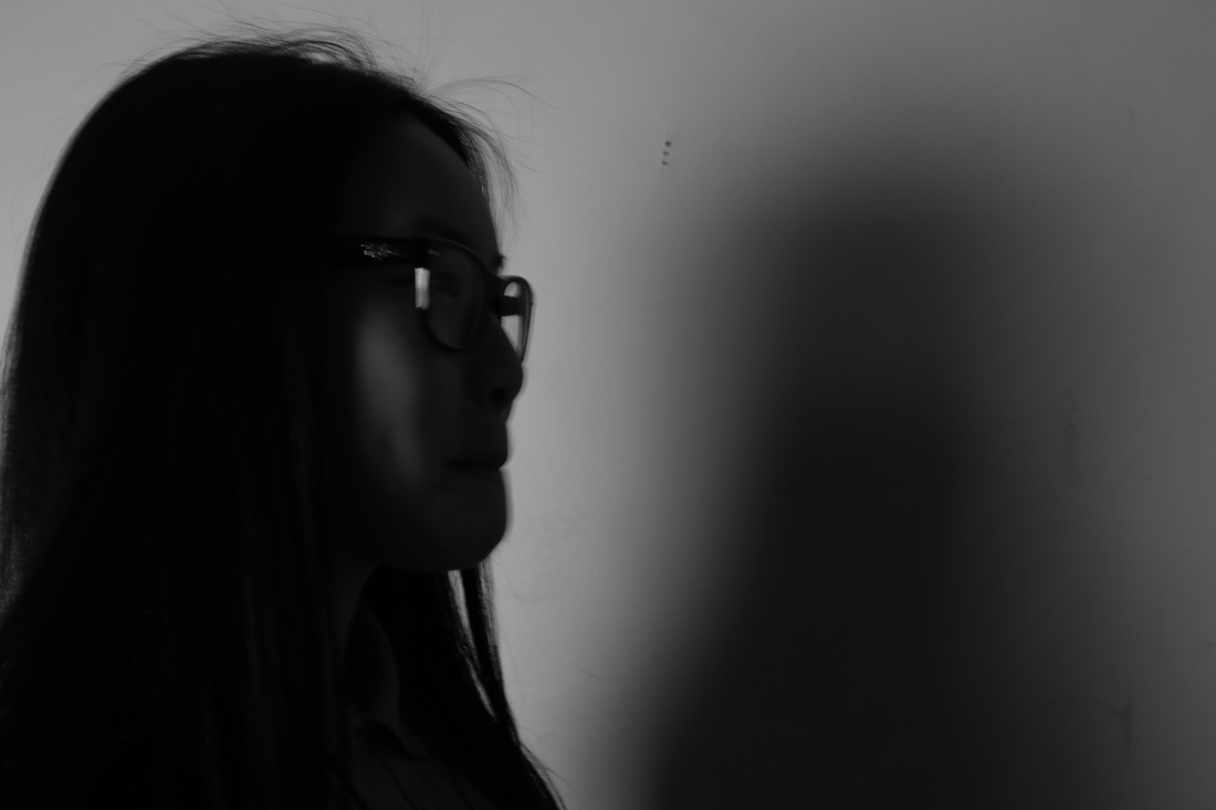
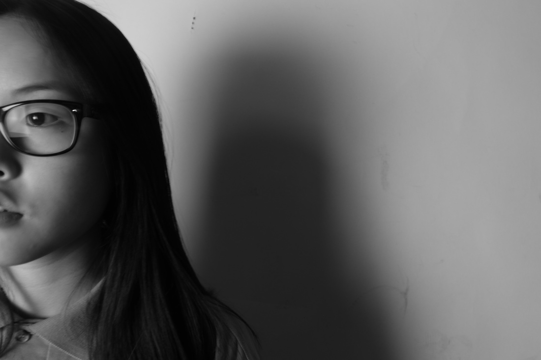
Out of the images i took, i feel like this one is my most successful image. Even though it's very minimal and simple, it captures what i had intended to capture and i especially like the light within the photo. The light permeating through the window and hitting the wall and the person is very direct, creating a difference in tone. Not only is the side of the face illuminated, but the shadow formed behind it captures the outline of the facial features also. I hope to develop this image even more either capturing similar pictures but using more light. I will hopefully draw lines onto the image as well by outlining the face once again but with pen.
|
Least successful:
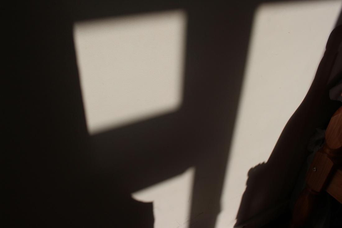
This image is my least successful image as it was very unplanned and there isn't a clear subject matter. I simply took an image of the light shining onto the wall, it is just a block of light which is rather boring, it would've been better if the light was shining through a pattern creating different lines and shapes. Though i don't especially like this image since it doesn't fit with my collection i hope to use this as a start for future experimentations. Here the contrast is extreme and i will research an artist that works with shadows such as on buildings and i can try to create similar images such as in a busy area at the golden hour where shadows are especially highlighted and apparent.
|
ARTIST RESEARCH #1-MAN RAY SOLARISATION
|
|
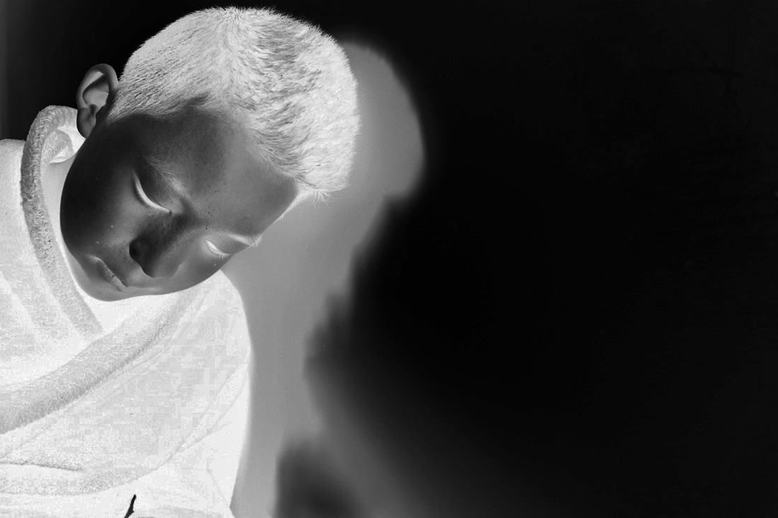
Solarisation is a technique in photography which demonstrates an image but on a negative or on a photographic print which is reversed in tones. Which basically shows light areas darker and dark areas lighter. Man Ray uses this technique within his own work (some of his work on the slideshow to the left). He generally focuses on capturing close ups of finer details such as the face, hands and natural objects as petals. The combination of close ups and solarisation makes the outline of the element more stand out. The reversal of tones means that the usual light outlining of a particular object becomes more apparent once its developed. The technique also makes the image seem more rustic almost like an image developed from a film camera, which has a grainy type of texture. In addition, solarisation requires a dark room, chemicals and also careful control of the images exposure to light. Overall, I think this technique is especially interesting, which i'll intend to replicate some aspects of it in my own work.
I intend to instead of using chemicals to create my images, but to rather use photoshop to reverse the tones, which will hopefully create a similar image to those produced through the technique. I intend to use the images which i have taken from my 'initial response' first as they are predominantly close up and there are also clear shadows which will be interesting to see after the development. If successful, I will take more improved images still focusing on shadows and continuing the same process. |
Development #1 (photoshop)


Photoshop process-
|
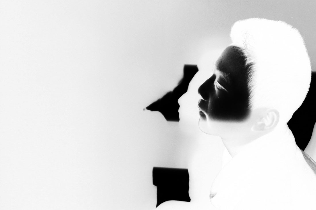
Following on from my shoot, i decided to develop it by contrasting the tones. originally the shadows formed from the face was dark, blurred and slightly faded out. So i wanted to change the shadow to be much brighter, sharper and clear. These images relate to my theme of outline as i have only focussed on the face when taking these images. In addition I waited till the light permeating through the windows was strong creating a distinct shadow of the figure. The shadow formed is a replica of the facial features such as the nose and the mouth.
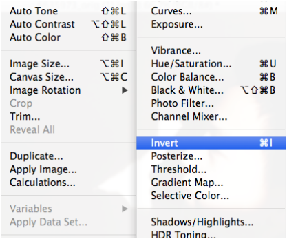
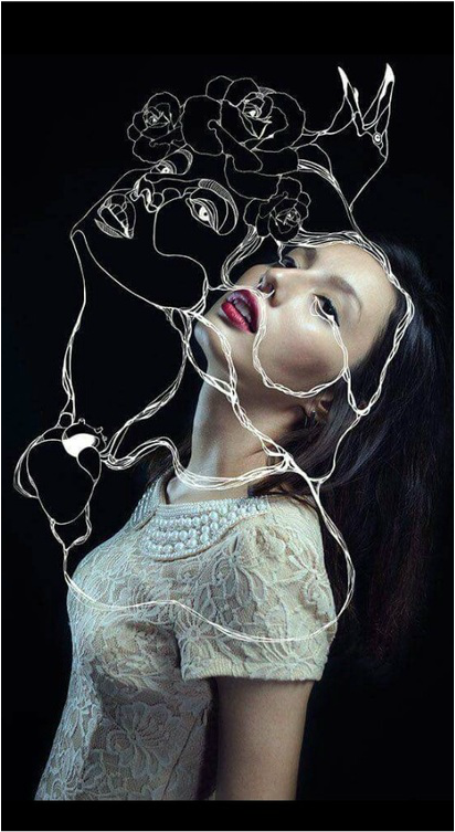
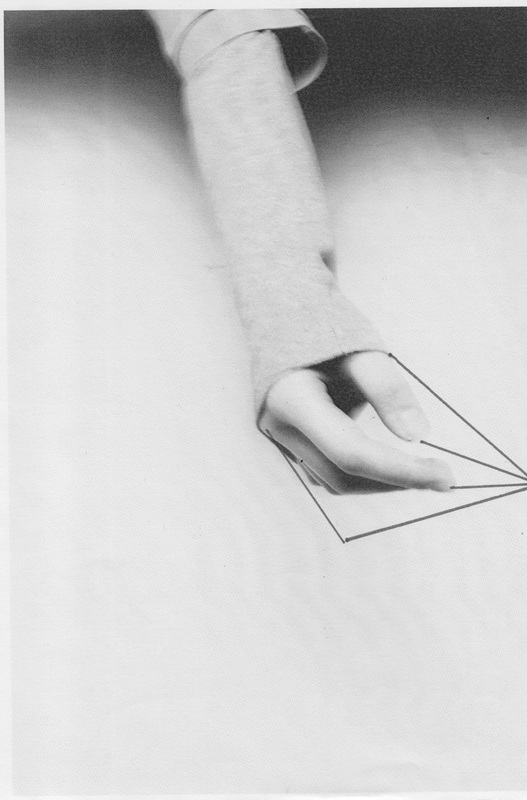
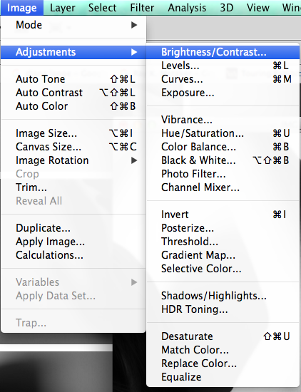
Following on, I used the photo editing software Photoshop to create even more intriguing photos. To begin with I adjusted it to make the image black and white by lowering the saturation. Then I inverted the image making the tones alter (image to the left) by this it accentuates the features even more making the image stand out more. This is because before it was inverted the image was quite soft and light. However by inverting it, it makes the image seem more harsh and the formal element of tone and shadows is more clear. In addition, i altered brightness, contrast, highlight and shadow in the adjustment section. Overall, i think this development is successful, especially the first two. To develop it, I had seen an image on pinterest (which i will link below) that depicted white lines further outlining the features in the background. I hope to print out the inverted images and physically drawing on the lines. |
Inspired image regarding outlining lines and features. (pinterest)
Development #2 (printing and outlining)

Evaluation-
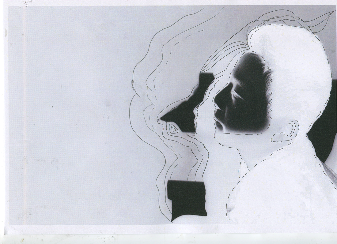
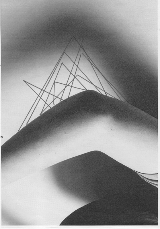
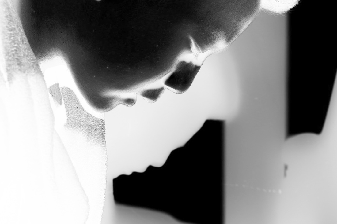
These two images show the development of my most successful image in my first photoshoot. I have improved and changed the image many times till it resulted in this outcome. I began by shooting a figure against the wall with the light shining at it, which hence created a shadow of purely one side of him, and mainly the facial features are most apparent. After researching Man Ray and the technique of solarisation- I decided to follow to develop the image with a similar technique. However, rather than using chemicals and a dark room, I went down the easier route of using photoshop and simply inverting the tones, which created a similar effect. I think the product of this was very dynamic. The tones of black and white were very sharp and deep. I especially like how the face was dark whilst the shadow is white; this way it makes the shadow much more significant and clearer within the image. As without inverting the tones, the formed shadow would be quite soft, almost fading and dispersing into the surrounding. Afterwards, I saw an image from Pinterest which was a portrait of a face and with lines outlining its facial features, which i found interesting. I hence incorporated this idea in my own image. I printed out the developed image then used a pen to draw on it. i began by drawing on the outline of the facial features onto the empty space on the left. I repeated this step several times. Then i drew dashes around the face, emphasising the shape. Overall, it didn't come out as well as i hoped, as it was difficult to accurately outline the features, but I think the dashes around the face works well. I intend to either take more similar images and continuing the same process, hopefully it the end result will improve, but by focusing on more straighter, geometric lines.
Artist Research #2- Ray K Metzker
|
|
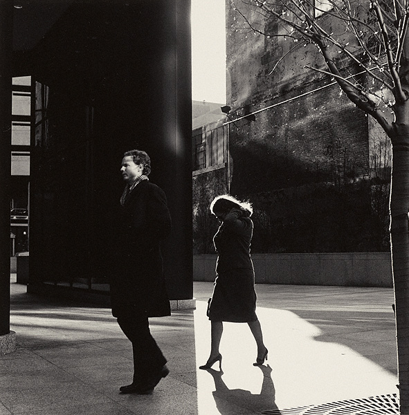
After researching the artist Ray K. Metzker, i was fascinated about his work and how it relates to my explored theme of outline. At initial glance his work perceive great contrasting tones. In addition the shadows created further emphasise the lines and the contrast in his photos. In addition, his images are very sharp and has a slight aesthetic feel to it when we look at it. His images all seem to be located in an upbuilt area, with just two or three people situated randomly within the photo. His style of work reminds me when i experimented with street photography, where the photos are very spontaneous yet well composed. I hope to be able to create similar images to his as well, by going to an area and capturing someone spontaneously rather than planned out as what i'm used to capturing. I also intend to carefully focus on elements such as lines and focus to really accentuate the content of the image. I intend to look into more deeply, the composition and features of his photos which make his images intriguing and interesting. |
YOUTUBE VIDEO DEPICTING THE MANY IMAGES BY METZKER, FOCUSSING ON CONTRAST
|
|
METZKER INSPIRATION FOR NEXT PHOTOSHOOT -
|
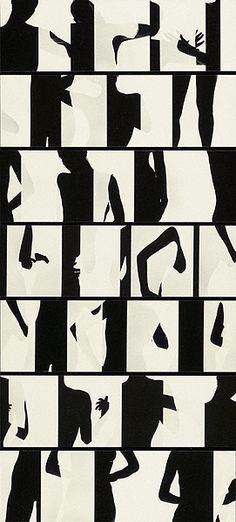
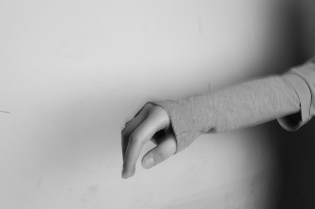
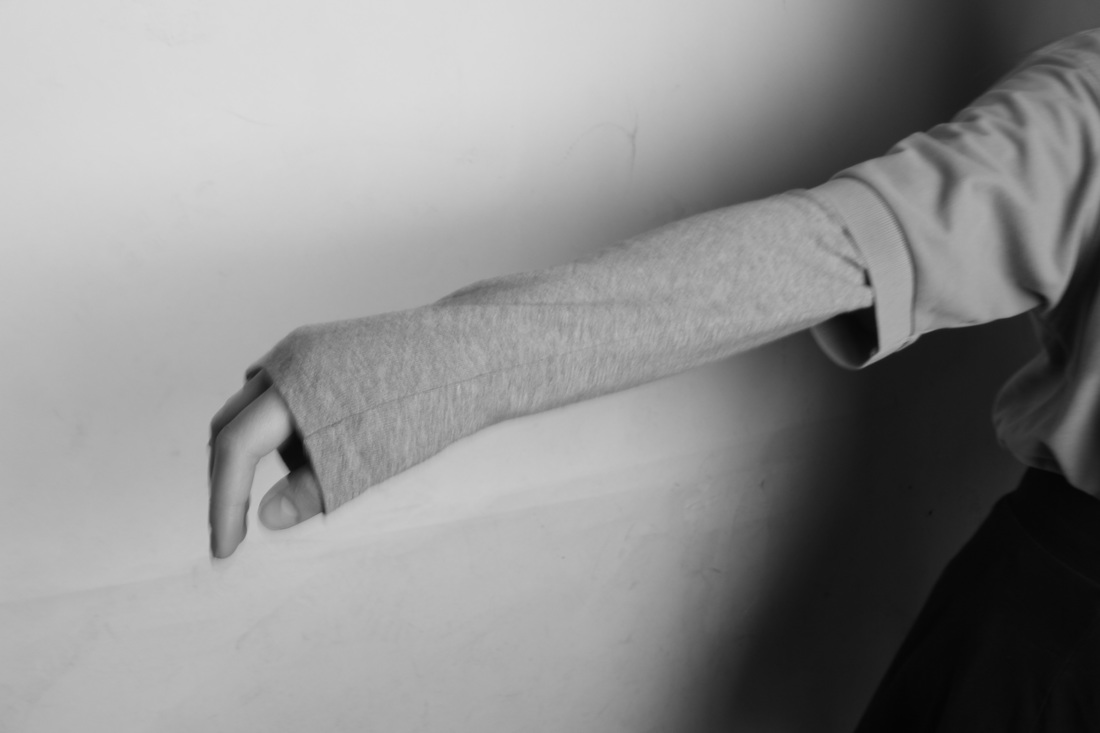
I especially like this collection of images from the artist Metzker. Here it depicts parts of the body such as the arm, the hand which have been silhouetted in order to see only the outline. This is effective as it's only the outline of the body rather than the features which may hinder the purpose of the photo. In addition, we see that most parts are blacked out however, there are some sections which are blurred out and slightly unclear. For example, the image on the top row furthest right, we see that the fingertips are blurred out, whilst the palm and the arm remain blacked out. The composition of these images are extremely simple, and seem abstract, allowing the image to stand out and seem effective. Whilst some of the outlines of people seem to be natural, some stills seem posed and on purpose. I like the idea of these different images placed in a collection, as it creates different shapes and adds a dimension to the image as a whole.
WHAT NEXT? Inspired from Metzker's great contrast and tones, I intend to create some simple images focusing on close ups of certain body parts. To make this successful i will take these images on a white backdrop with lighting so that it accentuates the features. Thus i want to create a collection of these, and possibly develop it on forwards, so that it ends as a final piece. |
" I am not an objective reporter. I prefer to go further, to the unstated things of our existence. What I can’t understand and grasp seems to lead me. "
Ray K Metzker
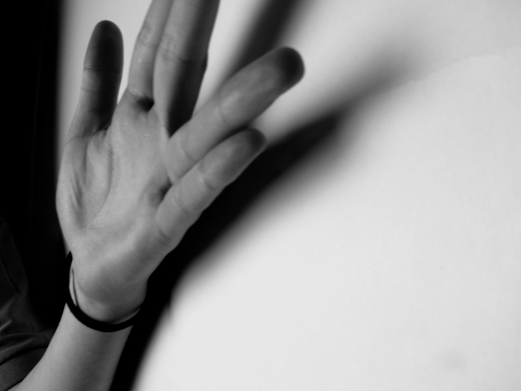
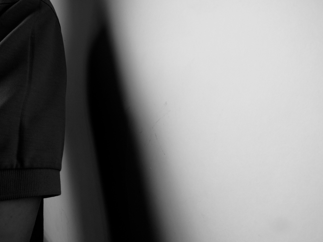
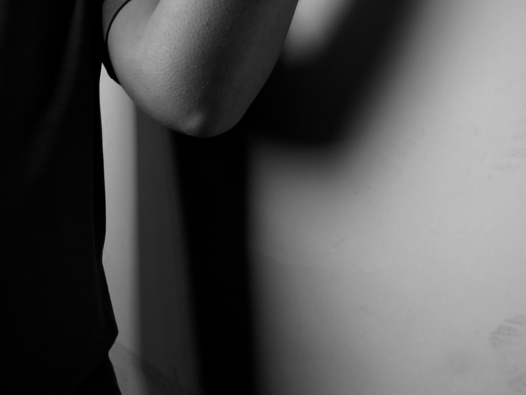
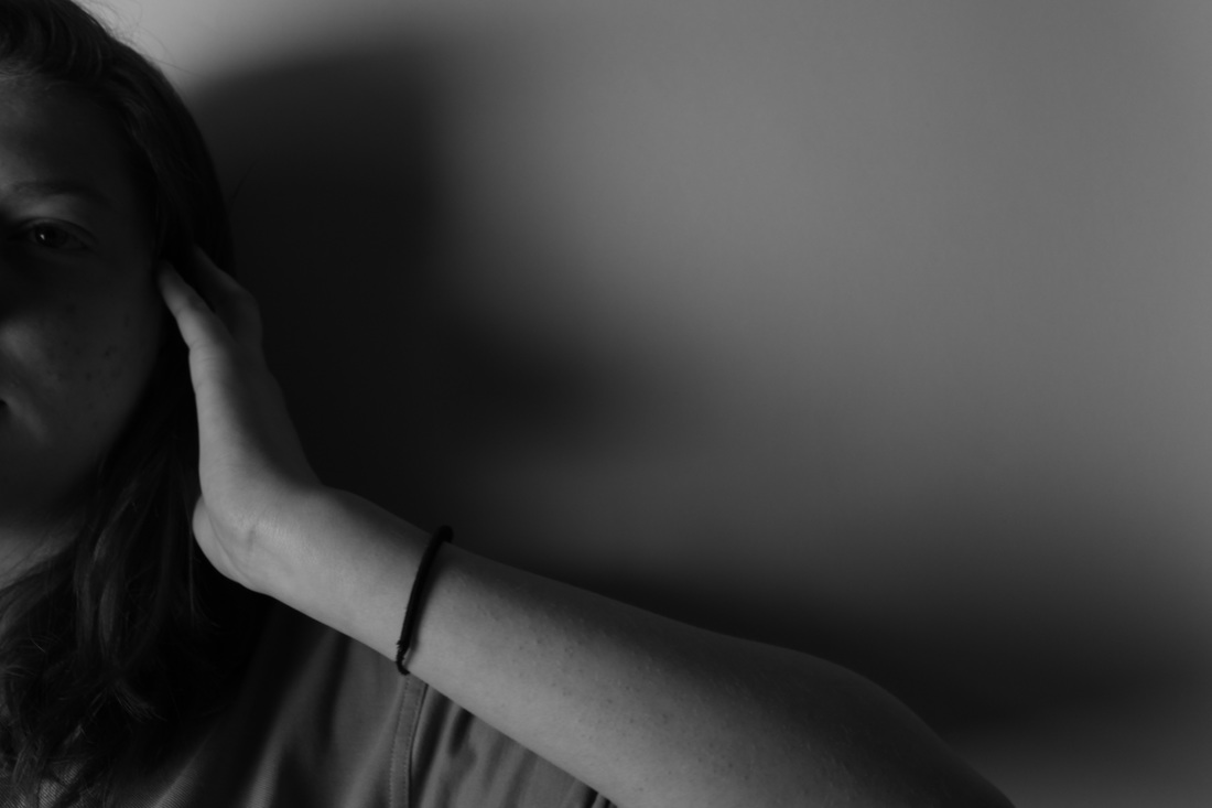
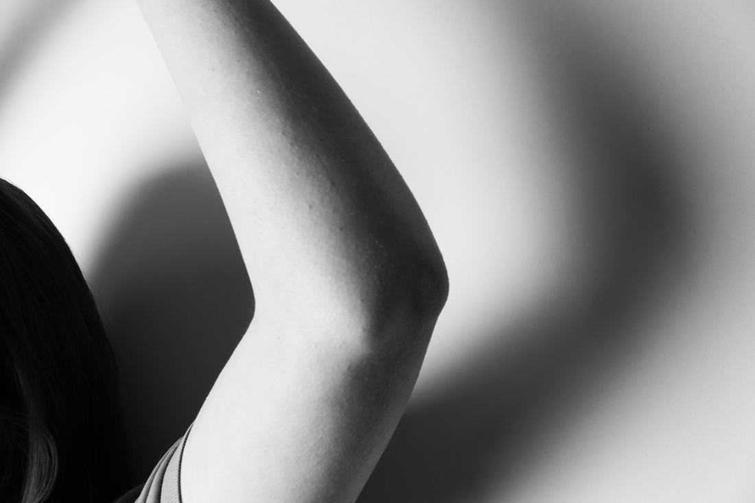
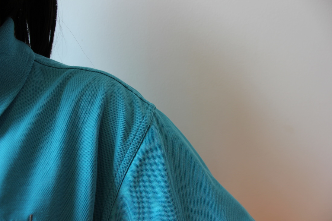
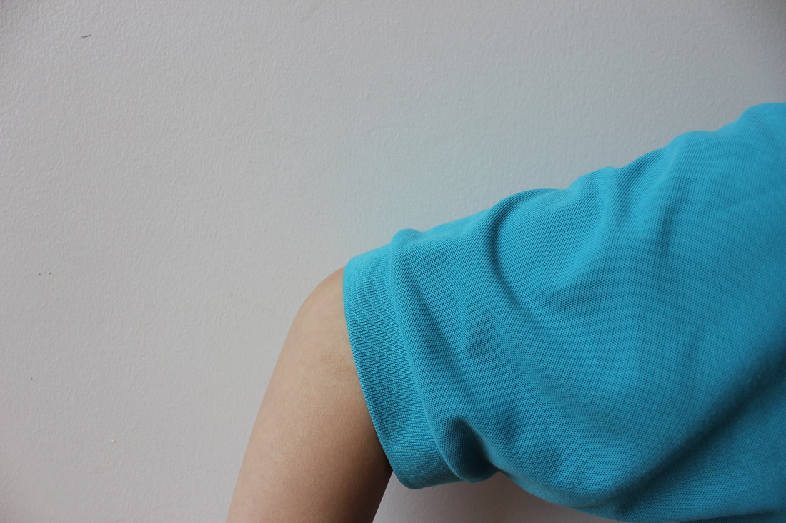
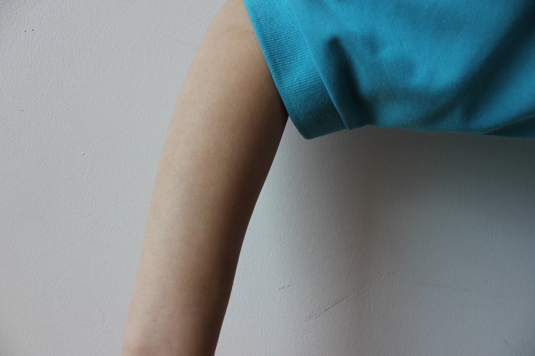
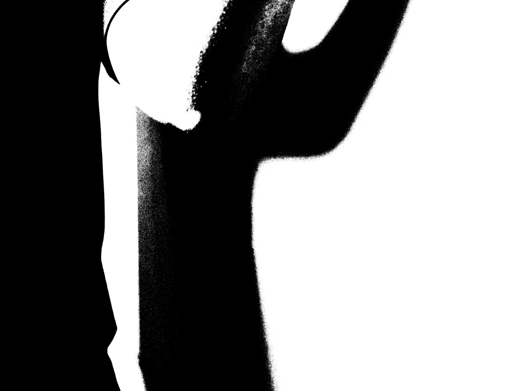
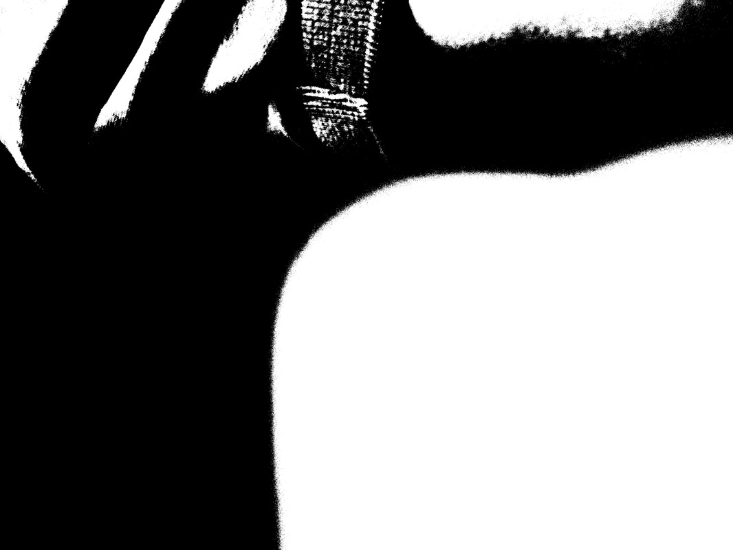
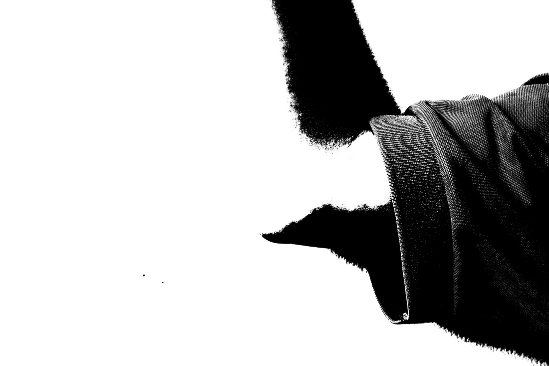
IMAGES WITH BLACK BACKDROP AND ARTIFICIAL LIGHTING- (COMPACT CAMERA)

EVALUATION-
|
WWW-
Following on from my experimentation of solarisation, after evaluating it seemed very successful and that i could develop it further. In the previous experimentation, I had used natural lighting, but this time i decided to use artificial lighting. Overall, these images came out successfully as it met my initial intentions, however the process was a slight struggle. One of the reasons for this was because the artificial lighting caused shadows to form in different areas. Initially, i was concentrating on creating shadows of the outlines, however later came to the conclusion that shadows could be used as a constituent feature of the image rather than the main feature. Here, my images depict parts of the body, some natural whilst some were posed. In addition, i wanted to maintain its simplicity which has been achieved, by using the black backdrop along with the sharp lighting it mean that there were no distractions in the background. Initially i had used a white backdrop but found that the figure was seen less clearly than compared to using the black one so i stuck with it. |
EBI-
If I were to improve these images even further, I would make these images lighter since some are quite dark making it hard to see the purpose and subject of the image.
WHAT NEXT? To develop these images, I intend to use some to draw lines onto, similar to my previous experiment. However, with the others i intend to use photoshop to make it lighter, and then printing them out to darker certain segments, creating a similar effect as Metzker did. If successful i hope to use a few of them to place in a collection as one of my final pieces. |
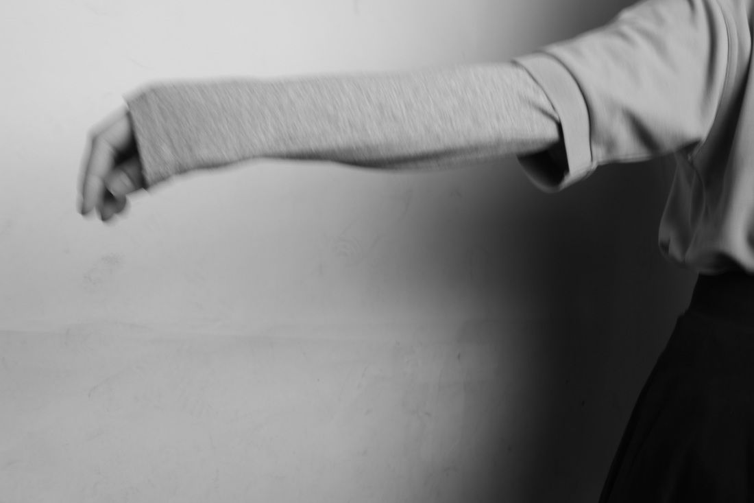
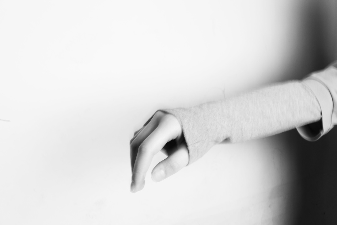
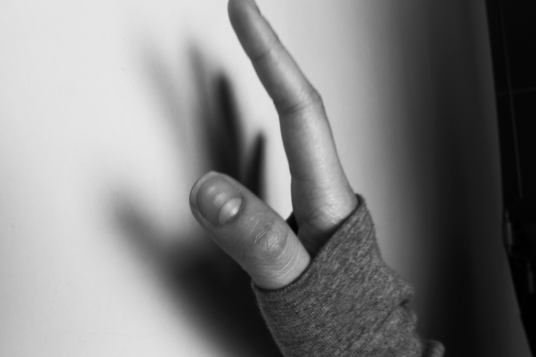
Development #1 (photoshop to increase contrast and lightness and slightly blurred)

|
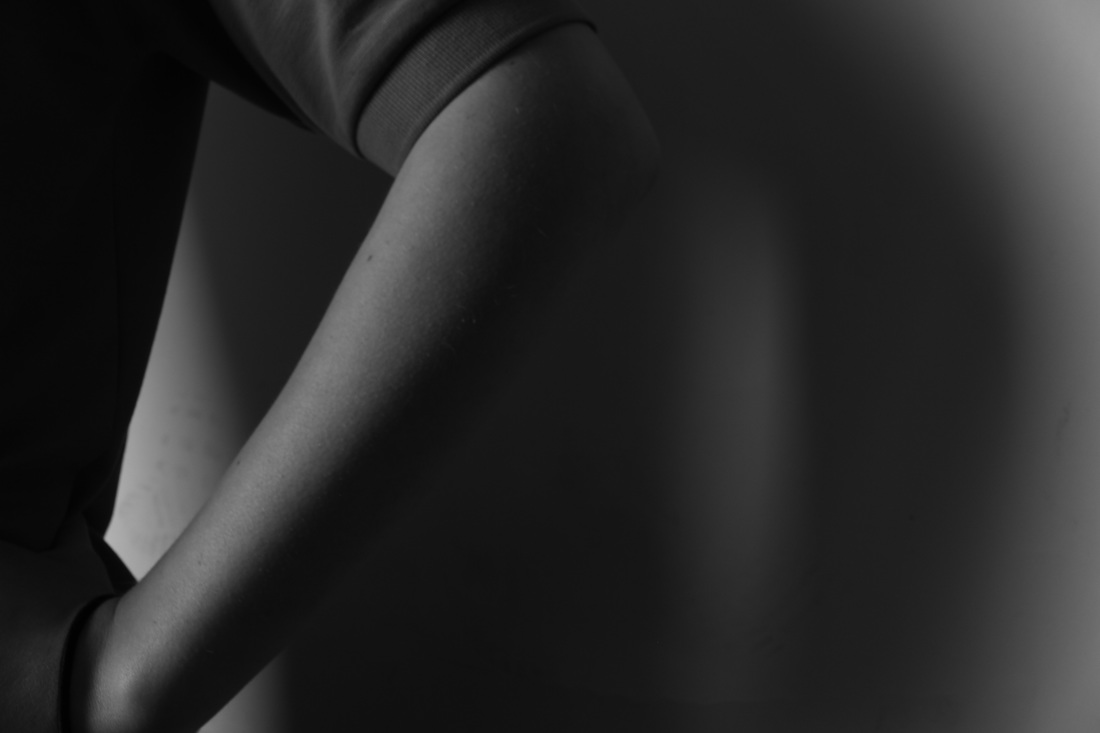
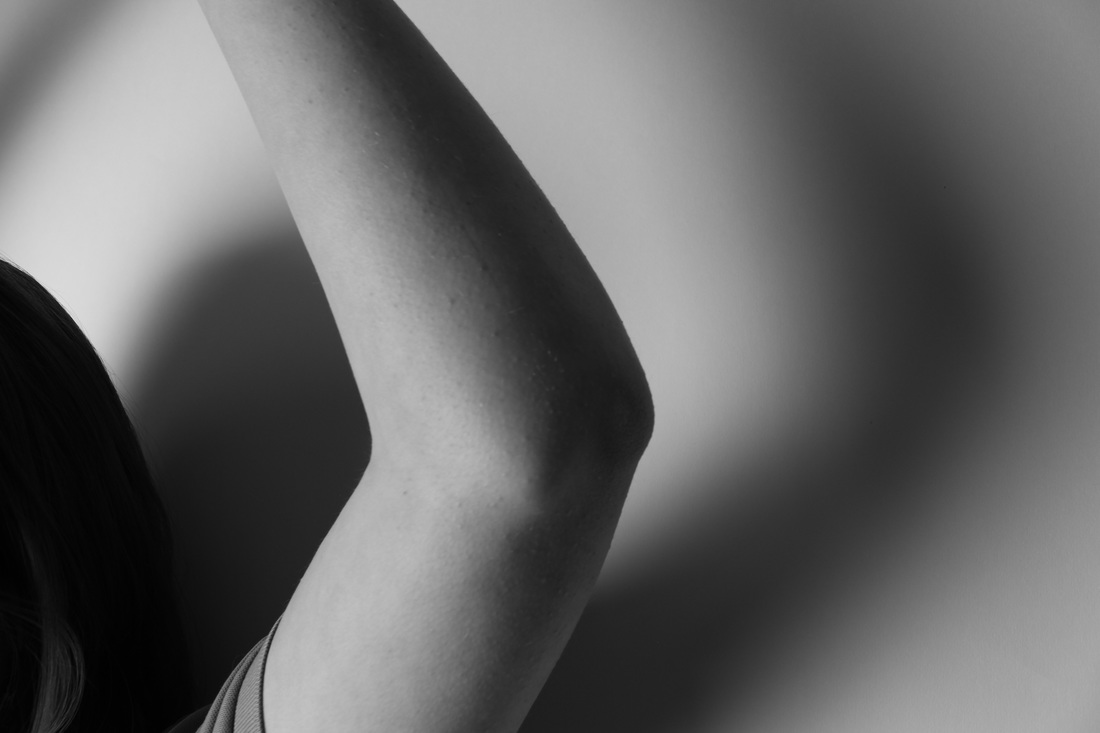
For my first development of these images, I used Photoshop in order to increase the brightness of the image, this was because they were slightly dark and the features weren't as clear. I also increased the contrast of the images, therefore the tones were more accentuated and so that the black and white effect was more apparent. I chose these four images out of my collection to make such adjustments, this is because the different features such as the arm, the hand or the fingers were more dominant, whilst some of my others which weren't as successful were blurred out. Such ones failed because the lighting was to direct onto the body hence distorting it and it almost blended in with the backdrop so it was harder to see the outline of the feature.
WHAT NEXT?
|
Development #2 (images printed out, shaded certain parts black, leaving some light, then scanned in)
Development #3 (images printed and drawn on geometric, straight lines)
IMPROVED PHOTOSHOOT, BRIGHTER BACKGROUND
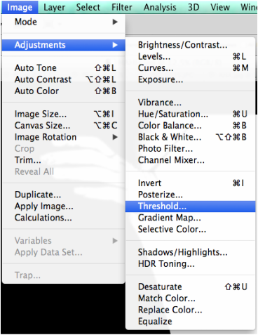
DEVELOPMENT #1 (Shading in black, with photoshop)
|
WHAT I DID-
|
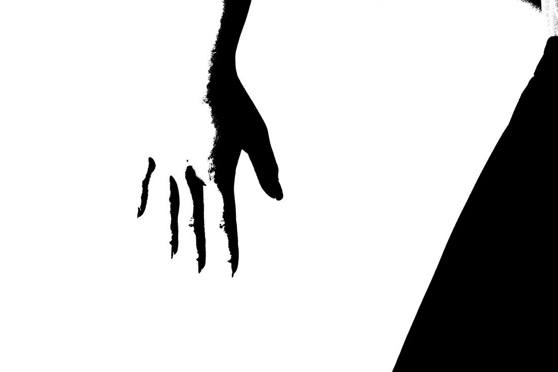
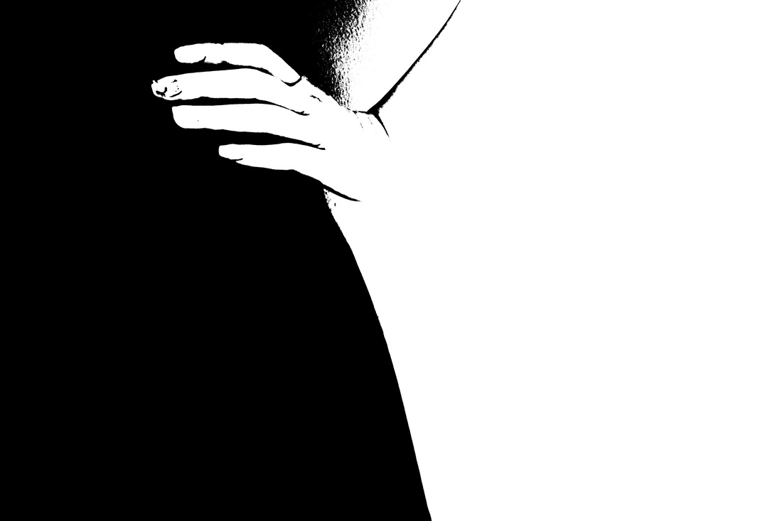
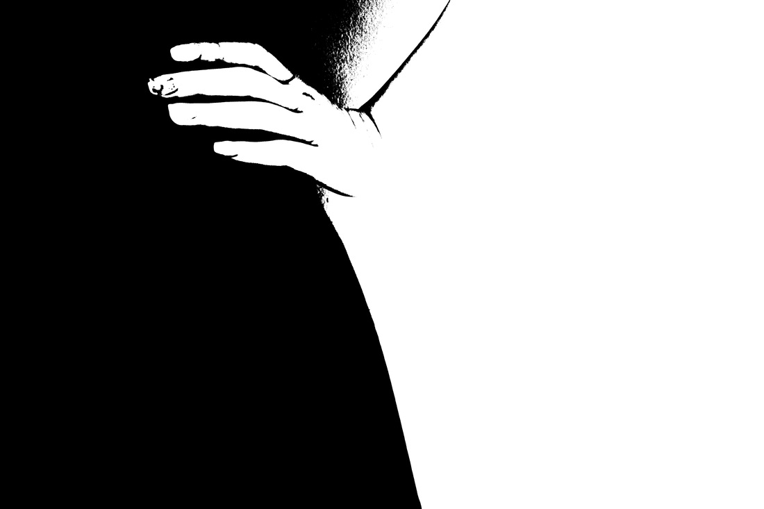
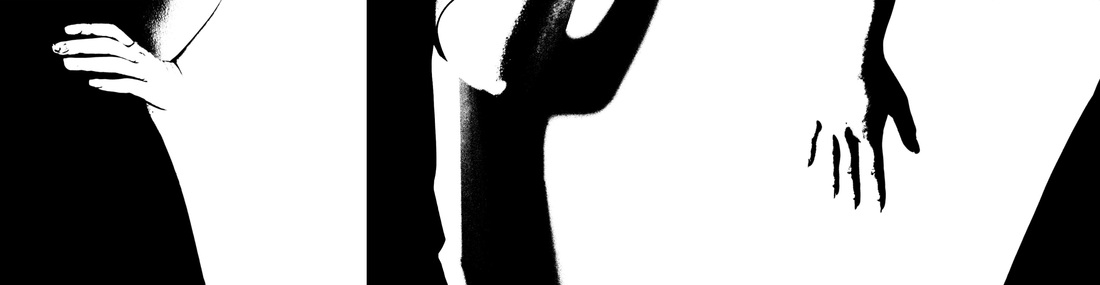
After my experimentation with shading with a board marker, which turned out less successful than anticipated, i decided to turn to another method to shade in the region. Therefore, I used my new images and used Photoshop, and adjusted them by using the 'threshold' effect, which made the features of the body into a bold black colour, and allowed the background to be white. using this effect had some compromises as well, as the distinct outline of the figure was distorted. However, overall these came out well, such that it disguised the whole figure and that the rough outlines of the body are still visible. This worked as i chose to develop the images with the more bolder and distinct lines. I especially likes the images of the hands, as though the images depicts two main tones, the hands perceived both of these tones, as the hands had a darker side and the brighter side, which allowed the hands to be more significant. in addition, these developed images slightly relates to the initial plan i had, which was to capture silhouettes of figures. But in this case, the effect used further enhances and exaggerates the idea. Thus, the outcome is similar to the work of Metzker, in which he places different body part features in a collection.
HOW TO DEVELOP FROM HERE?
|
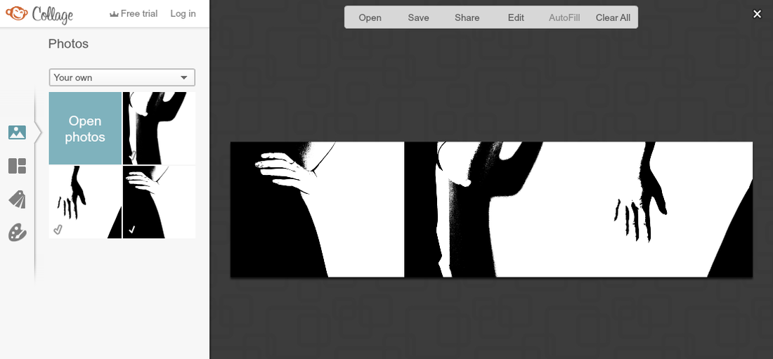
DEVELOPMENT #2 (PICMONKEY FOR GROUPING THE FINAL IMAGES)
|
Overall, the final product came out very successful and i really like it, which i now intend to use as one of my final pieces. When choosing the arrangement, i played around but ended up choosing this layout, so that all three images were clear and that the black areas near the edge weren't affecting the images on the nearby one. I think this group of images display outlines well, such that the outlines of a few body parts are seen and they are almost replicate the ideas of silhouettes. This final product was inspired by the artist Ray K Metzker.
|
___________________________________
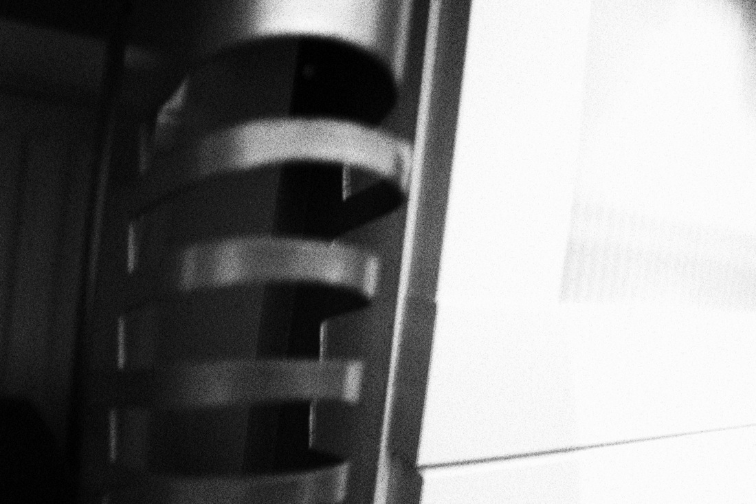
HIGHLY-EXPOSED IMAGES photoshoot#3 (CANON 700D, effect: grainy b&w)

EVALUATION-
Here i was inspired by Metzker to create these images. His images show the contrast between the tones of black and white. He mainly takes images outside and focussing on buildings and people using natural light. However in this set of photos i decided to focus on more close up objects around the house. To create a similar style to Metzker's I used flash to set them with a high exposure, to create images with great contrast. I set the setting using manual with a 'grainy black and white' filter on my Canon 700D. With this effect, it added a certain texture to the image, such that its not as plain as if it were just on auto mode. I captured objects which had distinct lines, enabling me to captures its outline. I have been predominantly focusing on people in this project hence why i wanted to change it up a bit, however after this experiment i feel that i should discard the idea to capture objects, so i will maintain this idea of a singular figure capturing it in different ways. However, though i will not capture images of objects from this photoshoot i have learnt about the simplicity of images and also how the distinct lines can add to an image about outline.
__________________________________
ARTIST RESEARCH #3 -REBECCA LEPKOFF
|
|
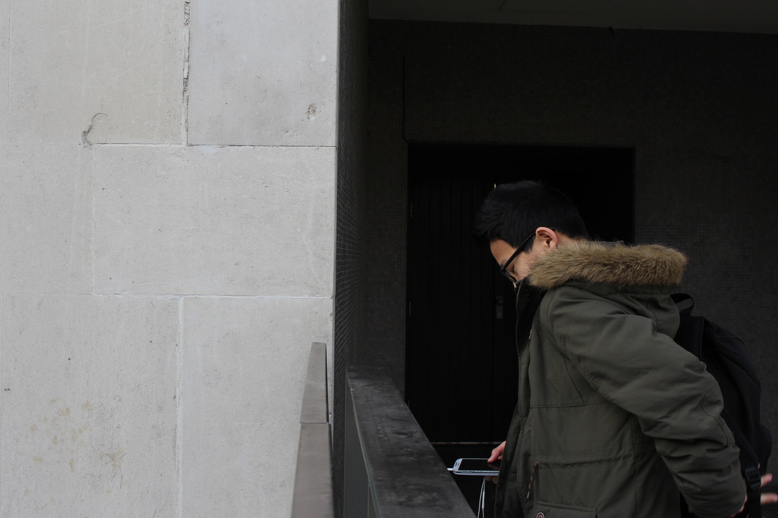
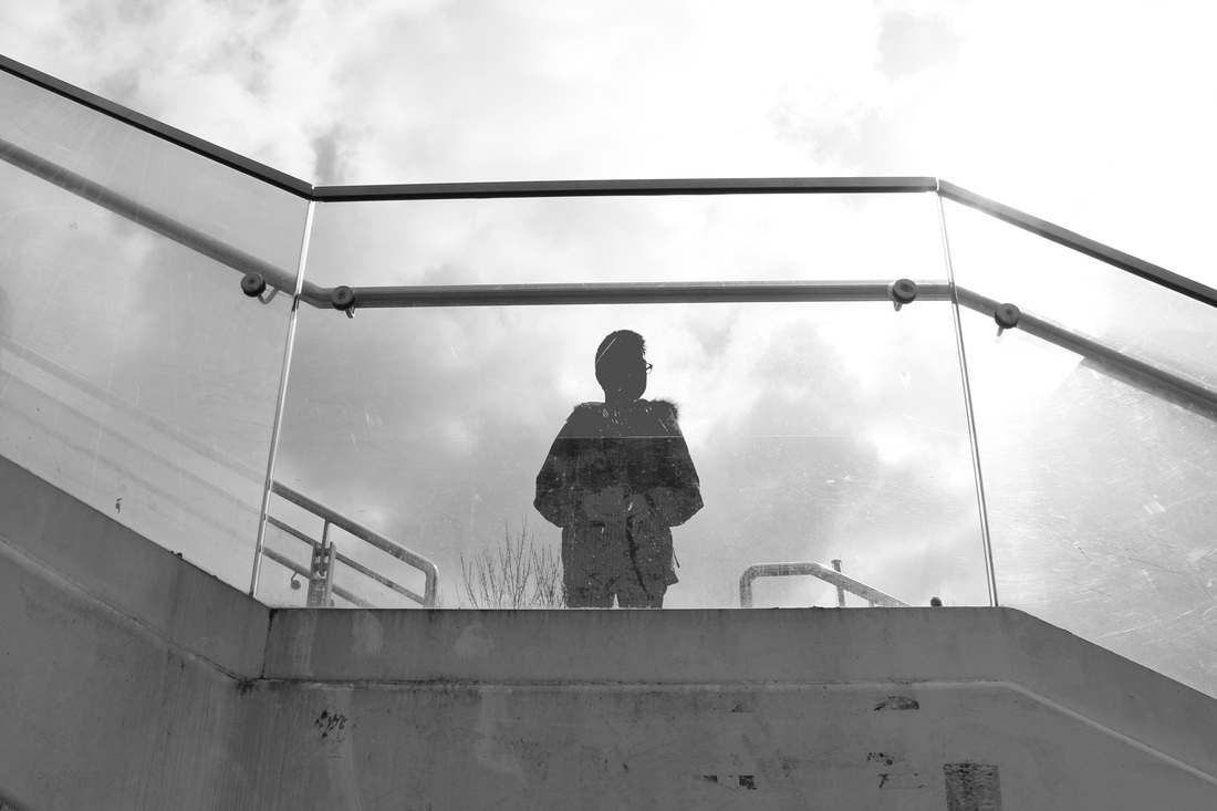
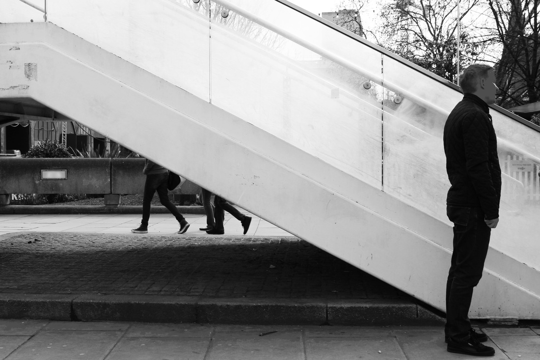
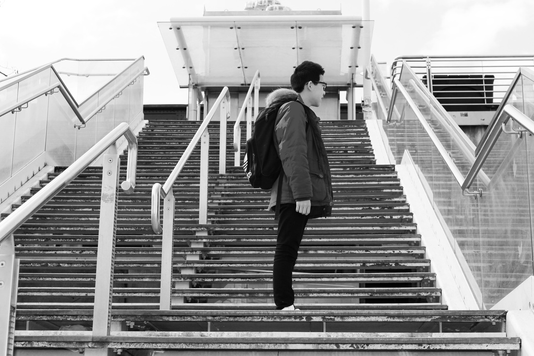
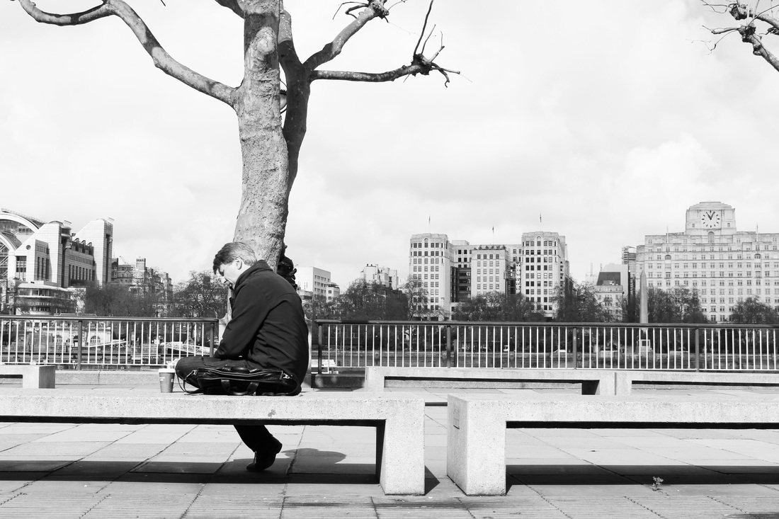
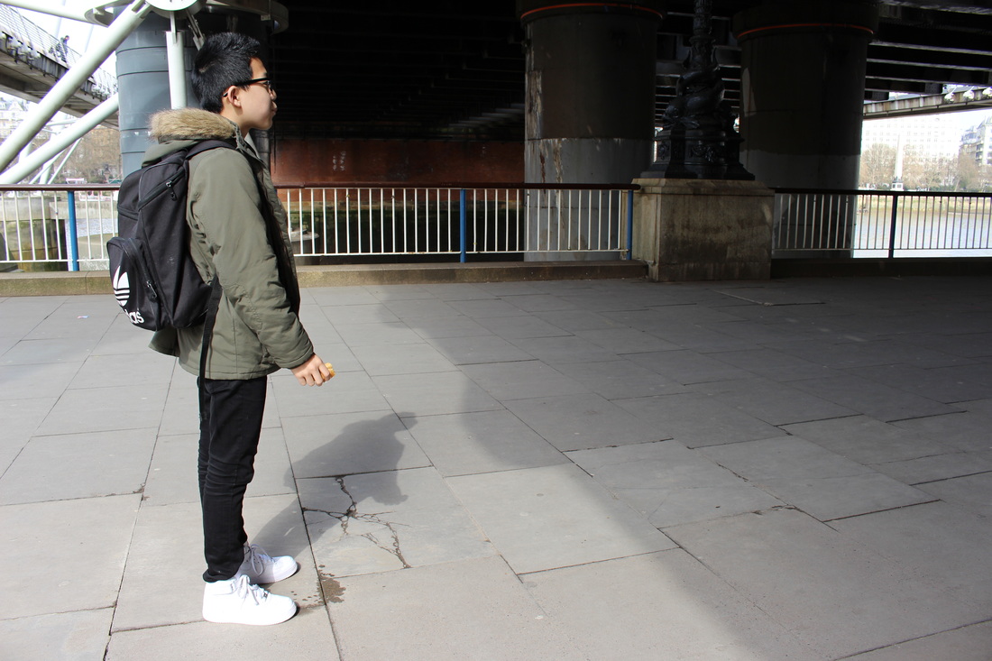
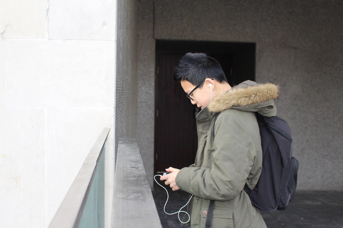
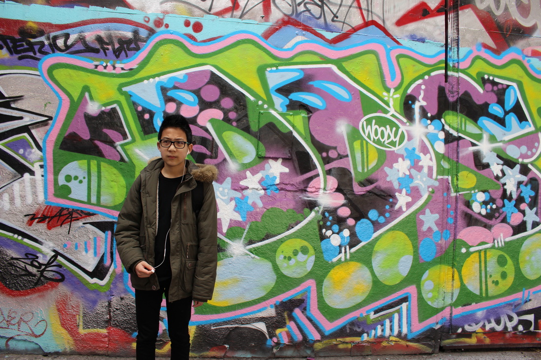
Lepkoff is an American photographer, who captured street scenes on the lower east side of Manhattan in the 1940s. Her images focuses on the movement of people, especially focusing on the background, which reflects the Manhattan region. Her photographs capture usually a singular person alongside a striking background, thus the person is in the foreground, usually insignificant but it is still apparent. Lepkoff's images relates to outlines such that her depiction of the person in the image focuses on the whole body; this is emphasized by the lighting within her images which are normally from the natural sources. She emphasizes outline by placing a distinct natural form against a mundane background. However in some cases, the background is very significant in that the formal elements play a vital role, such as that of lines, tone and texture. Her black and white images of normal everyday people portrays a sense of normality thus with the added touch of the black and white, or sepia tone it gives the image an edge. INSPIRATIONS FROM LEPKOFF- After looking intently at the works of Lepkoff, i intend to go out to central London, creating images of a figure and also carefully choosing the composition such that there are other elements incooperated in the photos, but it doesn't take away from the simplicity and the purpose of the image; which is to capture the figure of a person. I will take some with a more complex background, whilst some which are more plain. |
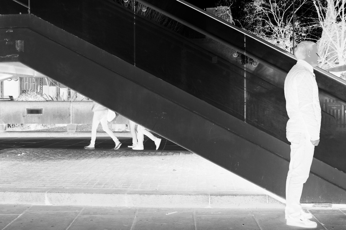
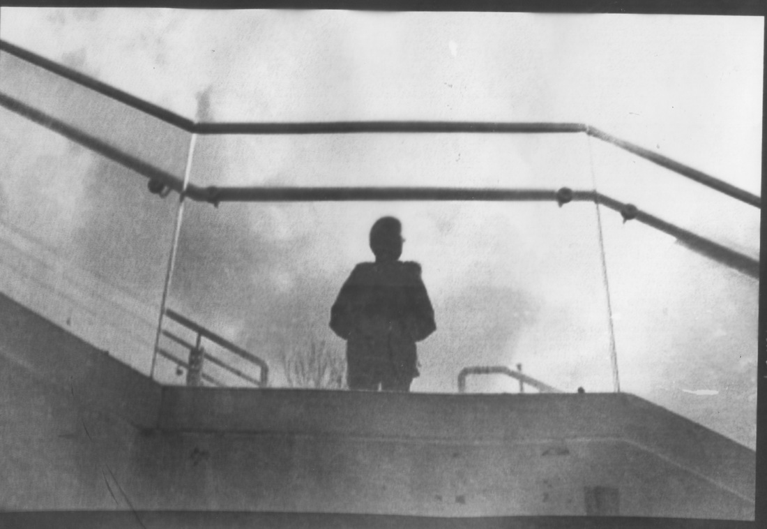
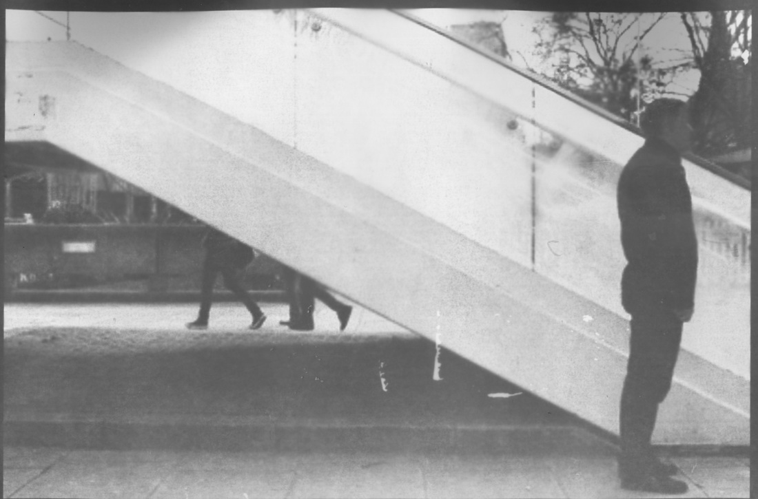
IMAGES FOCUSSING ON FIGURE AND BACKGROUND

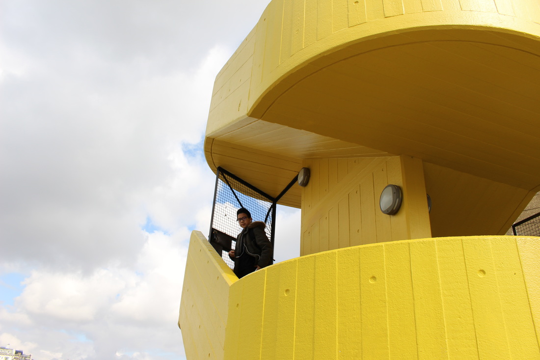
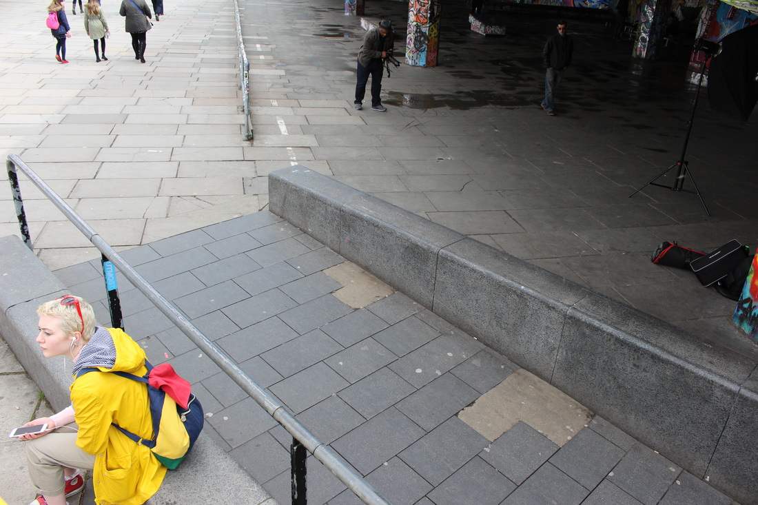

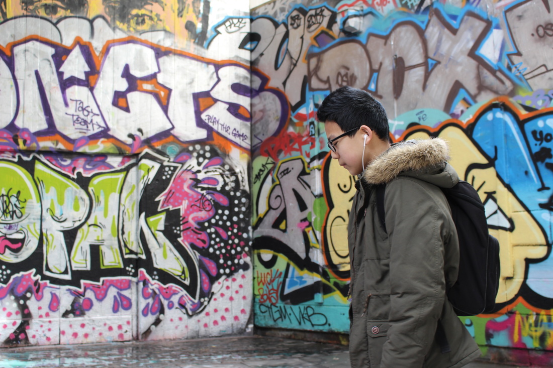
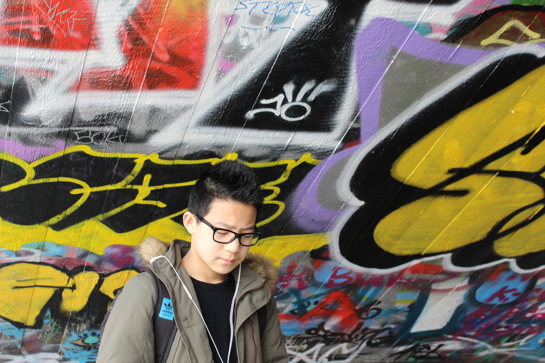

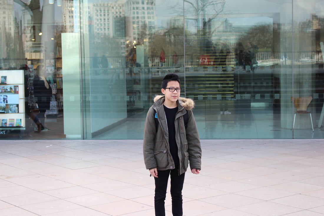
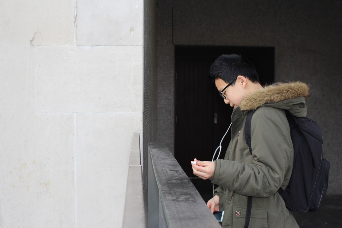


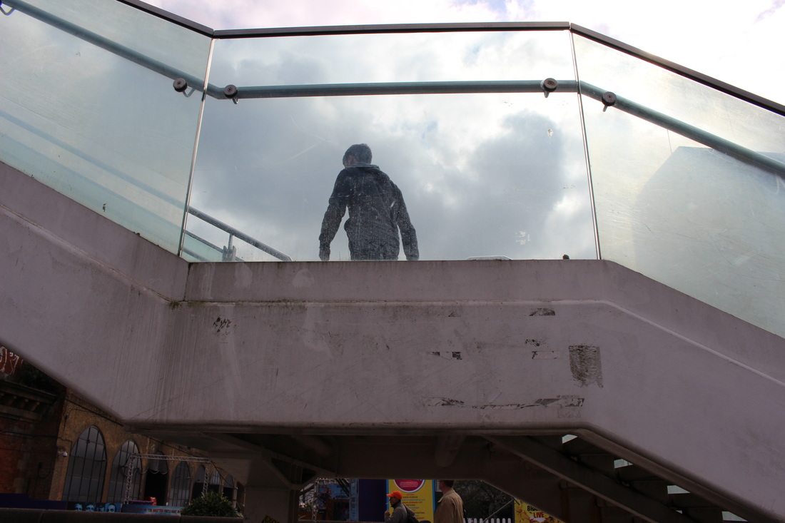
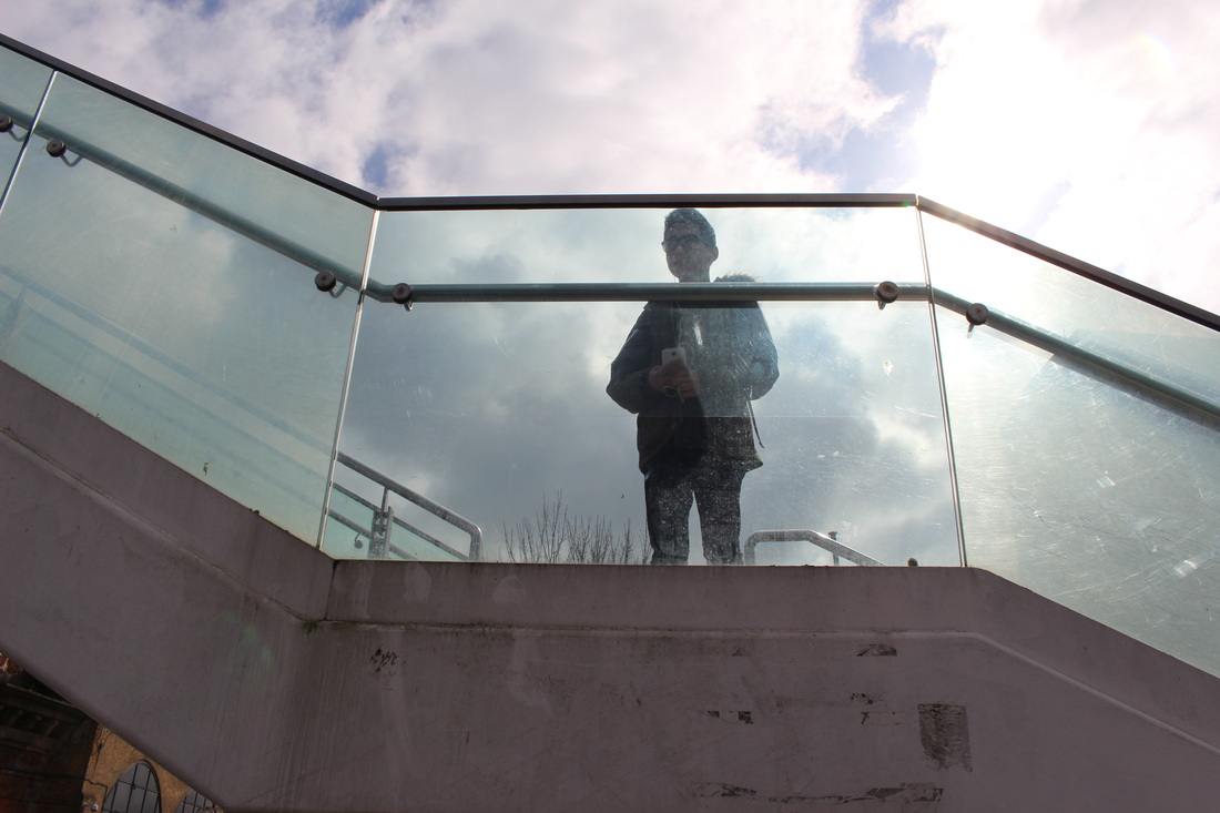
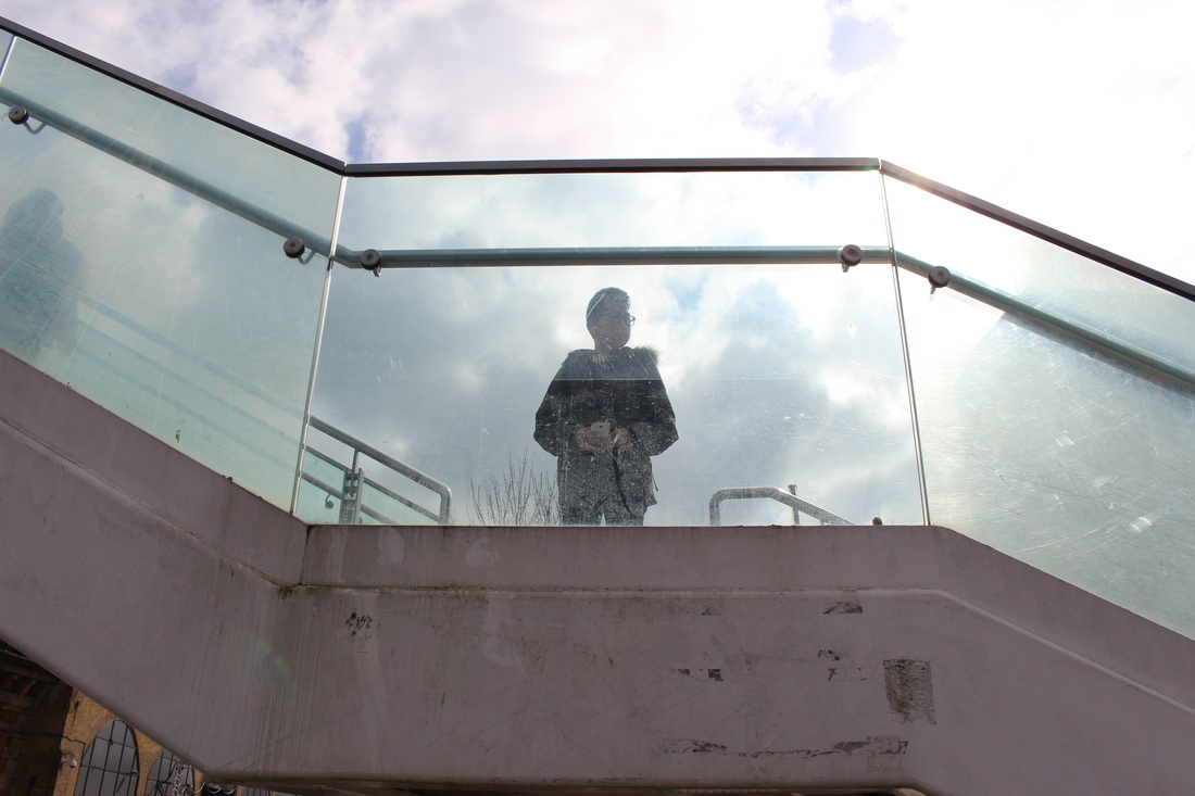
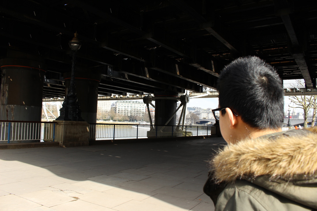

MOST SUCCESSFUL IMAGES
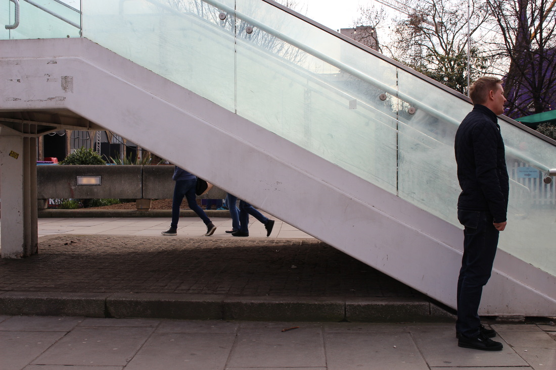


EVALUATION
These three images are my more successful ones. One of the main reasons is because of its simplicity. I was inspired by Lepkoff to create such images, thus her work was focused on simplicity and the presentation of a figure within a photo. In addition, all three of these images are very different and represent different moods. Some of these images, the main figure is most prominent whilst in some images the figure hindered and the background elements is more significant.
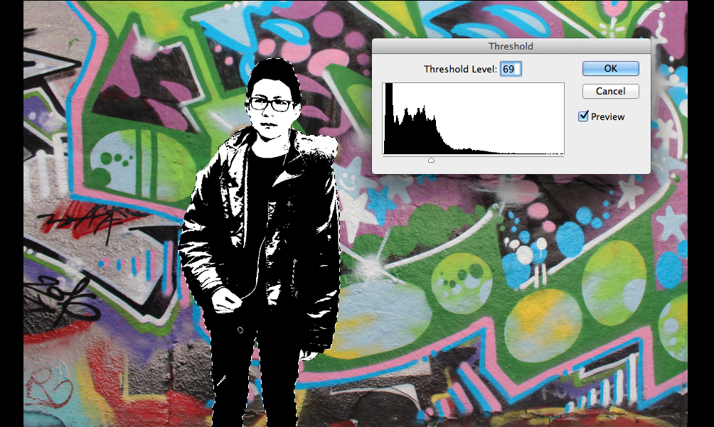
Development #1 (convert to black and white)

-ALSO FILLED IN SOME PARTS BY PHOTOSHOP; PROCESS:
EVALUATION OF ONE OF MY SUCCESSFUL IMAGES FROM THIS SET:

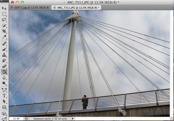
|
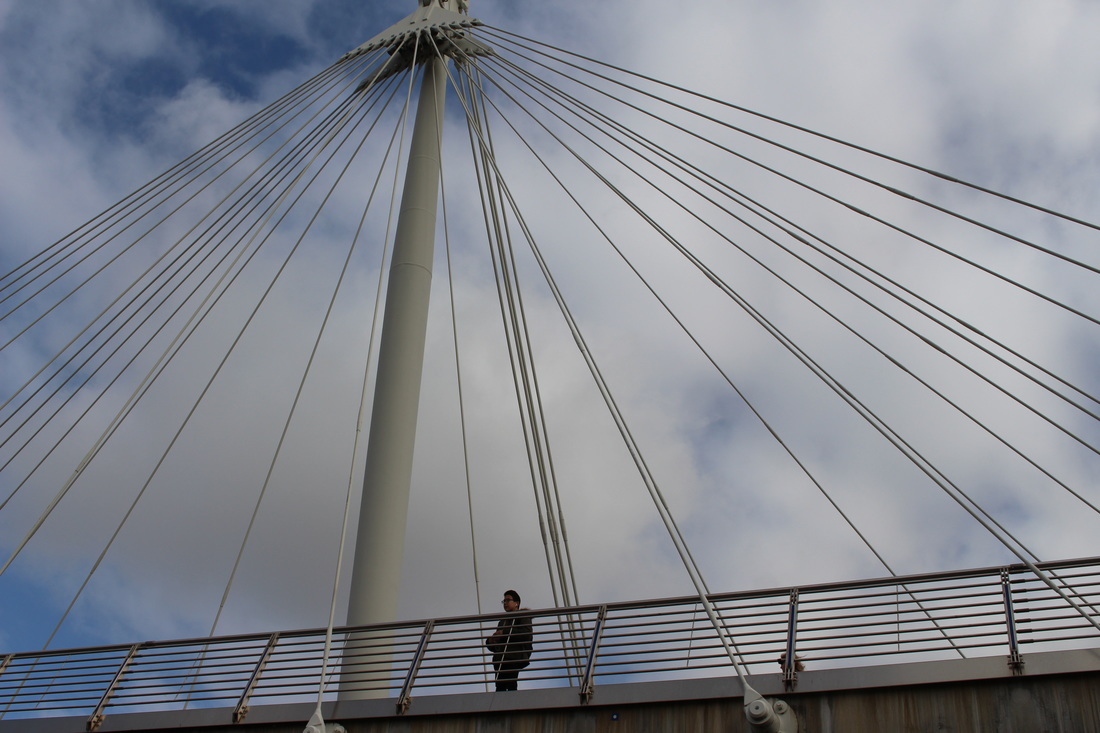
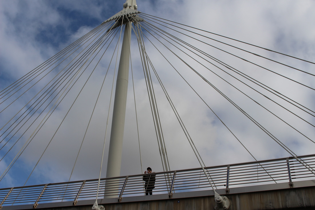
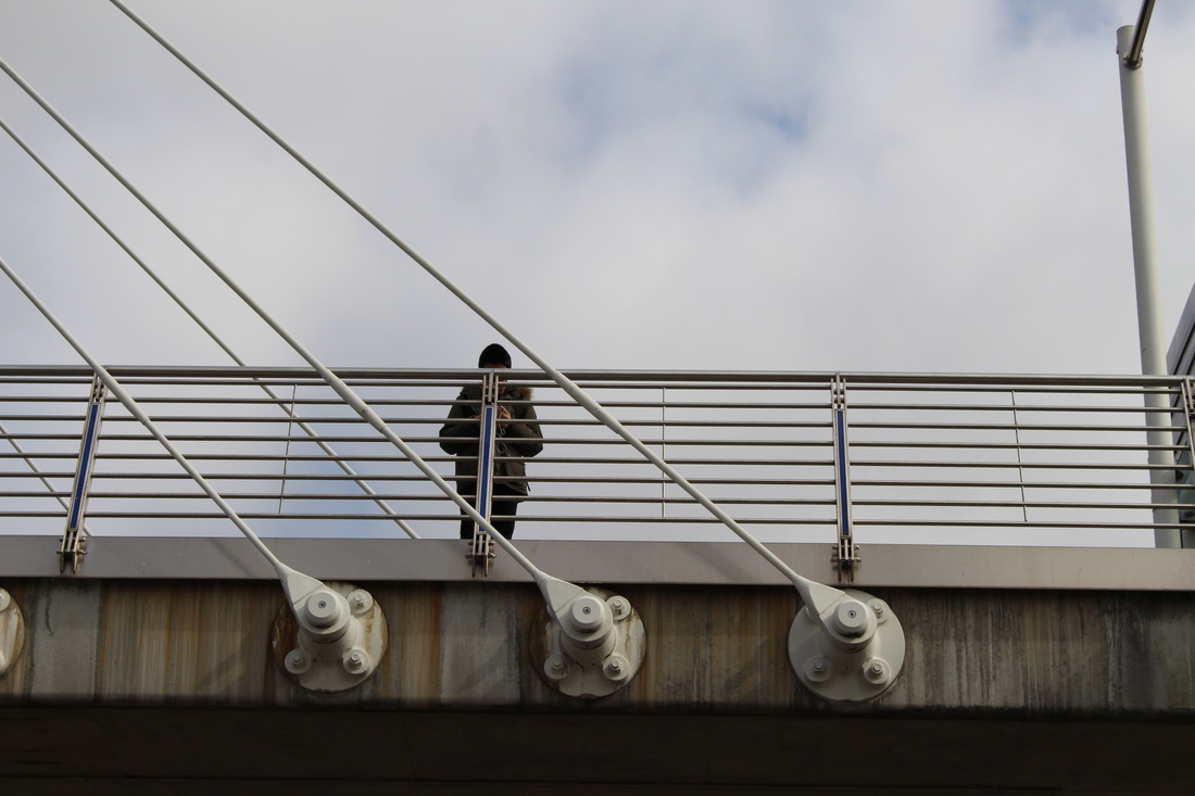
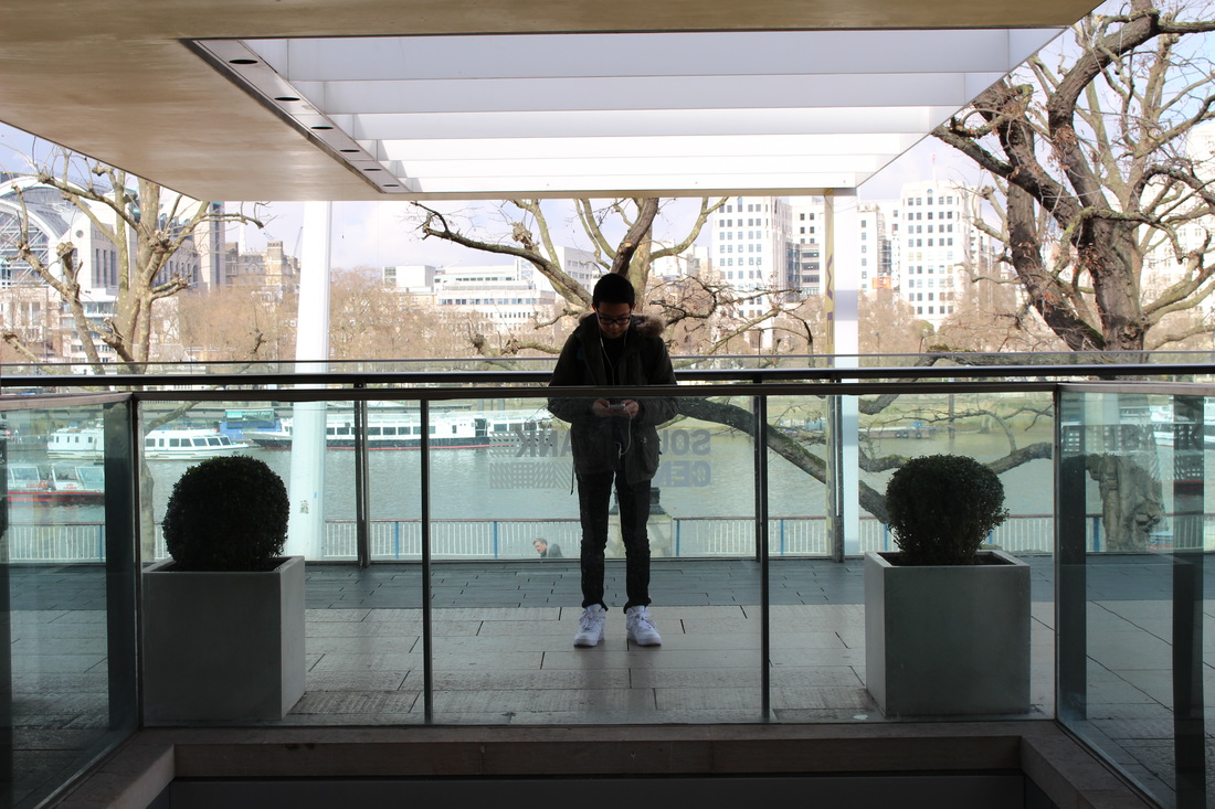
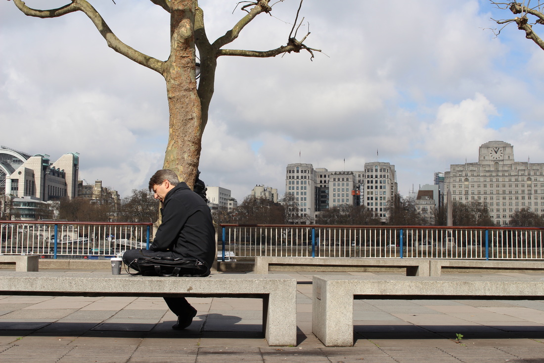
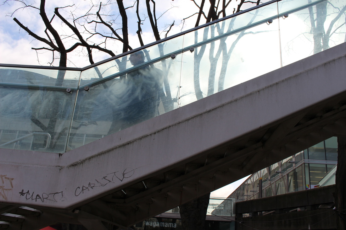
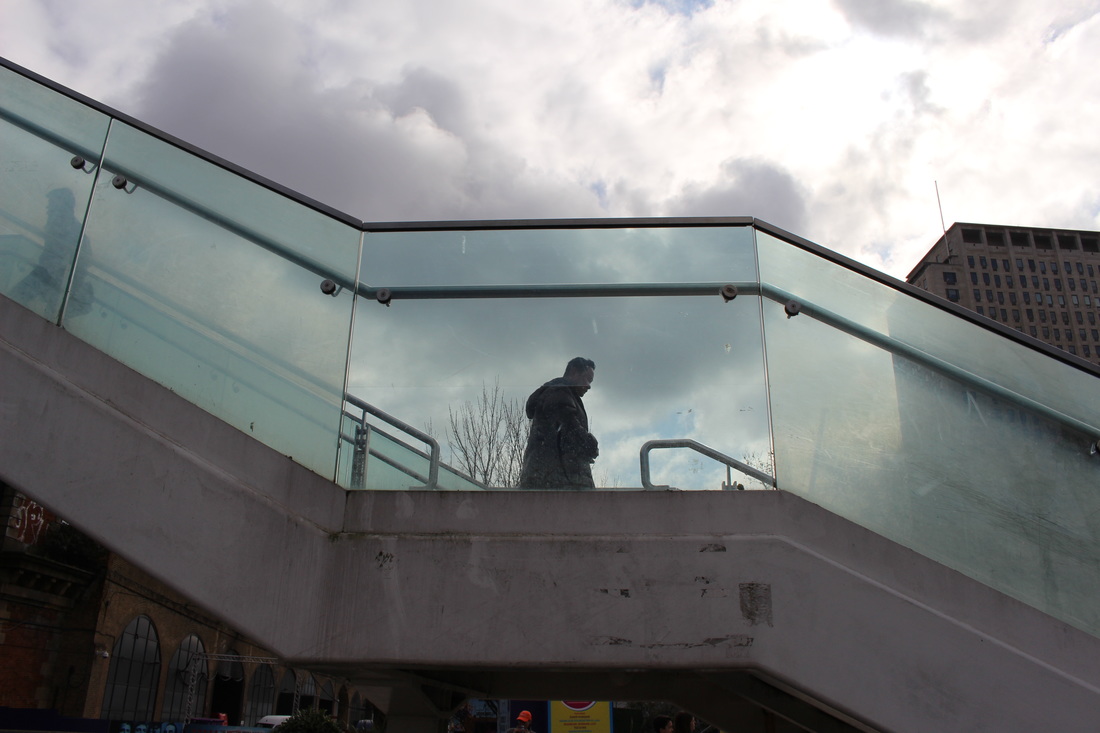
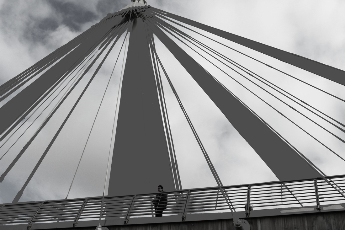
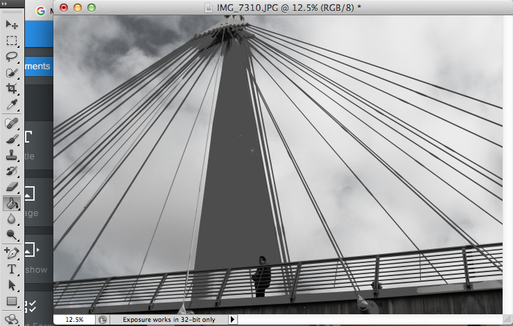
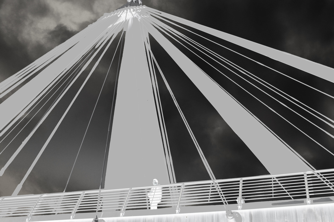
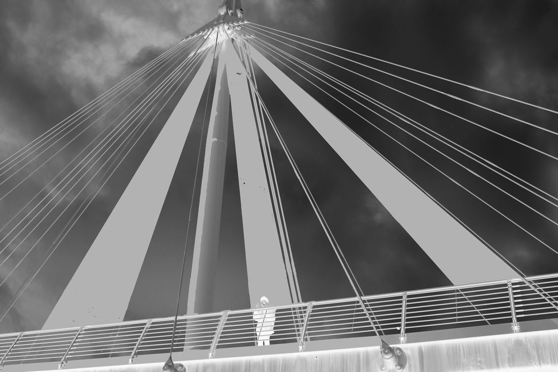
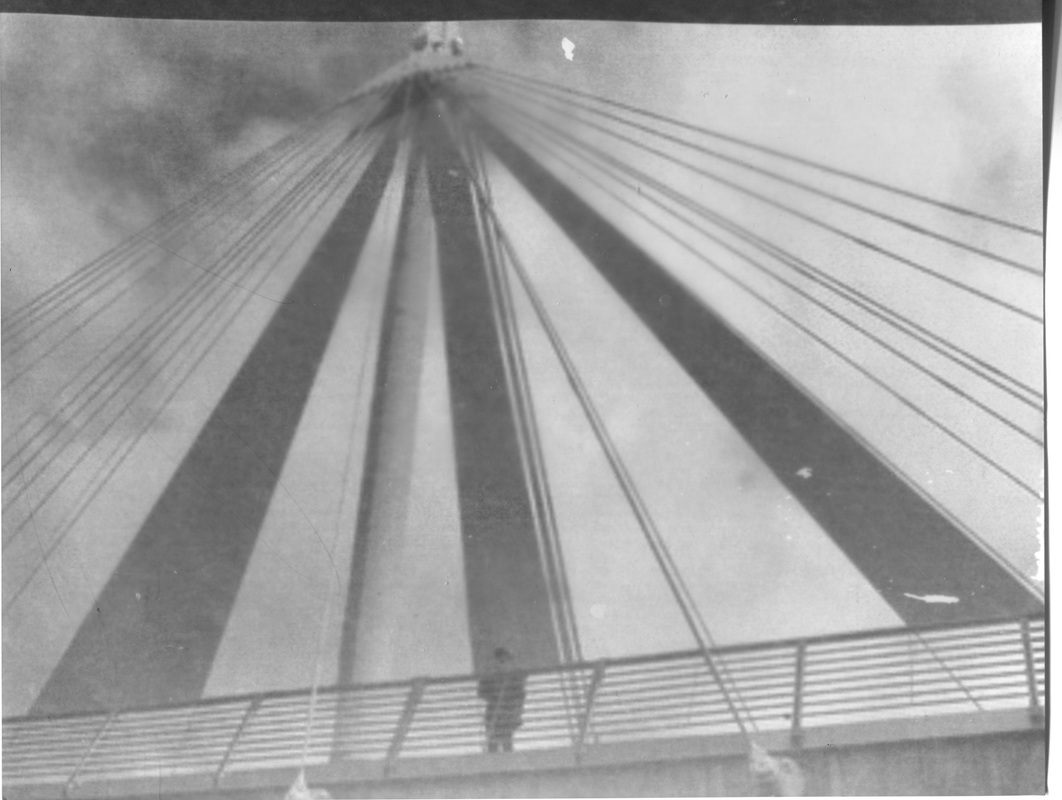
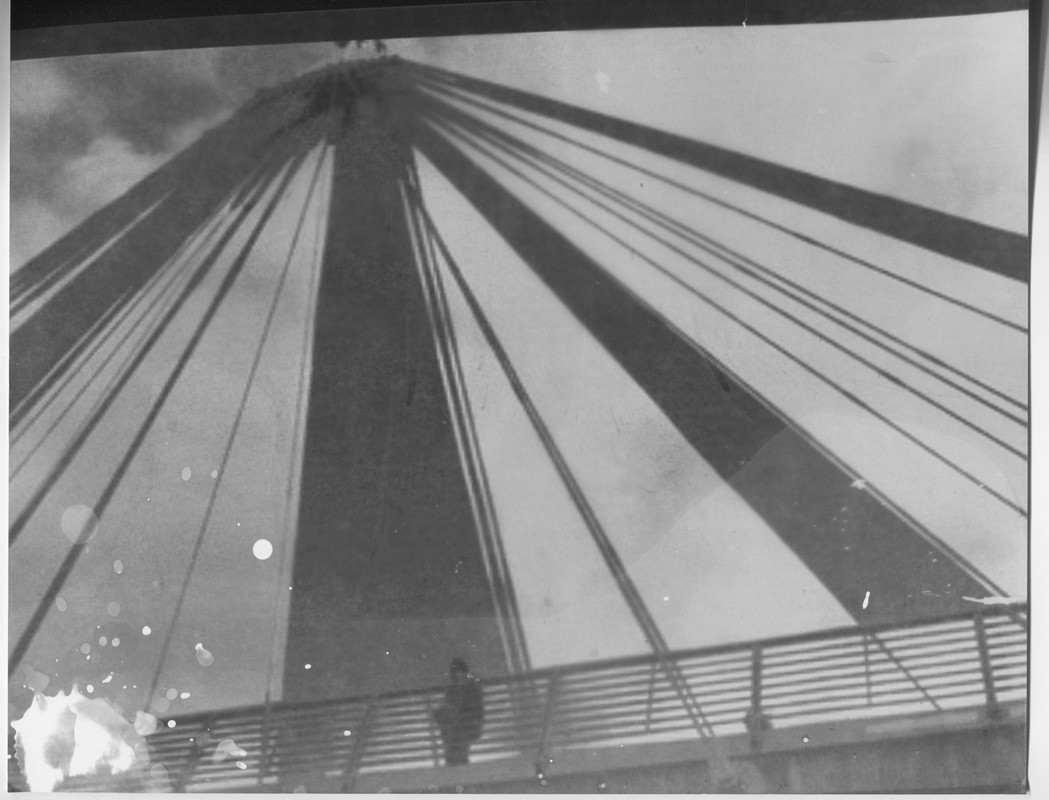
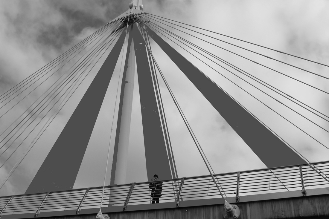
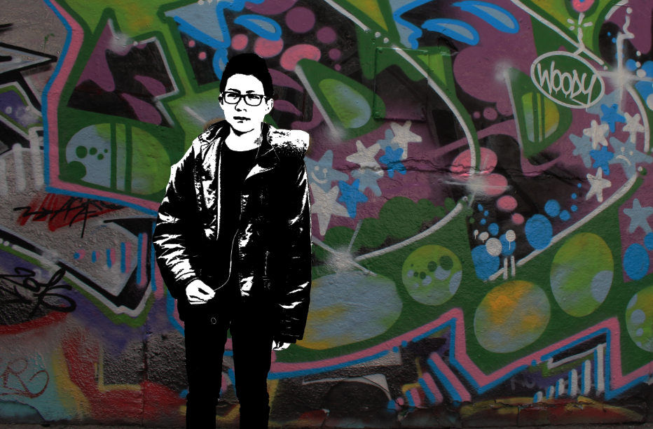
This image was inspired by Rebecca Lepkoff, as she placed humans or a figure within an desolated area, creating a sense of eeriness. Here, i captured a singular figure on an empty bridge looking out. This images depicts great vastness, this is as a result of me capturing from a low angle and shooting above; this meant that the sky with the clouds were the background. The sky is especially significant within the image as when converted to black and white, it adds texture, making the image seem less undermining. In addition, another key formal element which is present is lines, this is from the tall, long poles and the horizontal lines on the bridge. Hence, there is a contrast between the horizontal lines and the diagonal ones, thus adding to the image making it seem more vast. The most important subject yet not quite obvious at first sight is the figure in the middle. When capturing this photo, I ensured that the figure was centre of the frame so even though its small and almost unrecognisable, it is still clearly seen and significant to the photo. By editing this image of photoshop, i used the fill effect, filling in a few of the empt spaces between the poles of the bridge; the one in the middle is mostly filled as that is where the figure is. As a result of this, it further enhances the figure making it more visible, and it also enhances the different tones as well as contrast from the image. In conclusion then, this image relates to my theme of outline, as the main outlines are of the large poles, and yet even though insignificant, the outline of the figure within the middle of the piece.
|
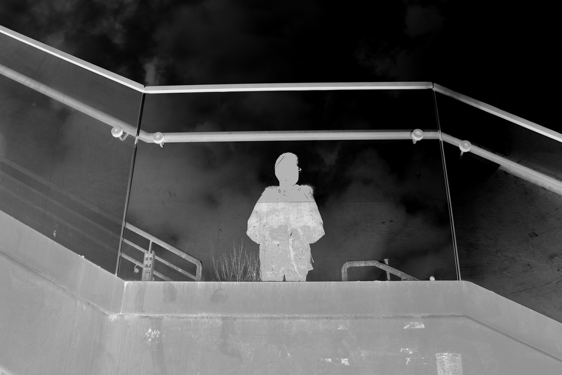
DEVLOPMENT #2 (PHOTOSHOP TO FILL IN WHOLE FIGURE WITH A SIMPLE BACKGROUND: WHITE AGAINST A BLACK BACKGROUND)


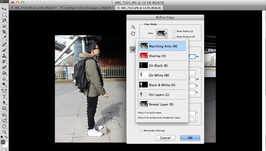


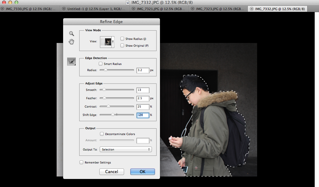

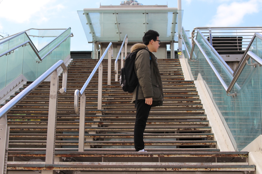
DEVELOPMENT #3 (BLACKING OUT A FIGURE AGAINST AN INTERESTING BACKGROUND, USING PHOTOSHOP- LASSO AND FILL)


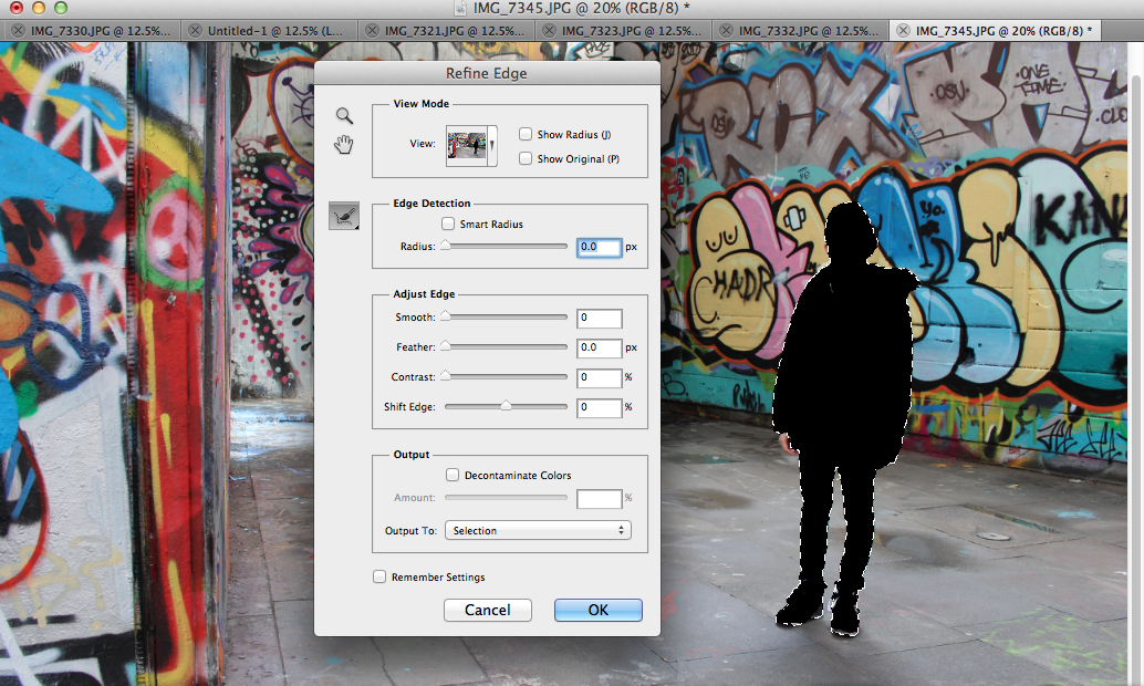

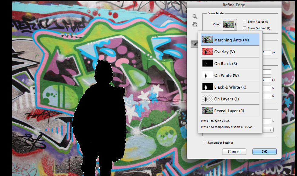
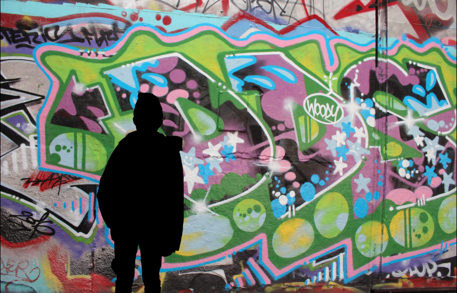
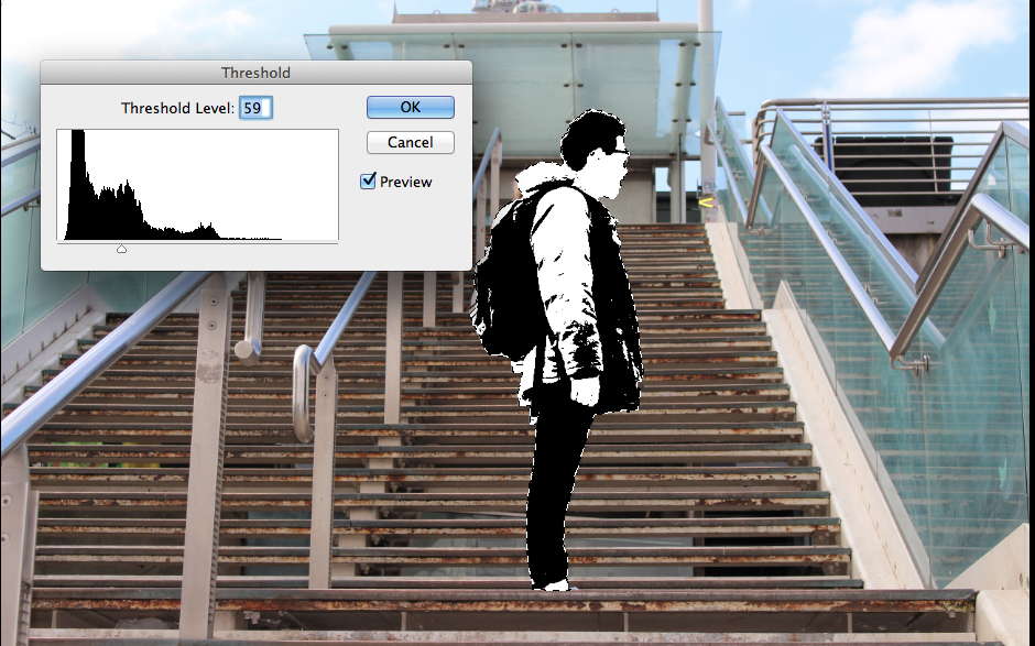
DEVELOPMENT #4 (FIGURE DISTORTED WITH THRESHOLD EFFECT)
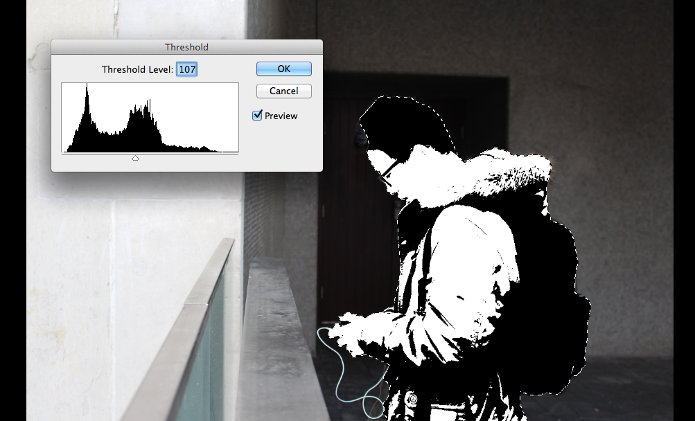
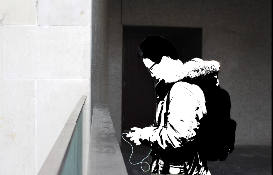
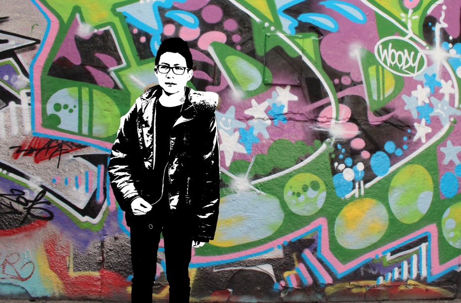
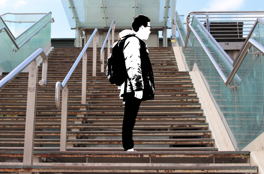
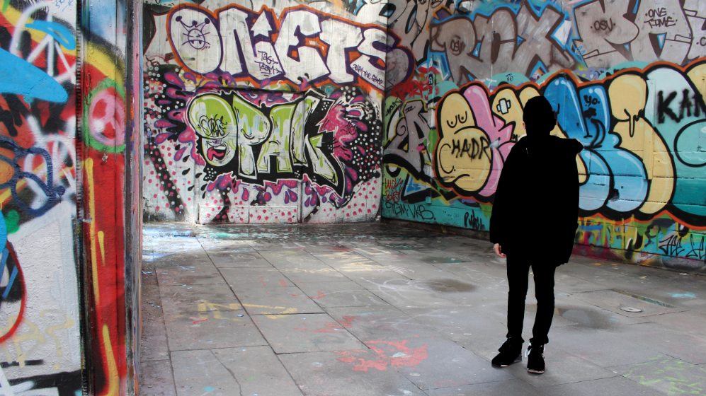
FINAL OUTCOME OF THRESHOLD EFFECT WITH BACKGROUND, SLIGHTLY DIMMER)


DEVELOPMENT #5 (inverting black and white images and then using dark room to develop them using chemicals)
INITIAL EXPERIMENT WITH FILM, WITH ORIGINAL IMAGE
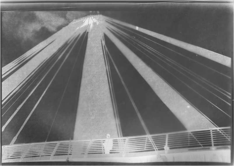
In the beginning i was slightly unsure as to whether to use an original or an inverted image. So i began by using an original image that wasn't inverted. After exposing and developing, I realised i had made a mistake such that it came out inverted. So, after i printed out inverted images of my final pieces and then developed them in the according way allowing it to turn out how i wanted it to.
SAME EXPERIMENT WITH INVERTED IMAGES
EXPERIMENTATION-
After inverting these images, I went into the dark room and using the enlarger i inverted the images back to the original tones. The process was:
- Printing off photoshop inverted images
- Placing the image underneath, with the photographic image on the top with the shiny side facing up
- Above the film i placed a glass layer on top, so it kept the image flat
- Exposed the image to light for just three seconds then covered again
- Remove the photographic film, placing into the developer for about 2 minutes
EVALUATION WITH USING FILM-
Overall, even though this idea was a last minute decision i feel that the images have turned out well. The process was relatively fast and the final outcome came out well. A reason why i especially like these photos, is that it's from the inspiration of Rebecca Lepkoff, her images from the 1900s are predominantly in film as she captures the distinct figures within an area. Thus the difference between her images and my original ones was that mine being taken on a digital DSLR is very clear and sharp, compared to hers which is a less sharp and has a grainy texture and effect. Hence, my outcomes of these developed films seems to have a similar texture to hers. In addition, one thing i wanted within the image was a clear figure and also darkened so that only their outlines are clear, and apparent within the whole image. By developing the images, this idea was achieved, as it's less clear and the images focusses more closely on the different tones rather than the specific details. As a result the outline of the figure is more emphasised, thus my focus on the specific lines within the image means that the background elements are also prominent and outlined also. One thing which i'm not really happy about is how the third image came out, on the left, bottom hand side, it seems to not have been exposed and developed properly which creates a white blob, which slightly disorientates from the image. Overall then, i intend to use the three successful images as one of my final pieces. I intend to place them in a row, with a slight white strip between them.
FINAL PIECES
FINAL PIECE #1
FINAL PIECE #2


FINAL PIECE #3

FINAL PIECE #4

FINAL EVALUATION
For my unit two project, we were faced with a series of starting points/themes to develop. There was a wide range of pathways however after carefully thinking about it, I chose this theme: Outline. This theme has many interpretations and different routes that i could've chose to go down. Overall, by researching the different artists as well as my numerous developments and experiments, I feel that this is my most successful project throughout as i have used many techniques to further improve and develop my images.
There were many artists available for me to explore, including the artists Man Ray, Joan Fontcuberta etc. I began by researching and looking at the works and techniques by Man Ray. His images depict strong emphasises on tones and shade, clearly representing the formal elements which are perceived through the photos. One of the techniques he uses is the process of solarisation. Whereby chemicals are used in order for the image to seem like an inverted one, these were of portraiture and of the human figure. As a result i was inspired, so similarly i adopted such ideas and represented it within my own work, using clear images of the human body and developing them. I feel that these Man Rays solarised images are so successful because in normal images the outline of the figure is predominantly faded as it blends in within the background such that we are more focussed on the centre, where the features of the figure is. Nevertheless, the solarised images meant that the reversed has occurred so the outline of the figure is much more accentuated amongst the whole image. Another artist i researched and looked into depths to is Ray K Metzker, I was introduced to his works as i looked through Pinterest, finding several images by him which are very intriguing. His images mostly in black and white, mainly of the urban streets and the people within it. His images reminded me of when we explored street photography, where the images are more based on instinct rather than planned out. Thus the juxtaposition between the built up buildings with the natural form of life is effective as the tones further highlight such ideas. In addition, one of his works which most stood out to me, was a photo collage where there were many images of silhouetted outlines of parts of the body and grouped together in random ways. This was rather effective since it just depicted the outline of ones figure putting aside all other features, i was inspired by this idea which i incorporated into my work such that it related directly into my theme of outline. A final artist i researched was Rebecca Lepkoff, her works which i particularly love and inspire me, so I decided to use some of these inspirations within this unit two topic. One sub-topic which is evident from most of her images is the idea of isolation, whereby a singular figure is placed within a vast surrounding with minimal other distractions, so that we are focussed on the figure though at times it seems insignificant within the piece. One formal element which is clearly evident within her images is composition and lines, thus making her images very simple yet complex at the same time. I was inspired by her images by capturing a image of a person within different style backgrounds; whether that be more plain or in some cases more hectic. Thus with experimentation from my previous projects it allowed me to take images with a clear eye as i knew what i was focussing on, and i always imagined how Lepkoff would've taken an image as if she was in my position.
Furthermore, within this unit 2 project i tried to incorporate as many processes and techniques within it as possible, ensuring they relate accordingly and are effective as to my ideas and the theme. The first sub-theme i explored was shadows and silhouettes, this was with the natural sunlight which required patience as it was inconsistent. After taking these images, inspired by Man Ray, i used photoshop to edit them by inverting the image and also adjusting the contrast and brightness. I especially liked these images since they really outlined the figure and the final outcome the shadows were extremely prominent,which i decided to use two of the most successful as my final piece. I followed on by taking inspiration from the works of Metzker, his deep contrasted images inspired me to find contrast within my own images as well. I liked his collection of silhouetted body parts, so similarly i did likewise. In this photoshoot i used a studio with artificial lighting and experimenting with such equipments, in trying to get a good image. In this selection, I focussed particularly on the sides of the body such as the arm and the head. These positions were posed such that it created interesting shapes and the composition is well structured. i followed on by using photoshop again and increasing the brightness as most of these images came out quite dark. Then, i printed it out and drew on straight geometric lines as a result of my inspiration from an image in which i encountered through Pinterest. Following on, i decided to follow on by improving the original set of images by setting it on a white background, such that the images came out brighter and composing the images more well. Then, i used photoshop and adjusted the images with a threshold effect such that it adjusts the tone to a purely black and white tone. These images came out well, and i placed them in a row in a collage and this is another one of my final pieces. After looking at the artist Rebecca Lepkoff, and going to central London, i took images of different people within different backgrounds. Afterwards, I used Photoshop and used the lasso tool to outline the figure of the person and adjusted the tones of the figure. I began by filling in the outlined figure in a black tone, then i followed on by adjusting by filling it with the threshold effect, which is my most successful and this has ended up as another final piece. These images compared to my other final pieces are less plain, since these have a different background within the three images. After this, I decided to experiment a bit with film, I went onto Photoshop and inverted the original image and printed this out. Afterwards i went into the darkroom and changing the light intensity followed on by using developing chemicals to develop these images. I liked this experiment as it was exciting to see the colours develop and come alive. Overall, I did four images using an A4 sized film, three came out successful whilst one didn't come out so well.
Furthermore, for every experiment, I would plan it out first, so that the images captured were all successful and worked well. Thus, after each experiment also I would write an evaluation with what went well and some even better ifs for improvements. I especially liked my first set of images which was the set of silhouettes and after my research on Man Ray, I developed them by manually solarising them. which was very successful. I especially liked how the tones were very sharp and contrasted, which really emphasises the outline of the figure. I followed on by taking images based on the sides of the body or body parts, however these images came out not as well due to the darkness and it was too simple, so my next photoshoot had improved as it was brighter and much clearer. Following on, I took images focussing on a singular person within different backgrounds as a result of the inspiration of Rebecca Lepkoff. I really liked these images due to the different features of colours and the difference between the simplicity and the complexity of the images. After, i used some of the techniques in which i have acquired in the past such as that of photoshop, I developed my images in different ways and documenting such processes by screen capturing them at placing them in a row. i did this for each experiment with photoshop, with my last experiment the most successful, as I used a variety of the lasso tool the fill tool and finally with the threshold effect. This was the most successful because the tools used had accumulated and it finally came out as that.
Overall, i have thoroughly enjoyed this unit two project, I have explored the theme of Outline in as many ways as possible. I have also accumulated all my knowledge of photos, processes and techniques within this project making it a very good project.
