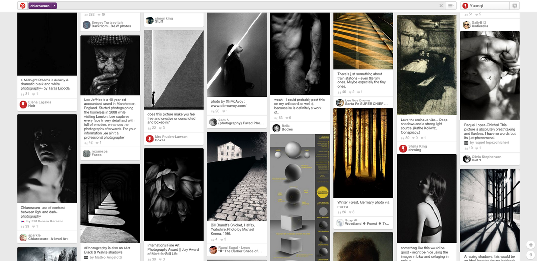
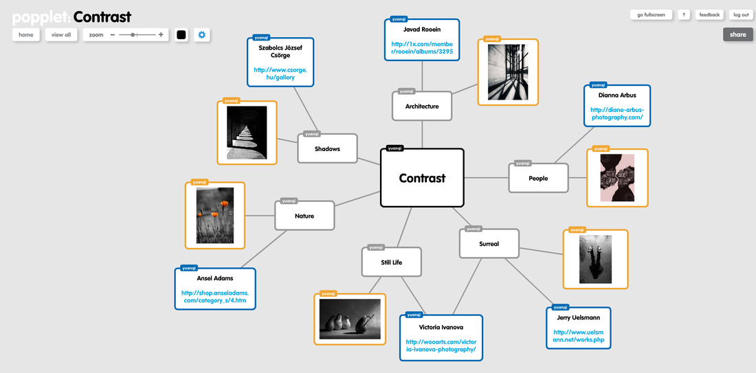
CONTRAST
|
Chiaroscuro-
|
: is the Italian term which literally translates as 'light' and 'dark'. It is the technique in visual arts to represent contrast through light and shadows, commonly in black and white images. These contrasts which are usually bold affects the whole composition and mood towards the image.
|

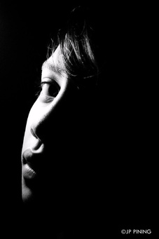
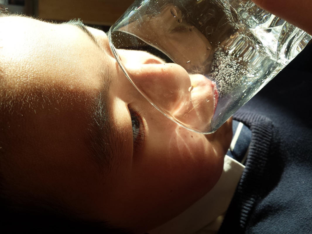
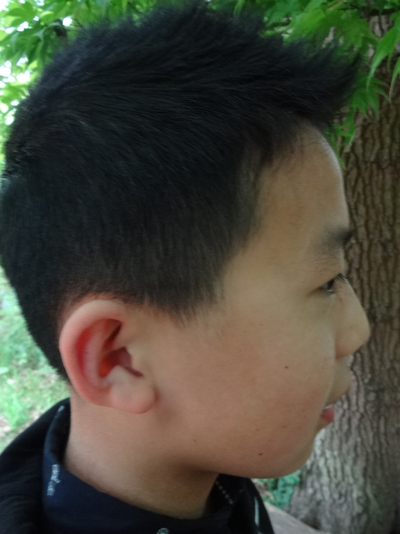
Example evaluation-
|
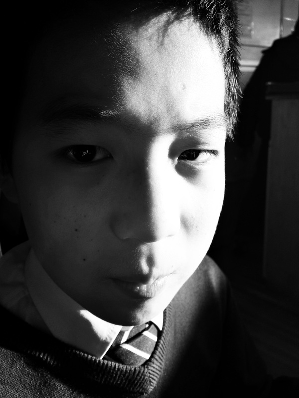
In this image, we can clearly see the contrast between the dark, bold tones with the bright, light tones. In my opinion, this example of chiaroscuro is successful, as the light and camera is directly focussed on the face and nothing else; it is a close-up shot, hence we're captivated by him. This image portrays a young boy's face, and as the light is shining to the left of him, therefore we can only see all the dimensions and features on his face. The light which is directed on this boy is a hard light (probably an artificial lighting), this is because it is only focussed on one area, and it is not diffused meaning the light not spread out within the image. The contrast creates the various tones across his face, which provokes a sophisticated and suspicious effect. In addition, his face is neutral, showing no emotions, allowing him to look more natural and formal. Whilst the lighting is harsh, his facial expressions are direct and harsh as well. Further, the bright light evokes to his youthful appearance, and makes the boy seem more innocent; this is because with the bright light it creates a more angelic type of characteristic. This image allows the viewer to question- What are the boys feelings and emotions in this current moment?, Why is the boy looking towards the camera rather than straight ahead?'
|
_________________________________________________________________________________________________________________
Edward Weston-
|
|
Edward Weston was an 20th century American photographer- (March 24, 1886 – January 1, 1958). He is well known for his 'pictorial style' images, as he captured- nudes, close-up, natural forms and landscapes and several other works. Weston's images are black and white, and are captivating as we feel the emotions within the image. Further, as there isn't any colours, it emphasises the idea of chiaroscuro. He has many different images all based on a separate theme, each being successful as it focusses on certain formal elements. One of the most intriguing collections includes his bel pepper images, where he captures a solitary pepper in rich black and white tone, which all have strong illuminations from above. These images were part of a larger collection called still-life where he focussed on close-up's of particular objects. So, he ended up recording twenty-six negatives of pepper during 1929 which were all taken against a plain backdrop. This relates back to the theme of contrast, as he captures the contrasts between strong black and white tones. The peppers started from a fresh bold shape and in the end it became distorted and gradually lost its' form, creating an intricate delicate shape. Overall, i think that Weston creates interesting images but using everyday ordinary objects, but simply capturing it in a creative way.
|
Pepper no.30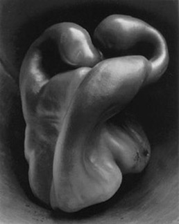
|
In this image by Edward Western, it shows a pepper which has slightly been de-formed. It depicts a single pepper in rich black and white tones with strong illumination from above, hence representing the concept of chiaroscuro. There are tones within the background as well as the pepper. In addition, an aspect which makes this image successful, is due to the variety of tones Further, the composition is significant as the pepper covers the whole image and there is only small parts of the sides which are bold. This pepper has a shiny and smooth texture, which is probably due to the light shining from up above. Further, the shape of the pepper plays an important concept in the photo, as its really delicate and smooth. Also, the background is quite interesting as well, as the top half of it is more or less just dark, whilst the bottom half shows more lighter, grey tones.
Inspirations;
Overall, I have been intrigued by the layout, composition and contrast within this image. I wouldn't usually take an image like this- based on a solitary object. Nevertheless, for next time i will try to take more images similar to this, which depicts distinct tones with artificial lighting. |
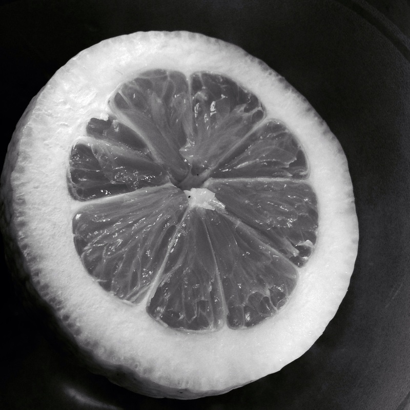
Image inspired by Weston.
|
|
Image evaluation
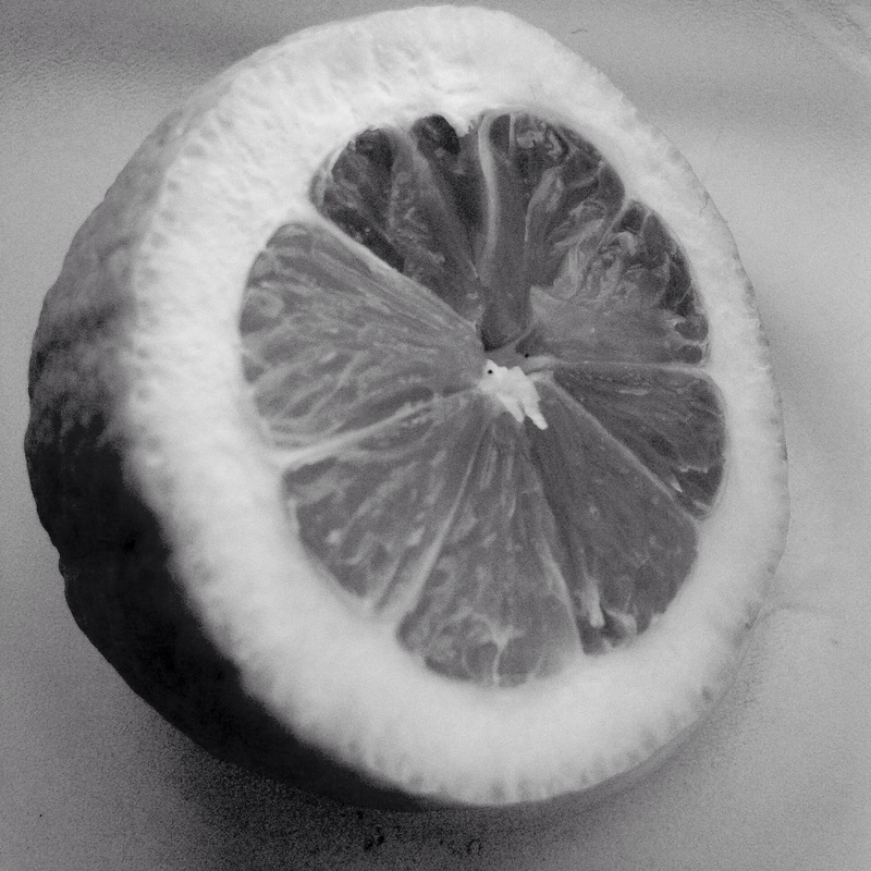
For the homework we had to capture an image inspired by Weston, therefore i chose to experiment with an opened up lemon. I chose a lemon, because there are clear intricate lines and details in it, and the sections within it are interesting. I took these two images with my iPad, and i didn't use any artificial lighting. So, the lighting which was present was the natural daylight shining through the window in the morning, it was shining from a high angle. After, taking many of these images and experimenting with the angles, i found these two the most successful, so i went on to further develop them. With the second image i used an app called photo editor, however after adjusting the the saturation, brightness and contrast of this image, it didn't really come out as i wanted it to. This was because, this image ended up looking a bit blurry and also, there was light in the background, which i felt affected the composition of the photo as it wasn't purely focused on the main element. So, after i used another editing app called 'Afterlight' and after lowering the brightness, making it black and white, and also increasing the contrast, the image came out really well and i felt that this image is much better, as it truly represents the concept of chiaroscuro. This was the image on the left, and it's also better, as it slightly contrasts with the second one, as the background is much darker compared to the lemon, allowing us to distinctively see the contrasts of tones in the lemon. Next time, to improve i could maybe experiment with artificial lighting, to really experiment with much more significant tones of light and dark; along with different types of intricate objects.
___________________________________________________________________________________________________________________________________________
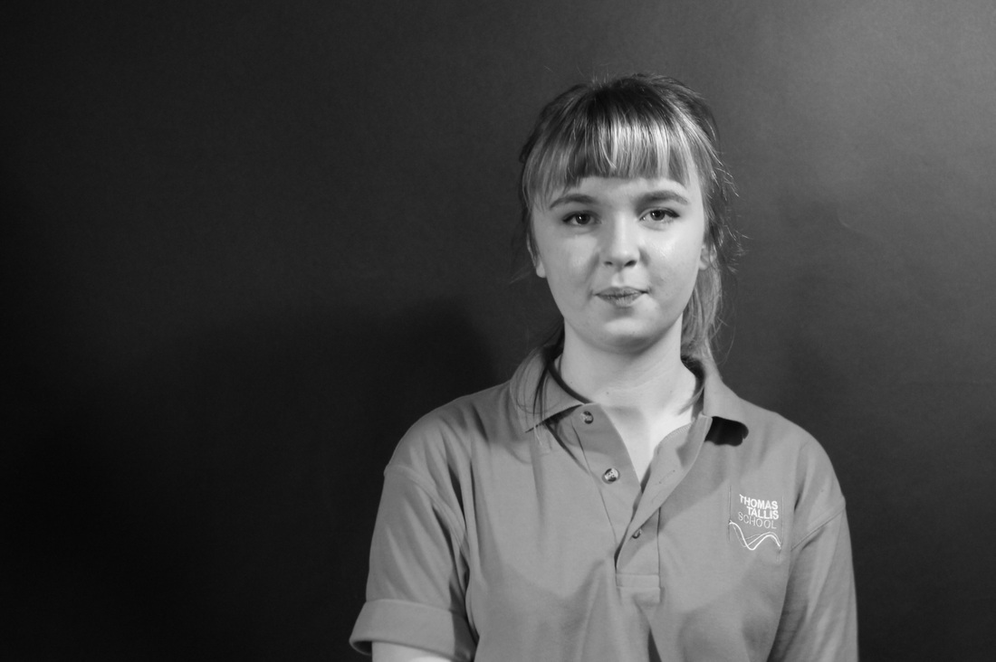
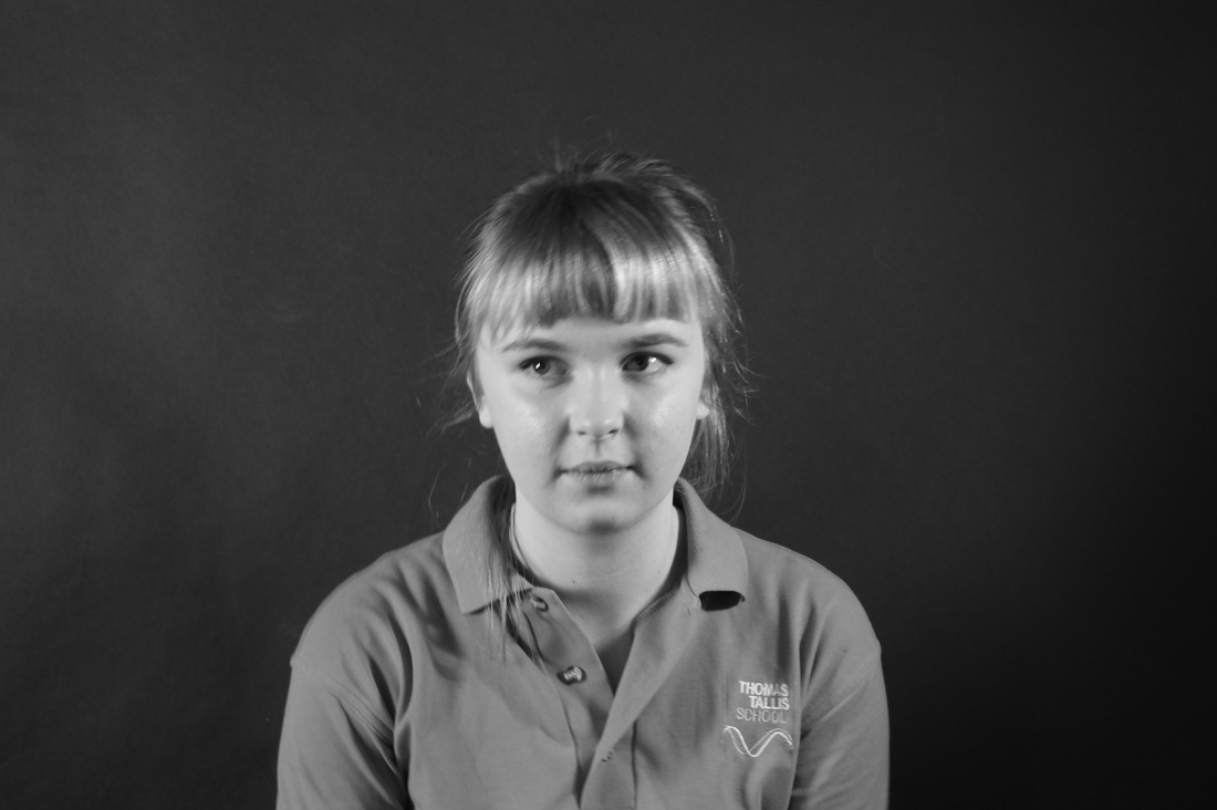
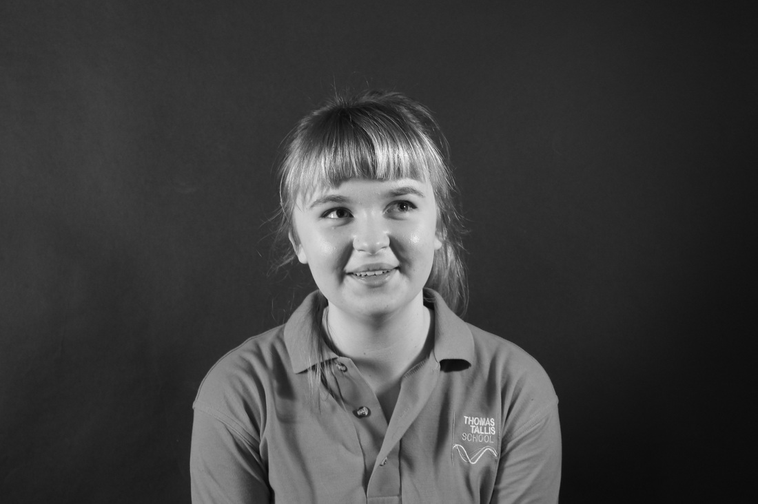
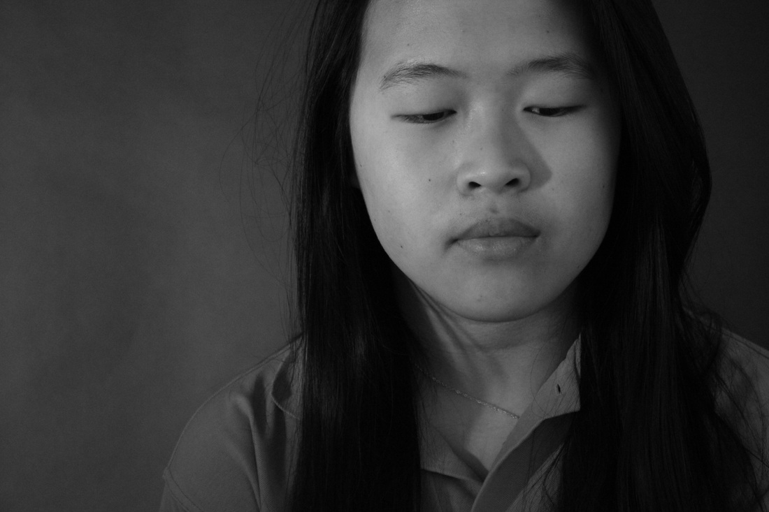
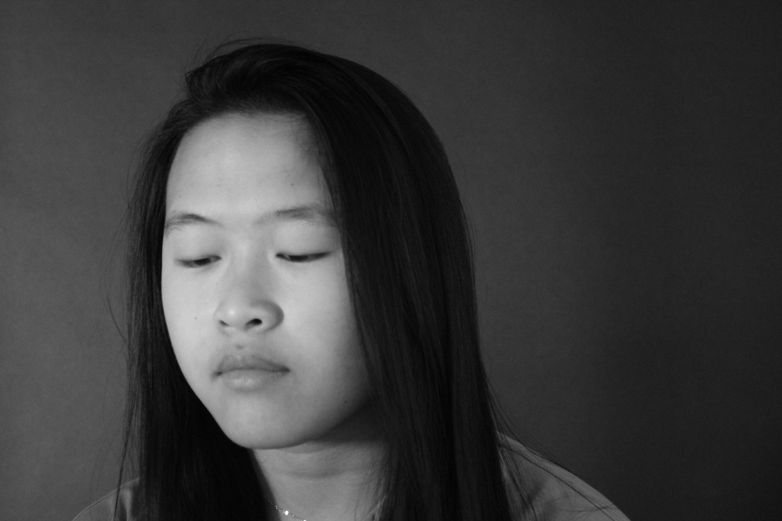
Portraiture images


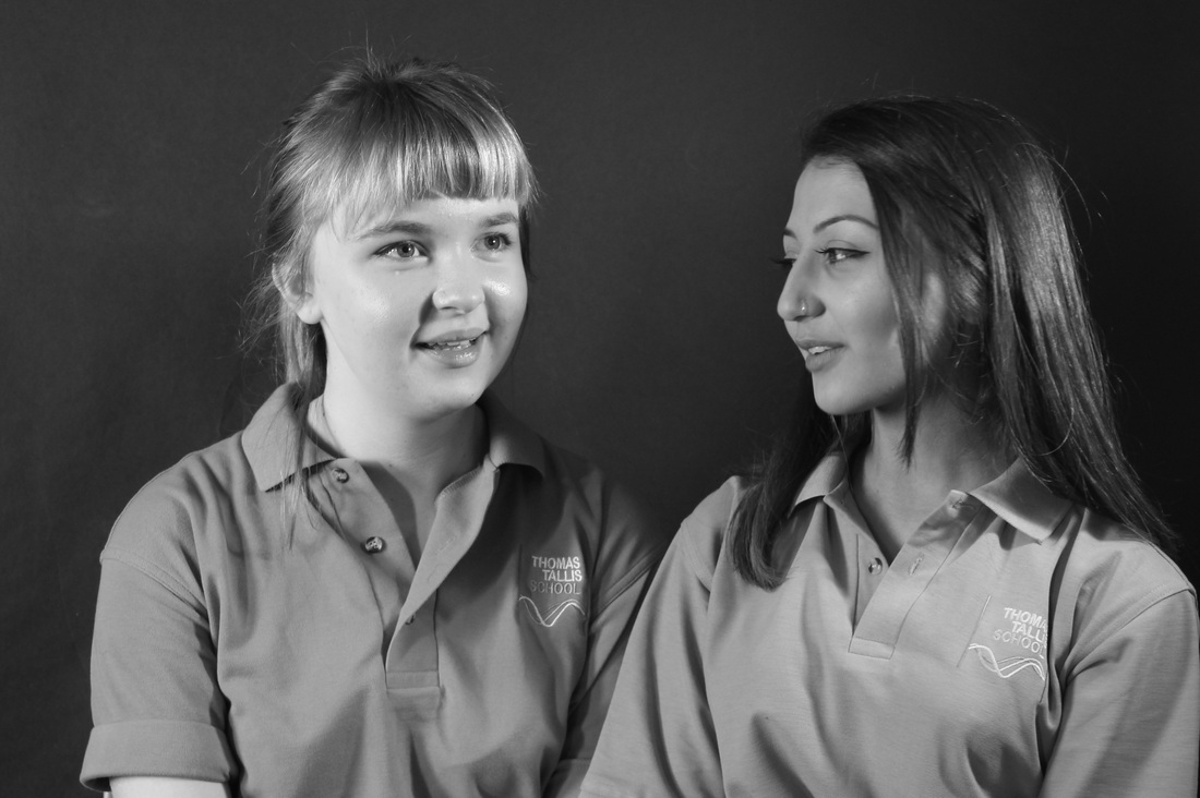

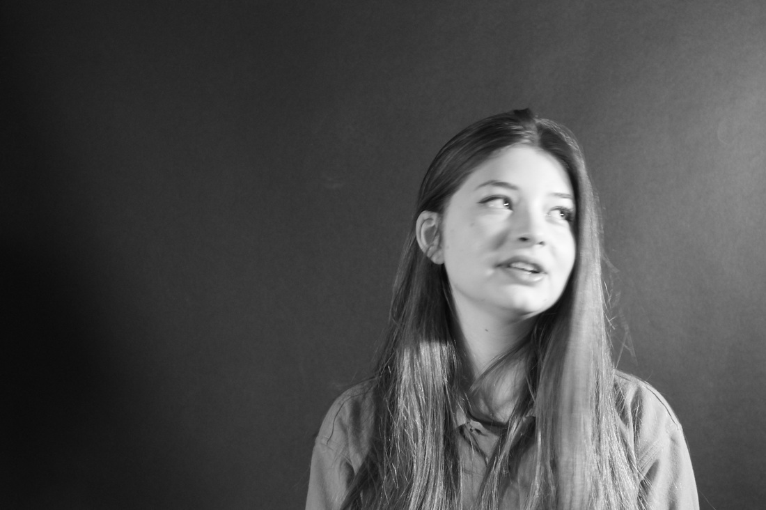
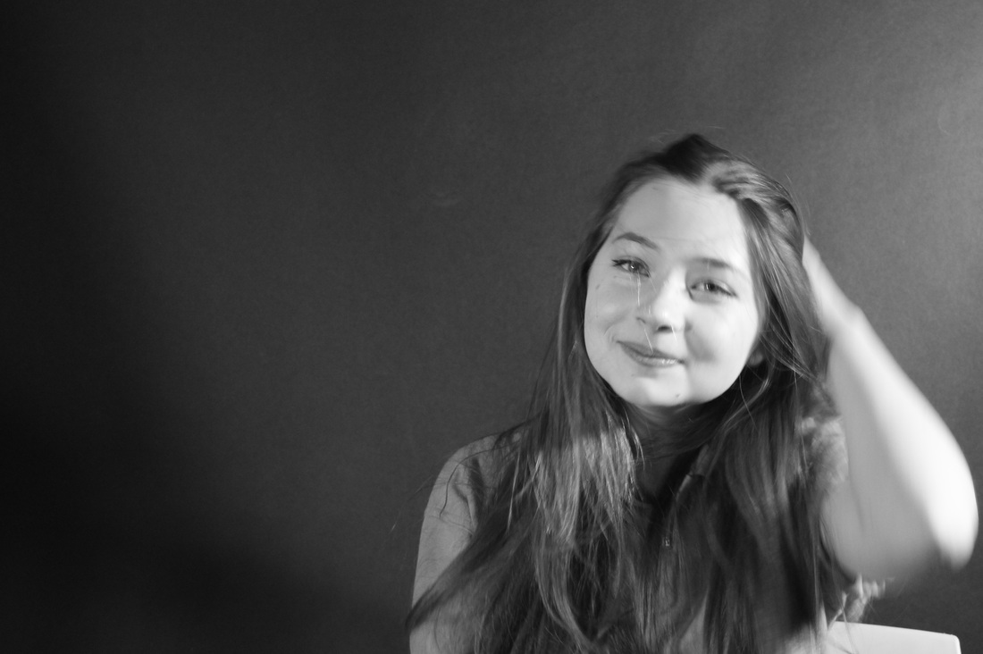
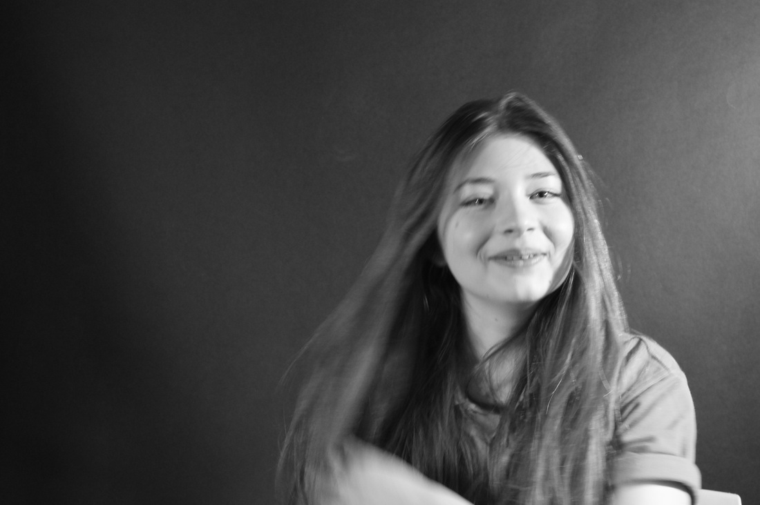
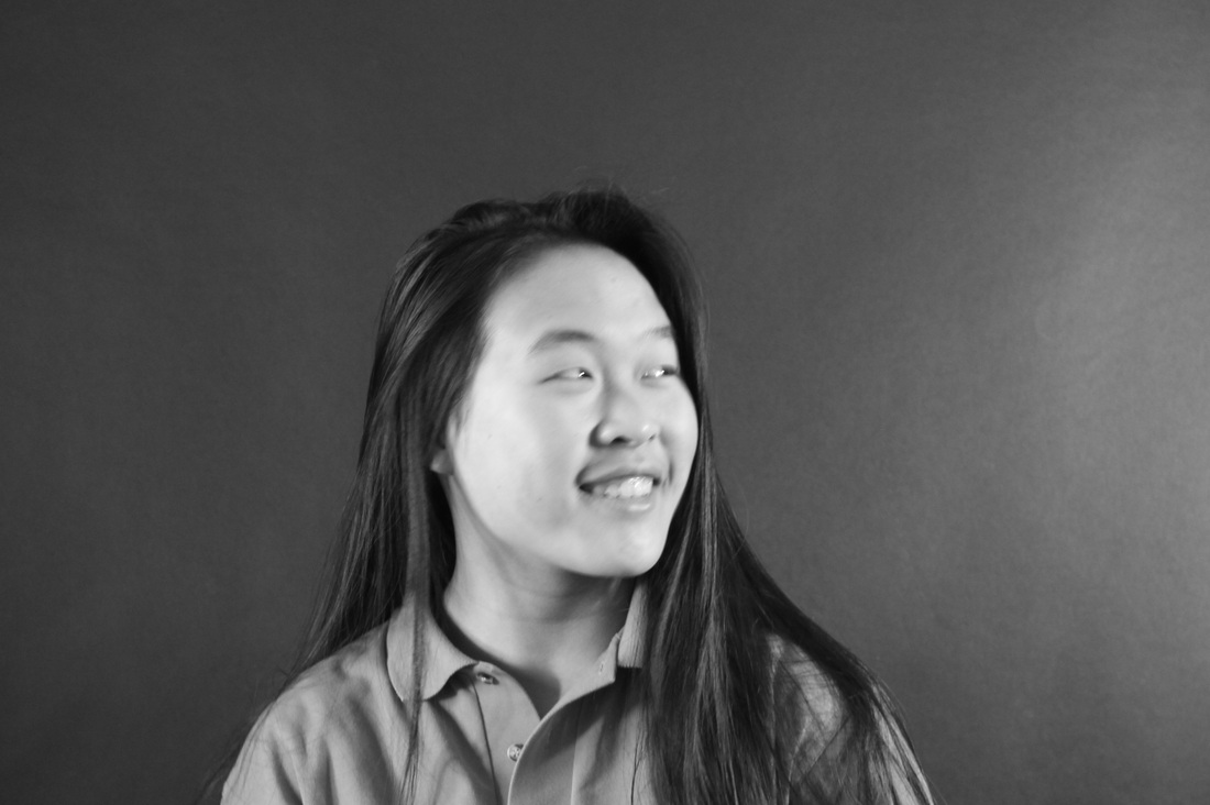
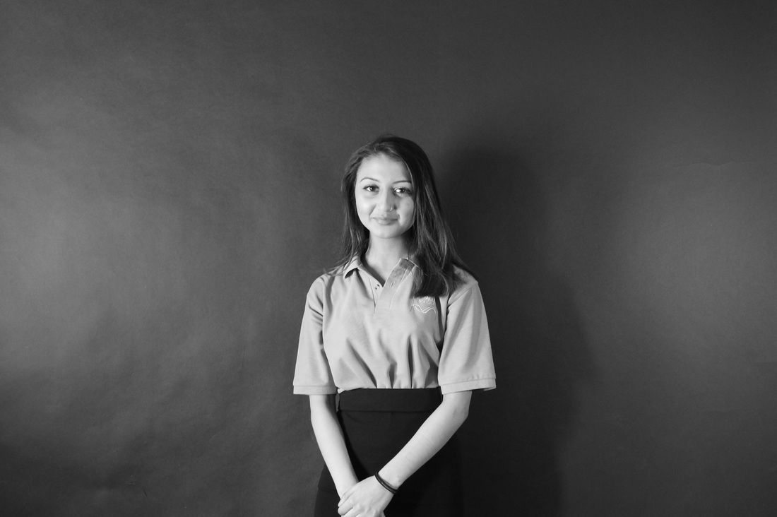
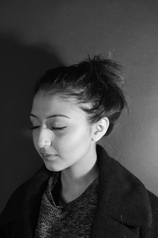

Evaluation-
|
WWW-
After taking these images, i realised that there were some aspects of experimentation which were better than the others. We experimented with different type of shots, for example we did some which were more further away from the model, showing their full upper body; whilst some were really close up, exemplifying the details of the model's face. i think that the close up images were most successful as there it shows distinct dark and light tones; also they were most in focus. During the experimentation process, each person in our group had the opportunity to be the photographer, the model and the person controlling the light. Even though this was my first time actually taking portrait images, i know which things to improve on and have a more in depth understanding of what makes a successful portrait image. |
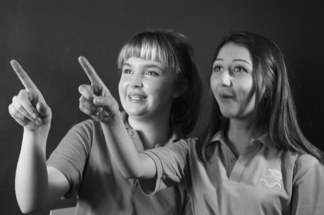
EBI-
As mentioned, this was my first experimentation, and from the images produced, it is clear that there are many aspects which i can improve on. This is especially true for the images which are mid-shot images- the first four rows of images. From them, we can clearly see that the lighting wasn't particularly successful, this is because there are light parts on the backdrop, and it isn't fully dark. Also, is some of them there are shadows, which is not what we intended to have. This may have been due to the positioning of the lighting and also the light which came from around the room as well. To improve, for next time, i can make sure that the room we are in is fully dark and that there are no un-wanted lighting that could disturb the image. In addition, from these images, the close-up ones show the most chiaroscuro, so i could use these images as an inspiration for my next set of images. |
________________________________________________________________________________________________________________________
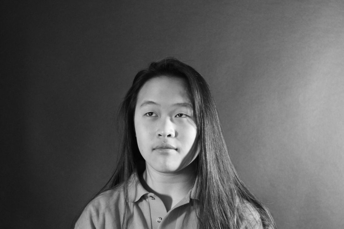
Artist image and analysis
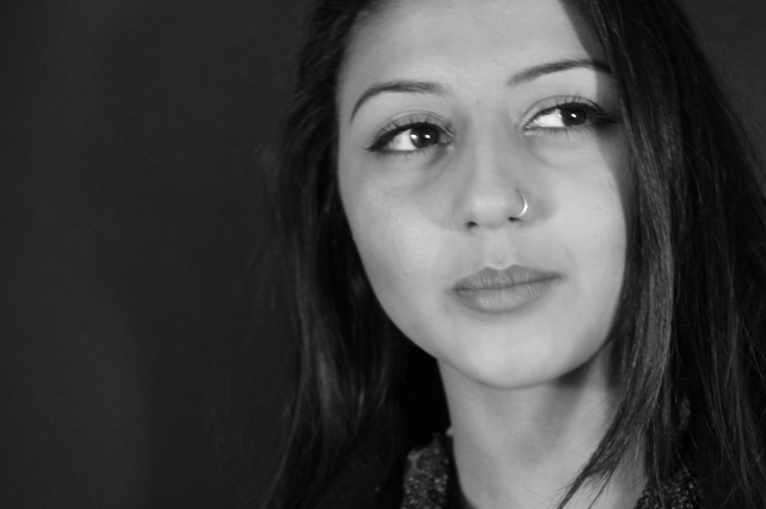
Elliot Erwitt
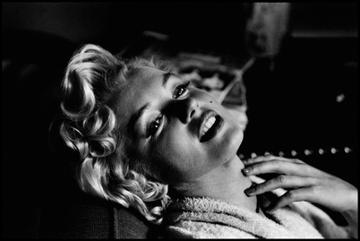
|
After researching and looking through images from Elliot Erwitt, i found this one most intriguing and inspiring. In this image, there is a woman which is striking a prominent pose. In my opinion, i feel like this image clearly represents chiaroscuro. As there is a wide varieties in tones, ranging from the light ones and the more darker black tones. In addition, i think that there has been an artificial light used to create this image, and its not natural light; this is because the lighting isn't spread out within the image but its instead steadily focused mainly on her. The light is shining in front directly at her, which creates the bright, angelic kind of look in her face. The lighting and tones are more significant in her hair, as it is short and its curly, the light almost bounces off it and it also covers some parts. I think that the photographer has used a lighting source and also purely focused on her face (upper part of the body) because it further portrays her beauty and innocence.
|
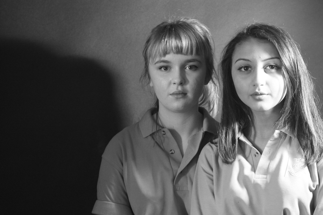
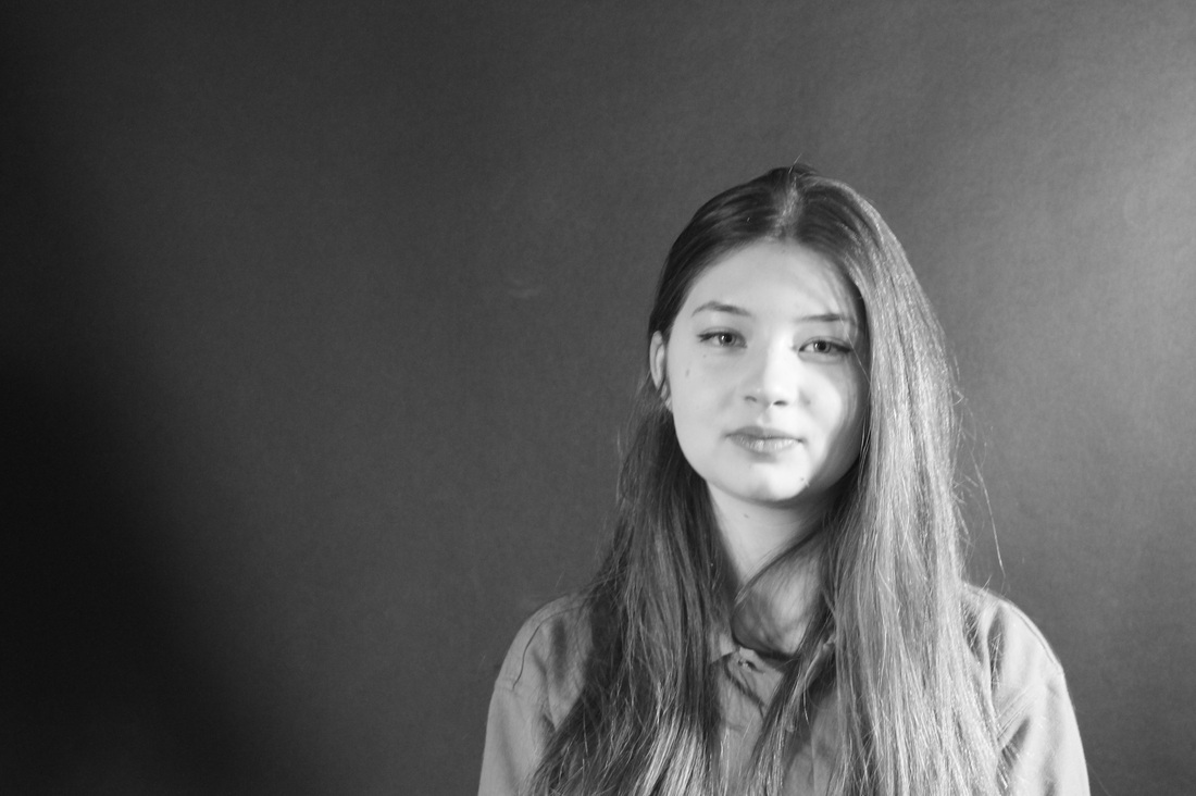
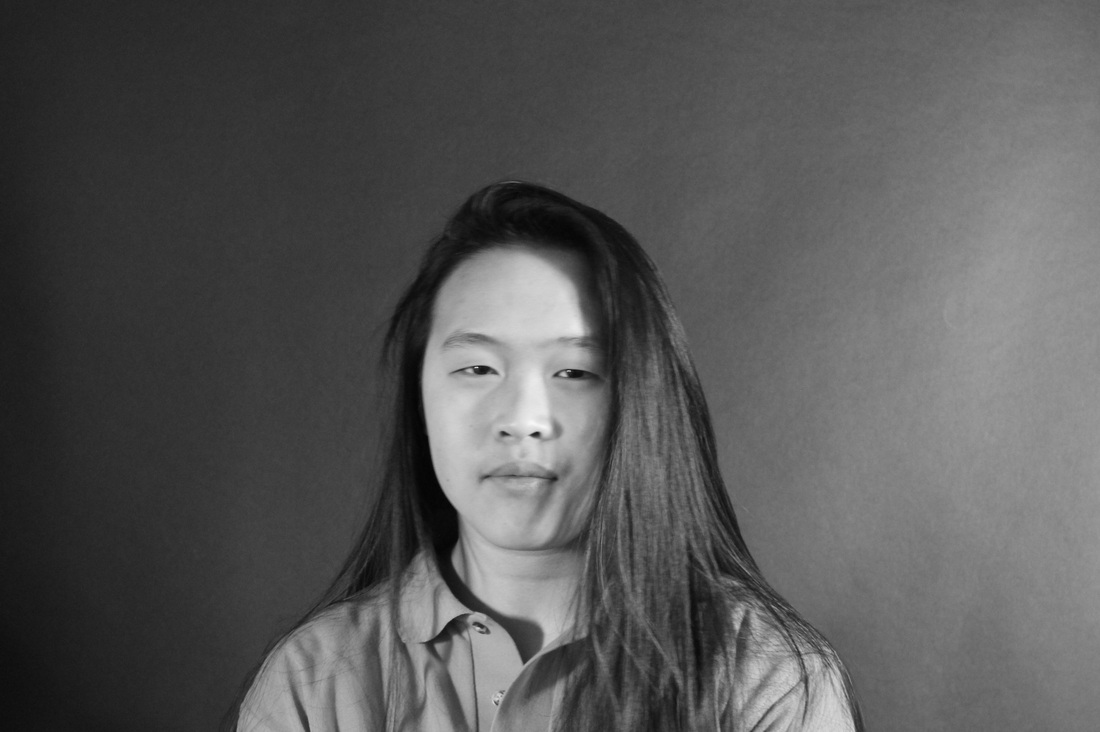
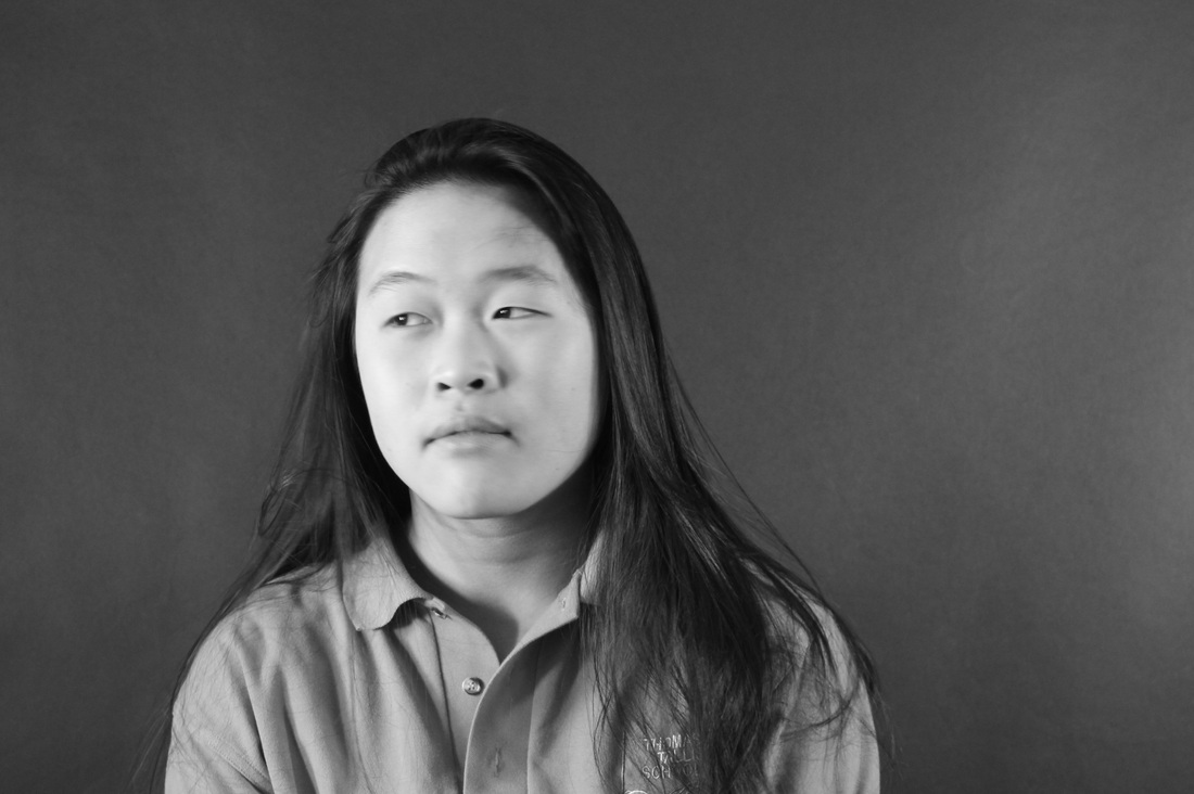
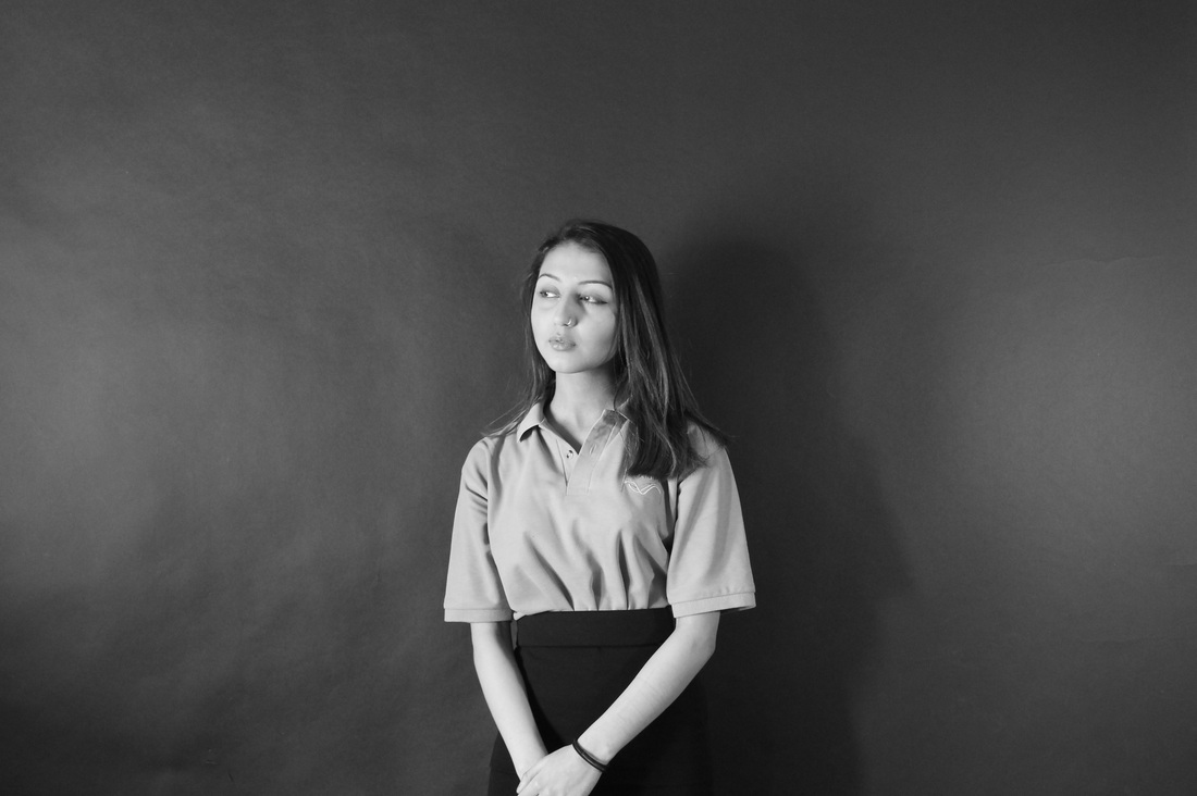
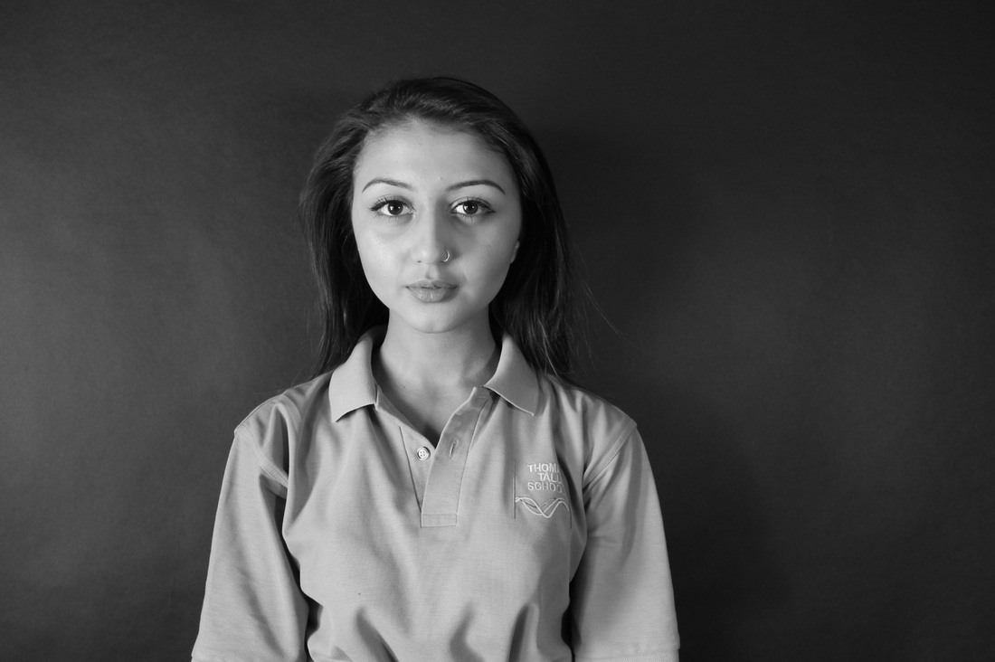
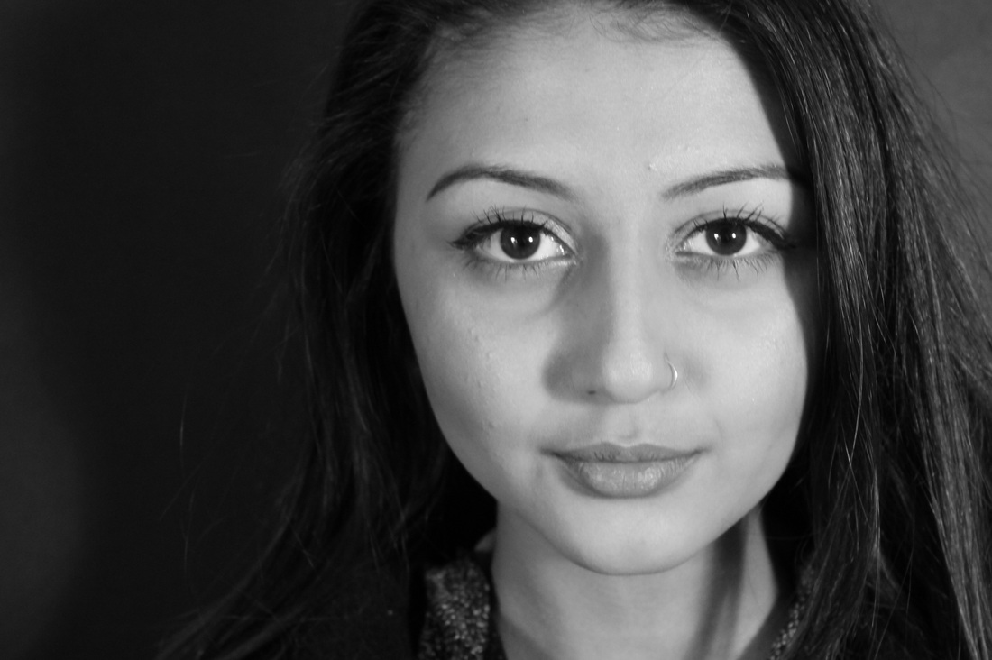
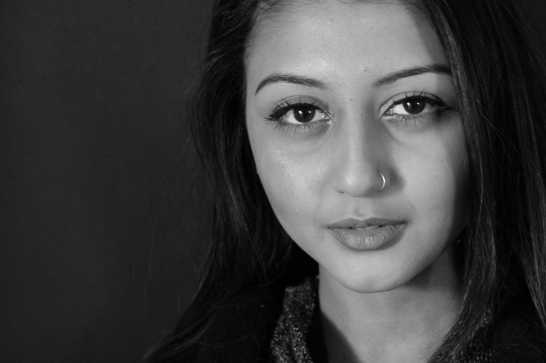
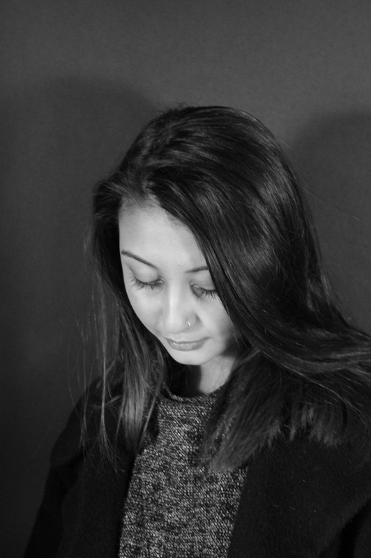
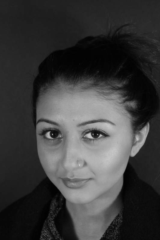
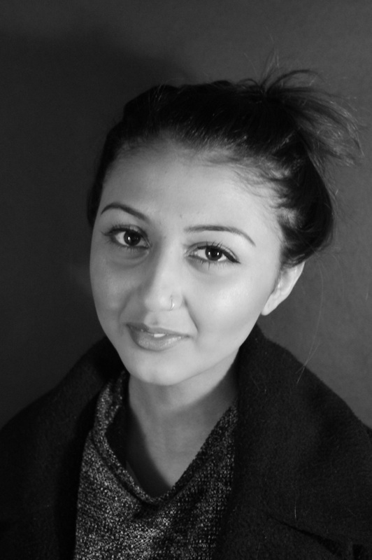
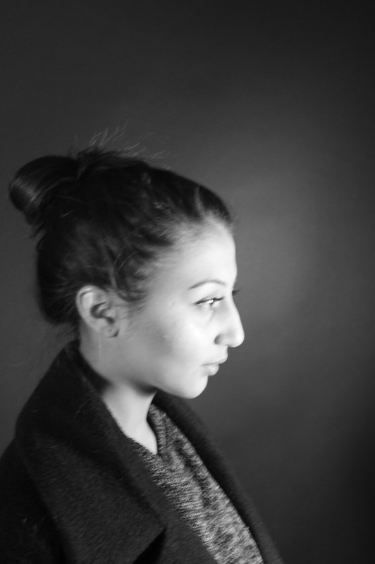
Portraiture images #2
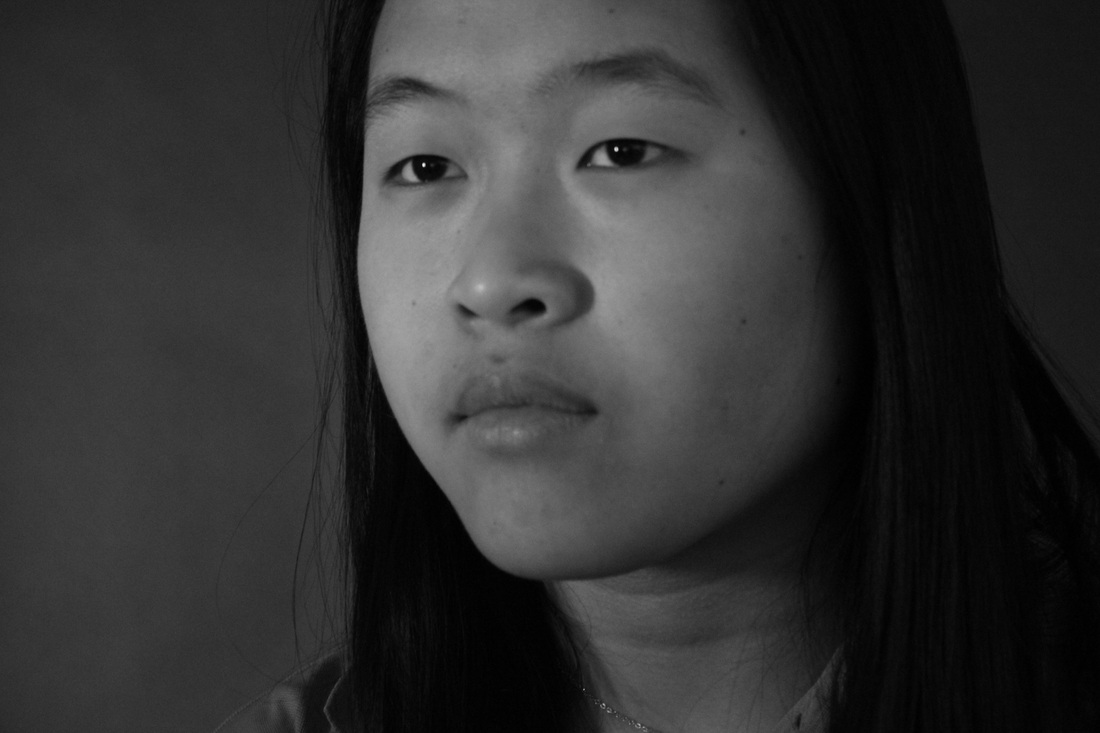
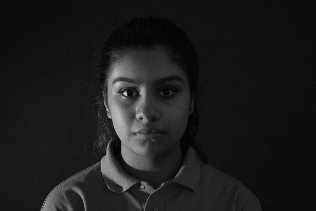


Evaluation
WWW-
These are our images, following on from our previous shoot. From the last shoot we recognized that the successful images were the ones which were closed up, simply just focusing on one person and i think this is evident from this shoot. Though we had lighting issues in the beginning, we ended up fixing it and therefore achieving good images. Another improvement from this shoot include that the background was now plain and no formation of shadows or specks of light. As it is plain, it allows the focus to be directly on the individual and not on the surroundings.
EBI-
For my next set of images which focuses on the human face, instead of having a plain background, i may have some simple elements, however i will make sure that it does not hinder the original meaning of the image to be conveyed. Further, to improve i could also improve the lighting in the image, as some of the images have a really dark tone and the face could be more brighter (last three images).
____________________________________________________________________________________________________________________________
Artist photos and research for further experimentation-
Fay Godwin
|
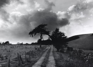
In this image by Fay Goodwin, it captures a plain, desolate, plain land filled with grass and two trees on each side of the road. Like many of the other images which i find intriguing, it shows like a pathway or lane which is leading to the centre, almost like it's leading us into the unknown. However, as its in black and white, and it illustrates the dark and light tones, it makes the image seem more powerful, especially if it's inspired by nature. Further the dark trees place a deep emphasis on it and it blends in with the dark thick clouds. I intend to take images with strong black and white tones, but focussing more on the vast buildings in the city. Nevertheless, i hope to also in my project to focus on nature with texture and tones like Fay godwin.
|
Trent Park
|
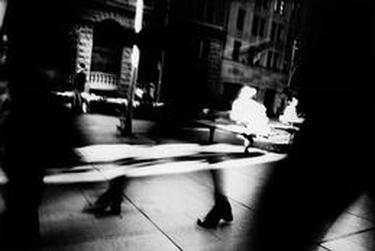
This image by Trent Park captures sophistication and a sense of mystery. Everything within the image seems to be blurred out and rather closed up, allowing the viewer to question to main focus and the purpose. From what we can see, it seems like Trent has captured a moment in a space where a few people are walking passed each other. The blur could suggest a fast movement motion, which may represent the active, swamped atmosphere on the street. In this image, there are also a variety of tones, but more extreme. This is because some elements in the image seem over-exposed which is why they appear pure white, whilst some elements nearer the foreground seem dark and it hasn't received much light. Hence, i feel like there is a bright, natural light shining through the middle of the street which creates that stark, streak of light in the middle of the image. I intend to create similar images to Park, with shadows, line and light to create a similar type of atmosphere in his photos.
|
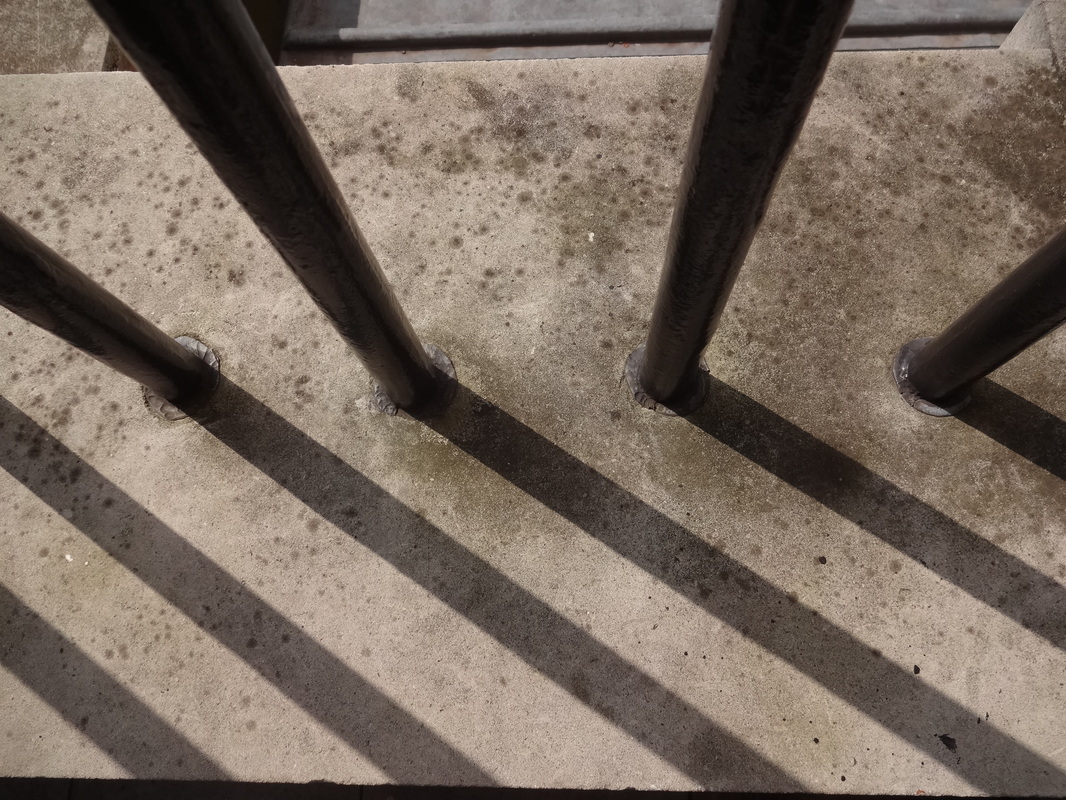
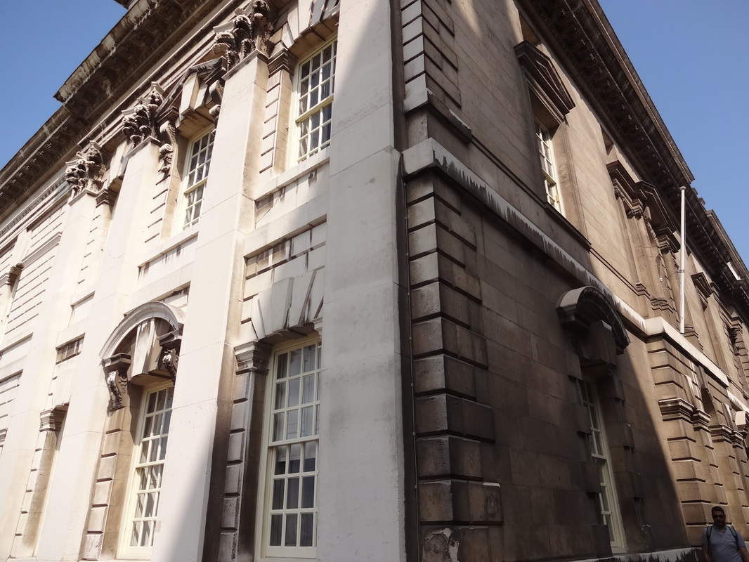
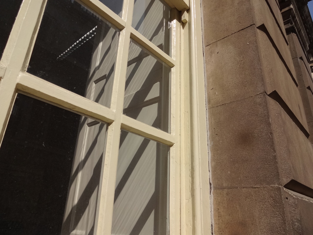
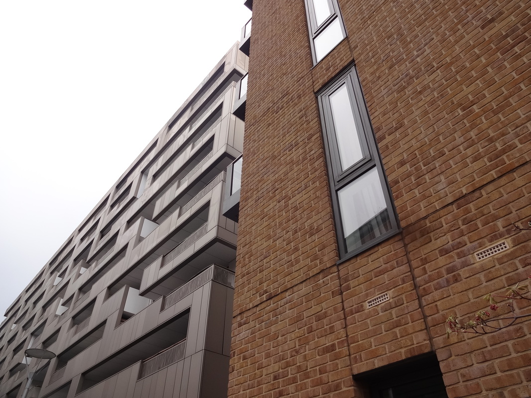
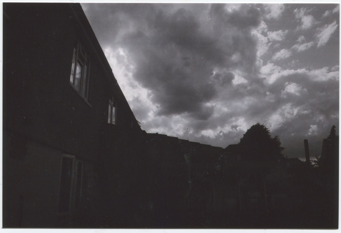
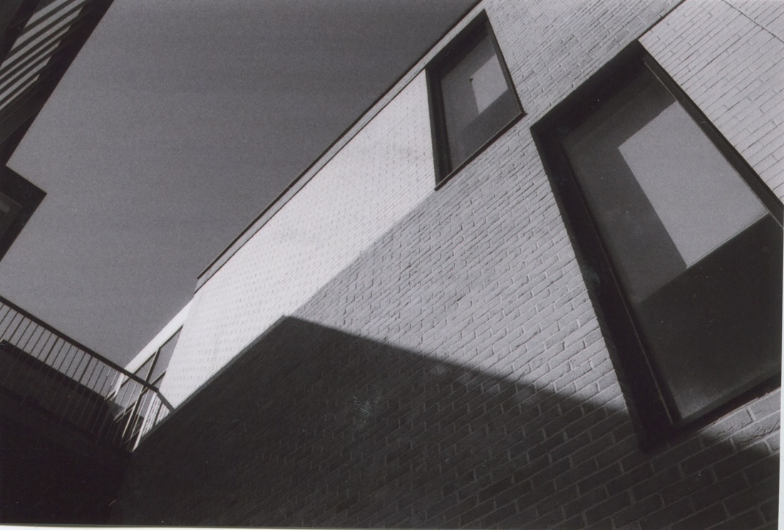
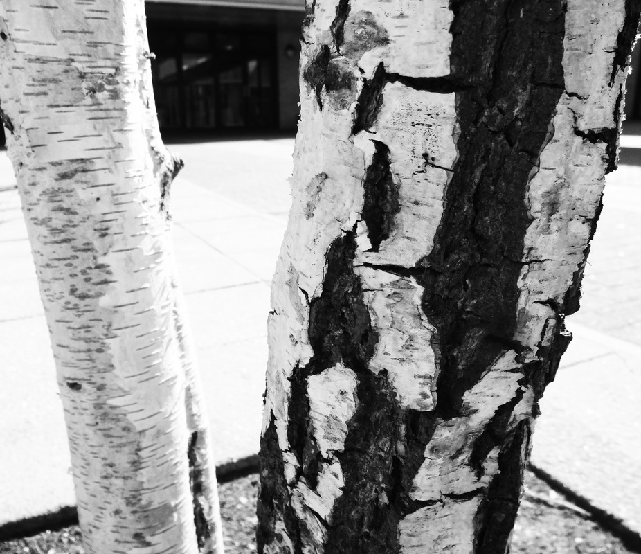
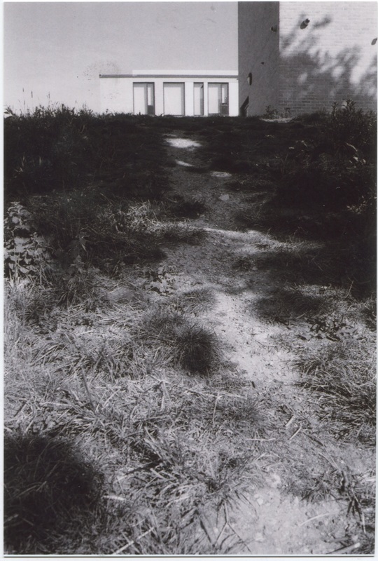
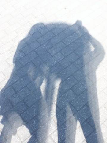
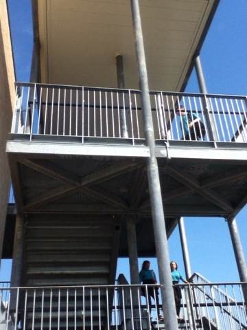
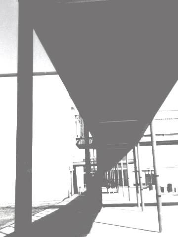
Images focusing on light and dark; (buildings)
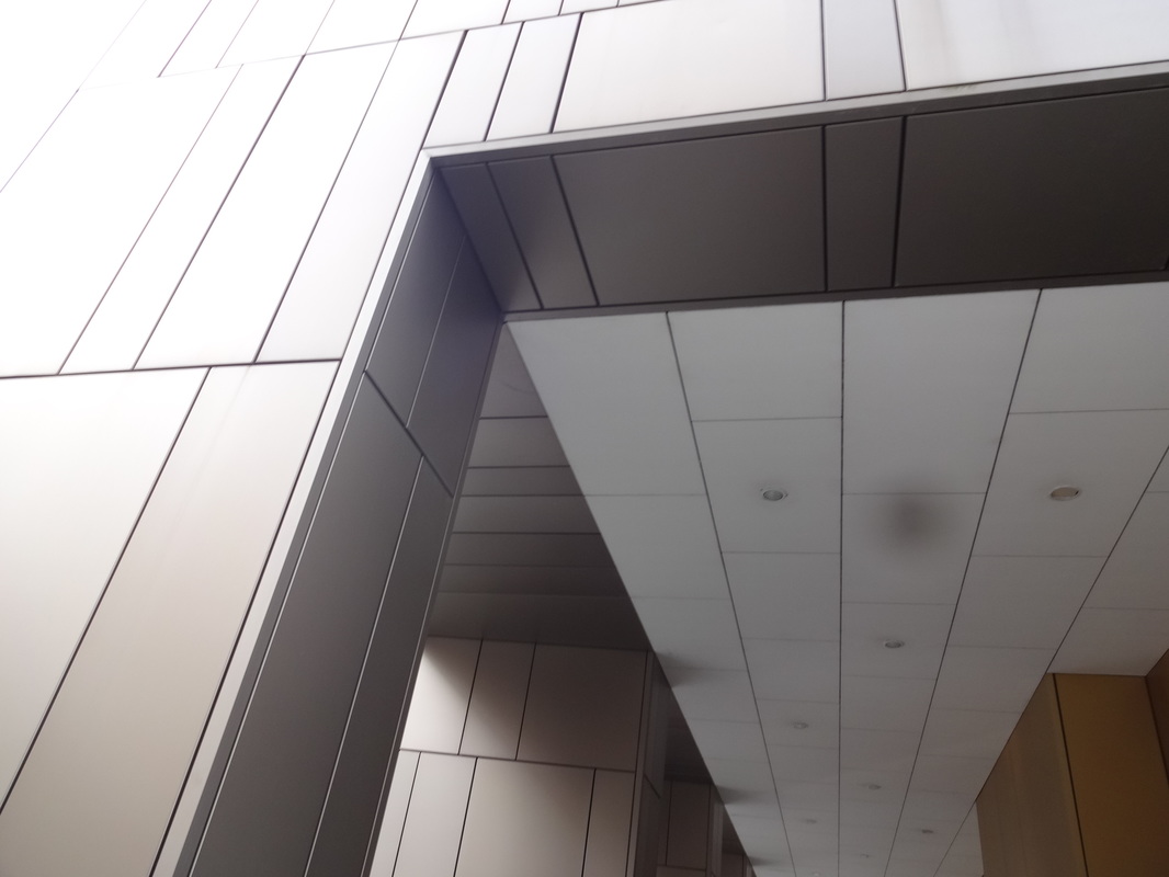
Evaluation-
Our task was to take images based on contrast, especially focusing on light and dark. I decided to focus more on concrete eg. building works, etc. I took these on days which were bright, hence it could create shadows when hitting onto the surface.
|
WWW;
One of our main objectives was to focus on composition within the photo. In addition, looking at my results i think this has proven successful. When taking my images, i carefully thought about my position, angle, and framing. One of the things i tried to achieve was to make the element within the image central and bold, not leaving any negative areas, which may have been unnecessary. Furthermore, along the lines of composition etc, as most of my images were based upon buildings, i tried to make the lines and angles straight and precise; allowing the image to further seem bold, and convey the juxtaposition between the light and dark. In my opinion, the formal elements which i conveyed in this set of images include: line, tone, shape and composition. |
EBI;
Though these images seem successful for me, there are still ways in which i could develop it and make it more interesting. One of my ideas include, converting some of my images into black and white, to make the tones in the image more sharper and stronger. Further, i could crop certain sections of the image, allowing it to be more precise. Nevertheless, next time, if i were to take more images following on from this theme of chiaroscuro, i may experiment with natural light, but rather on buildings, it would be more designated towards people and their movements. This way my images will seem more softer and could convey some sort of emotion unlike the building ones. |
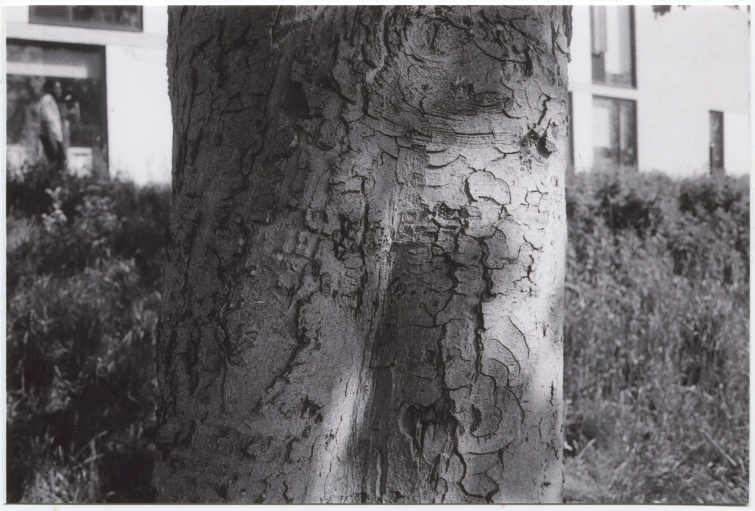
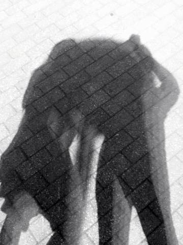
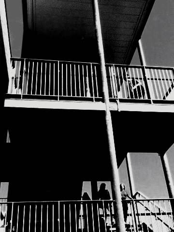
3 successful images converted into black and white and further refined.
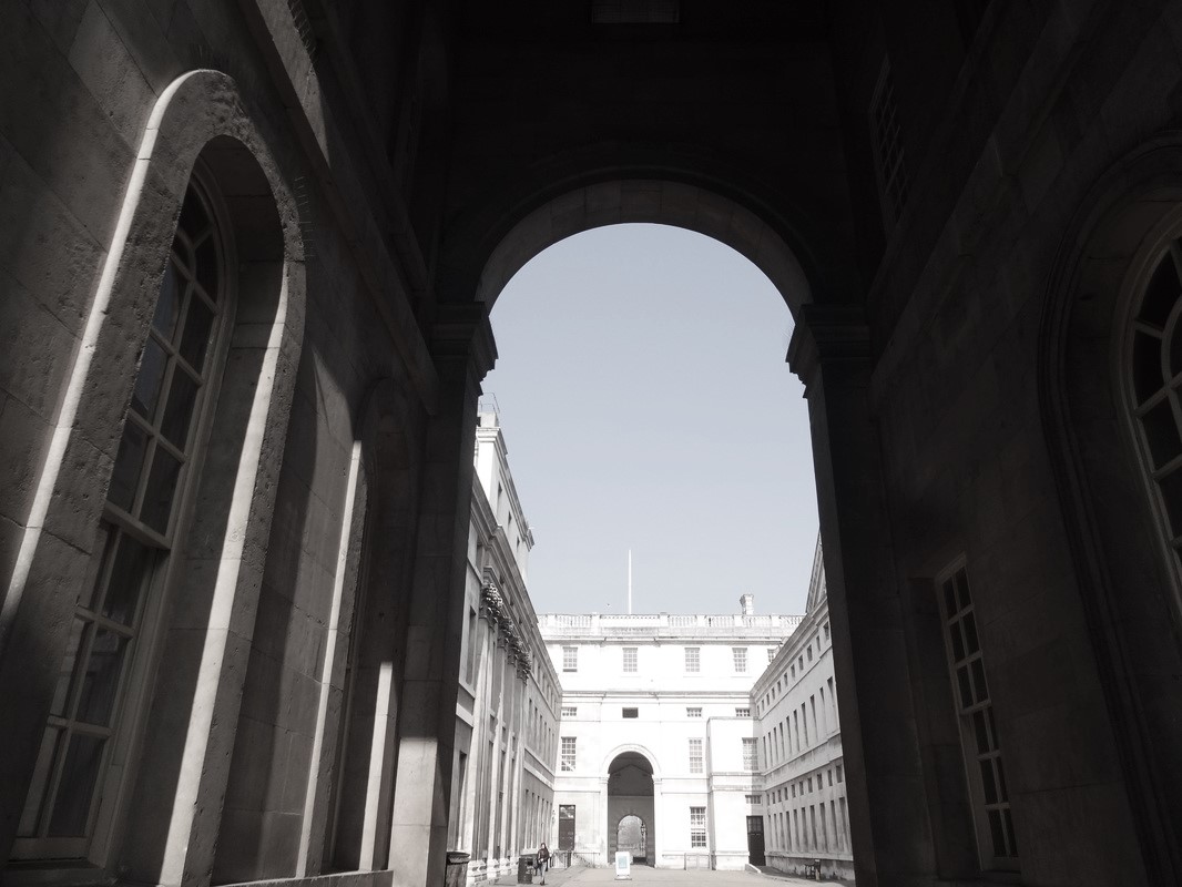
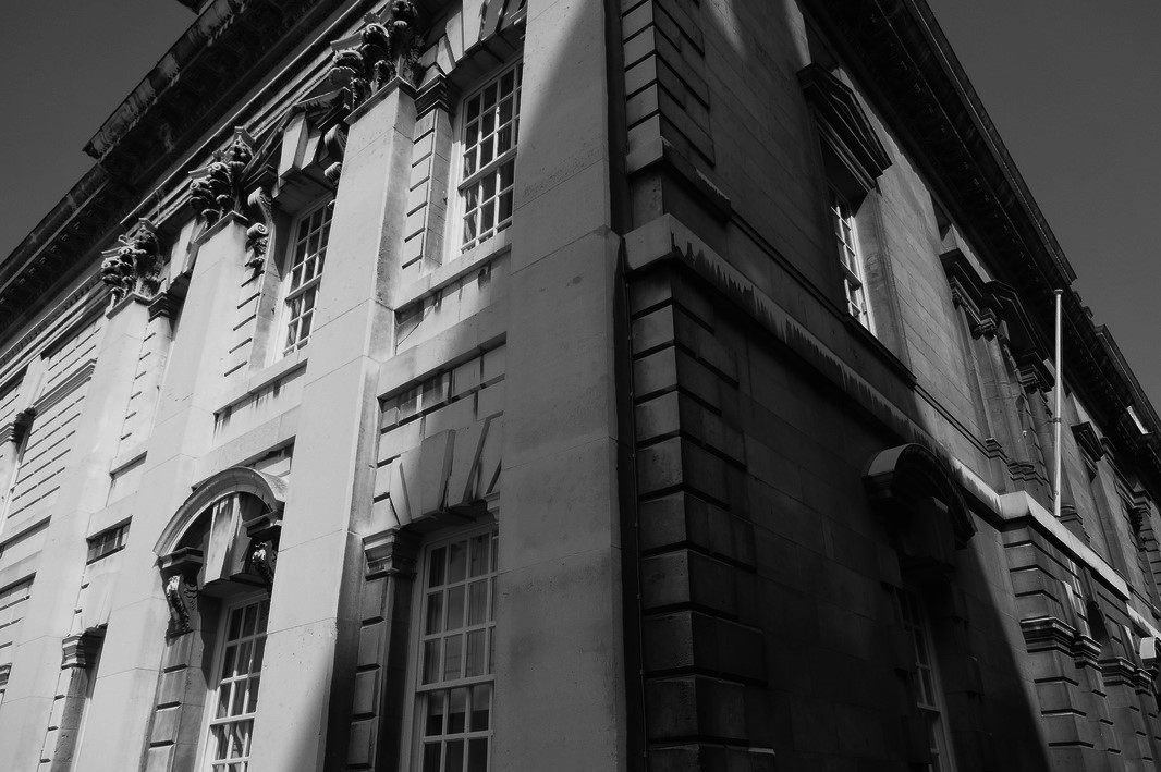
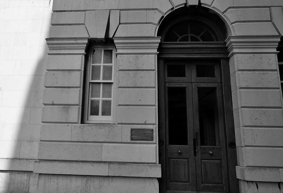
Evaluation- |
Overall, I found the final adjustments to these photos very successful, i especially like the geometric shapes and the lines. Also, by adjusting the contrast and the saturation it created intriguing tones. The tones were my main focus for this series of photos, hence it relates to the project of contrast since there is a wide difference in tones within the image. I really like these 3 images as a series, as it explores buildings and big openings. However, i do want to experiment more with tones and buildings, but instead of using a digital camera, i intend to use a film camera, to create some black and white film. Nevertheless, before i take this step, i am going to research an artist that produces similar works to the ones i have- Lewis Balts. I hope by analysing some of his images, i will receive inspiration to take more interesting images.
|
Artist Research: LEWIS BALTZ
|
|
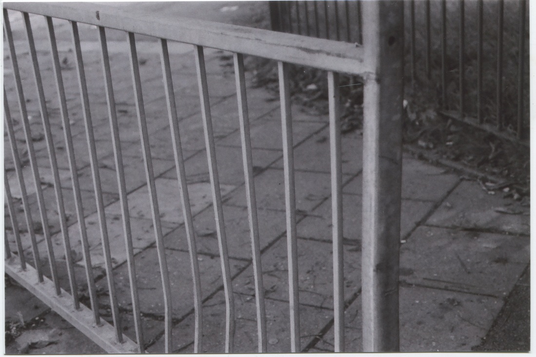
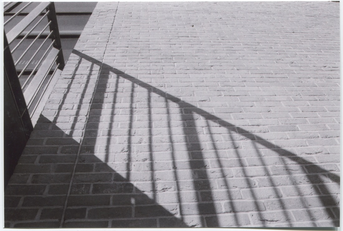
Lewis Baltz born in California 1945, is an american visual artist and photographer. Baltz graduated with a BA in Fine Arts from San Francisco Art Institute in 1969 and has a Master of Fine Arts degree from Claremont Graduate School. Many photos of suburban realities were captured and a lot of Baltz's images are of the human landscapes, parking lots and factories They provoke a very minimal simplicity in style, yet the use of black and white very much shows a strong connection of the theme of 'contrast'. His work is often displayed in a tidy and almost grid format with geometrical and straight lines and fairly two-tone or simply black and white which adds to the starkness of his work. Though Baltz's work is very refined, precise and minimal, I feel that sometimes the actual meaning behind the pictures is often obscured and generally non-existent. This simplicity allows the image to seem aesthetically pleasing, with all the elements being arranged neatly with sharp lines. I am very much inspired by his work and think the contrast of the absolute white tones next to the black works well and his minimal style can be effective even without attention to light. What makes Baltz's work of high quality and skilled, is his close attention to focus, line and space. Like Baltz's i hope to create images of the similar style focusing on precision, simplicity and being minimal; whilst still reflecting the theme of contrast. |
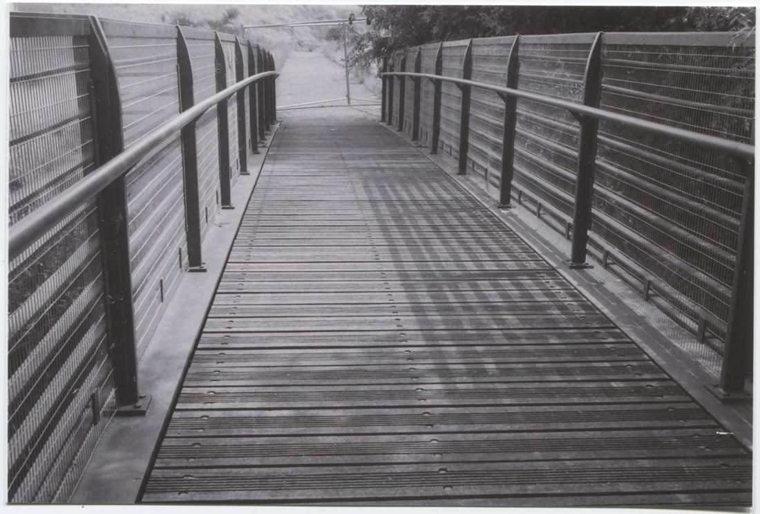
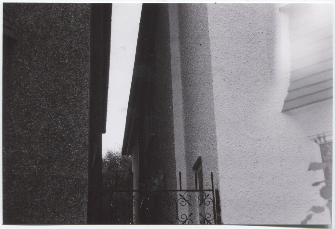
Inspired Baltz's Photos- (Using Film)
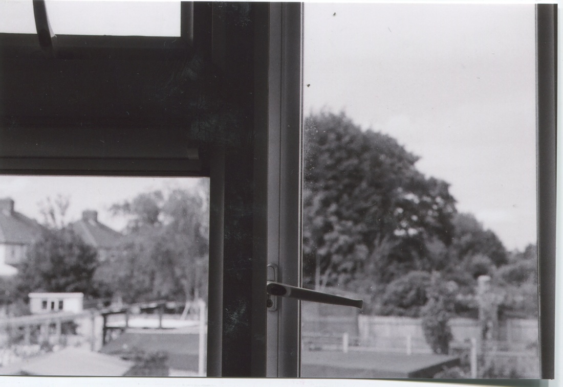
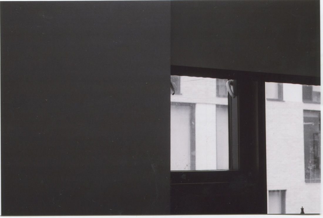
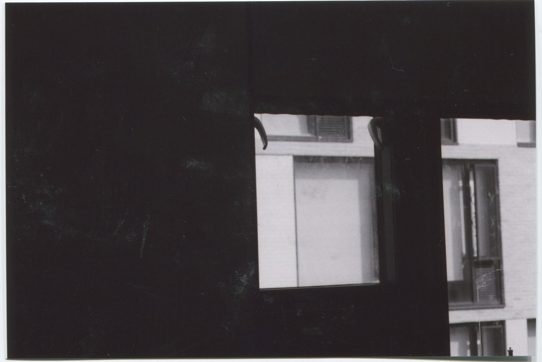


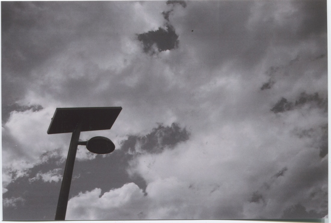
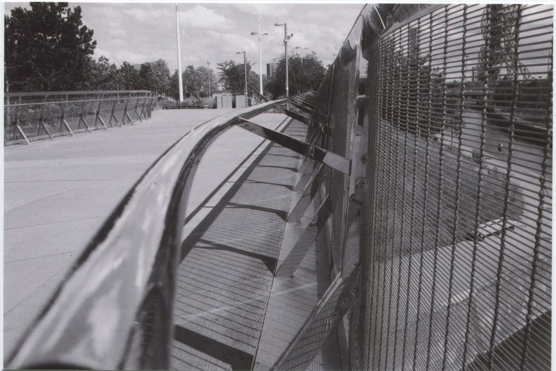
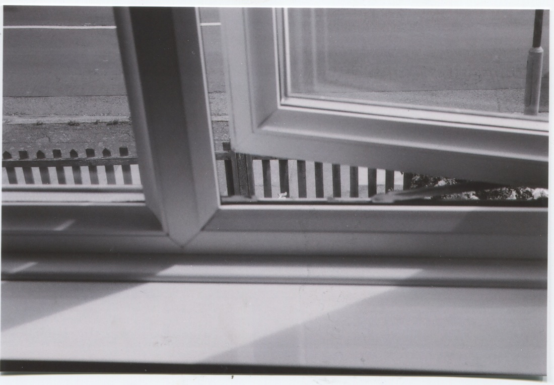
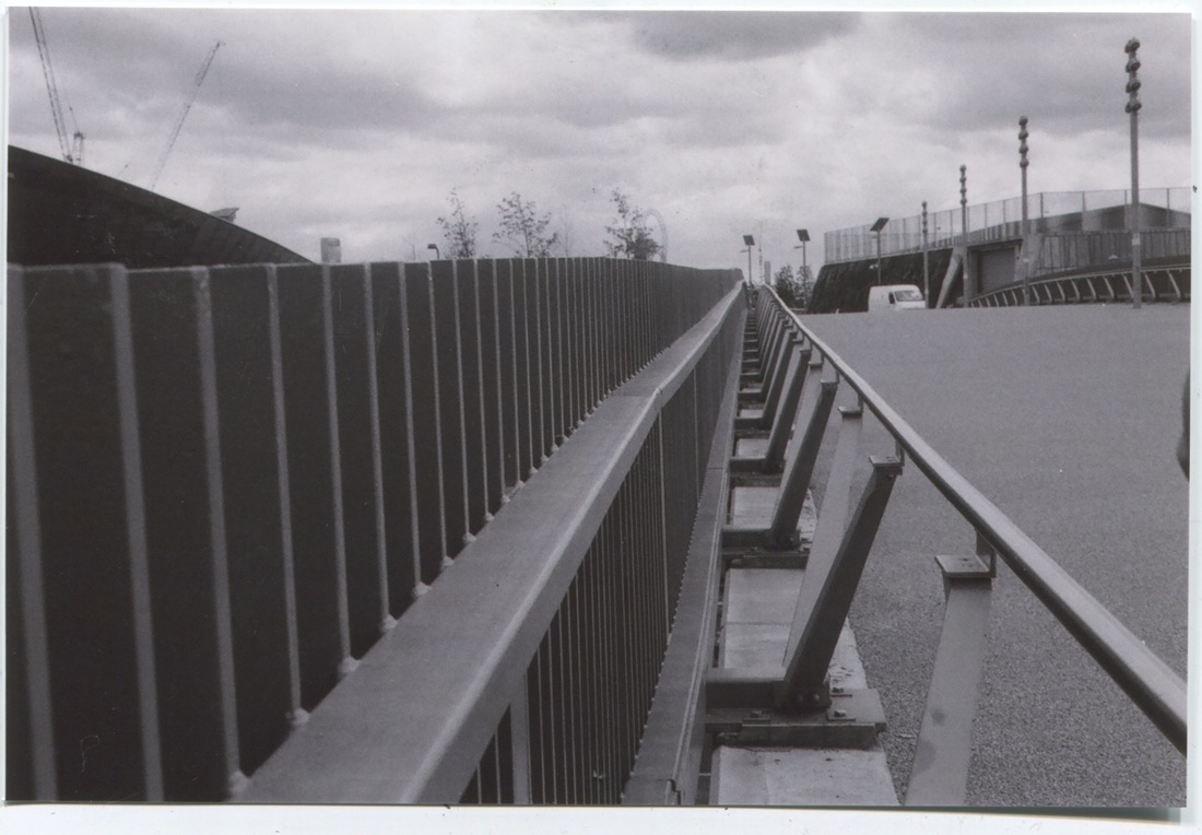


Evaluation
|
WWW-
Overall, i really enjoyed working with a film camera since it was my first time experimenting with one, i used a black and white film, so there so has been no editing so far on the images above. I simply got them developed in a store, and scanned them in into the computer. I like how the camera has made the images seem much more vintage, with the tones being more grey instead of the classic strong black and white tones. I particularly focused on lines and angles in these images, to capture the most within the image. I was also inspired by the artist Lewis Baltz's when taking these images, so i also focused on simplicity and precision. Like Baltz's I experimented with buildings and their sharp edges and interesting architectures. Hence, another thing which i find particularly good about these images, is the shapes, geometrical ones. |
EBI-
Though, i view this set of images as a success, there are also ways i can still image in the future if i were to capture these again. I hope to be able to take images of the similar style more close up; but in some of these it seems rather busy full of lines, so maybe i could take some others which are more simple. Nevertheless, I am going to choose a few from this selection to see what they would look like together, and if they look decent, I may consider it as one of my final pieces. |
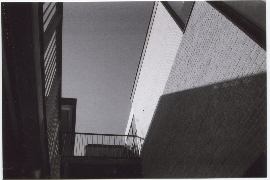
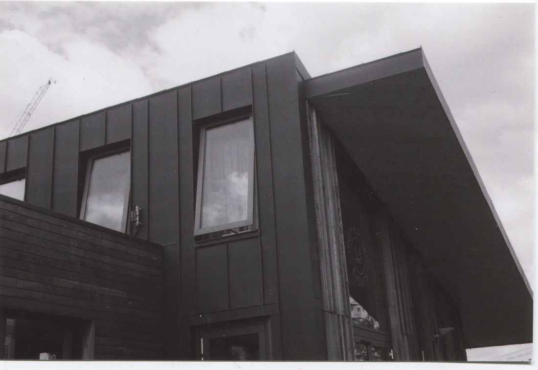
Final 4 successful ones & edited.


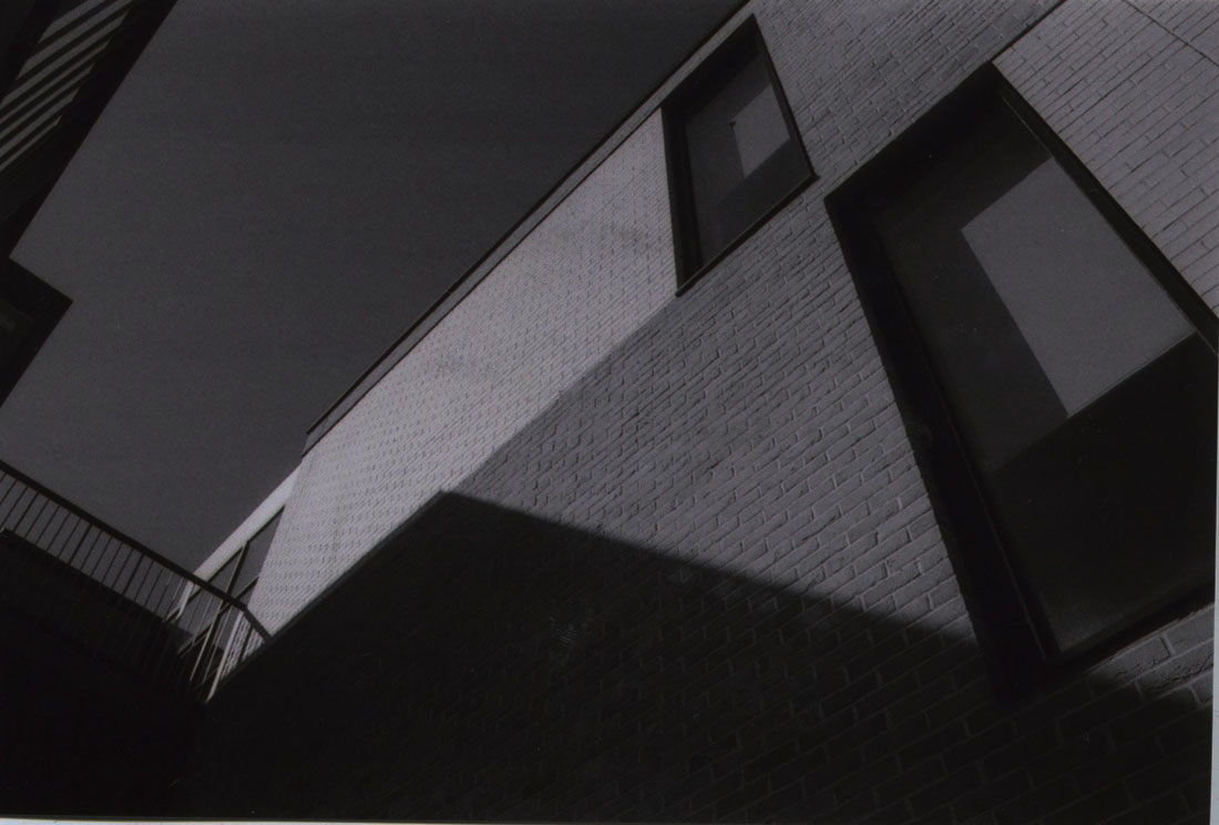

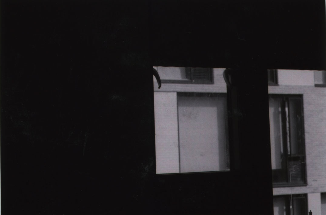
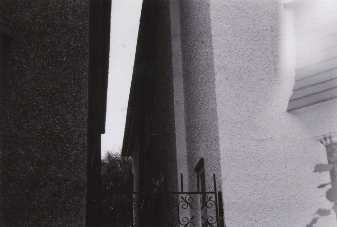
EVALUATION-
Overall, i found this set of 4 most interesting and most related to my theme of contrast. I chose these 4 since I particularly liked the tones and the lines, which create abstract geometrical shapes. They all have very sharp, strong and bold shapes, which results in the image being more accentuated. The use of film to capture these images add to the texture and the tone. In this set of images the formal element of lines is evidently seen, which really adds to the image, making it come alive.
Overall, i found this set of 4 most interesting and most related to my theme of contrast. I chose these 4 since I particularly liked the tones and the lines, which create abstract geometrical shapes. They all have very sharp, strong and bold shapes, which results in the image being more accentuated. The use of film to capture these images add to the texture and the tone. In this set of images the formal element of lines is evidently seen, which really adds to the image, making it come alive.
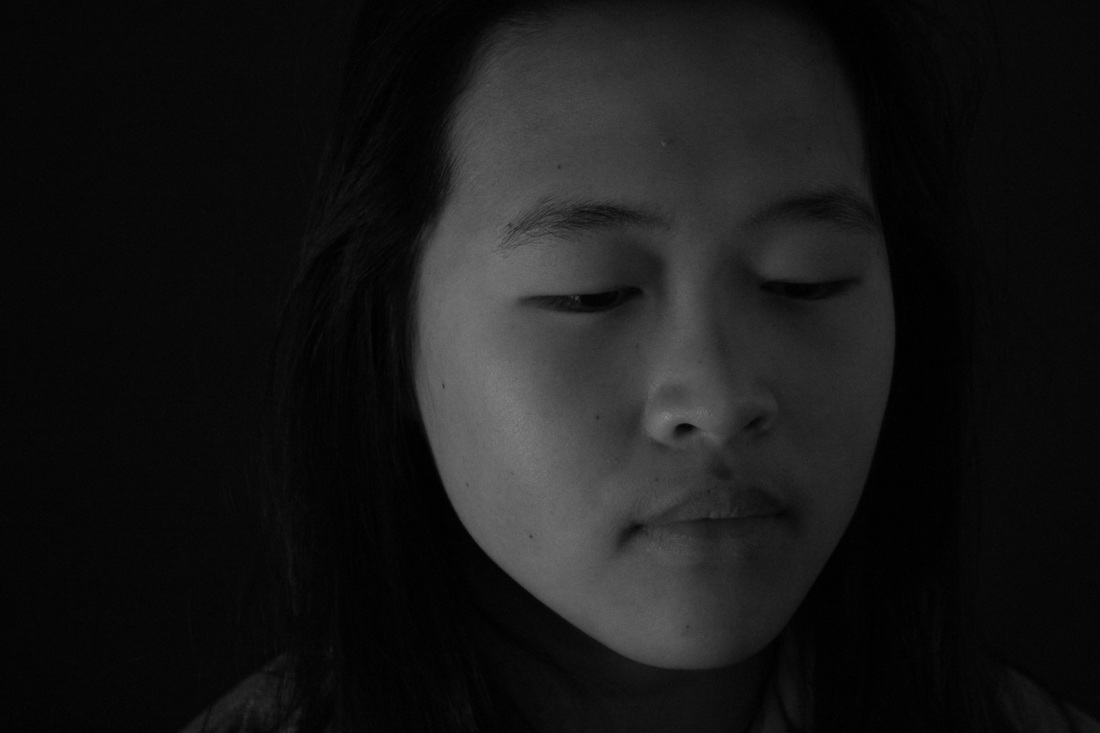
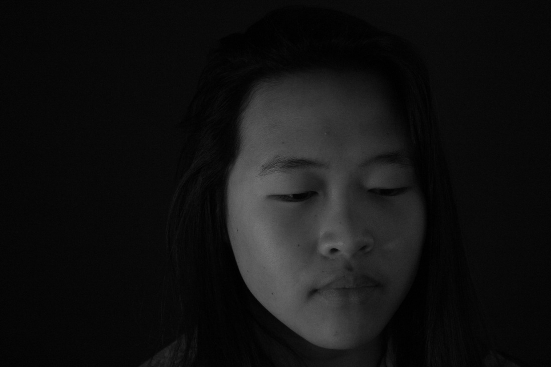
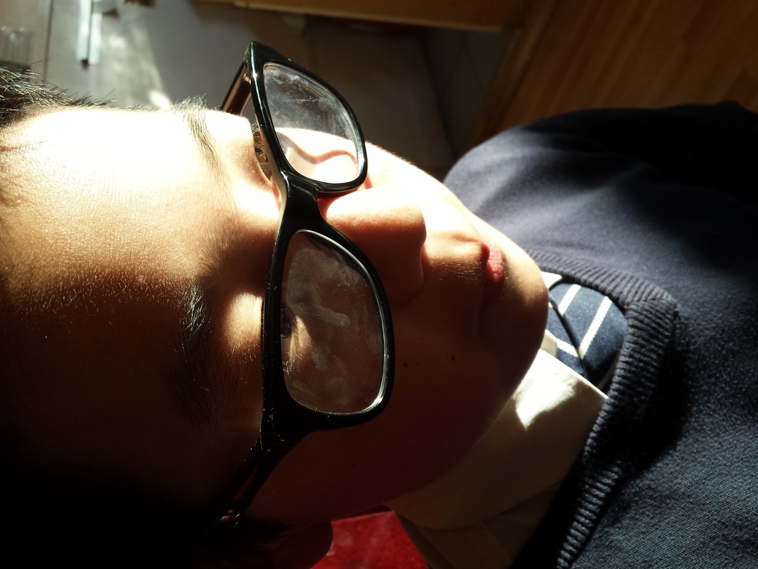
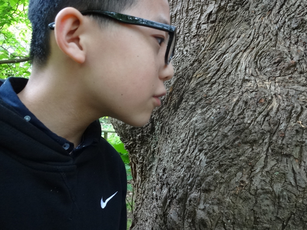
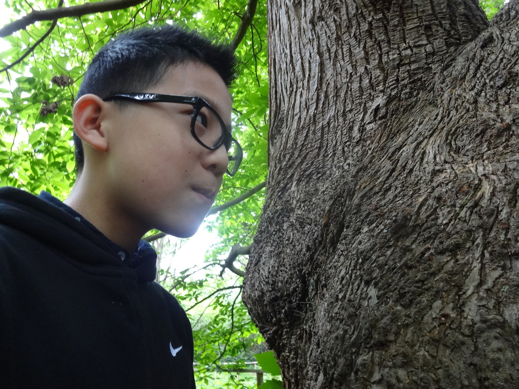
Portraiture images #3 : Natural light focusing on the human face

Evaluation-
- Inspirations- After taking many images around buildings and architecture, i realized that it may be more appropriate to experiment with a different element. Hence, i still wanted to remain capturing shadows and tones, and also use natural and soft lighting. Some of the ideas also came from when i took more chiaroscuro images, so i capture these portraits close up, focusing on detail.
- WWW- I experimented with a different concept and it also came out successfully. After, taking the images, i adjusted some of the settings: contrast, brightness and also converted it into black and white. I think with this contrast project and especially when focusing on portraits and the face, it is much more intriguing in these strong black and white tones; as this conveys a more emotive and strong message. In addition, i positioned myself on the left side of the person, allowing the light to directly hit the face and it covered the right side, leaving the remaining side much darker, which creates the tones.
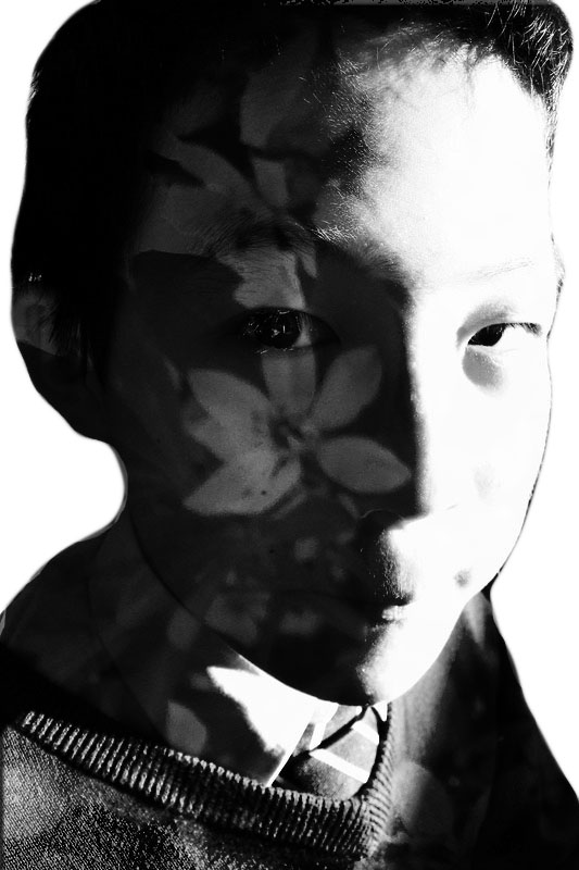
- EBI- As the singular portrait of the face seems quite bold and significant, there isn't much other elements, which may allow the image to seem quite unoriginal. Therefore, to make these images seem less dull but more creative, i may use Photoshop or some other source to create some double exposures with these, using maybe some nature attributes, juxtaposing it between the human and natural aspects. I will find these inspirations from Pinterest, identifying artists which may have taken on similar ideas.
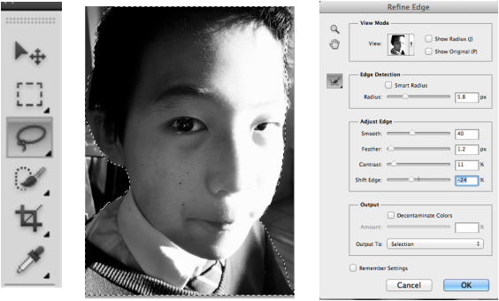
Image edited and refined- (photoshop)
What I did?
As mentioned in my previous proposal, i have used Photoshop to produce a multiple exposure.
1) Once i uploaded the image i used the lasso tool from the side bar, to outline the figure of the head and to leave out the unnecessary background.
2) After this, on the top of Photoshop, i clicked the 'refine edge' icon, which allowed me to refine and make my outline more smoother.
3) This tool automatically made the background white, leaving me with just the face alone. Then, i further adjusted some of the settings on this tool, eg. contrast.

|
|
Updated contrast pinterest board & Popplet page
(Click image for links to page)
________________________________________________________________________________________________________________________________________
Aaron Siskind (1903-1991)
"We look at the world and see what we have learned to believe is there. We have been conditioned to expect.. but, as photographers, we must learn to relax our beliefs."
|
|
Aaron Siskind is an American photographer born in 1903, and most of his career he was best known for being an influential American teacher, editor and also a photographer which is best known for his innovations in abstract photography. Later his abstract photos became well known as it showed his own interpretations and it showed his own state of mind, instead of just capturing the ordinary. In the early 40s he became well known for his close-up images, as he began photographing patterns and textures of such mundane subjects such as coiled ropes, footprints in sand and seaweed. Later, within a few years, he became preoccupied with two-dimensional surfaces such as pavements, billboards, and walls especially those transformed by weathering and decay. However, these themes weren't necessarily popular around this era, hence Siskind's work wasn't immediately accepted by the other photographers. But soon after, some artists became to appreciate his work, and took on some inspirations. Some artists which admired his work include- Willem de Kooning, Franz Kline etc- who were associated with abstract expressionism. Much of Siskind's images resulted from his activities as a founding member of the Society for photographic Education and as a coeditor of Choice, a literacy and photography magazine.
|
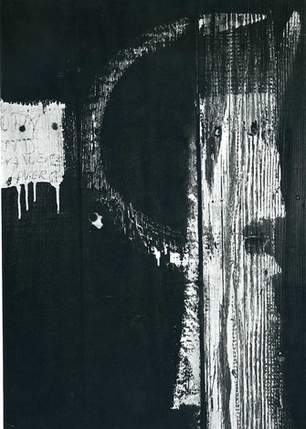
Siskind's image evaluation-
|
In this image photographed by Aaron Siskind, it captures a dilapidated wood wall, with strong enriched black and white tones. The high contrast is shown through the hard sharp lighting, which is directly shone at the right hand side of the wall, creating a intriguing shape. Further, to the left of the image, we can clearly see a square shape of paint which looks to be dripping down. Though this image may come across as rather simple, there are many formal elements displayed such as- lighting, shape, composition, texture, tones etc. I think that Siskind has intentionally framed the image as it is, and carefully though about the elements within the image, since it looks quite thought out due to the straight directions of the lines of the wood which are vertically going down. The concept of lines in this photo is also quite though out as there are curved lines, as well as diagonal, straight and jagged lines. This further contributes to the concept of contrast as it makes the image seem and feel more interesting. Overall I think that this whole image truly emphasizes on contrast and even though it is simple, I can get inspirations to put it into my own work.
Inspirations- I have been inspired by Aaron Siskind to capture images focused on texture and tone, to then apply it into my pieces of work. Though i may not present my final images just as Siskind has, but instead i may apply it to my initial intentions of creating double exposures. Therefore, I will experiment by using these inspired images to overlay it on over the human face. This will emphasize on own theme of contrast since it will show the juxtaposition between human and natural aspects. |
|
Images inspired by Siskind.
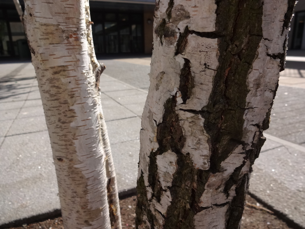
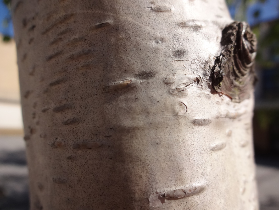
3 successful ones refined-
Evaluation-
|
WWW:
Overall, these images came out really well, as I was inspired by the artist to take images which demonstrate the formal elements of texture, shape and tone. My intentions were to take images of nature, then to convert them into black and white, to emphasise on the strong contrasted black and white tones. Further, the images were mainly close-ups, so the element of texture would be clear and significant. |
EBI-
Overall, though these images were successful in what i intended to do, i hope to further improve them and refine them. I won't leave these as a singular image, but i may use them to include into other images, for example if i experiment with double exposures. Also, to improve next time, i will still focus on close-up nature, but i will ensure that there are less elements within the images and are much simpler. |
Further experimentation (Using Film)
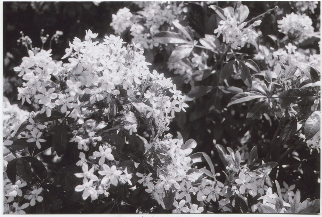
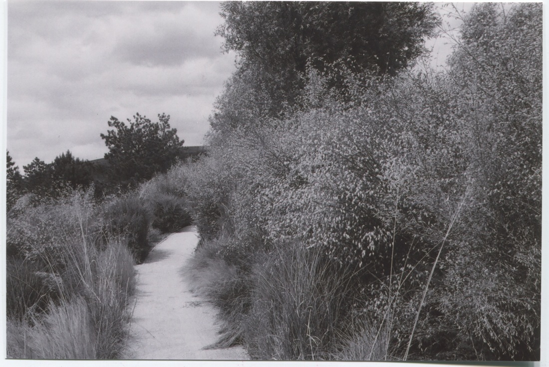
Evaluation-
|
WWW-
As proposed in my previous set of images with evaluations i have gone out to experiment with textures especially with close up nature. I have experimented with also a new source which is film camera, creating much different tones. I really like the outcome of these, as they show a variety of tones in every image, though they only focus on the three tones of black, white and grey. As a result I have also captured shadows in the image, which make the image seem more pleasing, creating depth in the image. |
EBI-
In my next set of images, i hope to focus on shadows and possibly even tones, since it seems like it was successful in this set of photos. Though i like how the images look without being edited in this set, I will take some more images next time with colour, then further refine it to experiment with the contrast. |
Images experimenting with tone using an iPod.
Original Images-

After edited and refined-
Evaluation
|
WWW-
Overall, though I was slightly stuck as to where to carry on, I went out to take images to experiment. I decided to use my iPod and to use an app called 'CameraProFx' where you can capture quick shots with a quick shutter speed. After taking some images i decided that it was best to focus my images on tone as it was a sunny day which helped form shadows. It also resulted in certain parts such as the background to be much brighter and then shaded areas to be more darker creating contrast. Afterwards, I selected three successful images and I used a photo editing app on my iPod called 'PhotoPower' to edit these images. |
EBI-
Though these images came out as an success, there are also some ways where i can improve. Since i took these images using my iPod, the quality of them isn't that great; also it would've been better to rather than select a black and white filter, to adjust the contrast, lighting and saturation myself instead. By doing this it'll also emphasise on the tones within the image, whereas as seen in my edited images the tones seem rather equal without variations. |
_________________________________________________________________________________________________________________
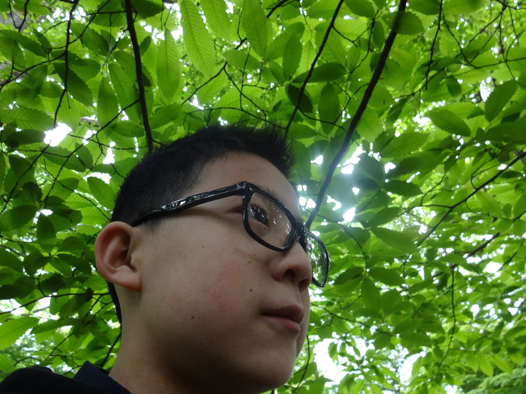
Portraiture images #4 : Natural light with nature features as background
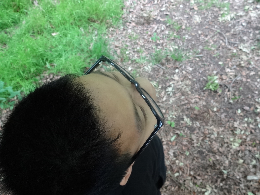
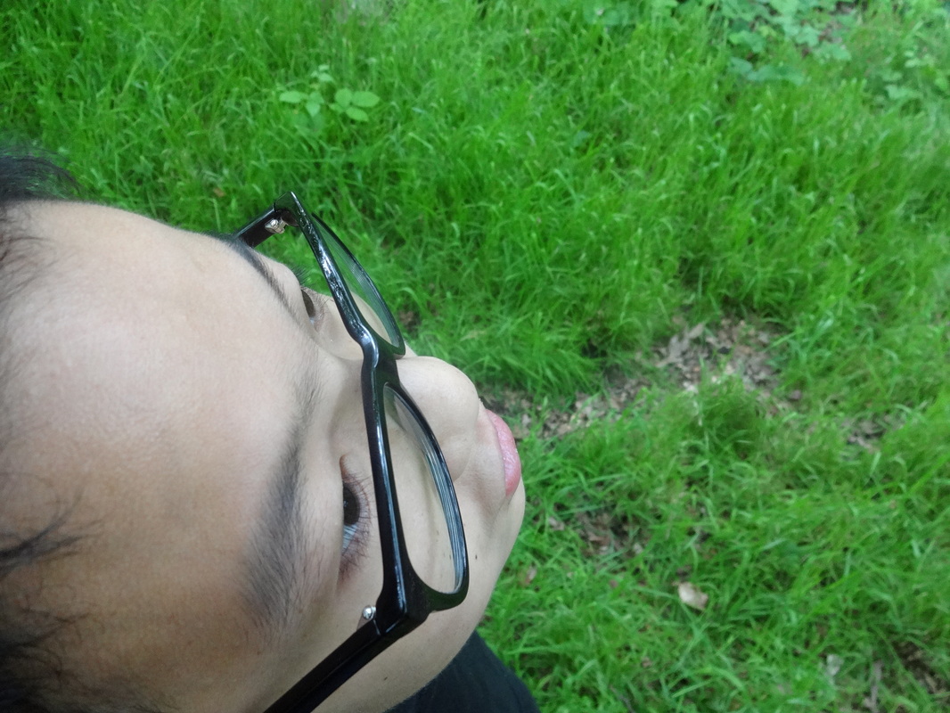
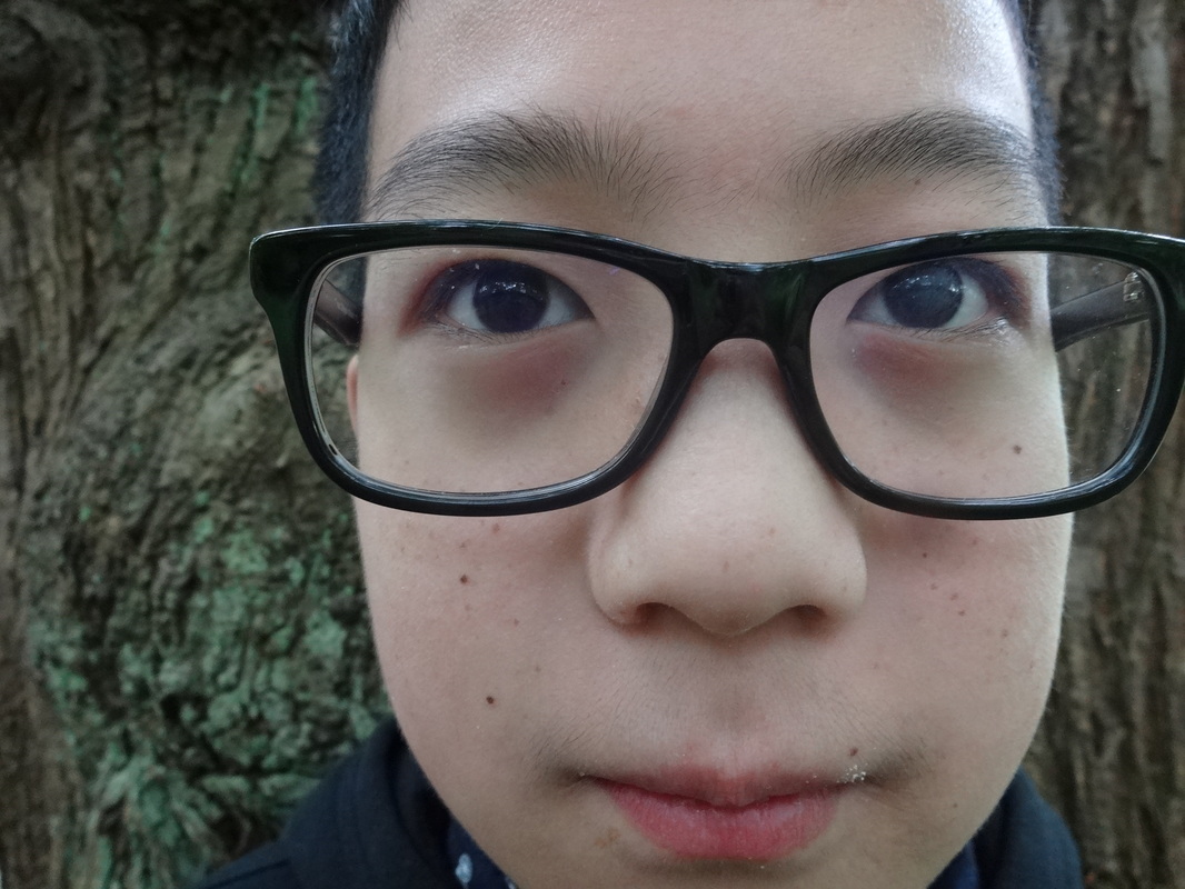
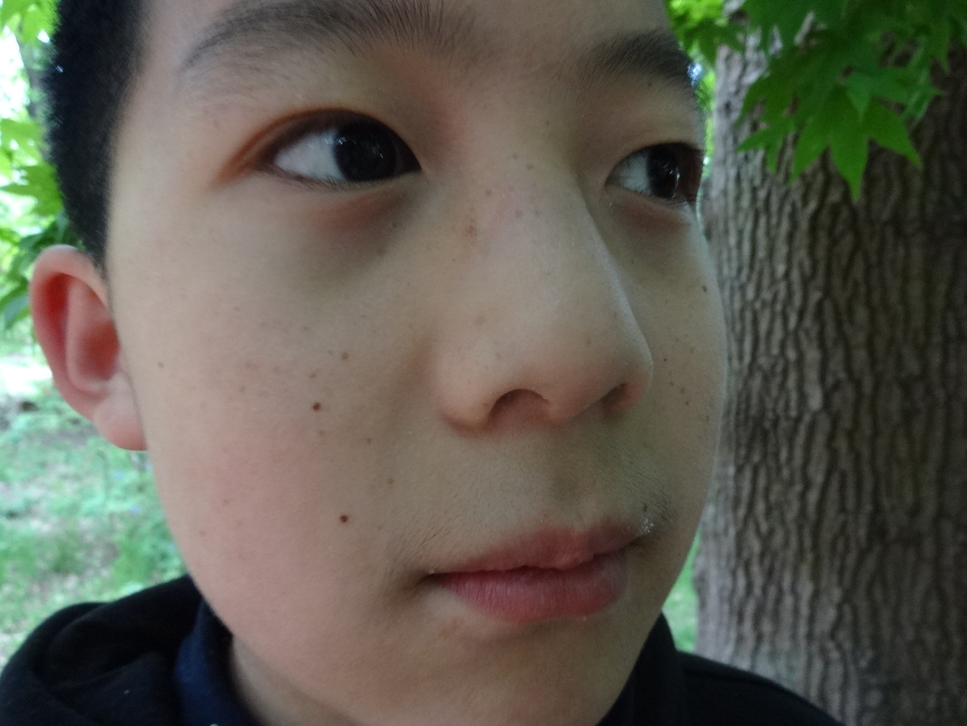
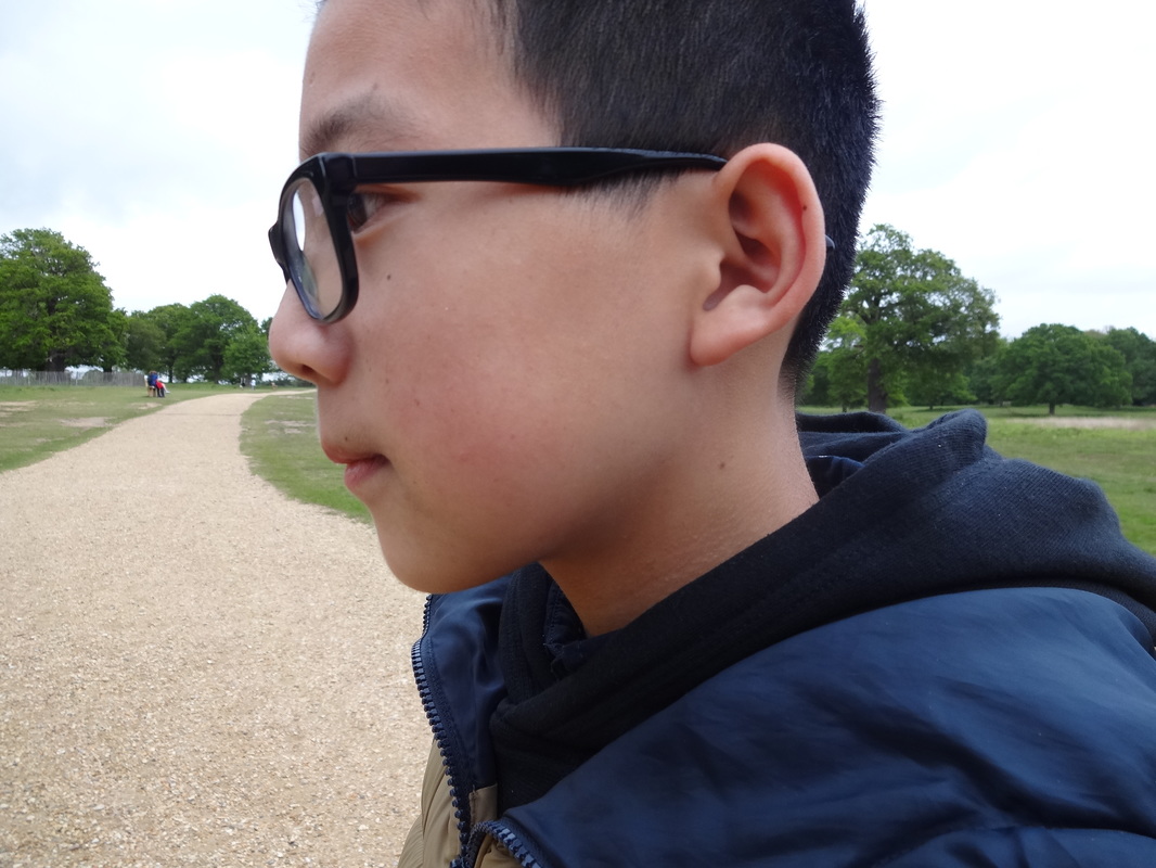
Evaluation-
Overall, these images came out really well, and it came out as i intended it to. As i wanted to just focus on the face itself using just the natural daylight outside. Unlike my previous portraiture images, which had plain dark backgrounds, i decided to go to a local park and capture more images again focussing on the human face but this time incorporate some nature aspects in the background. I used my sony digital camera to take these. I most like the compositions of these photos, especially in some of the images, where the face is in the centre, so we are directly drawn to it, without any distractions. Also, as we are focussing on contrast in this project, i like how his outfit is predominantly black, which contrasts with the green, brown and beige background. Whilst taking these images i also experimented with angles (as seen in the first row of images), so that we can see the main element with different perspectives. I now plan to further develop these images; unlike in my last developments where i mainly focussed on black and white, i intend to experiment with colour, and see how combining two colours together will look within an image.
Overall, these images came out really well, and it came out as i intended it to. As i wanted to just focus on the face itself using just the natural daylight outside. Unlike my previous portraiture images, which had plain dark backgrounds, i decided to go to a local park and capture more images again focussing on the human face but this time incorporate some nature aspects in the background. I used my sony digital camera to take these. I most like the compositions of these photos, especially in some of the images, where the face is in the centre, so we are directly drawn to it, without any distractions. Also, as we are focussing on contrast in this project, i like how his outfit is predominantly black, which contrasts with the green, brown and beige background. Whilst taking these images i also experimented with angles (as seen in the first row of images), so that we can see the main element with different perspectives. I now plan to further develop these images; unlike in my last developments where i mainly focussed on black and white, i intend to experiment with colour, and see how combining two colours together will look within an image.
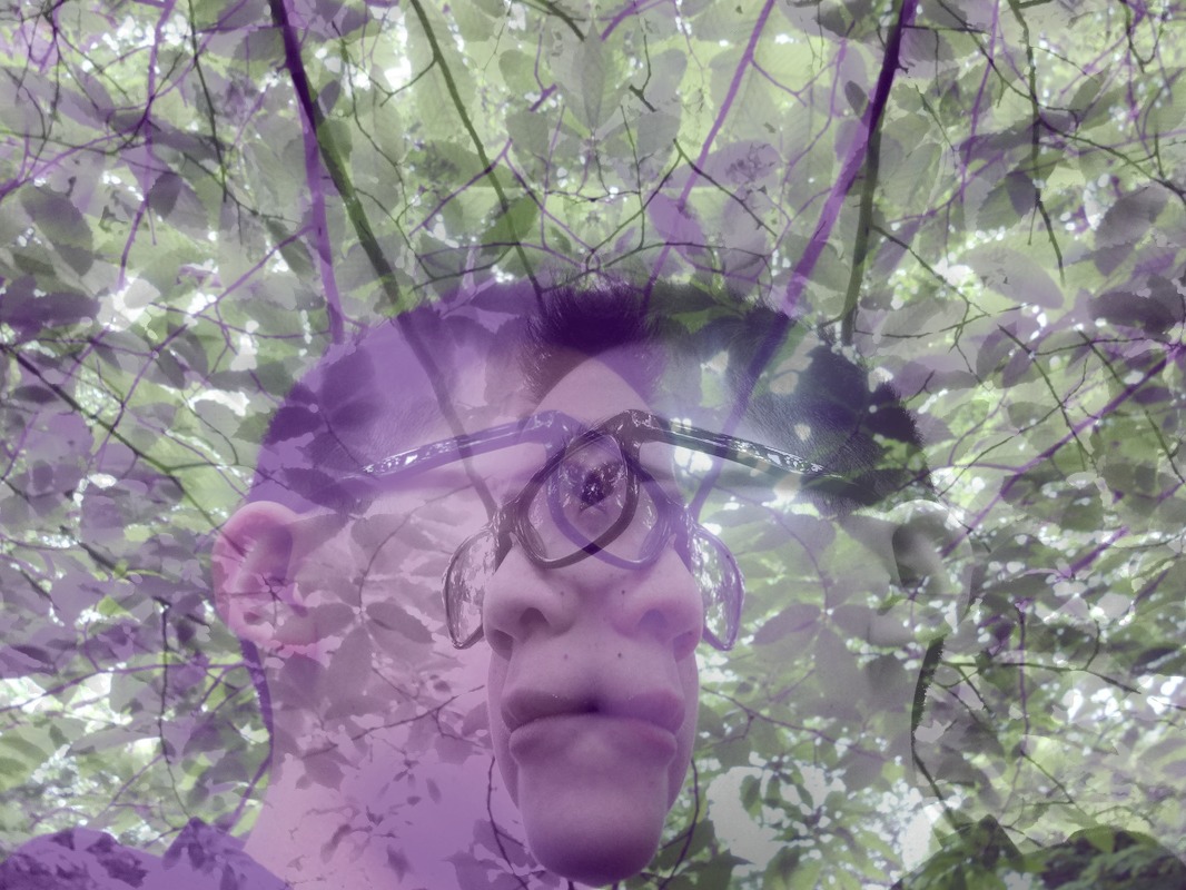
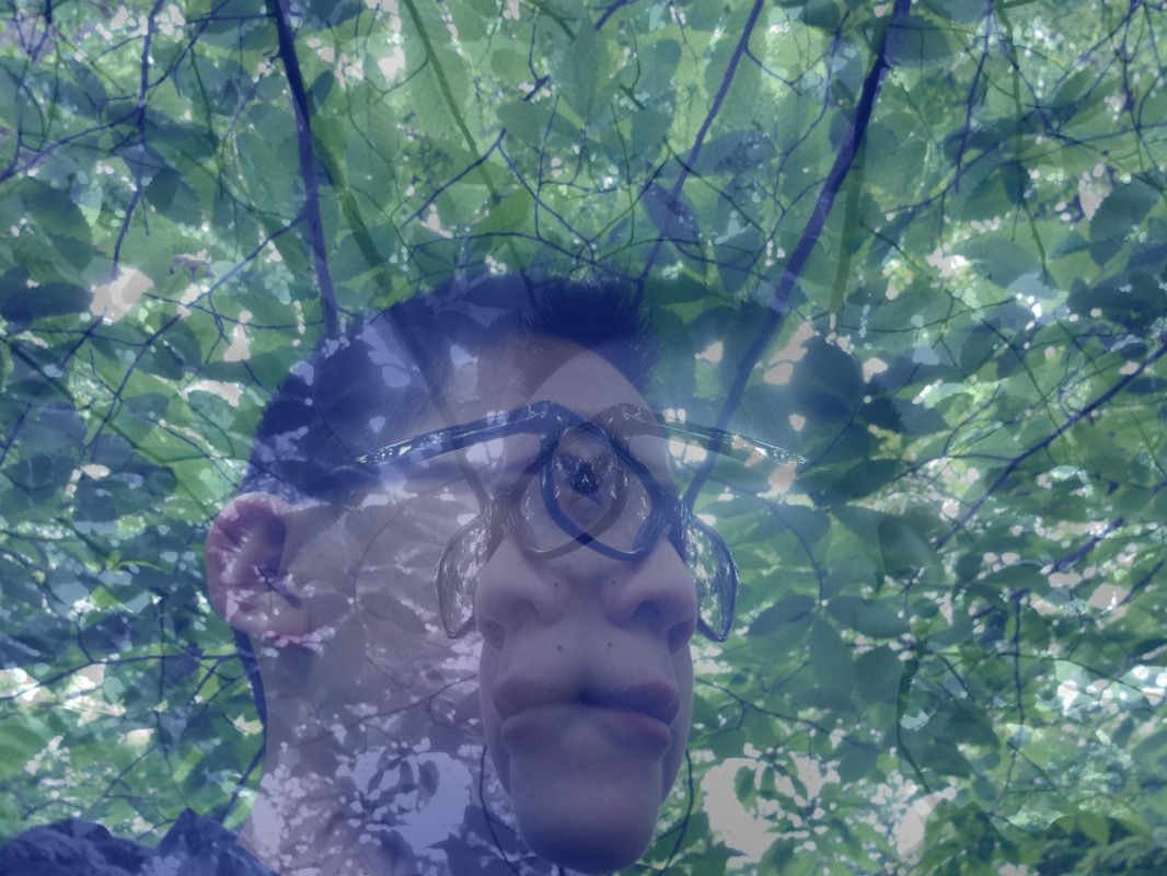
Double Exposure with colour (Picmonkey)
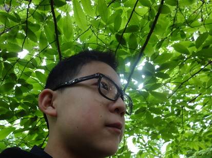
|
I decided to use this image on the left as the base image; it was taken at a low angle facing up; which resulted in the leaves to surround the whole background. Thereafter, i went on a photography editing website called 'Picmonkey', to see what experiments i could try out. Firstly, my main priority was to adjust the colour settings of the image. I chose the 'colour' settings, where there was a range of colours and i began by choosing a reddish colour; as a result the main face had a red tint and the green leaves turned orange. I was then intrigued by the colours so i wanted to try out more. Next i wanted to try out another colour at the other end of the spectrum: violet; then similar to the last image the main face had a violet tint and the background had a combination of purple and green. Finally i experimented with a darker blue option. After just changing the colours, it looked quite overloaded, however i wanted to make it look eve more interesting; so after i saved the edited picture, i overlayed it on top of the original one, but the second layer was flipped the other way. As a result of this change, the image had much more textures and tones. Overall, i think this experiment has been successful as it was different from my previous experiments and it is something new which i have not tried before. Therefore, i want to carry on with this colour theme within my contrast project and i hope to have a final piece which has colour.
|

__________________________________________________________________________________________________________________________
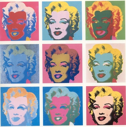
Andy Warhol- Marilyn Monroe
|
Isn't life a series of images that change as they repeat themselves? Andy Warhol After, having a successful previous experiment with colour, it reminded me of a famous artist named Andy Warhol- which i remembered he created a collage of Marilyn Monroe, with a wide range of colours and tones. These images could potentially have no link with contrast, however I researched contrast of colours which showed up something. When associating images with contrast, it would normally be of black and white of different shaded tones. However, I wanted to experiment with colour contrast as it seemed interesting and it's something i haven't considered doing before. In this image Andy has simply focussed on one face and repeatedly edited it with different colours. I have been influenced by this as i intend to use a singular image on a building - as it is what i've been basing my work on so far - and editing them with different colours.
|
Experimenting with colour contrast:
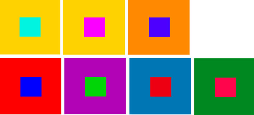
Throughout my whole contrast project so far, most of my images have been in black and white with dark tones, which is why i now wanted to experiment with contrast in colour. Though we may normally associate contrast with black and white, there are also contrast between certain colours. (see image below)
The different types of colour contrast are the following:
1. Contrast of hue
2. Light-dark contrasts
3. Cold- warm contrasts
4. Complementary contrast
5. Simultaneous contrast
6. Contrast of saturation
7. Contrast of extension
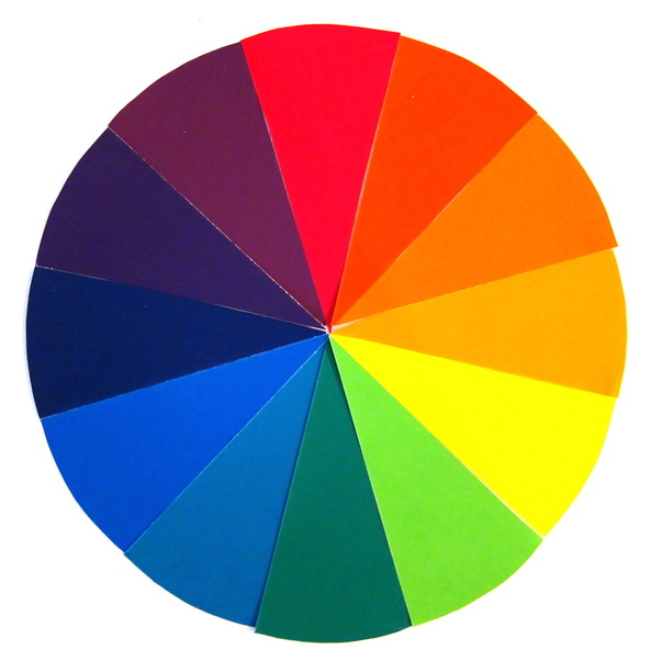
I decided to focus on cold-warm contrasts, as well as complementary contrasts. With the cold-warm contrasts refers to the contrast between cool and warm colours; the cool colours consists of blue, purple and green; whilst the warm colours consists of orange, yellow and red. By placing one of the cool colours in relation to a warm colour, it creates contrast. Complimentary (opposite) colours refer to two colours which are opposite each other on the colour wheel; for example, green and purple are complimentary colours.
The different types of colour contrast are the following:
1. Contrast of hue
2. Light-dark contrasts
3. Cold- warm contrasts
4. Complementary contrast
5. Simultaneous contrast
6. Contrast of saturation
7. Contrast of extension
I decided to focus on cold-warm contrasts, as well as complementary contrasts. With the cold-warm contrasts refers to the contrast between cool and warm colours; the cool colours consists of blue, purple and green; whilst the warm colours consists of orange, yellow and red. By placing one of the cool colours in relation to a warm colour, it creates contrast. Complimentary (opposite) colours refer to two colours which are opposite each other on the colour wheel; for example, green and purple are complimentary colours.
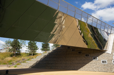
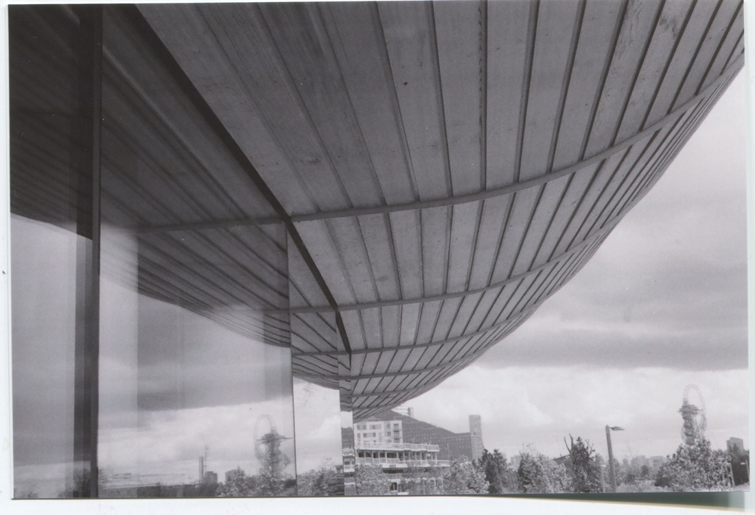
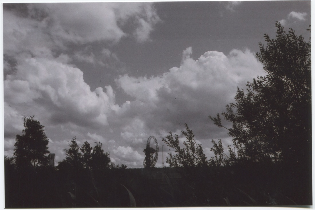
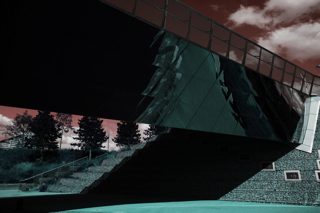
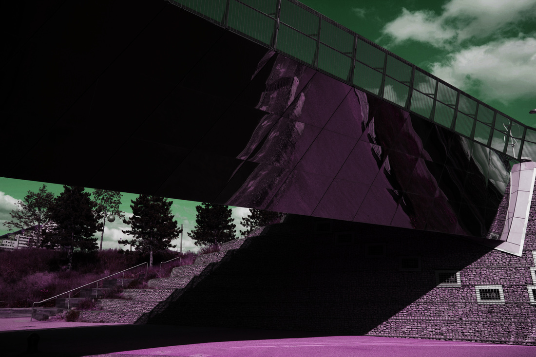
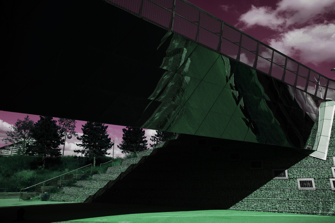
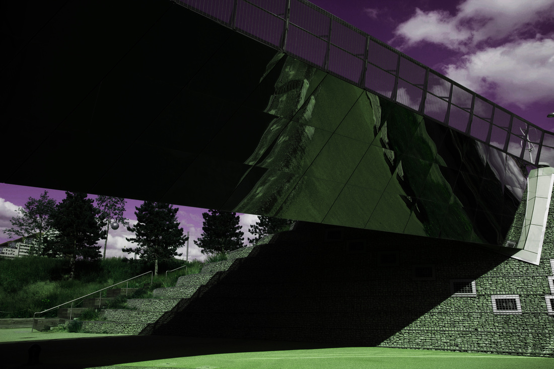
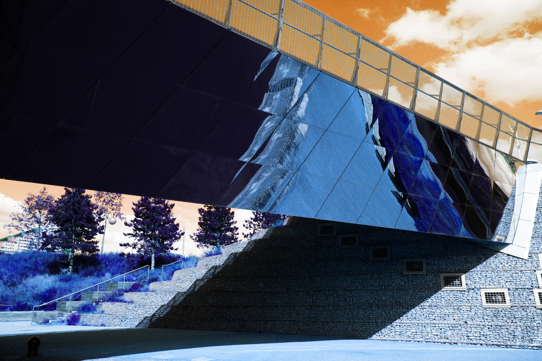
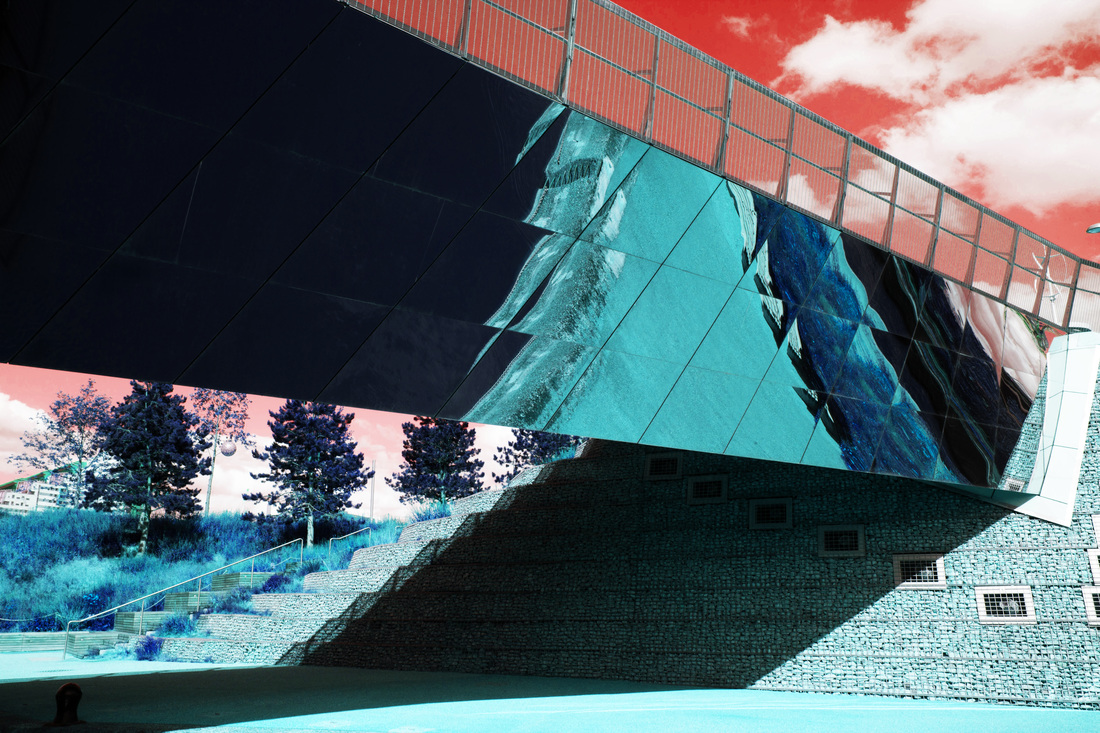
This is the image I've decided to use for my colour contrast experimentations. I took this image using a Canon 550D DSLR camera with a 'wide angle lens'. This image was taken in the olympic park, which has high contrasts between nature, built up buildings and concrete. I focussed specifically on composition and tone in this image. The mirror panel reflects a shadow which is interesting as it is distorted and contorted. As well as the composition being neat and straight, there are also many evident lines; diagonal, straight, short, line, vertical that are formed. I like the contrast between the open sky with the clouds and the dark, confined shadow beneath the mirror. The settings for this image was: ISO 200, F.4.6 (aperture), 1/250 (shutter speed). I had to adjust the settings a couple of times before the lighting and whole image seemed decent, as the image is not over-exposed nor under-exposed. In addition, the colours in this original image are all fairly neutral, hence I am going to use this image to experiment with different contrasted colours. I will use Photoshop to create these images.
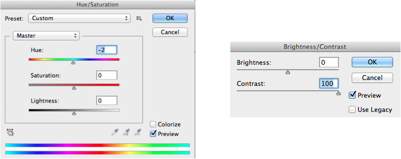
Editing Process through Photoshop-
To edit this image, i have simply used photoshop and after hovering over the image tab, clicked the hue/saturation option. Then, I adjusted the hue setting by dragging it along the colours, and for each degree the colours changed. I also, set the contrast level to 100 each time, so that there were strong contrasts in the image; so the image had a higher definition and much sharper.
__________________________________________________________________________________________________________________________________________________
FINAL PIECES
FINAL PIECE #1
2nd Final Piece:


Evaluation of Contrast project:
Overall, i have thoroughly enjoyed this project of contrast, as i have been able to develop my skills, and use many skills which i haven't been able to previously. I have improved as i have been able to experiment more using a wide range of resources which has as a result allowed me to create a successful final piece.
I began with creating a Pinterest board based on Contrast and pinned images relating to this theme which i found interesting and i could create something with a similar concept. The first artist i came across was Edward Weston, his images were very singular object based with strong illuminations from above. One of his most famous collections was his solitary pepper collection, where he captured a singular pepper in many different intervals, which showed the slow deterioration of it. Thereafter, I analyzed one of the images from the collections, which motivated me to capture an image similar to his. I then went on the to do my own experimentation with a lemon cut up in half. I specifically chose to capture a lemon as it has distinct tones and texture. Unlike Weston, I only used natural lighting coming through the window and not with artificial lighting. As a result, i ended up with two images of the same lemon, as i edited them differently, one with much clear black and white tones, and then one with the contrast levels slightly lower so it came out more grey; but i feel like the black and white one is more successful, as the contrasted tones make the image much appealing.
After that, I researched another artist: Elliot Erwitt, that captured images that had similar tones to Weston, but instead of using still life objects, Erwitt presents humans in his images; one of his images that i admire the most is the one where he captures Monroe, with strong tones illuminating her face allowing her beauty and angelic features to show even more, After this research I went on to experiment with artificial lighting and a DSLR 500D, similar to Erwitt, we simple captured from the face to simply focus on the facial features. We worked as a group to create this set of images, so we ad different roles, which we alternated in controlling; one controlled the light, one was responsible for the camera and one was in the images. Overall, these images came out really well, in terms of lighting, angle and composition. Nevertheless, I intended to carry on with this portraiture series later on in the project but with different backgrounds.
Next, I wanted to experiment something on a much wider scale, and not simple closeups. Therefore, i wanted to experiment with shadows this times, so after researching and analyzing the works of Fay Godwin and Trent Park, I used a digital compact camera to captures works of the similar style. Both these artists had very interesting works, as their images were very much focused on the light and the dark and the shadows which naturally form. Their images didn't require artificial lighting like the other artists which i have looked at, but only involved the natural light form the surrounding area. Therefore, i again went out to capture more images based on the lighting and shadows on buildings, I really enjoyed capturing this set of images, as it was interesting to experiment with the angles and composition; since it was a bright day the sunlight beamed though the windows on bounced off the buildings which created bold strong lines and shapes. After my evaluation analyzing what went well and how i could improve, i came to the conclusion to refine this set of images by using Photoshop and converting it into black and white, which was definitely worth while doing because i ended up with three compelling photos. In consideration of this, I wanted to further experiment with this theme of shadows and lighting in Contrast. Thence, I stumbled across an artist named Lewis Baltz, his images are very minimalist, which almost seems un-ordinary and absurd, yet they are very precise and organised which makes his images very aesthetically pleasing. I was inspired to capture more images, but this time with another resource which was a Minolta Film Camera, using a black and white 35mm film which i got developed and after scanned into the computer. As well as focusing on the two elements as mentioned above i also looked out for geometric shapes, as black and white images can sometimes seem quite dull, so by capturing these shapes it gives the image more dimensions. Nevertheless, some of the images didn't come out as I anticipated as they were rather basic and not at all interesting as it contained quite a lot of negative space. So, after my evaluation of this set, I chose 4 which were most successful and refined them. Thereafter, I intended to combine my first set of building images set together which the film one to see how they looked together as a collection, and to consider it as e of my final pieces; which i did. Hence, this is one of my strongest final pieces I've created as the strong contrasted tones, shadows and shapes all work correspondingly well together as one piece.
Following on, I wanted to experiment with more of the human face and also colour this time in the project. Hence, I captured some more images of my brother closed-up, and then used a website photography website called Picmonkey, which allowed me to experiment with over-laying the images on top of one another and creating some colour on top of it. This was interesting as i was able to experiment with colour and how they related to one another in an image. After carefully analyzing these images i researched to see if there was something else i could experiment with to do with contrast yet based on the contrast of colours. I therefore, came across the colour theory which shows how two colours can compliment eachother, for example, light-dark contrasts and cold-warm contrasts. So, I retrieved one of my images captured previously with a Canon 550D, and used the photoshop app to customize the contrast, hue and saturation of the image. I played with 6 different colours in total, which all though very different looked very captivating together. Hence i am going to use these image as my second final piece for this contrast project.
Overall, I have enjoyed this project, as i have come across new artists who produce very compelling photos, which have inspired me to capture more images that are more un-ordinary and focusing on some of the main elements i am not used to experimenting with. I have also been able to use a wide range of new resources which i haven't tried before, and it allowed me to produce great rewarding images that i can use as a final piece. In addition, I have ensured that i carefully evaluated each set of my images thoroughly so that i am able to identify what i did that was well and also what i could do to improve next time. which allowed me to improve every time i experimented. Even though, i had a rough idea of contrast before this project, i feel like i have now captivated a deeper insight into this theme within photography and i am sure that i will perceive to use what i have learnt in this project in future plans in photography and also develop my characteristic of creativity.
