My starting point; EDGES.
why i chose this topic?There are many reasons for why i chose this topic. Firstly, i've chosen to do a similar topic in the past, where i chose to focus on the topic of lines. Moreover, i relatively enjoyed that experiment and i was quite successful in completing it. I have also chosen this because it's a wide topic and i could approach it in many different aspects. It will be interesting to explore the various ways to complete it including to do specific detailed research, developing and improving my images and getting more inspiration to take more images related to edges.
|
initial plan:
|
Pinterest board; Edges
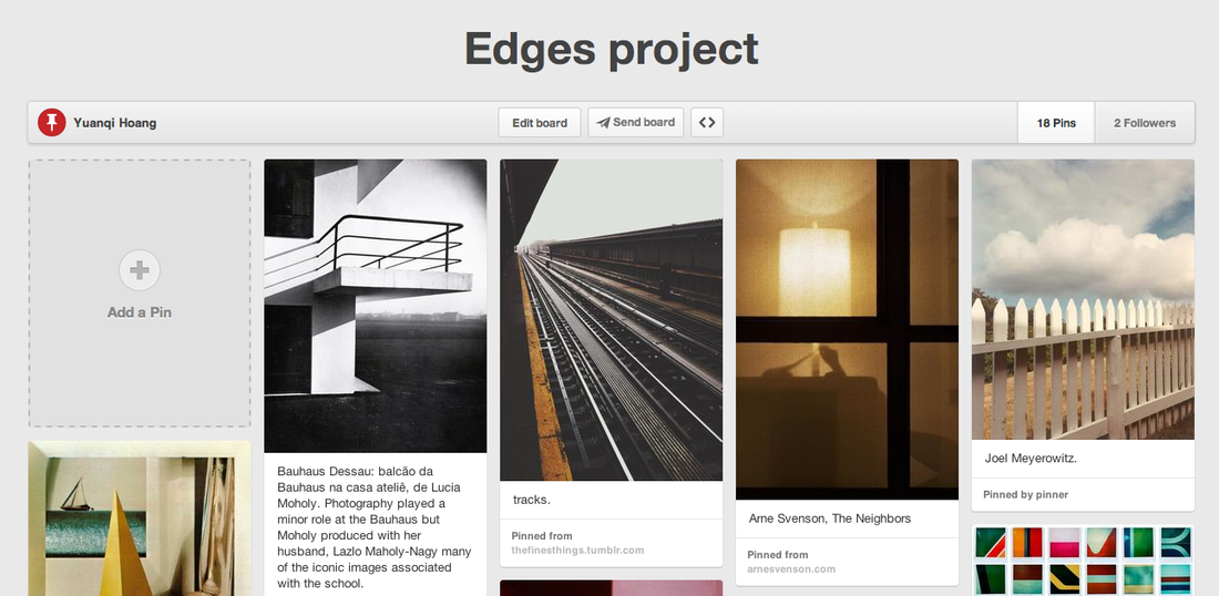
Click image for link to my board:
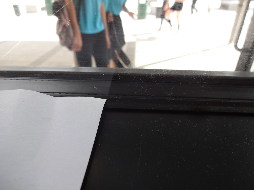
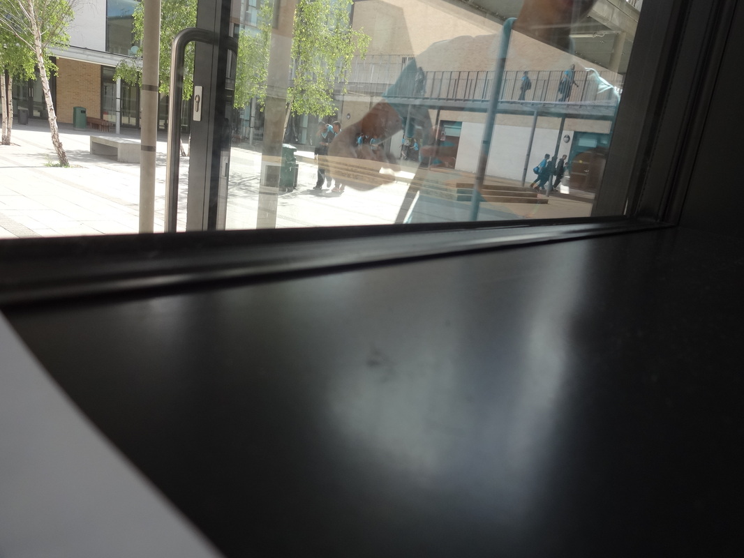
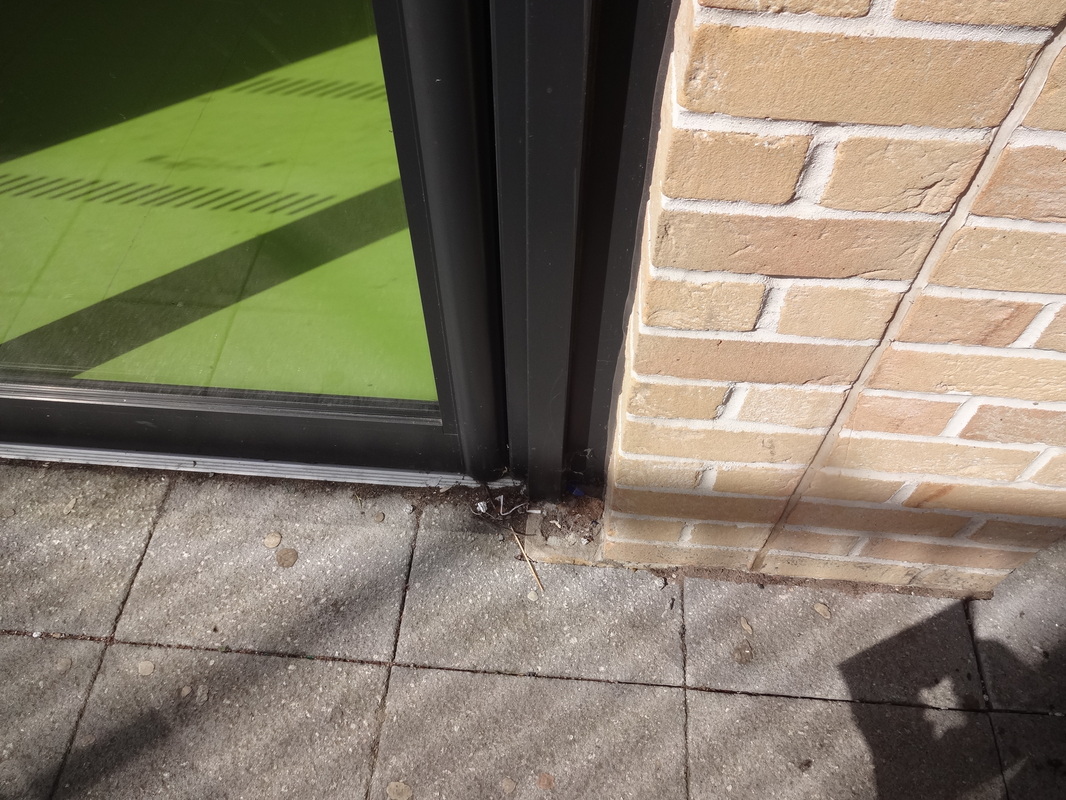
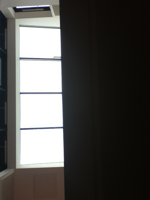
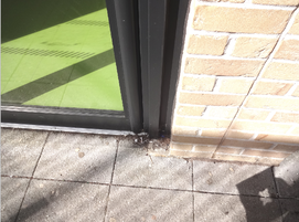
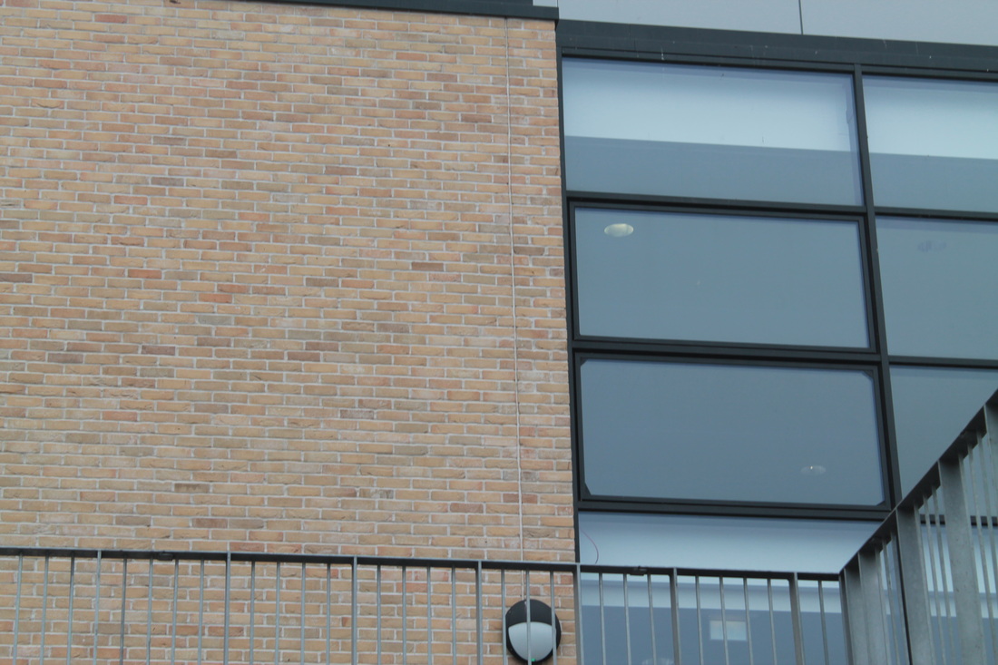
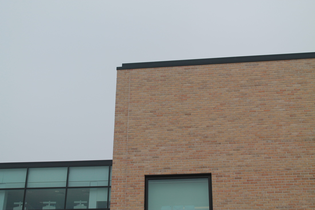
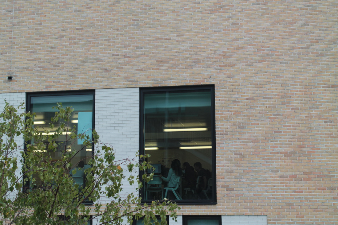
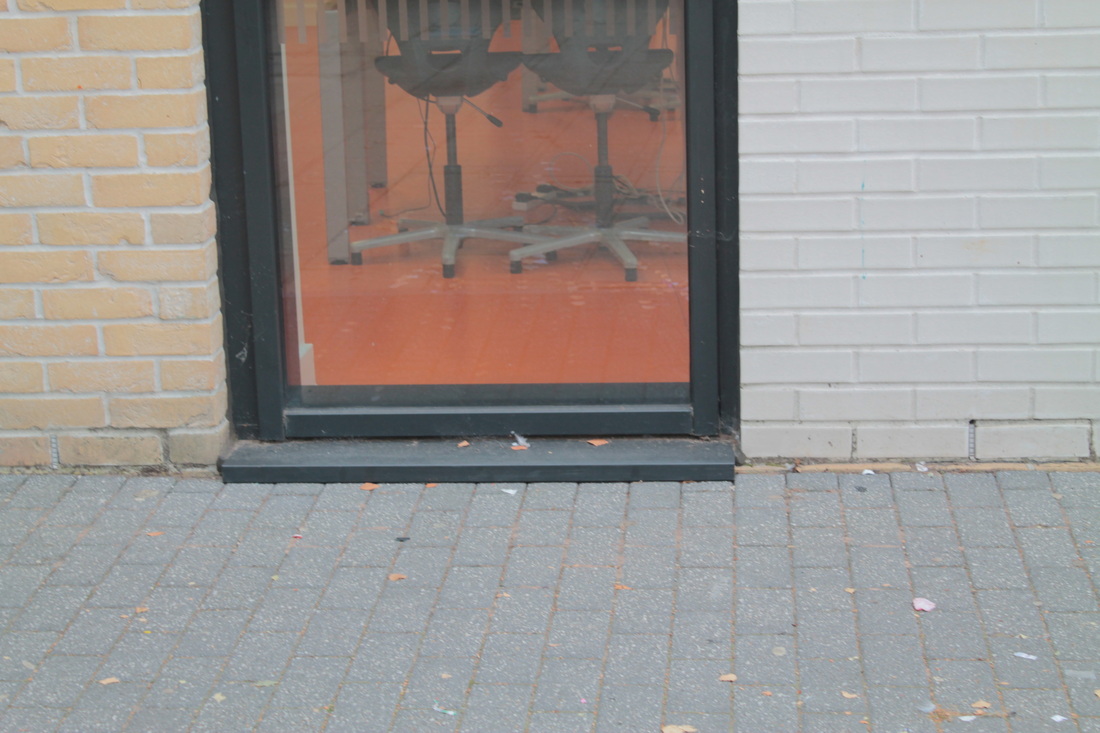
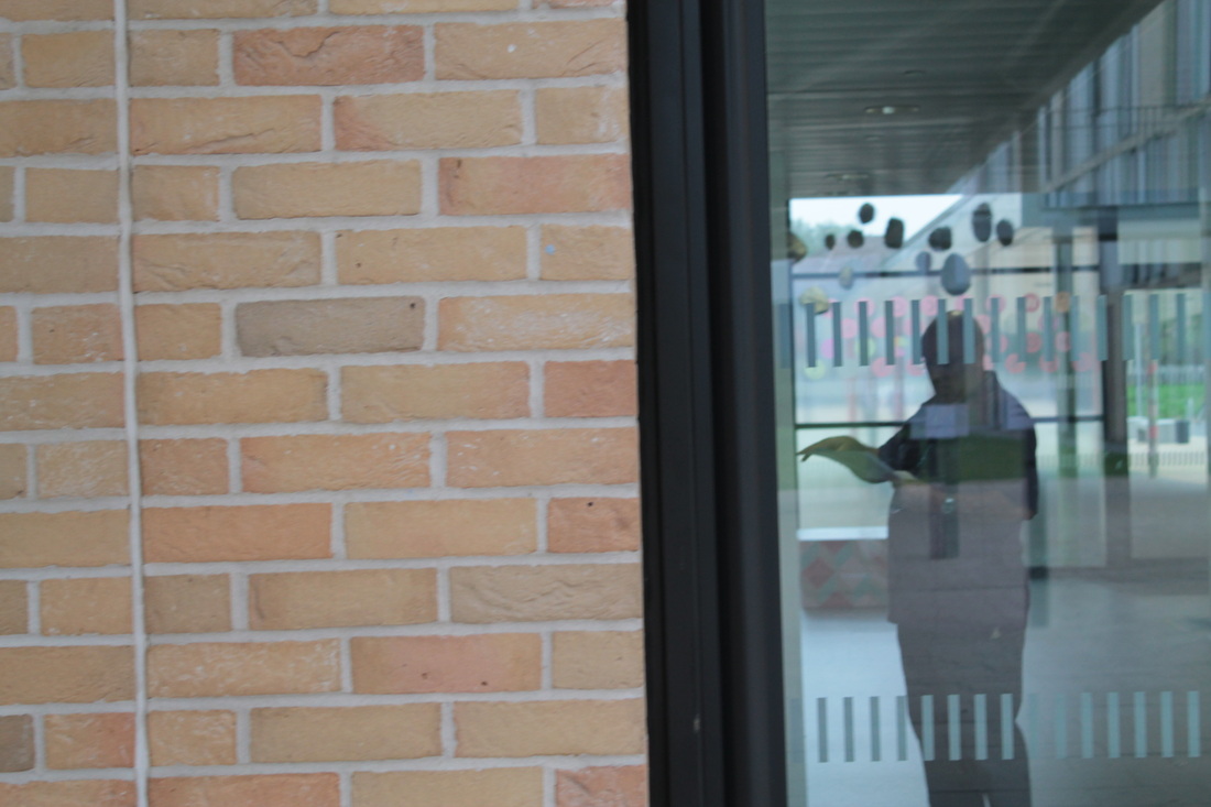
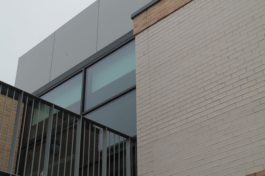
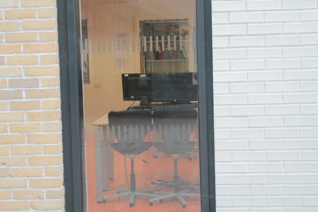
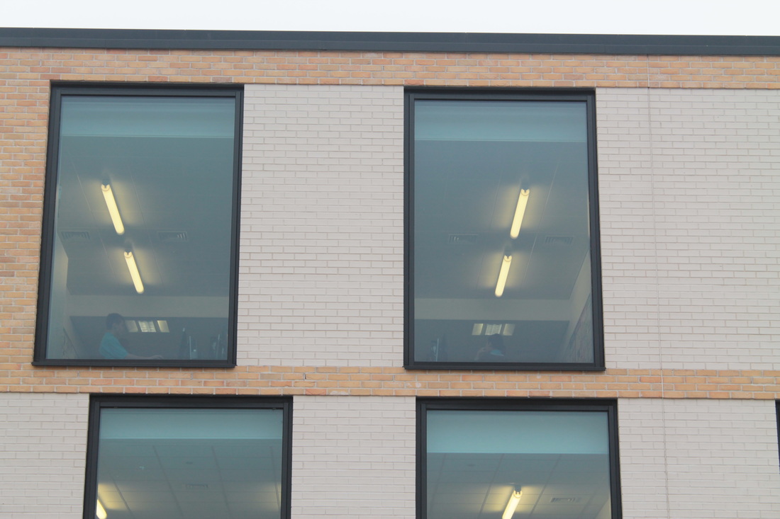
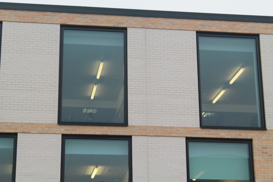
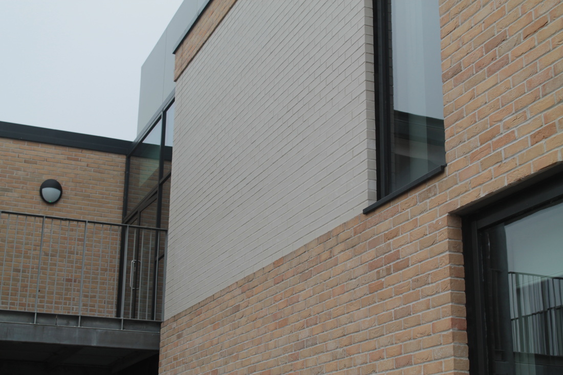
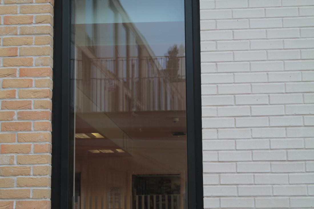
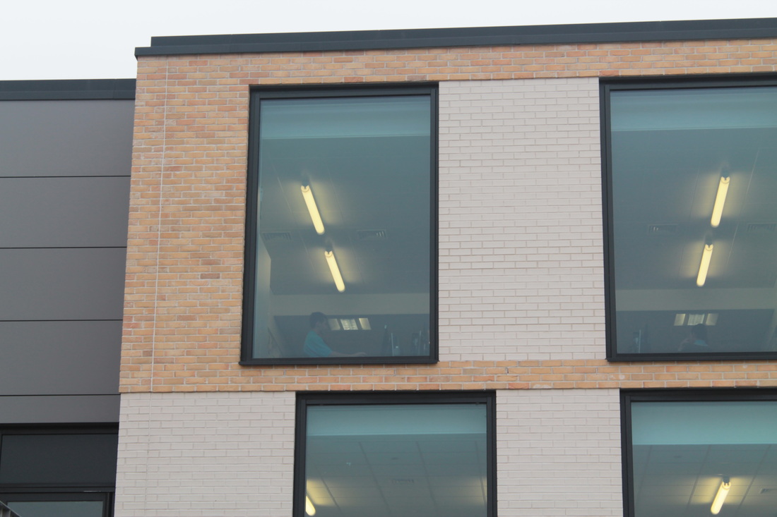
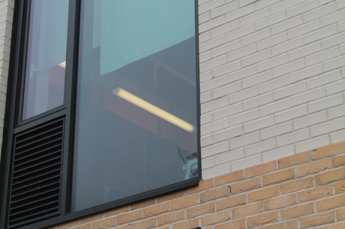
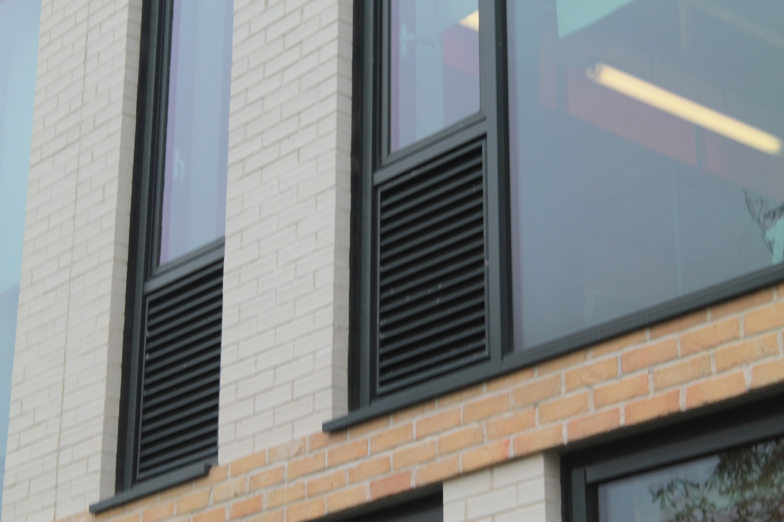
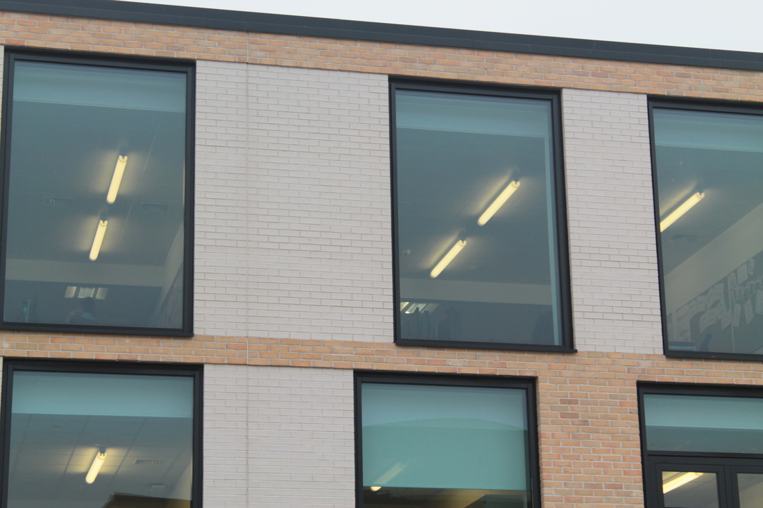
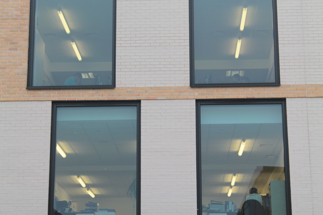
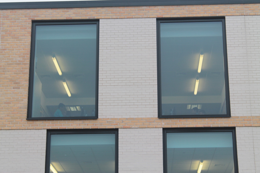
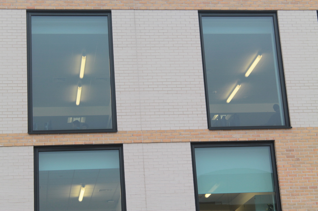
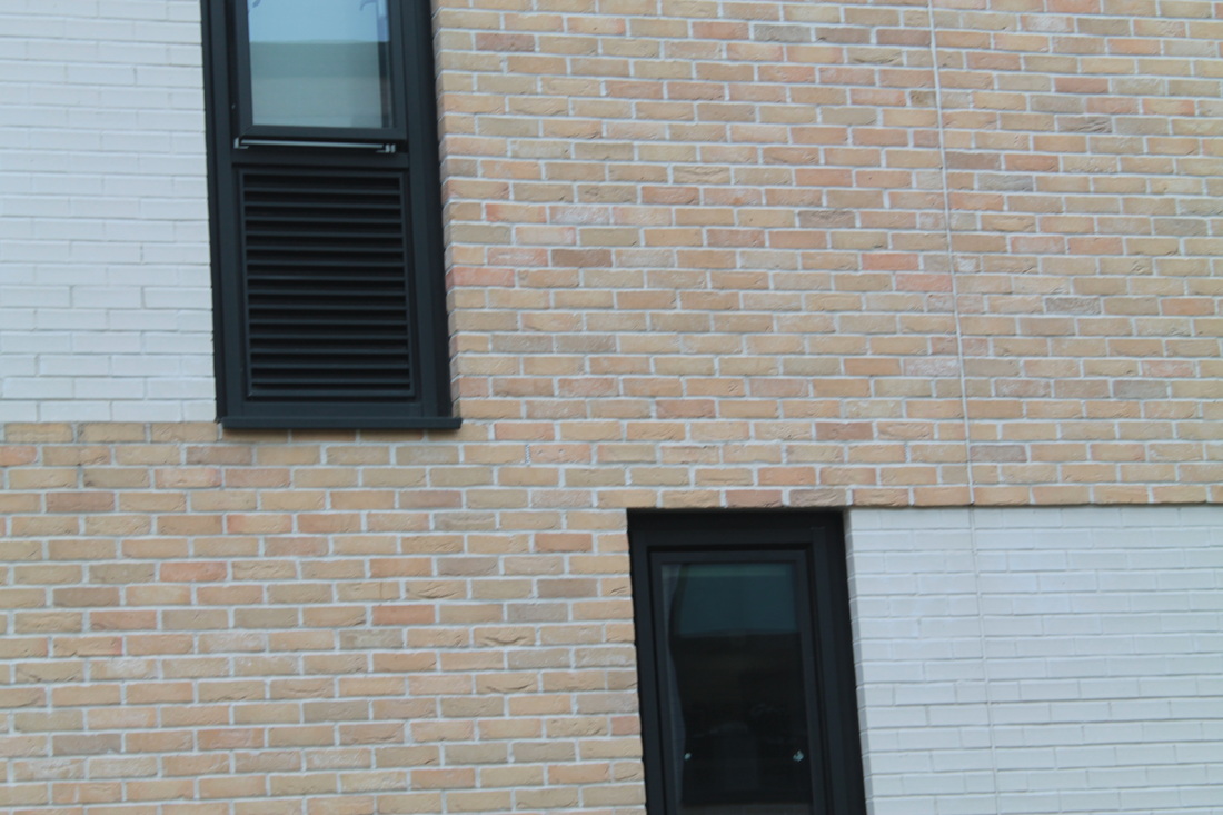
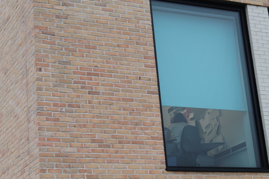
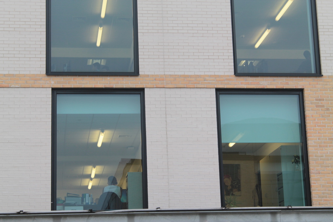
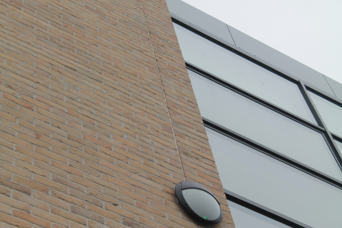
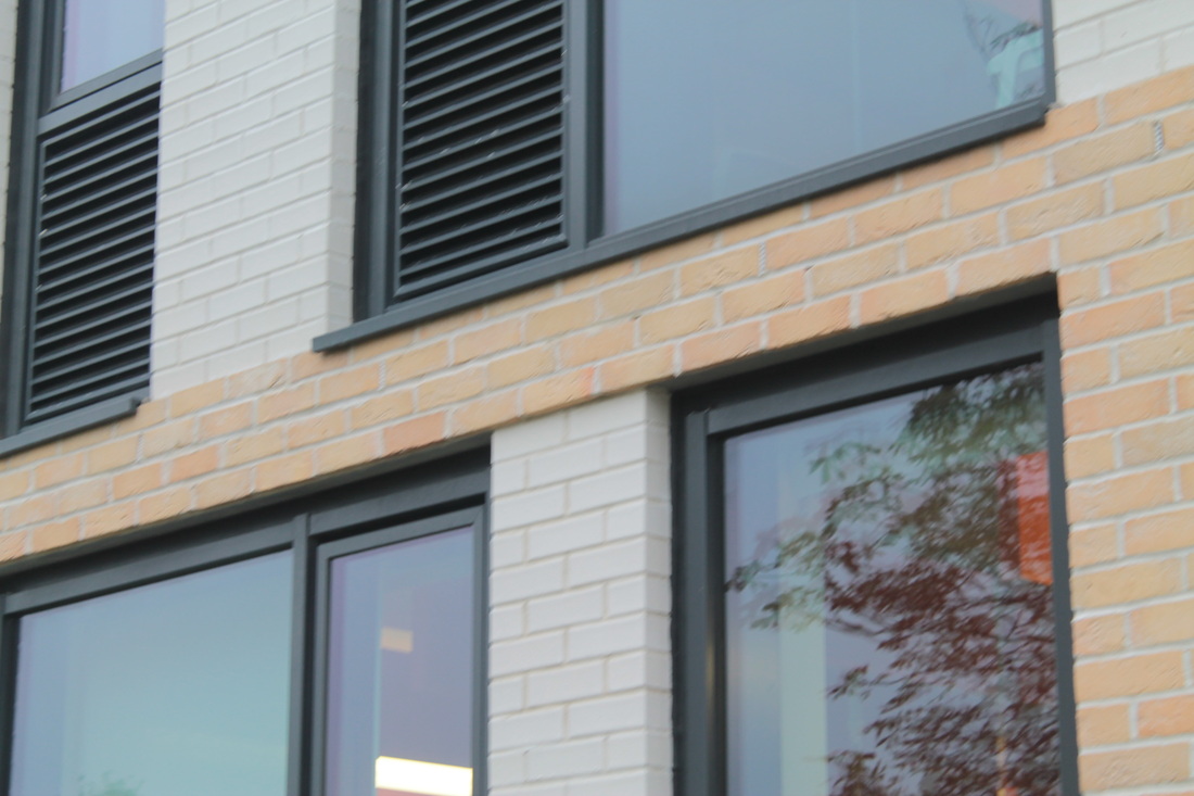
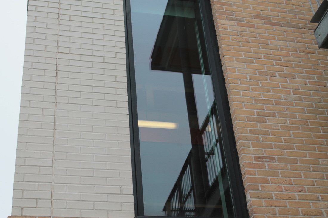
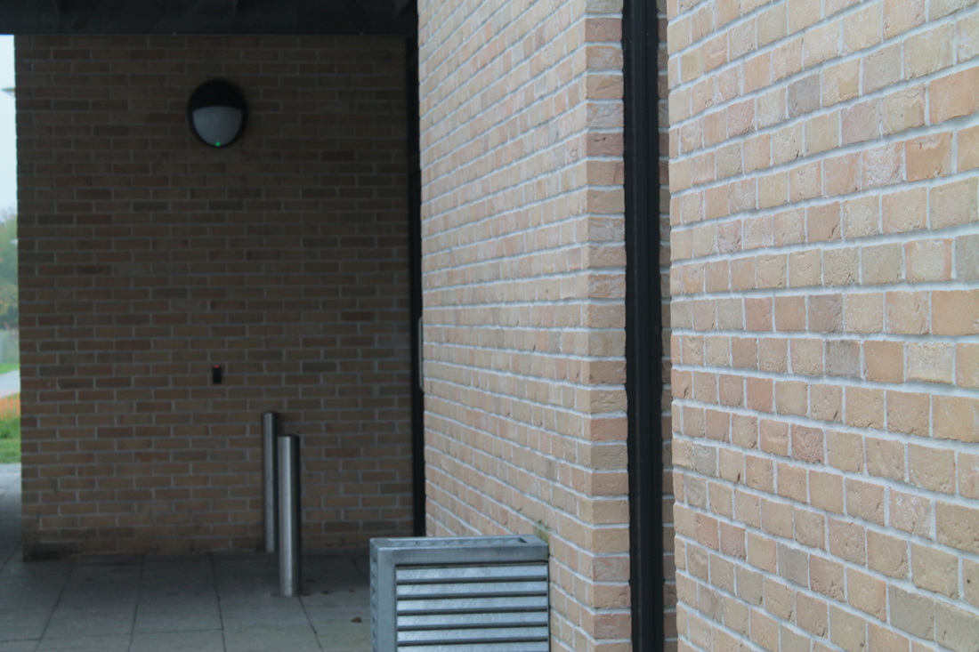
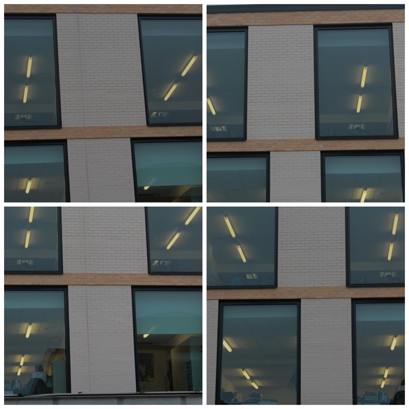
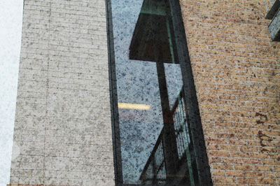
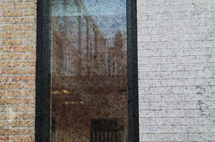
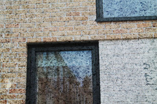
My first experiment- theme of windows (own interpretations)
When i thought of the topic edges, the theme of windows really intrigued me. Windows are really broad for experimentation especially with the topic of edges; this is because no matter what angle the photographer is standing, all the edges will be clear and look really effective. The images below are some that i took in my house of windows. I captured the images at different times of the day, the fist 8 were around afternoon, where it was most bright. However, the next few were around the time of sunset as we can see the streaks of sunlight which is yellow, this represents warmth and it makes the windows seem more suburban.
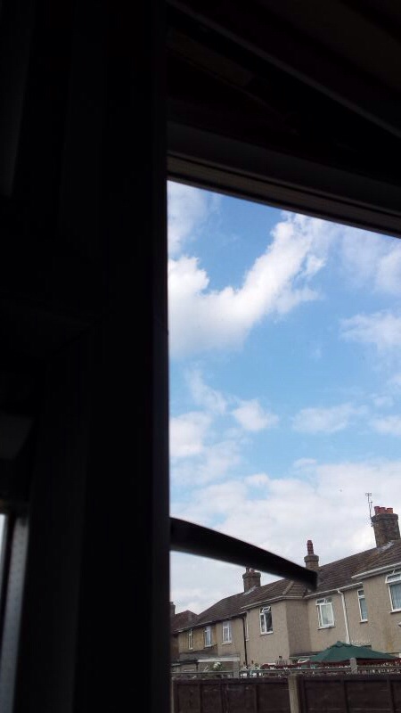
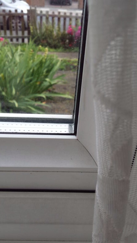
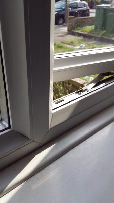
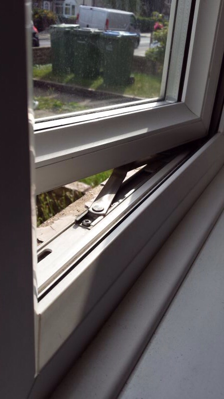
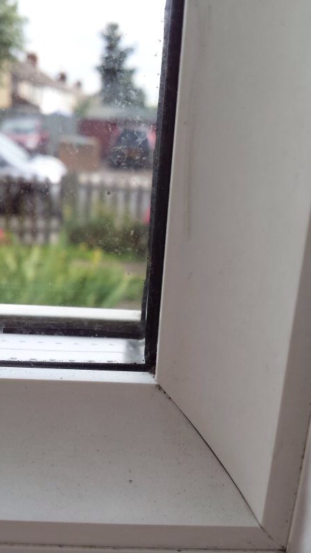
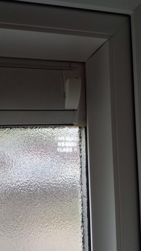
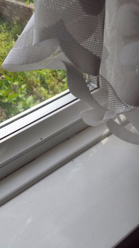
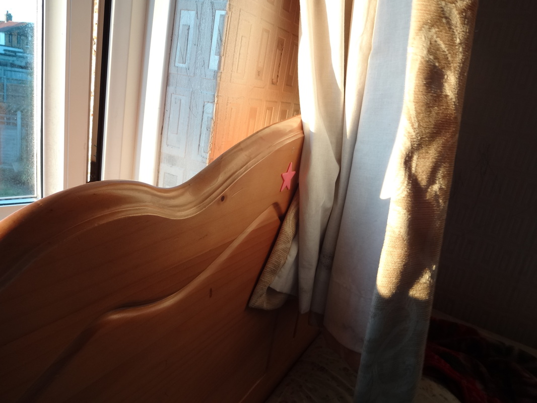
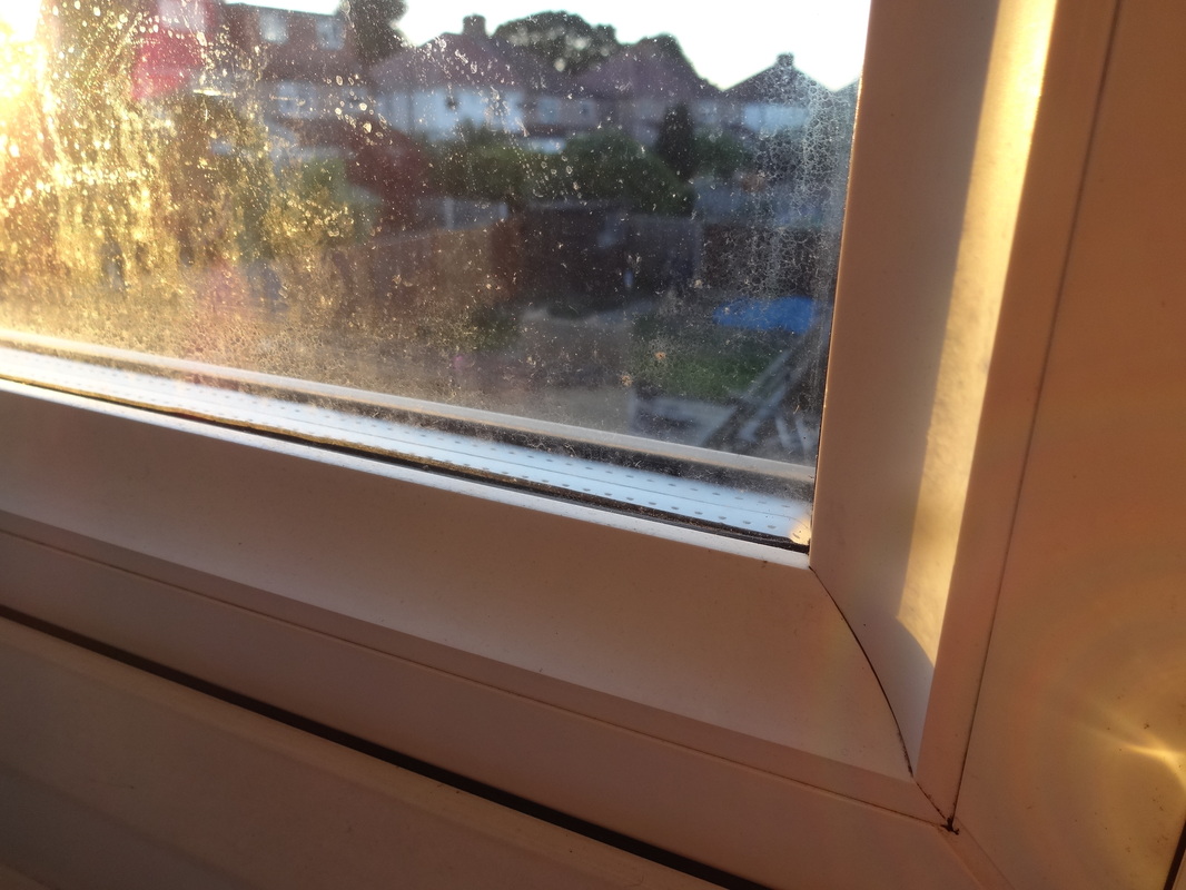
WWW;I captured images just focusing on the edges of windows, therefore emphasizing the concept of edges and clearly shows the details. In addition, i tried to take this with different angles, so i can compare which images worked well and which weren't so good. Also, as mentioned before i took these images at different times of the day, this is clearly evident from the colours perceived by the image. After viewing and carefully analyzing the images, i think that the ones taken during sunset has proven to be more effective and interesting. This is because, there are a wide variety of tones, and there is a solid contrast between the more darker parts to the image and the lighter parts.
|
EBI;I went out to experiment more, where i could go to different places, and capture different windows and not just the ones from my home. Another place i could of taken images of windows is for example- the rear mirror of a car, therefore we could also see the reflections formed. In addition, most of these images are close-ups, next time i could take some of them with a wide angle, so it sucks in more features within the image.
|
Saul Leiter
|
Saul Leiter- December 3, 1923- November 26, 2013; an American photographer and painter with works during 1940s and 1950s. After moving to New York city to become an artist, he developed an early interest in painting and was fortunate to meet 'Richard Pousette-Dart' who was an abstract expressionist painter. The artist then encourages Leiter to pursue photography and he was soon taking black and white pictures with a 35mm Leica.
Leiter’s earliest black and white photographs show an extraordinary affinity for the medium, and by 1948 he began to experiment in colour. Leiter has made an enormous and unique contribution to photography. His abstracted forms and radically innovative compositions have a painterly quality that stands out among the work of his New York School contemporaries. Perhaps this is because Leiter has continued through the years to work as both a photographer and painter. |
|
'' Some photographers think that by taking pictures of human misery, they are addressing a serious problem, i do not think that misery is more profound than happiness'' -Saul Leiter
|
|
what inspirations do i have from this researchFrom this research i have learnt a lot more about the idea of 'edges'. Leiter dedicated his life to photography and created many images in different ways which makes them very interesting. For example he experiments with the idea of colour carefully, in some of his images he uses the colour red, which the video points out that the human eye is naturally attracted to that colour. Moreover, basing back to the topic of 'edges', composition plays a vital part when taking images. Leiter really focusses on this technique, as he places isolated objects close to the edge which draws more emphasis to them. In addition, in some images he has a large section of obscure or negative space, by doing this we are focussed to the concept of the image. In addition, i think i can learn a lot from this and there are many images that i can take inspired from him.
|
inspirational image and evaluation
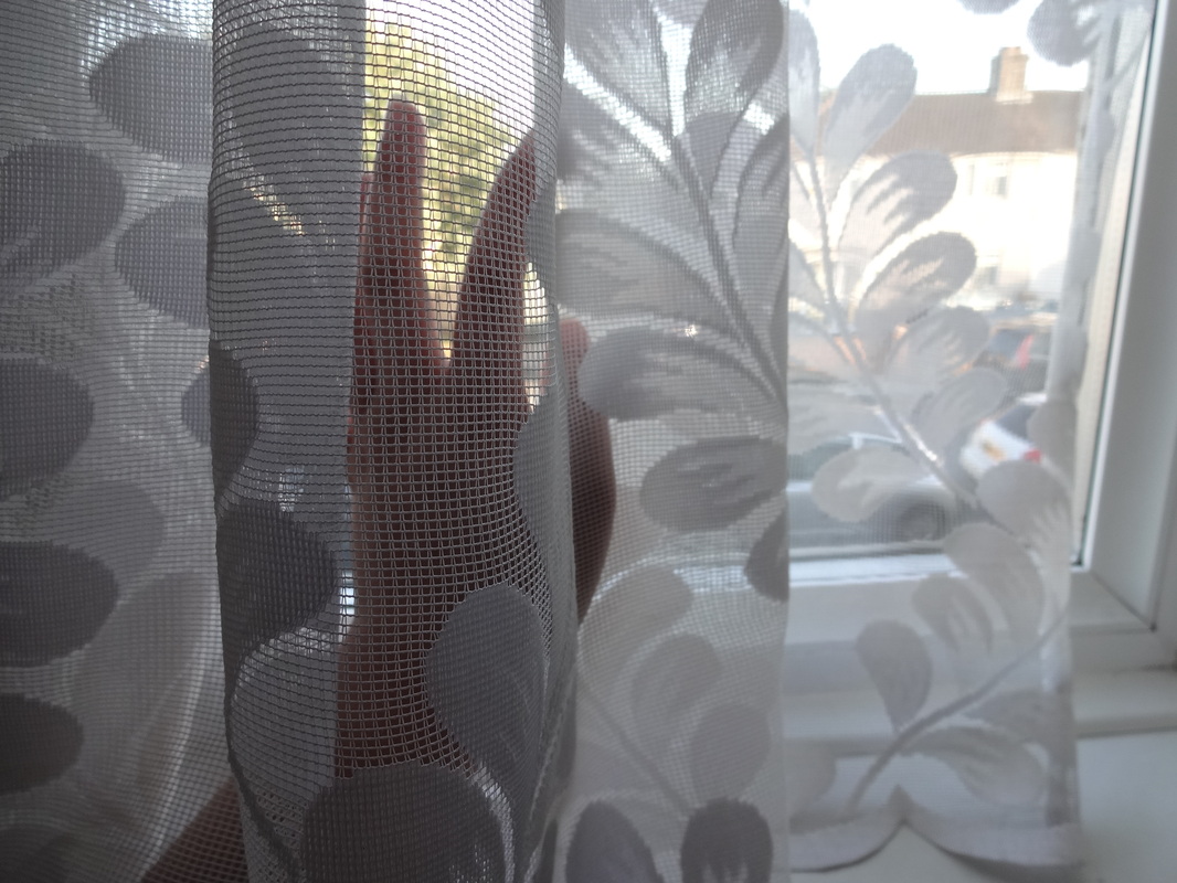
The composition of this image consists of a large area of negative space, it fills around 3/4 of the image. Even though, there is no content in this section it's still effective. The reason for this is because, on the top right hand corner there's an old man which is facing a different direction. I think the photographer was taking the image on the train and positioning the camera on the corner of the window. In addition, the man is the main subject of the photo and his whole figure is visible. Leiter used the technique of colours well in this image, as the negative space is black and dark, however the background of the station has a strip of yellow, this is interesting as it contrasts with the negative space therefore we are naturally drawn to that section of the image. The outline of the window sill is clear which reflects the concept of edges. I feel that i can take an image similar to this, then after i could adjust the image by the brightness, contrast, saturation etc. After doing this, the effect would be similar.
|
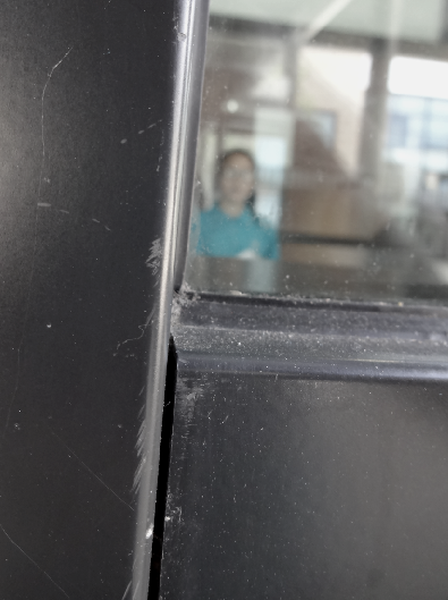
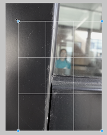
After looking at the artists image, i tried to re-create it. This image was taken on the edge of a window sill, where there was a large proportion of black area. On the other side, the girl is standing however only the top half of her body is seen. In addition, she's wearing a blue bright top, therefore the two colours contrast with each other, making us drawn to her. However, as this was taken behind windows, the camera focussed on the foreground, therefore this made the girl in the background out of focus which makes us wonder and question on why she's there or who she is. On the other hand, there are many ways i could improve this still. Firstly, i could make sure the lines are straight and not tilted, this allows the image to feel more sturdy and not unstable. Also, the black area isn't as dark as i wanted it, therefore i have to edit it.
|
Image edited and improved
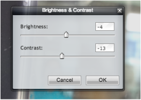
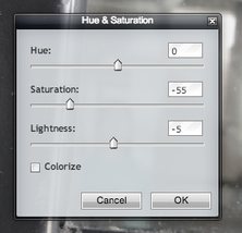
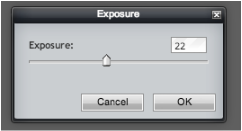
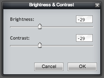
After taking the original image i decided to edit and adjust some settings to make this image seem more surreal and interesting. These are the screenshots of my progress. Firstly, i went onto the 'Pixlr' editing programme which allows you to adjust and improve your images. Once i uploaded the image i decided to adjust the brightness and contrast, i decreased the percentages of these. Next i changed the saturation setting, by lowering this as well, allows the colours in the image to be more faint. This made the colour orange in the background fade away as i only wanted the blue colour to be the main focus in the image. Finally, i cropped the image, by cropping out some of the top and left sections of the image, this makes the girl center of the photo. On the left is my final product.
|
|
Second set of images; response to Leiter's work
- WWW; I focussed on the composition of my images, also i focussed on the different edges and proportions in each image. I also experimented a bit on shadows, reflections and contrasts. In addition, in some of the images there are many different techniques in co-operated together.
- EBI; improve the angle at which the camera is capturing the image, so it's even more focussed on the edges and lines.
Evaluation and refining
This is one of my most successful images based on Leiter. I have used his technique of placing two different colours side by side to create contrast. I think that the pastel green and the light cream colour works really well together, and the sunlight also makes the image seem more bright. One of the things i like about this image is that there are shadows of the railings formed by the sun onto the concrete, this creates emphasis to the shadows. Furthermore, regarding back to my concept of edges, this image has various types of edges, being it from the side of the wall, to the edge of the shadow. After taking the image, i edited it by making it brighter, and also decreased the contrast within the image.
|
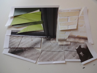
Thereafter, i decided to print out this image to refine and improve this even further. Once i printed it, i began cutting out sections within the image where there were lines and edges. I did this because i thought that it'd really emphase more deeply on all the different edges making it seem more sharp and stand out more clearly.
|
Ralph Gibson
|
Ralph Gibson- born January 16, 1939; an American art photographer. His works are usually based on fragments with erotic and mysterious undertone and his other images have a meaning through contextualization and surreal juxtaposition. He currently lives in New York and travels frequently to Europe and Brazil, where his inspirations come from.
He studied photography while in the US navy then went onto studying further at the San Francisco art institute. His photographs are included in over one hundred and fifty museum collections around the world, and have appeared in hundreds of exhibitions. His works are included in many important collections, like 'the Museum of Modern Art', 'International centre of photography' and many more. His works are really surreal and provoking, he creates a various selection of images and all these are visible on his website. |
|
Photographic technique is no secret and – provided the interest is there – easily assimilated. But inspiration comes from the soul and when the Muse isn’t around even the best exposure meter is very little help. -Ralph Gibson; from his book 'Deja vu'.
|
|
what inspirations do i have from this researchFrom this increased research of another photographer, my knowledge on edges has increased and received more inspiration. One of the main inspirations i have received from this artists is that 'you can take images of anything but make it interesting by directly focussing specifically on your theme', in my situation is 'edges'.
The youtube clip which i have inserted on the left, is an interview of Ralph Gibson. He talks about his early life and how he has been influenced by different famous artists. In addition, he says that he improves images by either cropping or adjusting the image, to emphasis on the main concept. His images are all from his imagination but influenced by other photographers eg. Henri cartier Bresson. ''Try to say true to your own vision and don't let the world adjust your thinking'' |
Gibson' collections; 1971-2004 France Colour
|
|
After looking through many of his works and exhibitions, there was one selection which really intrigued me. In addition, it gave me a lot of inspiration, and i love how these images are all based on edges. Furthermore, he uses colour well in his composition of these images as well, they are really vibrant and he uses very bold colours. Also, his use of colour is very much similar to Leiter's work as he places to colours which contrasts with each other together, therefore creating more emphasis on the brighter colour, the one which stands out. For example, this technique is really evident in the image of the bright pink scarf on top of the black. This image has a strong depth of field and also this is rather interesting as the edges aren't straight but they're more ragged and rough. Furthermore, some of his images in this collection are close-ups (like the one of the button), this allows the image to be really focussed on the details and all the edges. Even though, i feel like i can take a various images inspired by him, however one of the things that i may find challenging is that by trying to focus on the edges and not being dragged away by different concepts and themes.
|
Evaluation of an image by Gibson

After looking at his France Colour collection, there was many images which i felt could really inspire me and help me when i'm taking my images in response to his work. Nevertheless, i really liked the image on the left of the chair behind the curtains. There are two rather rusty and quite antique chairs close together, placed on the bottom half of the image. The orange curtains act as background and they fill the whole image. Even though, i don't really find the colour orange quite interesting, however the way Gibson has used it in this image makes it stand out well. The reason why i don't usually like orange in images is because i find that its very vibrant and as its quite a strong bold colour, when placing it with another colour it doesn't stand out as well and the colours clash, making the image seem very dull. Nevertheless, in this image there are different shades of orange, parts of it is a brighter colour whilst some part is more darker and its almost like the colour red. Therefore, he has taken upon the technique of tones, and so we are naturally drawn to the curtains. In addition, i like the way that Gibson, has looked at texture in his images as well; firstly, the chairs texture looks different between them too. The one placed on the right is more shiny and smooth, this is evident as there is light which is reflecting of the top section of it. This also contrasts with some parts where there isn't as much light, like the side bit of the chair where its more darker. However, going back to the idea of texture, the one placed on the right looks like it has more scratches and more rustic, this means that it's more rough and it has an uneven surface. Furthermore, the texture of the curtains seem like velvet and this makes it quite soft. So, with the various textures explained, i think i can be influenced by Gibson's image, and could probably take it on board and focus deeply on it when i'm creating my image. One other thing i noticed within this image is the use of space which is clear in the composition. He has used the corners of each chair to fill up to bottom half, whilst the curtains are the main subject in the top half and mainly dominate the image.
Jon Widman
|
Jon Widman- born 1972 in the capital city of South Japan Seoul. Nevertheless, he is currently living in New York with his family, which also gives him inspiration. He captures interior images, where he captures the things inside the home which are usually things like the bookshelf or objects. In addition, one thing i noticed while viewing his images, is that he really focusses on applying different colours within his images. He includes more lighter colours, they are usually all merges colours together which gives a more packed effect. Furthermore, composition is also one of the main elements in his images; the composition is usually very neat and thought-out. Also, the elements in his images usually are in-front of a white background, this allows the things placed in the foreground to stand out and we can really focus on the details.
|
|
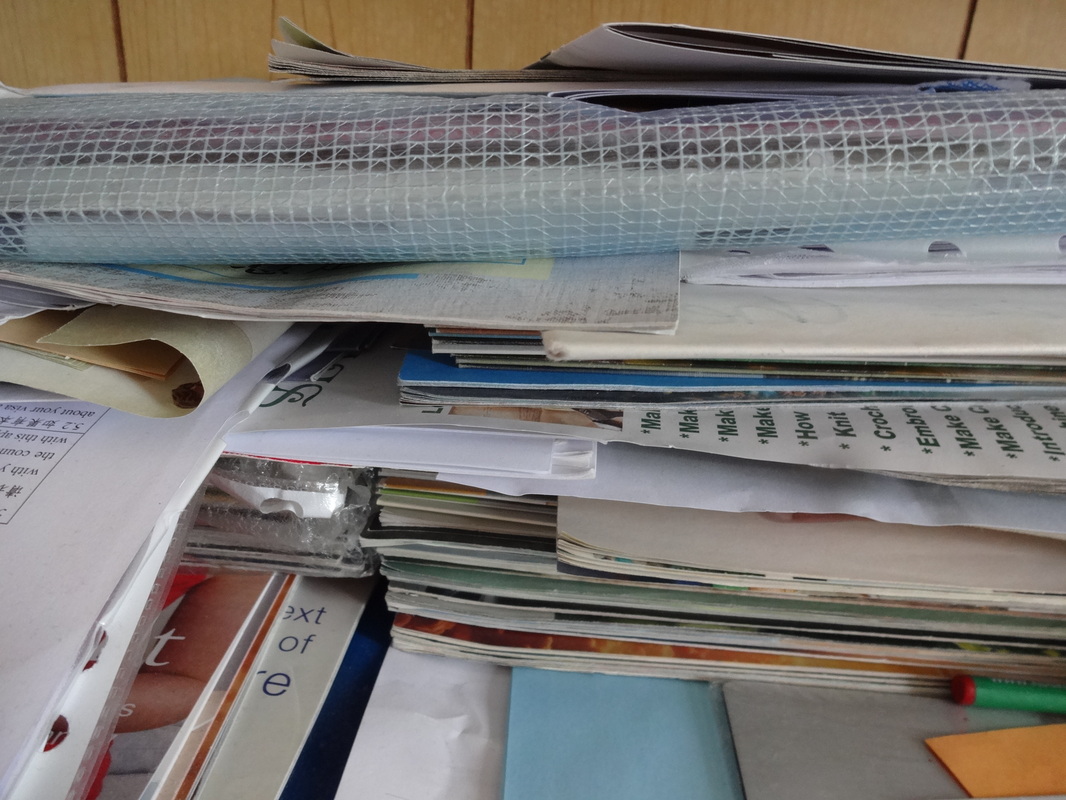
Fourth set of images; response to Widman's work

Evaluation of these set of images;
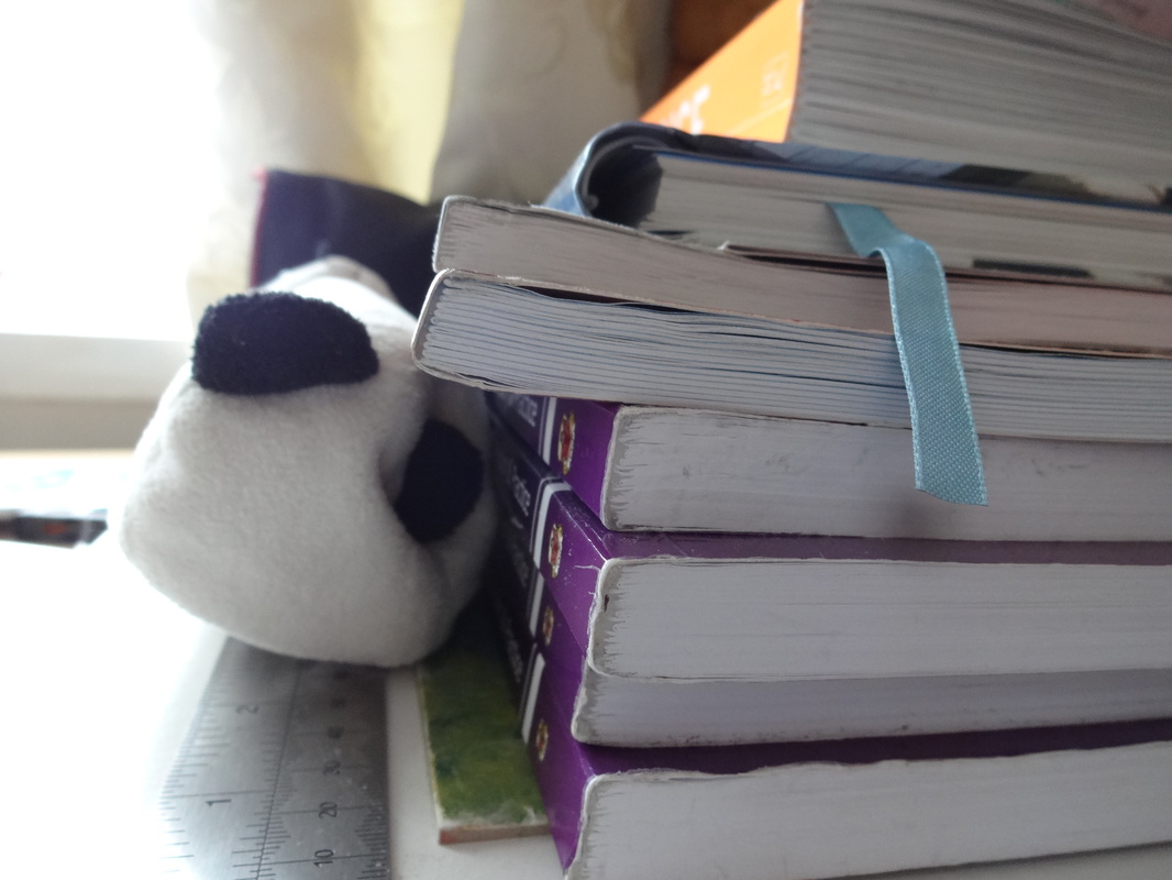
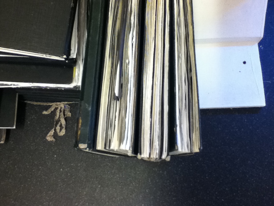
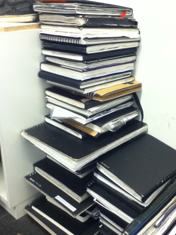
When taking these set of images inspired by Widman, i managed to focus on one subject rather than taking edges of different things and various things. This is better as i can see which images came out well and which images i can improve on. My images are based on the edges and sides of paper and books. Widman's work reflected this as he usually captured images of spines of books, stacking each other or either lying on the book shelf. However, one thing i did different compared to him is that i took mainly close-ups, whereas he took images from a wide angle and also had a clear background. Taking close-ups really emphasis on the details and the different edges shown. Furthermore, the being closer into the image, allows us to clearly see the various depths of the books, varying from slim to others being more chunky. Another thing that i did well from this experiment, is that i played around with colour and used different colours to show all the various tones within the image. In some images, for example the first one, i captured the corner of plain white paper, and the background is relatively dark, this is interesting as the saturation in this image is very low, therefore we focus more on the over-lapping paper rather than the background. On the other hand, the forth image (last image on the top row), there are various colours in the image. This image captures a bookshelf with many different books stacking on top of each other. Also, the sixth image, uses a wide range of colour as well, where we can see the colour red, green, yellow and more. Furthermore, in these images, i captured them with different angles, some were from my hip whilst others were diagonal towards my subject. After looking back at my images, i think that the images taken from my hip (low angle) are much better, as the whole image is filled and there is not much negative space. In addition, whilst taking these images, i really tried to focus on the composition and tried to make it as effective as i could of, whilst always remembering my concept-edges. In some of the images, the composition is much neater and the features in the image look very organised, this is evident in the forth image (last image on top row), as the books seem carefully stacked upon each other. Nevertheless, the last image (last image on bottom row) all the elements are really chaotic and doesn't seem like it's been carefully placed. To improve these images furthermore, next time i could focus more on the idea of contrasts; shadows and brightness.
Using the Rule of Thirds
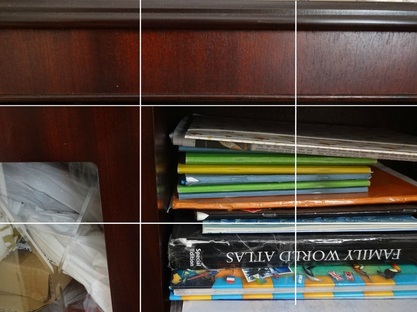
One of the many compositions i used in my set of images is the rule of thirds, which we have studied before. I have in co-operated a three by three grid onto my image, to show where each section is separated. From this grid we can immediately see that the main concept is to the bottom right hand corner. In addition, there is also a few parts of negative space made by the edges of the bookshelf. Therefore as there is a large proportion of the image which is filled up, we are directly drawn to that space. In addition, that section has the most variety of colour, they are mainly pastel colours, however the black colour gives it some contrast. Furthermore, these colours also contrast with the negative space as its a relatively brown colour. One other thing good about this image, is that i also focussed on texture; the bookshelf has a shiny and what seems more smooth, this is evident as to do top right hand side there is some light which is reflected back, this makes that section more lighter. However, if i were to improve this i would possibly take the image facing away from the light so the surface remains the same tone. Going back to my idea of edges, i think that this image has clearly reflected as there are many edges being perceived within one image; being that from the corners of the bookshelf to the spines of the books.
Fifth set of images; improved response Widman's work;
Evaluation of images
After taking a few images at home inspired by Widman, i decided to improve my work and take more improved images. So, these images are more linked to the artists work, where i have mainly based it on the spines of books. Most of the images are closed-up, therefore this really focuses on the details and depths of the books. Even though, i captured these images using an iPod, the quality of the photo wasn't as bad as i expected it to be. However, if i'd of took it with a DSLR the quality and contrasts in the image, may appear much more bold and clear. In addition, as some images had a clear white background, this meant that the elements could really stand out in the foreground and it wouldn't blend in with the things in the background either.
Image edited and refined;

|
|
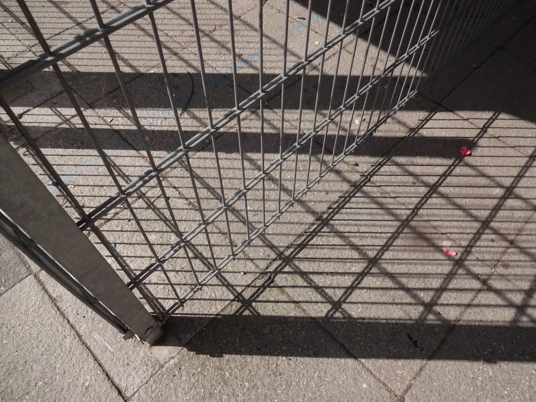
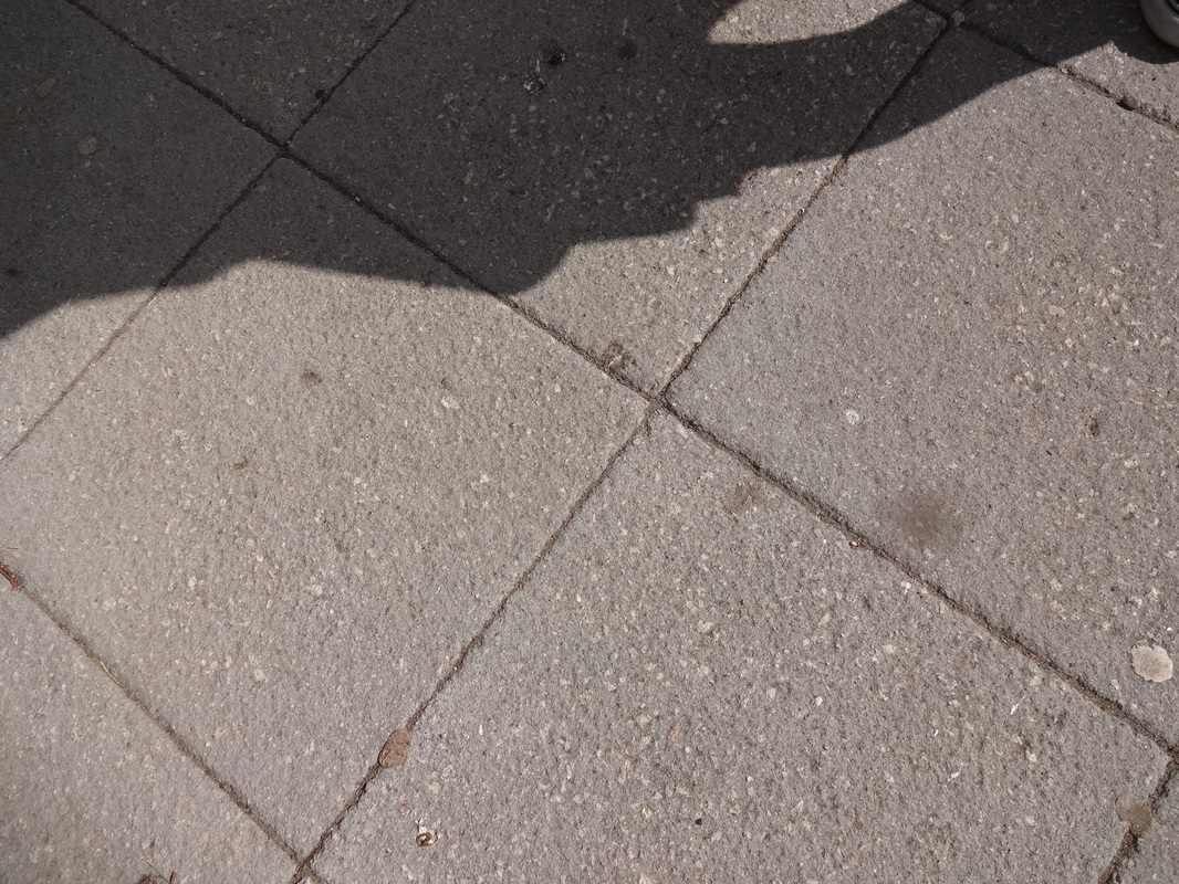
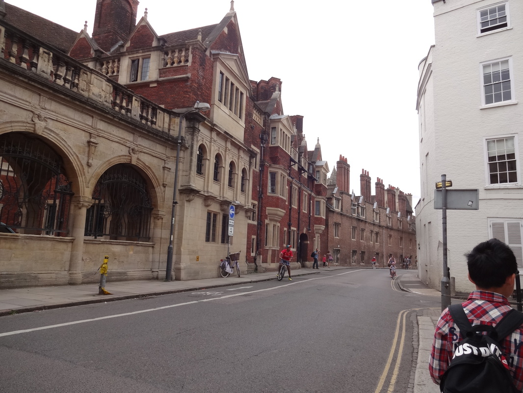
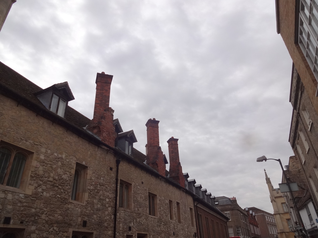
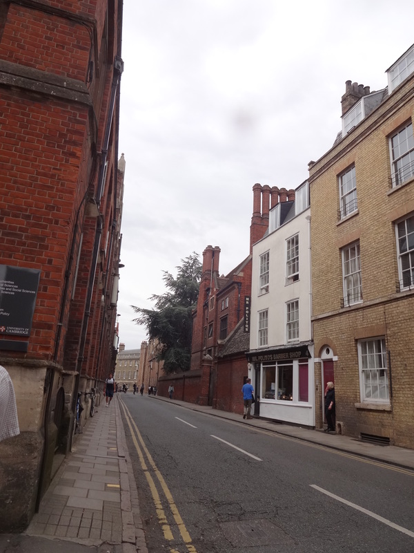
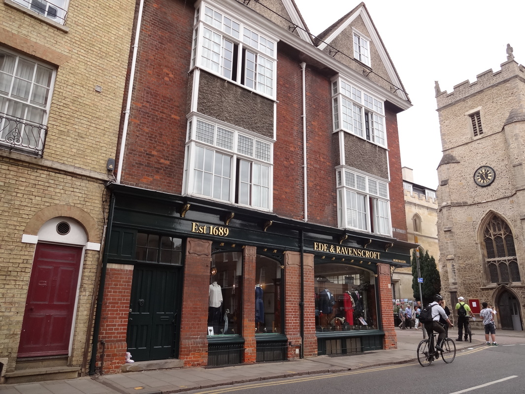
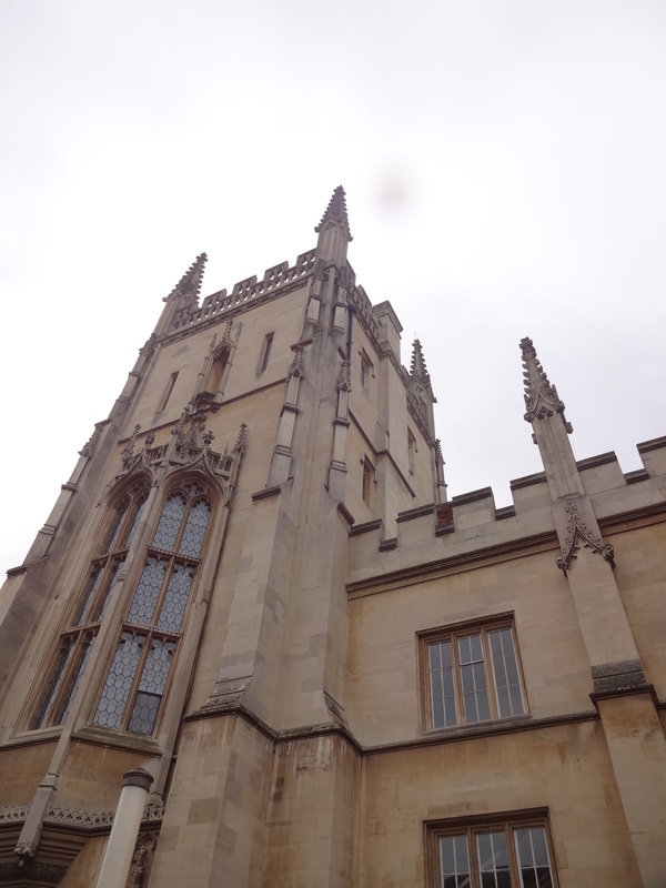
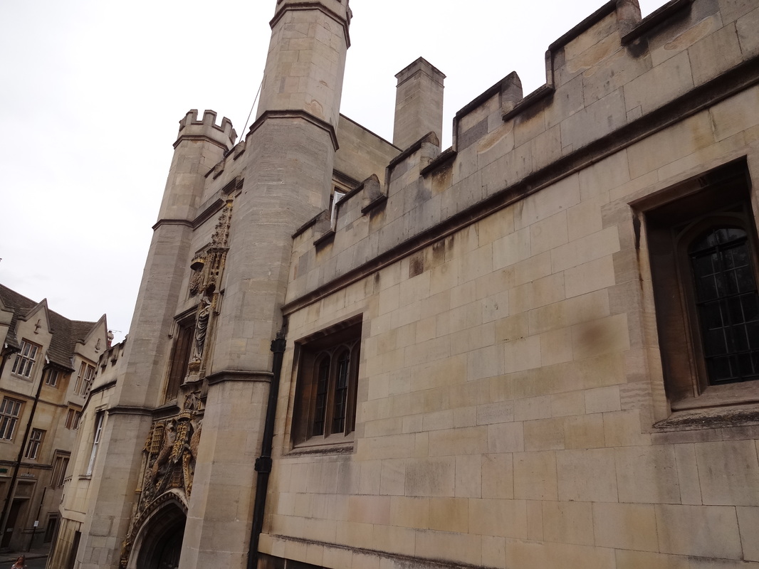
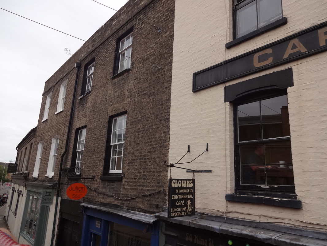
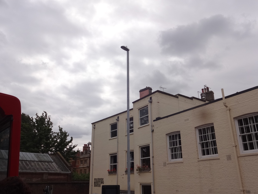
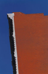
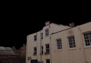
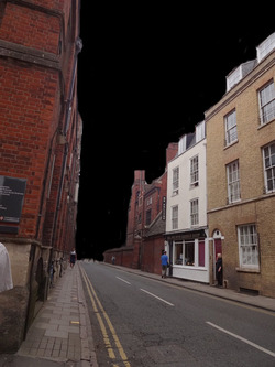
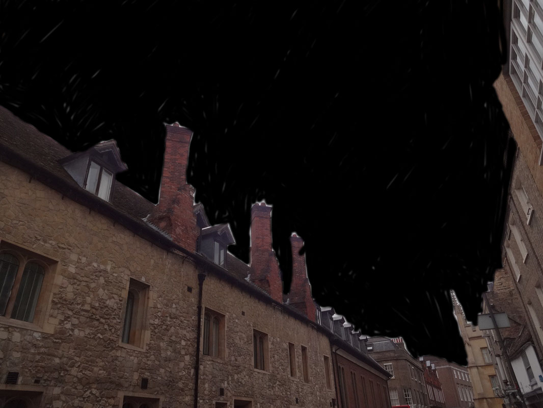
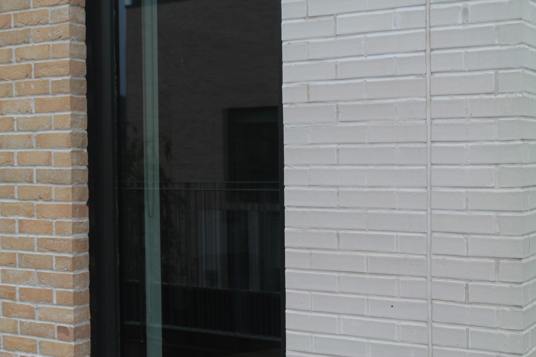
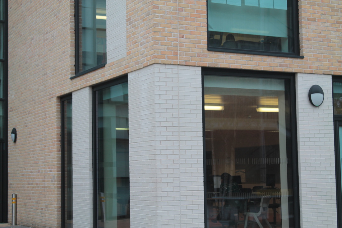
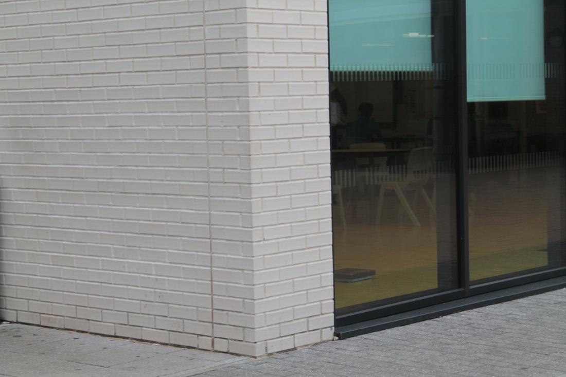
Cambridge (sixth) images; building edges -inspiration Ralph Gibson
Evaluation on the set of images overall.
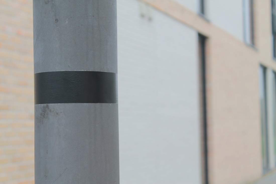
During the summer holidays, we received a task to take several images based on our chosen images, mine which was edges. Therefore, i was in Cambridge for one day and decided to capture different edges, mainly ones on buildings. I especially like the ones of buildings, as they aren't modern buildings, but they have defined and clear edges. Nevertheless, i focussed on composition whilst capturing these images, as i tried to fill the whole image, and that there was only one subject in the whole photo. So, nothing was disturbing it in the background. In addition, after uploading my images, i noticed that the first 3 on the top row, all had similar properties, where the colours on the buildings were quite dark, with a combination of maroon and creams. Also, the sky in the image all follow a certain rule, where they all go in into the centre. I found this really intriguing which gave me an idea, as i remembered the works of Ralph Gibson, where he filled the negative parts of the image, I will be explaining this process down below. Overall, i think these images worked out well due to composition, the angles in which i captured my images and colours. To improve, i could do some close-ups, as most of my images are from a distance. Next, i will try to group some images together some images which are similar.
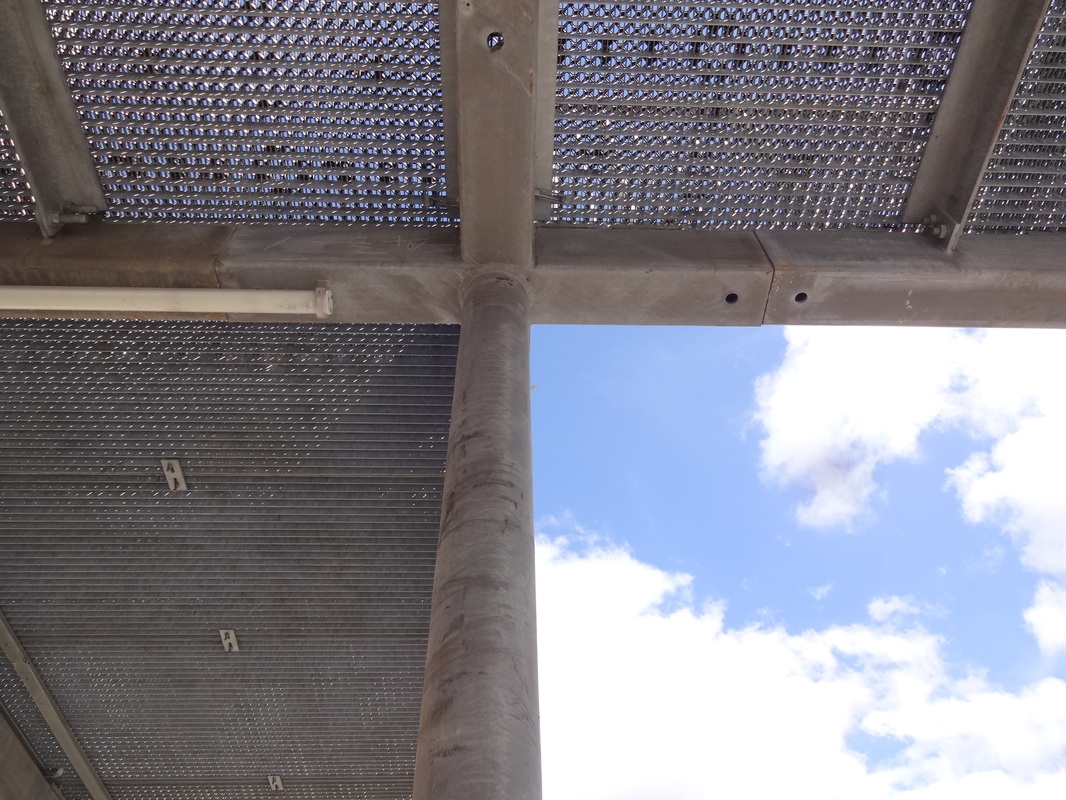
Inspirational images.
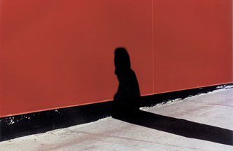
These two images, gave me an idea which i could do for my final pieces. In these two images, which focus on edges, Gibson has filled the negative places, with a clear opaque colour. The filled areas, are the parts which are not necessary for the image, in some cases it could change the meaning in the photo. Nevertheless, by filling it, it allows us to just focus on the main parts of the image. For example, the image on the right, we are directly focussed on the shadow and nothing else. In addition, the shadow is also a very opaque black colour which is similar to the background. This allows the main element to not blur in into the background.
FINAL PIECE #1
|
|
|
In conclusion, after researching the works of Ralph Gibson and receiving inspiration from his works, i have come up with 3 images which i have edited and refine which i feel is strong and good. Firstly, i looked at the Tallis arts website, which i came across the photographer Ralph Gibson. From there i began my sophisticated research on him; his background, career, works etc..
Buildings- school
SECOND FINAL PIECE-
|
|
|
THIRD FINAL PIECE-
|
|

|
Display Strategies
As our A04 is 'presenting our images', the way we display our final pieces plays a vital role also. Therefore, i went onto the Tallis Arts pinterest site (link above), to find ideas and possibilities which i can experiment with later. After scrolling through the page, there were many different and interesting ideas, but there was only a couple which i feel would work with my edges project. My choices were quite simple but also really representative. I will only display a few images, not several, because if there's too much then its too complex. The idea of hanging my images is quite compelling and simple. I will be use the first two as an inspiration for my first final piece which is inspired by Ralph Gibson, I will use 3 seperated strings to separate each image but hung onto something like a hanger. Secondly, for my next final piece i will be using the third image as an inspiration- to cut up the image. I will be using one image inspired by Saul Leiter; which i will cut up in a more neater and formal way than this image here.

|
|
|
----------------------------------------------------------------------------------------------------------
Evaluation
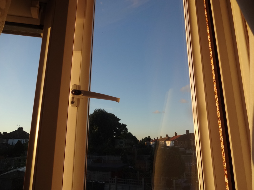
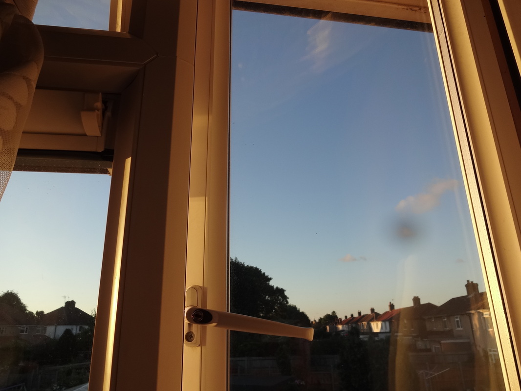
When we received this project, we were given the options of: fragments, disguise, edges or openings. After considering these options i decided to follow the edges theme, this is because i particularly like taking bold, abstract images. Before, with previous photo shoots and experiments after analyzing them, i feel like my most strongest use of the formal elements was edges and lines. Therefore, i thought it would be the most easiest and obvious pathway to go with. I firstly began with using the resource- Tallis pinterest page, to get initial impressions and inspirations. I began pinning some of the things i found interesting and appropriate to experiment with. During this, i found that the topic 'edges' was rather broad and open to interpretations. Some images were really abstract whereas some was capturing literal daily life and street life. At this point, i realized that i had to understand which way i wanted to go with this topic and how what i wanted to experiment with. So, i created an initial plan to help me throughout the whole project so i remain on track and achieve all the AO's - objectives. Nevertheless, firstly i took some original images, of what i felt edges could be related to. My first set of images was based around the idea of windows, windows show very defined and sharp edges. As the edges were quite lifeless, by adjusting the light within the images and also the angles in makes the image more captivating. These images also showed the views outside which was related the the natural world, as they showed grass, sky and also plants. By adding these subtle changes, allowed the set of image to also contain contrasting tonal elements. Even though i hadn't done any artist research yet, by creating this first set of images gave me a clear basis and showed that i could work independently and creatively.
Thereafter, i came across the artist Saul Leiter from pinterest, which i found his work quite appealing and intriguing. After doing some research, i found out that he was has created rather abstract, contemporary images; he's made a lot of photography collections which i found on his website. To understand more about him and his photography works , i looked at a lot of his collections and thoroughly analyzed some images to see which ones i could adapt from. Leiter focuses on the technique of composition and colour within his images. After doing Saul Leiter experiments, which were in some aspects successful because they weren't really focused on one main concept, i began improving my images by using the resource Photoshop. I selected one image which was most related to his work; however, i feel like this image decision wasn't really good as it was too basic and rather literal. When editing this image, i adjusted the saturation, contrast, lightness, also cropped out a small section of the image, this way the concept in the theme was more visible and clear. Nevertheless, as this was my first time using this source, i wasn't really familiar with all the various processes and techniques i could use. However by taking a risk and actually trying to reprove an image, allowed me to be more confident using Photoshop and therefore, i wanted to carry on using it in my future experiments. After analyzing and evaluating my second photo shoot, finding WWW and what i could do to improve them, i found out that the elements i used in some of the images was shadows and reflection.
From the last experiment, i didn't really know how i could further develop the images. So instead of wasting time and thinking about this, i directly went onto research another artist- Ralph Gibson. Referring back to the tracker and in this case AO1, this artist research was one of my best because i produced a detailed research which i also developed sophisticated ideas from, and i could also analyze an image skilfully and i understood the context in which they were made. I viewed lots of his view which was in some ways similar to my previous artist, as they both used the idea of using negative space within an image to contextualize and focus on the concept. Moreover, work with quite striking colours, to really ''naturally attract the human eye''. Even though at this point i hadn't created an experiment inspired by him, i knew that i would in a few weeks when the opportunity comes. One reason which i hadn't started this third photo shoot was because i wanted to capture these images elsewhere and not around the school as i felt like this area was compact and didn't have a lot of connection with my theme. Therefore, in my summer holidays, i got the chance to go to Cambridge where i knew i could take very good images inspired by Gibson. Overall i was really pleased with the outcome of the images, as they really reflected the idea of edges and also colour. As most of the images were captured from a high angle, it wasn't close up, so there was quite a bit of 'free' space, where it just acted as the background, in this case it was the sky. From my research i found out what i could do to improve and make these images much interesting. So, again by experimenting with Photoshop, i decided to fill these 'blank' areas with just a black filling. By doing this it created more character in the image making it seem more surreal and imaginative. In the end, i decided to do this to 3 similar images, so that they relate to each other. I arranged these 3 images in a row, hopefully hanging on a hanger, acting as my first final piece, which i am proud of!
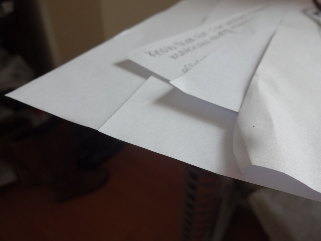
Continuing on, i returned to the Tallis pinterest site to find more inspiration- which i came across the artist Jon Widman and also Lucio Fontano. I created 2 photo experiments based on Widman's work, which was quite successful. I found this photo shoot quite easy and it wasn't really challenging for me. Therefore, if i was to do it again i would've chose to look at someone more captivating and more imaginative. In addition, i researched an artist: Lucio Fontano. There wasn't much information which i could find about him on the internet, which is why i haven't included a research artist on him on my page. Nevertheless, his work was just based around tiny cuts in the image on an plain piece of paper. Although, his work was quite boring, i still got some inspiration from it which i have included in my second final piece.
For my second final piece, i have just one image which i have carefully refined and improved. I tried to combine many ideas and techniques in this so it's more sophisticated. I used one of my initial first photo shoot images which was the window ones. After printing this image out, i used a scalpel to carve out different lengths and widths of lines, going in a diagonal line across the image, this idea originated from Fontano. I found this really interesting and it created more emphasis within the image. Once i finished with that, the image still looked quite simple, so i cut out this image into small sections which represented my edges theme and also related to one of the formal elements- shapes (geometry). Following on from this, and after looking at the display strategies page, i decided to arrange the sections in a neat and organised way where there was just a tiny gap between each section; creating a distinct and perspicuous final piece.
In conclusion, i am overall very pleased with my progress in this Externally set Task. During this whole process i have learnt a lot; to be more confident with my experiments, taking risks and trying out new sources and techniques and to persevere with challenges and difficulties. I have developed a stronger and more sophisticated idea in photography, where i have learnt to be more creative and imaginative, which i can therefore use during the rest of my GCSE course.
Thereafter, i came across the artist Saul Leiter from pinterest, which i found his work quite appealing and intriguing. After doing some research, i found out that he was has created rather abstract, contemporary images; he's made a lot of photography collections which i found on his website. To understand more about him and his photography works , i looked at a lot of his collections and thoroughly analyzed some images to see which ones i could adapt from. Leiter focuses on the technique of composition and colour within his images. After doing Saul Leiter experiments, which were in some aspects successful because they weren't really focused on one main concept, i began improving my images by using the resource Photoshop. I selected one image which was most related to his work; however, i feel like this image decision wasn't really good as it was too basic and rather literal. When editing this image, i adjusted the saturation, contrast, lightness, also cropped out a small section of the image, this way the concept in the theme was more visible and clear. Nevertheless, as this was my first time using this source, i wasn't really familiar with all the various processes and techniques i could use. However by taking a risk and actually trying to reprove an image, allowed me to be more confident using Photoshop and therefore, i wanted to carry on using it in my future experiments. After analyzing and evaluating my second photo shoot, finding WWW and what i could do to improve them, i found out that the elements i used in some of the images was shadows and reflection.
From the last experiment, i didn't really know how i could further develop the images. So instead of wasting time and thinking about this, i directly went onto research another artist- Ralph Gibson. Referring back to the tracker and in this case AO1, this artist research was one of my best because i produced a detailed research which i also developed sophisticated ideas from, and i could also analyze an image skilfully and i understood the context in which they were made. I viewed lots of his view which was in some ways similar to my previous artist, as they both used the idea of using negative space within an image to contextualize and focus on the concept. Moreover, work with quite striking colours, to really ''naturally attract the human eye''. Even though at this point i hadn't created an experiment inspired by him, i knew that i would in a few weeks when the opportunity comes. One reason which i hadn't started this third photo shoot was because i wanted to capture these images elsewhere and not around the school as i felt like this area was compact and didn't have a lot of connection with my theme. Therefore, in my summer holidays, i got the chance to go to Cambridge where i knew i could take very good images inspired by Gibson. Overall i was really pleased with the outcome of the images, as they really reflected the idea of edges and also colour. As most of the images were captured from a high angle, it wasn't close up, so there was quite a bit of 'free' space, where it just acted as the background, in this case it was the sky. From my research i found out what i could do to improve and make these images much interesting. So, again by experimenting with Photoshop, i decided to fill these 'blank' areas with just a black filling. By doing this it created more character in the image making it seem more surreal and imaginative. In the end, i decided to do this to 3 similar images, so that they relate to each other. I arranged these 3 images in a row, hopefully hanging on a hanger, acting as my first final piece, which i am proud of!
Continuing on, i returned to the Tallis pinterest site to find more inspiration- which i came across the artist Jon Widman and also Lucio Fontano. I created 2 photo experiments based on Widman's work, which was quite successful. I found this photo shoot quite easy and it wasn't really challenging for me. Therefore, if i was to do it again i would've chose to look at someone more captivating and more imaginative. In addition, i researched an artist: Lucio Fontano. There wasn't much information which i could find about him on the internet, which is why i haven't included a research artist on him on my page. Nevertheless, his work was just based around tiny cuts in the image on an plain piece of paper. Although, his work was quite boring, i still got some inspiration from it which i have included in my second final piece.
For my second final piece, i have just one image which i have carefully refined and improved. I tried to combine many ideas and techniques in this so it's more sophisticated. I used one of my initial first photo shoot images which was the window ones. After printing this image out, i used a scalpel to carve out different lengths and widths of lines, going in a diagonal line across the image, this idea originated from Fontano. I found this really interesting and it created more emphasis within the image. Once i finished with that, the image still looked quite simple, so i cut out this image into small sections which represented my edges theme and also related to one of the formal elements- shapes (geometry). Following on from this, and after looking at the display strategies page, i decided to arrange the sections in a neat and organised way where there was just a tiny gap between each section; creating a distinct and perspicuous final piece.
In conclusion, i am overall very pleased with my progress in this Externally set Task. During this whole process i have learnt a lot; to be more confident with my experiments, taking risks and trying out new sources and techniques and to persevere with challenges and difficulties. I have developed a stronger and more sophisticated idea in photography, where i have learnt to be more creative and imaginative, which i can therefore use during the rest of my GCSE course.
