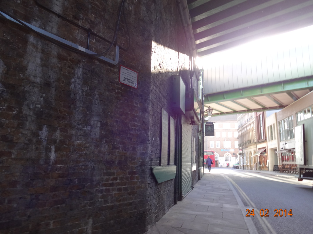
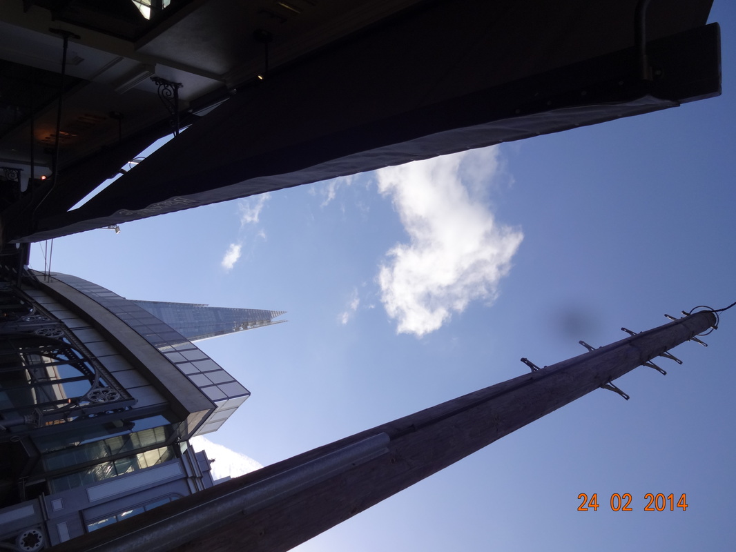
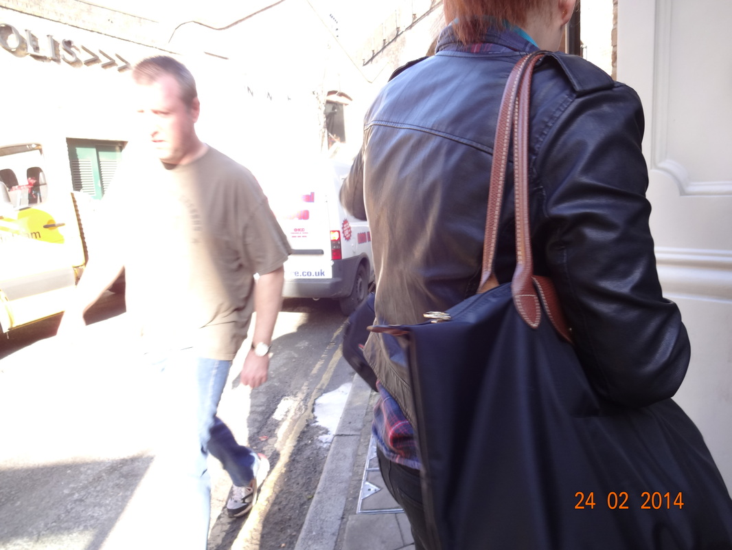
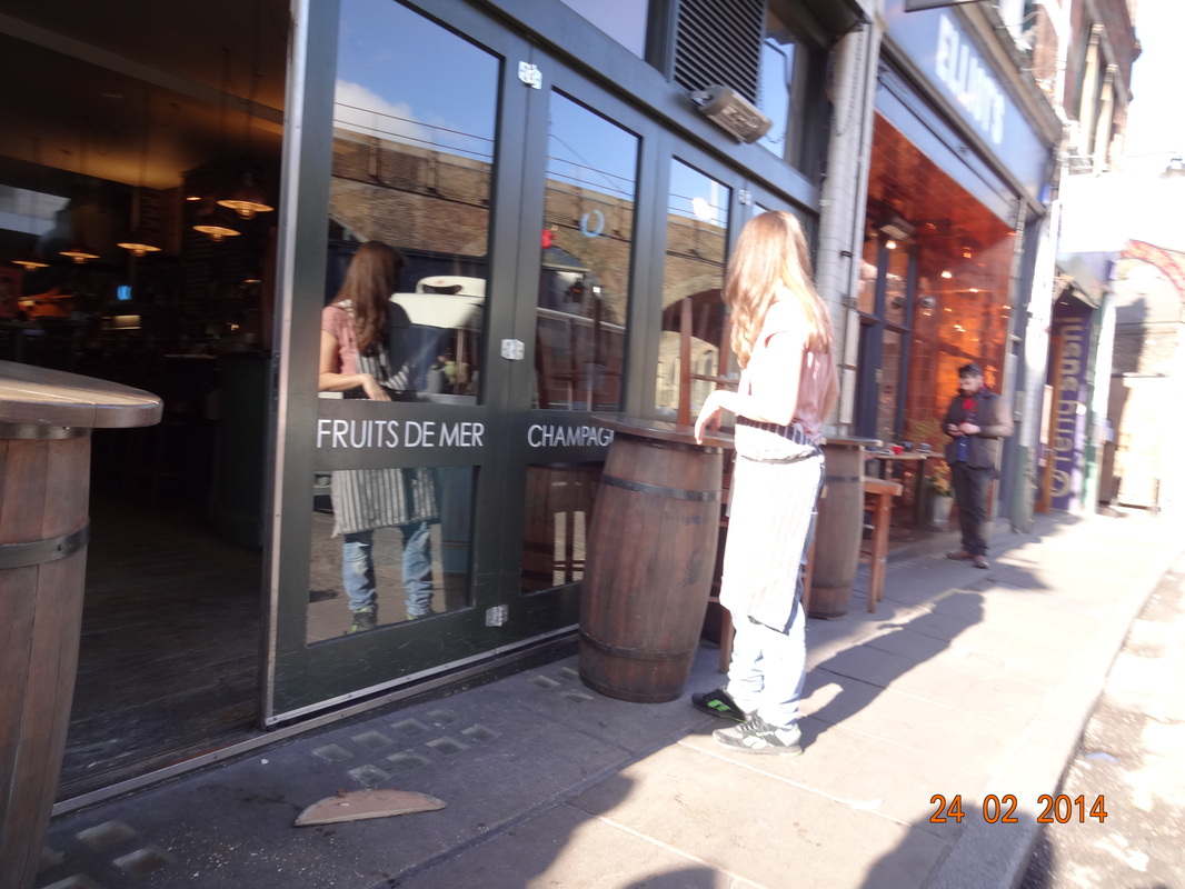
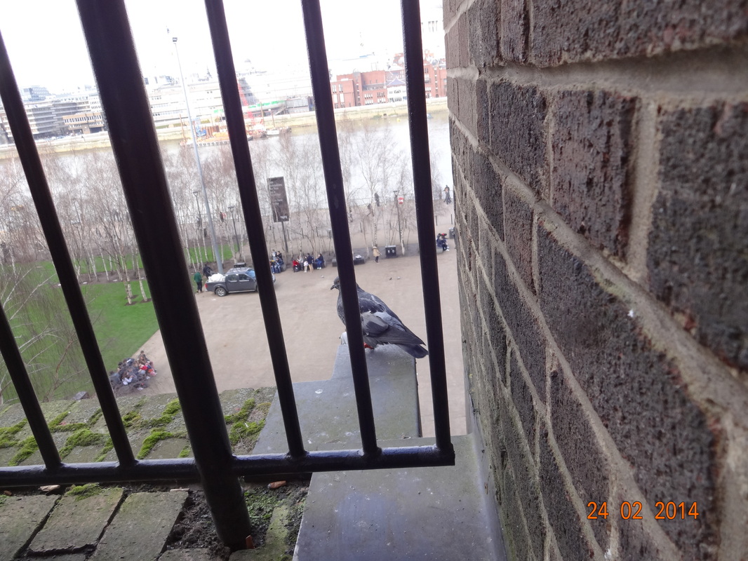
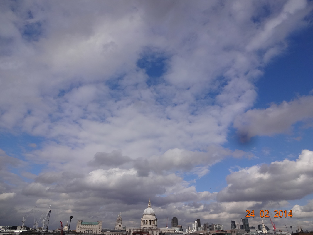
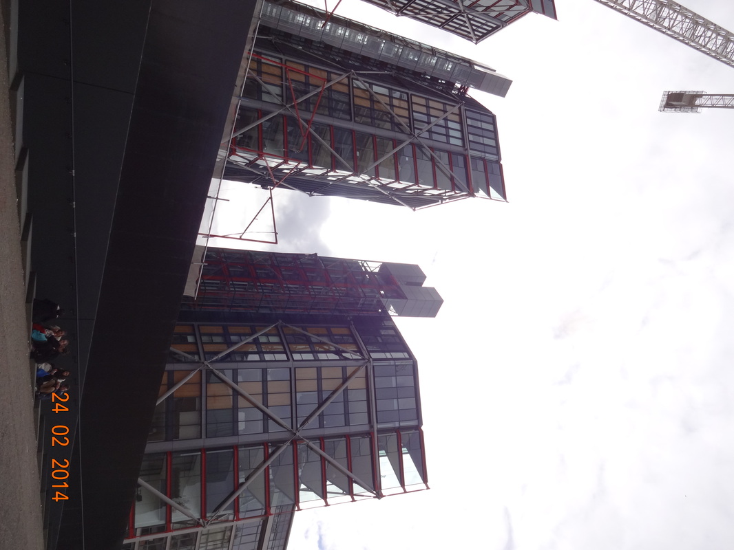
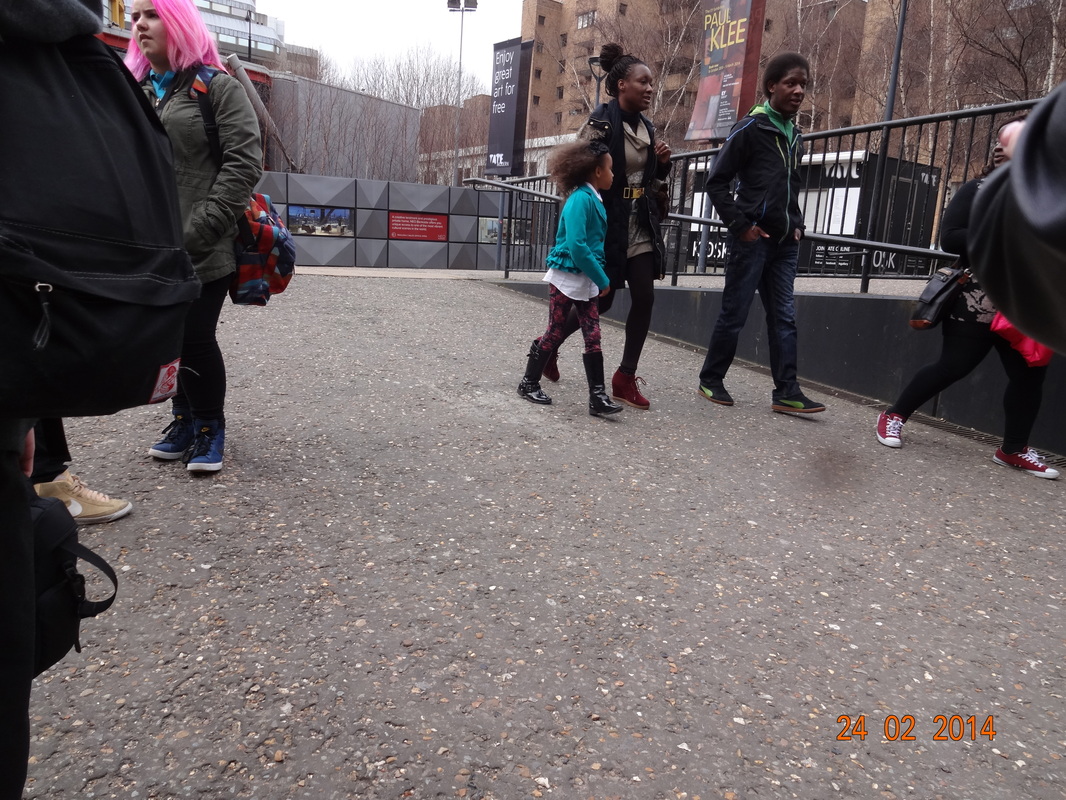
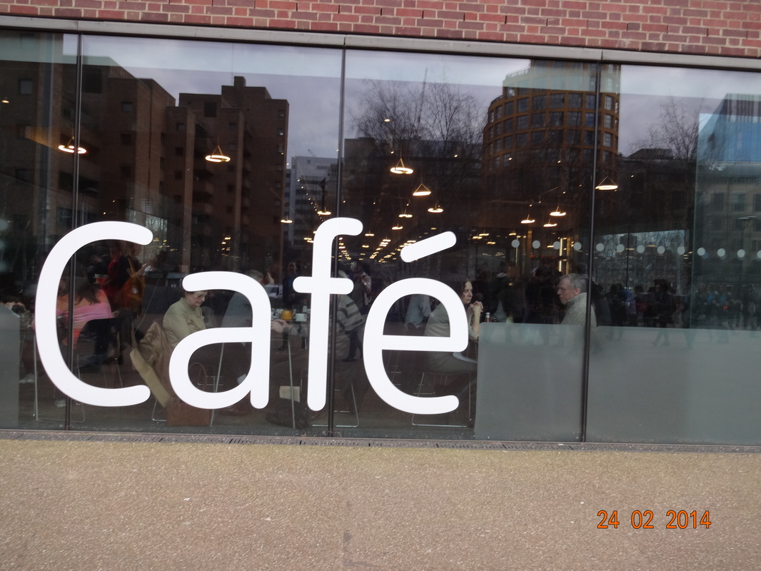
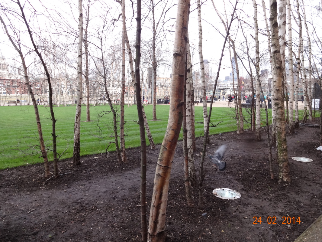
Tate Modern street photography.
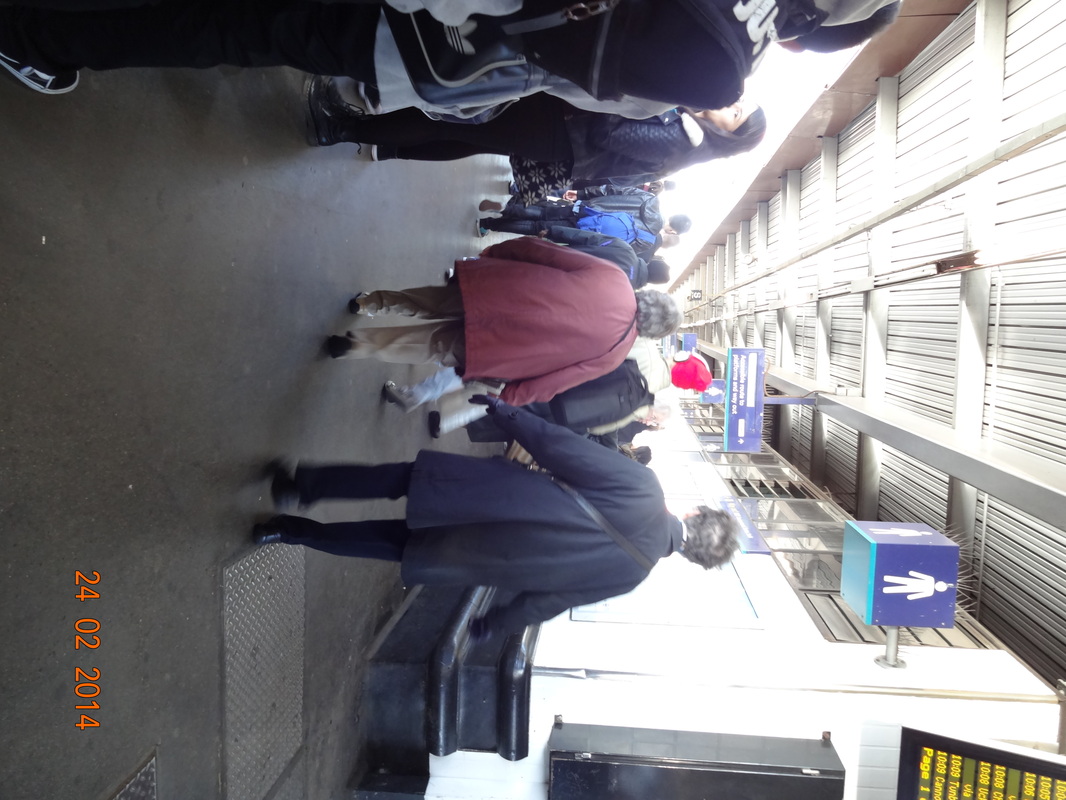
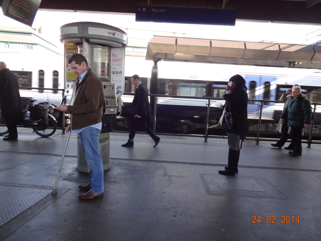
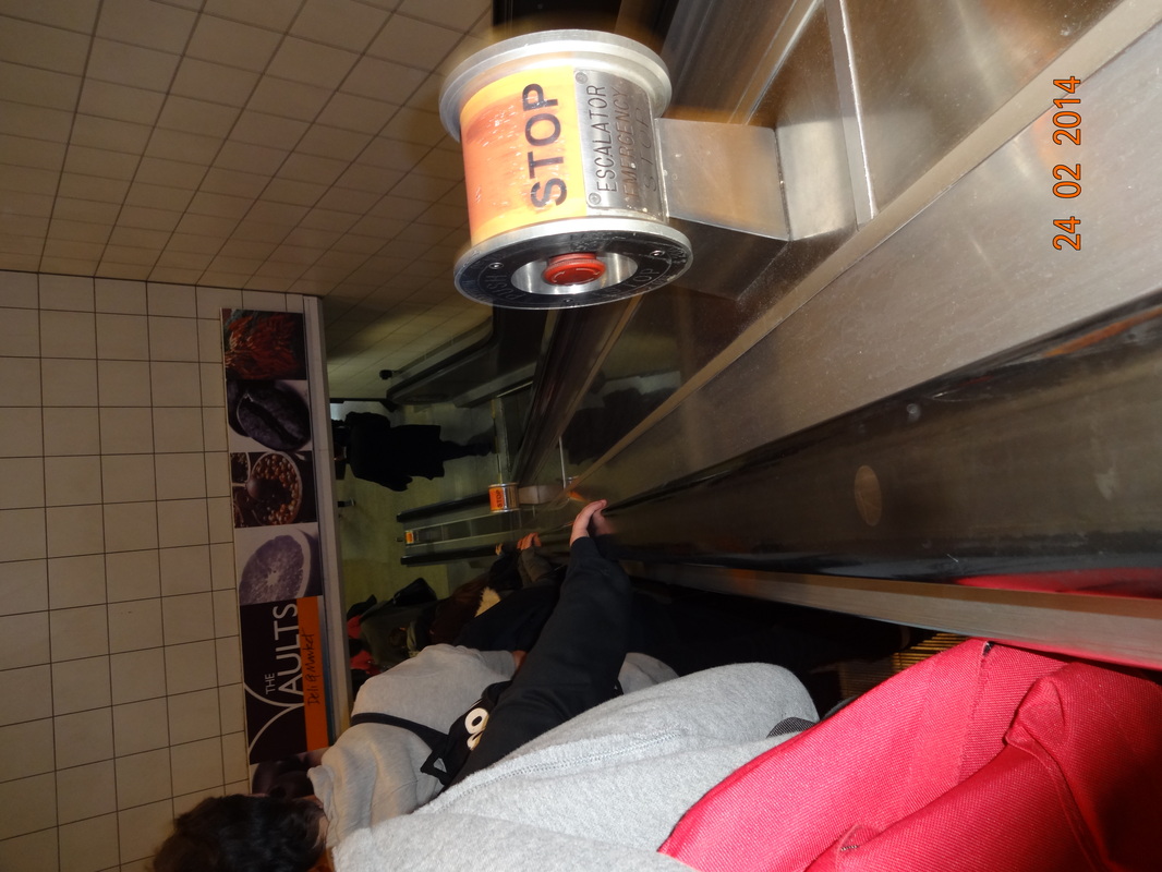
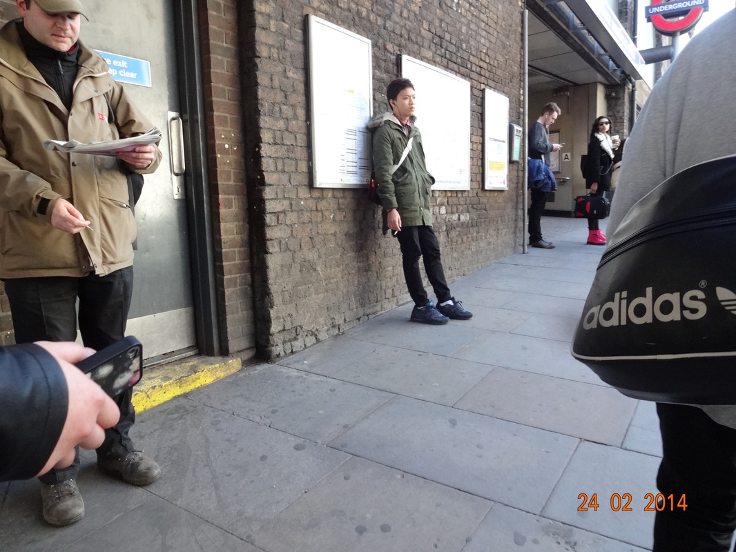
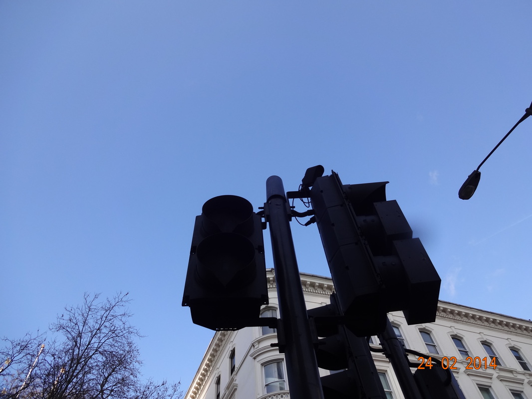
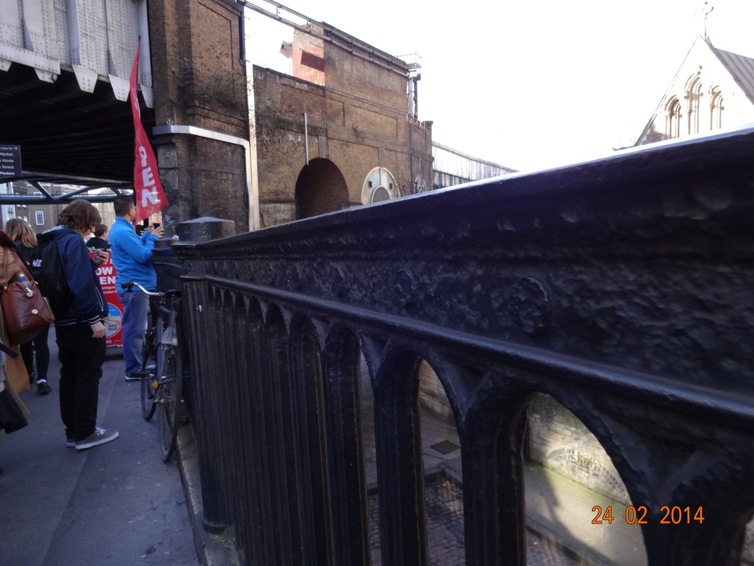
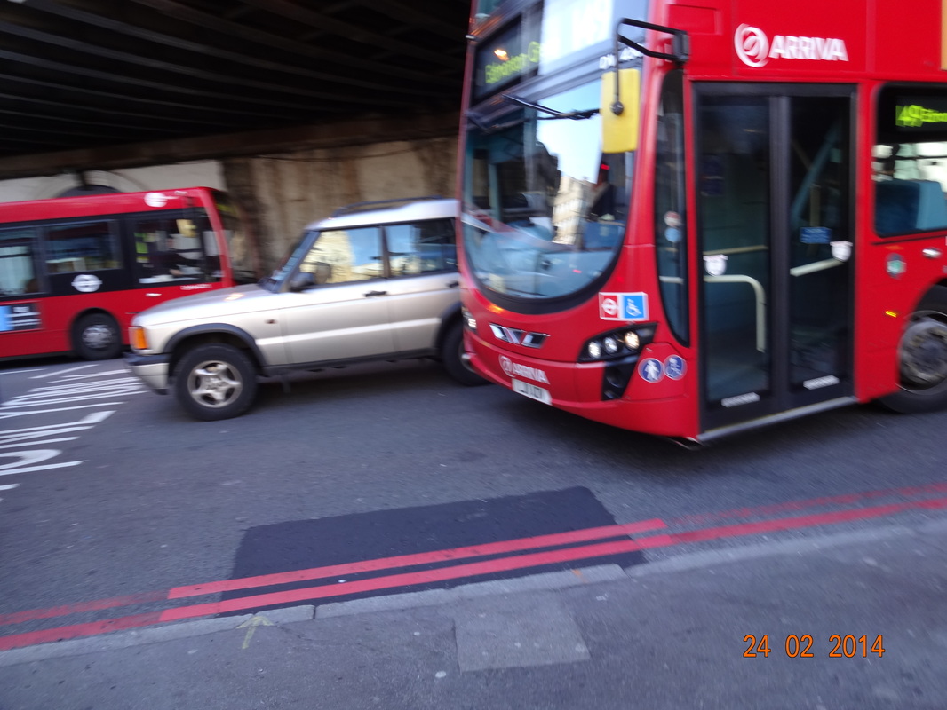
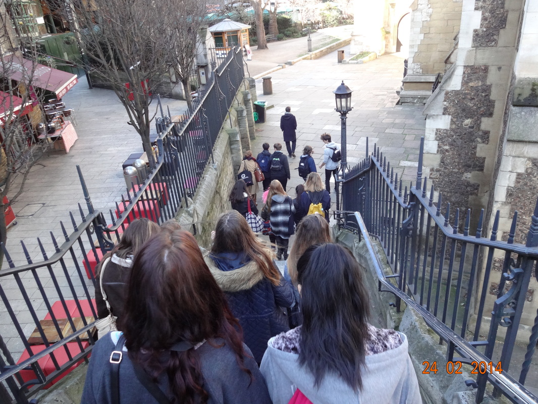
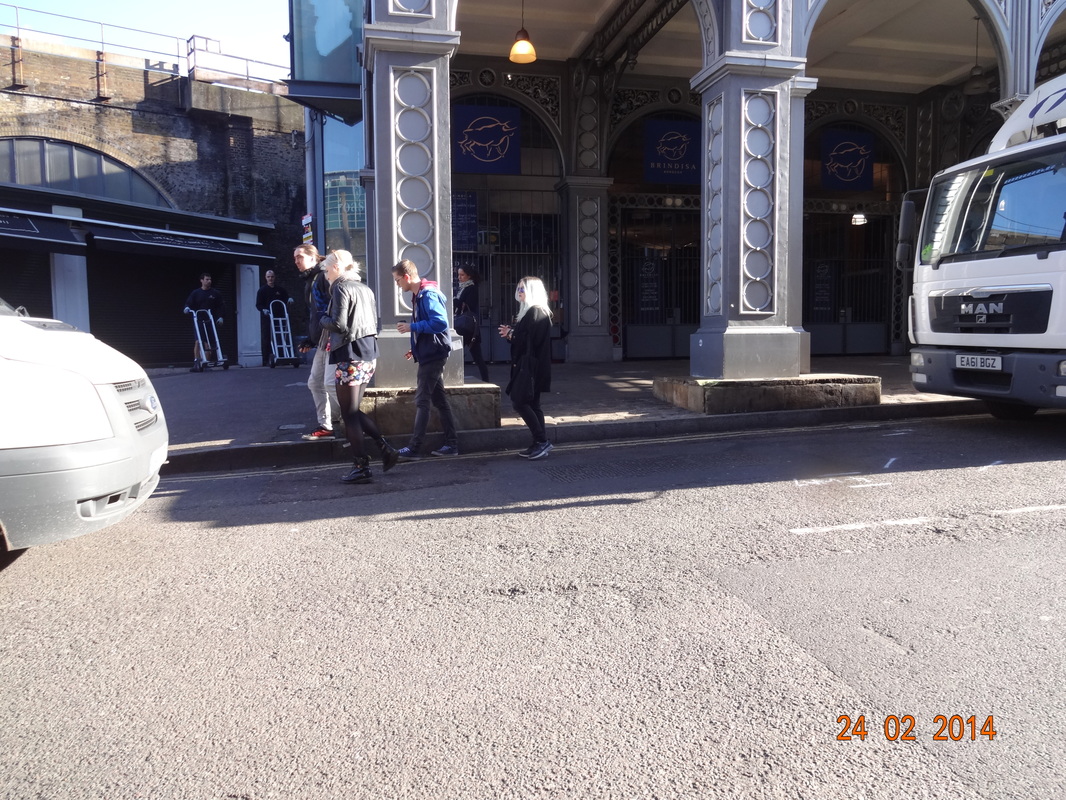
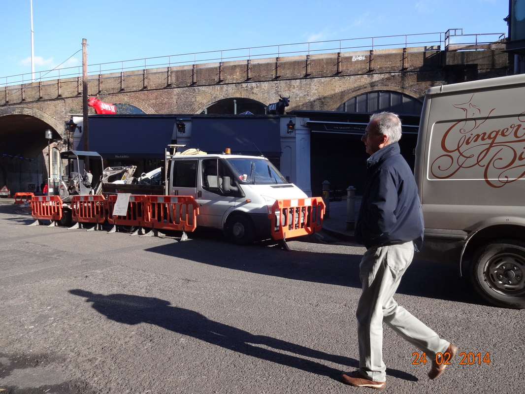
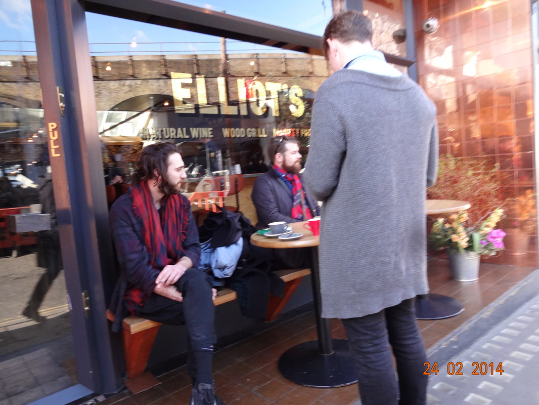
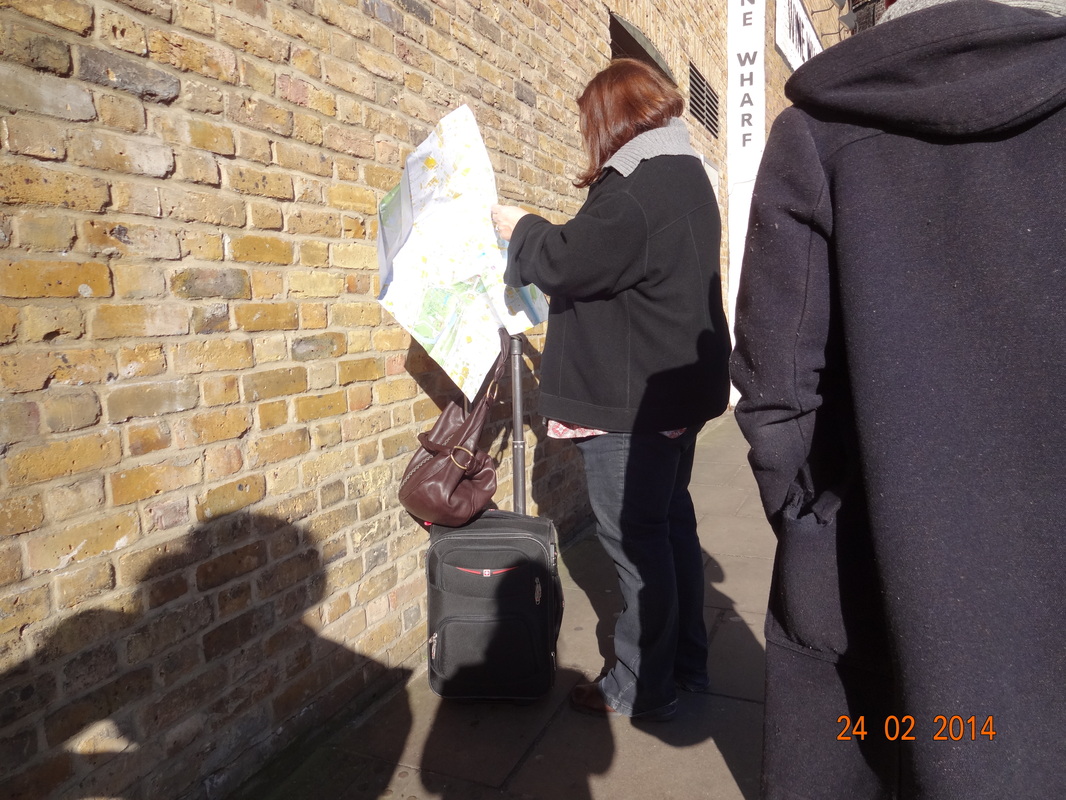
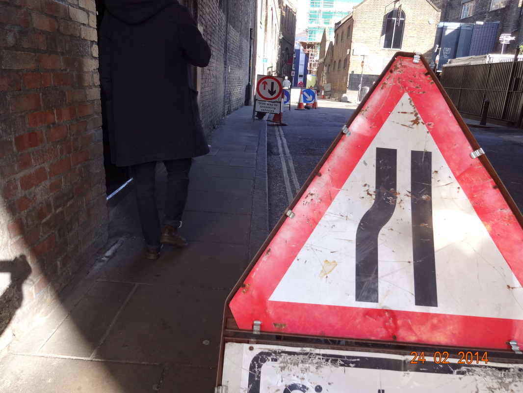
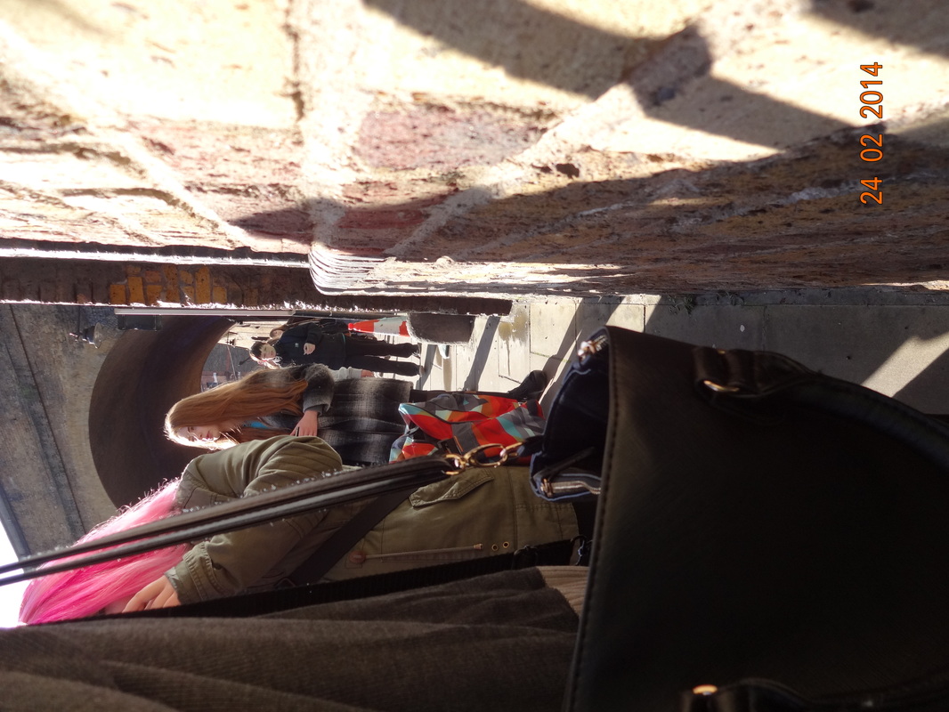
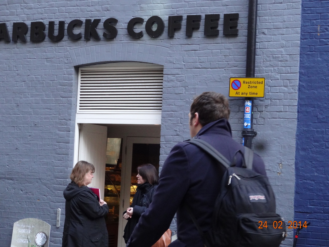
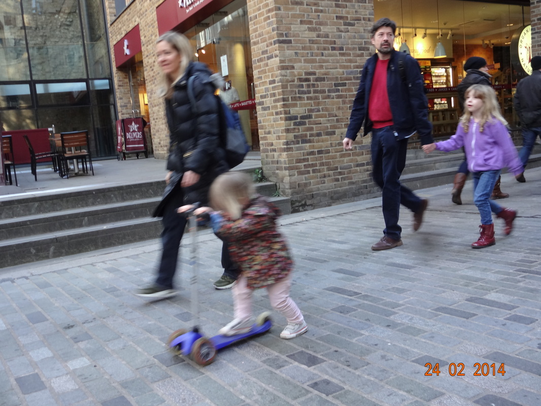
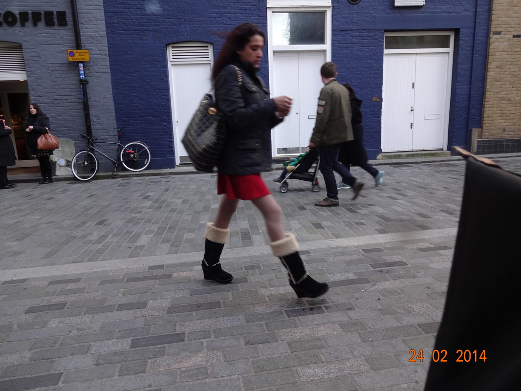
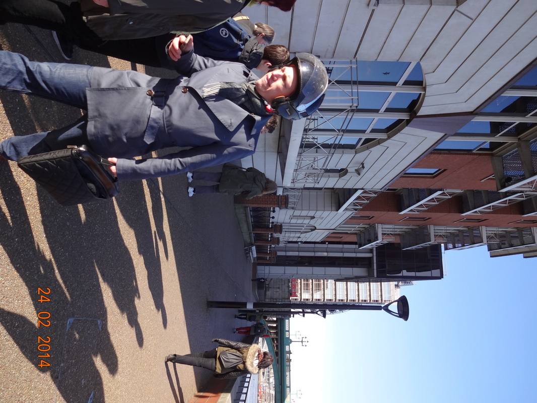
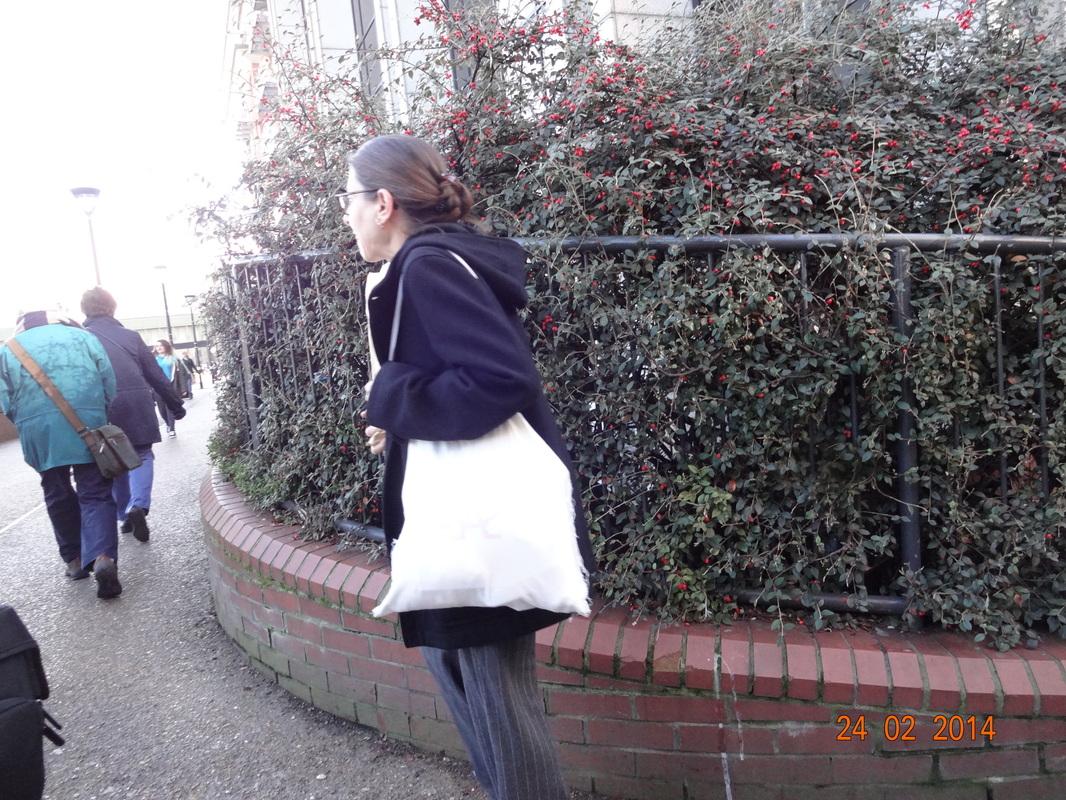
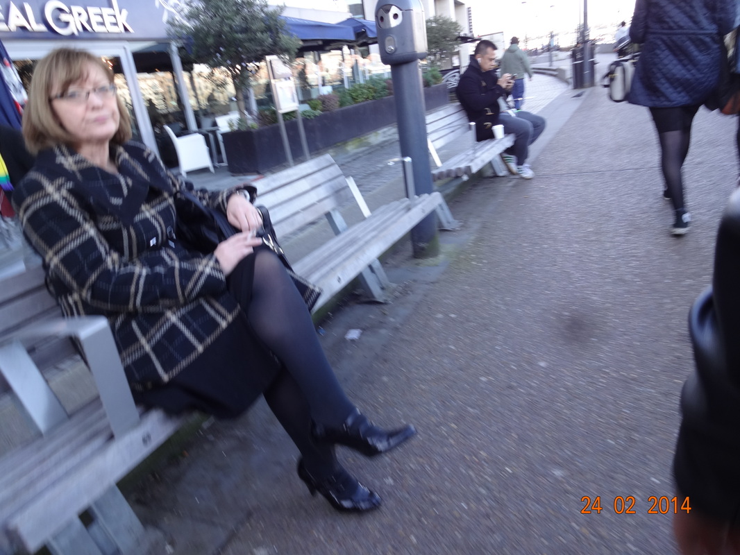
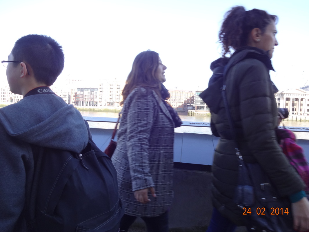
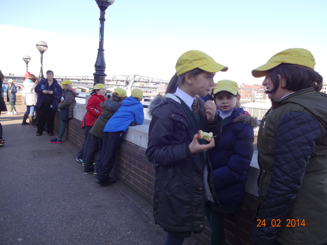
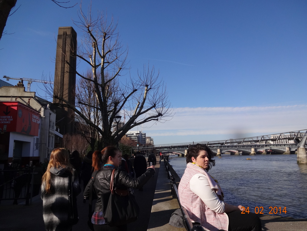
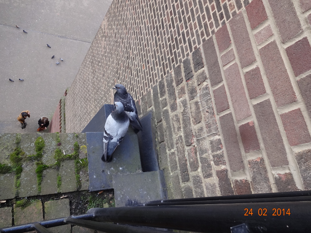
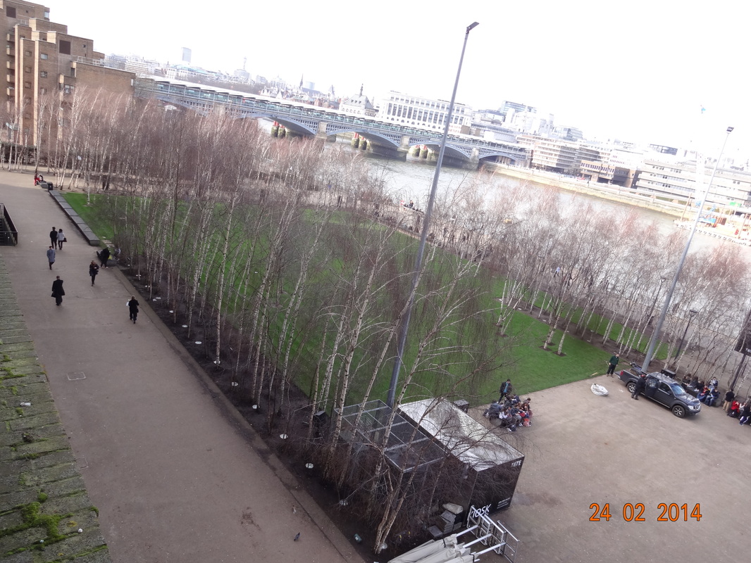
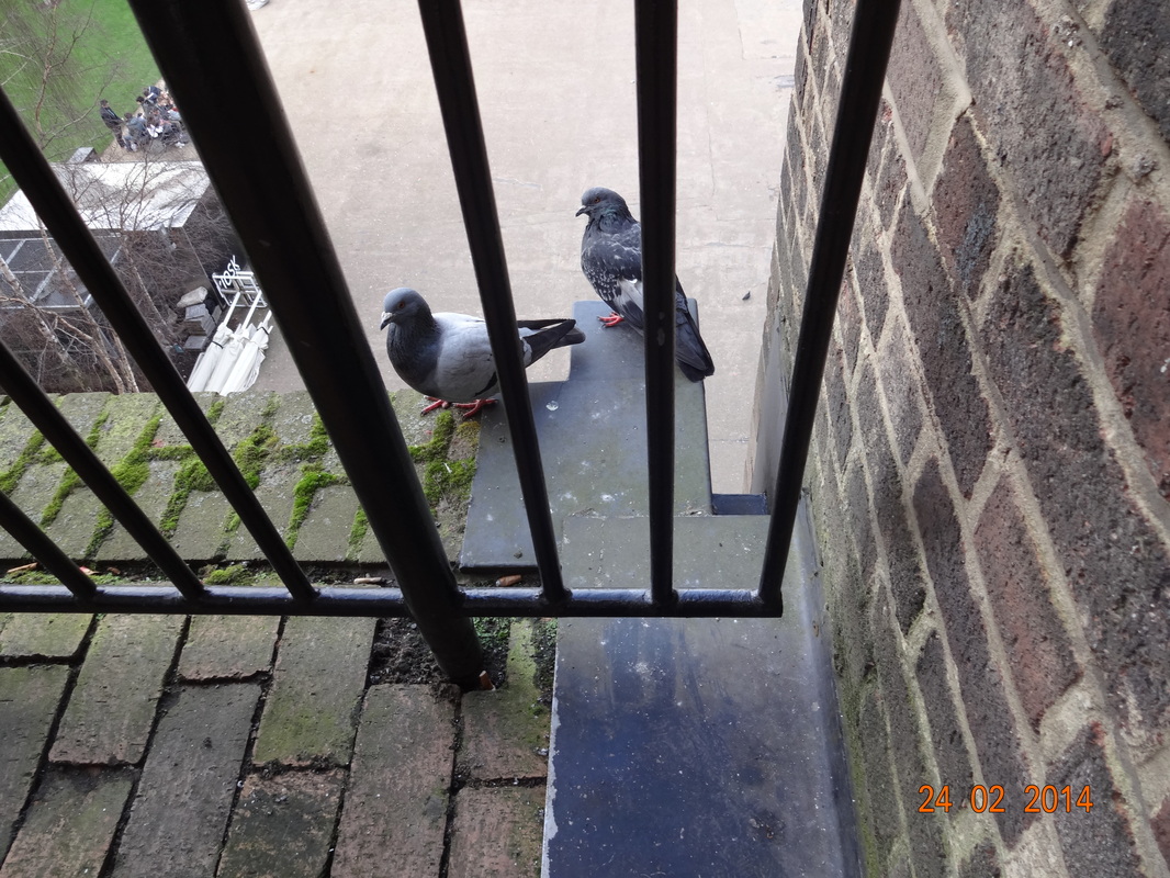
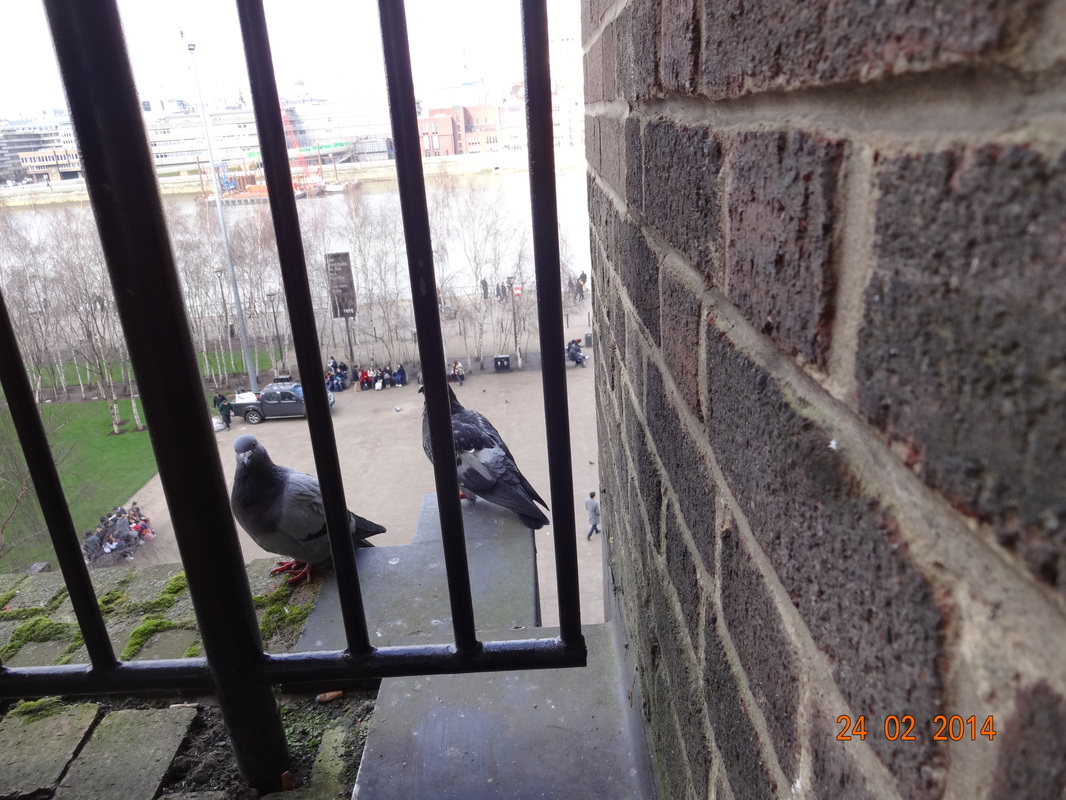
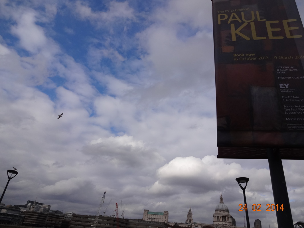
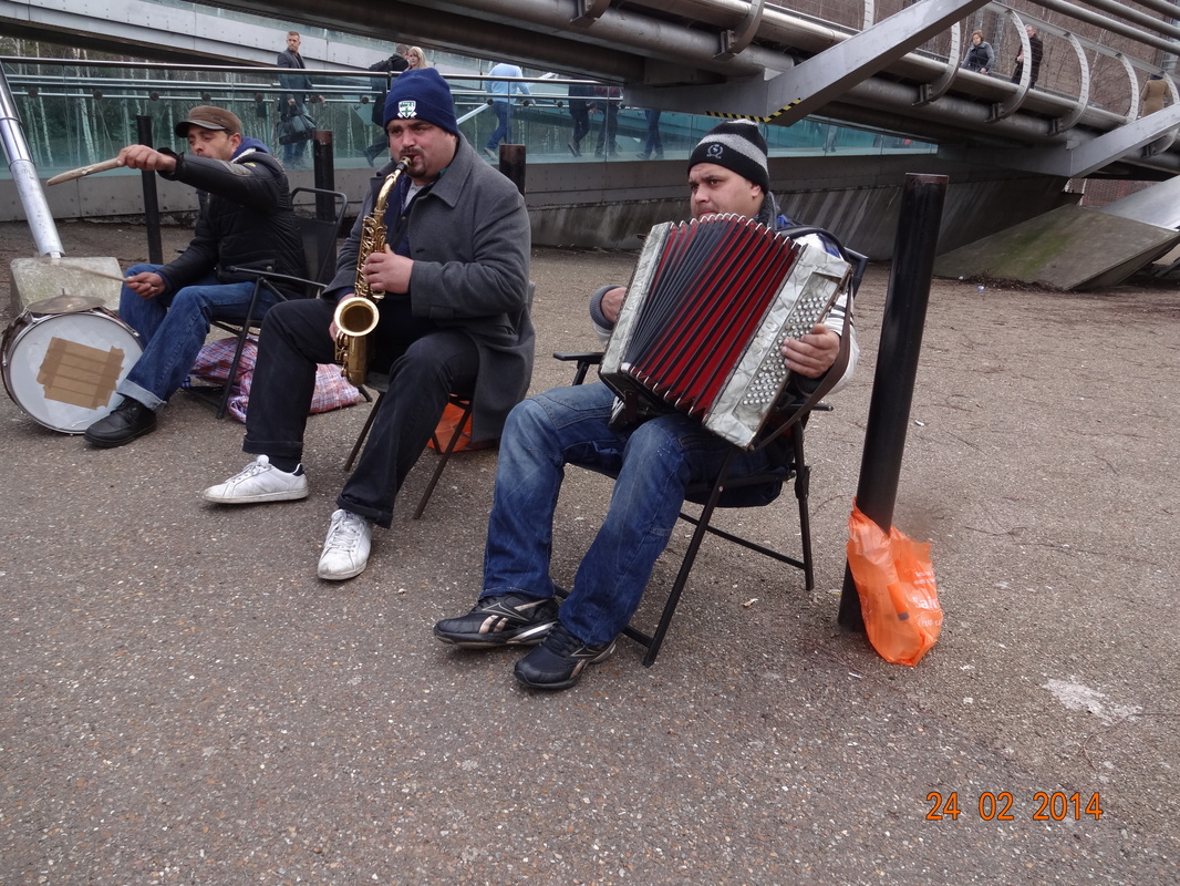
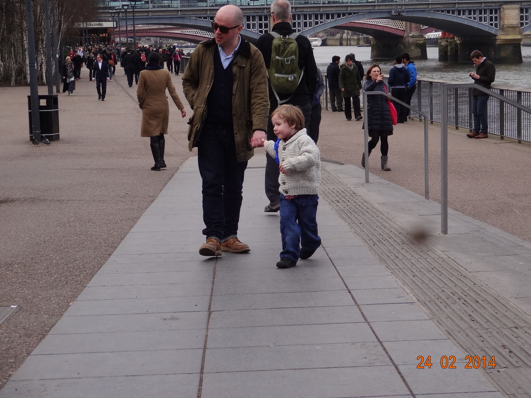
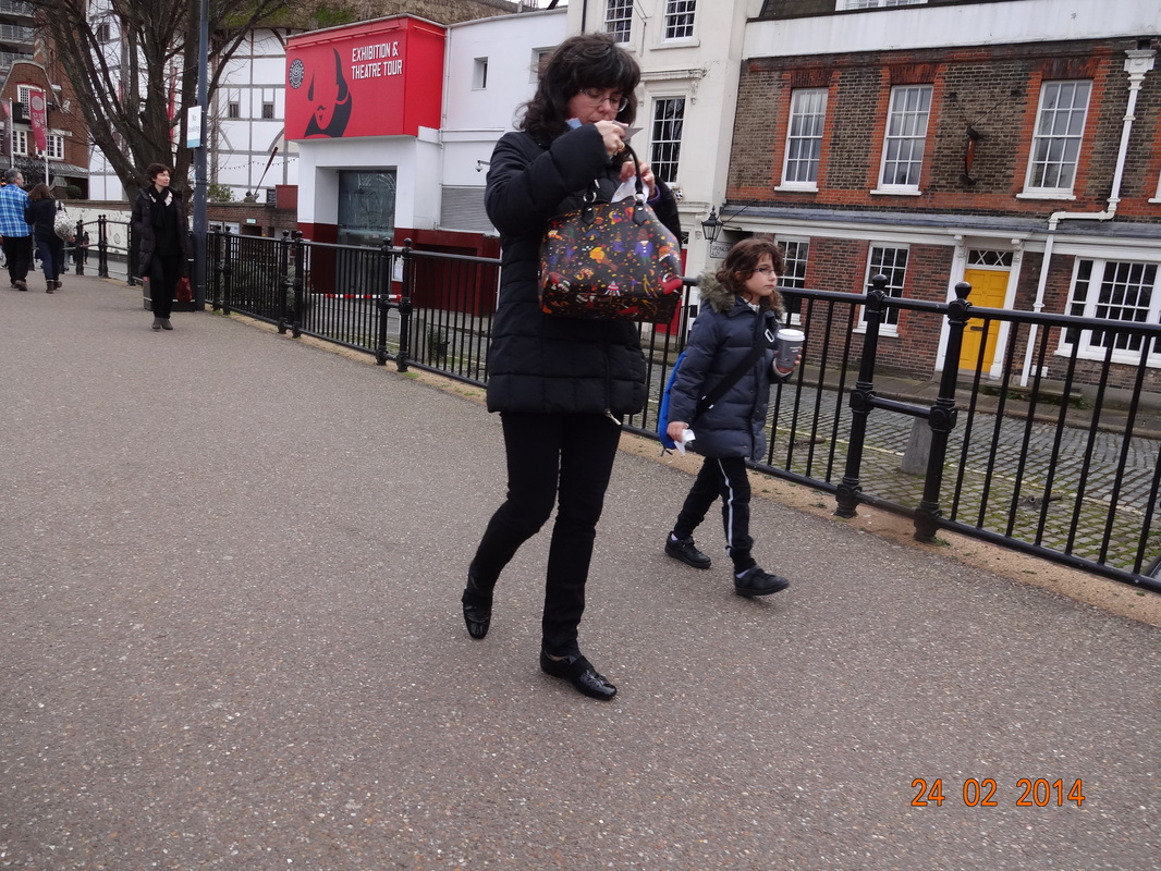
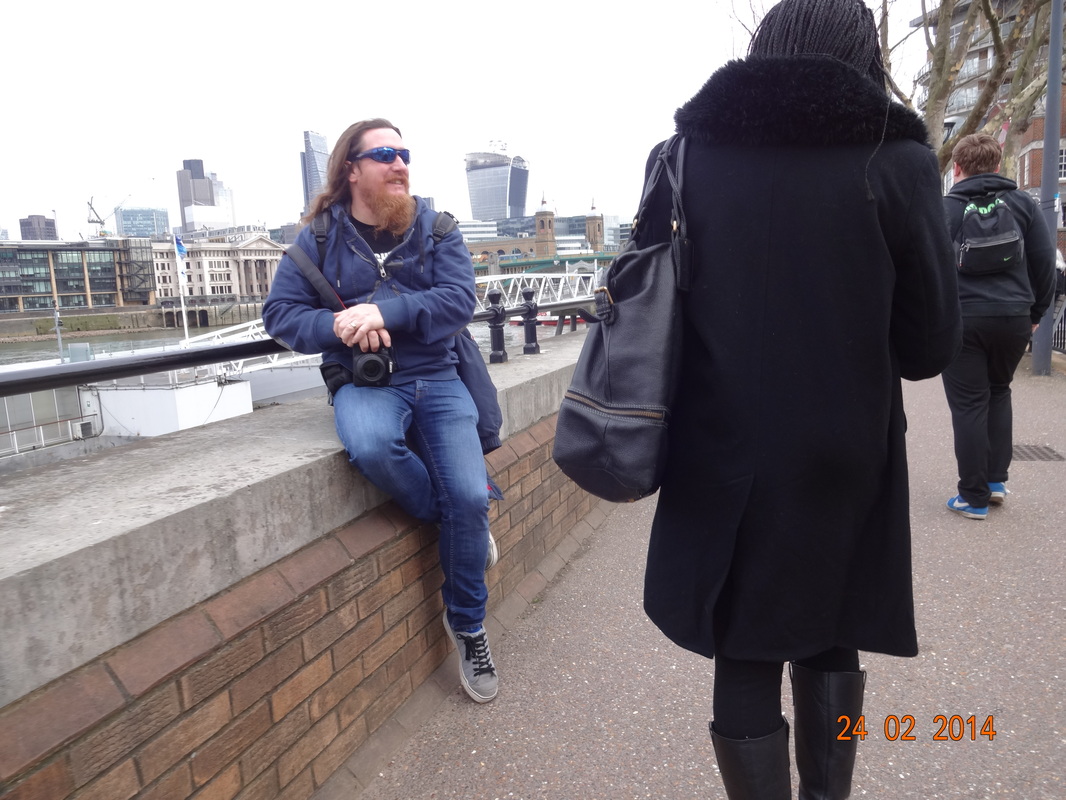
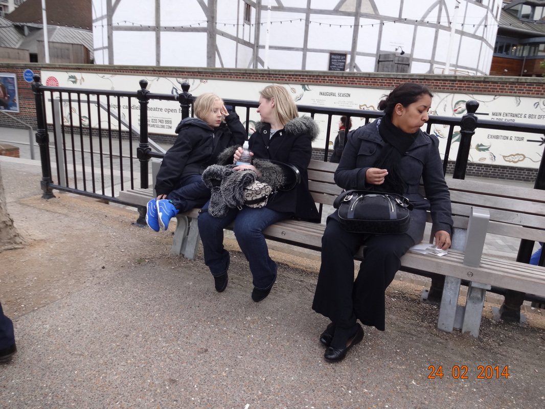
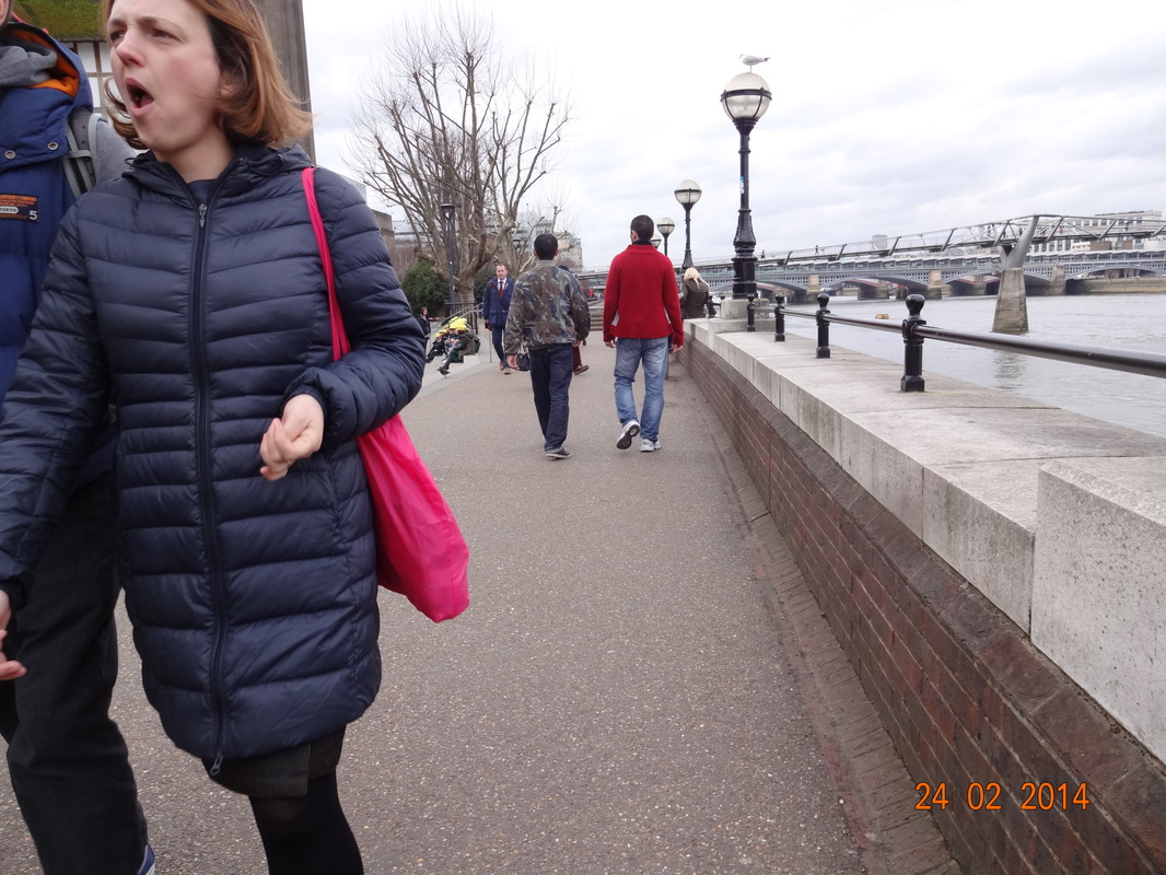
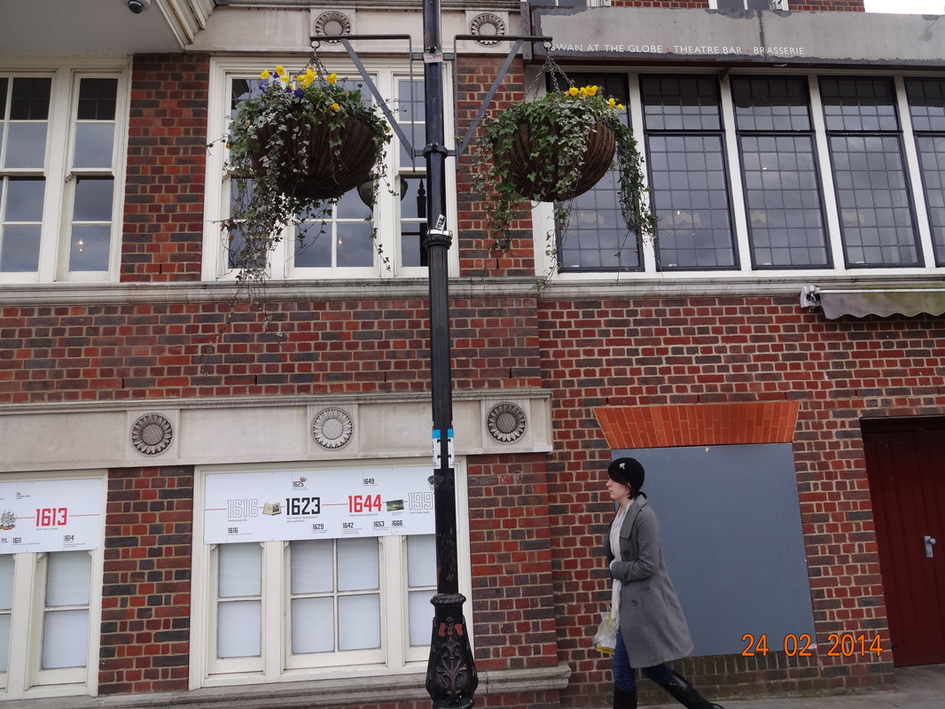
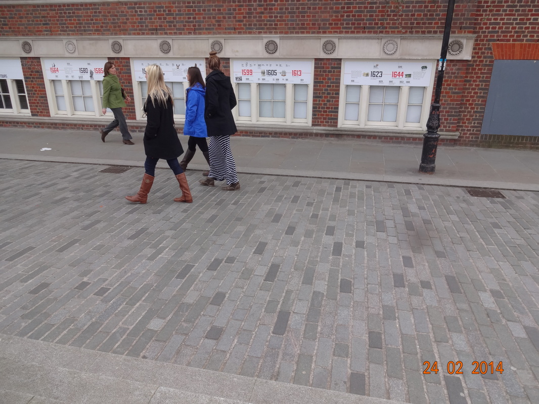
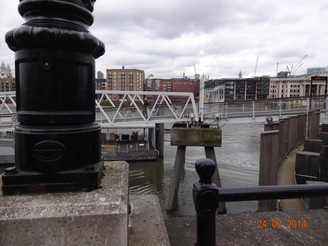
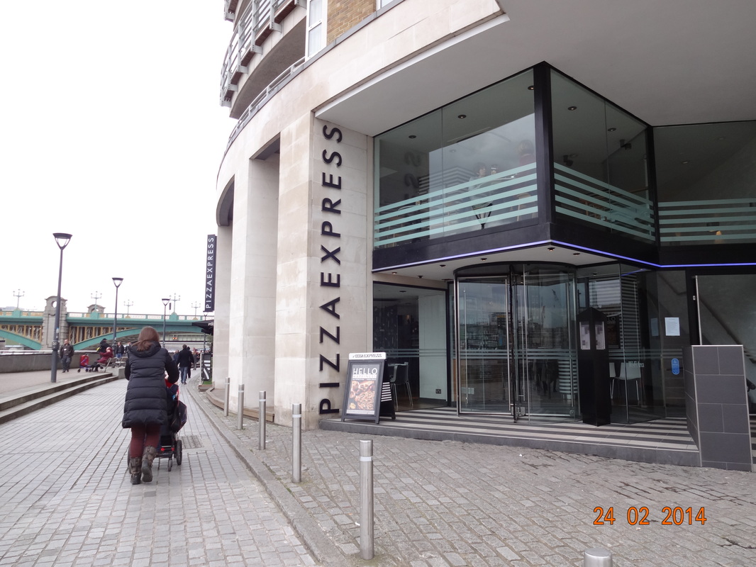
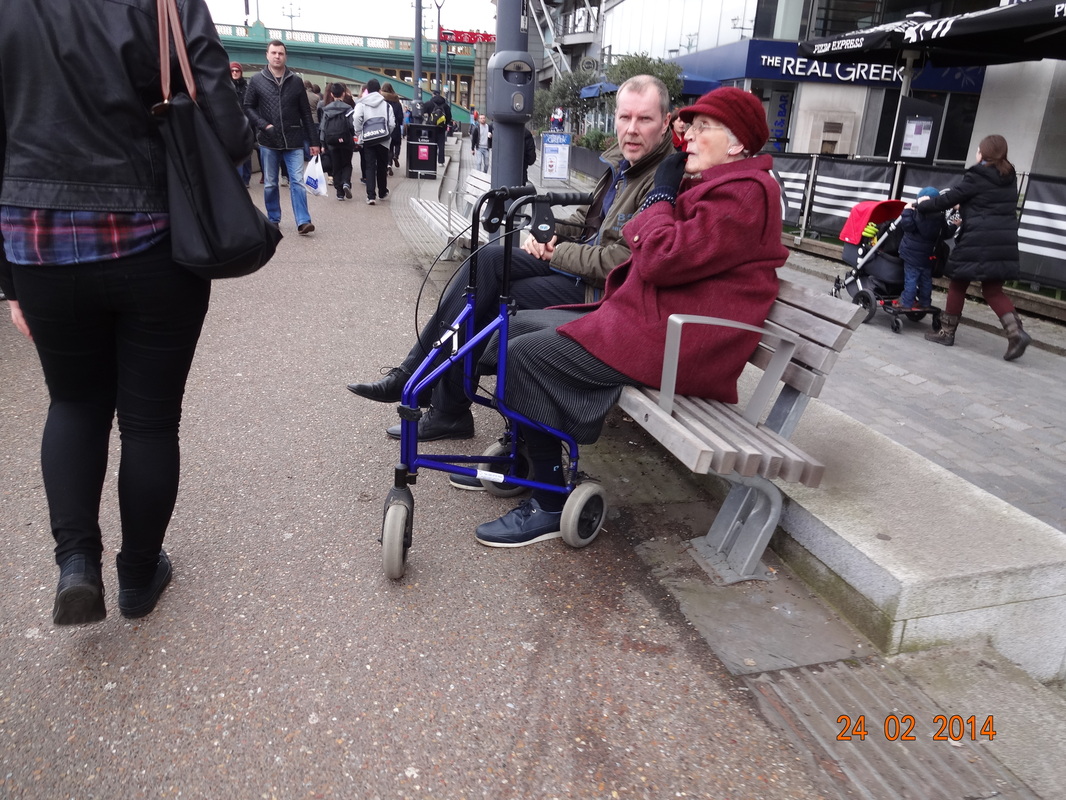
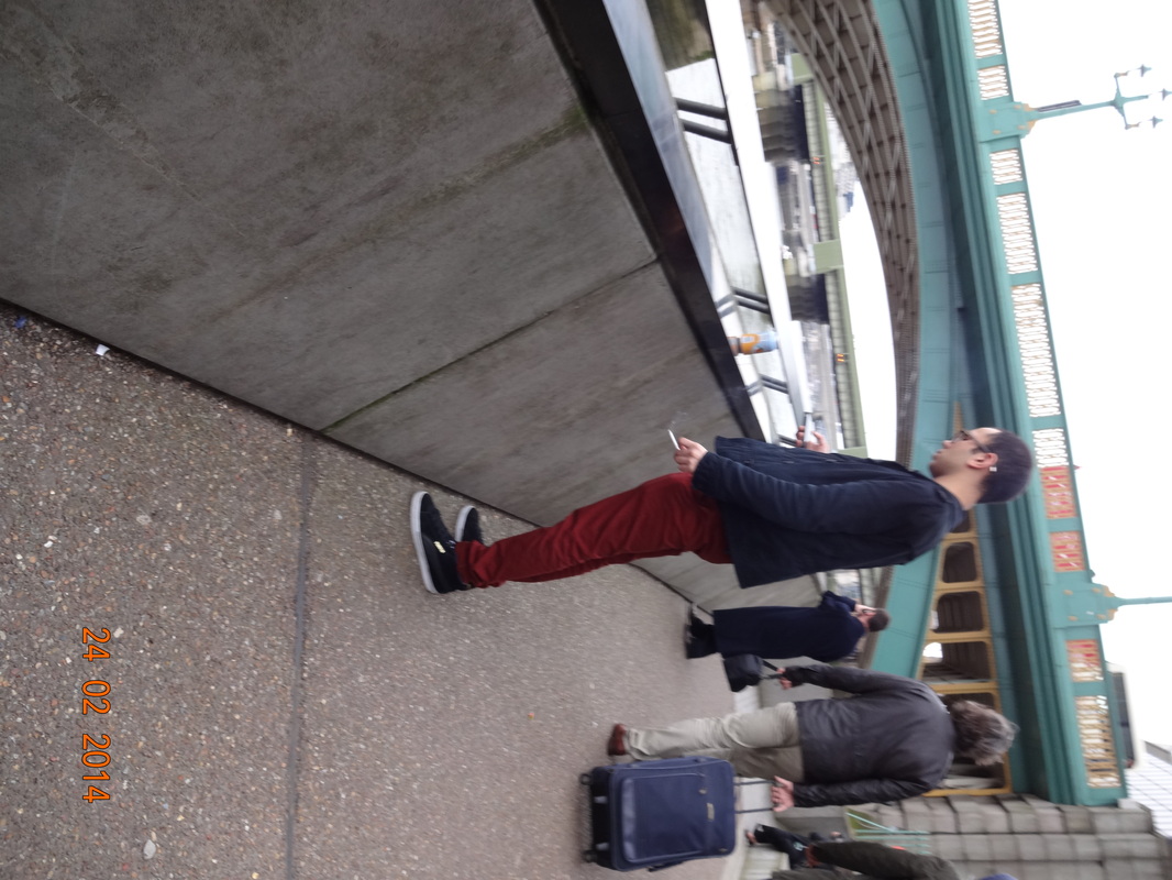
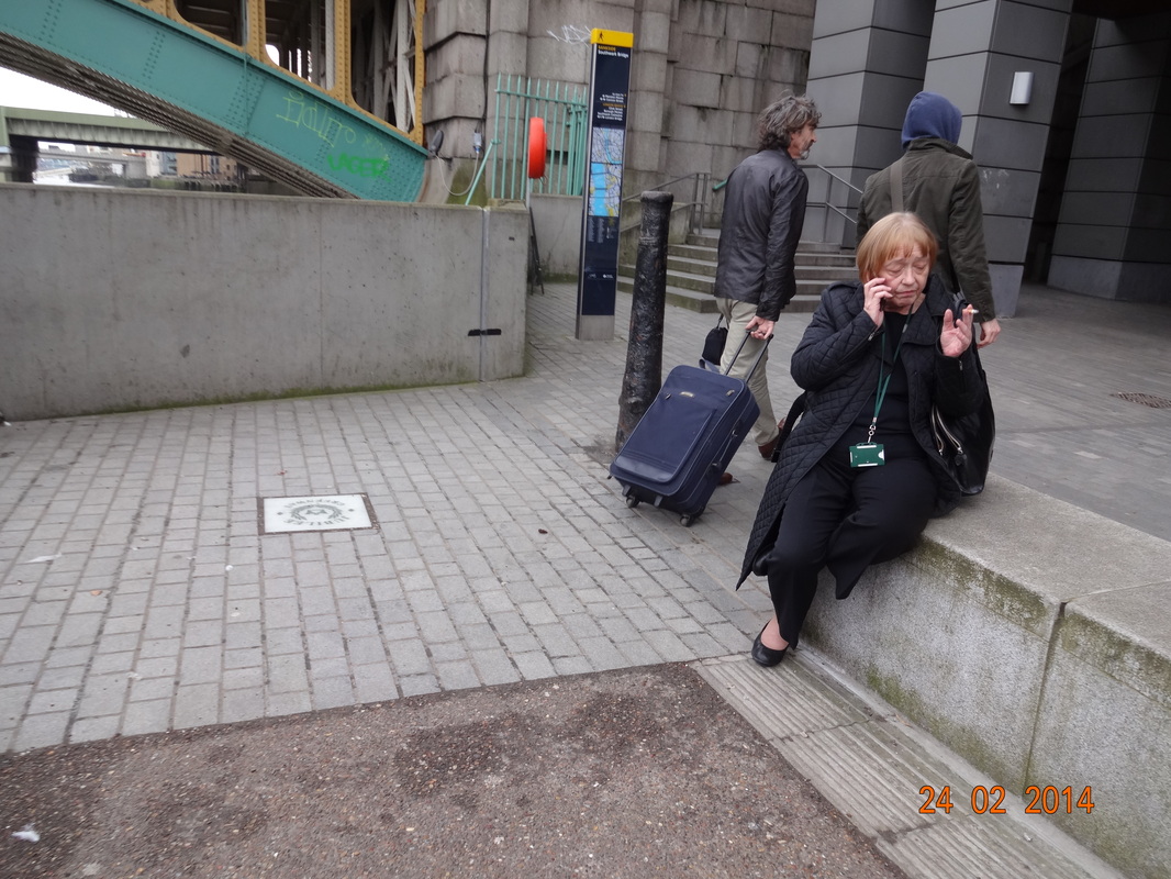
On Monday 24th February, we had an opportunity to visit the Tate Modern gallery in central London to view two famous street photographers- Harry Callahan and William Eggleston, but we ended up viewing a few more works from other artists as we had more time left. Moreover, as we've studied street photography for a period of time now, and practiced taking some images as a street photographer, on the way to and fro the gallery we captured some images. I used my camera to take these images and i'm impressed by the results. When visiting these exhibitions, i was really drawn into the photographs by the artists and it gave me some inspiration on how to take my own images. Some artists like Harry Callahan focused on contrasts between colours whilst William Eggleston focused on the framing of his images. Nevertheless, the images have really encouraged me and inspired me to take more images on the streets. Also, when taking my our own images, we had to remember to capture within the moment, using contrasts and similarities etc. In my opinion i found taking these images really easy as it was in a public place and it was less restricted as there was more opportunities for good images. I had more confidence to take images of people, by doing this i was able to capture every moment and not feel regret. In conclusion, i felt like this trip has really benefited me and gave me more insight into the lives of street photographers.
Harry Callahan
|
Harry Callahan was born 22nd October 1912, in Detroit, Michigan. Callahan was an influential twentieth century American photographer. At a young age he began to study engineering at Michigan state university, but eventually dropped out and joined a camera club. In 1938, Callahan began teaching himself photography; with that he became friends with Todd Webb and they began visiting places together. In 1946, he was invited to teach photography at the Institute of Design in Chicago. Later on in his life, He moved to Rhode Island in 1961 to establish a photography program at the Rhode Island school of design and taught their until his retirement in 1977.
Even though there's not much about his career but we know that he went out every morning to take numerous images of the city he lived in. He then spent most of his afternoons making proof prints of that day's best negatives. He photographed many things, from his wife and daughter to the buildings of cities where he lived; showing a strong sense of line and form, light and darkness. Moreover one of the primal subjects in his images was his wife, where he captured many images of her in different places and he did this for a period of fifteen years. Callahan also worked with multiple exposures, double and triple exposures, blurs, large and small format film. Collections |
|
|
|
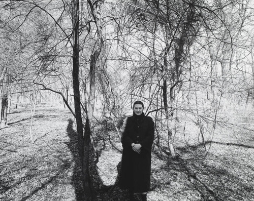
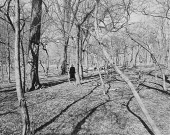
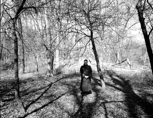
In the gallery when i was walking around the exhibition, one of the main things that got my attention was that he took images in a collection, so the images had something in common. Some of them were taken in the same place but just at different angles, whereas some were similar in shapes or colours. The reason why i liked this was because i think that having several pictures in a collection conveys more feeling and it gives us a better sense of the atmosphere the artists is trying to capture. However, if it was a singular picture we may not pay as much attention to it because we can't relate to it as much.
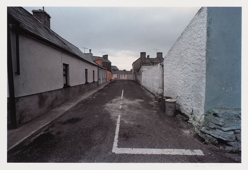
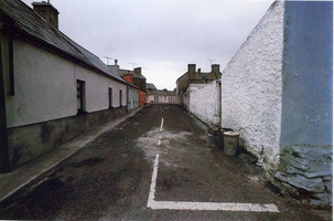
On the left hand side, i have inserted two of my favourite collections that i was really drawn into whilst walking around in the gallery. I really like the first collection of the forest due to its wide tonal range between the black and whites. The second collection was also really good due to its composition and lines, i also enjoy using this compositional technique in my own images. |
Callahan's themes
Callahan took images with many different subjects and different background; nevertheless, he grouped his images in 3 groups as 'nature, buildings and people'.
NatureCallahan's images of nature perceives a really calm atmosphere as the composition in the images are not chaotic and everything is clear. They are very simple and isolated therefore we are really drawn into the atmosphere and contrasts within the images. In these images, i he has used to technique of cropping as well.
|
PeopleCallahan's images of people really go in depth with their facial expressions and movement within the streets. Most of these images are close-up's, this allows the viewer to relate to them. Also, there are usually just one or two people in the frame, by doing this we are more focused on one thing rather than a whole load.
|
BuildingsCallahan's images of buildings are really sharp and bold. Also, in some of his images he used the compositional technique of lines in a really good format. In these images he used more colours and displays more contrasts within the image. Callahan captured the images at various angles which makes the buildings seem more surreal and linear.
|
Evaluation of Callahan's image
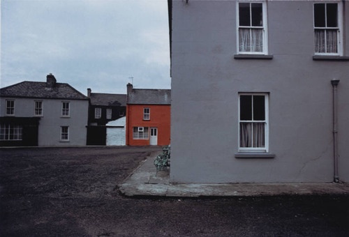
On the left, is one of my favorite images by Harry Callahan. In this image we see short buildings on either side that are leading into the center as the diagonal lines are clear, sharp and significant. There is also a straight rusty road leading into the center of the image which has some road markings painted upon it. The image is in color, Callahan focuses on the white and black parts of the atmosphere but on the left corner we can see a tint of orangy-red which gives more character to the image. This is because if it was just white buildings the image may seem more dull and plain. The composition of the image is very isolated and calm, there is not much in the image and no movement. Also, the way Callahan has taken the image makes the image seem very organised and neat. As, we are focused on the center of the image, i think that the photographer must of been standing directly opposite to the other side of the road, as the road markings are central. Nevertheless, the angle of the camera would've been horizontal and still, we can see this in the image as the other side of the road, is central of the composition. Moreover, as the roads and buildings seem quite old and damaged it gives the image a kind of rustic impression. This impression is as the clouds are rather gloomy and grey. On the other hand, as I've mentioned before the orange color leaves just a bit more complexion. In this image, the shades are really prominent, Callahan also uses levels. The road is a darkish black shade, the buildings are more plain and white whilst the sky is more greyish and has more texture than the rest of the image.Even though, the image seems quite plain, it's still a really successful image and it signifies how good of a photographer he was.
________________________________________________________________________________________________________
William Eggleston
|
William Eggleston was born July 27th 1939 in Memphis Tenesessee. He is an American photographer. He is widely credited with increasing recognition for colour photography as a legitimate artistic medium to display in art galleries. In his young ages, Eggleston was introverted; he enjoyed playing the piano, drawing and working with electonics. He was also drawn to visual media, and enjoyed buying postcards and cutting out pictures from magazines. Eggleston attended Vanderbilt University for a year, then the University of Mississippi for about five years. Whilst being in university he was influenced by his friend and he eventually began to have an interest in photography.
Eggleston's early photographic efforts were inspired by the work of Robert Frank and Henri Cartier-Bresson. First he was photographing in black and white, then experimented with colour in 1965-1966. Colour transparency film became his dominant medium in the later 1960s. Eggleston's development as a photographer seems to have taken place in relative isolation from other artists. Eggleston also worked with filmmakers, photographing the set of John Huston's film (1982) and another one. He took images around 'old tyres, vending machines, posters, power poles, different signs, etc'. |
|
Evaluation of Eggleston's image
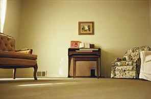 A shot of a stereotypical suburban living room
This is one of my favourite images by William Eggleston. It is an image of two chairs on either side, with the table as the centre of the image. To the left of the image, we see the sunlight drawing into the room which then has created a few shadows on the floor. The image is in a creamy vanilla colour; which allows the image to feel more relaxed and calm. Also, as the context of this image is a living room with furniture it relates to the colours. When we think of a living room, we usually picture a calmful place where we can be with the family and just relax and enjoy ourselves. Moreover, in the image the use of levels and spacing has worked really well. The furniture is all arranged in a horizontal line through the middle of the image, whilst in the top center there is a small painting. The photographer would've been close to the floor and probably kneeling to capture this image, because if he was standing we wouldn't be able to see the bottom part of the chair. In the image, even though it seems plain there is still a lot captured within the image. The odd angle emphasizes the flood of yellow lights on yellow walls with yellow objects which makes a commentary on family, on the space we inhabit at home, expectations and isolation's.
FINAL IMAGES AND EVALUATION FOR STREET TATE PHOTOGRAPHY
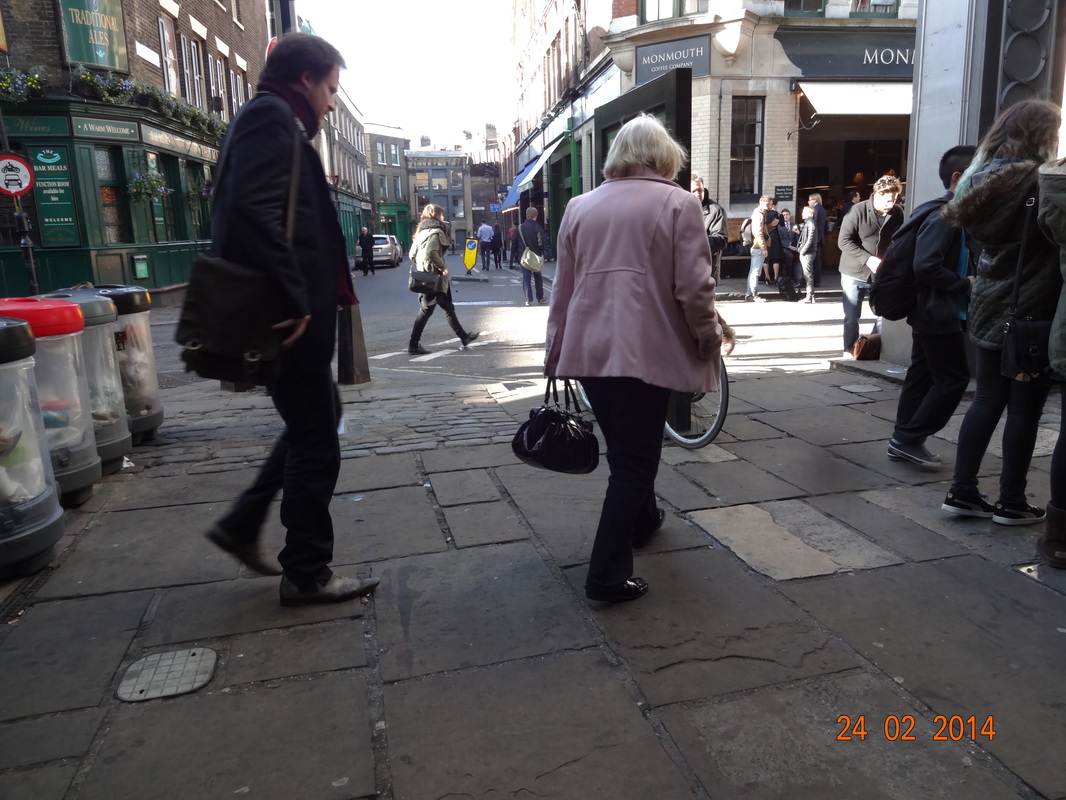
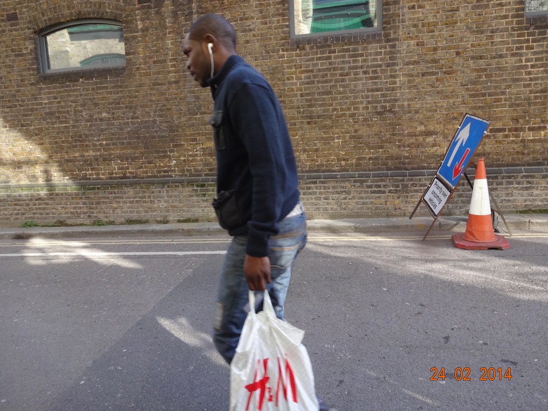
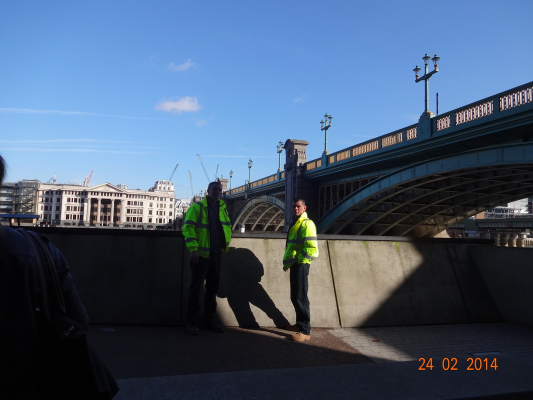
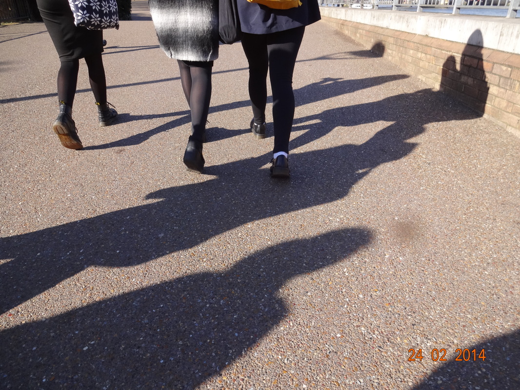
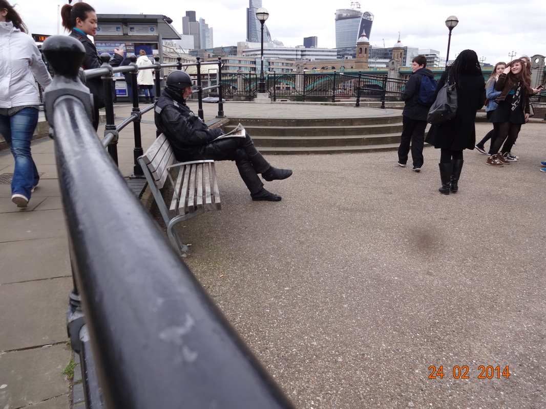
Out of all the images we took on our trip to Tate Modern, we were asked to pick out 4 which we found most successful and interesting. Even though, i had taken a lot of images, scrolling through them these 4 were the ones which i feel had a lot of meaning in them. Nevertheless, when i looked at the 4 i chose together, i found something quite peculiar, which was that the images had something in common - contrasts and shadows. I will analyse each image in more detail and information.

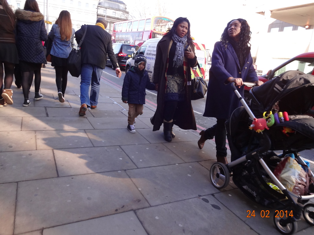
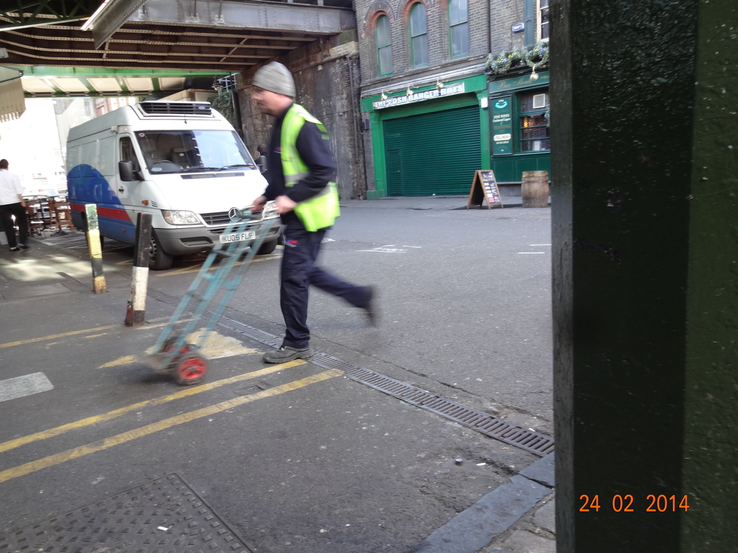
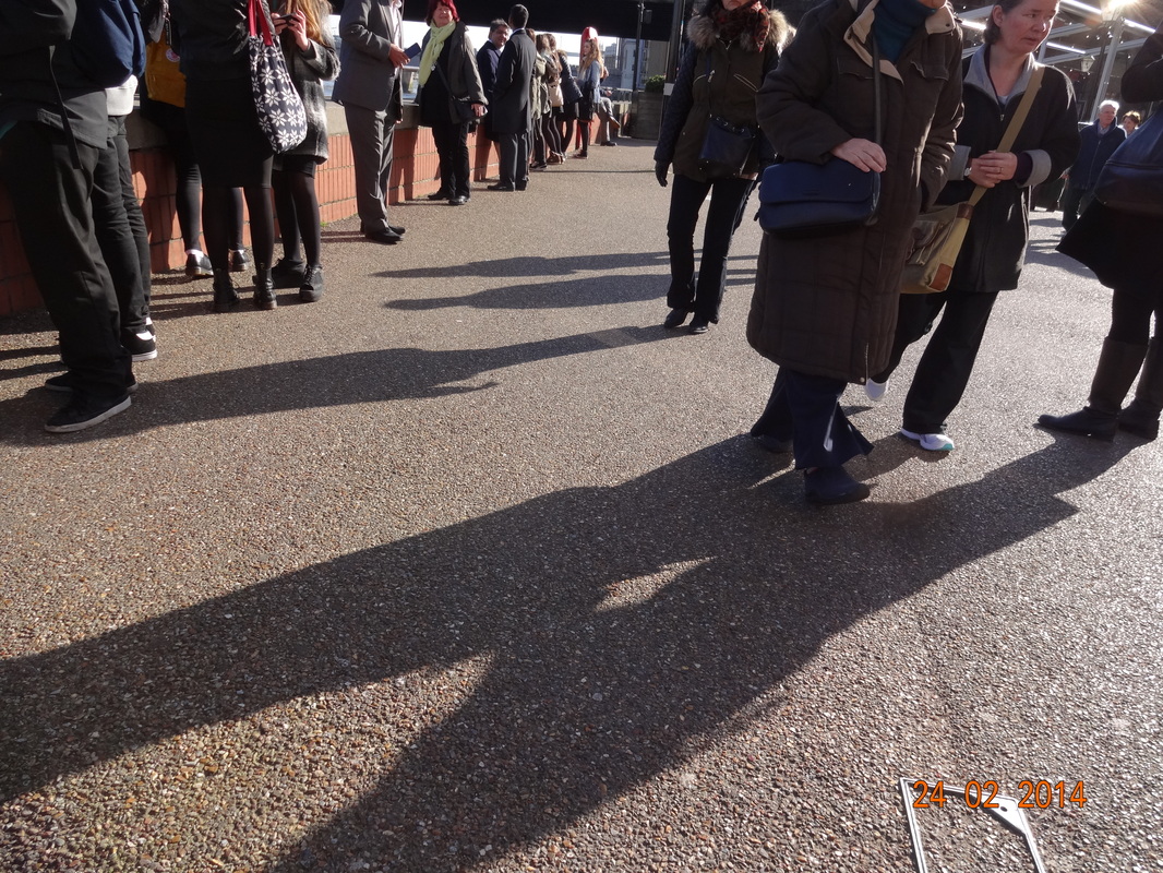
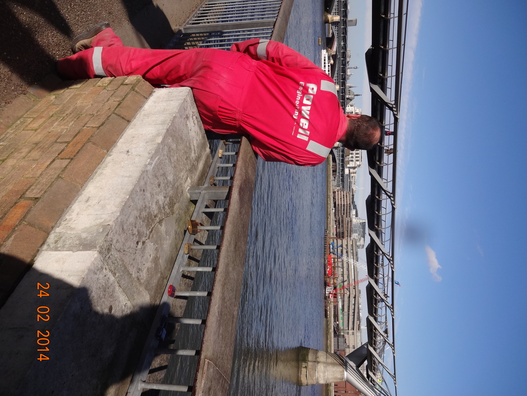
In this image, we can see 2 men as the center of the composition in a isolated area. They are wearing bright yellow luminous jackets which make them stand out, even though they're in the shade. There are strong contrasts within this image, the shade on the pavement makes the place look gloomy and dull, but the sky is bright and almost lifts up the atmosphere; moreover as mentioned before the yellow jackets look really sharp and immediately we're focused on the men as it is prominent. Also, this image has been taken in the moment, because we can see that the 2 men are looking towards the camera and look quite puzzled. This image has really reflected my confidence to take images on people on the street.
 Click on image for Lepkoff's image. Click on image for Lepkoff's image.
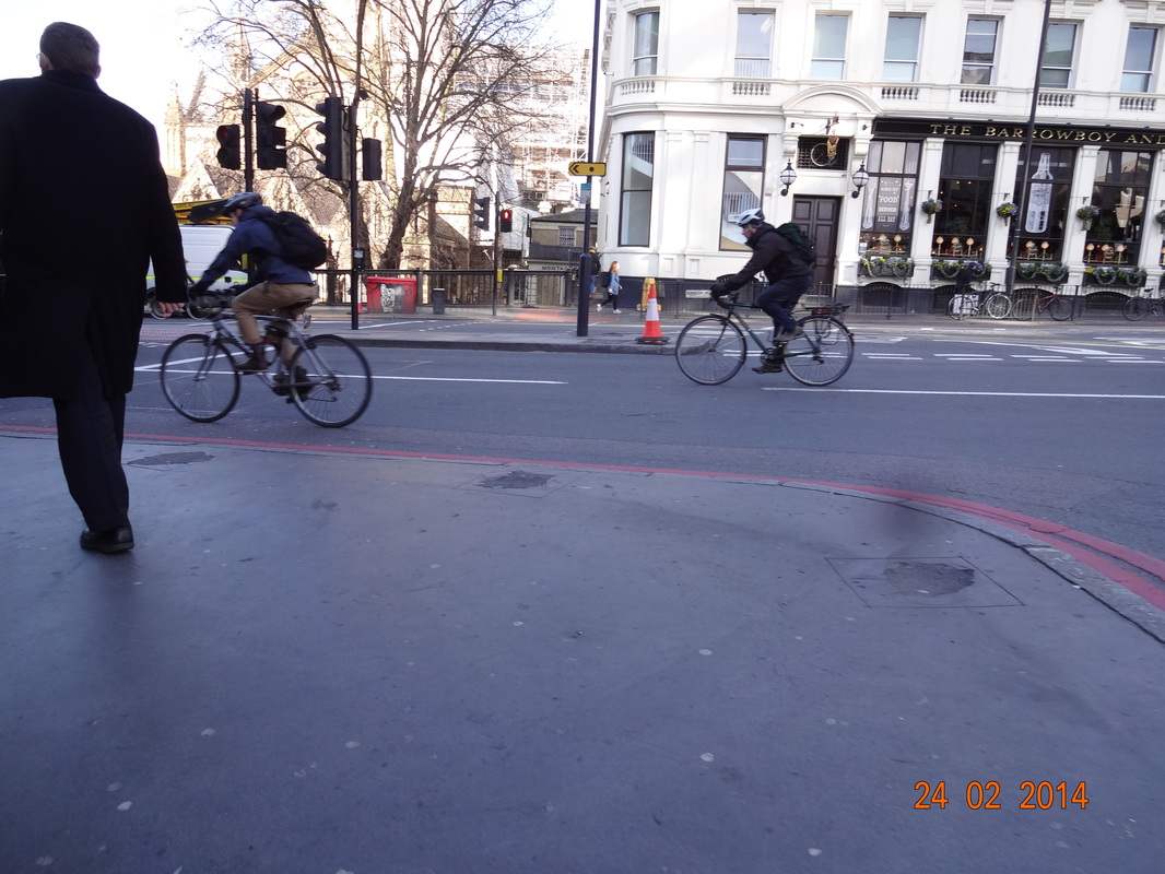
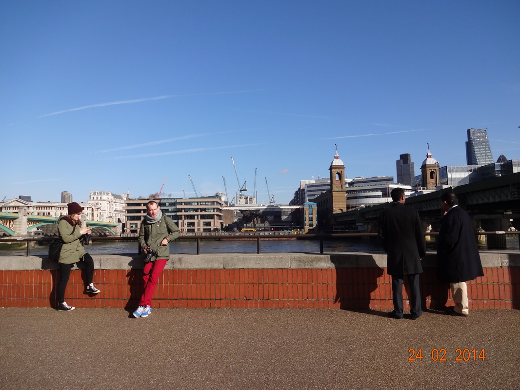
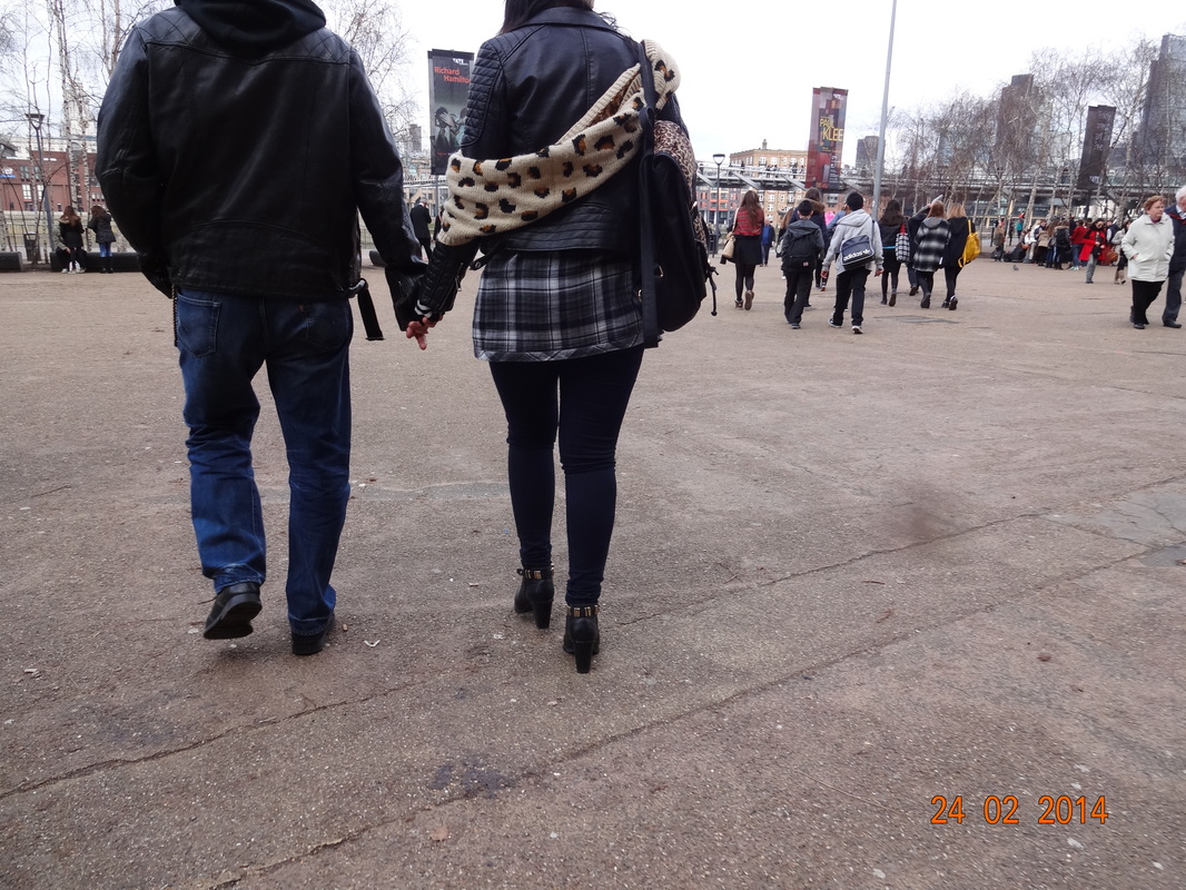
The reason why i like this image is because it is similar to an image by Rebecca Lepkoff (one of the street photographers i researched). Once i saw this opportunity right in front of me, i felt really excited as I felt privileged to take something just like Lepkoff's. In this image, there are 4 people, 2 on each side leaning on the railing. On the brighter side, where there is more lighting, there clothing of bright colours resemble this. Nevertheless, on the other side, they are wearing more dark colours which suggests a more dull type of atmosphere. This image is in some ways quite mis-leading, as one side is bright whilst the other is dark and gloomy, similar to the Yin Yang symbol. The symbol represents contrasts, one could not exist without the other for each contains the essence of the other. This is significant in this photo as without the contrasts between dark and the light, this image wouldn't seem as captivating.
|
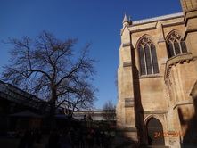
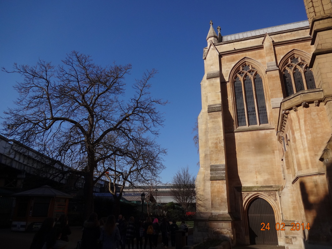
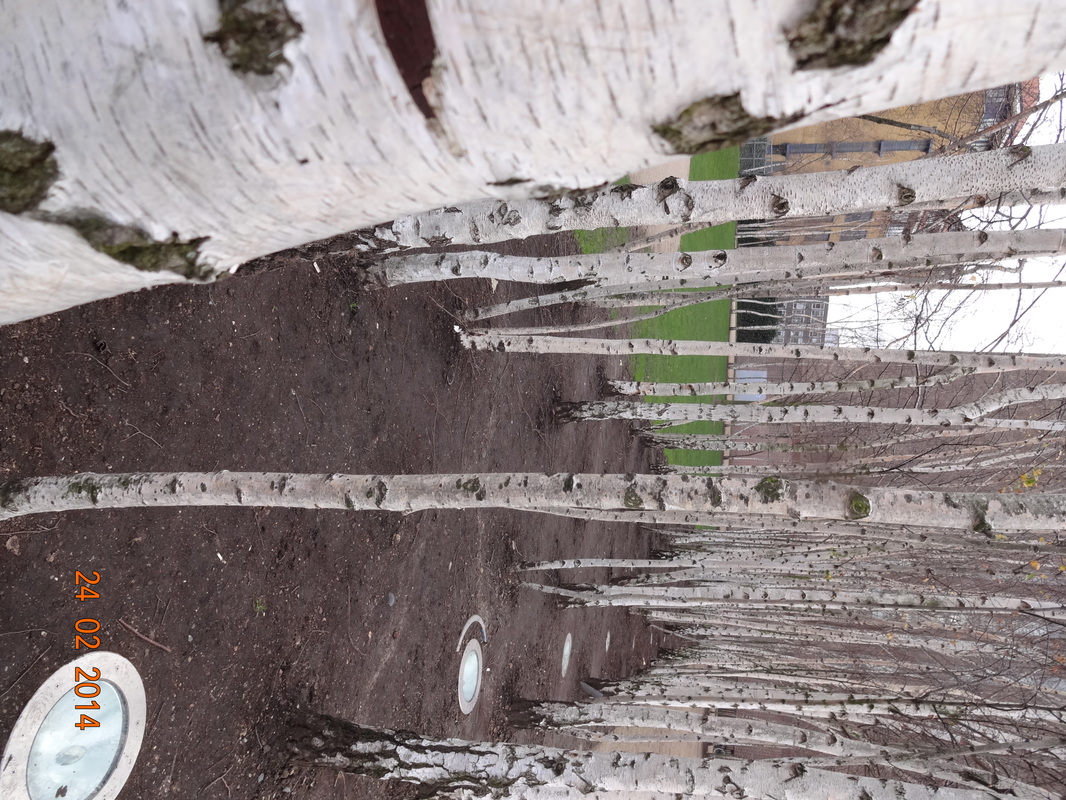
Personally i feel that this is my favorite image, there are many elements which are really strong and reputable. Firstly, there are contrasts between the objects in the image, and also the tones. The building of the Church represents man-made and un-natural, whereas the tree on the left represents nature and purity. In addition, the building is a very bright creamy colour and we can see the windows and details on it etc. On the other hand, the tree seems like a silhouette as the tone of it is dark but the shape and outline of it is visible. Moreover the composition of it is quite plain as the main focus of the image is the tree and the building and there is little movement within the people; the background of the sky makes the image seem and feel more tranquil.
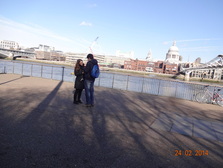
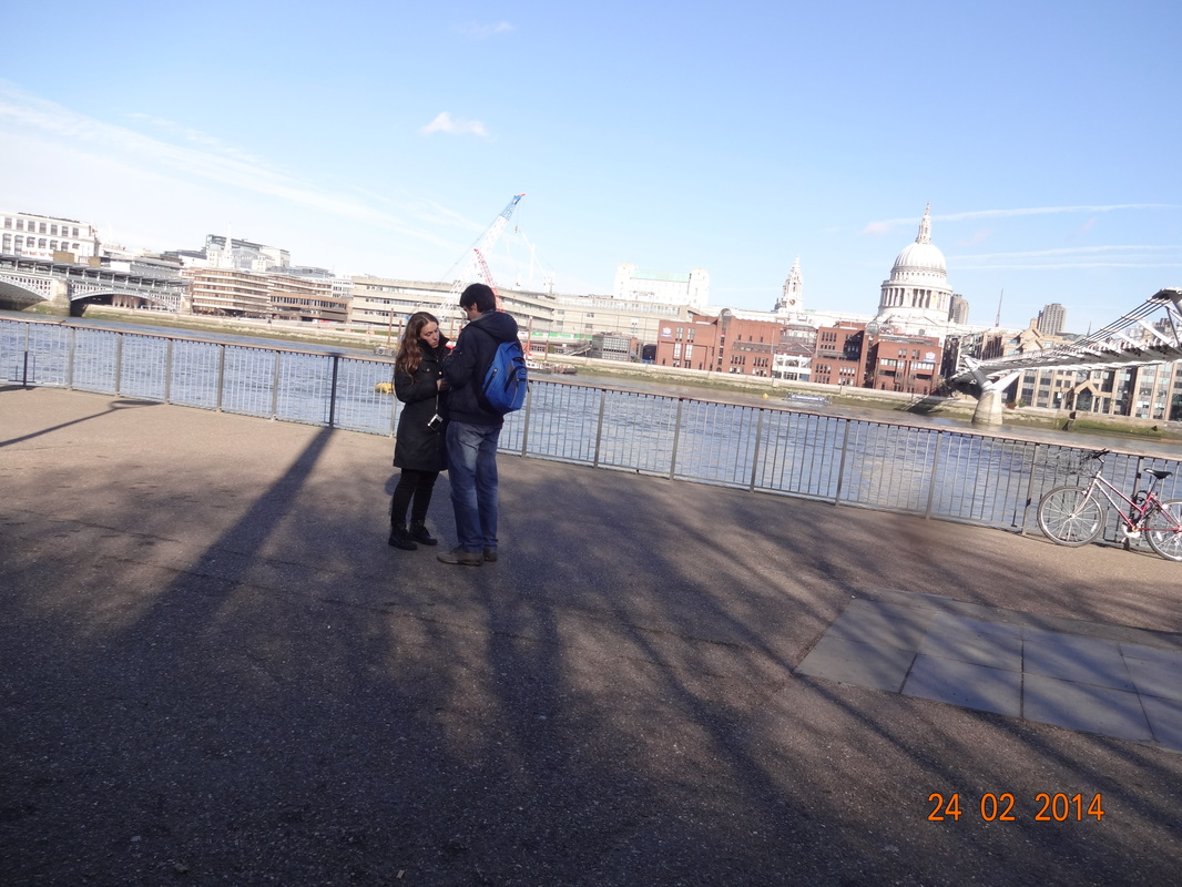
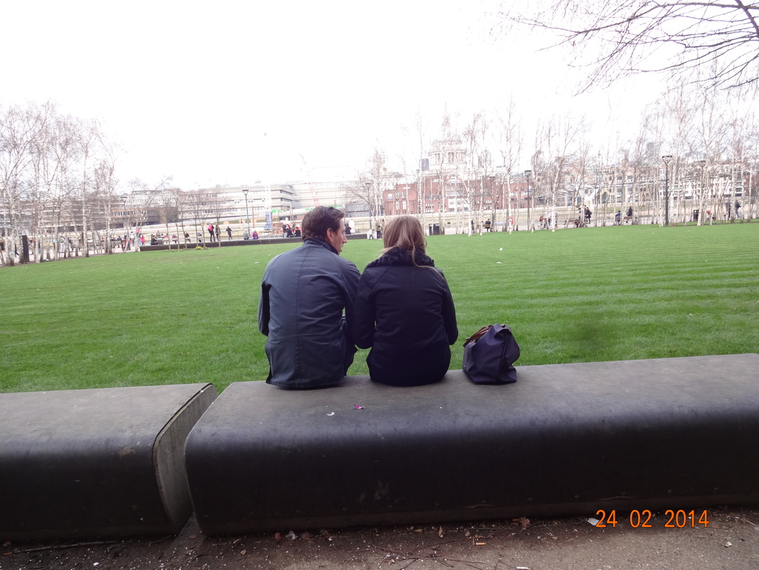
In this image, there is a couple close to each other and in an uninhabited place. There are also some shadows of trees which are reflected onto the pavement. One of the reasons i like this photo is because it reminds us of nature and the beauty of it, which is resembled by the couple. When we think of a couple, it usually conveys the idea of love and emotion. Therefore, with the two elements in one image i feel that the image is very cherishing and romantic. Composition wise, there is no movement so it's very peaceful and un-chaotic. However, if there was more in the image, we would be focused on more than one thing, whereas in this image the couple is the center of the attention. Moreover, the angle of the image is tilted quite a little which doesn't make the effect of the image seem bold and striking. This means that the image itself feels more lighthearted and warm when we look at it. The background of the river is nice but doesn't diminish the feeling of the image.
|
