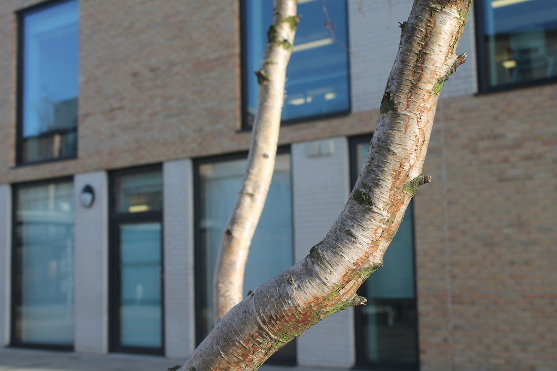
Street photography
|
|
Everybody street video.This short video explores the way Street photographer's capture images on the streets. By taking images on the streets, there are a vast majority of things to take, varying from the chaotic cars beeping to little children playing with each other and enjoying themselves. Street photographers capture what they see that may catch their attention within the moment and don't want the chance to disappear, even if it's just a few seconds. Furthermore, images captured on the streets can show the atmosphere in that certain place it may be really wild or sometimes seem quite quiet with nothing really happening. Also, the people on the street may show emotion in their facial expressions. This video is only a segment of the whole movie and it features many successful photographers.
|
Rebecca Lepkoff.Rebecca Lepkoff is an American street photographer. She is famous for taking street scenes in the 1940s especially on the 'lower east side of Manhattan'. She was very fascinated about the place where she grew up, she says 'were full of pushcarts'. She captured many interesting images including- people in the streets especially children, as well as buildings and the signs on door front. She also photographed people at work and play at 'Vermont'; these images were used to illustrate the book 'almost utopia'. On the right hand side is a slideshow of a few of the images i find interesting and inspiring. I like the composition of her images, this makes the image more appealing. Moreover, she captured black and white images, this allows us to be directly drawn to the contrasts of the image and the subject. Also, Rebecca focuses on 'shadows' in some of her images, this in some ways could change ones perception to the image, as the 'dark shadows' seems quite daunting. By using this effect, it could change the characteristic to the photo. Nevertheless, generally she captures normal everyday life in an interesting way.
|
|
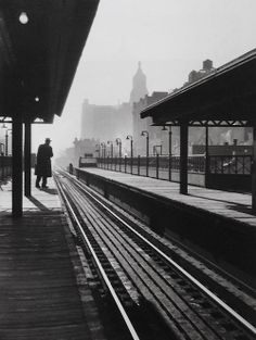
Evaluation on Rebecca Lepkoff's image.
|
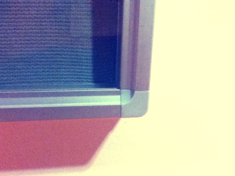
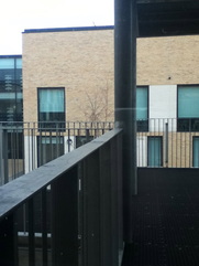
The image on the left hand side is one of my favorite images captured by her. The image is taken at a train station and we can see a silhouette of a man possibly waiting for his train. The posture of the way the man is standing gives the viewer an impression that he's probably been waiting a long time, as it seems like he's trying to see if one is arriving by leaning close to the train tracks. Moreover, the atmosphere seems quite wintry and tranquil; in comparison to the image there isn't much going on and with the man only being the subject matter the photo feels more serene. This is clear to us, because the buildings in the background looks quite hazy. Also, the idea of there only being one person at a train station is quite deviating, as we would usually picture several people at a train station waiting for the train. The composition of the image is very elegant due to its simplicity. It is clearly organised and not chaotic with many things happening at one time. Nevertheless, the man is more in the background whereas the tracks and the station is in the foreground. This is more engaging, because if the man was closer to the camera and more focused, then image wouldn't have the same mood as it does. Moreover, everything is still and nothing is moving which also makes the image seem mysterious.The angle of the image is straight on, the train tracks and the stands are parallel which seems quite dimensional; the idea of the train tracks disappearing into the midst makes us want to know where it ends up to. Above all, this image attracted me straight away, because of the tones and contrasts in the image. The image has a wide tonal range, with it varying from very light grey parts to the dull dark black sections.
|
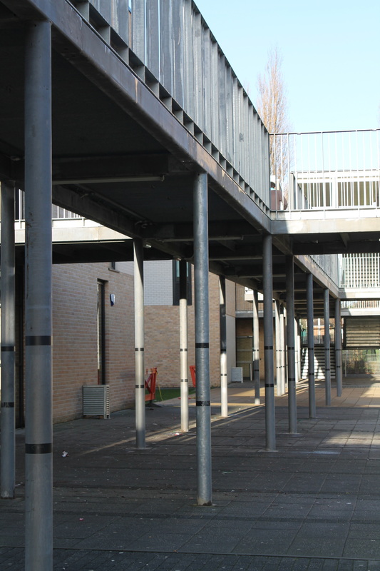
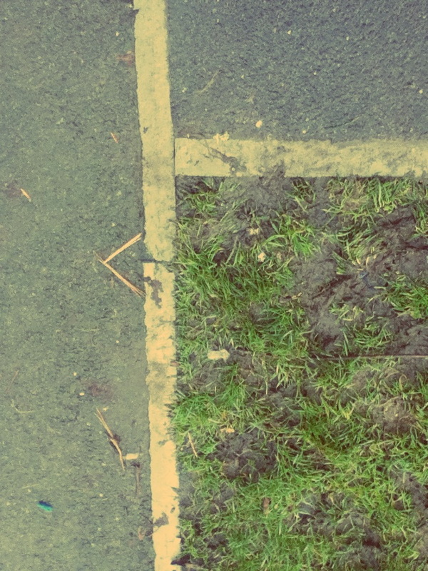
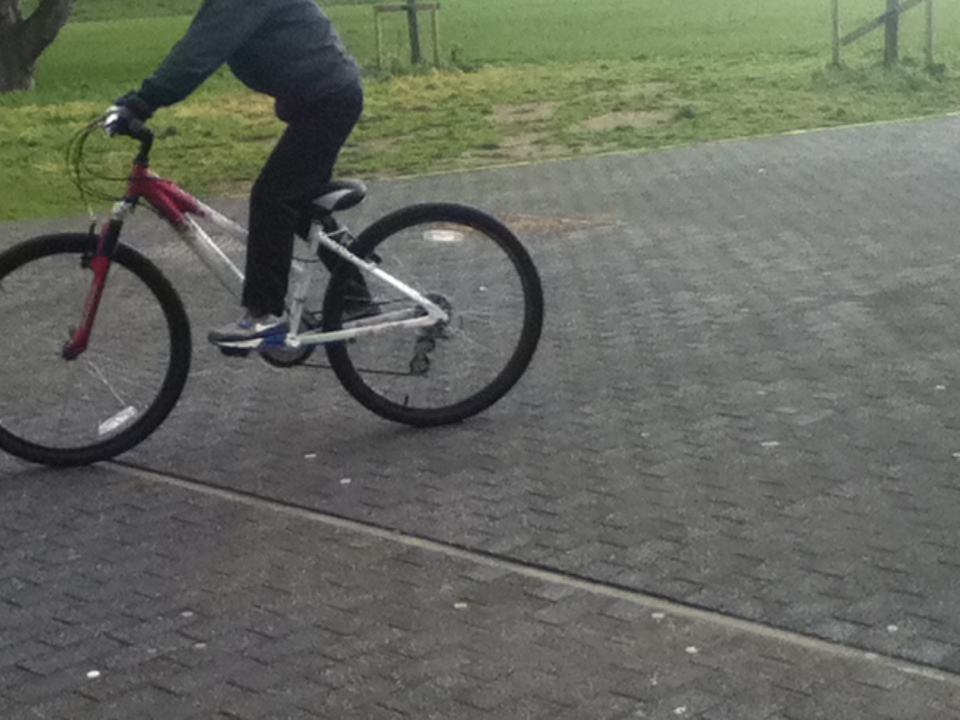
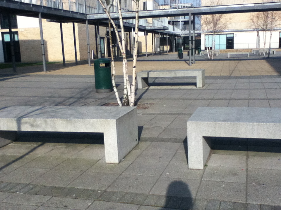
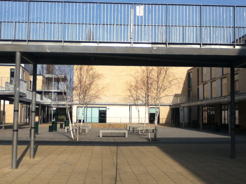
Images based on composition.
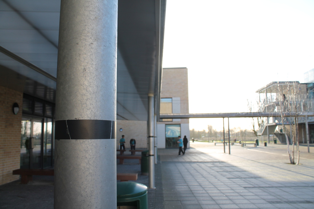
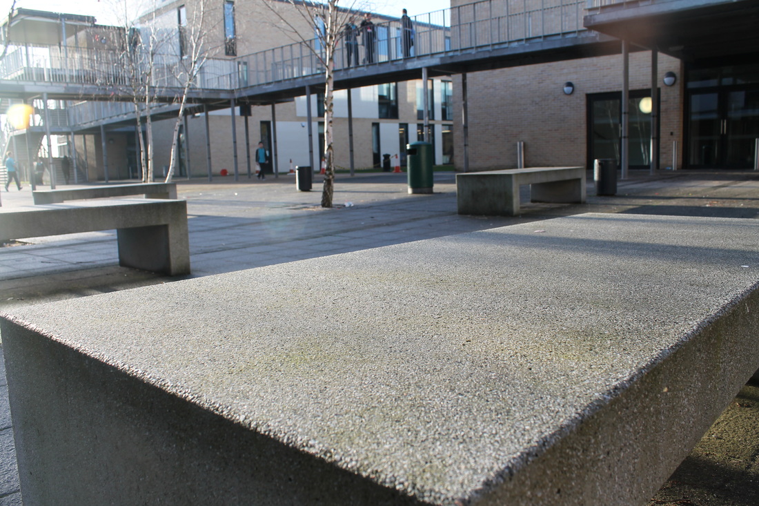
Below, are a few images i took during photography. Our task was to take images that reflected the element of composition. At some points it wasn't as easy as i expected because the position i was standing wasn't able to provide much things which gave the image feeling. I tried to take pictures of different things around the school from nature- trees to some solid, sturdy, man-mind objects- benches. Moreover, i tried to differ my angle position in each image, by doing this it gives each image a different perception. For example some of them were 'long-shot' whilst some wore literally 'over the shoulder' shots also with some 'close-ups'.
Evaluation of two images.

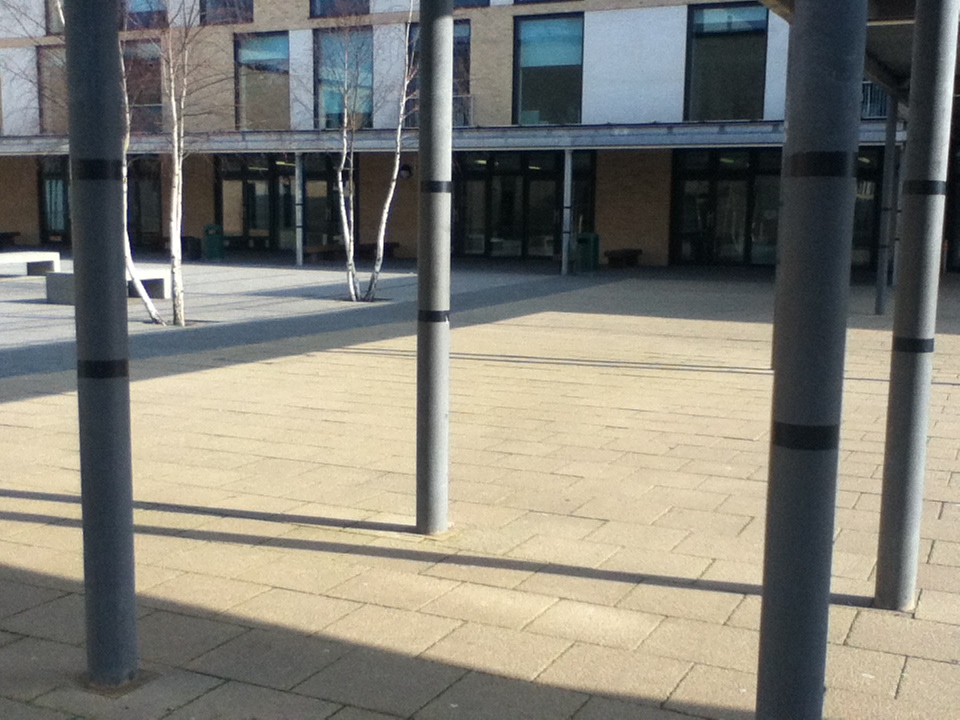
This is my least favorite image, due to some elements. Firstly, the composition of the image is quite chaotic; there are many stands, which make the image look very compact and sophisticated. This is one of the reasons i feel like this picture wasn't thriving as we had to focus on the composition. Even though, i like how the stands go from big to small, but i abhor how they are laid out. Initially i wanted the stands to be more evenly spread out, but it was quite hard to achieve that. The reason of this maybe because of the position i was standing. I was standing upright and diagonal to the stands. However if i either crouched or thought more about the angle of where i stood then the image would look more central and it would draw us in more. Also, everything looks in-focus which makes the image seem more dull. Whereas if there was more depth of field between the foreground and the background then it would look more interesting. On the other hand, there are many contrasts between the dark and light parts to the photo which is . Also, the image doesn't emphasis much feeling and it seems quite boring.
|
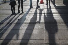
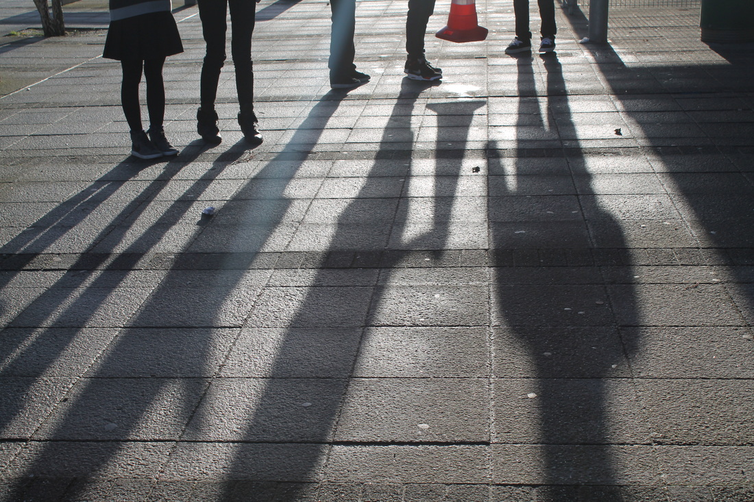
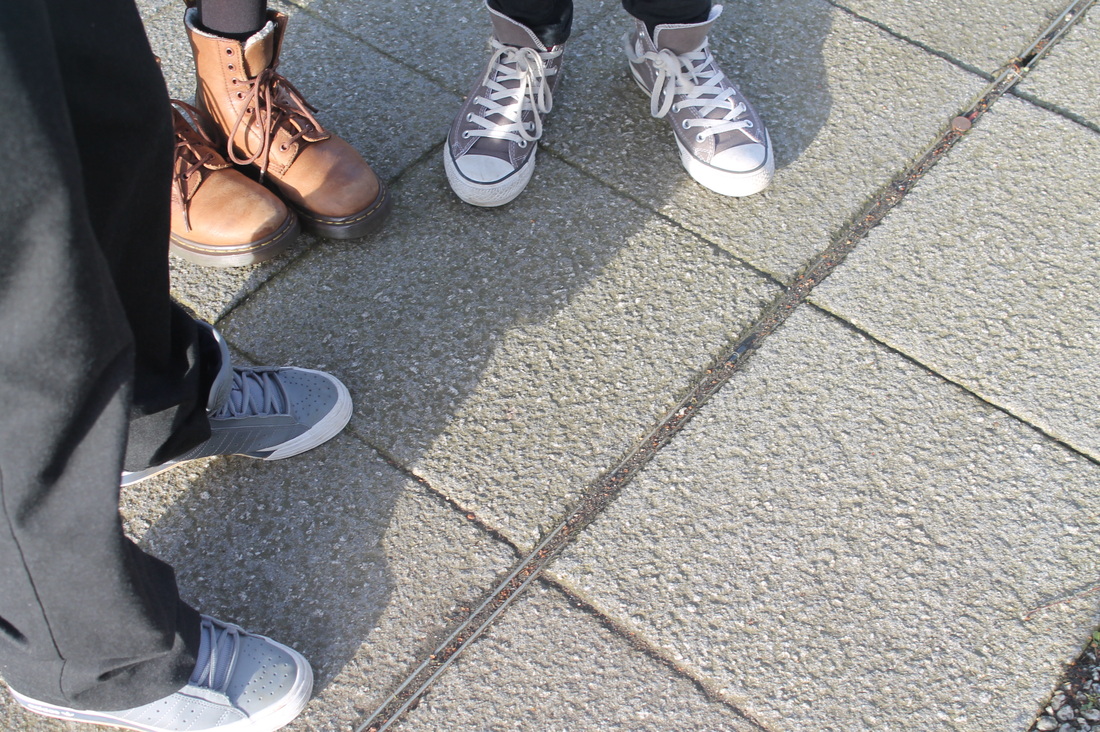
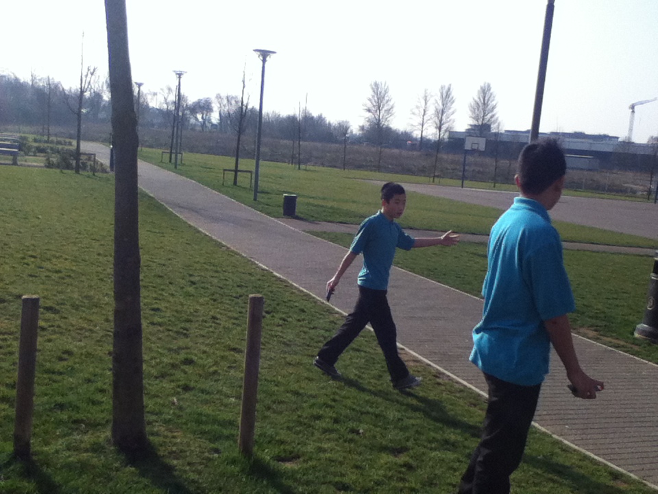
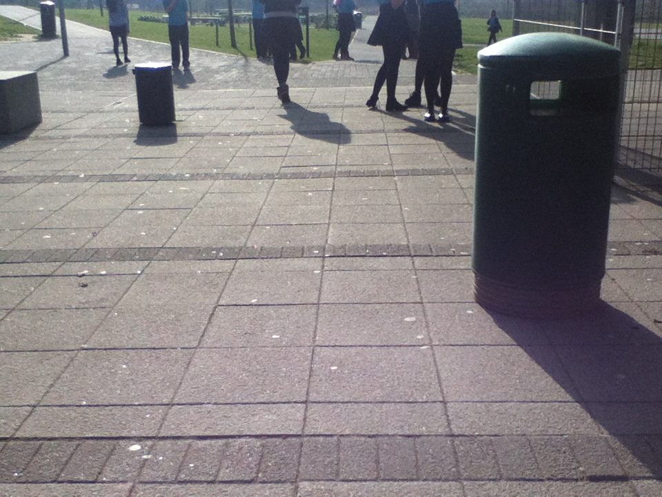
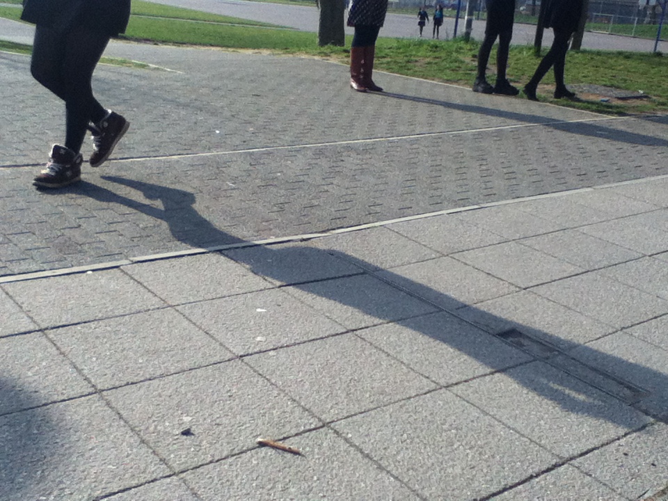
This was one of my favorite images that i took because of the different tones in it. One of the elements i based this image on was shadows. In this image, there are 5 people standing in a straight line. The idea of only seeing their shadows and only the bottom part of their body allows us to see not their emotions of their face but their posture. Moreover with the shadows being stretched this conveys some emotion. This is because, the shadow is making them seem taller than they already are which gives the viewer a surreal impression. Also, this grabs the viewers attention automatically as it is the main focus. There are many different contrasts in the image from the tones and the lighting. The idea of the sunlight being bright and peaceful, differs from the shadows as they give a concept of being dull and scary. Moreover, the texture of the shadow is relatively smooth and faint whilst the concrete floor seems rigorous and rough. Lastly, one of the key elements in this image is the angle. The camera captured it looking down, this way it just focuses on the shadows.
|
Images based on 'cropping'.
Below, are some photos i took based on cropping and a few on shadows. In these images i had to think carefully about what things were in the frame before i took it, to capture and focus on the main context.
Why street photographers use-
Shadows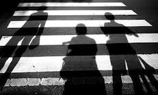
Some street photographers enjoy using shadows because of many reasons. Firstly, shadows show characteristics, some may be soft whilst some look darker and more bolder than others. Also, some of them are longer and some are short, whatever the shadow may look like it will always give a different impression each time. Moreover, the use of shadows catches the viewers attention, as its not focusing on the facial expressions or what the person or object looks like, rather it focuses on the posture or position. Usually shadows are utilized to display texture to an image, they do this by involving the sun. Even though shadows just seems like one dark section to an image, it provides emotion and is really effective when taking photos.
|
Cropping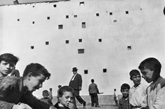
Street photographers use cropping due to the fact that it allows the image to just focus on one thing. The use of cropping is so that you don't capture the unwanted parts that may not be too relevant in an image. Moreover, cropping is almost like a close-up of the context within the image and it is more targeted on the details of the image. If the image was not cropped we may not see every inch of detail clearly, whereas if we cropped a certain image we may see parts of an image that we may not have seen originally. It may also show more feeling as you're stepping into the photo.
|
Images based on 'cropping' 2.
We took 10 images based on 'cropping' in our groups. I used a digital camera- Canon DSLR 1100D; therefore the quality of the images were really clear and the lighting was quite bright. Moreover, most of my images were took outside, as i felt there was more things to take and the atmosphere seems more brighter. Nevertheless, i tried to not use flash as the pictures would seem too over-exposed. The images were focused on different things and the subject matter were varied. The subject matter varied from the staircases to branches on the trees. The use of cropping allows us to focus more on one thing rather than the whole image and the unwanted parts (usually the outside sections) are not captured. In particular i find this image on the left hand side quite successful to the set task. Firstly, i like to take images on trees and nature, as it has a really peaceful feeling. Moreover, i feel that this image has a clear sense of cropping, as it's just part of a tree and it allows us to be more drawn into the twigs as its the main focus. Overall, most of my images i took are good because of the composition however, if i looked more into the contrasts and the tones within the particular image, it may seem more interesting to look at.
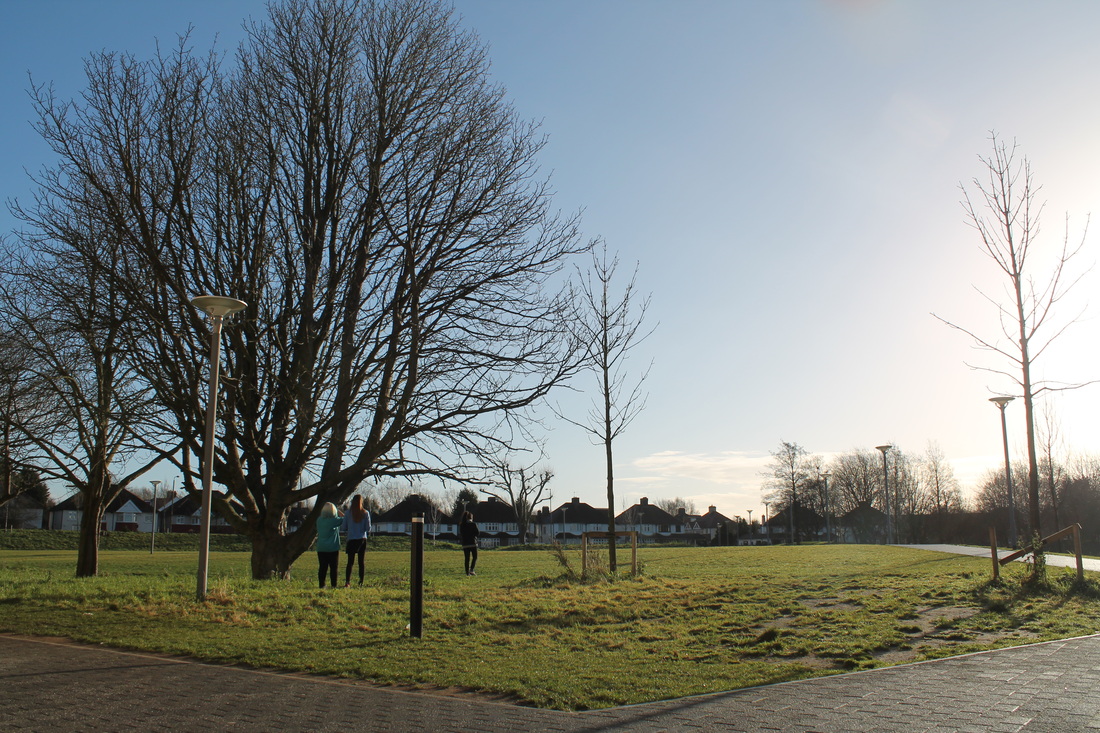
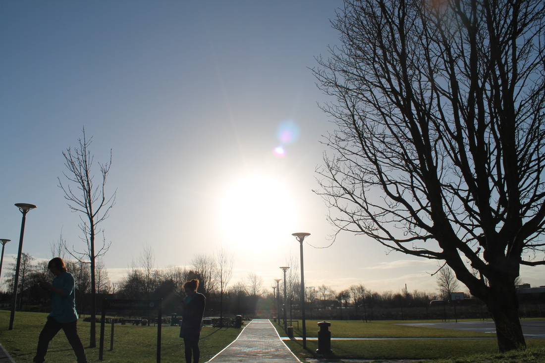
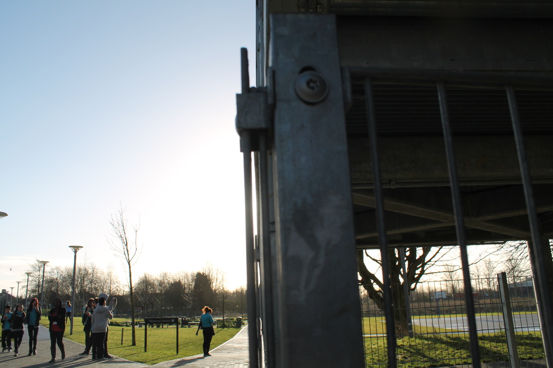
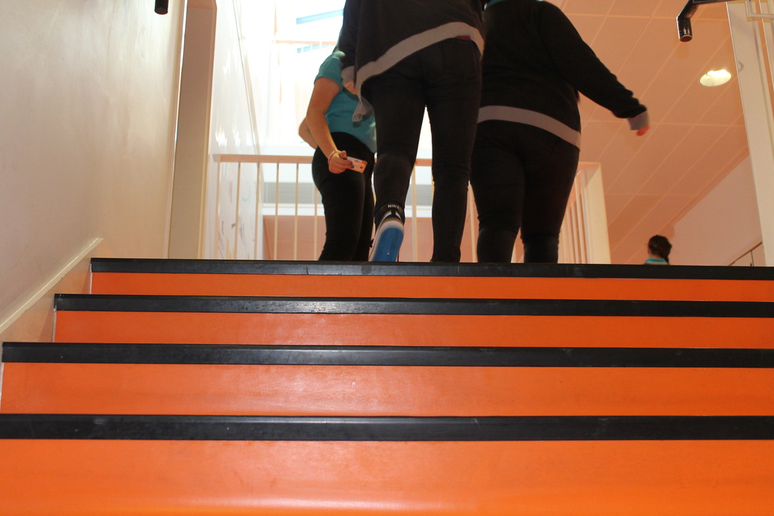
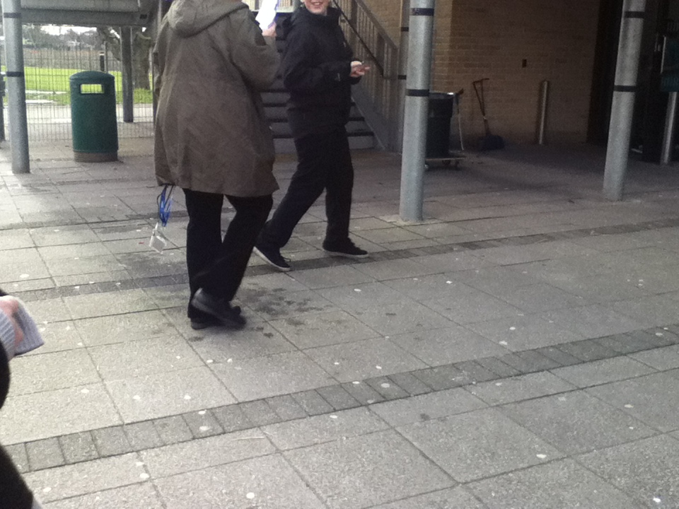
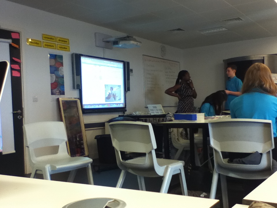
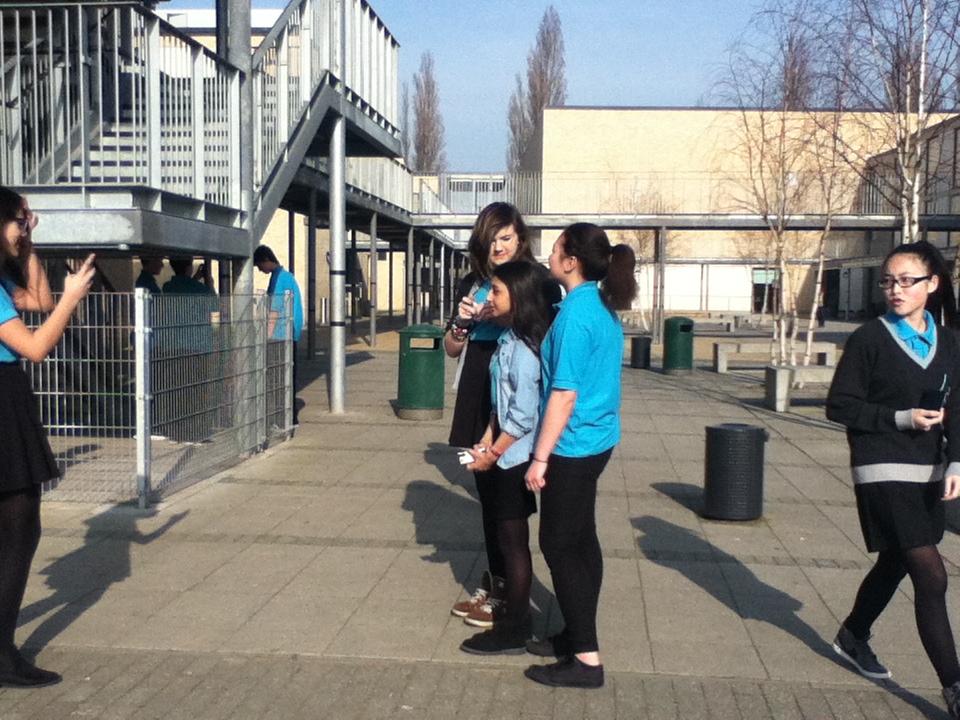
'School life' images.
In the lesson, we were asked to take 12 images around the school; trying to capture the atmosphere around the school and within the people and how they move around in the school. I took my images in the school building and also outside, i took them in different places because i wanted a variety of backgrounds which makes the images seem more interesting to look at. Moreover, all of my images had people in it, therefore if i had arranged them all in the same position, the composition wouldn't be as appealing to look at. Also, i wanted to capture the images with different angles, so it could show all the aspects of the school, and not in just one perspective. Usually, i find taking pictures of people quite difficult as i would take images more around still life and nature normally. Nevertheless, this was an opportunity for me to experiment more with a camera and take risks when photographing, allowing me to feel more confident when taking images i'm not necessarily use to taking. Whilst taking this series of images, sometimes i missed the opportunity as i didn't have the courage to just snap it. By taking images of people, their emotions and gestures are focused more. Although we were meant to take images within the moment and just capture it, i still hesitated at times, as i had a feeling that either the images wouldn't come out as i wanted to, or things in the image wouldn't look as pleasing eg. the composition. I hope that if i have more chances to do street photographing, i will increase my confidence in taking within the moment and taking good images.
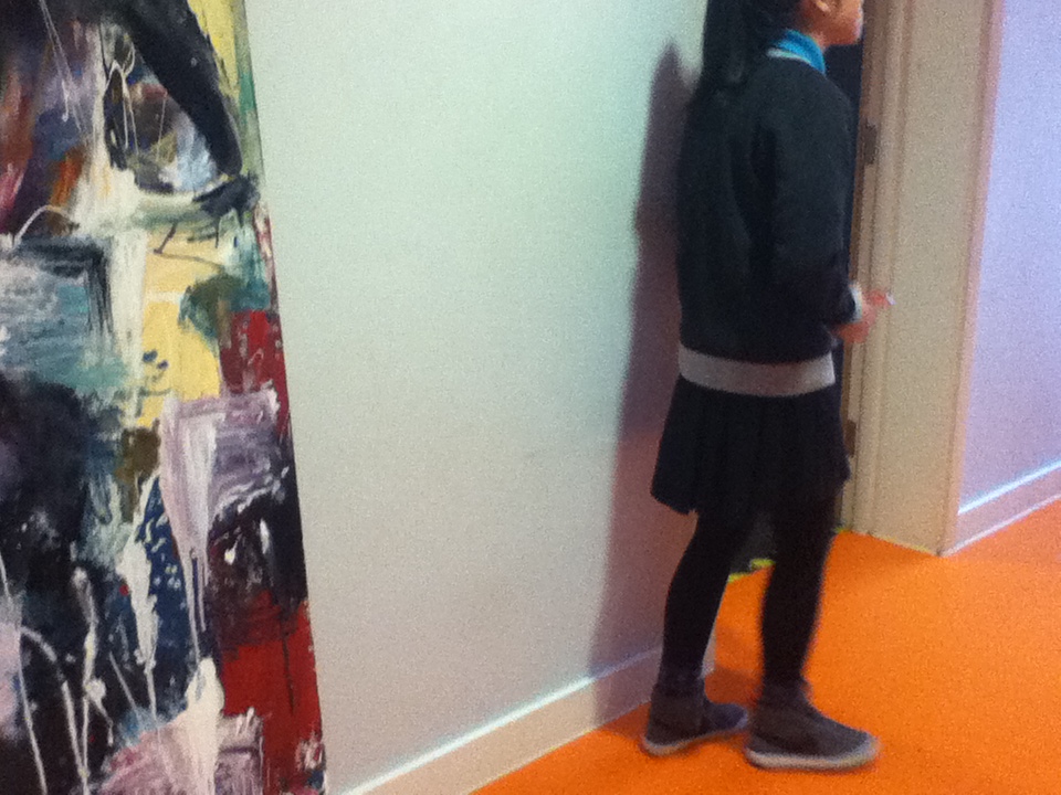
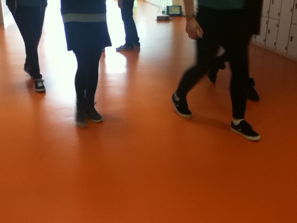
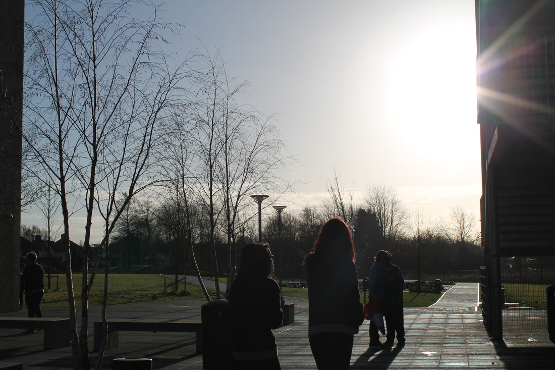
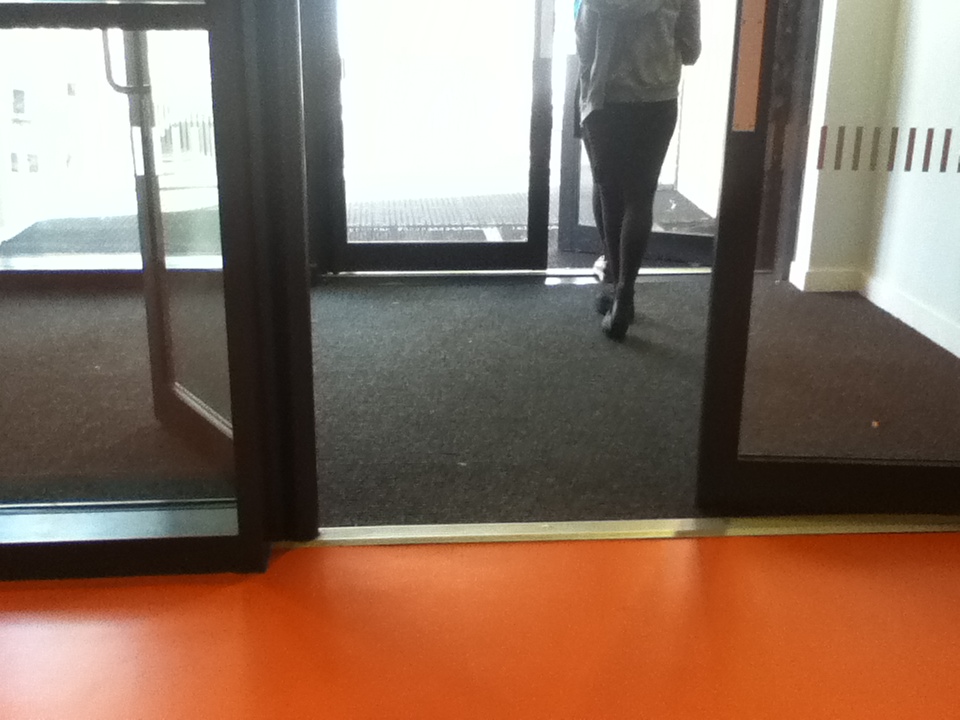
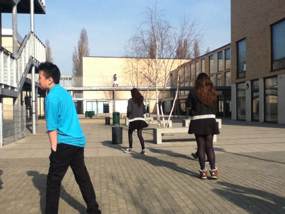
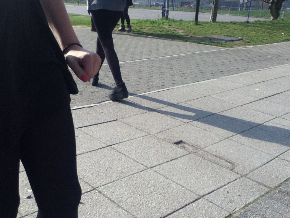
Evaluation of an image

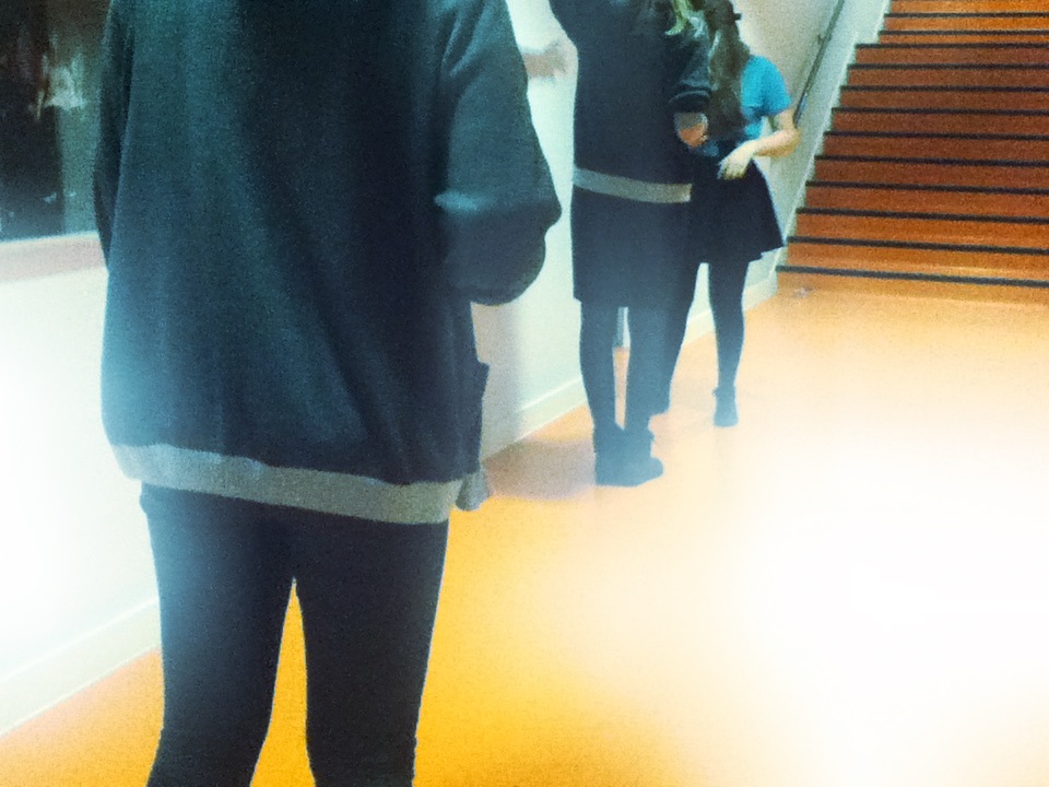
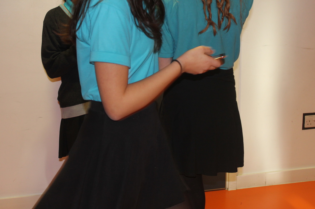
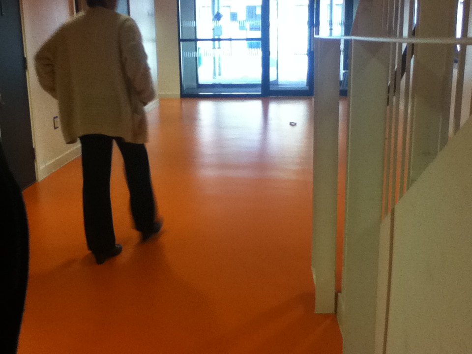
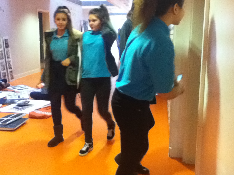
In this image, we can see two girls walking towards the camera, and then there's one that looking away from the camera. This image was taken in the orange block and on the left hand side we are able to see some artwork by sixth form students. Although most of my images didn't come out as i wanted to, this was one that i found quite interesting due to some elements. Firstly, in the image i was able to capture things like street photographers do like- shadows and over the shoulder shots. There are a few shadows in this image; one that we can clearly see is the one of the girl turning away from the camera. This shadow doesn't signify her actual body figure, but as the lighting was quite dim and the angle i was taking the image was diagonal, so it just seems like a reflection on the wall. Moreover, the two girls walking are out of focus as they are moving, this shows us the movements in the school and people rushing around. On the other hand the girl beside the door is clear to us as she's in the foreground and in-focus. The composition is quite neat, as the people are not over-lapping each other and everything we can see each thing is in a horizontal line and clear.
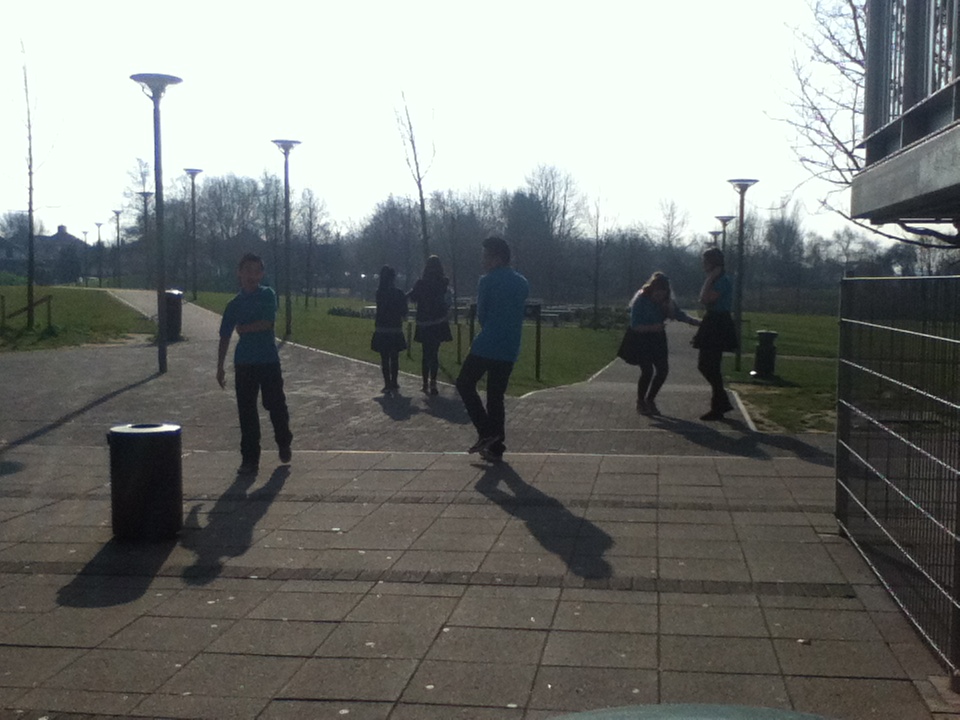
Mini street photography project
Next, we were asked to take a series of 10 images near where we live and capture images in the style of a street photographer. We were inspired by the photographer Boogie, as he said "the deeper you go the better images you get". This quote helped me when taking my images as i tried to get images of different things that happens on the streets and go more into details. Moreover, as i was taking not in the school we had more freedom and more things to take within the moment. I tried not to think about what i was taking and just capturing it, some of the images i took was chest-level so i couldn't see what i was taking. Street photographers are also really independent so whatever catches their attention they'll just take it without hesitation. As i always remind myself- even though we may not like how the image appears at first sight if we go deeply into the image we may be surprised by ourselves. On the other hand, i was hoping that there was more people in my images, but as my nerves took over me, i wasn't as confident; however i do regret this. Nevertheless, next time i will take more risks when opportunities arise. In my images i tried to allow the streets to engage with the camera more, so that i'm not constantly thinking about the composition or the layout, but capture the way successful street photographers do.
Evaluation of my own image.

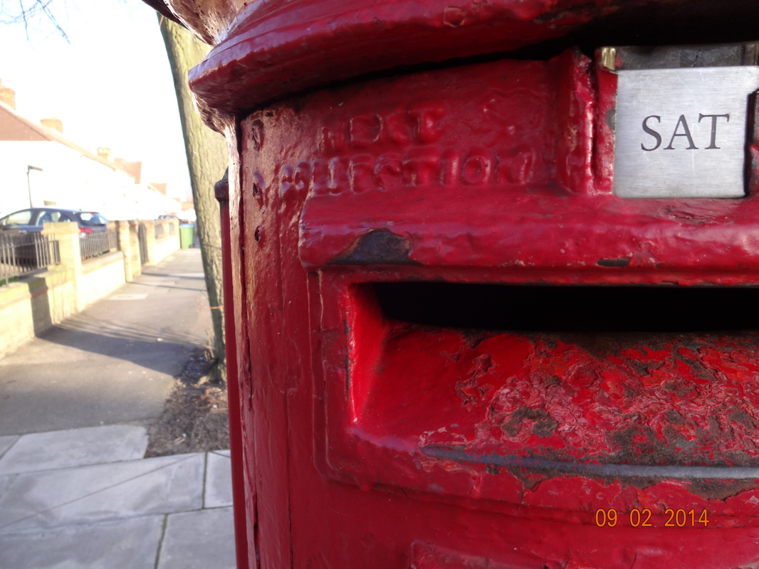
Out of all the images i have taken in this project, the image on the left is one of my favourites and most successful ones. In this image we can see the top left corner of a postbox that's bright red. The background is faded and out of focus where we can see a tree and it's reflection. I find this image really good because by capturing the postbox, it shows the things that are common on London streets and it also shows how the streets are. Moreover, the postbox is quite rusty as it's probably been there for quite a long time, this also reflects that it's probably really antique. One of the elements that i like most about this image is the contrasts, whilst the postbox is bright red and draws us in as the viewer, the background is blurred and is more greyish and brown. Whilst taking this image, i thought about how street photographers capture things. For example, using the cropping technique, this is shown in this image as i only captured a section of the postbox and not the whole thing. If i did, the composition may have looked less interesting and we may of not been as drawn in as we are.
Triangles
|
When analyzing an image based on the element composition, there are many things in a certain image that can reflect and enhance this. One of the best compositional techniques are 'triangles'. Photographers use this technique to fill the frame of an image, add balance and add movement within your image. They are also a good way to combine different elements eg. lines and paths, which creates a more interesting part to the image. Triangles can make the image feel stable too, as it is a 3 sided shape which is bold and the sides are straight. Also, using this technique is a great way to group together 3 points of interest in a photograph so they can portray a certain feeling like stability, instability, aggression etc. Nevertheless, as images using the technique maybe not as easy to notice for the viewer, it evokes a strong feeling to a image as it'll catch their attention immediately. Some of the triangles used in an image may not be a solid equilateral one, but it may be isosceles or a scalene, this may be due to the fact that it was taken at a angle. By using triangles, it could improve or make a huge difference to your image.
|
|
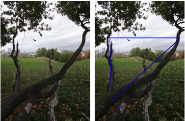
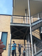
On the left hand side is an example of my own image which uses this compositional technique- triangles. I've included the original picture with one that's been marked showing where the triangle is. In this image we can see long stretched out branches of a tree. Initially i wanted to take this image as the background scenery was quite pleasing, but in the end i in cooperated it with the tree that's in the foreground. Nevertheless, by using the 'triangle' technique, i was still able to successfully capture what i wanted in the background. This is because looking at the marked triangle in the image, we can see that the area of it is clear and there's nothing blocking it, which allows us to feel more drawn into the background as it stabilizes the image. Moreover, this technique allows the frame to be filled; this is clearly seen in this image as there is not much going on within the image, and we're focused on the simplicity and not distracted by other things that are going on. Hence, i also find the contrasts in this image quite interesting as the branches are quite dark and hard, whilst the clouds are soft and light.
Rule of thirds.
|
The 'Rule of thirds' is a guideline which helps to place elements in the image so it can improve the composition, balance and stabilize it. It consists of an imaginary grid which is divided into 9 equal parts by 2 equally spaced vertical lines, and the same for horizontal lines. The elements in the image should be placed along these lines or their intersections. By using this technique to align the elements it creates more tension, energy and interest in the composition as it is all spread out and it prevent placement of the subject in the center. This also allows linear features in the image to flow from each section. Moreover, this technique is convenient as the human eye naturally gravitates to intersection points that occur when an image is split into thirds. The idea is to divide up the space into areas 1:2 ratio, rather than equal halves; the imbalance results in a more dynamic image.
Counterpoints- placing your primary focal point at the thirds position, then you can place a secondary focal point at the diagonally opposite thirds position. Horizon- A natural extension to the photography rule of thirds is to place your horizon line along the one-third or two-third line of the tic tac toe grid, rather than in the middle. You can “stretch” the photography rule of thirds for a more dramatic effect by placing your horizon (or your main subject) even closer to the edge of the frame. |
|

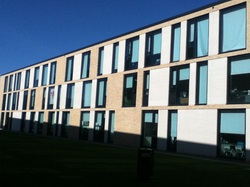
Evaluation of 2 images.
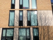
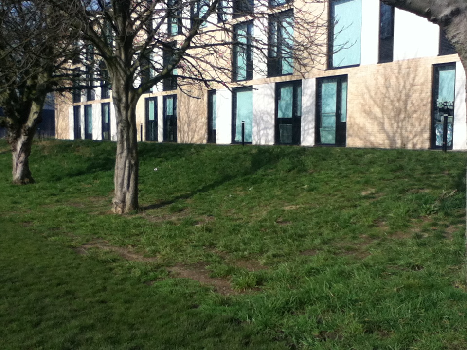
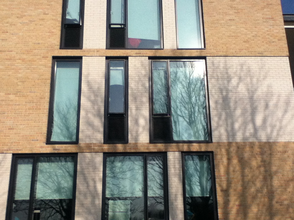
This is my most successful image out of all the images i've taken. In this image the building and the reflection of the tree is prominent. Nothing else is in the background or foreground, so we are focused to what we can see. Moreover, i was standing directly opposite, so i could achieve the the framing of this image. The three levels on the building is clear and the elements are all spaced out well which shows the compositional technique. Moreover the colours within the image are creamy colours which leads it feeling quite soft and doesn't make the image seem too rough. Nevertheless, as the image is of a building the overall texture of it is still really solid. The reflections make the image feel more smooth and character.
|
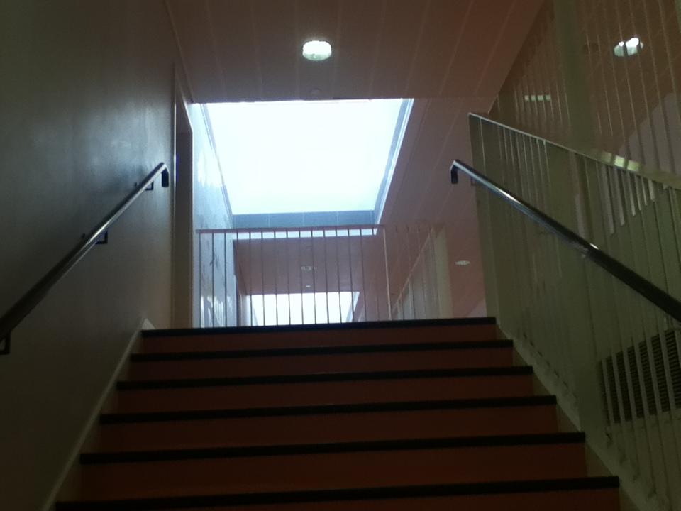
I feel that this is my least successful image and i don't really like it. One of the reasons is because there is no content and the image in general looks really dull as there is nothing to focus on. At first i wanted to capture the different levels of the stairs, however it didn't really work out. It was hard to make them even as i was taking it from a low angle compared to the subject. If i could make the composition better next time, i'd probably stand further away a bit more so i can capture at a wider angle and capture more into the frame. Moreover, the elements in the image all seem compact and they're not spaced out well enough; if i experimented more on the angle and composition of it it may seem more interesting. However, i like how the colours in the image are contrasting.
|
Evaluation of Lepkoff's image on 'rule of thirds'
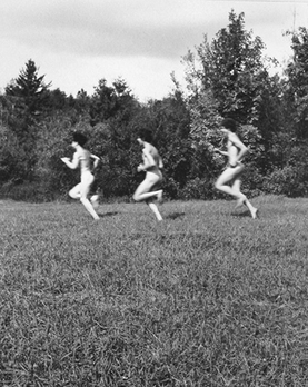
This is one of the many images where it is clear that Rebecca Lepkoff uses the compositional technique 'rule of thirds'. The title of the image is 'hippies running' and this is no surprise to us because we can clearly see that the 3 people running are prominent within the image. Moreover, as the tone of the image is in black&white, the people have a much lighter tone than the rest of the elements in the image which makes them stand out as the foreground; so they don't blend in to the background. Lepkoff has successfully used the 'rule of thirds', as we can see in this image, the 3 people are evenly spread out around the center horizontally, and in the top half are the bushes, whilst the bottom is surrounded by the grass. The way Lepkoff has arranged her image, allows us to recognize all the elements in the image as a whole rather than just one part of the image. Therefore, meaning the subject focus is not only on one specific corner. Furthermore, i assume that Lepkoff was standing quite a distant away from her subject as it's not cropped but we can see more than just the people. We are not too close or too far from the subject, because everything is clear and especially the people as we can see their whole movement in the body. By focusing on the actions made by the body parts, it allows us to understand them more and for us to wonder what their facial expressions may have been. We may question- what are they running away from?, why does it look like they're naked?, what was Lepkoff trying to perceive and get what idea across by capturing this image?. Also, the 'rule of thirds' has allowed the image to feel more stabilized as the framing of the photo is equal and there is the same amount on each side. Generally, even though the composition of the image is quite plain and simple, if we observe the image more, we find out more about the concept.
Diagonals.
|
The compositional technique of 'diagonals' allows the images to be stabilized as the lines are like a guideline for the elements in the image. There are many types of diagonals including- the horizontal, the vertical and diagonal line. Each type of line, depending on the angle of it provokes different dynamics. Moreover, diagonals are really efficient when trying to focus on a section of the image. This is because if two lines meet and cross together, the point at where the intersection part is, we'll automatically focus as thats where the main subject is. When composing an image with this technique, you could simple place the areas of interest onto the lines as well, so the viewers attention will directly be drawn to the points.
The slideshow beside, shows the different types of diagonal lines, along with an example from Henri Cartier-Bresson from Eric Kim's website. The image shows the clear lines made by the people on the train. Nevertheless, there are also some triangles created in the image. In general the image is very strong and has a lot of context which is made by the composition of the image. |
|
|
|
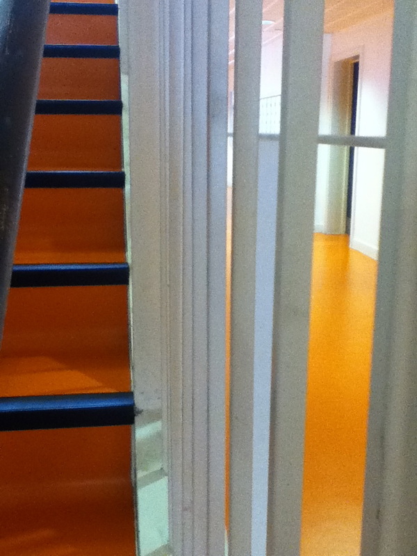
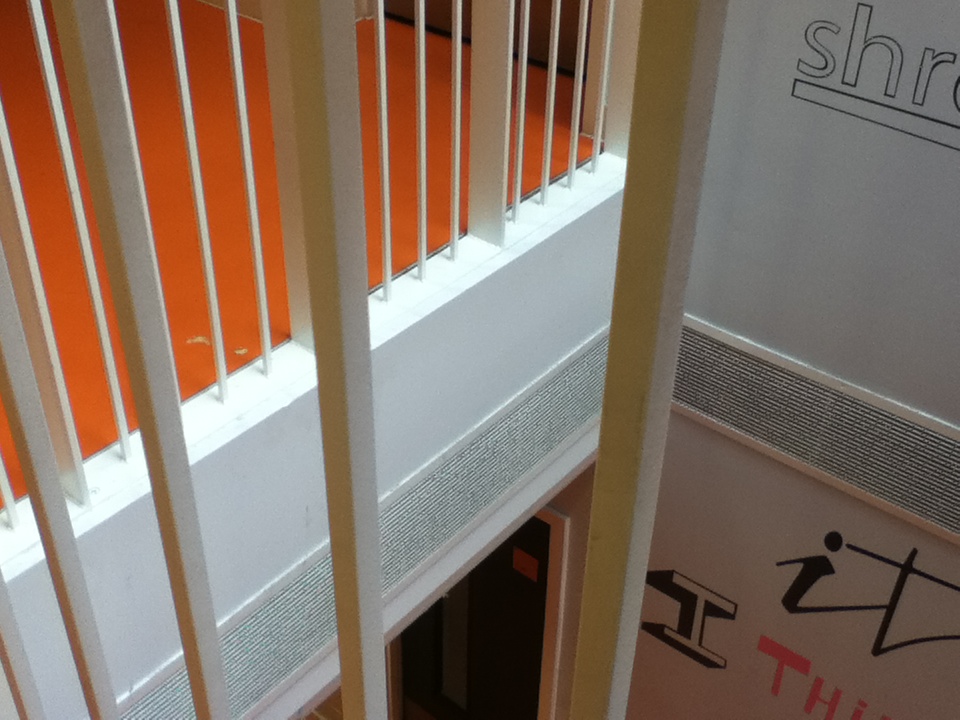
Pinterest board images on diagonalsHere are just a few examples i found interesting on the 'Tallis Arts Street photography board'. All the images i've chosen clearly shows the compositional technique of 'diagonals', whilst some aren't as easy to see at first glance, and some are clear and sharp.
These images are from many photographers including: Nils Jorgenson, Paul Russel, Paul Graham, Oliver Seignette etc. Carefully analyzing these images from professionals really help me to improve in my own works; like how i frame my images- whether there's a lot captured, or if its cropped, how everything is laid out (composition), the colours that are visible- are they sharp and intriguing. Nevertheless, i feel that diagonals are one of the basics for a good image. |

Evaluation of two images
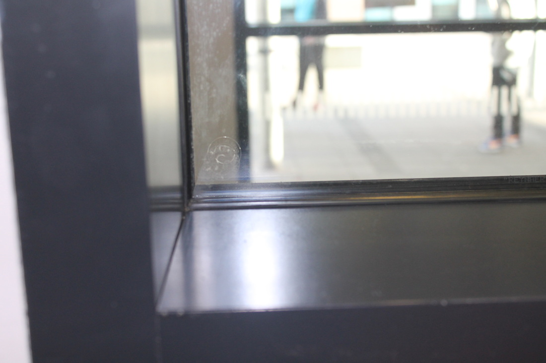
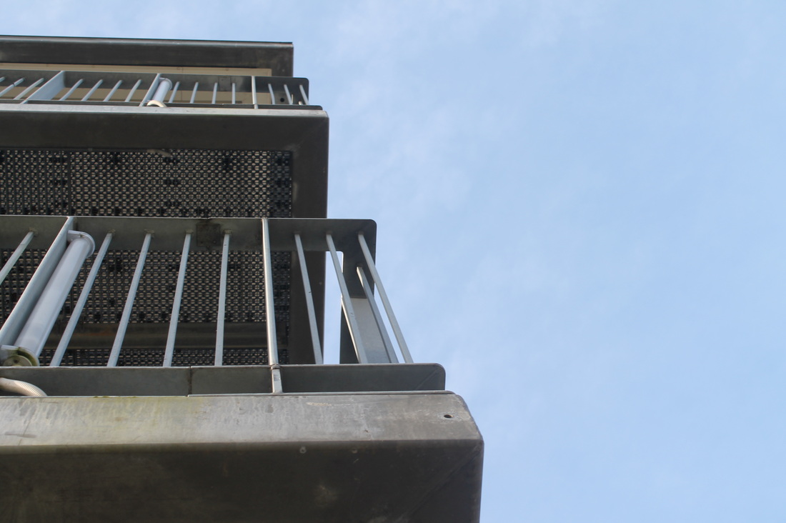
This is my most successful images i took revolving around the technique of diagonals. This image was taken behind glass windows, however this doesn't effect the image as much because it looks clear and there are no reflections made from the windows. The reason why i was quite far behind from my subject, was because i wanted to capture more, so more diagonal lines, meaning more elements captured in just one image. The composition is more to the left hand-side as there is more to focus on there. There are many different lines here, including some from the railings, the windows from the buildings, the poles, outline of the building and many more. I like how i did this as the all the lines are clashing and overlapping each other, nothing is in its' own place; therefore meaning the composition is very chaotic but still very clear. The idea of all the lines being straight and there being no curvy or bent lines is very unique, whereas if they were present, we wouldn't be as drawn into it, because the dynamics being contributed would be different. Moreover, all the lines are contrasting which makes the image feel more life-like; as nothing in life is the same thing and everything we see has its own elements which makes life interesting, Similarly, the image has diagonal lines which are more thicker whilst some are thinner, some which are lighter/darker than the others, some are more bold whilst some seem to blend into the background. Nevertheless, this image is well composed and i don't think there is anything to change.
|
In contrary to the image on the left, this is my least successful image, the main reason is due to the composition. The composition is relatively dull, as there is no focal point and everything seems to bland and there is no subject. The main reason why i took this image was because i liked the contrasts within the strings at the top half of the image. As i tried to capture the different lines, it didn't seem to particularly work as there are all bunched together, and i would've preferred it more if they were more spaced out. Moreover, in my opinion i find that the merging of some particular colours don't work as well, and looks quite unpleasant as they don't really look good together. One of these combinations include orange and white; the reason is because the colour orange represents enthusiasm and fascination whilst 'white' represents purity, coolness and innocence. Therefore, the contrast is that the orange has a more tropical and lively feeling, whilst the other one evokes a peaceful feeling and is considered to be the colour of perfection. In addition, if i were to take this image again to improve it, i'd probably stand at a different angle and possibly closer to my main subject so there is actually a focus point, so we can see what i'm trying to capture in the image. Another reason why i may find this image quite tedious is because i have taken images of the strings many times before and i'm so accustomed to it. Hence, an improvement i could make is to capture something else as the main subject, meaning i'm not continuously taking the same things.
|
Compare and Contrast
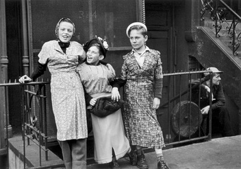
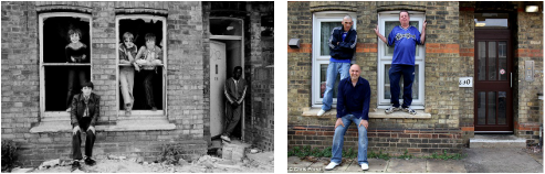
Helen Levitt
|
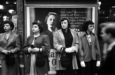
Louis Faurer
|
Similarites
In both of the images, the main subject is the females standing in the foreground. In each image, each one are looking in different directions, some looking straight ahead, whilst some looking towards either the right or the left hand-side. The images seem to be taken at the same period of time but just of a different generation. Moreover, the ladies seem to be leaning on something behind them, one is leaning on the railing and the other image is leaning onto the billboard. Both of the images are in black and white so we can see the clear contrasts of the elements in the image. In addition, the ladies are all evenly spread out, so all of them have the same amount of focus as the other one. Also, the composition of both are very central, so there isn't much going on around them as everything is still. Also, the ladies in each image are of a similar age, Levitt's seems like a younger generation of girls whilst Faurer's is of more older looking ladies probably in their 20's. They both capture the whole body and how it is positioned alongside with the facial expressions being perceived clear as well. There figures and character are relatively the same, so they are all equal to one another. Also, the photographer of each one was presumably standing opposite the ladies and not too far away. Another similarity, is that in each image there is also a man to the right hand side of the image, both of them not being seem as clearly as they're looking at different directions. Both photographers captured it within the moment and i imagine that it was not planned but they found a good opportunity to capture the atmosphere in the place by capturing how the people are.
Differences
There are also some differences between these two images. One of these differences is the way the ladies are dressed and presented by their clothing. They're are dressed accordingly to their age. For example, in Faurer's image, the ladies are dressed more modestly and is more formal. As their clothing looks more vintage, this makes them look older. On the other hand, Levitt's girls are dressed in more loose fitting clothes. They're wearing bright, floral, long dresses which makes there character look quite innocent and sweet. Moreover, the placing of their hands are a clear contrast in the image as well. In the left image, their hands and arms are more loose and less tensed. In contrary, the right image seems that their hands are in the same fixed position, which is both hands together, seeming clenched. Moreover, 3 of them have similar small bags, which suggests that it must have been in the fashion around that time. Their clothes also contributes to how focused they're within the image. The dresses that the young girls are wearing is more prominent in the image as the background seems quite darker. But, the more formal looking ladies are wearing more medium coloured clothes so it kinds of blends into the background. Nevertheless, in the Levitt's image, the background is clear, we can see that there are stairs and an isolated building. Whereas it isn't as visible what is behind the billboard in the second image. Moreover, in the similarities section i slightly mentioned on how there is a man seen in the corner of the image. However, the man in the right image is still and is not moving as it just seems like he is staring at something. However, the man in the right image is blurred probably due to the fact that he was moving at a quick pace or trying to avoid the camera. Furthermore, the tone if the image are different as well, the left one has a wider tonal range as there is a wider variety of greys, blacks and whites than the right hand side one. In both images, the ladies captured seem to be in ease; the girls in Levitt's image are posing freely and there seems to be no fixed emotion. However in Faurer's image of the more mature looking ladies they aren't.
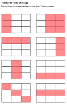
Rule of thirds challenge.
|
Our next challenge was to take several images that didn't fit into these 'rule of thirds' patterns. This was quite hard because when we take images based on composition we would usually place the point of focus in the certain areas. By doing this we are directly attracted to these areas where the subject is clear. Moreover, the fact that we couldn't take images using this range of compositional technique was difficult, as these are one of the most easiest and the ones that we would normally do.
In these grids. the pink sections represents the subject or the main element, an area our eyes are drawn to directly therefore it's the main part of the image. On the other hand, the white sections are of less interest, an area of open or negative space, which supports but doesn't dominate the image. Furthermore, by NOT taking images that fitted into these compositional patterns, means that there's no certain area where we're drawn to and all the elements within the image are equal. Moreover, there's no particular point of interest, but there is still a subject and a meaning to the photo. If there wasn't then there would be no purpose to the image, and it would be difficult to analyze and question about it. When taking these images i still remembered all the all the compositional techniques we've learnt about so i've included it into my image. |
|
Why my images don't fit into the 'rule of thirds' pattern.
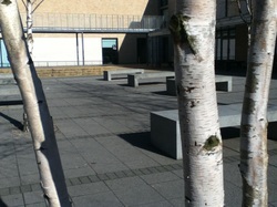
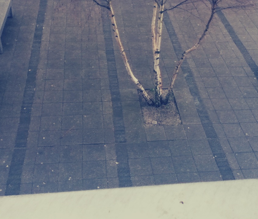
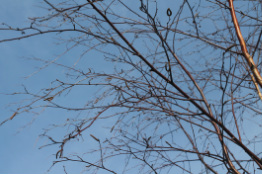
In this image, we can see 3 branches of a tree, some benches in the background along with the links. The braches are more prominent as it's in the foreground, but the other things are in the background. The reason why this image doesn't fit into the patterns is because everything is evenly spaced out, even though the branches are prominent within the image, there are still things in the background which meets our attention as well. Everything is clear and the branches are placed on the lines which run vertically and it's not only in one certain area. This is a close-up image and i also like the contrasts within the photo, as there are some shadows which gives the image some character.
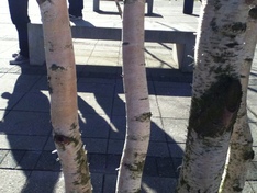
This image is similar to my first image as the subject is the 3 branches from the tree. However, the isn't much happening in the background, but in this image there's a bench along with half of a person and his shadow. Even though it isn't quite clear it's quite grainy as the texture of the elements within the image are rough and hard. This allows the image to feel quite cold as not much feeling is being perceived.
Another image that doesn't fit into the rule of thirds pattern is this one, due to the fact that the elements are all overlapping and we can see many separate interesting layers. For example; the pole and the link etc. As there is so much that is in the image, there is no actual subject The contrasts in the image are really insightful. The lighting in the image is quite bright and the buildings and other objects are quite light as the colours of them are creamy. Whereas, the link is very dark and we can also see a reflection. Even though there is so much happening in one image, it still feels quite plain as there's no movement and everything is solid and still.
|
The reason why this image doesn't fit into the rule of thirds pattern is because the fact its a close-up. it is very plain, so there isn't a context. The door handle is in the foreground whilst the background isn't as clear. The handle is to the left hand side . If i could improve this image i would probably crop the image so that the handle was in the centre so the focus would be to the centre more.
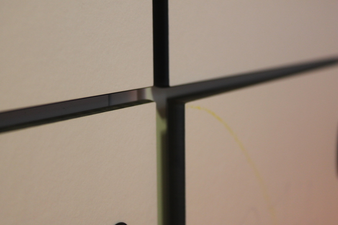
This image doesn't fit into the rules of third because the elements in the image are all drawing into the centre, so they're all clumped together and not actually separately spaced out. I love the composition of the photo as the sides are all equal. Moreover, the fact that the image is like 'being dragged in' it allows the viewer to be more intrigued also as it's very clear. We can picture a 'X' from the image and they meet in the middle. We also are interested on what is actually in the image because it's quite dark so it's not as visible. Another thing i like is the different lines made by the elements in the image; the verticals from the doors and the poles, the horizontals from the benches. Personally, this is one of my favourite images i've taken.
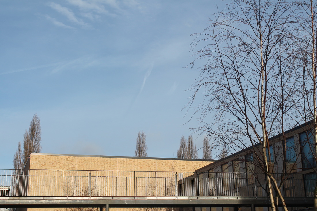
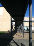
In this image, nothing is prominent as the elements are all equal. There is a long building which stretches out in the whole of the image. Our eyes are not drawn to just one part of the image so there isn't an actual pattern. The colours and tones in the image are quite interesting as there are a wide tonal range; there are different types of blues and creams, some turquoise and more darker and some lighter creams whilst some are more creamy.
|
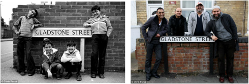
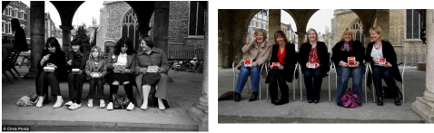
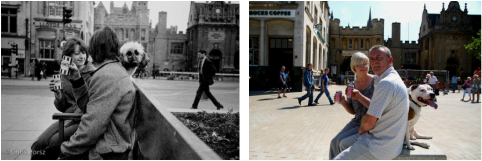
Short documentary: Chris Porsz.
''you never knew what was around the next corner and people do the most amazing things to the camera'' Recreating pictures from the past to the presentWhen Chris takes images, one of his styles is 'reunions'. Chris tries to track down the subjects of old evocative images and recreates the scenes. The local newspaper publishes old photographs and appeals to the people in them to get in touch, thereafter Chris takes them to the original location and recreates the picture. He has taken many of these images and this task has proven to be successful. Below are just a few examples:
|
Summary & thoughtsThis youtube video is focused around a street photographer named 'Chris Porsz'. He captures images in Peterborough as he believes it is 'rich with lots of photograph opportunities'. He says that the area is full of a variety of people and there is a strong sense of community. One of his techniques when taking images of a particular person is not just by eye contact, but by starting a conversation with them so they don't feel intimidated by what you're doing. Nevertheless, he feels that his job as a paramedic has really been crucial in his photography career, he says 'you really need to have a relationship with people to put them at ease'. I feel that Chris has a really good personality and i can imitate it as he doesn't just take images but tries to have a relationship with the people in his images and capture memories. Moreover even when he's on the move he'll never miss a photo opportunity. Personally, i really love his style of street photography as it really shows the different aspects of the streets and there's always a meaning in his images. Also, the way he composes the people and the buildings including the foreground and background is really intriguing and thought-provoking.
Chris Porsz's images''I see the streets as my studio and i just wait for the right characters to walk on'' Evaluation on Chris Porsz' image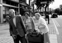
This image consists of 3 elderly people on a isolated street and leaning towards the left hand side. Moreover, they have got a luggage which may suggest they're on a trip or they're moving somewhere. However, the viewer may find it difficult to understand why they are leaning and not standing up straight. Therefore, questions may arise like- what so interesting are they looking at?, are they lost?, what type of relationship do these people have with each other? etc. They are leaning almost at the same particular angle, this makes the image look more captivating. Another thing that we notice is their facial expressions which shows that they are in some ways confused and not really clear as they look quite suspicious of their surroundings. Furthermore, the subject focus in the image is quite inscrutable, as usually we would image young women and men travelling and exploring the cities, whereas in contrast to this image it's older people. This is opposing to the thoughts of many and it shows that older people are also keen on travelling and enjoying their lives to the fullest. A lot has been captured within this image but still focused on the 3 elderly, so we understand more about the people and the area around them.
|
FINAL EVALUATION AND PIECES.
To conclude our 'street photography' project that we have been working on for a whole term now, we were to choose 4 final images that can summarise our journey through this project. Each image had to be of a different theme or topic and then we had to write a paragraph about it. Personally, I've really enjoyed this project and i feel that it has truly increased my photographic skills for example- we learnt a variety of compositional techniques that could help us when taking images eg. rule of thirds, diagonals, triangles and many more. Moreover, we had many opportunities too experiment with different devices like the DSLR camera and also iPods. This way of experimenting really works as it allows us to be inquisitive and we can think carefully about what we're doing which also makes us more creative. Furthermore, because this was a personal project we were to be independent, therefore we could realise our own vulnerabilities and our capabilities. Most of the images were taken on the school grounds which i feel was quite restricted as there wasn't much photograph opportunities and as we were continuously taking the same contents i couldn't really express my skills as much as i could of. However, during this project we were able to go on a trip to the Tate and look at a few exhibitions which really motivated and inspired me. Furthermore the images i took to and fro there, i found really adequate. One of the reasons for this is because there were no restrictions and we could basically take anything we wanted that we found interesting and peculiar. Secondly, we were in a different environment so we could really have a sense of a street photographers life. I hope that we can have more chances to explore the city like the last one. In conclusion, even though this project wasn't that difficult, it has really benefited me, as now i have a basis of many photography techniques; finally, one of the many things i learnt from this project is simply: you'll never capture the 'perfect' image unless you keep trying and experimenting! The below images are my final pieces from this project, which i have individually evaluated in simple terms-
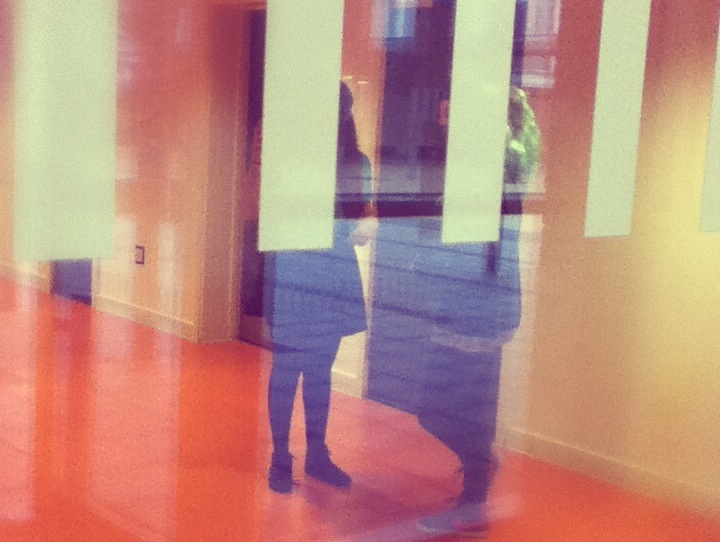
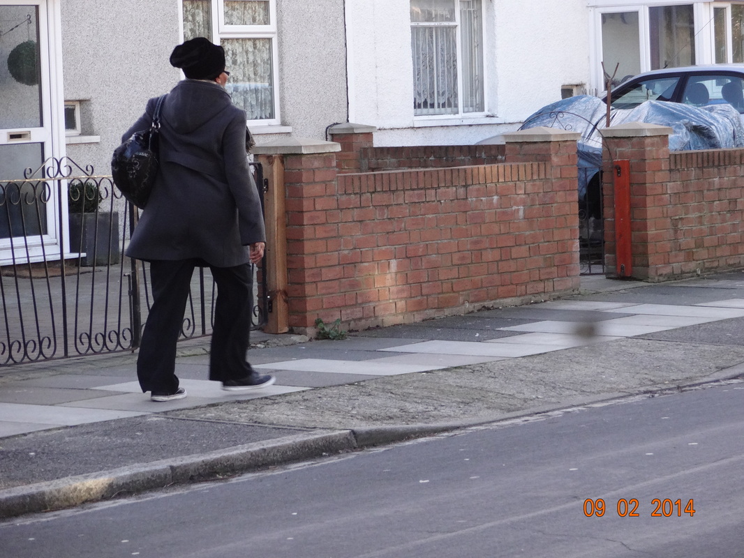
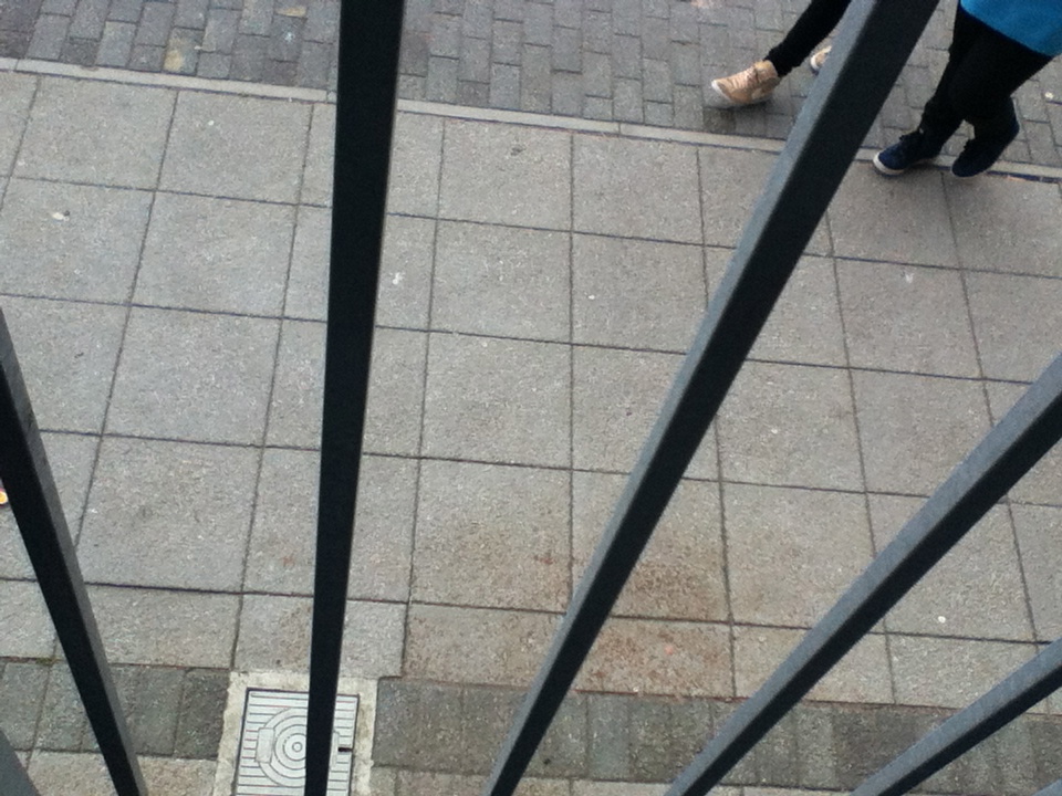
1st image -lines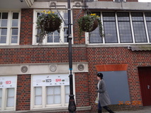
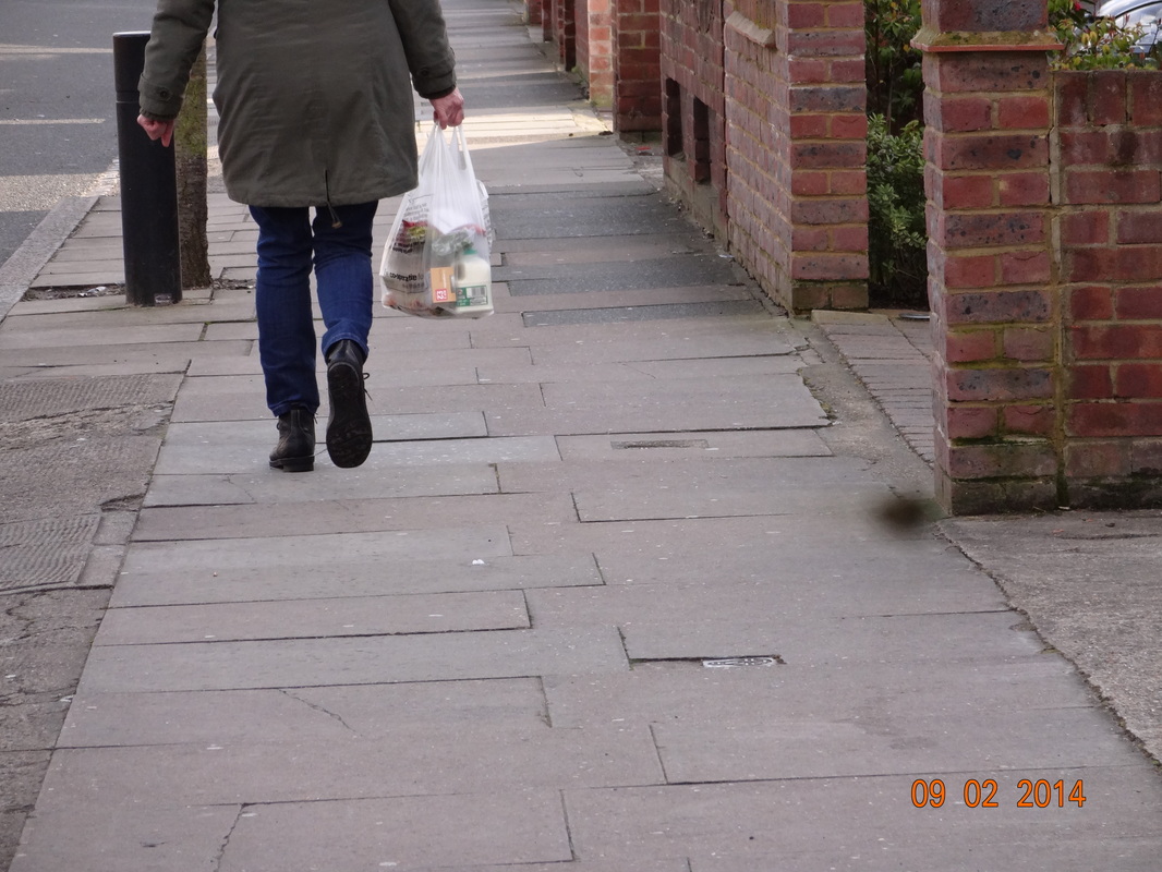
This image was taken based on diagonals and lines. There are many types of lines in this image alone which makes it seem quite sophisticated, some vary by the thickness whilst some by the length. This image is really sharp and bold, therefore it draws the viewer in. Moreover the tall lamp post in the centre creates more character in the photo so it makes it less tense. The lady is walking past the buildings and we can't see her face so it make us question- is she in a rush? Where is she going to in such formal clothing? Etc.
3rd image -contrasts
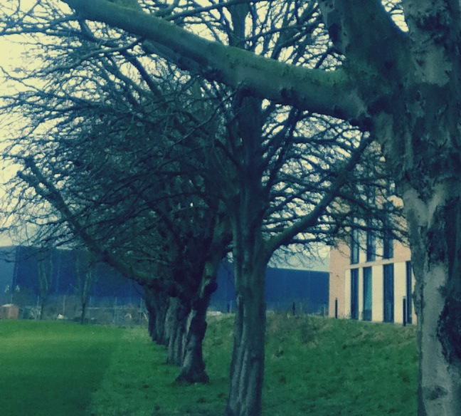
So far this is one of my most successful images. One of the main reasons is as a result of the clear contrast. There is a clear contrast between the tones, as one side is overall much brighter with the other side much darker. There is also contrast between the intricate detail of the dark tree compared the the large and bold statement of the building right beside it. This related back to my theme of street photography, since it is what we normally see in the streets predominantly the back ones with fine details which we normally miss.
|
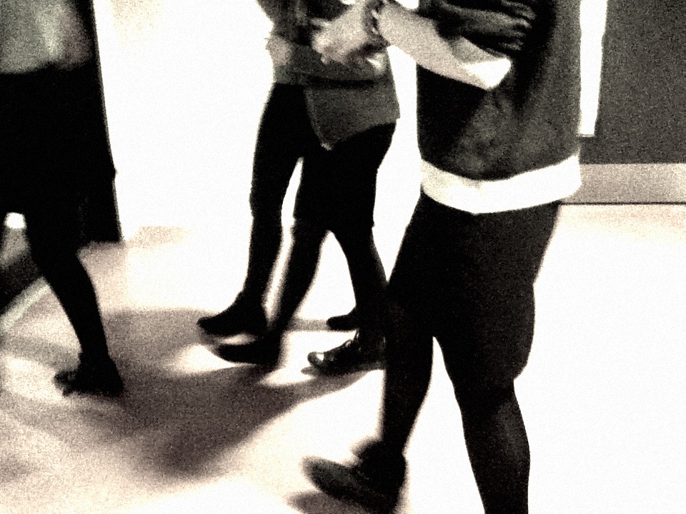
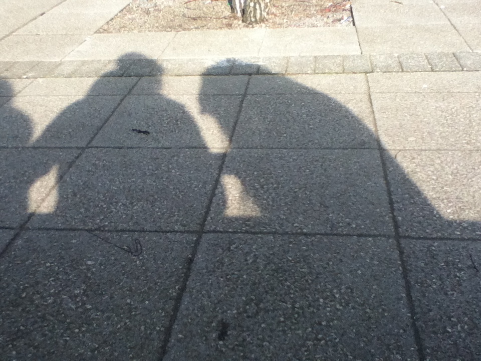
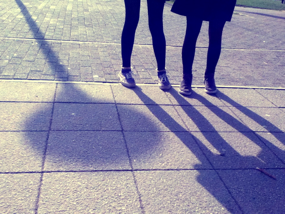
2nd image -shadows
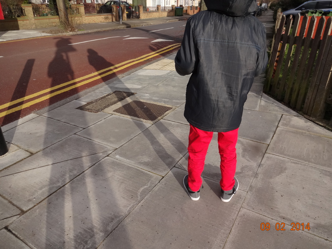
In the image there are 3 clear elongated shadows. One of the lamp and 2 people on a concrete floor. The shadows are really bold and they aren't blurring away in the foreground. I also captured the bottom half of the people to make it seem more curious as we don't know who they are. Thus, each element is within its own space so that they are not distorting one another but instead are clearly seen such as the shadows of the two individuals and also the lamp post beside them.
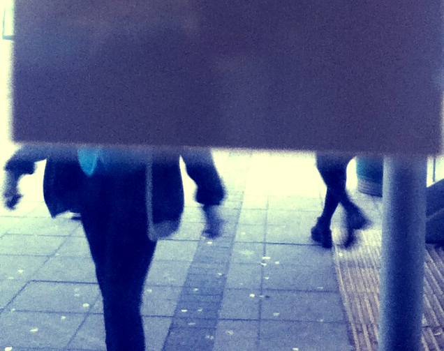
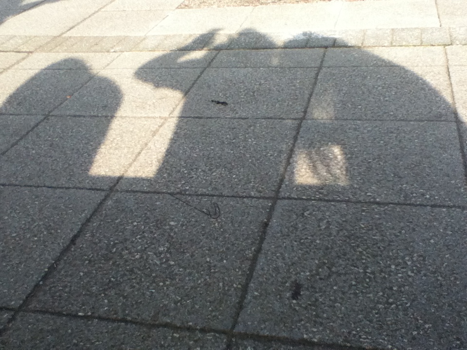
4th image -walk on by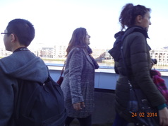
This is my final image in this project, which is based on the idea of 'walk on by'. Whereby i have captured the movement of people around me doing there on things on the street which we all share. This image though not as clear, is taken instantaneously, capturing what i would see on an everyday basis. Thus, another reason why this image was successful is because of the composition. The image is close-up focussing primarily on the three figures and also some remnants of the background buildings which aren't as prominent.
|
