ABSURD
Absurd Example- Mark Jenkins.
|
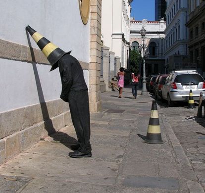
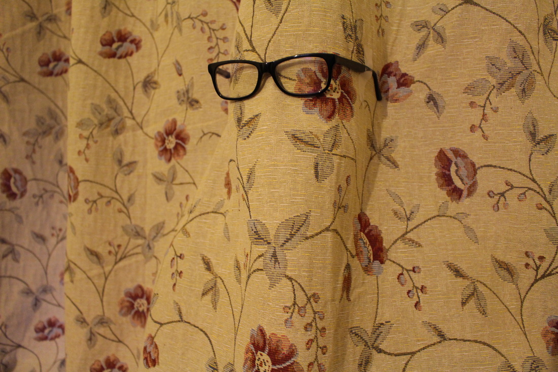
Here is an image photographed by Mark Jenkins; it shows a singular man with a hazard cone placed to cover his head. His body has a slight tilt, and we assume that he has used a cone to support his head as he leans to the large wall. The cone's colour creates an interesting touch to the image, as the mans outfit is predominantly black, hence the cone gives his body some colour, which also has a nice distinct contrast between the yellow and the black colour. The cone also creates an obscure shadow in which it creates a dark bold streak. Along with the man's body and the shadow it creates a nice geometrical shape- a parallelogram. This makes the image seem more interesting since all the other lines in the image are mainly straight, whereas by having a slight diagonal one, it creates a nice touch. This image is absurd, as we question the aspects within the photo, and why they were placed in that form. We question why he's dressed in that way, since the two women behind him walking seem to dress more lightly, as assuming from the bright lighting, it looks warm, so we ask why he's dressed that darkly with layers on.
I intend to capture similar images, by placing everyday objects on top of others hiding the face and the head and body positioned facing in different directions. |
Absurd Example- Erwin Wurm.
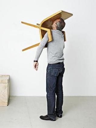
"I am interested in the everyday life. All the materials that surrounded me could be useful, as well as the objects, topics involved in contemporary society. My work speaks about the whole entity of a human being: the physical, the spiritual, the psychological and the political." Here is an image by Vienna-based sculptor Erwin Wurm. He's arranged it so that there's a man standing centre of the image with just simply a average wooden chair across the top half of his body. His face also seems to be merged into the chair, as his head is also slightly tilted. Whilst both of his arms are out to support the chair on top of him, he also seems quite un-eased, as it seems that his body is quite tense. This image is absurd since, the artist has placed the chair onto another plain, whereas the chair should be sat on and with the body position sitting down, however the artist has counteracted this perception and reversed it by having the person standing up straight with the chair on the top. The background is very plain, which causes the man to stand out, and there is nothing there to distract him. Nevertheless, the two tones in the background, makes it less dull, and the touch of yellow and blue makes the image more interesting.
i intend to take similar images by placing everyday objects on different planes. |
|
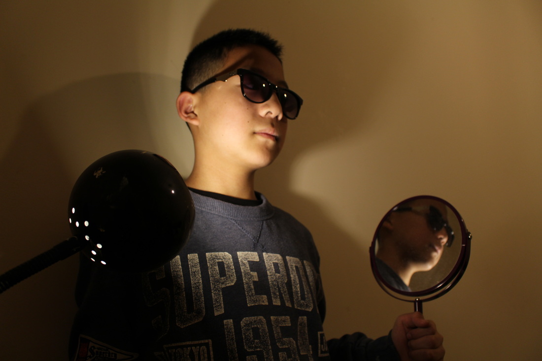
•Photo Shoot #1
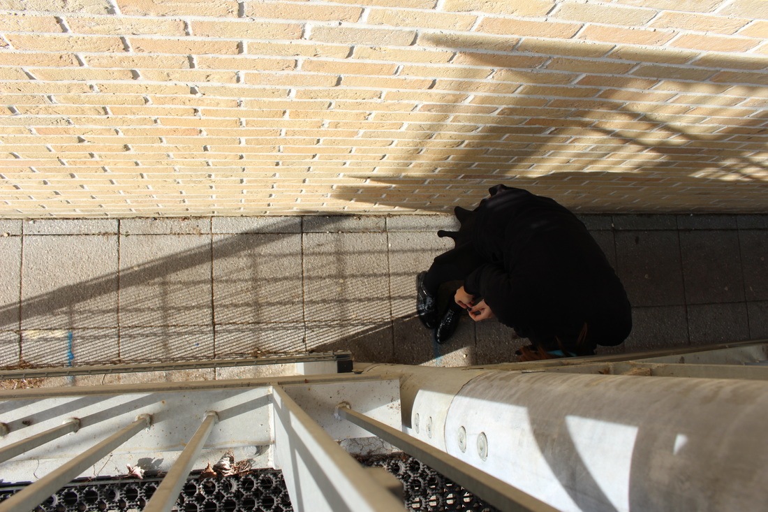
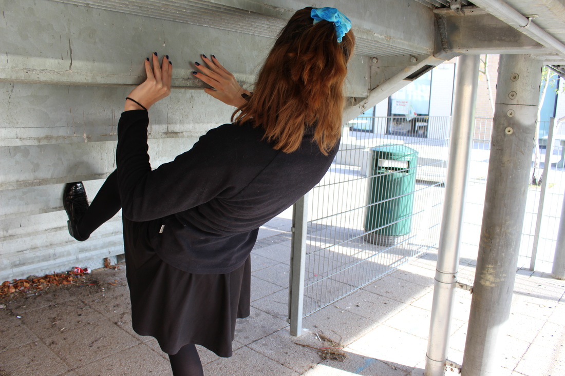
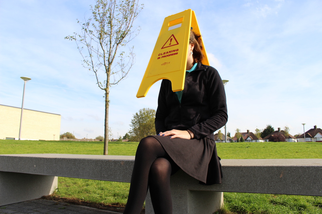
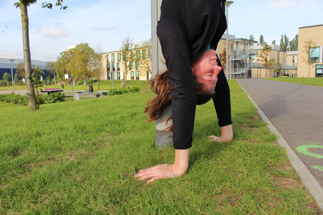
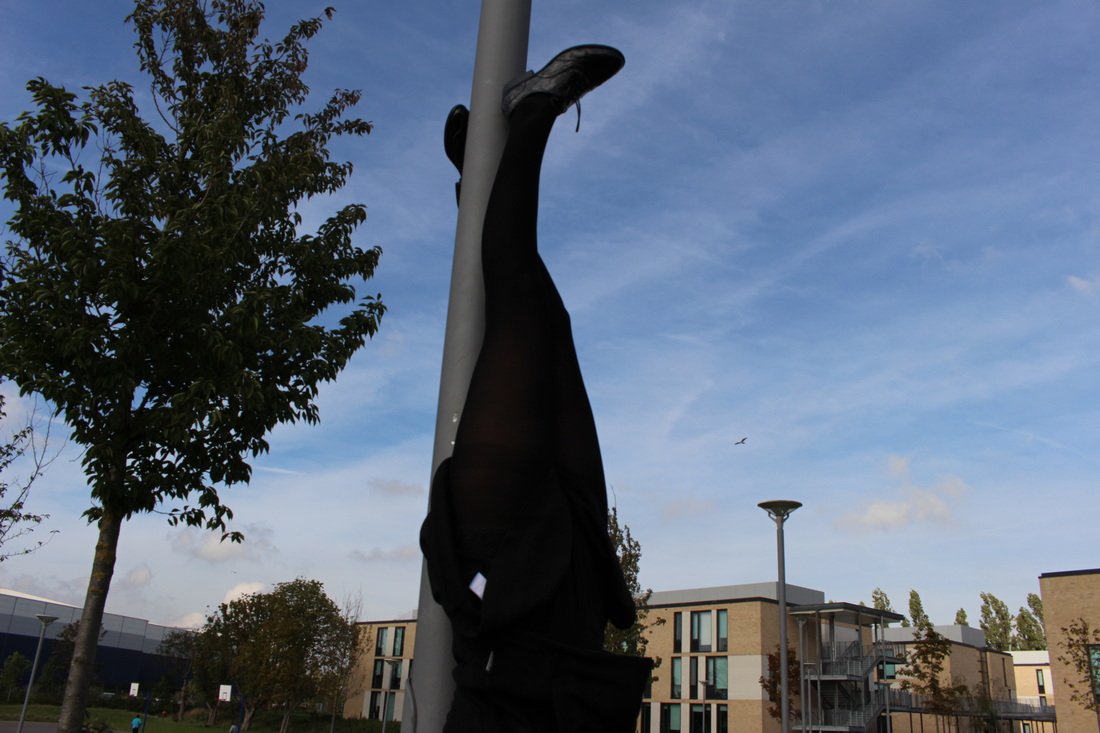

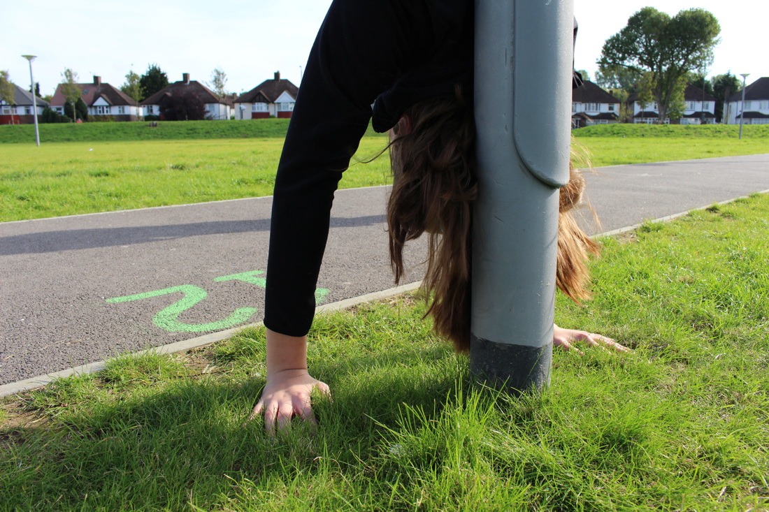


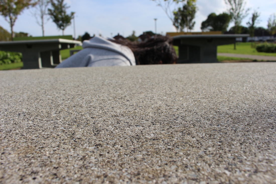
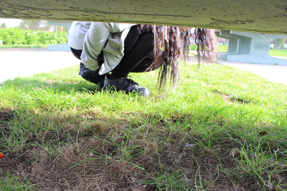
EVALUATION-
|
WWW-
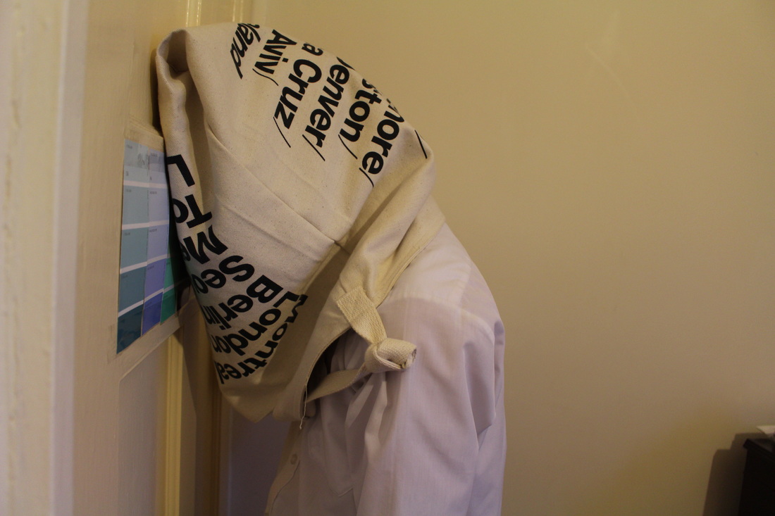
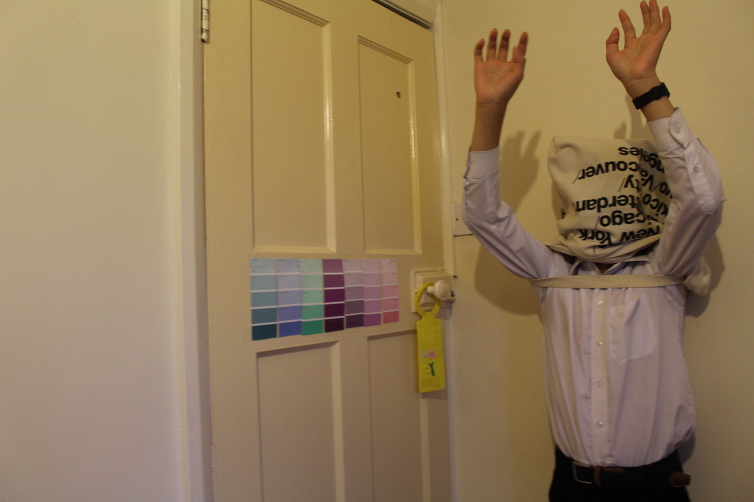
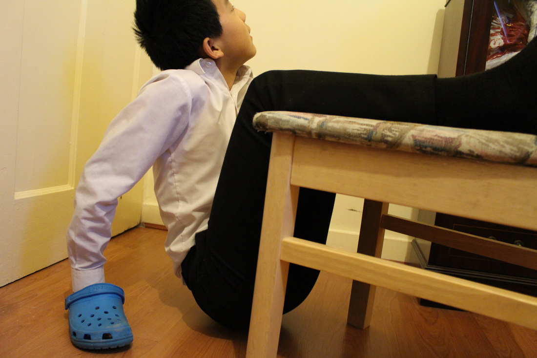
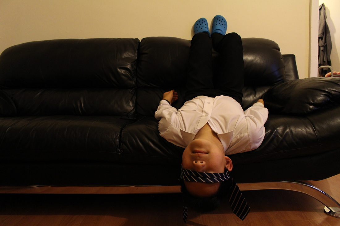
We were asked to take several images within the school ground, and experimenting within the theme of absurd. After looking at Pinterest, I had retrieved some inspiration for my own photographs, which i wrote down on a sheet of paper, then i also went out to take these images by interpreting my view on absurd, as well as adding in some of the inspirations which i got from Pinterest. As evident form the photos, i didn't aim to take any specific photographs, but i simply experimented with different perspectives, objects and postures. Absurd is all about creating images which don't seem 'right'; so some of my images had people who were upside down, which contrasts from the upright tall position; as well as having people hiding by covering there faces behind something like a cone, or in some cases simply facing the other direction- to hinder their identity. Overall I think that these images came out well as my first try since i was broadened my ideas and ways to interpret this particular theme. |
EBI-
From this first experimentation, I have learnt a lot on how i could improve next time; unlike in this experiment, I didn't have a particular aim and focus, I hope to be able to simply focus on one aspect on my future experiments and refine to further develop them, to make them look even more absurd- for example- only to focus on hiding, upside-down etc. With my next set of photos, i will take them outside of school, since the school can sometimes restrict me from creating images 'outside of the box'. I intend to use these images in photoshop to make it seem more quirky and absurd. |
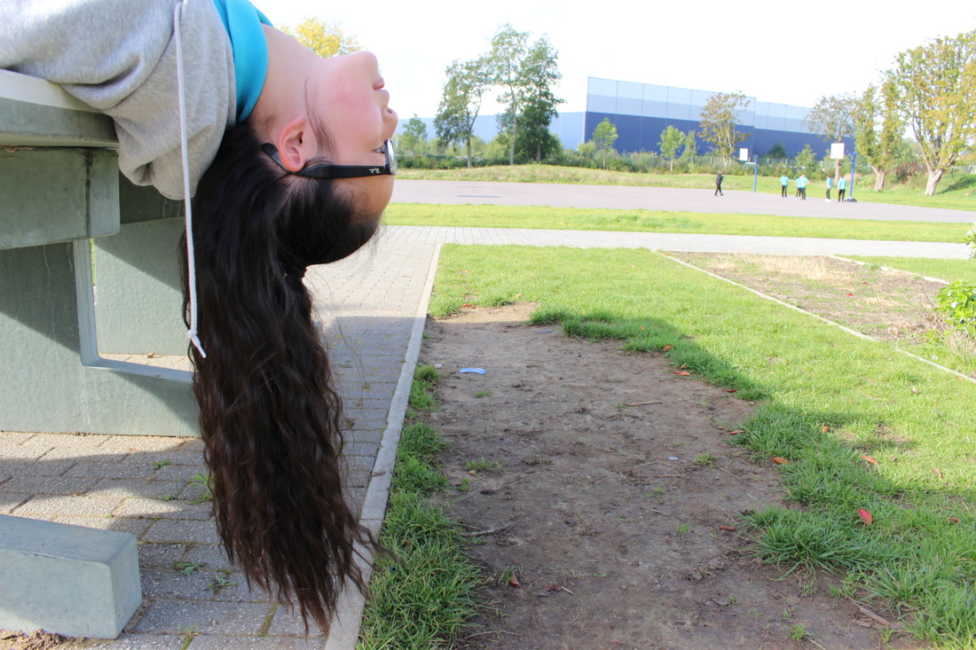
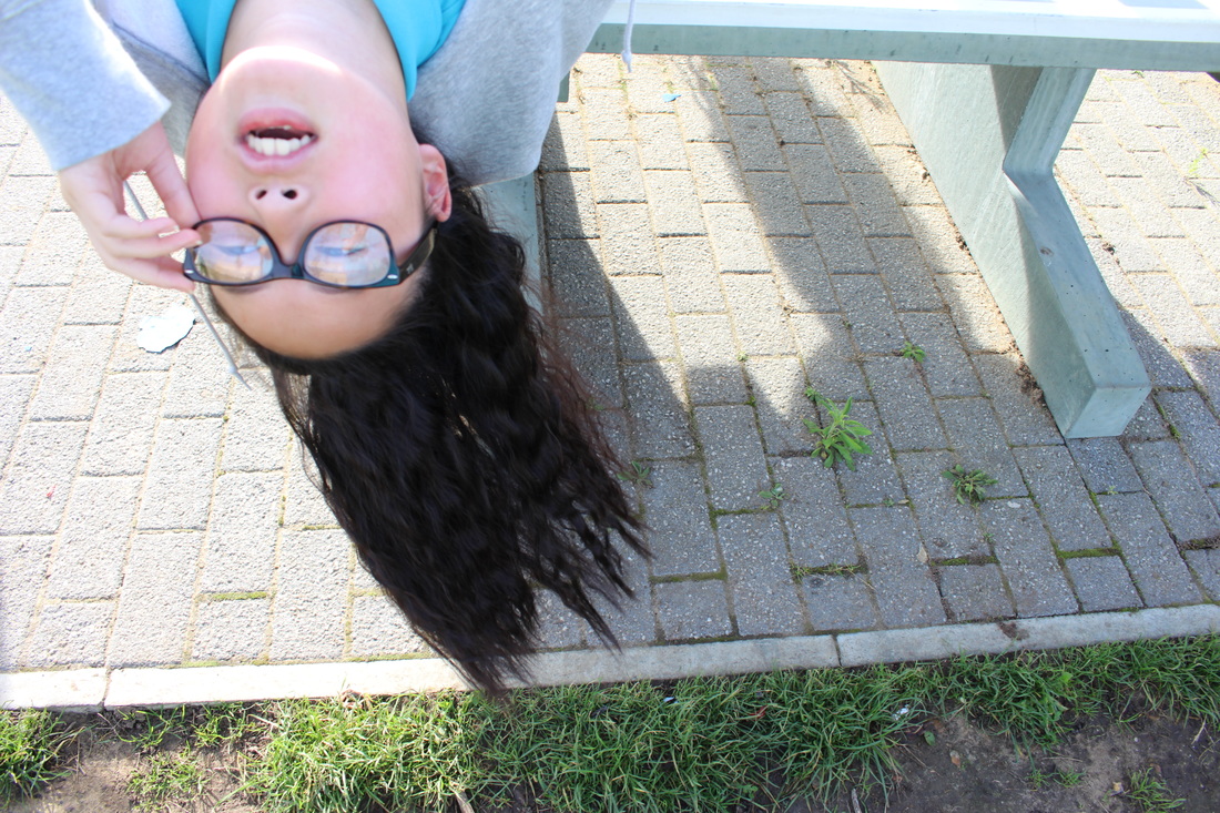
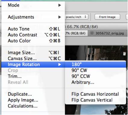
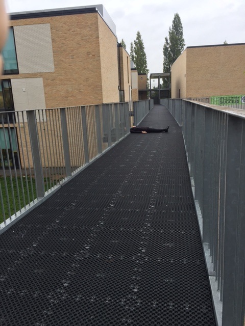
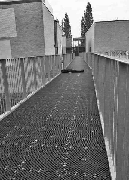
Upside Down Developments
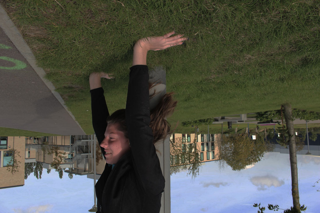
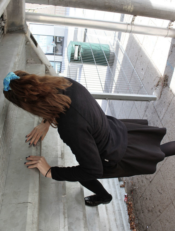
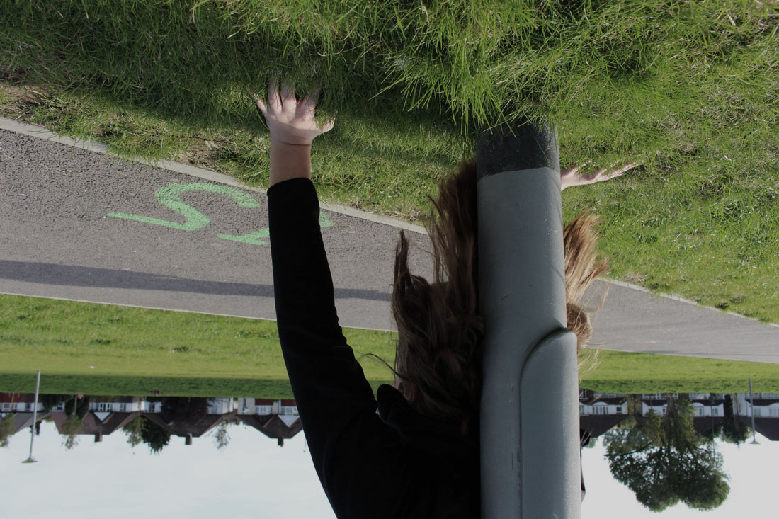
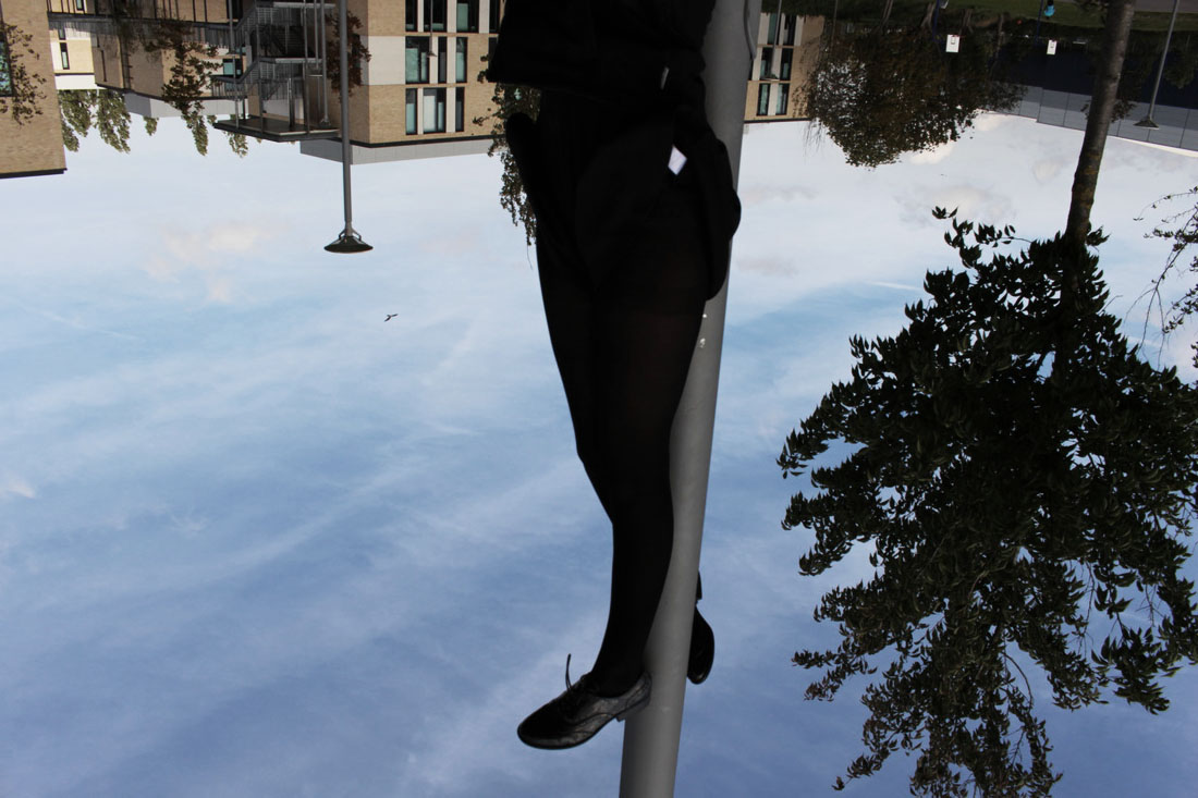
Development Evaluation-
|
I liked the original set of images i took, but after analysing, i figured out that i could do more with these images. I originally was unsure of what i could do, but i later went on to Photoshop to develop these images. Some of the images had a girl upside down doing a handstand, though this was already absurd, I intended to make it even more interesting. So i went onto photoshop and rotated the image 180* and further refined it by reducing the saturation of the piece. As a result of the upside down image, it seems like the girl is pushing against the grass above her, rather than below her as per usual. Hence, the grass corresponds to the sky that is above, however its even more absurd as she's pushing against it, which could have connotations that life is so low that she's almost trapped in the world and she's trying to release tensions and pushing it away. Nonetheless, it could also represent that she's trying to balance the situations in life by both arms both in the similar position. Overall then, the refinements allow the viewer to view it in another perspective and further questioning the meaning behind the image. These four image developments i think truly interpret this theme of absurd, which i may consider as one of my final pieces. |
" Basically, at the very bottom of life, which seduces us all, there is only absurdity, and more absurdity. And maybe that's what gives us our joy for living, because the only thing that can defeat absurdity is lucidity. " Albert Camus
•Photo Shoot #2
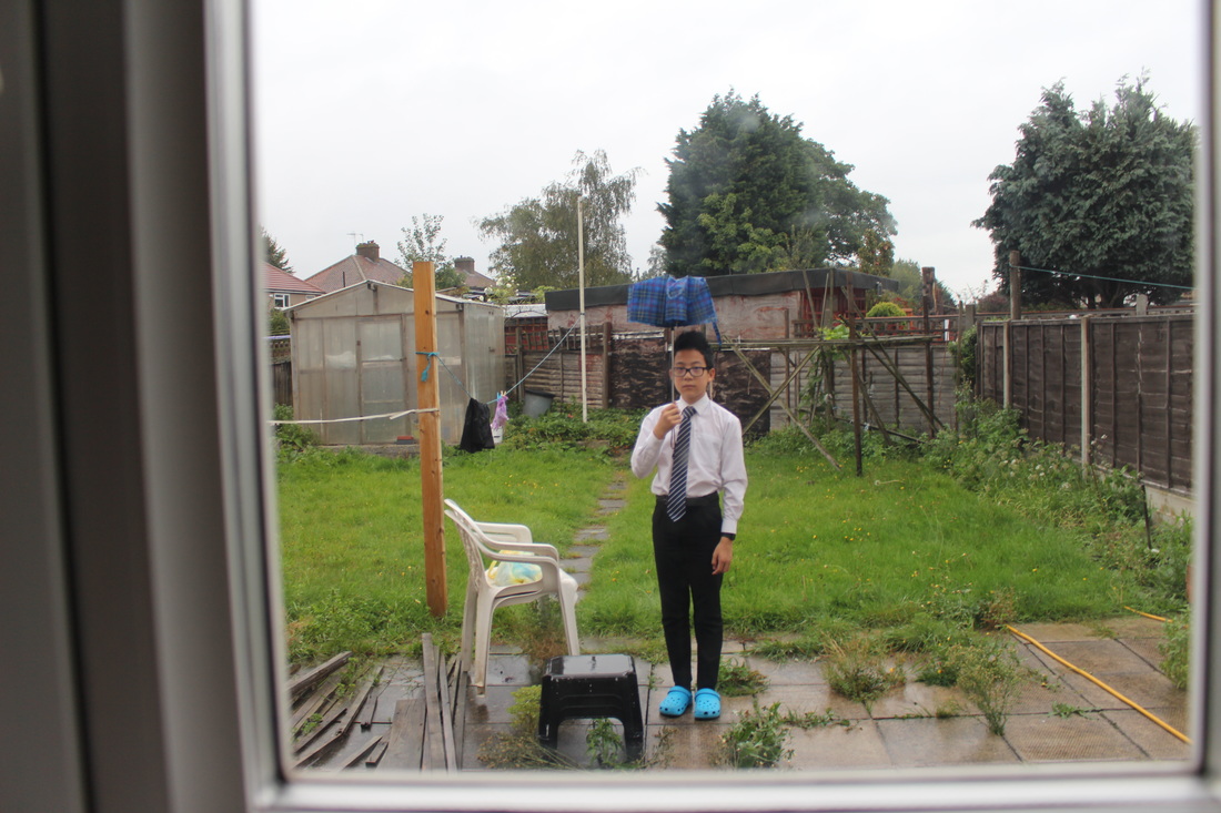
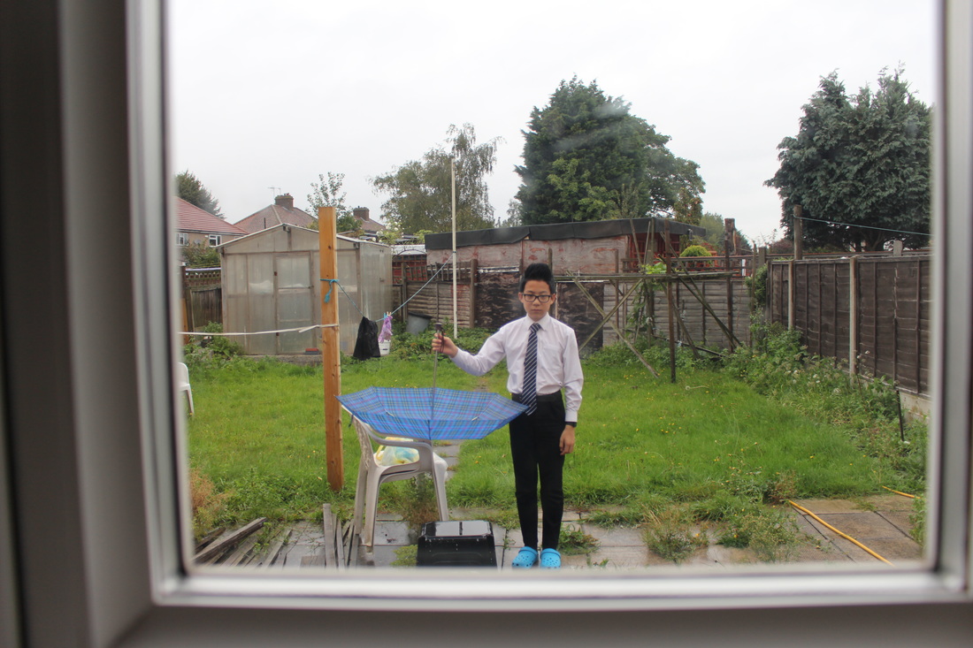
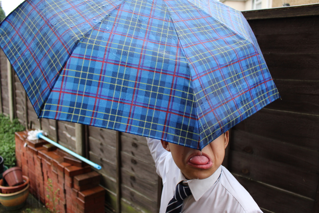
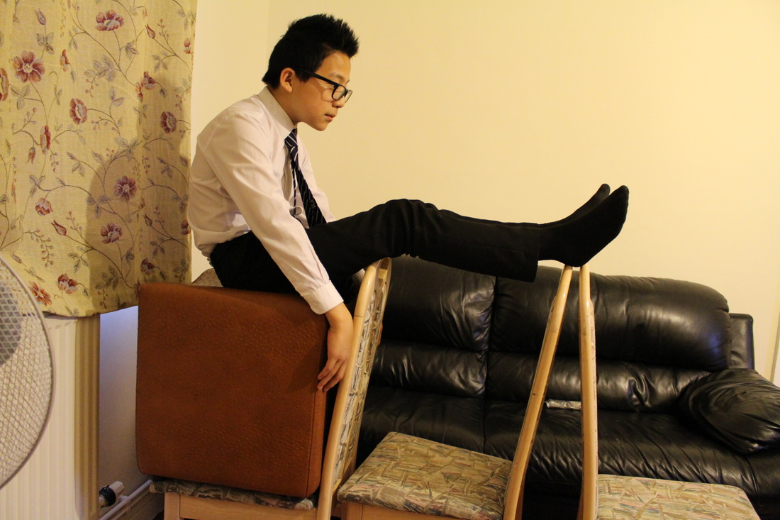
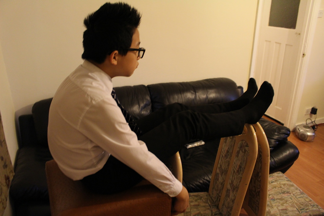
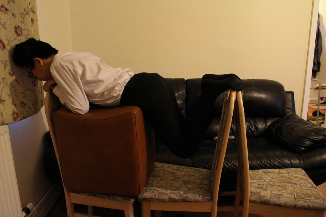

EVALUATION-
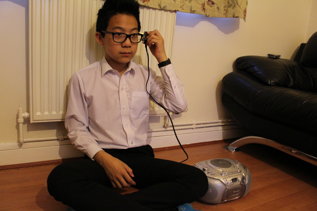
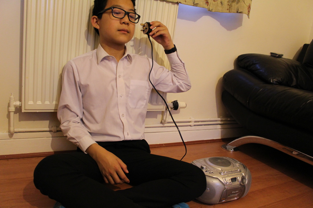
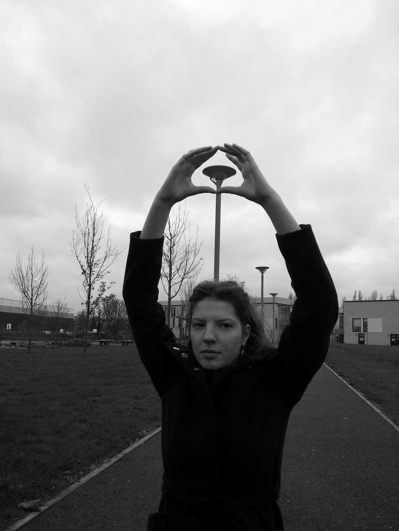
As intended in my previous evaluation, I took my second photo shoot outside of the school, which resulted in many creative and interesting images. In these images i focused on the use of props and everyday objects, however by placing them into another format it signified that object and created weird absurd images. For example, instead of plugging the socket to the radio into a source of power, I arranged it so that it seemed as if the person was the power source and it was plugged in through his ears. Another way i went about this experiment, was to use our living room chairs, by placing them in an arranged order and by having the person sitting on the chair itself, rather on top of several chairs; this hence creates a very busy images, which results in many questions to arouse in the mind. Overall, I think that this selection of images is much better than my previous ones, since i thought more about the composition, this meant that whilst taking the images, i captured it about 3 times to simply find the right composition- in some cases the lines in the background weren't straight, so by fixing this it allowed the focus to be simply on the foreground subject and the absurdity of the image itself. Like many of the artists images which i have seen based on absurd, they have predominantly been very much simple, so i wanted to in-cooperate this idea into my images also; which i feel like i have done. To improve I intend to edit them maybe by using an app or by Photoshop to develop the colours or even the shapes.
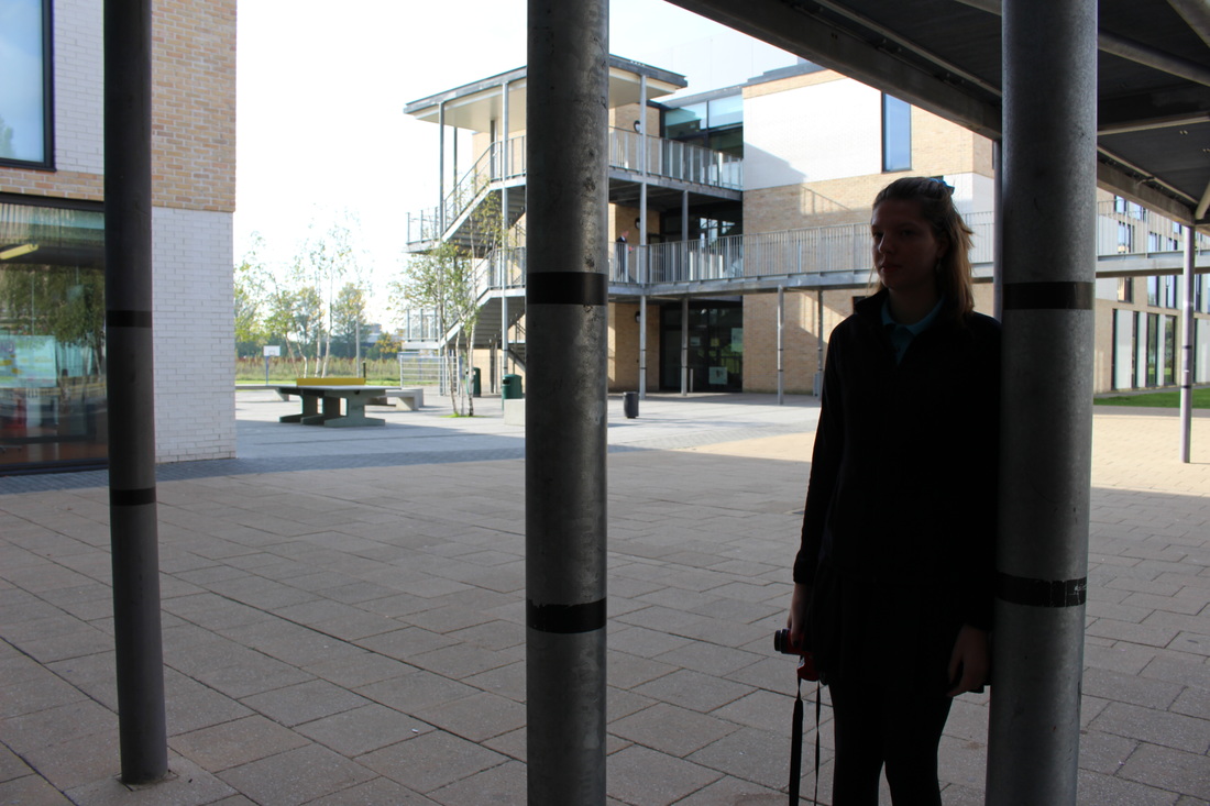
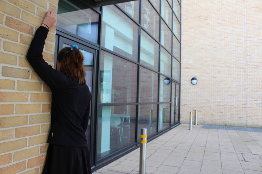
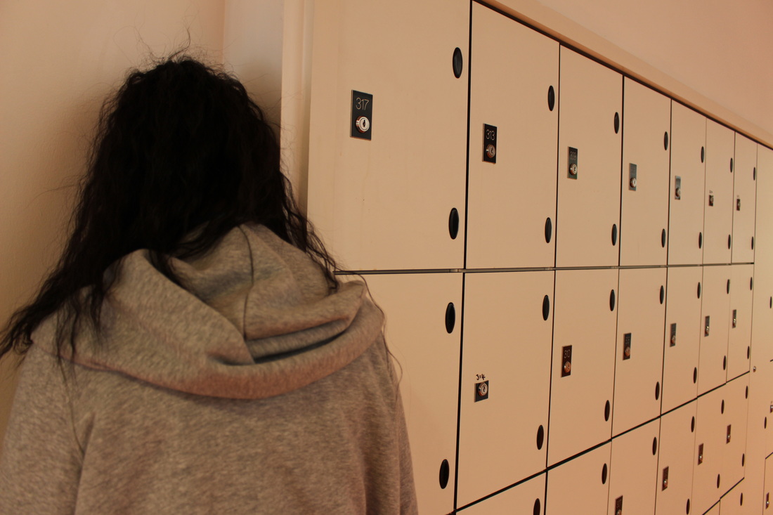
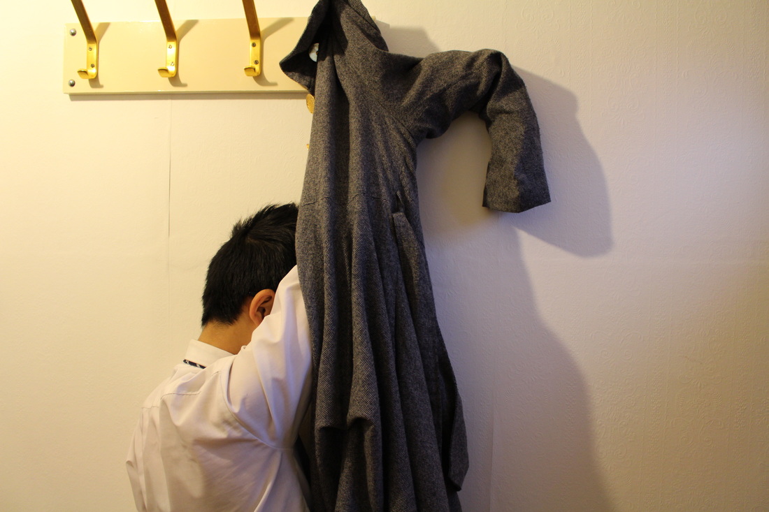
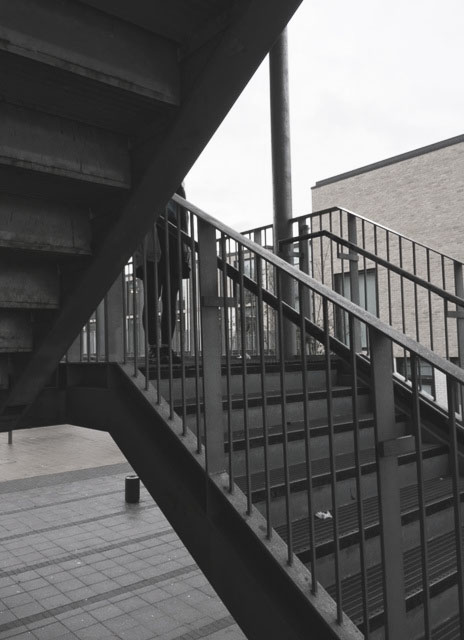
•Photo Shoot #3 : Hiding
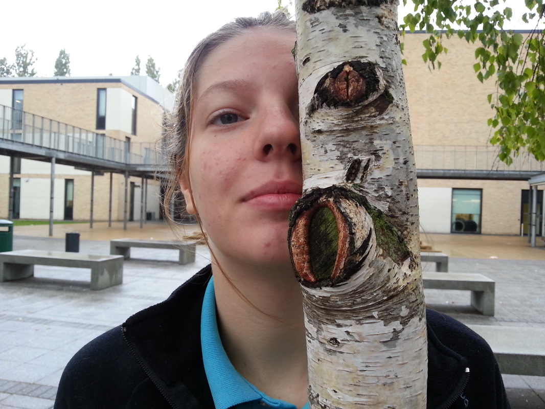
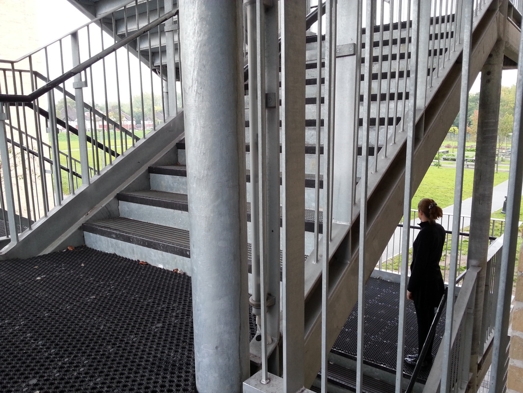

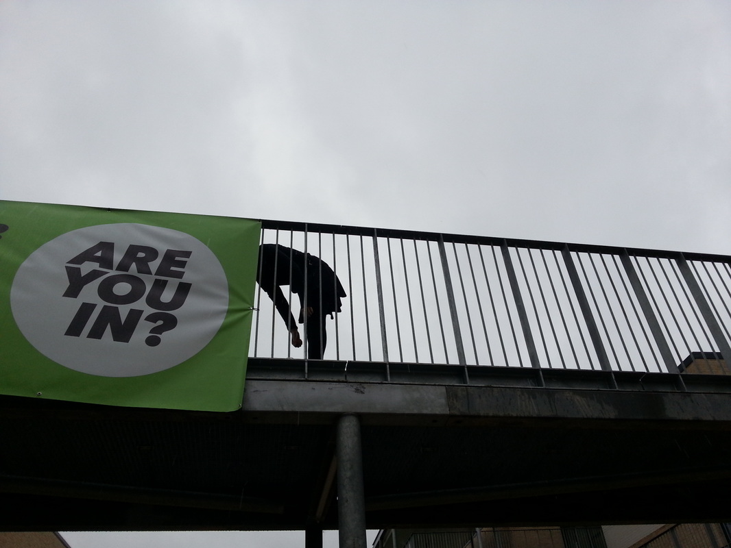

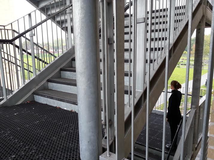
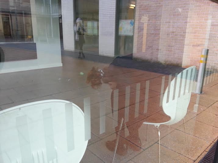
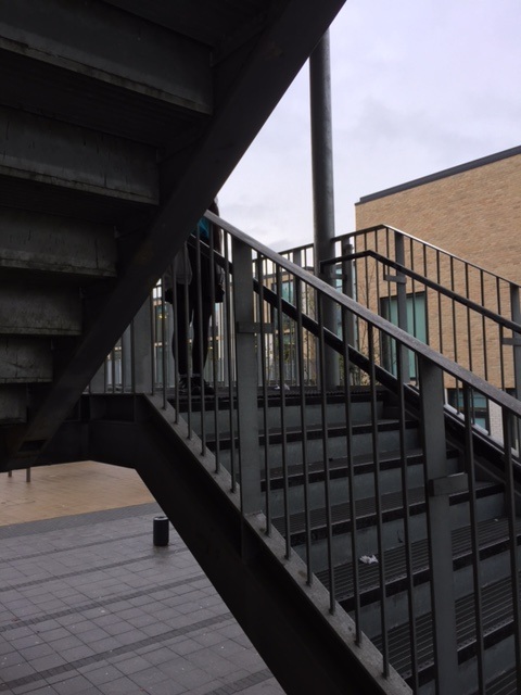
EVALUATION-
|
WWW-
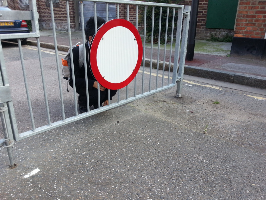
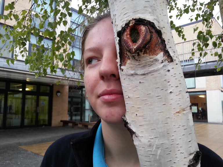
In this photo shoot, I focussed on hiding within absurdity. I took some images within school, with one person doing different things to hide herself. For example- some of the images were her standing behind another object to cover features of her face or even the whole face itself like the tree, the stairway, a sign etc. Others were that she stood in another direction, opposing the camera to see her face, but instead to only see either the side or the back of her head. Again, i focused on the composition of the photos, one thing i did (apart from the first two photos) was include other elements within the foreground. So that it wasn't only the person in the photo but also other things, so the image had more to it. Going around the school i found certain things which helped me to convey the meaning of the photo. For example, the photo with the 'are you in?' sign and the girl sticking her head behind it, portrays the idea of someone trying to be fully covered, but only part of it. Overall, the images worked and were able to convey the theme of hiding showing absurdity. |
EBI-
To improve next time, I will explore another branch within this theme of absurd. Instead of having people in the image, I'll focus on signs and posts etc. I aim to make the next set of images more simple and the colours in the image to be more saturated, since in this set the images the colours are bold and bright. Though I have ensured that the image has good composition, in one or two of these photos, I will crop parts of it, so there's nothing else distracted the purpose of the image. |
Photo Adjustments-
______________________________________________________________________________________________________________________________________________________
Artist research: David Shrigley
|
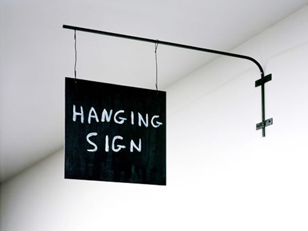
David Shrigley is a British visual artist, he captures absurd images of objects and animations etc. Though he has a wide range of photographs, i've decided to focus on his collections which shows very weird and creative signs. His images are very simple and minimalist, since he captures just a singular object in the foreground, alongside a white plain background, allowing the object to stand out. One of his images include the one on the left, which depicts a sign hanging from the wall with a sign saying 'hanging sign'. This is something very obvious and pointless, yet it still provokes a sense of creativity and absurdity. Though this image is very basic, he has made it seem more interesting my writing in an irregular font, instead of a formal neat one, so the sign seems quirky.
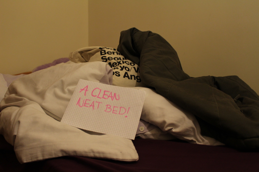
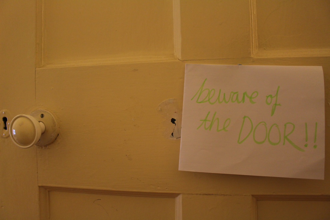
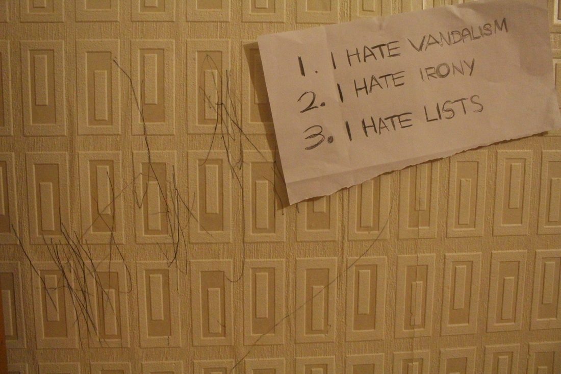
i have been inspired by Shrigley to capture similar kinds of photographs, by making signs with post-it notes, and handwriting obvious yet creative signs. I alos intend to create signs which contradicts the obvious- for example a sign saying 'a clean, neat bed' but in reality the bed is messy and unorganised- i plan to create similar photo ideas. |
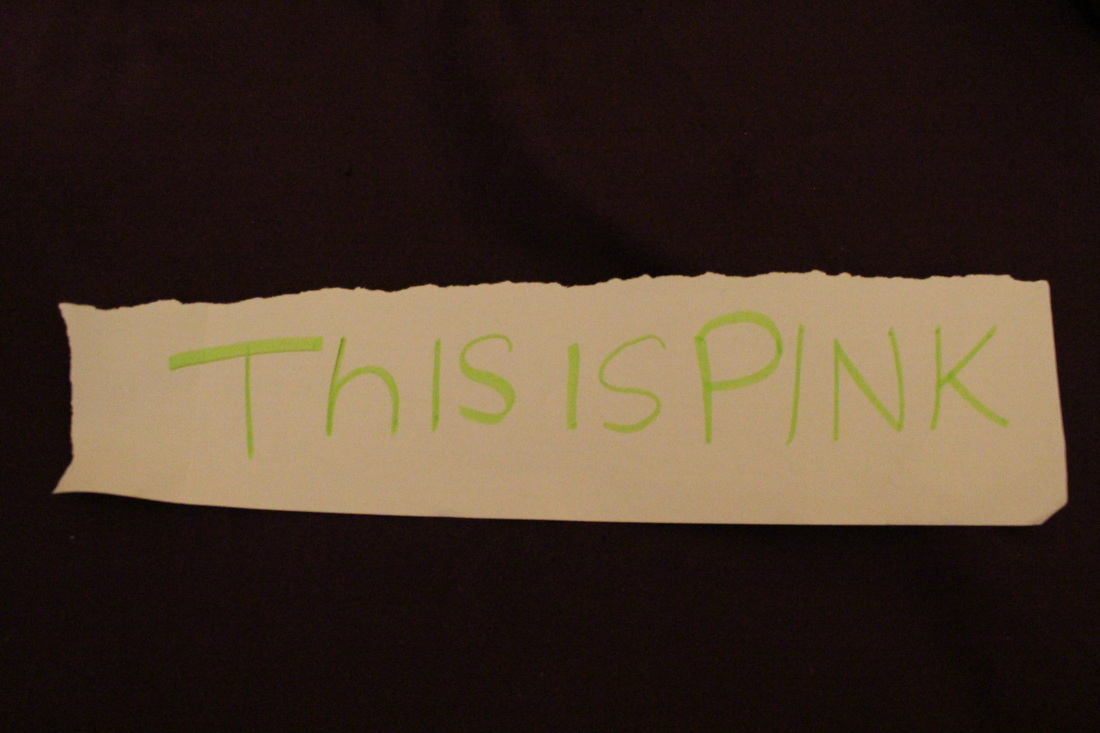
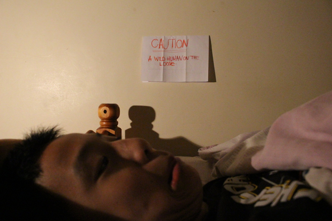
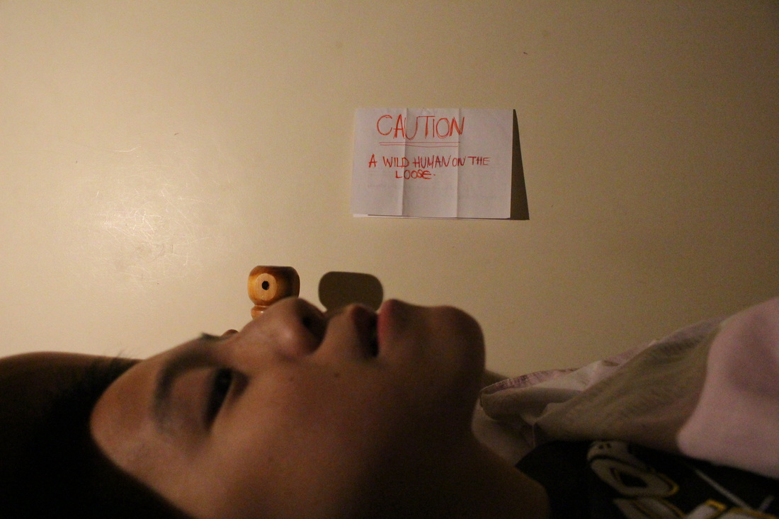
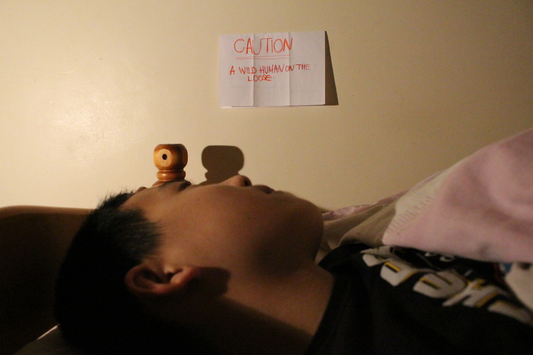
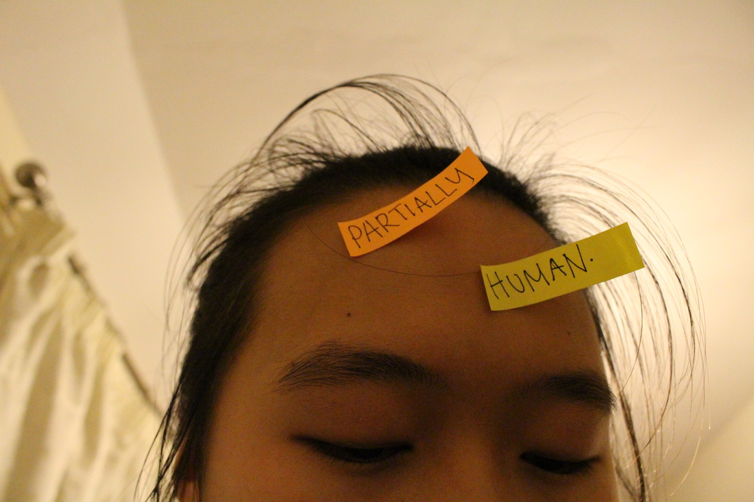
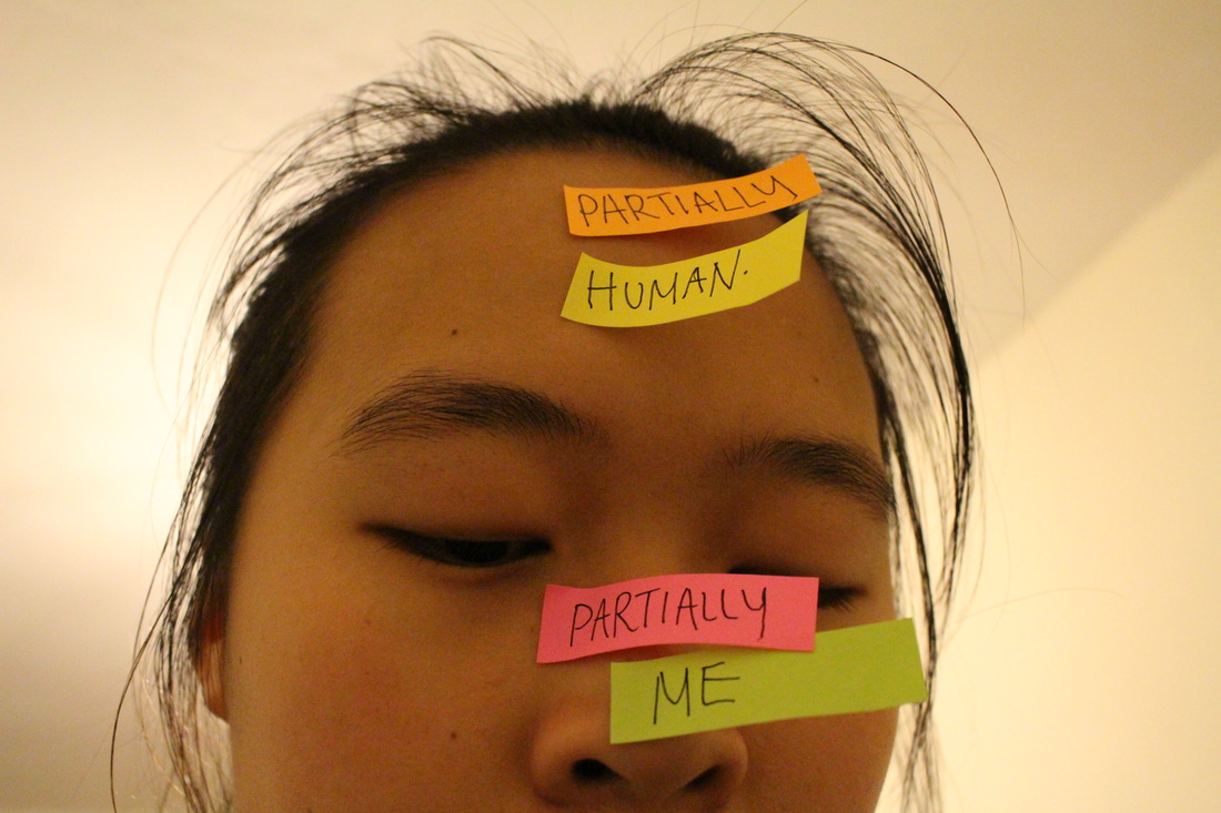
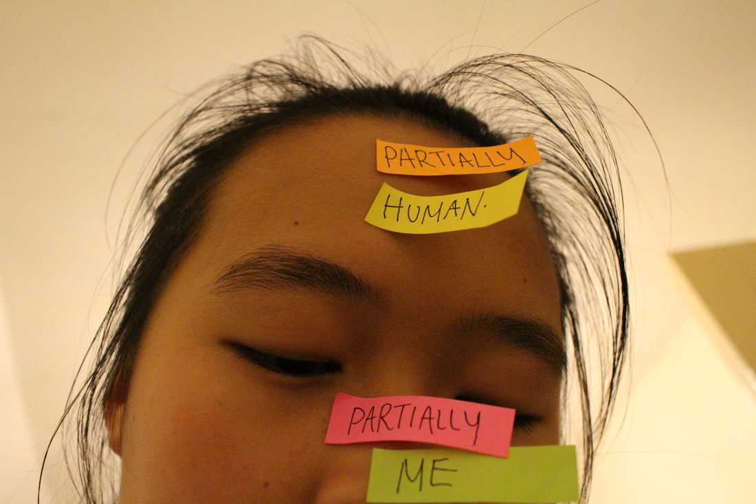
•Photoshoot #4 : Signs
Evaluation-
I was inspired by Shrigley's work to create images using signs and post-it notes. For the post-it notes i customised them, by writing words and phrases on them, so i could stick them in certain places, which correspond to the sign. I intended to capture clear distinct images however, it did prove to be a struggle to make these images to seem original and quirky. The first few images were minimalistic as i wanted to focus to be purely on the sign itself. Another issue i came across was the composition of the photos, in some of the images the background seemed to plain whilst in some of the others, i found it a challenge to capture with a background and a clear focus and purpose to the image. I intend to experiment next with objects, props and also carry on this idea os signs throughout my project.
|
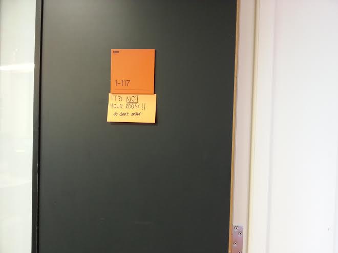
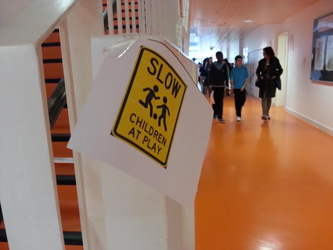
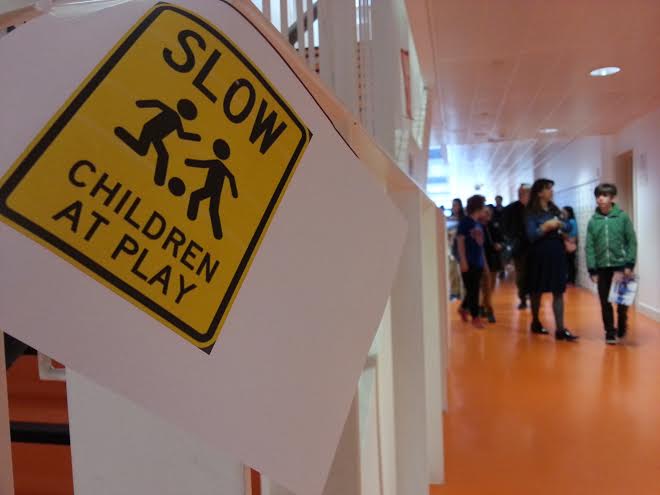
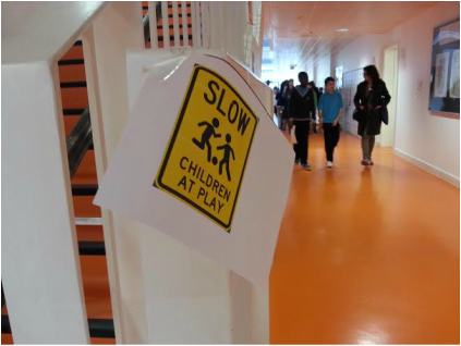
Image Evaluation-This is one of the images from my series of signs. My intention was to print out this picture and place it where there are students carefully studying and behaving themselves, to contradict the sign which states that children are playing. I wanted to place this into a classroom, however i think it was because of my lack of confidence which caused me to be not created the image i exactly wanted. Nevertheless, I saw that there was an opportunity to create an image with this sign; there were students showing parents around in the school and they were slowing walking towards the camera, so i stuck this image on to the railings to capture this image. Overall, i feel like this image wasn't as successful as i would hope due to a few factors. Firstly as mentioned above the subject and the elements in the foreground and background. This then also impacted the composition of the photo- the sign is loose and I rushed to take this image instead of carefully experimenting and thinking of all four corners. If i was to create improve this image, I would make sure that the sign is more clear and placed onto a wall or something so the composition is neat and composed like the composed students.
|
______________________________________________________________________________________________________________________________
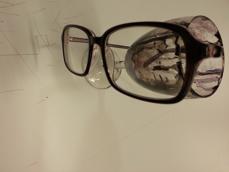
•Photo Shoot #5 : Props and Objects


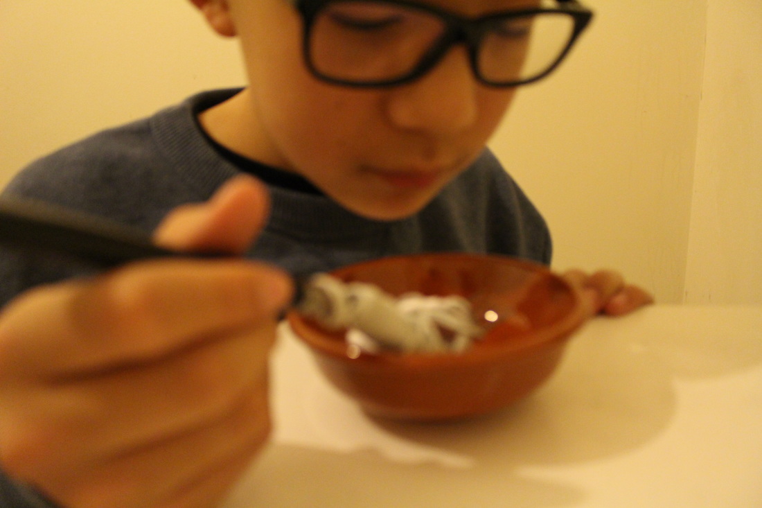
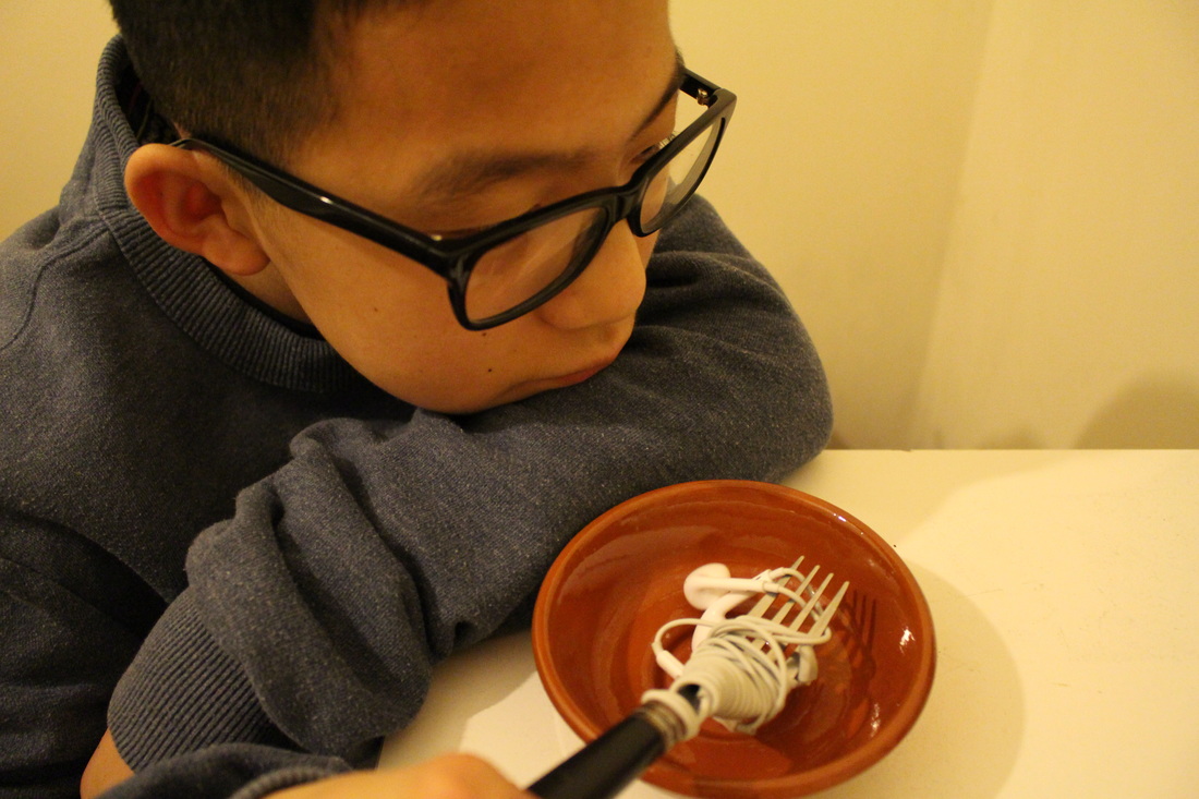
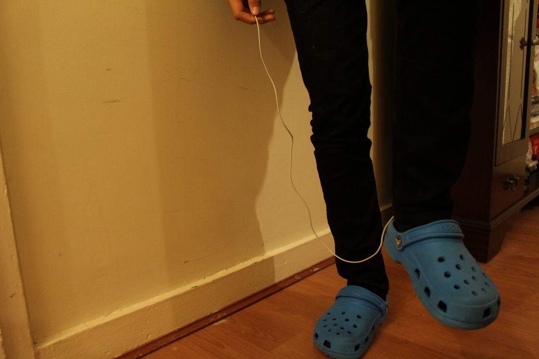
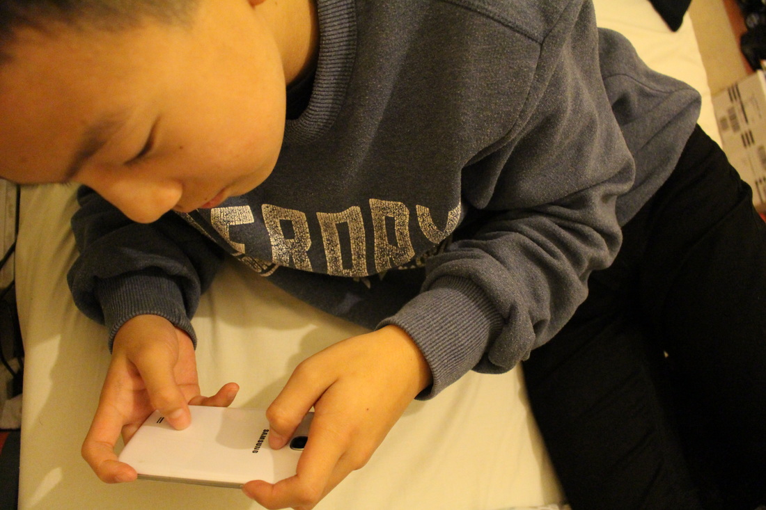
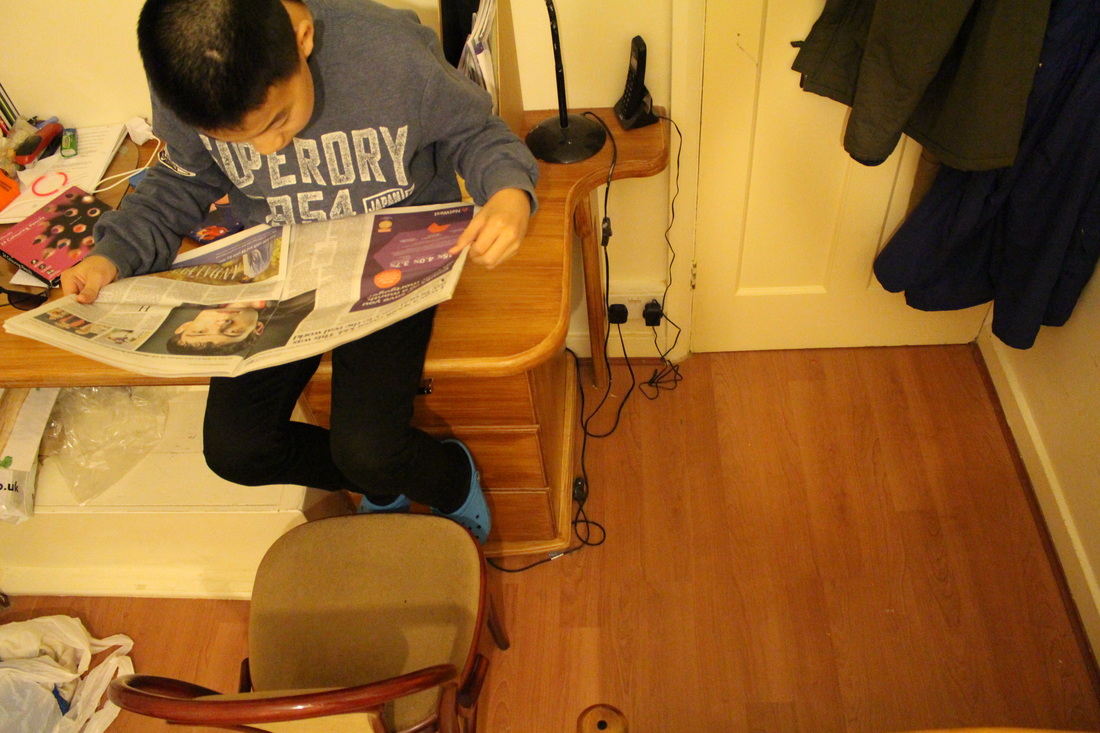
Evaluation-
In this set of images I aimed to capture people alongside prop, including newspaper, a phone, earphones. By arranging and placing these objects in an unordinary place, it formed an absurd image. I used a DSLR to capture these images, so that i could really focus on the composition and the angle. I experimented with a variety of angles, including close-ups, mid-shots, from above. This series of images was much better than my previous one, as i focussed on the subject in relation to the background, for some of the images I had to clear the area so that the background wasn't filled with distractions. Overall, I think this set of images is successful for my first attempt of using props.
•Photoshoot #6- Signs
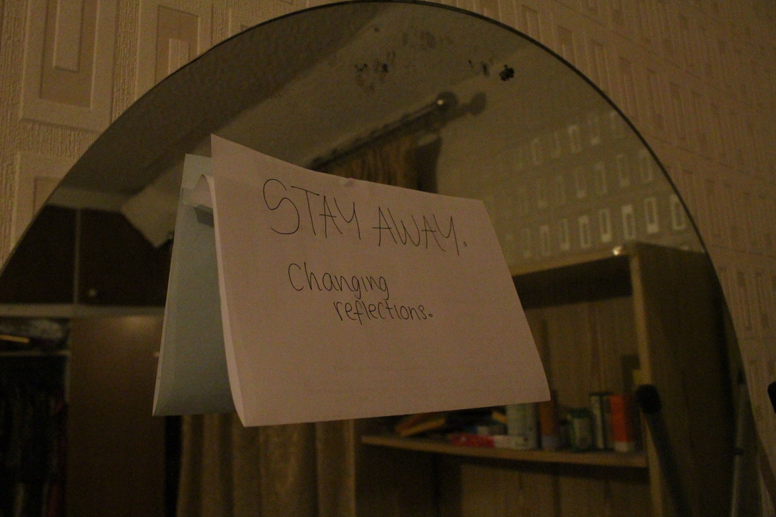

Evaluation
Continuing on from my previous sign series, i intended to create more successful images which i have done. In this set, unlike the previous one, I paid special attention to the composition and the angle of the photo, ensuring that the sign and the subject of the image is clear. Instead of using signs of the internet, I personalised my own to seem less normal but sophisticated.

|
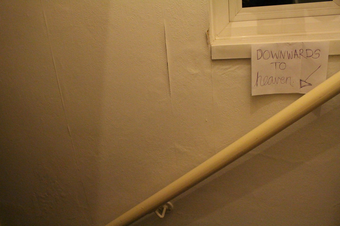
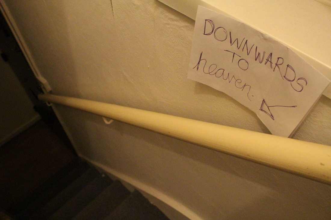
Successful Image analysis;In this image I hand-wrote a sign stating 'DOWNWARDS TO heaven'- the 'heaven' is joined up, making heaven seem pleasing and interesting. This sign contradicts the stereotypical perceptions, as we would associate heaven up above and really light, but the signs states heaven is below us. The image goes from a bright area and slowly becoming darker, creating almost like an ombre effect, making heaven seem dull- hence contradicting the obvious, so it portrays this theme of absurdity. Another thing i focussed on is the composition and the lines and the viewers eye alignment. By drawing an arrow pointing downwards, it follows the same diagonal pathway as the stair railings, so we the viewer have the intention to look towards the bottom left of the picture. One thing i had difficulties doing whilst producing this photo was the angle. I tried to capture it from the top of the stairs and standing on a chair to capture it from up above, but instead I took it nearer the middle of the stairs, so the bottom of the stairs seem much less illuminated.
|
•Forced Perspective
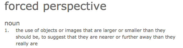
Forced Perspective Examples-
|
|
Forced Perspective is the idea of placing the subjects in different levels so that the subject either appears closer or further away from the image, by forcing objects that don't belong together to be directly in relation to one another. Some of the typical ones include someone pushing the leaning tower of Pisa, or pinching the top of the Eiffel Tower etc. This idea is achievable through photography because photos flatten space, so whatever is in the image it seems like its in the same plane; as long as the angle is correct, then the image can seem interesting and in some cases difficult to interpret. Photographers may do this by using objects already available and simply capturing at a different angle, or either placing objects where they don't belong. I hope to capture a series of images relating to forced perspective, but i am still ensure of exactly what I want to focus on in this series. I'll try to use objects which I can get hold of easily. So, I will experiment with everything that I have in mind, and after analysing, i will narrow it down to a specific idea. |
•Photoshoot #7
EVALUATION-
Here I've began to do some experimenting, but I feel like they were unsuccessful as they are basic and not especially creative. I think that taking images on the school ground restricts my ideas so I will definitely take more images regarding forced perspective at home as I find this theme interesting. Nevertheless, the compositions of these images are successful as they are clear and portrays the elements and subject of the photos.
_______________________________________________________________________________________________________________________________
Artist Research: Philippe Jarrigeon
|
|
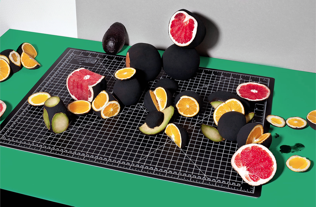
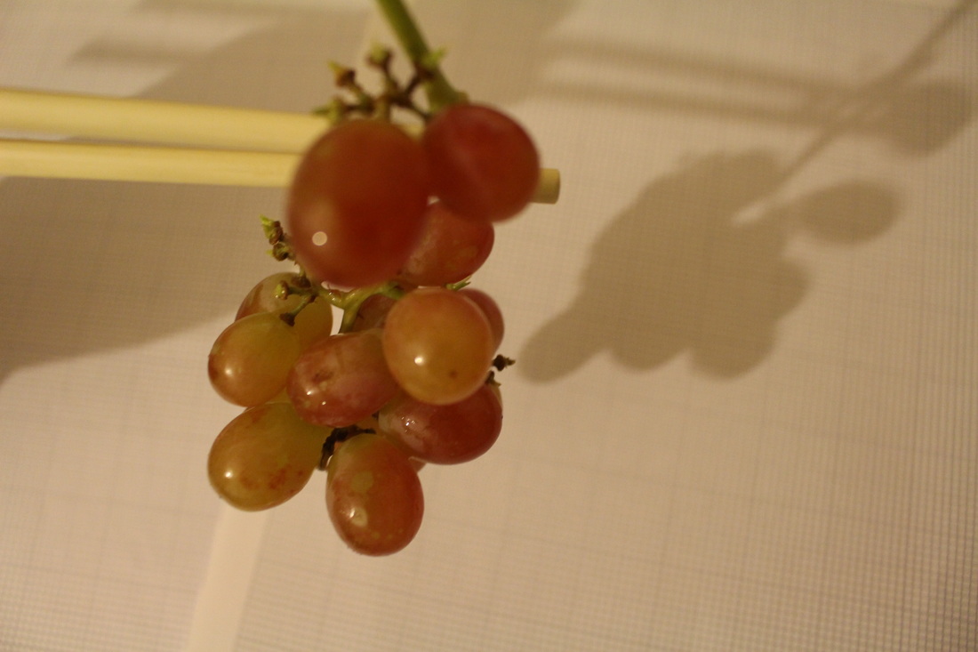
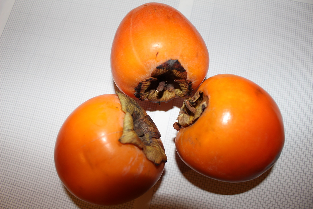
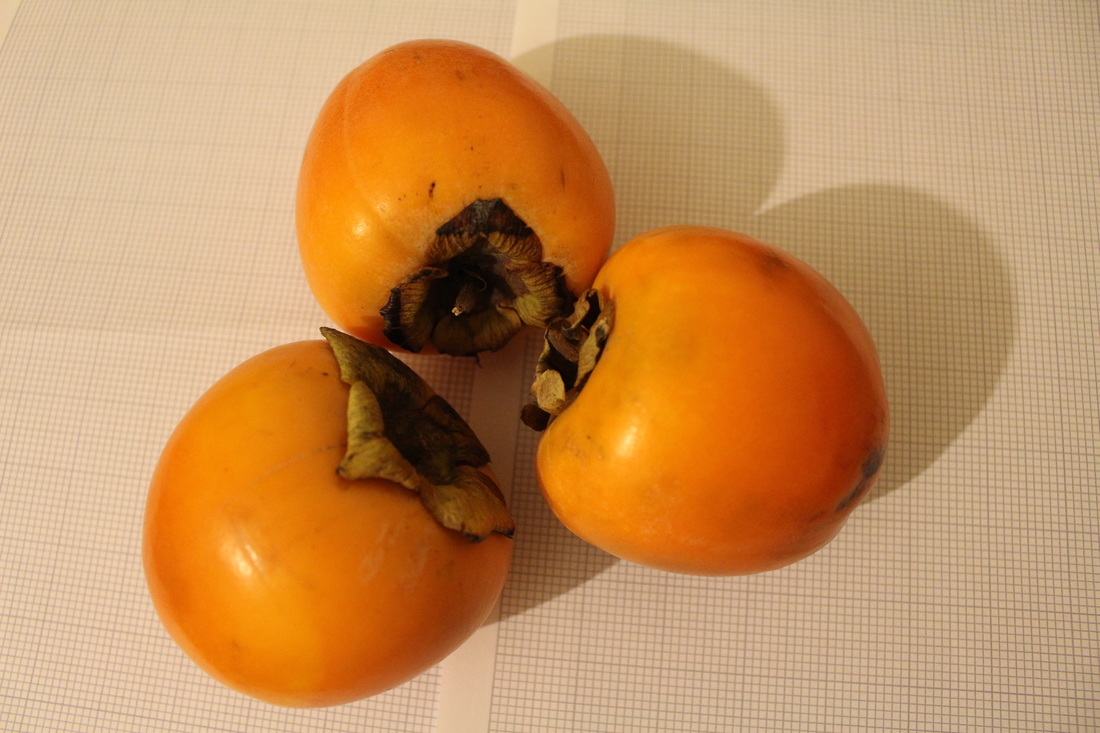
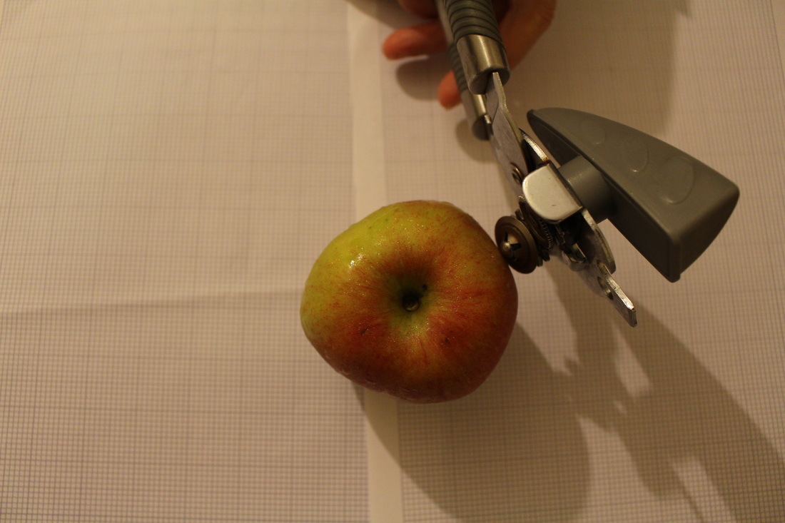
After being stuck with further experiment ideas, i went onto Pinterest to retrieve more inspiration. I then came across the artist- Philippe Jarrigeon. He like the previous artists creates absurd images, but he focusses on normal everyday objects and placing them in unordinary areas or making them look weird.
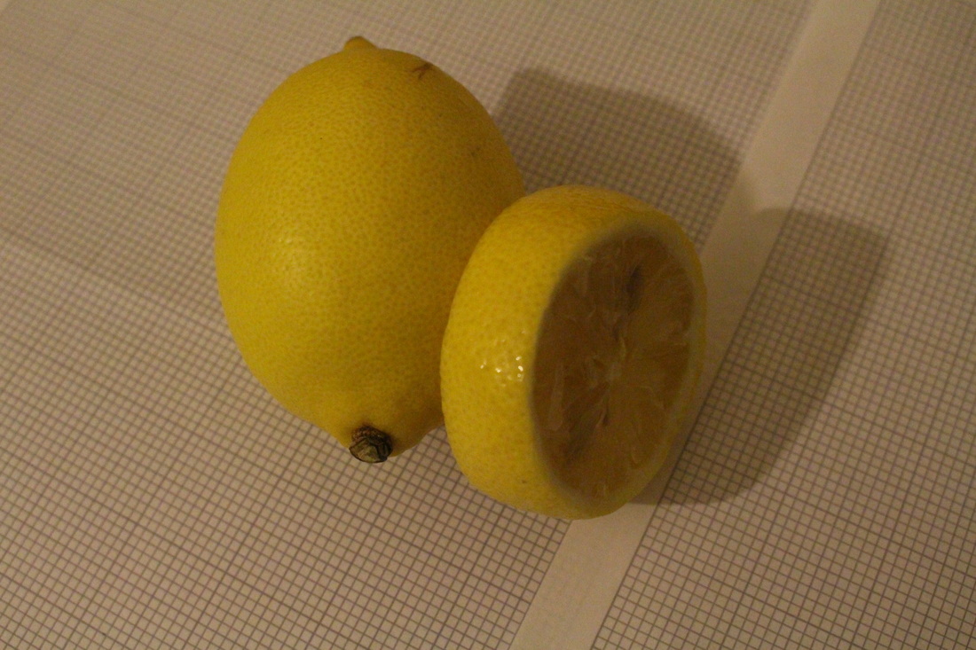
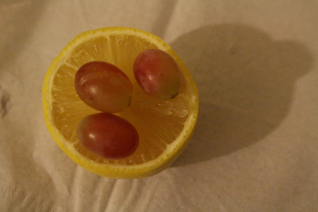
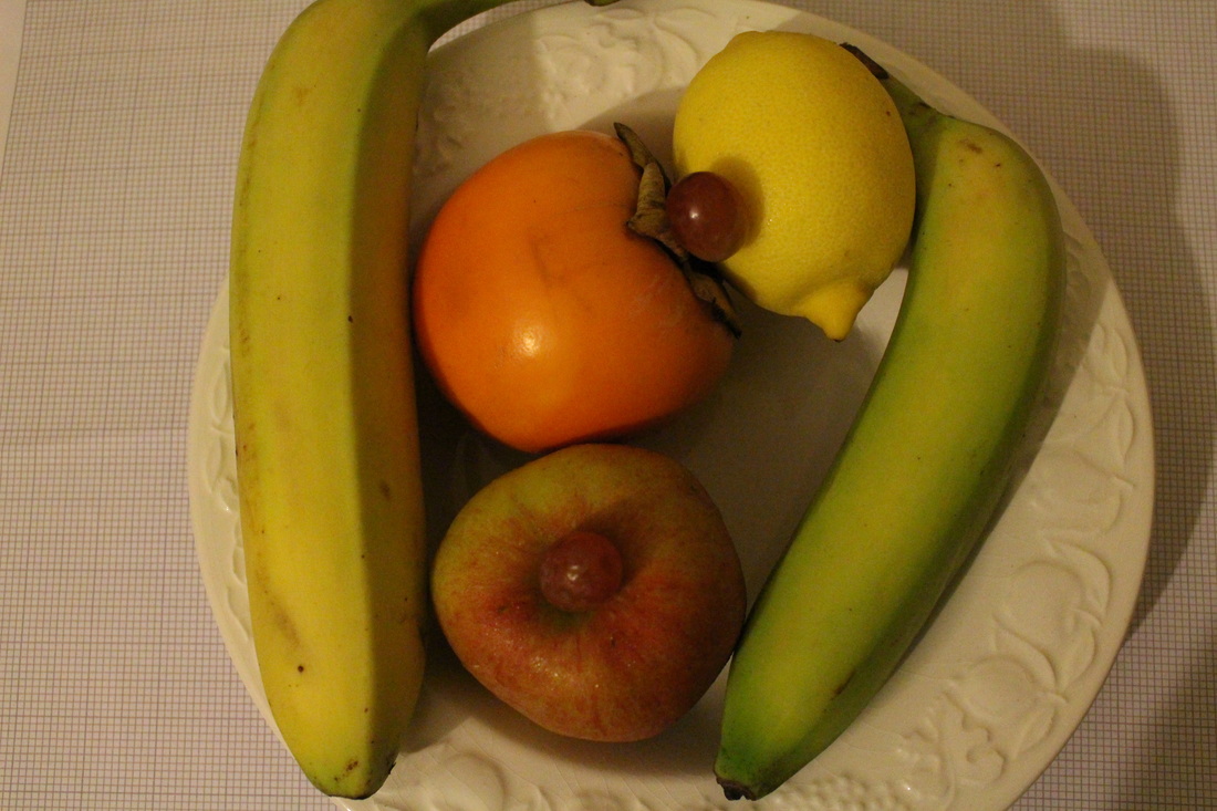
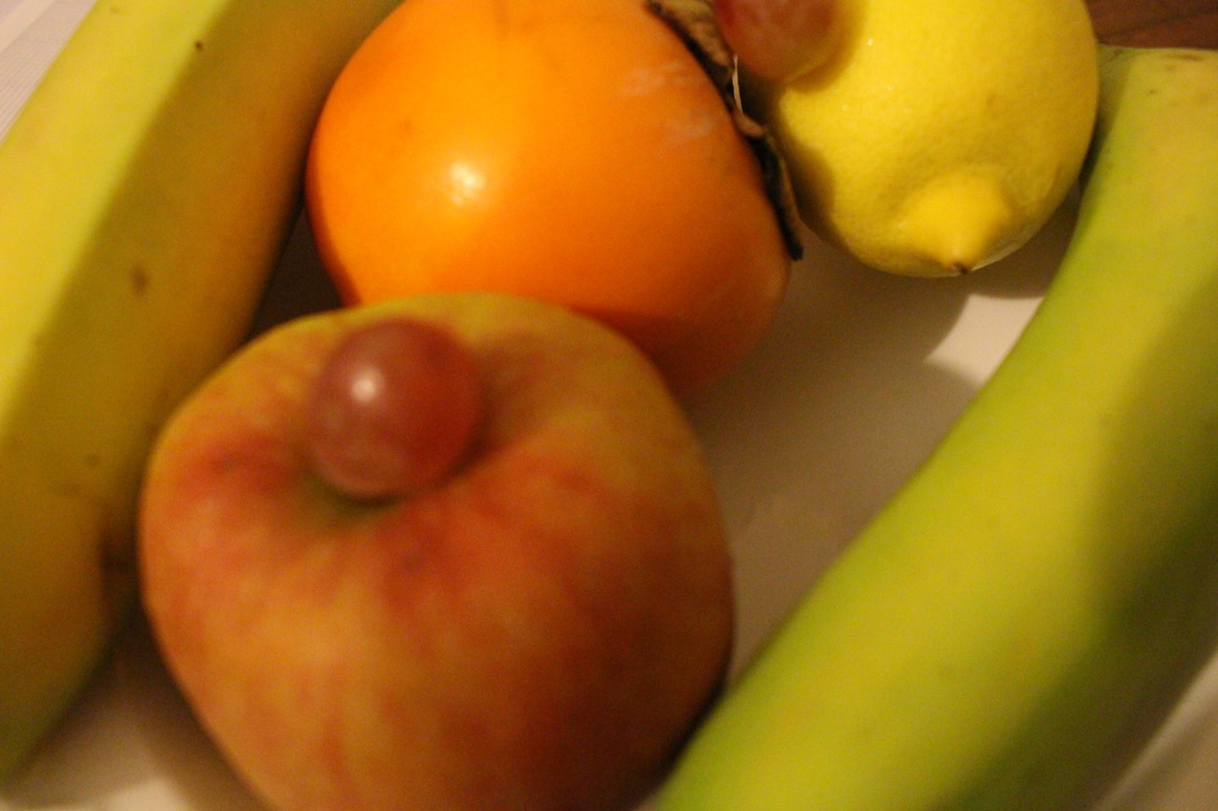
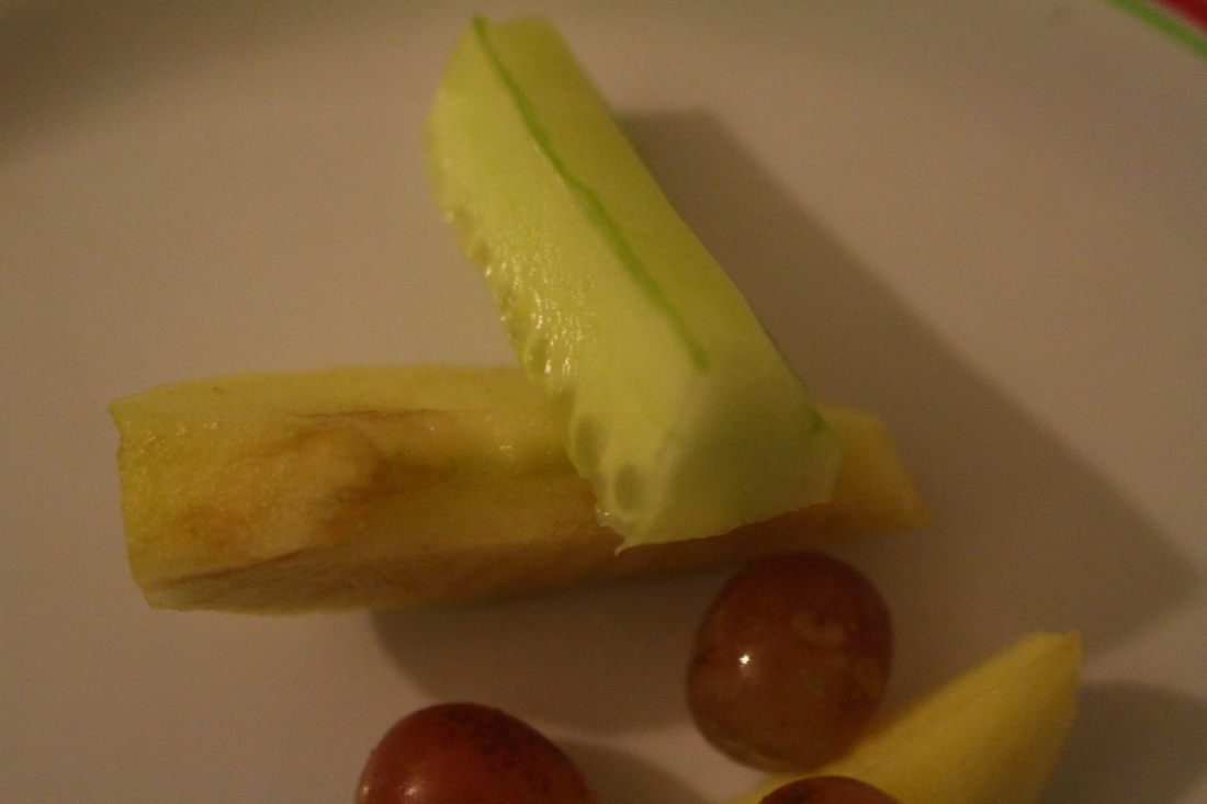
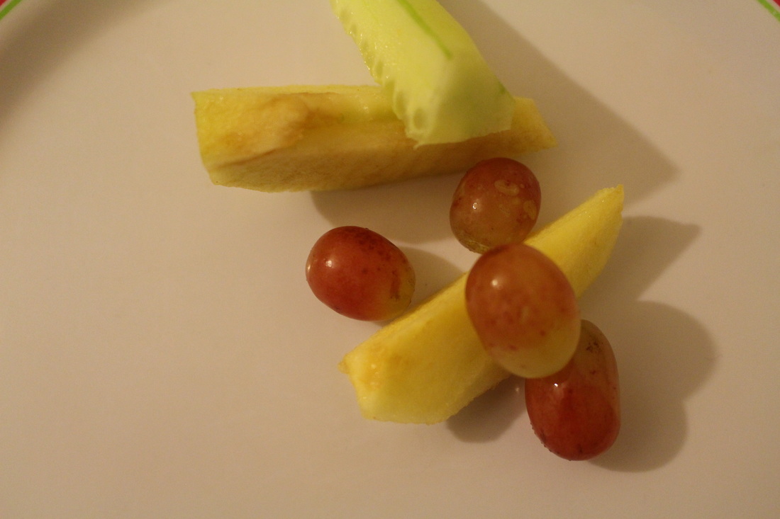
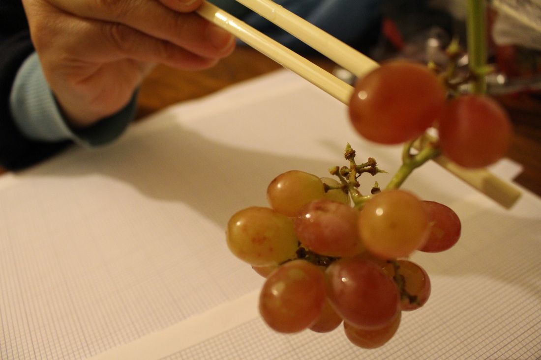
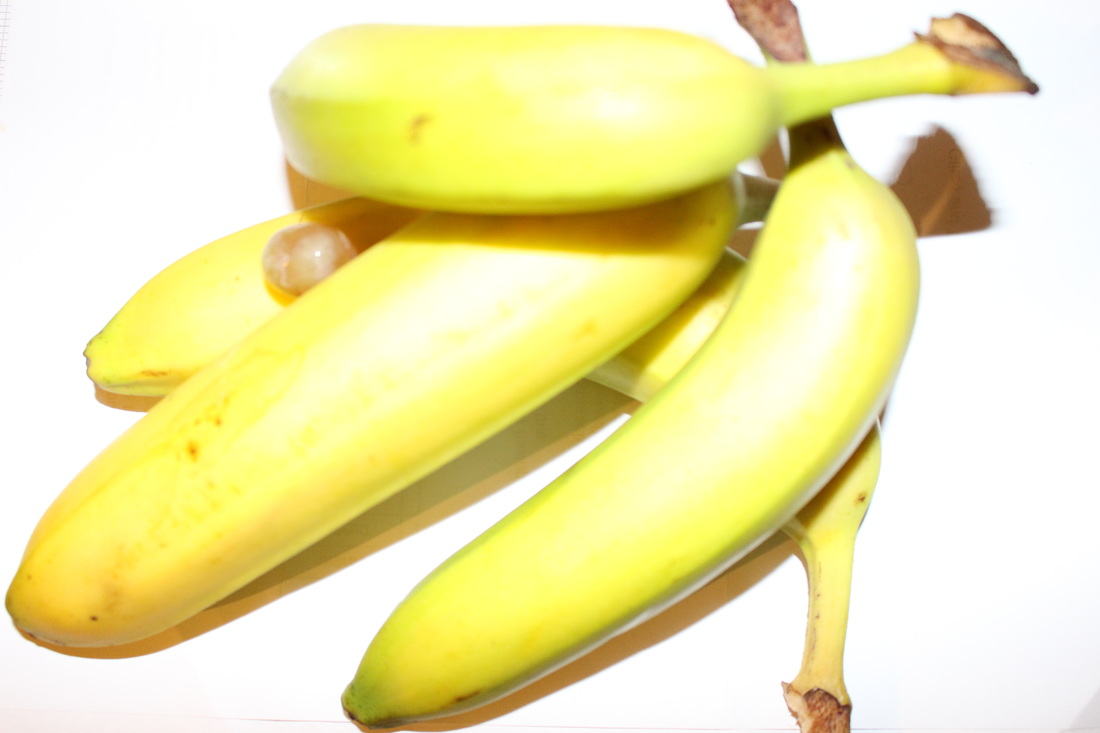
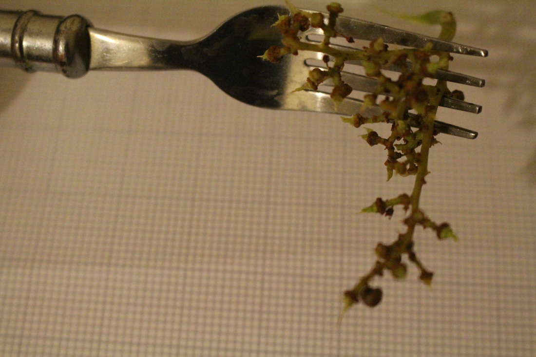
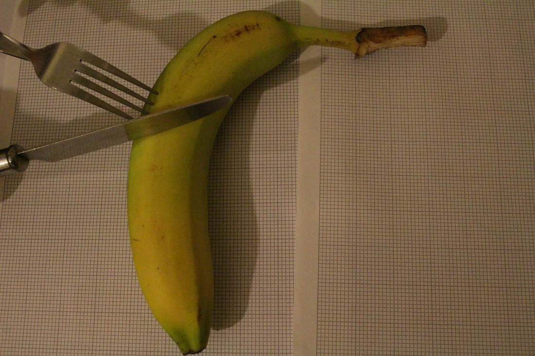
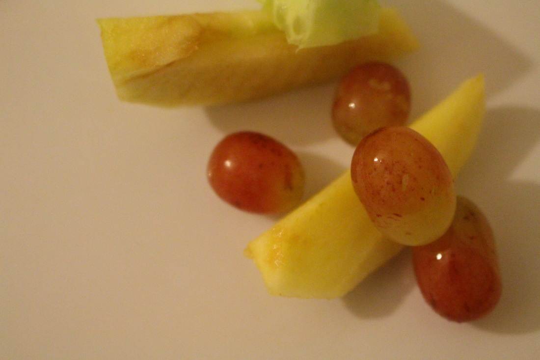
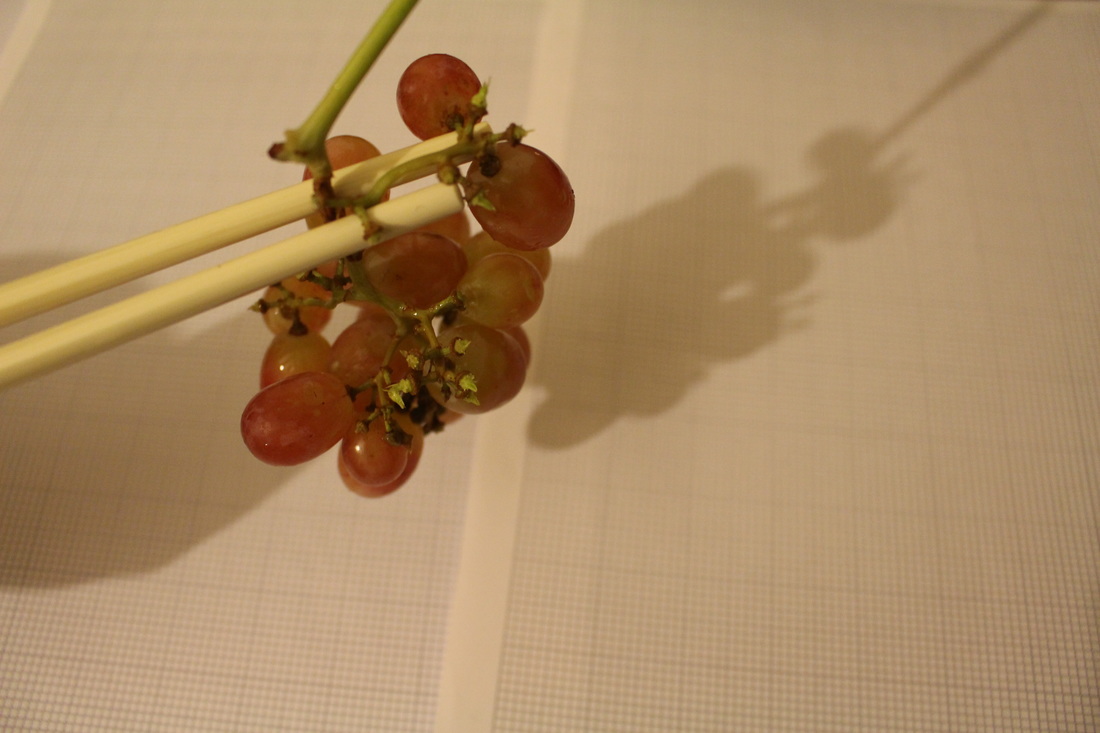
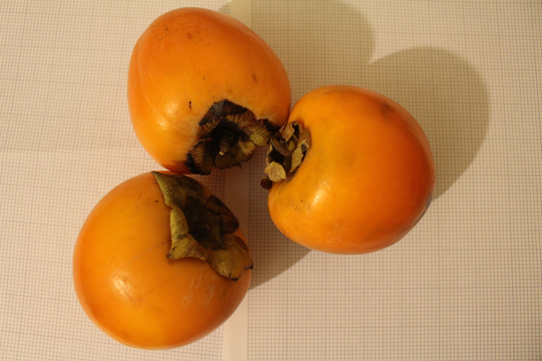
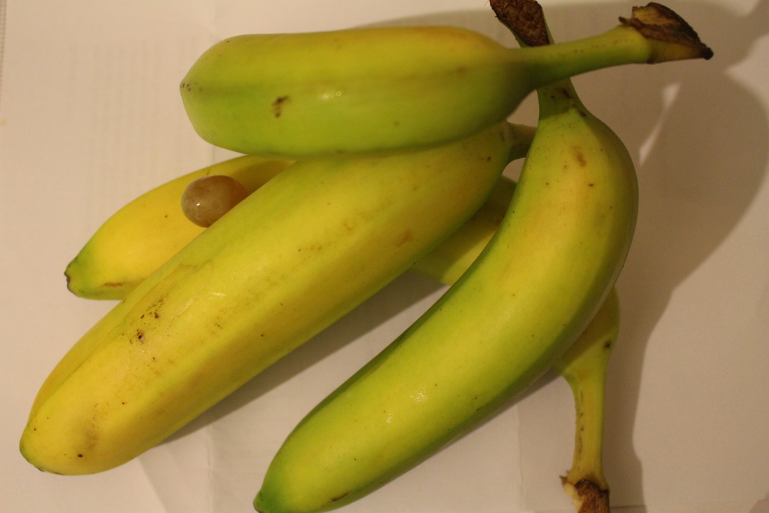
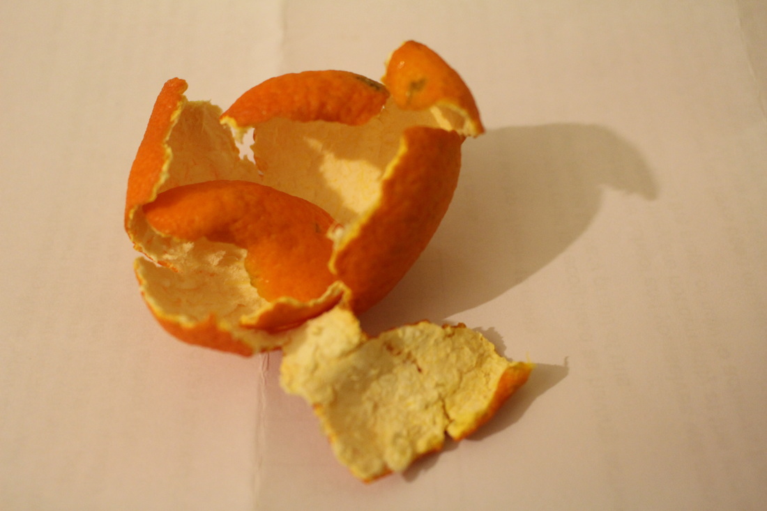
I intend to capture normal objects however arranging them in a weird absurd way. Such as placing different fruits next to each other; such as a lemon and grapes. These will demonstrate absurdity since it will be scattered all over the place in an unordinary way. My other idea is by placing random objects in a cup. |
INSPIRED BY THE ABOVE IMAGE I CREATED SOME IMAGES WITH A GLASS CUP-
INSPIRED BY THIS IMAGE BELOW I TOOK THESE IMAGES :


EVALUATION-
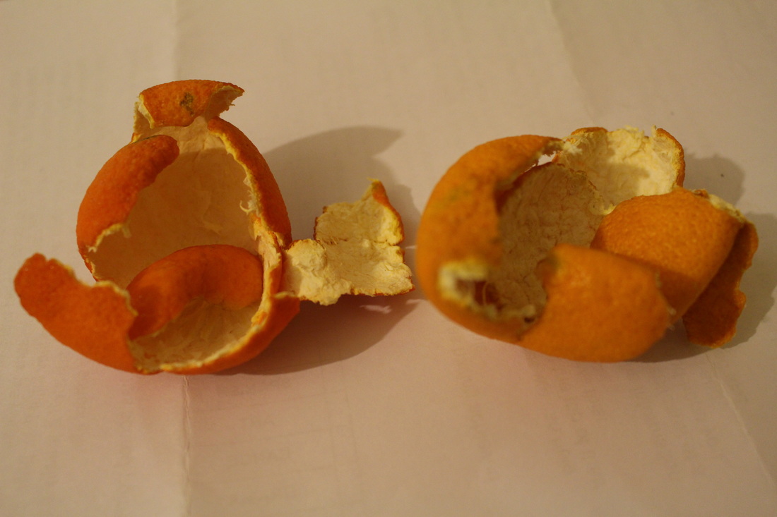
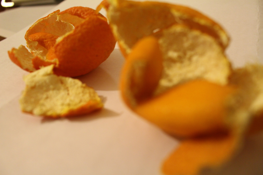
Inspired by Phillipe Jarrigeon, i created this set of images by rearranging them in interesting ways. From the artist image above i found the chaotic arrangement of several cut up fruits interesting. Even though I was unsure of the link to this project of Absurd- I still carried on with this photo shoot to see whether it would lead me to somewhere else or if not to abandon this idea. So, i went on to capturing the above images. After capturing them and looking at them, I found it unsuccessful so i don't particularly want to carry on with this idea. This is because even though they were very simple, it doesn't seem like the image has a meaning and they just represent still life. Also, just the rearrangements of the fruits alone wouldn't be enough so I would need to develop it, but I don't particularly like it and don't want to continue with this idea.
___________________________________________________________________________________________________________________________________________________
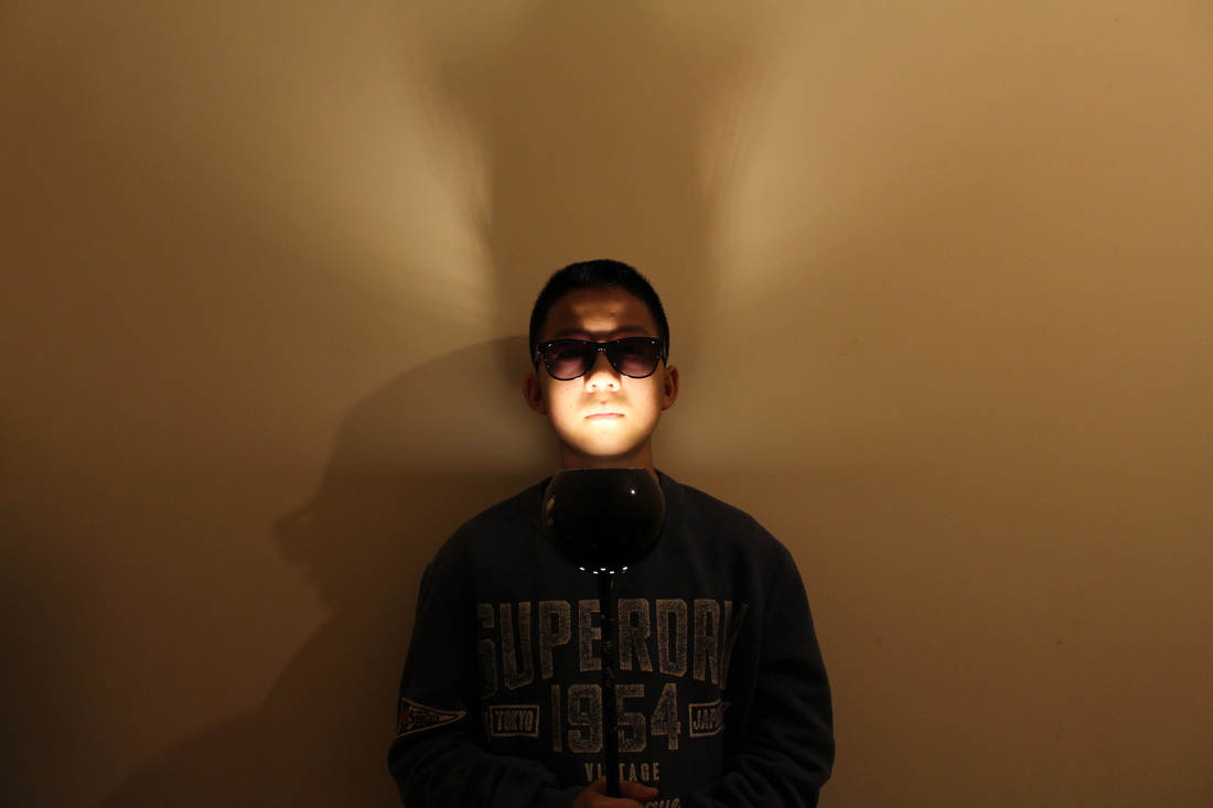
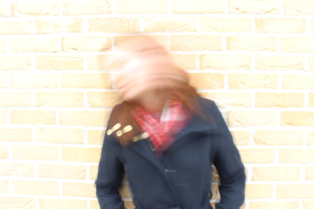
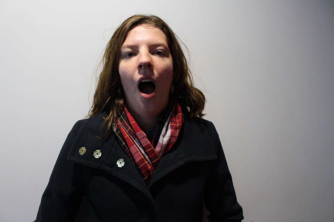
•Development of images with Light and Motion

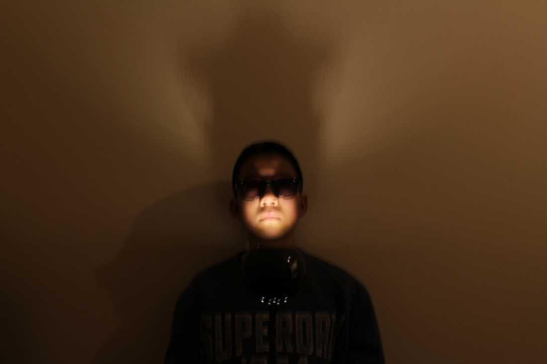
After my set of images with still life and using objects, i was stuck with ideas on how to develop and continue to create successful images. So, i decided to leave the idea of capturing objects and of still life and return to people and experiment with light. I received this idea from a previous photoshoot where my brother held a lamp shining onto his face which created a shadow and it looked very interesting. In particular the images came out slightly blurry, making the image seem more eerie and it looks like there is slight movement within the photo probably due to the unintentional slow shutter speed. So, from the inspiration of the three photos from above, i intend to create similar images and to continue with this theme and idea. To improve these images i will take long exposure portraits so that the face is blurred and distorted out. I'll create some sense of transparency showing a sense of movement and emotions. In addition to the blurred out faces I will also use light sources to experiment with light painting.
Pinterest Inspiration-
|
|
Before beginning my experimentation, I wanted to gain some inspiration from artists and see how they have used long exposures to portray absurd. After researching artists I couldn't really find a particular one which i liked, so i went onto Pinterest to gain inspiration, I searched, long exposure portraits and I saw many examples, which i have included on the left which i found interesting. I particularly like the simplicity and quirkiness of the photos, which distorts and smudges out the face, which creates sense of curiosity and wonder. It could represent the anger within a person, and by shaking it out releases all the emotions. Whilst this idea could also be used to hide and cover ones identity. I have been inspired by these images to create my own, by incorporating this idea within my own work. I will experiment with long exposures by altering the using a long shutter speed, so movements are captured; i will mainly focus on the upper part of the body mainly on the face which will be moving. I will begin by experimenting with daylight outside of school, then if successful develop it further by capturing in the dark room, where there'll be a black backdrop. In addition to my long exposures I will play with light painting with multi-coloured torches. |
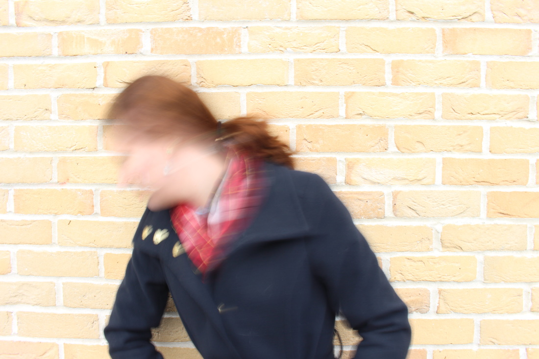
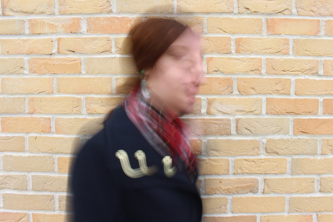
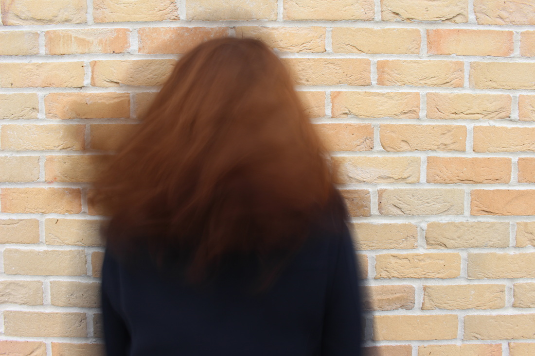
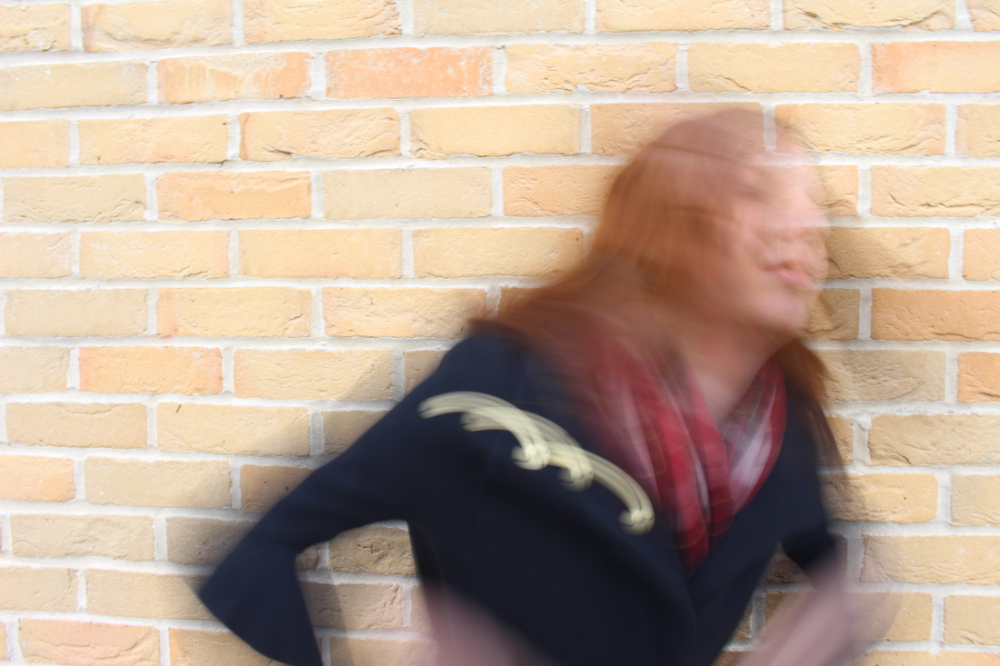
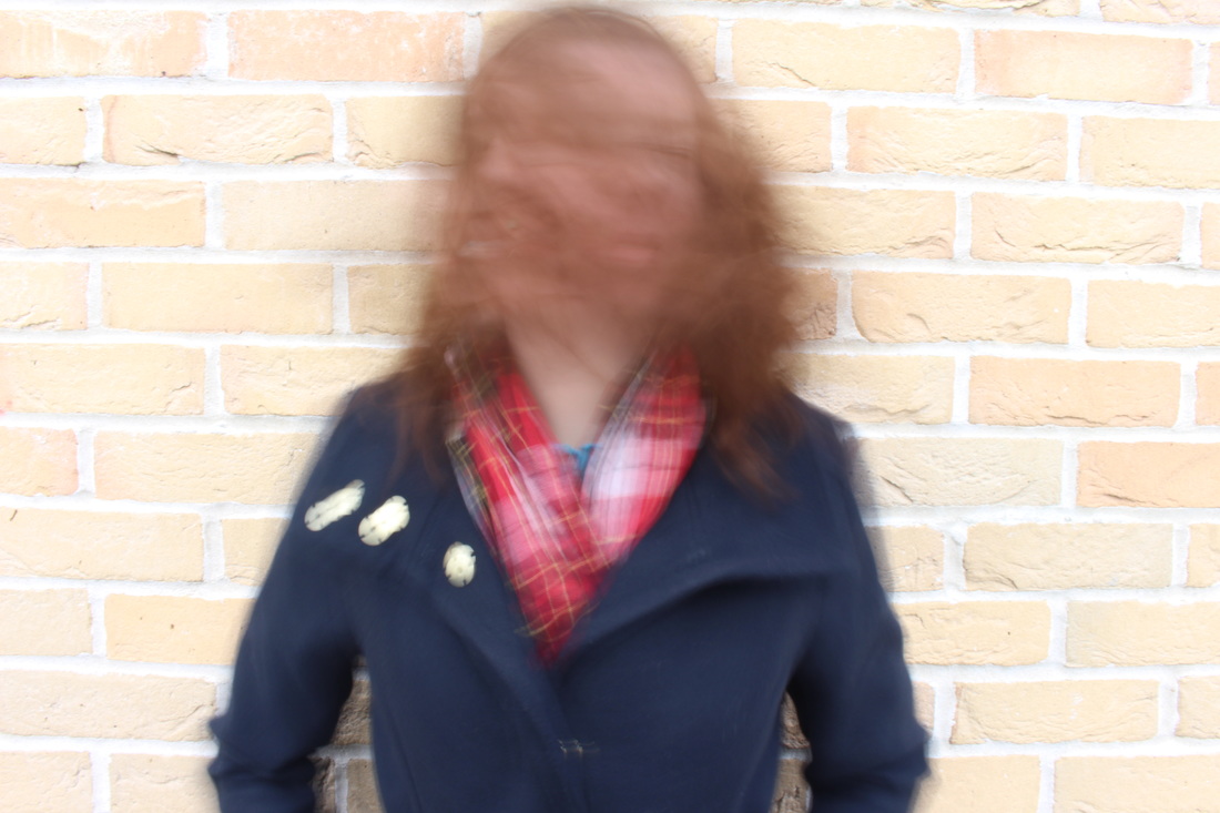
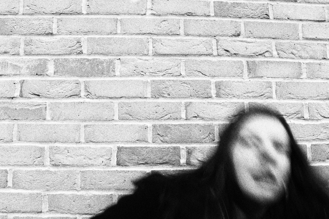
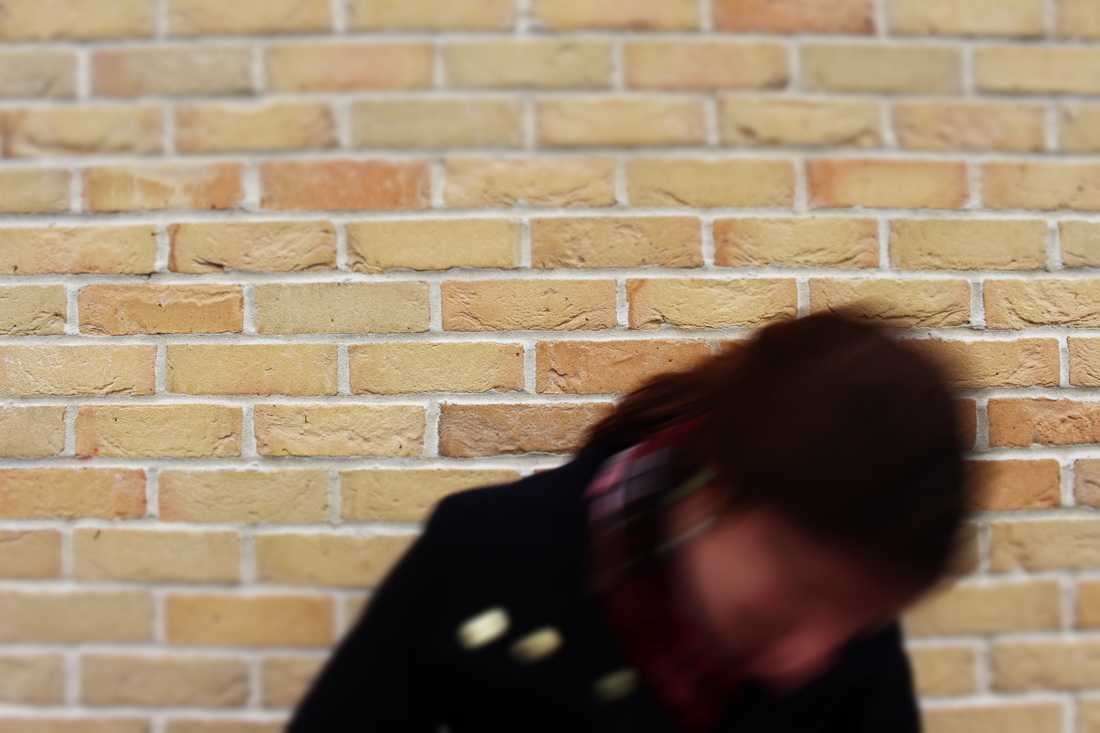
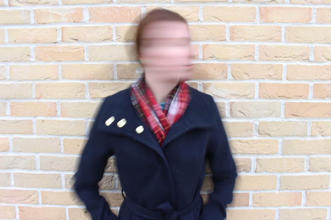
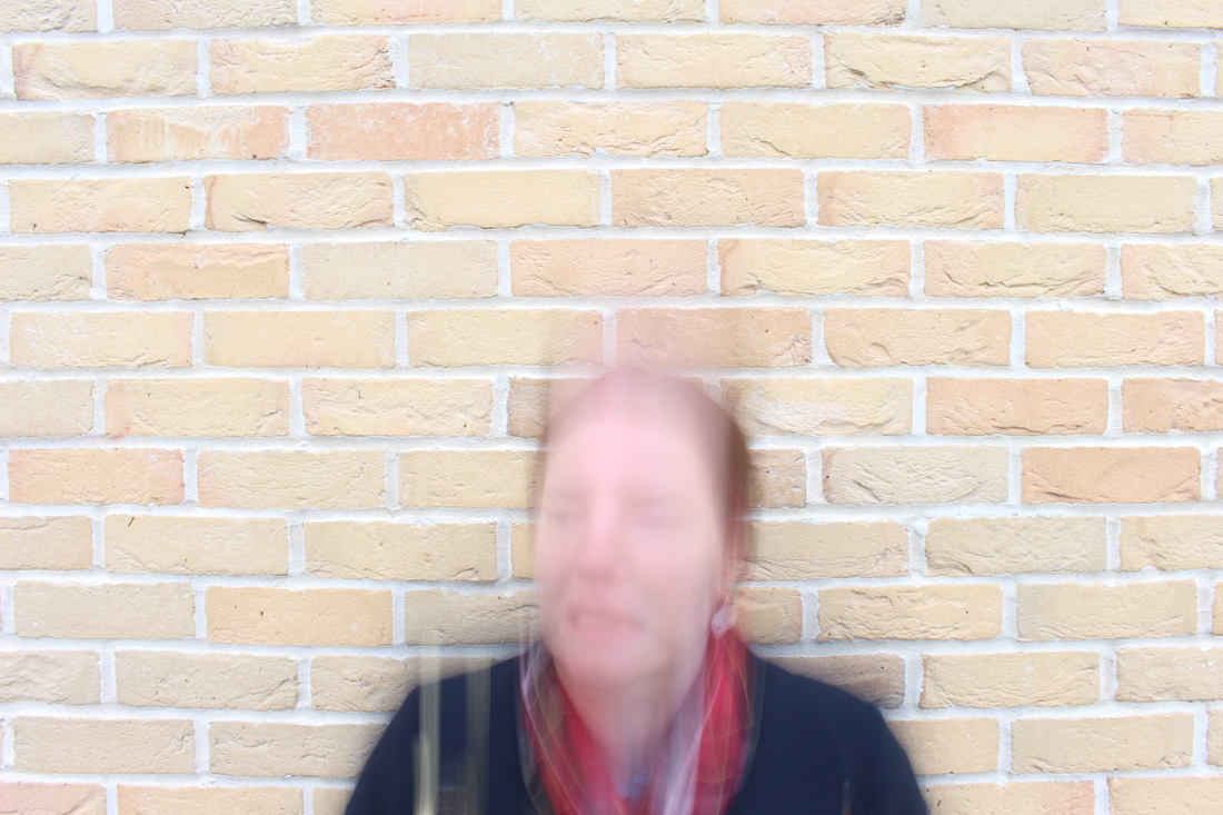
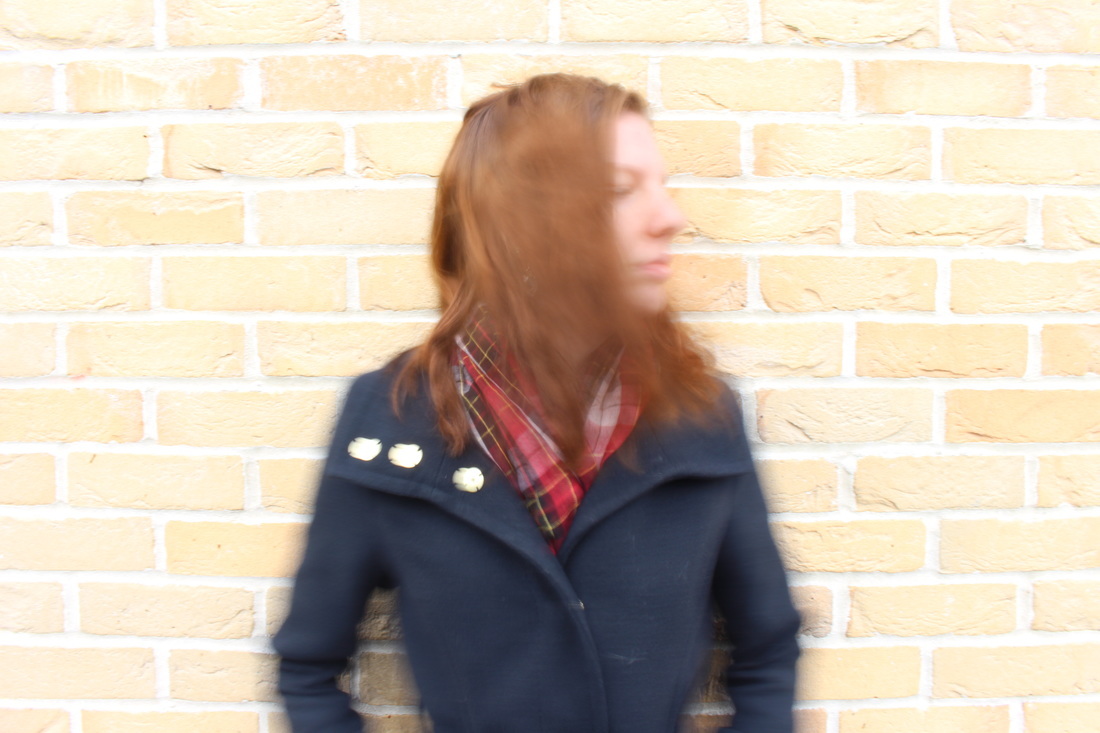
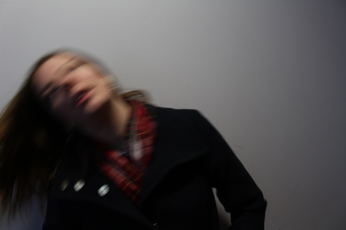
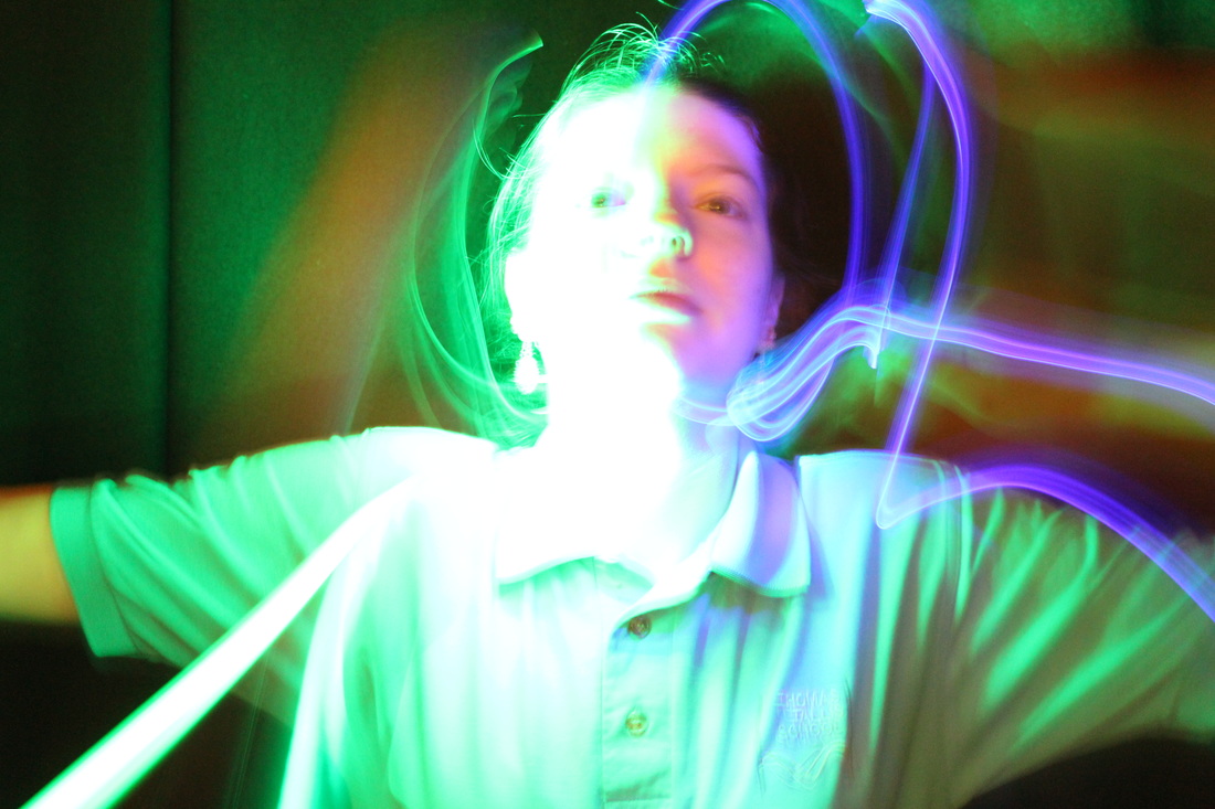
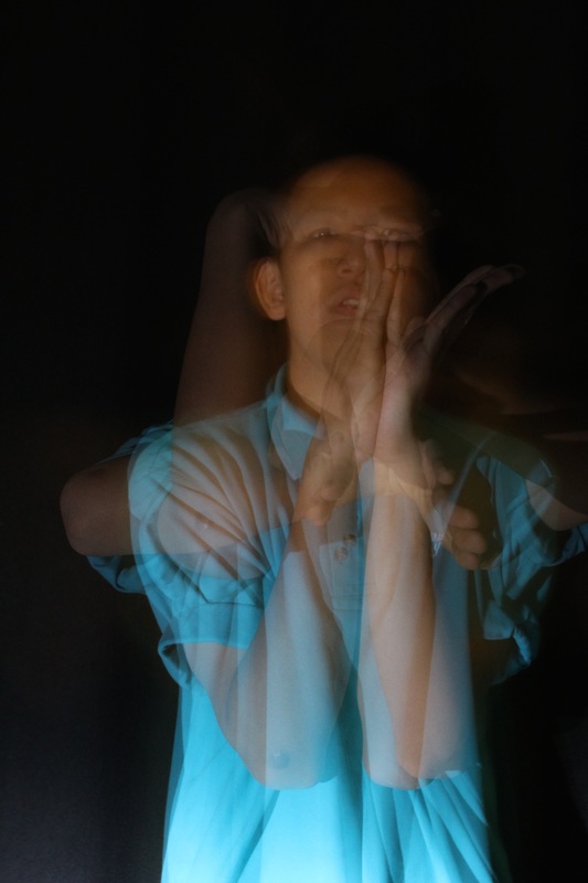
Photoshoot #10
|
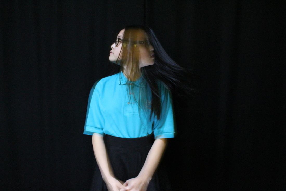
WWW-
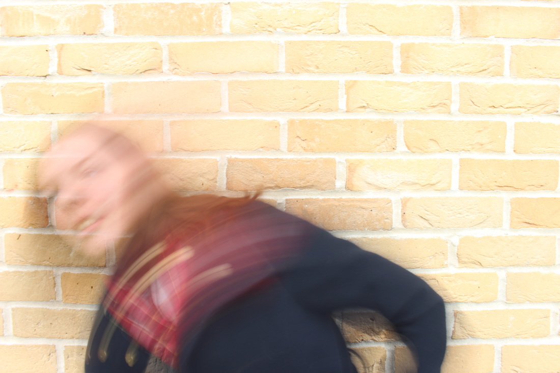
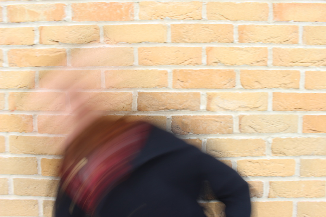
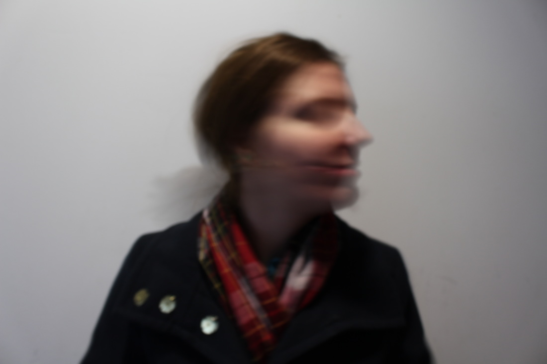
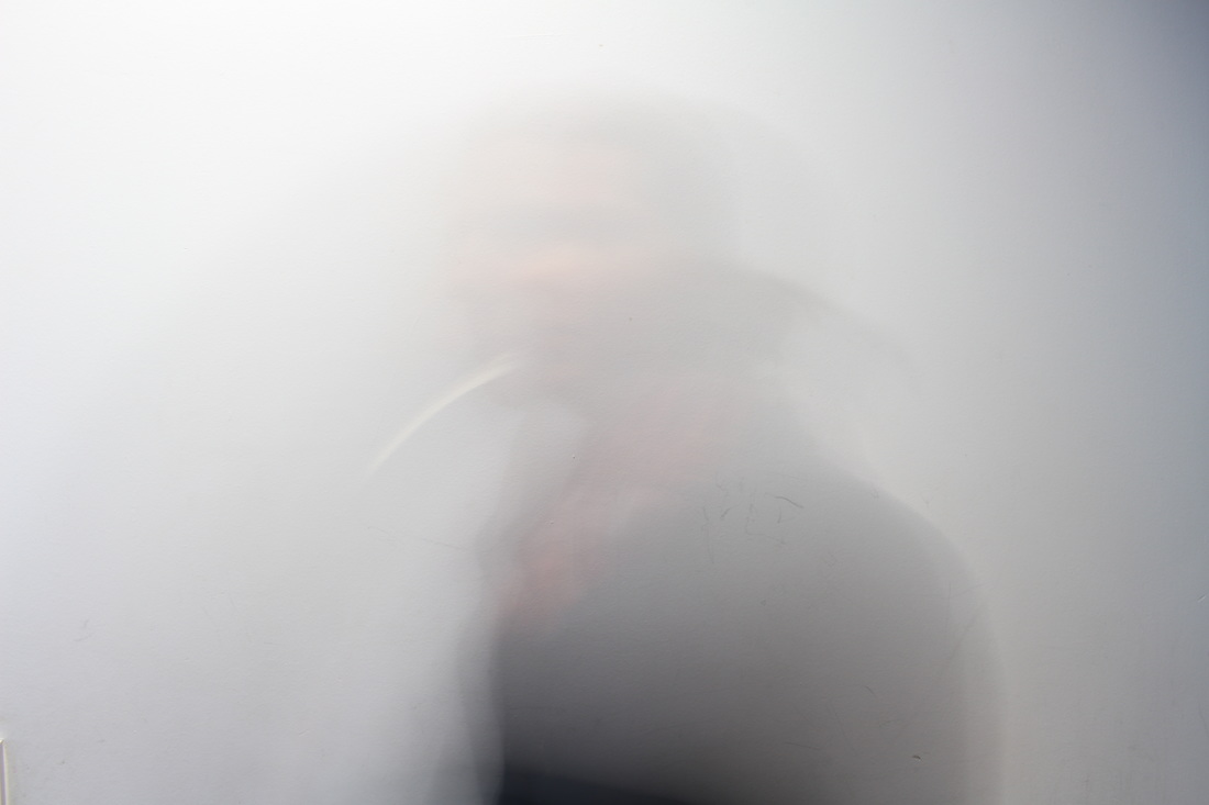
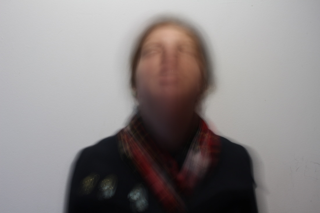
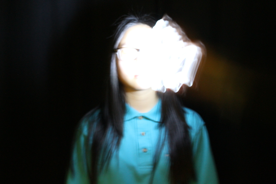
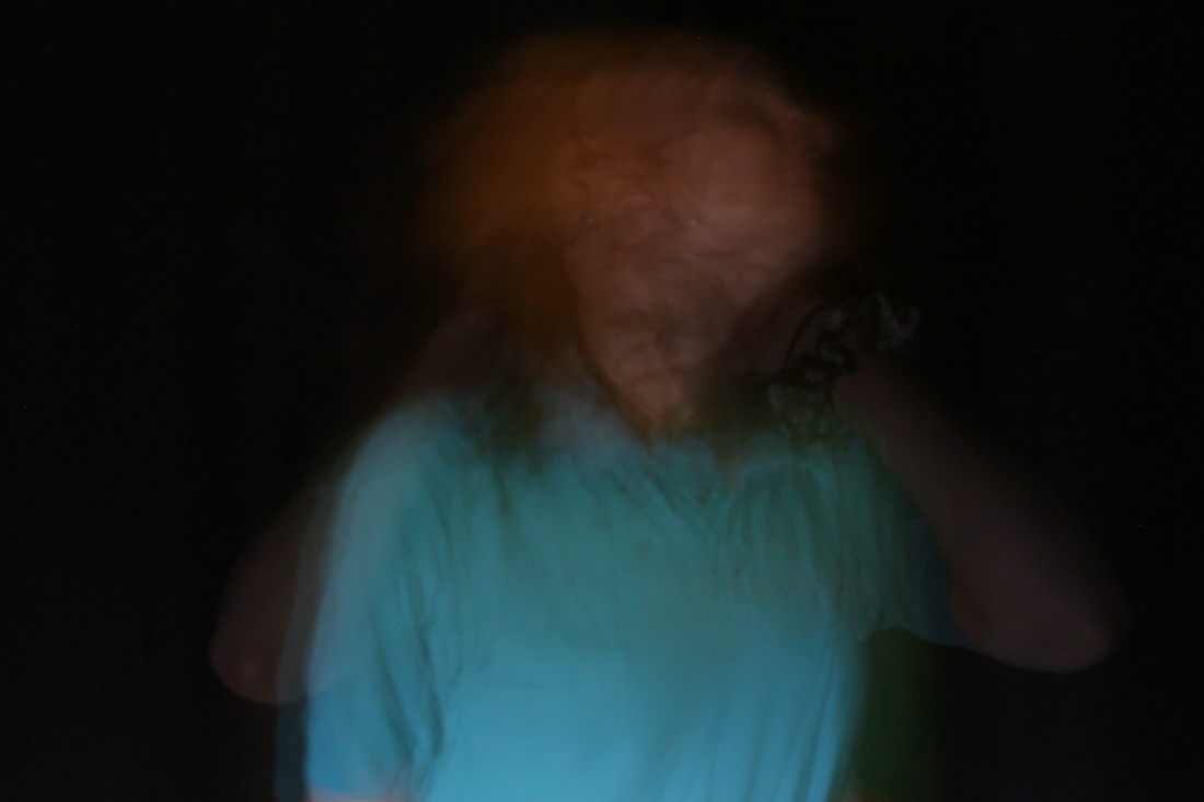
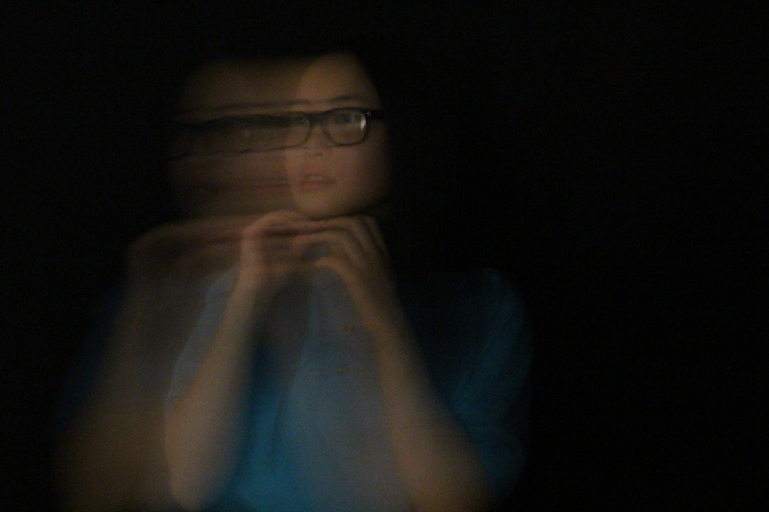
This was my first experimentation with long exposures, which wasn't as successful and well as I had intended. I tried many apertures and shutter speeds with my DSLR, some settings worked whilst some didn't. In some situations, it was brighter and too exposed. I used a tripod so the background was still and it was only the subject that was moving. Overall, i like the warm background and it was a good first attempt, as it has allowed me to know how to further improve my work. |
EBI
As it's my first experiment, I have learnt how to improve this technique. I realised that some of these images had a really long shutter speed so the image created was too blurry, so next time I'll use a shorter shutter speed, so image is much sharper yet also shows motion. Further, I would like to use a clear white background so all the details is on the foreground and the human motion rather than details from the brickwork and yellow colour. |
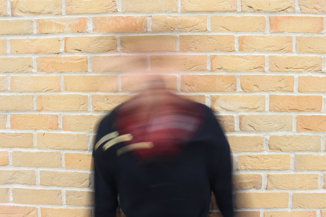
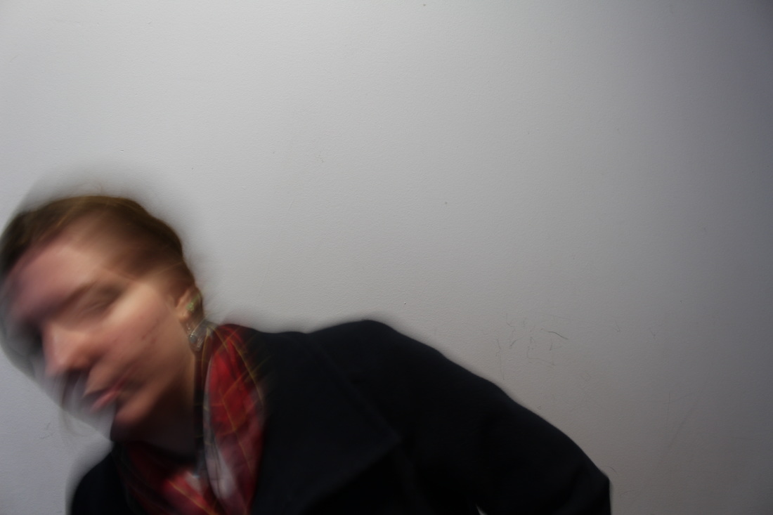
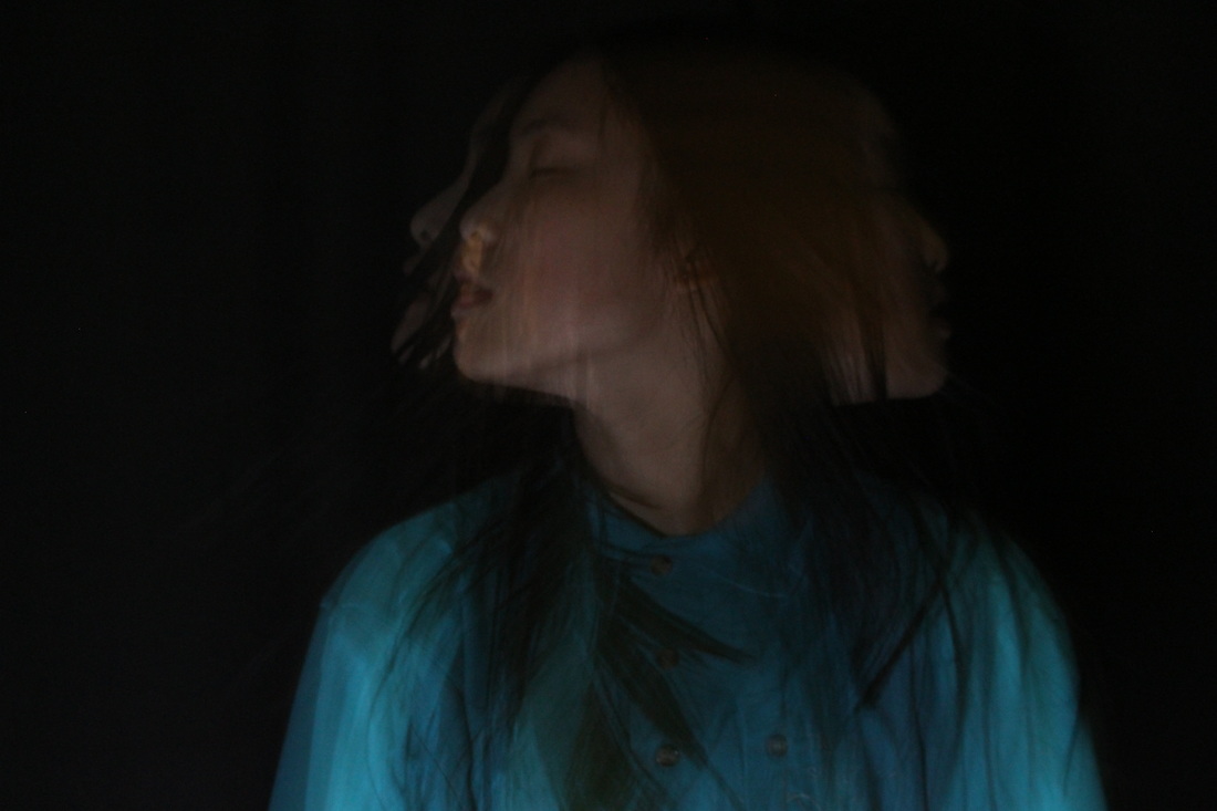
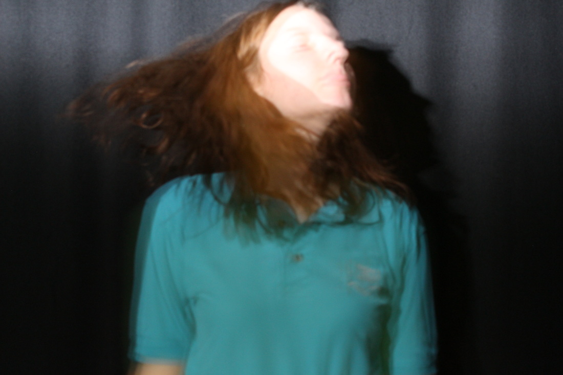
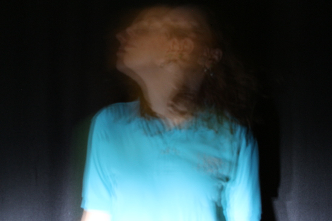
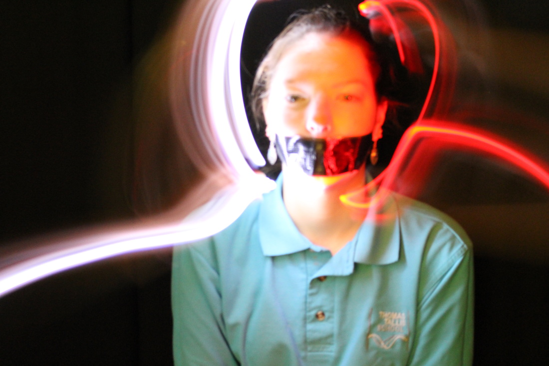
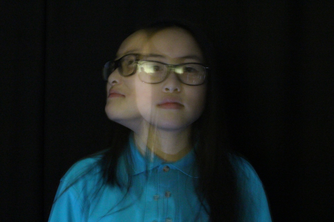
Photoshoot #11
|
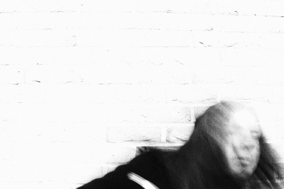
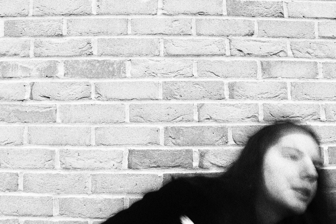
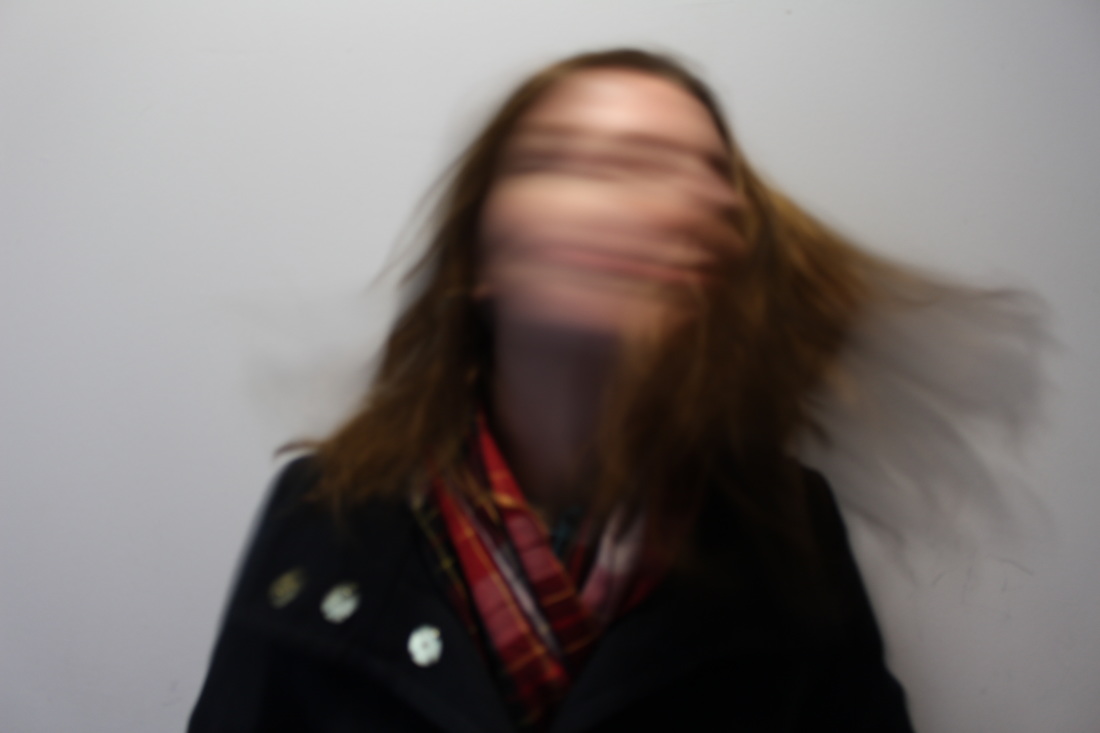
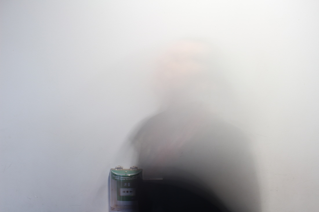
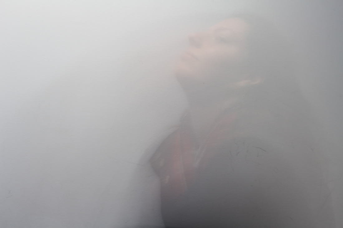
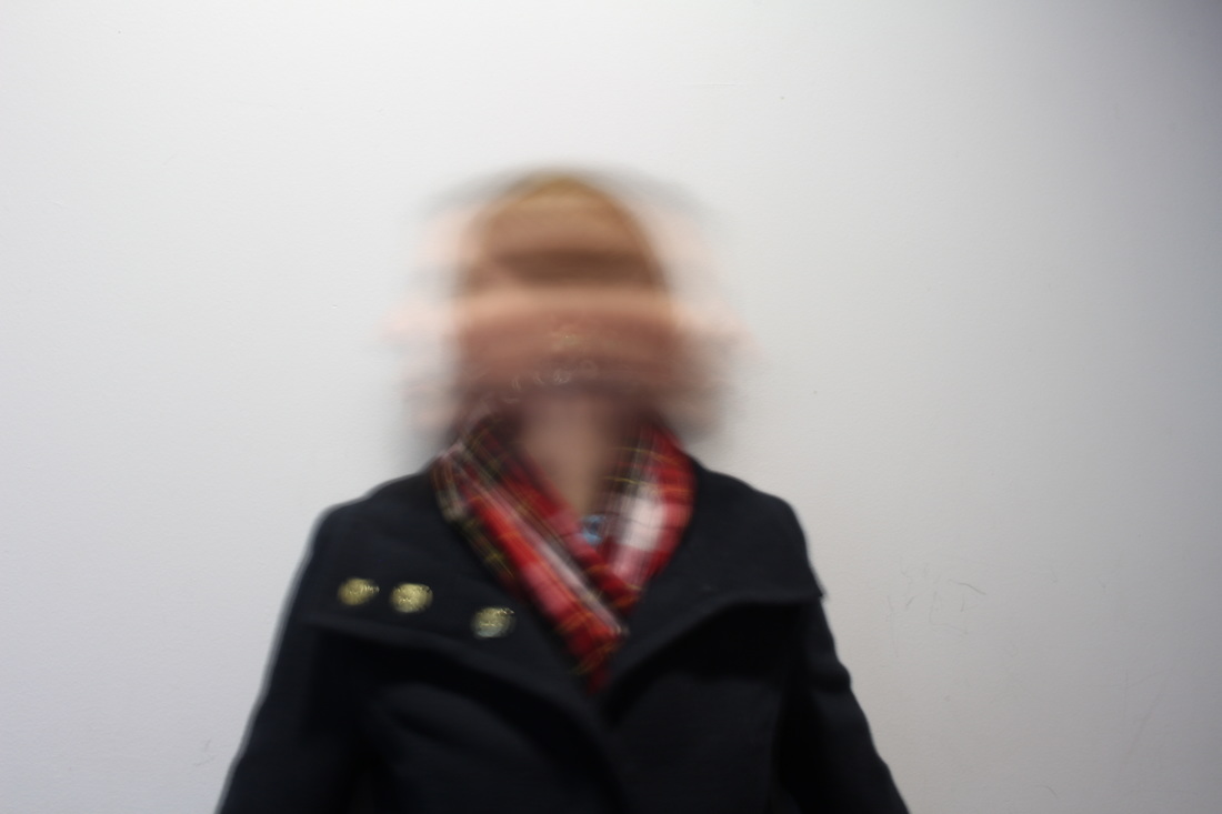
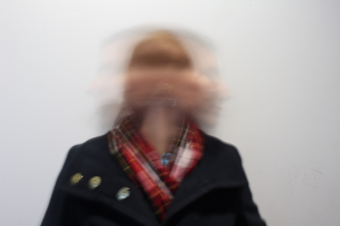
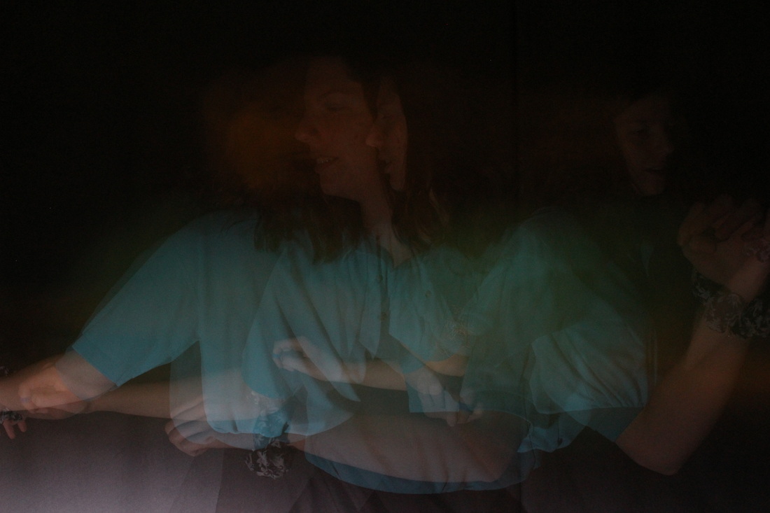
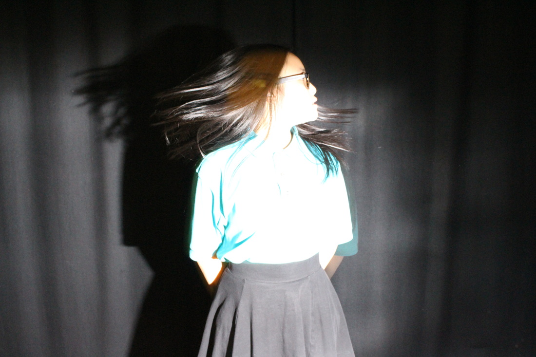
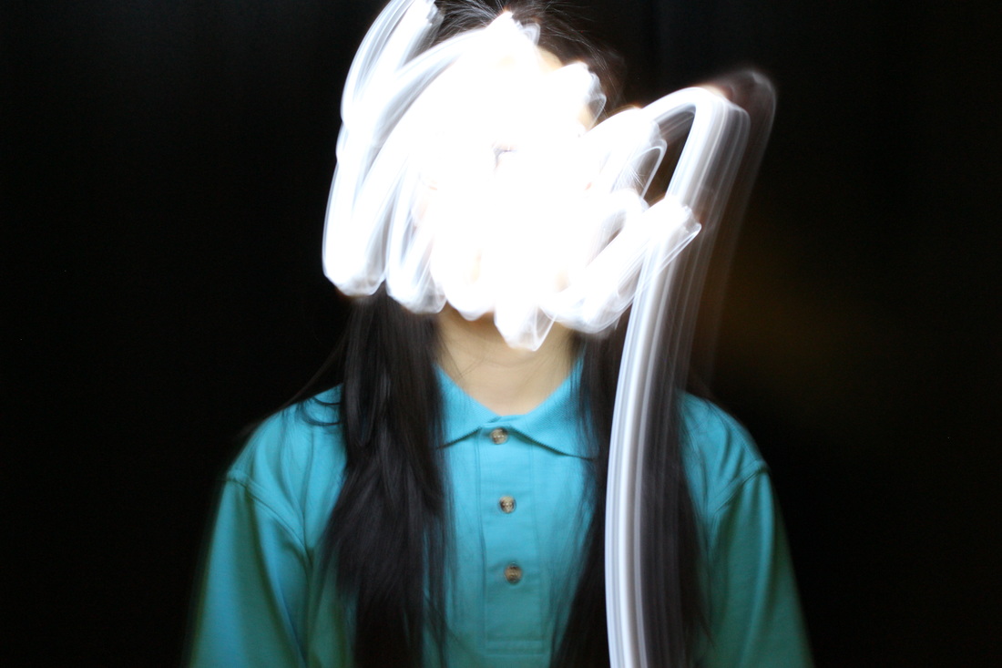
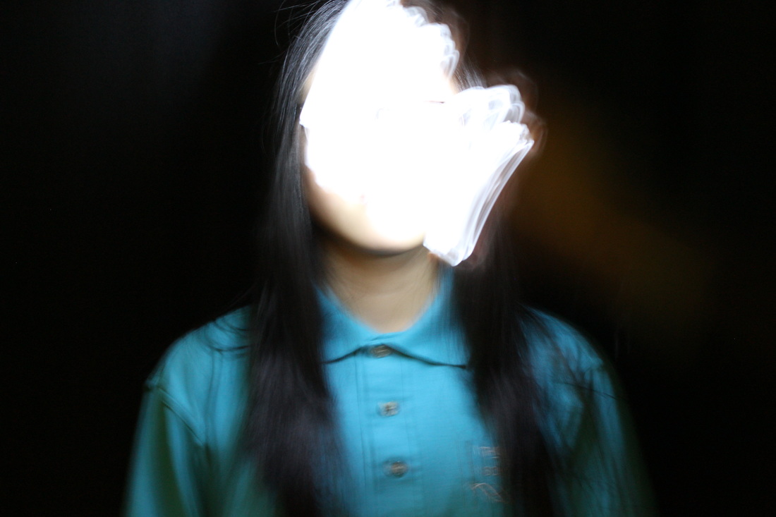
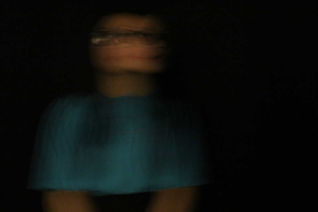
WWW-
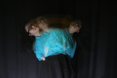
For my second experimentation, I feel like it went well, we worked with a white background inside the building but there was still some light which penetrated through the windows to create a natural brightness effect. I like the neutral white tones, with the off-greys and whites. These are an improvement from my previous set as i have used a shorter shutter speed such as 1/20 with aperture of 3.5, whilst the misty ones were 3''2 seconds and an aperture of 20. I think both these settings work well and which portrays anger and confusion much significantly, |
EBI-
To improve these images, I will still focus on the distortion of the face but work in the dark room and use artificial lighting to capture these images. By working with a black backdrop, it creates dimensions within the image with a sharper depth of field. In addition by using a flashlight i can control the amount of light exposing at a certain time capturing a singular movement within a set time. |
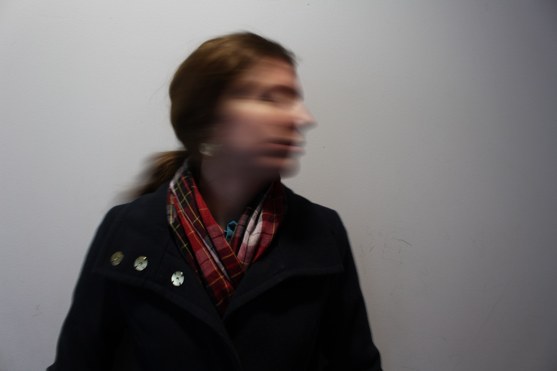
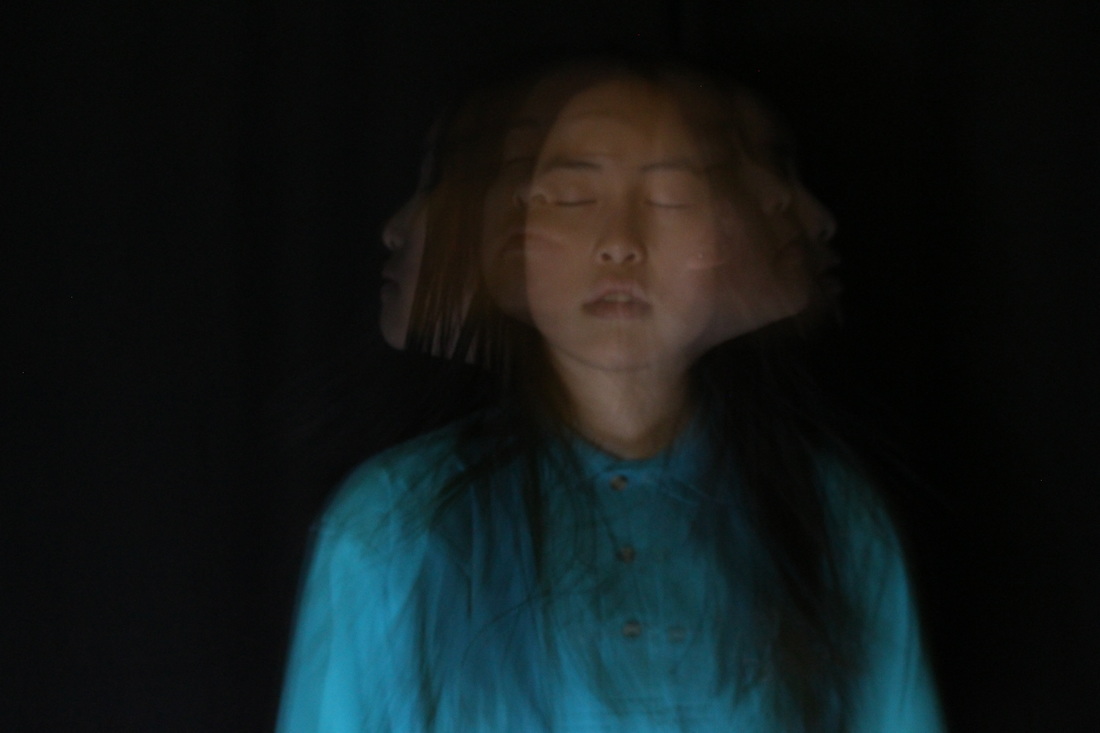
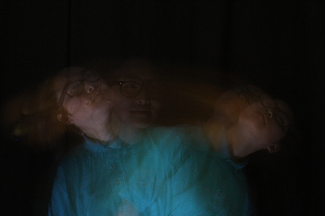
Photoshoot #12


|
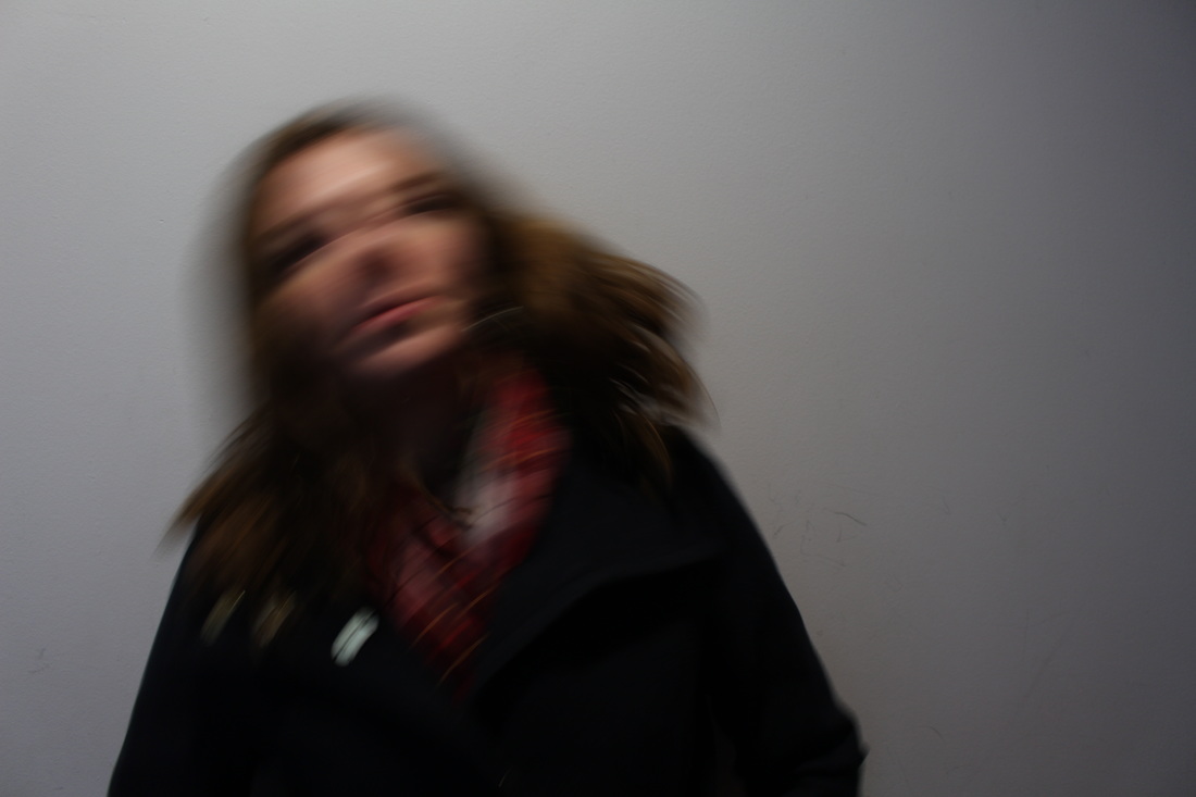
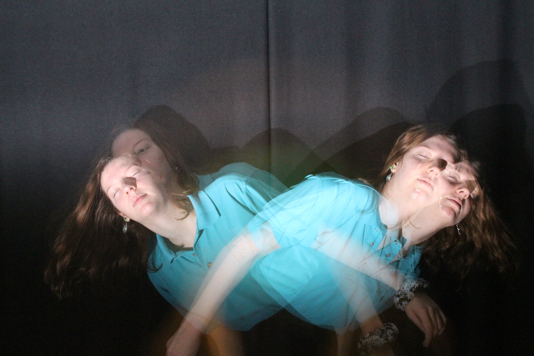
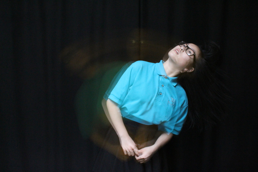
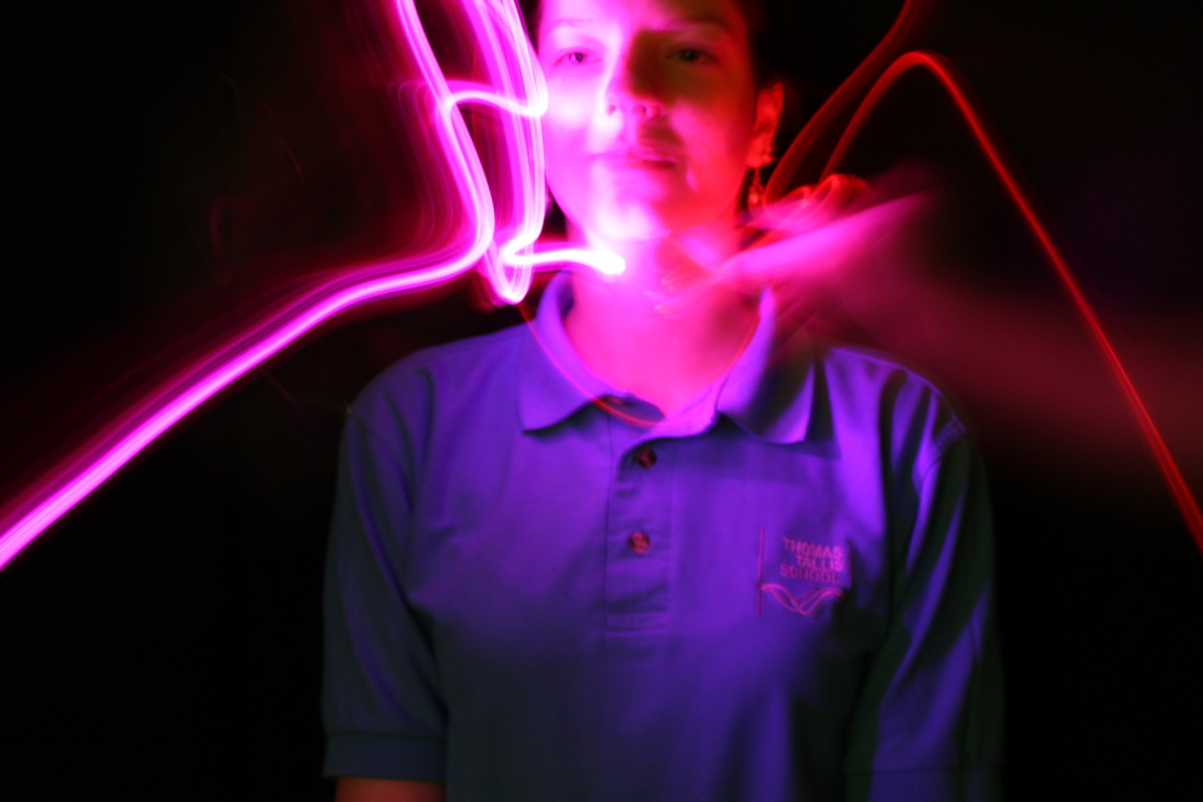
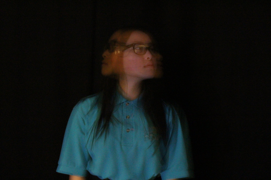
WWW-
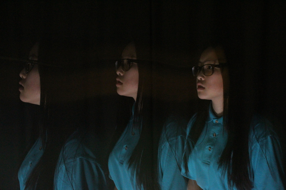
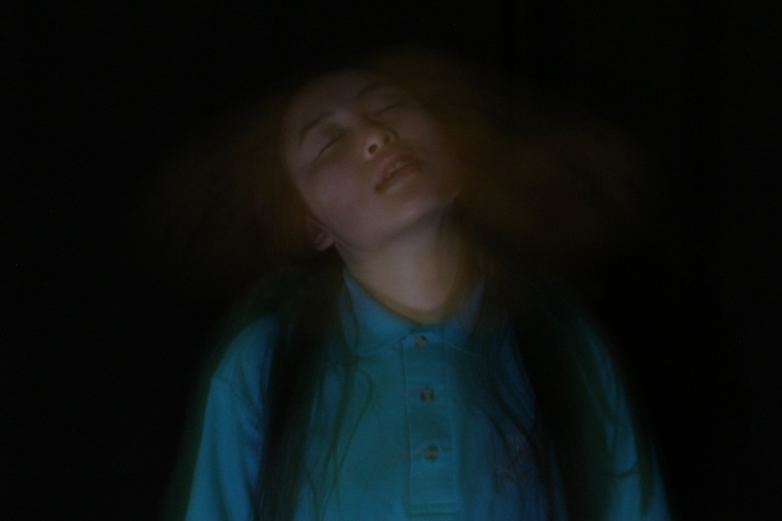
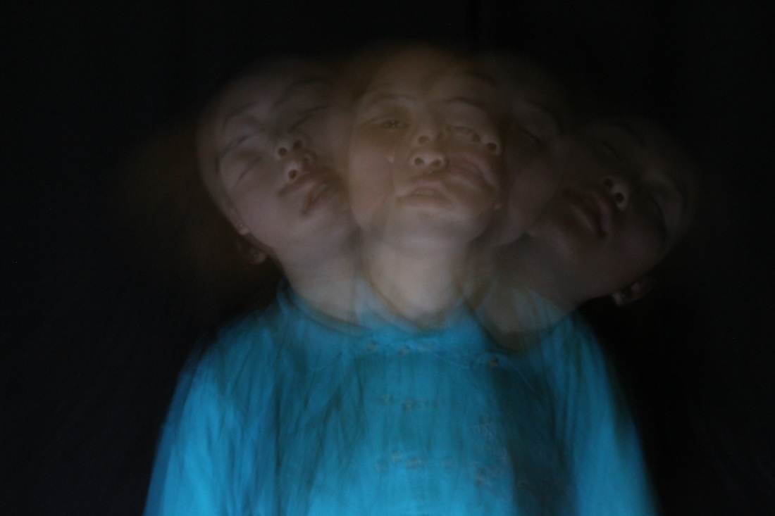
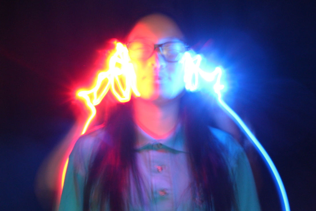
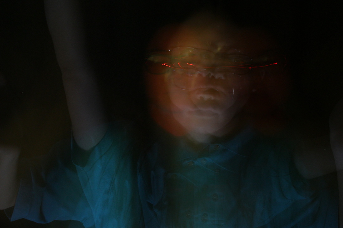
After identifying the ways to improve i refined the images by the improvements i had suggested previously. Initially there was slight difficulties on what to capture and what the motion should be as the actions seem to be too repetitive, but i simply continued with it to see which set were better. We also had difficulties with the flashlight and where to flash it as well as how often. In some cases the image was either over-exposed and in other situations it it was under-exposed. It was also hard to control all three settings at once, with changing shutter speeds, apertures and the flashlight. After many tries we established the most successful setting which was : shutter speed at 2''5 and an aperture of f/7.1. With these settings the image came out clear and sharp along with the shorter shutter speed time with only two or three consecutive flashes made the image precise and successful (images from 3rd and 4th row). |
EBI-
In this series I focussed predominantly with long exposures and occasionally with a torch. My intentions with the torches were to cover up the face so the facial features weren't seen, however the images weren't in focus so the light trail was blurry and unclear. I only used a white torch so i hope to use a different coloured torch such as blue or red or even combining two colours within a photo; and instead of simply covering the face i will outline the face and draw around it. |
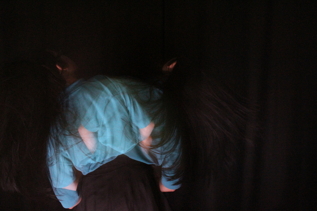
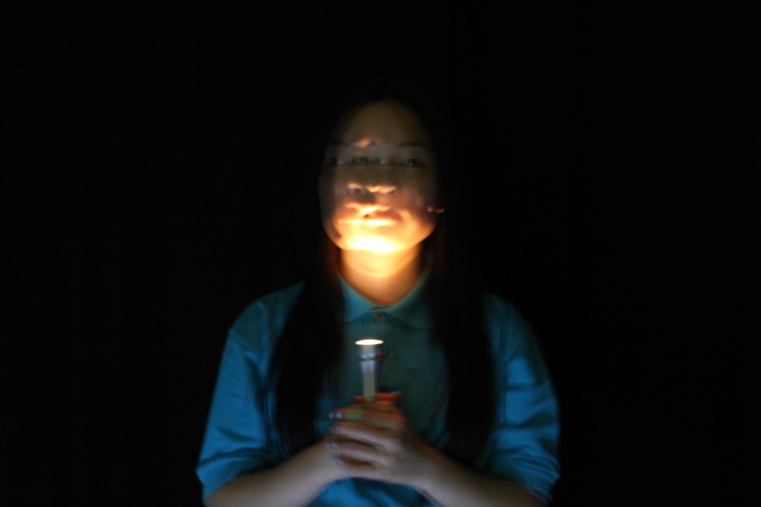
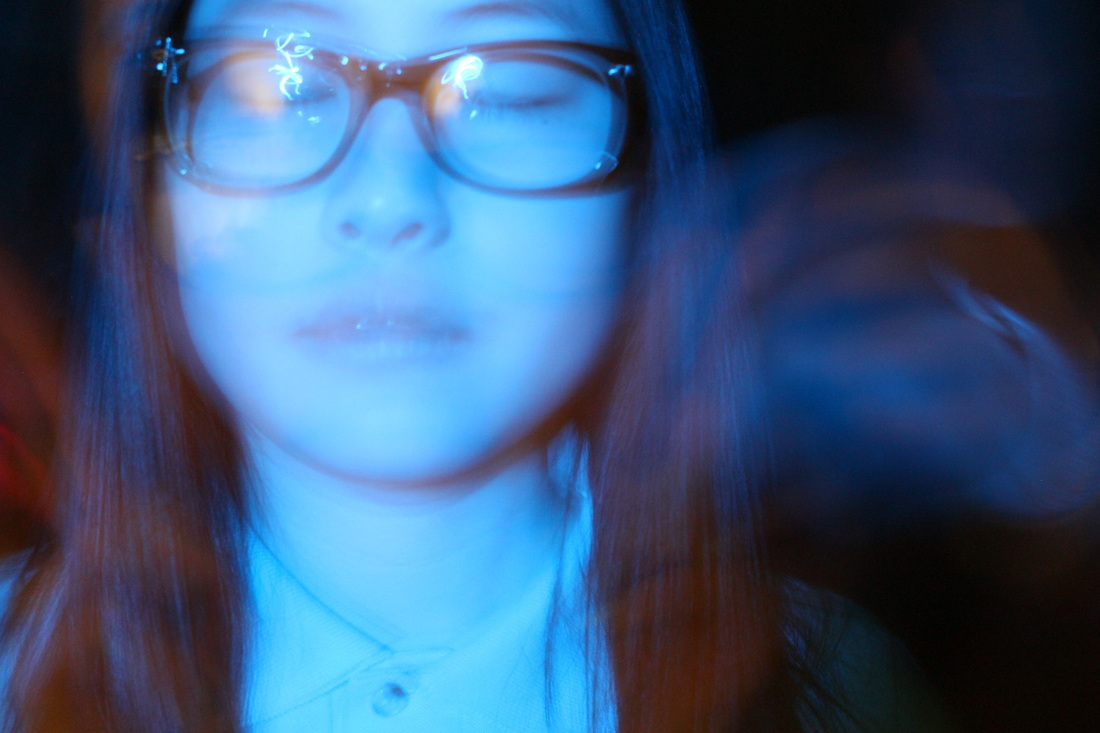
Photoshoot #13
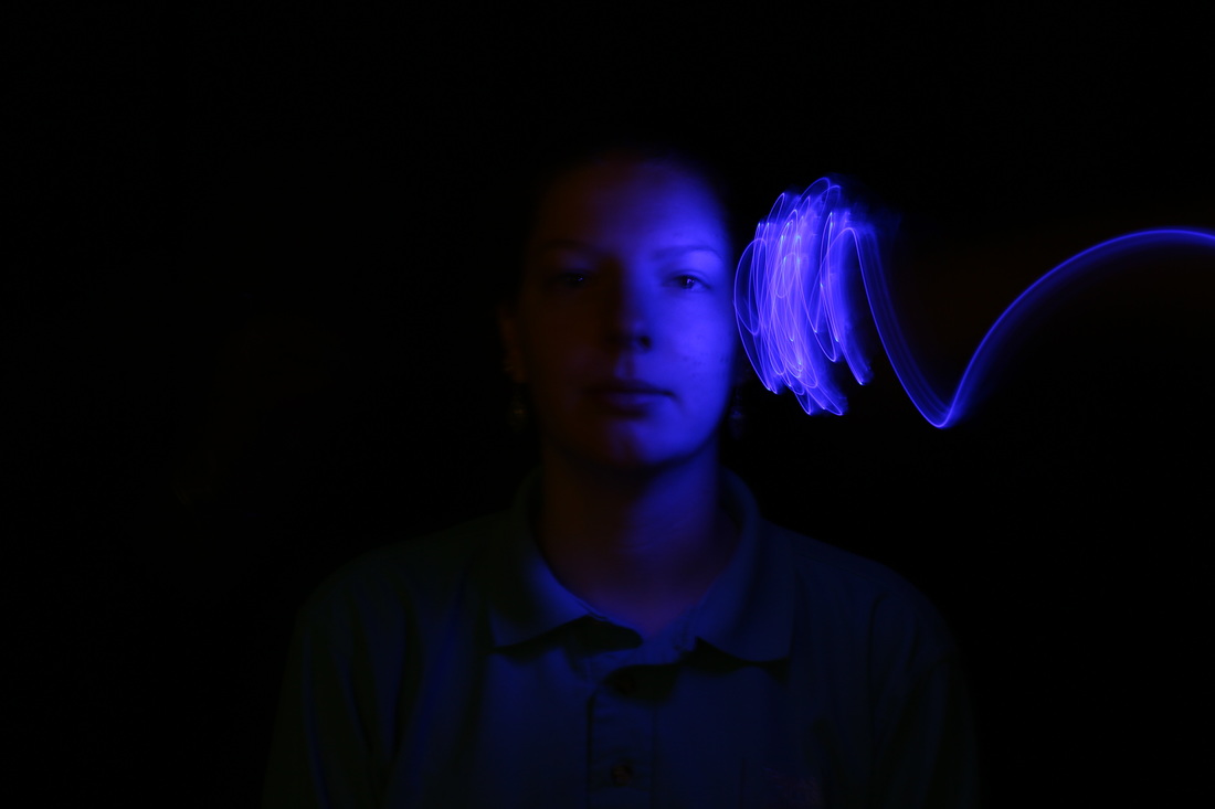

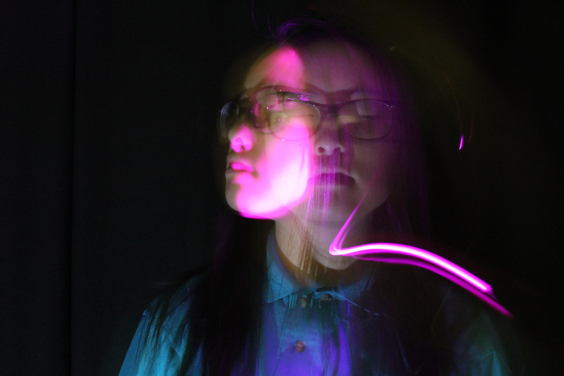
Evaluation-
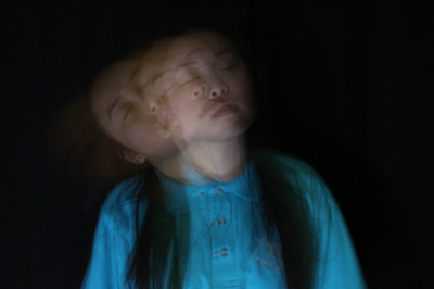
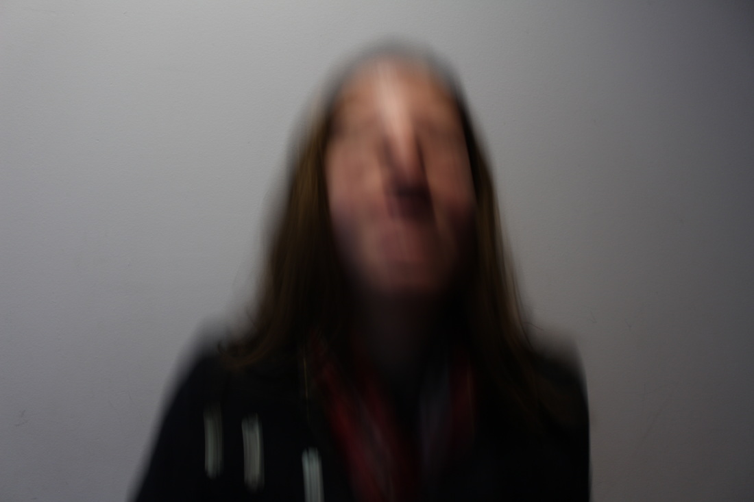
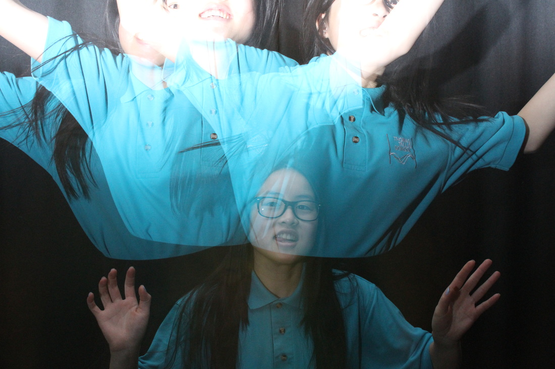
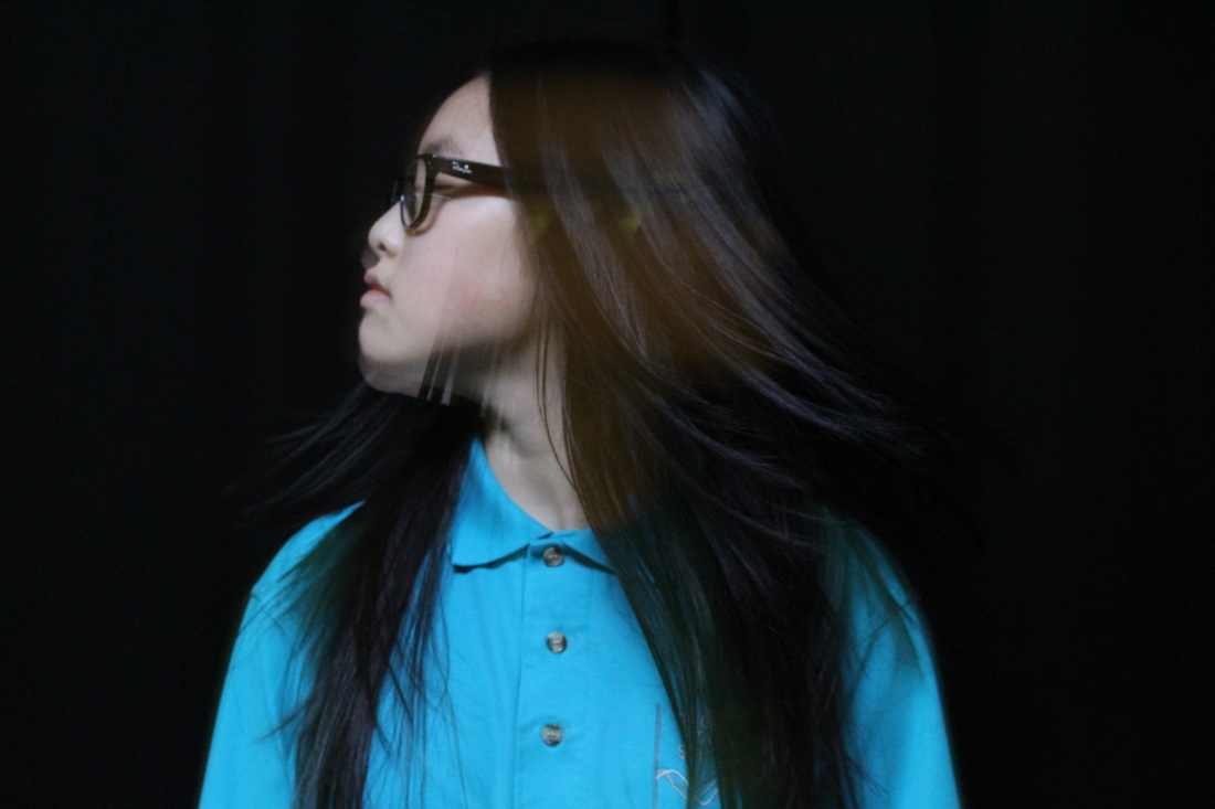
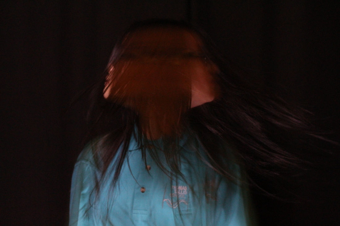
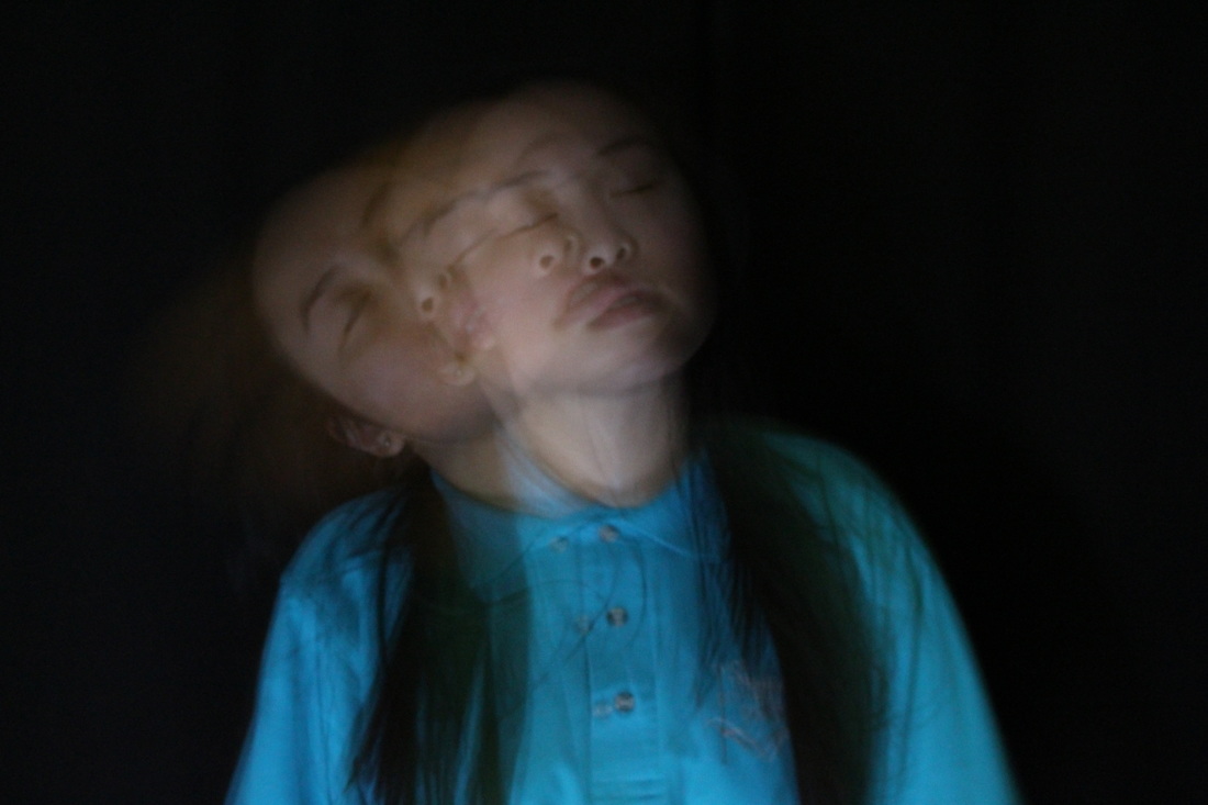
Following on and developing on from the previous shoot i intended to experiment more with colour light in the dark studio room, I combined both the techniques of long exposures and light painting. Overall, i feel like only two of these images came out well- the first image on the first row and the first image on the fourth row. This is because of the good lighting. Especially with the first image the light source seems to only come from one side -the right- and the blue light trails seems to be following her. Blue has connotations of fear and depression, which could show the persons feelings. It could show the she has released this tension inside of her as to why that side is bright and pure. One difficulty with this photoshoot was the focussing of the images and the timing as to when the flash should be and when to draw the light onto the face. This series of long exposures have worked out well and has been particularly interesting as it captures the absurd side within a persons life and by photographing it, it demonstrates it visually. I intend to use the successful ones with the series in my final piece.
Following on and developing on from the previous shoot i intended to experiment more with colour light in the dark studio room, I combined both the techniques of long exposures and light painting. Overall, i feel like only two of these images came out well- the first image on the first row and the first image on the fourth row. This is because of the good lighting. Especially with the first image the light source seems to only come from one side -the right- and the blue light trails seems to be following her. Blue has connotations of fear and depression, which could show the persons feelings. It could show the she has released this tension inside of her as to why that side is bright and pure. One difficulty with this photoshoot was the focussing of the images and the timing as to when the flash should be and when to draw the light onto the face. This series of long exposures have worked out well and has been particularly interesting as it captures the absurd side within a persons life and by photographing it, it demonstrates it visually. I intend to use the successful ones with the series in my final piece.
• FINAL PROJECT EVALUATION •
Overall, this project of Absurd has been very interesting and has allowed me to step out of my comfort zone within photography and experimentation, as i have done more photo shoots compared to previous projects. This was good as i could develop and refine my ideas and techniques.
In the beginning i was slightly confused as to what 'Absurd' actually was so i researched it and then understood that it meant something- wildly unreasonable, illogical, or inappropriate. After that i was intrigued as to how i could develop this theme adding my own touch to it. So, i began by going onto Pinterest, and searching the different pins that would come under the theme- absurd. The searches were all different yet also interesting, so i pinned and created the ones which i found particularly intriguing and the ones which i found inspirational. I decided to evaluate two of the photos within my board and researched the artist as well as initial impressions of the photos and the possible connotations behind the obvious. I researched the two artists- Mark Jenkins and Erwin Wurm. Both these artists use people and normal everyday objects in places they aren't supposed to be placed; such as a chair on top of ones head. I particularly liked their work as it was clearly absurd and it seemed that i could create similar images by placing objects in wrong places with a singular person. These two artists were my inspiration for my first two photo shoots. After developing the idea of objects, i decided to go onto another theme within this wide topic which was to research an artist which uses signs within their work. I came across the artist- David Shrigley; who created obvious yet pointless signs within a plain background. I especially liked the simplicity within his photos, so i was inspired by his work to create my own. However instead of stating the obvious in my signs, i stated the opposite to what i was actually capturing. After many different experimentations with signs and various objects, i realised that i didn't particularly liked the idea and wanted to carry on my idea of people and this time incorporate light within the pictures. So, to know where i was heading to next, i went back onto Pinterest, and searched 'lights and people' and then after i refined my searches to 'long exposure portraits' as i wanted to experiment with this idea. Similar to before i saved some of the pins which i particularly liked and created a slide show to show this collection. There was no specific artist which had the idea that i wanted to do, so i simply analysed the images and relating them to the theme of absurd. These long exposures contained a singular figure with their face or body blurred and smudged. It seemed to me that these smudges were the movements and motions of the person, which could represent their emotions and feelings, in particular anger and how they wanted to let it out; hence their frustration was shown through their head movements. This idea of long exposures was one that i liked the most in this project, it represents absurd as it is hard to understand what the meaning behind the image is and the intentions.
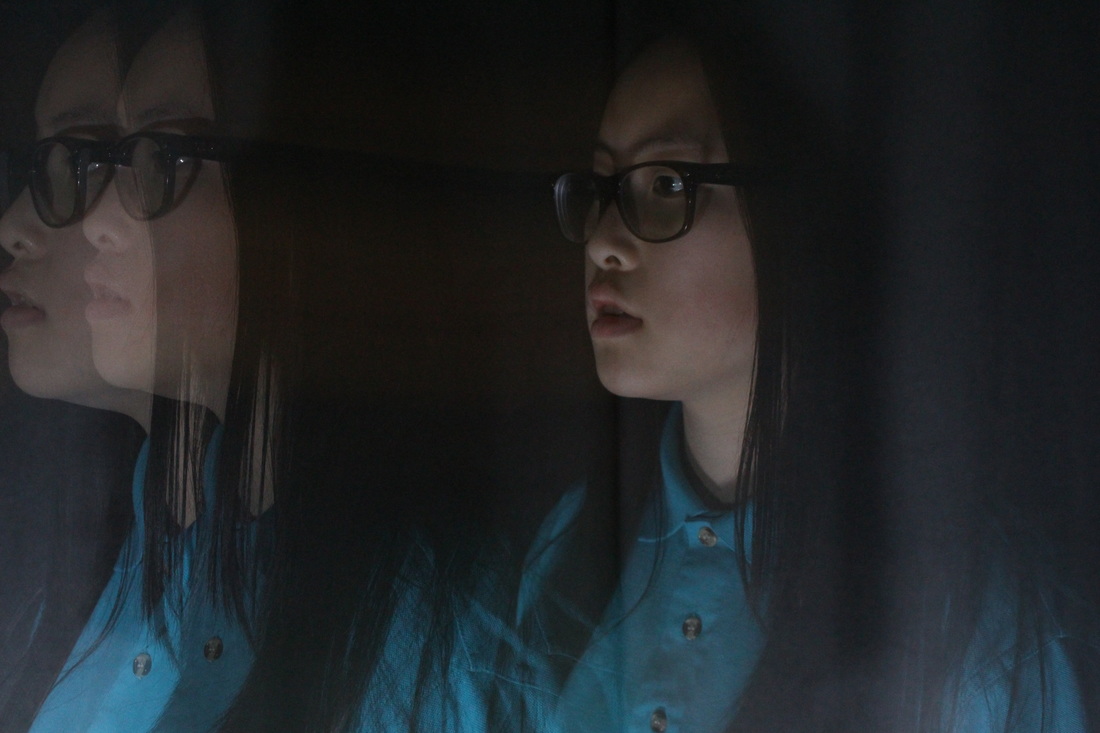
With this theme of Absurd, I feel like there were many endless directions i could've went to interpret this idea, as absurd pictures things which are not normal, i felt like i could be really creative and also original in the following experimentations. This was one of the areas which i tried to focus predominantly on as in my previous project I hadn't experimented as much. Overall i did 13 photo shoots all which were very different, i began by experimenting with objects by placing them in different planes and angles, in areas where they don't belong. Such as a safety cone on top of a head, or joining objects with things which were unordinary, such as joining the radio to someones head, as the head represents the the power source. I liked such an idea but it was very hard to develop and make more and more interesting and different each time. Hence, after researching the works of David Shrigley I began experimenting with signs, I focused on post-it notes originally with hand written statements which i placed around the school. After i carried on this experiment as home by simply writing on a piece of paper placing it in areas which is completely opposite to what the statement on the sheet says. One example included a sign saying 'a clean neat bed' whilst being in the center of a very unorganized bed. This idea similar to the previous one with objects was successful, however I couldn't find a way to make it more original and i didn't know how to incooperate it with other elements to make it absurd and interesting. Therefore I looked back at my previous research and experimentation to see whether there were tinier elements which i had played with which i could further develop to become much more original and much more personal for myself. So, after finding a selection which i had previously captured with objects- I had also used a lamp to create shadows and it created a very eerie effect which i liked. In addition, from the Pinterest page there were inspirational posts which played with light to create double exposures- where the shutter speed is longer than normal to create almost two images within one. These images were very interesting and i liked the idea so i decided to begin my experiment. So, just simply with a model and my DSLR i went outside to a plain brick wall background to capture a selection of these double exposures. As i was unsure of the exact settings i should use i played around with different apertures and shutter speeds till i found the one which most suited my surroundings hence creating a successful picture. To further develop this i went inside for the second round and did exactly the same process but with a plain white background and just some lighting from the windows. After analyzing these images i found that they were very blurry and almost smudged which was a problem as we couldnt see the details of the face which i intended to have in the picture. Which led me to remind myself of the time which we learnt to do light painting in the dark room. I remember that we used a dark room as well as a torch to create double exposures and also light painting. So, I went and did exactly that but mainly focussing on double exposures. This was mainly successful but at times challenging such as the focussing and the setting of the camera. It was a vast difference compared to shooting from the natural light to trying to adjust my method to capture these images with a flashlight. My set of double exposures demonstrate this theme of absurd as it distorts the face allowing the viewer to question the meaning behind the image and also the emotions which the person within the image has as they seem quite distressed from the head movements.
In addition after each photoshoot I ensured i spent time to review and analyze the images precisely. By doing this it allowed me to know whether it was successful or to find out the areas in which to improve the images. So i did a WWW 'what went well' and EBI 'even better if' for each shoot. It helped me to identify the strong points and weaknesses within my experimentation. In most cases after I applied my suggestions for the ways to improve in the next photo shoot i would do, therefore it would allow me to create much successful images in the end which i could refine to make look intriguing and interesting.
Overall i ave really enjoyed this project such as the artist researches, experimentation and refinements- however i then was stuck with how to present these images. But then after thinking about it i came to the solution. So for my final piece I am using 4 images from photoshoot number 12 which i will print out to stick inside a small box. I did this because the original images represent the distress and wrapped up emotions within the person, so by presenting the images close to each other in a tightly contained box it would enhance the idea by really restricted.
FINAL PIECE-
In the beginning i was slightly confused as to what 'Absurd' actually was so i researched it and then understood that it meant something- wildly unreasonable, illogical, or inappropriate. After that i was intrigued as to how i could develop this theme adding my own touch to it. So, i began by going onto Pinterest, and searching the different pins that would come under the theme- absurd. The searches were all different yet also interesting, so i pinned and created the ones which i found particularly intriguing and the ones which i found inspirational. I decided to evaluate two of the photos within my board and researched the artist as well as initial impressions of the photos and the possible connotations behind the obvious. I researched the two artists- Mark Jenkins and Erwin Wurm. Both these artists use people and normal everyday objects in places they aren't supposed to be placed; such as a chair on top of ones head. I particularly liked their work as it was clearly absurd and it seemed that i could create similar images by placing objects in wrong places with a singular person. These two artists were my inspiration for my first two photo shoots. After developing the idea of objects, i decided to go onto another theme within this wide topic which was to research an artist which uses signs within their work. I came across the artist- David Shrigley; who created obvious yet pointless signs within a plain background. I especially liked the simplicity within his photos, so i was inspired by his work to create my own. However instead of stating the obvious in my signs, i stated the opposite to what i was actually capturing. After many different experimentations with signs and various objects, i realised that i didn't particularly liked the idea and wanted to carry on my idea of people and this time incorporate light within the pictures. So, to know where i was heading to next, i went back onto Pinterest, and searched 'lights and people' and then after i refined my searches to 'long exposure portraits' as i wanted to experiment with this idea. Similar to before i saved some of the pins which i particularly liked and created a slide show to show this collection. There was no specific artist which had the idea that i wanted to do, so i simply analysed the images and relating them to the theme of absurd. These long exposures contained a singular figure with their face or body blurred and smudged. It seemed to me that these smudges were the movements and motions of the person, which could represent their emotions and feelings, in particular anger and how they wanted to let it out; hence their frustration was shown through their head movements. This idea of long exposures was one that i liked the most in this project, it represents absurd as it is hard to understand what the meaning behind the image is and the intentions.
With this theme of Absurd, I feel like there were many endless directions i could've went to interpret this idea, as absurd pictures things which are not normal, i felt like i could be really creative and also original in the following experimentations. This was one of the areas which i tried to focus predominantly on as in my previous project I hadn't experimented as much. Overall i did 13 photo shoots all which were very different, i began by experimenting with objects by placing them in different planes and angles, in areas where they don't belong. Such as a safety cone on top of a head, or joining objects with things which were unordinary, such as joining the radio to someones head, as the head represents the the power source. I liked such an idea but it was very hard to develop and make more and more interesting and different each time. Hence, after researching the works of David Shrigley I began experimenting with signs, I focused on post-it notes originally with hand written statements which i placed around the school. After i carried on this experiment as home by simply writing on a piece of paper placing it in areas which is completely opposite to what the statement on the sheet says. One example included a sign saying 'a clean neat bed' whilst being in the center of a very unorganized bed. This idea similar to the previous one with objects was successful, however I couldn't find a way to make it more original and i didn't know how to incooperate it with other elements to make it absurd and interesting. Therefore I looked back at my previous research and experimentation to see whether there were tinier elements which i had played with which i could further develop to become much more original and much more personal for myself. So, after finding a selection which i had previously captured with objects- I had also used a lamp to create shadows and it created a very eerie effect which i liked. In addition, from the Pinterest page there were inspirational posts which played with light to create double exposures- where the shutter speed is longer than normal to create almost two images within one. These images were very interesting and i liked the idea so i decided to begin my experiment. So, just simply with a model and my DSLR i went outside to a plain brick wall background to capture a selection of these double exposures. As i was unsure of the exact settings i should use i played around with different apertures and shutter speeds till i found the one which most suited my surroundings hence creating a successful picture. To further develop this i went inside for the second round and did exactly the same process but with a plain white background and just some lighting from the windows. After analyzing these images i found that they were very blurry and almost smudged which was a problem as we couldnt see the details of the face which i intended to have in the picture. Which led me to remind myself of the time which we learnt to do light painting in the dark room. I remember that we used a dark room as well as a torch to create double exposures and also light painting. So, I went and did exactly that but mainly focussing on double exposures. This was mainly successful but at times challenging such as the focussing and the setting of the camera. It was a vast difference compared to shooting from the natural light to trying to adjust my method to capture these images with a flashlight. My set of double exposures demonstrate this theme of absurd as it distorts the face allowing the viewer to question the meaning behind the image and also the emotions which the person within the image has as they seem quite distressed from the head movements.
In addition after each photoshoot I ensured i spent time to review and analyze the images precisely. By doing this it allowed me to know whether it was successful or to find out the areas in which to improve the images. So i did a WWW 'what went well' and EBI 'even better if' for each shoot. It helped me to identify the strong points and weaknesses within my experimentation. In most cases after I applied my suggestions for the ways to improve in the next photo shoot i would do, therefore it would allow me to create much successful images in the end which i could refine to make look intriguing and interesting.
Overall i ave really enjoyed this project such as the artist researches, experimentation and refinements- however i then was stuck with how to present these images. But then after thinking about it i came to the solution. So for my final piece I am using 4 images from photoshoot number 12 which i will print out to stick inside a small box. I did this because the original images represent the distress and wrapped up emotions within the person, so by presenting the images close to each other in a tightly contained box it would enhance the idea by really restricted.
FINAL PIECE-